1. House styleFor contents page this house style is Design balance/ symmetry The editor has
very effective for the type of magazine it is. The most used an effective balance between both sides of the
Salford City College
Eccles Centre
effective colours used are black and white; the white contents page. The editor has balanced it out by
AS Media Studies
text stands out clearly to the audience on the black
Foundation Portfolio putting the image on the left hand side of the page
background. These colours both contrast each other as and the text on the right hand side. This creates an
; equal balance for the contents page which is very
they are light and dark. The dark background creates a
dark maybe gloomy effect of the magazine which could effective towards the audience. The balance of this
be mysterious. Black could also represent a dark room contents page creates an effect on the reader. The
as the magazine is a dance/ club magazine. The editor design symmetry is not symmetrical as text is on one
is trying to create a sense of being in a club dancing. side and an image is on the other. This shows that it is
This creates a feel for the audience and the magazine not symmetrical. This could represent that the
which will draw the audience in for them to look at this magazine is different either the music genre is very
page and see what’s inside. Informal writing is used on different to other music genres like pop or the
this magazine to create the effect that this music magazine is different to any other magazine or is
magazine is different to other music magazines or different on each page. It could also represent that the
music. Informal writing could also represent that only music doesn’t follow the rules as the magazine doesn’t
certain type of people will like the magazine and the follow the design symmetry rules. Overall the editor
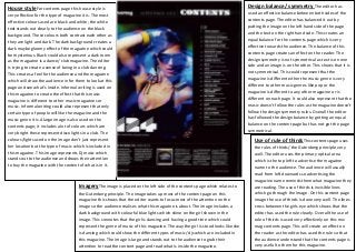
music genre it is.A large image is also used on the has followed the design balance by getting an equal
contents page; it includes a lot of colours which are balance on the content page but has not got the page
very bright these represent disco lights in a club. The symmetrical.
colours/lights used on the image don’t just represent Use of rule of thirdsThis contents page uses
her location but the type of music which is included in the rules of thirds/ the Gutenberg principle very
this magazine. This image represents Dj music which well. The editor uses the primary optical area
stands out to the audience and draws their attention which is the top left to advertise the magazine
to buy the magazine with the content of what is in it. name to the audience. The audience will usually
read from left downards so advertising the
magazine name reminds them what magazine they
ImageryThe image is placed on the left side of the contents page which relates to are reading. The use of thirds is invisible lines
the Gutenberg principle. The image takes up most of the content page on this which go through the image. On this content page
magazine this shows that the editor wants to focus most of the attention on the image the use of thirds is done very well. The lines
image so the audience realises what this magazine is about. The image includes a cross between the girls eye which shows that the
dark background with colourful blue lights which shine on the girl shown in the editor has used the rule clearly. Overall the use of
image. This connotes that the girl is dancing and having a good time which could rule of thirds is used very effectively on this mix
represent the genre of music of this magazine. The way the girl is stood looks like she mag contents page. This will create an effect on
is dancing which could show the different types of music/ djs which are included in the reader as the editor has used the rule so that
this magazine. The image is large and stands out to the audience to grab their the audience understand that the contents page is
attention to read the content page and read what is inside the magazine. very useful to them for this magazine.