Information Overload and Visual Imagery
•
2 recomendaciones•590 vistas

Digital Imagery as Technology & Information

Recomendados
Recomendados
Más contenido relacionado
La actualidad más candente
La actualidad más candente (14)
Similar a Information Overload and Visual Imagery
Similar a Information Overload and Visual Imagery (20)
Más de Binaebi Akah
Más de Binaebi Akah (13)
Último
Último (20)
Information Overload and Visual Imagery
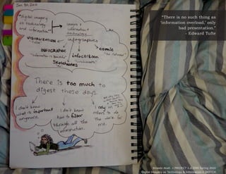
- 1. “There is no such thing as ‘information overload,’ only bad presentation.” - Edward Tufte Binaebi Akah » PROJECT 2.A I590 Spring 2010 Digital Imagery as Technology & Information » SKETCH
- 2. Information Design Infographic Mindmap Because we are firmly in the “Information With all of this information to sift through, it is I chose these examples for their varying Age,” it seems to me that the method in which ever more difficult to remember information levels of formality and ease of comprehension we showcase information is imperative. that was once the standard, such as grammar. when compared to prose papers. As mentioned by Alex Wright in the book In general, people are less likely to memorize The first aids comprehension of the similarities Glut, the internet has made it so people have bits of information today because we rely and differences within a set, delineated by access to more information than ever before. on the internet as a constantly-available the different circles and colors. The second Yet, how much are we comprehending? It is resource. That is, there is no need to utilizes comic-inspired images with arrows one thing to see information and understand; remember something now if I can look it up and boxes to showcase relationships and it is another to comprehend and discuss. later. Unless, that is, the information is shown potential decisions. in a memorable, humorous method. Shown above is a Venn diagram by Andrew The third is interesting because of its Yau, a traditional method of encapsulating For instance, this is an infographic that walks informality. It is hand-drawn, does not information into a visual format meant for the reader through a decision tree for using rely on grids, and has many colors. Yet, comprehension. It is simple enough for a an apostrophe. It uses visuals to simplify the the information is still understood, and cursory inspection, yet detailed to potentially information and provide examples, and so is the content is memorable due to the self- inspire passionate discussion. more memorable for the reader. deprecating humor. Binaebi Akah » PROJECT 2.A I590 Spring 2010 Digital Imagery as Technology & Information » DESIGN RESEARCH
- 3. Primary Attributions Secondary Attributions Specifications Lynn Dombrowski Edward Tufte quote from Adam Fullteron’s Designed by Binaebi Akah in Adobe InDesign CS4 Information as opinion and meaning-making blogpost discussing a Tufte workshop (http:// using the Typography menu set. through creativity; using layers in InDesign. www.adamfullerton.com/?p=588) @ Jan 31, 2010 Heading character style is Bookman Old Style Edward Tufte Photo of an infographic (source: Binaebi Akah, Regular, size 14 pt, leading 19 pt + tracking 30. Bad presentation of information leads drawn by Binaebi Akah, Bloomington IN to information overload. Jan 2010) Paragraph character style is Verdana Regular, size 10 pt, leading 14 pt + tracking 10. Alex Wright “What makes good information design?” Information and intellectual capital management from Information is Beautiful (source: David is difficult. McCandless, http://www.informationisbeautiful. net/2009/interesting-easy-beautiful-true/) @ Jan 31, 2010 “How to use an apostrophe” from The Oatmeal (source: http://theoatmeal.com/comics/ apostrophe) @ Jan 31, 2010 “Behold the awesome science of mindmapping” from Flickr (source: Tobias Lunchbreath http://www.flickr.com/photos/ lunchbreath/4129600869/) @ Jan 31, 2010 “Clay Sharky on Information Overload vs Filter Failure” (source: Boing Boing http://www. boingboing.net/2010/01/31/clay-shirky-on-infor. html) @ Feb 1, 2010 Binaebi Akah » PROJECT 2.A I590 Spring 2010 Digital Imagery as Technology & Information » ATTRIBUTIONS