2. Front Cover Conventions
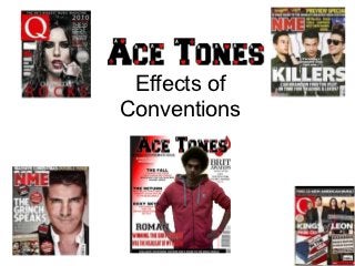
A key convention that is used on the front cover of Ace Tones magazine is the style of image. The effect of this style of image is that it is clear
and is a stand-out point on the front cover that can be easily recognised. Additionally, the image is not overshadowed by any other image and
this accentuates that it is linked to the main section within the magazine.
Another convention is the layout on the front cover. The layout within Ace Tones magazine and those found conventionally within the genre is
an ordered layout. The effect of this is that it makes it appealing to the target audience. Therefore, when they see this magazine for sale they
can immediately link it to a more adult audience where the mode of address will show professionalism. In addition to this the barcodes and
pricing is placed in a conventional place and this accentuates the professional mode of address.
The masthead is another key point
of convention upon the front cover.
The masthead for Ace Tones
includes the eye-catching font
which gives the magazine
recognition and appeal.
Additionally it has the conventional
colour scheme of red, black and
white. The effect of this is that it
connotes a certain meaning for the
magazine. For example the red
which connotes passion and anger.
3. Content Page and Double Page Spread
Conventions
Convention Effect Convention Effect
Provides easy navigation The effect of this is that the Wording and Typography Is appropriate to the target
around the magazine: reader will find this audience of the magazine.
Features divided into appealing. This is because This shows that the
sections they can easily focus on the magazine was made with the
Includes a band index section that they are audience specifically in mind.
interested in without having
to spend a long time Image Provides a clear stand-out
searching. point on the double page
spread cover. Additionally
Subscription offer Directly appeals to the the conventional use of the
audience in addition to close up means that the
providing a professional audience can identify the
mode of address. persons key features
Images are linked directly to Shows flow within the Fact file Provides the audience with
the front cover and the magazine. information on the artist.
double page spread. This adds to the appeal for
the audience.