1.
Evaluation
The first I did when recreating this magazine was going to the white room and taking the photo.
Then with the SD card I uploaded it to my computer and saved the photo to my desk top then
inserted it to the programme I use. However to help me get some hard things onto my magazine to
get the looking like the original, I also used the programme called ` Photoshop`. But the programme I
used what called ` InDesign `.
The tools I used to help me create my magazine were:
I used this tool to help me move and adjust the text or images to the size I would
like. It could also help me to change if I want to view something sideways.
2. I have used this tool mainly this whole process because there is a lot of text on my
magazine I chose to recreate. This helped me write all of the things need and then I
could also change the colour, sixe, type of text and even the stroke. This was important
because in some of the text I needed to increase the size of the stroke.
I used this tool when I need to upload some text that I highlighted in
Photoshop. I made an envelope and then imported/placed the text into the
envelope.
It was useful that they had this tool because it helped me make the circle shape.
I used the eyedropper tool because I need the colour of some text to be the
same and I clicked on the pink I needed and made it the same colour.
3. All of these tools to help me change the colour of the text or stroke. I
also used the colour in palette which helped me ad darker effect to the colours.
I used:
I also used this lasso tool from the programme Photoshop to capture text that I couldn’t
recreate at all on InDesign. I have used this tool before which made this a quick and easy
thing to do.
To make it normal or
bold
I have used this before
on other sites
To change the
font type
Used before
This changes the
size of the text
Used before
Makes
everything
CAPS
Haven’t used
before
I used this to automatically
make the first letter a capital
Haven’t used before
Makes the
letters
separate or
come closer
New tool
Stretches the vertical
scale
New tool
Tilts the text o
make it italic
I have used this
tool before
Stretches the horizontal scale
I didn’t end up using any of these
tools because I didn’t need to. I did
see what they were but it didn’t look
as close to the normal magazine as I
could get it
4. I have used so many new tools during this task project. This is because I have used a completely
different programme.Obviously using a new programme there will be new tools and things that I
haven’t used before; this helps my knowledge on editing media items.
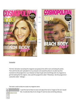
I think that my end magazine is as close to the original as it can be, making me quite happy how it’s
turned out. I think that some strength of my magazine are, nearly all of the writing is very similar to
the normal magazine cover.
I also think that the colours of the texts are also as close as it can be to the original magazine; this is
clearly a good thing that it’s the same colour because if it wasn’t the right colour, then it wouldn’t
look like the original. Deciding the colour of the text, to make it the same is important because
choosing the colours on a really magazine is a vital part of creating a magazine, it tells you what sex
and age that they are aiming to attract.
A weaker side to my magazine is that my model isn’t in the same place as Jennifer Aniston is. I think
this ruins the effect and the similarities about the two magazines. I think that if we would have taken
another picture or used a different one, with my model in the same position at the original, this
would have definitely made my magazine creation, look even better than it is now. More
importantly it would have made it look more similar to the original. maybe having my model to the
right scale, would have helped proportion where the text was needed to go.
5. I’m content with my magazine because I know I have spent a lot of time trying to make it match or
look the same as the original. however it never was going to be perfect but what I have done, I think
is good because it’s as close to the original as I could get it to be.
I do agree that it looks like the original cover. I think this because I have used the same font on most
occasions, I have also chosen the same font sizes and colours, and aimed to position the images and
the text in the same places as the original. I also like how my model looks very similar to Jennifer
Aniston.
The things that I would have changed in the process of evaluation my magazine I have notices things
that I would have changed or made different. This is:
In my magazine my model has a strap showing whereas in the original she doesn’t. I thought I would
have been inappropriate to make her have her strap down. And also my model wouldn’t have felt
comfortable.
I also would have changed the colour of the background on my magazine; this would have changes
the whole perspective of my magazine because I it would have made them look that much more
alike.
In conclusion, I’m proud of my magazine because I have worked hard on it and with the programmes
I had to used, I do think it looks as close to the magazine as possible.