SlideShare una empresa de Scribd logo
1 de 10
The title stands out, it’s
unique, and the
simplicity would appeal
to the target audience.
The picture is strong and
individual, it catches the
eyes of the audiences it
creates and style for the
audience to follow.
The cover lines are all on
the right side which
shows that they aren’t as
important as the ones on
the left side. Making it
clear which is more
important.
The text is a bright
yellow which stands out
from the background yet
it’s complementary as
the blue and the yellow
work well together on
the colour wheel,
creating compatibility
between the text and
background. Also by
having it bold and in
colour, shows the
importance.The text “veiled” also
anchors the image.
This is a huge picture of the editor,
which is quite unconventional
normally the editor’s picture is tiny.
The text “pilot fever” anchors the
rest of the text. It’s also written in an
informed tone, and ties in with
contents of the magazine.
By having the different
categories, it makes it clear,
obvious and easier to
understand where certain
articles are going to be.
By having the e-mail address
for the magazine, it appeals to
the target audience as they can
find more information. Also by
giving a bit more information,
to catch the audiences eye
shows it’s important.
Having the pictures are good as
they help the reader to identify
what the articles or sections are
about. The themes of simple
images also make them stand
out. The pictures also reinforce
the sections.
The colour of the text goes with
the colour of the background; it
stands out and maintains the
house style of the magazine.
The interview is three
column, flush left, a
normal question and
answering with the
journalist asking the
questions. The colour
scheme simple and easier
to read.
The picture stands out,
it’s looks serious, so it
goes with the title of the
article. The picture
reinforces melancholy
feel, which links to the
title.
The colours stand out, and
my having “dead” in the
word and then having
“summer” in red. It gives
a sense of danger to the
article.
This is important as it informs
the readers of who is being
interviewed and what it’s
about.
The title is short, easy to
remember, the colour
stands out against the
background.
All the articles are on the
left side which shows that
they’re important and
want to be seen by the
target audience. The
colour also goes with the
title.
It has here, a list of what’s
going to be involved in the
magazine, which means
the reader can make a
quick decision whether
they want to read the
magazine.
The background stands
out, by having animations
of blood and little eyes,
goes with the rest of the
shot. Making it desirable
to the target audience.
The picture is a bit
strange, and crazy which
shows the type of
audience the magazine is
targeted at. Also it’s laid
back which shows the
style.
Advertising, clear and
tells the reader who the
magazine is associated
with.
It has the magazines title
again so that the reader
can identify the style of
the articles. The colour
scheme follows through
out the contents page,
making it clear and
effective.
The sub headings are
clear and organises the
features better for the
reader to see what they
would like to read.
This is to inform the
reader of what the
magazine is going to
contain, so they can
identify certain articles
which they’d enjoy
more.
Editor’s letter, giving the
reader a little more
information and relating
to the reader.
By having an
unconventional
picture of guys
dressing in girls
clothes, it shows how
relaxed and fun this
article is going to be.
The colour scheme fits
together, red, white,
and black. By doing
this is forms simplicity
which the audience
would appreciate as
the point of a magazine
is to read and relax.
By having the speech
marks, it showing
that the magazine is
highlighting a certain
bit of text, the
readers might like to
read.
For new time readers,
they’ve added which
members do what in the
band, making it easier
for the reader to identify
and relate to the band
and magazine.
Also for fans of the
bands, they’ve added
dates from where they
are playing. Showing the
articles are always
thought carefully about.
By having the same text
style, size and colour
through out the
magazine, it creates
consistencies
Extras.
It’s also got what else is
included in the
magazine, which again
helps the reader to
identify whether they
want to read on.
Extras.
It has the date, which
means the reader can
keep updated. Useful.
Extras.
It also has the list of
bands, which means
the reader can
instantly identify
whether they want to
read the magazine.
Main image.
By having the close up,
you can see the
emotions and style of
the picture. & the
picture goes with the
features on the front
cover
Title.
Strong, bold,
remember able title
that the reader would
notice.
Colour scheme
It is simple but
effective, because of
the different coloured
back ground in the
picture, you can’t have
to much colour as it
would clash, so it all
fits together.
The readers of the
magazine value live
gigs and
performances. This is
clearly represented
through the choice of
imagery
The images also set
a style of
authenticity and
originality. Which
the readers can
identify with.
The layout is very
simple, the text is
slightly angled. It has
a torn quality shows
that it’s not perfect.
But also the size, font
style and colour have
all been kept the
same. That generates
a house style.
CD covers of new
releases likely to be
reviewed in the
magazine.
No large page
numbers associated
with the pictures.
The colour scheme
goes red and white.
But having such a
simple scheme it
makes it easier for
the reader to read.
The layout is also
very simple which
shows the style of the
band, there’s not
loads happening
which suggests
they’re simple and
relaxed.
However, both
images portray there
style as happy and
fun, which the reader
would respond to.
Again it has quotes
and annotations,
which are used to
help the reader
identify the more
important bits.
Again they’re using
the torn quality
which gives the
impression of
imperfection.

Más contenido relacionado

La actualidad más candente (15)

Task 3 research bmth
Task 3 research bmthTask 3 research bmth
Task 3 research bmth
 
Soap mag 2
Soap mag 2Soap mag 2
Soap mag 2
 
Magazine analysis
Magazine analysisMagazine analysis
Magazine analysis
 
Magazine analysis
Magazine analysisMagazine analysis
Magazine analysis
 
Magazine deconstructions (media coursework)
Magazine deconstructions (media coursework)Magazine deconstructions (media coursework)
Magazine deconstructions (media coursework)
 
Analysis of Magazines.
Analysis of Magazines.Analysis of Magazines.
Analysis of Magazines.
 
Task 9
Task 9 Task 9
Task 9
 
KERRANG! - Contents Page
KERRANG! - Contents PageKERRANG! - Contents Page
KERRANG! - Contents Page
 
Market research
Market researchMarket research
Market research
 
Contents page anlysis
Contents page anlysisContents page anlysis
Contents page anlysis
 
Contents page analysis
Contents page analysisContents page analysis
Contents page analysis
 
Analysis of 'blues matters'
Analysis of 'blues matters'Analysis of 'blues matters'
Analysis of 'blues matters'
 
Detailed class analysis of music magazine nme
Detailed class analysis of music magazine nmeDetailed class analysis of music magazine nme
Detailed class analysis of music magazine nme
 
Music magazine analysis
Music magazine analysisMusic magazine analysis
Music magazine analysis
 
Fonts and logo designs
Fonts and logo designsFonts and logo designs
Fonts and logo designs
 

Destacado (8)

F:\แป้ง
F:\แป้งF:\แป้ง
F:\แป้ง
 
แป้ง
แป้งแป้ง
แป้ง
 
Report on Vietnam World Bank Public Information Conner in 2011
Report on Vietnam World Bank Public Information Conner in 2011Report on Vietnam World Bank Public Information Conner in 2011
Report on Vietnam World Bank Public Information Conner in 2011
 
แป้ง
แป้งแป้ง
แป้ง
 
Iso 27001
Iso 27001Iso 27001
Iso 27001
 
Presentasjon first lego league fremtidens læring
Presentasjon first lego league fremtidens læringPresentasjon first lego league fremtidens læring
Presentasjon first lego league fremtidens læring
 
Gce vietnam introduction
Gce vietnam introductionGce vietnam introduction
Gce vietnam introduction
 
Programming, music, mathematics and physics
Programming, music, mathematics and physicsProgramming, music, mathematics and physics
Programming, music, mathematics and physics
 

Similar a Research. (20)

Textual analysis
Textual analysisTextual analysis
Textual analysis
 
Magazine Textual Analysis
Magazine Textual AnalysisMagazine Textual Analysis
Magazine Textual Analysis
 
Task 2,3
Task 2,3Task 2,3
Task 2,3
 
Classic fm mag task 3
Classic fm mag task 3Classic fm mag task 3
Classic fm mag task 3
 
Contents Page Research
Contents Page ResearchContents Page Research
Contents Page Research
 
Four mixed genre contents pages
Four mixed genre contents pagesFour mixed genre contents pages
Four mixed genre contents pages
 
Magazine resarch powerp 2 final
Magazine resarch powerp 2 finalMagazine resarch powerp 2 final
Magazine resarch powerp 2 final
 
Magazine resarch powerp 2
Magazine resarch powerp 2Magazine resarch powerp 2
Magazine resarch powerp 2
 
My magazine
My magazineMy magazine
My magazine
 
My magazine 2.0
My magazine 2.0My magazine 2.0
My magazine 2.0
 
Analysing contents pages prep for blog ppt 2
Analysing  contents pages prep for blog ppt 2Analysing  contents pages prep for blog ppt 2
Analysing contents pages prep for blog ppt 2
 
Question one
Question oneQuestion one
Question one
 
Magazine cover analysis
Magazine cover analysisMagazine cover analysis
Magazine cover analysis
 
Front covers, contents pages, double page spreads #5
Front covers, contents pages, double page spreads #5Front covers, contents pages, double page spreads #5
Front covers, contents pages, double page spreads #5
 
Mojo
MojoMojo
Mojo
 
Tasks 1 4 and hwk 1
Tasks 1 4 and hwk 1Tasks 1 4 and hwk 1
Tasks 1 4 and hwk 1
 
Deconstructions
DeconstructionsDeconstructions
Deconstructions
 
Annotations of contents pages
Annotations of contents pagesAnnotations of contents pages
Annotations of contents pages
 
Contents Page Analysis
Contents Page AnalysisContents Page Analysis
Contents Page Analysis
 
Magazine Conventions
Magazine ConventionsMagazine Conventions
Magazine Conventions
 

Último

Salient Features of India constitution especially power and functions
Salient Features of India constitution especially power and functionsSalient Features of India constitution especially power and functions
Salient Features of India constitution especially power and functions
KarakKing
 

Último (20)

Application orientated numerical on hev.ppt
Application orientated numerical on hev.pptApplication orientated numerical on hev.ppt
Application orientated numerical on hev.ppt
 
Exploring_the_Narrative_Style_of_Amitav_Ghoshs_Gun_Island.pptx
Exploring_the_Narrative_Style_of_Amitav_Ghoshs_Gun_Island.pptxExploring_the_Narrative_Style_of_Amitav_Ghoshs_Gun_Island.pptx
Exploring_the_Narrative_Style_of_Amitav_Ghoshs_Gun_Island.pptx
 
Single or Multiple melodic lines structure
Single or Multiple melodic lines structureSingle or Multiple melodic lines structure
Single or Multiple melodic lines structure
 
80 ĐỀ THI THỬ TUYỂN SINH TIẾNG ANH VÀO 10 SỞ GD – ĐT THÀNH PHỐ HỒ CHÍ MINH NĂ...
80 ĐỀ THI THỬ TUYỂN SINH TIẾNG ANH VÀO 10 SỞ GD – ĐT THÀNH PHỐ HỒ CHÍ MINH NĂ...80 ĐỀ THI THỬ TUYỂN SINH TIẾNG ANH VÀO 10 SỞ GD – ĐT THÀNH PHỐ HỒ CHÍ MINH NĂ...
80 ĐỀ THI THỬ TUYỂN SINH TIẾNG ANH VÀO 10 SỞ GD – ĐT THÀNH PHỐ HỒ CHÍ MINH NĂ...
 
Graduate Outcomes Presentation Slides - English
Graduate Outcomes Presentation Slides - EnglishGraduate Outcomes Presentation Slides - English
Graduate Outcomes Presentation Slides - English
 
Kodo Millet PPT made by Ghanshyam bairwa college of Agriculture kumher bhara...
Kodo Millet  PPT made by Ghanshyam bairwa college of Agriculture kumher bhara...Kodo Millet  PPT made by Ghanshyam bairwa college of Agriculture kumher bhara...
Kodo Millet PPT made by Ghanshyam bairwa college of Agriculture kumher bhara...
 
Fostering Friendships - Enhancing Social Bonds in the Classroom
Fostering Friendships - Enhancing Social Bonds  in the ClassroomFostering Friendships - Enhancing Social Bonds  in the Classroom
Fostering Friendships - Enhancing Social Bonds in the Classroom
 
On National Teacher Day, meet the 2024-25 Kenan Fellows
On National Teacher Day, meet the 2024-25 Kenan FellowsOn National Teacher Day, meet the 2024-25 Kenan Fellows
On National Teacher Day, meet the 2024-25 Kenan Fellows
 
FSB Advising Checklist - Orientation 2024
FSB Advising Checklist - Orientation 2024FSB Advising Checklist - Orientation 2024
FSB Advising Checklist - Orientation 2024
 
Unit 3 Emotional Intelligence and Spiritual Intelligence.pdf
Unit 3 Emotional Intelligence and Spiritual Intelligence.pdfUnit 3 Emotional Intelligence and Spiritual Intelligence.pdf
Unit 3 Emotional Intelligence and Spiritual Intelligence.pdf
 
REMIFENTANIL: An Ultra short acting opioid.pptx
REMIFENTANIL: An Ultra short acting opioid.pptxREMIFENTANIL: An Ultra short acting opioid.pptx
REMIFENTANIL: An Ultra short acting opioid.pptx
 
2024-NATIONAL-LEARNING-CAMP-AND-OTHER.pptx
2024-NATIONAL-LEARNING-CAMP-AND-OTHER.pptx2024-NATIONAL-LEARNING-CAMP-AND-OTHER.pptx
2024-NATIONAL-LEARNING-CAMP-AND-OTHER.pptx
 
How to Give a Domain for a Field in Odoo 17
How to Give a Domain for a Field in Odoo 17How to Give a Domain for a Field in Odoo 17
How to Give a Domain for a Field in Odoo 17
 
Google Gemini An AI Revolution in Education.pptx
Google Gemini An AI Revolution in Education.pptxGoogle Gemini An AI Revolution in Education.pptx
Google Gemini An AI Revolution in Education.pptx
 
Food safety_Challenges food safety laboratories_.pdf
Food safety_Challenges food safety laboratories_.pdfFood safety_Challenges food safety laboratories_.pdf
Food safety_Challenges food safety laboratories_.pdf
 
Salient Features of India constitution especially power and functions
Salient Features of India constitution especially power and functionsSalient Features of India constitution especially power and functions
Salient Features of India constitution especially power and functions
 
Sociology 101 Demonstration of Learning Exhibit
Sociology 101 Demonstration of Learning ExhibitSociology 101 Demonstration of Learning Exhibit
Sociology 101 Demonstration of Learning Exhibit
 
TỔNG ÔN TẬP THI VÀO LỚP 10 MÔN TIẾNG ANH NĂM HỌC 2023 - 2024 CÓ ĐÁP ÁN (NGỮ Â...
TỔNG ÔN TẬP THI VÀO LỚP 10 MÔN TIẾNG ANH NĂM HỌC 2023 - 2024 CÓ ĐÁP ÁN (NGỮ Â...TỔNG ÔN TẬP THI VÀO LỚP 10 MÔN TIẾNG ANH NĂM HỌC 2023 - 2024 CÓ ĐÁP ÁN (NGỮ Â...
TỔNG ÔN TẬP THI VÀO LỚP 10 MÔN TIẾNG ANH NĂM HỌC 2023 - 2024 CÓ ĐÁP ÁN (NGỮ Â...
 
Key note speaker Neum_Admir Softic_ENG.pdf
Key note speaker Neum_Admir Softic_ENG.pdfKey note speaker Neum_Admir Softic_ENG.pdf
Key note speaker Neum_Admir Softic_ENG.pdf
 
COMMUNICATING NEGATIVE NEWS - APPROACHES .pptx
COMMUNICATING NEGATIVE NEWS - APPROACHES .pptxCOMMUNICATING NEGATIVE NEWS - APPROACHES .pptx
COMMUNICATING NEGATIVE NEWS - APPROACHES .pptx
 

Research.

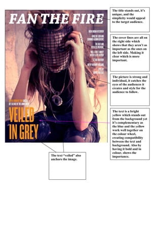
  • 1. The title stands out, it’s unique, and the simplicity would appeal to the target audience. The picture is strong and individual, it catches the eyes of the audiences it creates and style for the audience to follow. The cover lines are all on the right side which shows that they aren’t as important as the ones on the left side. Making it clear which is more important. The text is a bright yellow which stands out from the background yet it’s complementary as the blue and the yellow work well together on the colour wheel, creating compatibility between the text and background. Also by having it bold and in colour, shows the importance.The text “veiled” also anchors the image.
  • 2. This is a huge picture of the editor, which is quite unconventional normally the editor’s picture is tiny. The text “pilot fever” anchors the rest of the text. It’s also written in an informed tone, and ties in with contents of the magazine. By having the different categories, it makes it clear, obvious and easier to understand where certain articles are going to be. By having the e-mail address for the magazine, it appeals to the target audience as they can find more information. Also by giving a bit more information, to catch the audiences eye shows it’s important. Having the pictures are good as they help the reader to identify what the articles or sections are about. The themes of simple images also make them stand out. The pictures also reinforce the sections. The colour of the text goes with the colour of the background; it stands out and maintains the house style of the magazine.
  • 3. The interview is three column, flush left, a normal question and answering with the journalist asking the questions. The colour scheme simple and easier to read. The picture stands out, it’s looks serious, so it goes with the title of the article. The picture reinforces melancholy feel, which links to the title. The colours stand out, and my having “dead” in the word and then having “summer” in red. It gives a sense of danger to the article. This is important as it informs the readers of who is being interviewed and what it’s about.
  • 4. The title is short, easy to remember, the colour stands out against the background. All the articles are on the left side which shows that they’re important and want to be seen by the target audience. The colour also goes with the title. It has here, a list of what’s going to be involved in the magazine, which means the reader can make a quick decision whether they want to read the magazine. The background stands out, by having animations of blood and little eyes, goes with the rest of the shot. Making it desirable to the target audience.
  • 5. The picture is a bit strange, and crazy which shows the type of audience the magazine is targeted at. Also it’s laid back which shows the style. Advertising, clear and tells the reader who the magazine is associated with. It has the magazines title again so that the reader can identify the style of the articles. The colour scheme follows through out the contents page, making it clear and effective. The sub headings are clear and organises the features better for the reader to see what they would like to read. This is to inform the reader of what the magazine is going to contain, so they can identify certain articles which they’d enjoy more. Editor’s letter, giving the reader a little more information and relating to the reader.
  • 6. By having an unconventional picture of guys dressing in girls clothes, it shows how relaxed and fun this article is going to be. The colour scheme fits together, red, white, and black. By doing this is forms simplicity which the audience would appreciate as the point of a magazine is to read and relax. By having the speech marks, it showing that the magazine is highlighting a certain bit of text, the readers might like to read. For new time readers, they’ve added which members do what in the band, making it easier for the reader to identify and relate to the band and magazine. Also for fans of the bands, they’ve added dates from where they are playing. Showing the articles are always thought carefully about. By having the same text style, size and colour through out the magazine, it creates consistencies
  • 7. Extras. It’s also got what else is included in the magazine, which again helps the reader to identify whether they want to read on. Extras. It has the date, which means the reader can keep updated. Useful. Extras. It also has the list of bands, which means the reader can instantly identify whether they want to read the magazine. Main image. By having the close up, you can see the emotions and style of the picture. & the picture goes with the features on the front cover Title. Strong, bold, remember able title that the reader would notice. Colour scheme It is simple but effective, because of the different coloured back ground in the picture, you can’t have to much colour as it would clash, so it all fits together.
  • 8. The readers of the magazine value live gigs and performances. This is clearly represented through the choice of imagery The images also set a style of authenticity and originality. Which the readers can identify with. The layout is very simple, the text is slightly angled. It has a torn quality shows that it’s not perfect. But also the size, font style and colour have all been kept the same. That generates a house style. CD covers of new releases likely to be reviewed in the magazine. No large page numbers associated with the pictures.
  • 9. The colour scheme goes red and white. But having such a simple scheme it makes it easier for the reader to read. The layout is also very simple which shows the style of the band, there’s not loads happening which suggests they’re simple and relaxed. However, both images portray there style as happy and fun, which the reader would respond to. Again it has quotes and annotations, which are used to help the reader identify the more important bits. Again they’re using the torn quality which gives the impression of imperfection.
  • 10. The colour scheme goes red and white. But having such a simple scheme it makes it easier for the reader to read. The layout is also very simple which shows the style of the band, there’s not loads happening which suggests they’re simple and relaxed. However, both images portray there style as happy and fun, which the reader would respond to. Again it has quotes and annotations, which are used to help the reader identify the more important bits. Again they’re using the torn quality which gives the impression of imperfection.