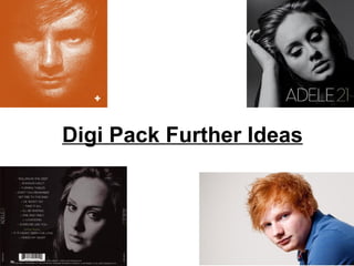
2. This is the front of Ed Sheerans’ current
album. It is basic and so simple and it has
inspired me within developing the digi pack.
The simplicity of the whole image is stunning
and stands out for being so simple. The
orange takes away the boring of the image
and this has made me think how simple
images can make the biggest effects.
The name of the album is situated in the
bottom right hand corner of the digi pack.
The title has been cleverly made into a
symbol ‘+’ standing for plus. It is also less
dominant that the dominant image therefore
it must have confidence that the look of the
artist is more well known than the artists
album title or even his name as his name
isn’t on the cover of the digi pack which is
highly unusual.
The colours used are bold and significant to the outlining of the featured artist within the
image. I like the way the sketching of the orange makes the face in the image. The
connection between the artist two and the buyer is strong as it is a close up of the artist which
gives relationship between the so the buyer is more persuaded to buy off the shelf and enjoy
the digi pack. The even stronger bond between the artist and the buyer comes from the eye
contact with the camera. I find that the eye contact will intrigue more ottention from
customers.
3. I really like this image of
Ed Sheeran and would
like to use it as
inspiration for my next
photo shoot with Lyndon.
This image uses the rule
of third which is easy on
the eyes and I would like
to use this rule within
making my digi pack. I
believe using a close up
like this would create a
stronger bond between
the buyer and the artist
as the buyer can see the artist clearer so there will be a better relationship between the
two. Although this image is not on Ed Sheerans’ digi pack I still think it would stand out
amongst a shelf of digi packs. I like the plain white background of this image as it makes
the artist stand out and the dominant feature within the image. As I have already tried
using multiple striking backgrounds, I am going to try the plain backgrounds in the next
photo shoot with Lyndon. This will enable me to see which works best and I will be able
to understand how dominant Lyndon is in the image compared to the back ground as he
has to be the main focus. In some of my images I have taken, the background is a more
dominant feature than Lyndon so I need to find a balance between the two.
4. This is the current album of the singer
Adele. Similarly to Ed sheerans’ album
this also has a close up image of the
artist as the front cover of the digi
pack, however, in black and white. The
black and white resembles the track
list of the artists album as it is simple
and classic. The sophisticated nature
targets the audience which Adele is
targeting which is the older teenagers
and above.
Although the artist in the image is not
looking at the camera, the image
among the front cover is still powerful
and stands out as she the artist is the
most dominant feature within the front
cover of the digi pack.
From looking at the relationship between the buyer and the artist I believe a more
powerful bond is of an image which the eyes are looking directly to the camera. This is
so the audience can feel involved with the artist and feel like they know them from just
that image, which is important when selling an album on a shelf full of similar albums.
5. This is the beck cover of
Adele’s current album of ’21’.
Like the front cover it is black
and white and is a close up of
the artist, but this time she is
looking directly into camera so
there is a connection with the
buyer.
This back cover links with the
front cover with the black and
white effect which is seen
throughout the digi pack. The
whole digi pack being this
simple and elegant relates to a
simple and elegant track list.
The layout of the back cover is easy on the eye as it uses the rule of thirds with Adeles face
(the main feature of the image) towards the right of the cover and the track list towards the
left. The writing is in white to match the black and white effect of the whole digi pack.
The element of fun with this digi pack comes with the text being centred which creates a
slight fun side to the artist and possibly the sound track. Also the green colour effect on the
album title to separate the artist name and the title as there is no space between them. The
numbers for the track list is also in green which creates more of a colourful digi pack, so it’s
not the boring plain black and white digi pack.
6. Here we see the front cover and the back cover of Adeles current album ’21’. The
images are extremely important to the digi pack and the way they have been done is
very clever. The direction which Adele is facing in both the images makes the digi pack
more intriguing to the buyer. Adele facing both towards the opening of the digi pack
creates more of a connection between the artist and her music linked in with the buyer.
I would like to incorporate this into the images that I take for my artists digi pack, with
having the artist in the frame facing the direction of the digi pack opening.