

Recomendados
Recomendados
Más contenido relacionado
La actualidad más candente
La actualidad más candente (20)
Similar a dmedia Design Project 2 Interaction Design Brief
Similar a dmedia Design Project 2 Interaction Design Brief (20)
Último
Último (20)
dmedia Design Project 2 Interaction Design Brief
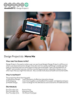
- 1. Hasso Plattner Institute of Design dmedia2012 - Design Project 2 Design Project 02: Move Me What Are You Going to Do? Design Project 1 focused on what a user can see (visual design). Design Project 2 will focus on what a user does (interaction design). Over the next two weeks we'll design a mobile app that helps an individual improve some aspect of their personal health. Take a broad definition of “health” and consider exercise, nutrition, monitoring, prevention, education, disease, or any other topic that you might find relevant. Also consider both physical health and mental health. What’s the Point? This project has three learning goals: 1) Interaction Design: Learn the basics of effective interaction design 2) Prototyping: Learn how to gather user feedback from paper and digital prototypes 3) Mobile Design: Learn to design for the affordances and constraints of mobile devices Deliverables: Due Thursday 2/2: Point of View Due Thursday 2/9: Interaction Map Due Thursday 2/16: On-Phone Prototype
- 2. Interaction Map Image Credit: Anthony Armonenderiz http://anthonyarmendariz.carbonmade.com/ Deliverable Details Your Interaction Map should take a broad, low resolution look at all of the potential user flows of your app. Focus less on on the detailed aesthetics and more on the most important flow of user actions and behaviors. What sequence of interactions is required to: • Explain your point of view in a memorable way • Guide users to their goal and/or destination • Re-engage your user after first and subsequent use Your prototype user flow should be paper based. Use Stone’s one page game designs as inspiration and consolidate any relevant views, interactions, actions or behaviors into one low-resolution visual artifact. Print your visual so it can be shared for feedback. Larger printouts preferred (taping together tiled pages works well). Evaluation The teaching team and your class mates will evaluate your Interaction Map during class on Thursday 2/9. It will be evaluated with the following questions: • Does the interaction support your point of view and focus on the primary user task? • Does the user interaction set a clear and understandable path for the user to follow? • Does the overall interaction consider the whole above the parts? • Does the app consider the context of when and where it will be used?
- 3. On-phone Prototype Examples Image Credit: Anthony Armonenderiz http://anthonyarmendariz.carbonmade.com/ Deliverable Details While your Interaction Map takes a broad, low resolution look at all of the potential user flows of your app, the On-phone Prototype requires a narrow focus and higher resolution. Focus on the first time user experience and the views required to: • Explain your point of view in a memorable way • Guide users to their goal and/or destination Your prototype user flow should be viewable on a mobile phone. Do not build a functional app. Instead, string together a series of static images using your phone’s photo gallery, keynote or any other tools you find (see the resources page for suggestions). Move beyond low resolution sketches and wireframes and instead create high resolution mockups. This is your chance to build on your visual design skills and apply them to interaction design. Evaluation Design for mobile phones must be clear and concise. Users evaluate new apps within the first first two minutes after launch. If their first user experience is confusing, boring or ineffective, most users won’t come back. Your classmates and the teaching team will evaluate your On-phone Prototype using your phone as if it was their own. Your prototype will be evaluated by the following questions: • Does it communicate your POV in the first 30 seconds? • Can the user achieve (or at least understand how to achieve) their primary task within the first 2 minutes? • Does it match expectations with conventions? • Do individual screens have a clear hierarchy that elevates the most important visual elements and interactions • Does it maintain consistent use of elements and interactions? • Does it use graphic elements to create depth and physicality? • Does it carefully consider copy and text communication?
- 4. 9 Basic Interaction Design Principles 1. Clearly communicate your point of view 2. Be consistent throughout the entire user experience 3. Match user expectations with past experience 4. Focus on the primary task and provide an obvious, logical path to accomplish It 5. Elevate the most important elements (use hierarchy, contrast, color, depth) 6. Give clear and consistent feedback to user interactions 7. Carefully consider your copy (written word) 8. Consider the context (where and when) of use 9. Consider the entire experience above the individual interactions Resources For Interaction Map Deliverable Mobile Design Patterns: http://mobile-patterns.com/ http://www.mobilepatterns.com/ http://pttrns.com/ http://www.lovelyui.com/ Design Elements: (templates, buttons, icons, etc) For Keynote: http://www.raizlabs.com/2011/06/wireframe-toolkit-for-keynote-and-powerpoint/ http://keynotopia.com/iphone-prototyping/ (scroll to bottom for low-res templates) For Illustrator: http://www.teehanlax.com/downloads/iphone-sketch-elements-a/ Game Mechanics (hint, hint...) http://www.ted.com/talks/jesse_schell_when_games_invade_real_life.html http://techcrunch.com/2010/08/25/scvngr-game-mechanics/ http://www.etc.cmu.edu/etcpress/content/15-games-15-years-stone-librande Advice For Success - Do several cycles. Most iterations wins! - Consider using simple game mechanics to help guide your interactions (see resources above) - Find a successful mobile and deconstruct it for inspiration and learning - Beg, borrow and steal resources, images, tools, icons, buttons, graphics etc, - Scope your app for the learning goals of the assignment... aka: KEEP IT SIMPLE!
- 5. Appendix: Nike+ App Example http://www.ioveva.com/index.php?/client/nike-gps-app/ Image Credits: Mario Ioveva