
Recomendados
Más contenido relacionado
Destacado
Más de superkmoni
Último
Último (20)
In what ways does your media product use, develop or challenge forms and conventions of real media products
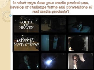
- 2. The first shot is an establishing shot of a dark road with houses either side. The Title of the film appears in this frame. It is the first frame the audience would see so establishing the film name here was a conventional approach to take. I felt that it was only right to do so however in order to establish the film straight away and give the audience an indication of what they are about to view. The font used for the title is minian pro bold font . We chose this font as it is easy to read to for the viewers and is very plain, in contrast to the storyline of the film. We felt as if the title shouldn’t be too complex as our target audience wouldn’t pay too much attention to it anyway. We chose the colour white simply because against the darkness of the shots it stands out and forces the audience to pay attention at that point, it was very important to keep our target audience engaged as they are quite young so having eye catching factors in our film is important.
- 3. We chose a very conventional and cliché location for our thriller storyline to be set, that is within an eerie menacing looking dark house. We decided to have a shot of the house in order to get the audience familiar with the location straight away. The shot is film using a first person camera angle this was done so the audience could feel like they were actually in the film as a character. This style also gives the shot a sense of enigma, keeping the audience observant and wanting to know more. All our shots are located in confined spaces this was to keep the audience on edge at all times, keeping the suspenseful quality of the thriller genre intact. Having the shot of the main road allows the viewers imagination to run wild as they try to reason as to what will happen next, the ordinary location of the road leaves the viewer able to think as much as they want as there is no obvious qualities to hint at a storyline.
- 4. the next shot establishes a character. He is called ‘tom’ and is the main actor and protagonist. He is shown wearing a t-shirt and pyjamas regular clothing as we wanted him to appeal to our target audience of young adults, these are the typical style of clothing they would wear. He is shown with a mug/glass this is very important as it our main prop and in accordance with the storyline is the motive for the character moving around. He is shown looking in the mug, there is nothing inside therefore he has a motive. The pyjamas represent what the character was doing and suggest a time of day to the audience. Our film followed the conventions of a normal media product in a sense that we established a character within the first few shots. For the antagonist we used an all black costume, that hid his entire face. Because of the storyline his face wasn’t important. The black colour also reinforces the stereotypical colour that a antagonist in a thriller would wear. This is because of the negative associations the colour black carries. The antagonist seems much bigger that the protagonist when in fact its only because of the over shoulder shot that makes it seem this way. We did this to follow the idea that all films in thriller genre have. That is the antagonist having a sense of supremacy that allows them to commit the negative acts.
- 5. Many high production value and highly funded flims can afford to have sophisticated equipment and trained technicians . In order to produce big complex special effects. Unfortunately we did not have a budget like most mainstream films. This forced us to rely on special effects coming from some of our group acting off screen to produce a desired effect. We did not add any effects in post-production. This shot establishes further enigma in the storyline with the character looking in the fridge and as he opens the fridge door a light in the background turns on, indicating other presence in the house that he is unaware.
- 6. This shot shows our protagonist searching for a something using a flashlight. We chose tried to find more interesting ways for the viewer to witness the events. For this we chose to add subtle differences in the shots we used. Such as have low angle medium shots instead of the conventional medium shot, to make the shot more interesting. In this shot we can see the outline of the character, and the focal point of the shot is the beam of light caused by the light. The shadows created in this shot make for an interesting non conventional medium shot.
- 7. In this shot are characters is established clearly using a medium close-up shot. His mental state can be observed by the audience just by them seeing his facial expression
- 8. In this shot the character has just left his room, we didn’t film the entire sequence of him leaving as it would take to long so we used a jump cut. In editing. Its not a conventional method of film editing as it takes away from the continuity editing aspect that tries to give the appearance of continuous time and space in the story-world by de-emphasizing editing.
- 9. ‘Scratched Car Paint‘ is the font used for the production company we created. This production company is all about furthering the exposure and credibility of thriller films. The typography represents thriller well, resembling “anger” and fear two major elements used in thriller genre.