
Recomendados
Más contenido relacionado
La actualidad más candente
La actualidad más candente (19)
Destacado
Destacado (16)
Similar a Covers
Similar a Covers (20)
Covers
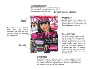
- 1. Skyline/Strapline This is about a quiz and is used to aim at young girls about their celebrity crush. It is red to catch attention as it stands out. Direct mode of address Masthead Based at the top of the magazine, can be read from a distance and it is glitter and pink to attract its intended audience which is young girls. Central Image The central image used is Jessie J and is used to catch the customers attention and also shows that it is a teenage magazine to draw in its target audience. She is behind the all of the surrounding coverlines so it doesn’t take over. Her makeup makes her face stand out and also attracts younger girls who may desire this look. Coverlines Small stories to draw in attention such as ‘embarrasing body worries’ to attract teenage girls who may have body worries and ‘spooky’ for the current season. It is in pink as it goes with the current theme on the page being pink, purple, red and white. Barcode Logo They have used different fonts, style and colours throughout the cover and it all the same colour and goes well with its audience.
- 2. No sklyine. This may be because the magazine is already popular and therefore doesn't need the extra information to draw in readers attention. Direct mode of address Masthead The mast head is based in the top left hand corner of the page and is in bright pink and therefore goes with this issue as it is Rihanna. It is places at the top left as this is the natural way of readying (left- right). Central Image The central image is Rihanna. Her make up stands out and she is positioned behind the masthead and cover lines so they stand out more. Coverlines There is only one cover line on this page, this is because the magazine is already popular and doesn't need to fill it up with information because they know people will still buy this issue anyway. Barcode
- 3. Skyline The skyline is to get the readers information and shows features inside the magazine to grab the readers attention. Direct Mode of Address Masthead Placed in the top left hand corner as that is where you read from (left to right) and is just plain and white so it looks tidy and contrasts with the dark background and picture. Central Image The central image used is Jay-Z and is definitely used for the purpose of the audience which is for chart music lovers. Coverlines Only 2 coverlines have been used to keep the magazine looking simple but allowing a little bit into the magazine. This shows the magazine is popular and doesn't need to draw the audience in with small stories. Barcode The colour scheme used is dark but with beige and white writing that is all the same font but different sizes. The background is dark in contrast with Jay-Z’s dark skin.