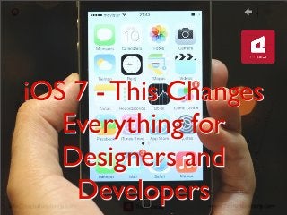
iOS 7 - This Changes Everything for Designers and Developers
•
2 likes•904 views

iOS 7 Is A Wake-Up Call For App Developers And Publishers.

Recommended
Recommended
More Related Content
More from TechAhead
More from TechAhead (17)
Recently uploaded
Recently uploaded (20)
iOS 7 - This Changes Everything for Designers and Developers
- 1. iOS 7 - This Changes Everything for Designers and Developers
- 2. According to Business Insider, “iOS 7 Is A Wake-Up Call For App Developers And Publishers.” iOS 7 which is being called the biggest change since the first iPhone by Apple has a new aesthetic which is "flat," with less shading, texture, and 3D-style effects in the icons and app design. According to analyst, Alex Cocotas, iOS 7 also does away with skeuomorphism, a design philosophy that advocates for digital tools to intimate the physical objects they replace. For example, Apple's Notes application, which formerly looked like a paper notebook is now having a non-textured icon that is far more abstract.
- 3. Practically, these are the important changes which are important from developers and publishers point of view: • Aesthetically, the changes are significant enough that developers will have to seriously consider aligning their apps with Apple's new color palette and design choices. • iOS 7 also introduces new styles and concepts for app user interfaces, which will create a lot of work for app developers. • These changes create a tremendous opportunity for publishers and developers to create iOS 7 apps that are more in sync with the new paradigm and leave legacy apps in the dust.
- 4. Matt Gemmell did a nice work comparing some aspects of the new UI style in iOS 7, against that found in iOS 6. iOS 7 represents a huge aesthetic evolution. The flattening of the user interface did away with a lot of shadowing. The result is a much brighter color palette, giving the impression of a cleaner overall design with more open space. Lets look at the side-by-side comparisons done by Gemmell in screenshots on following slides. And yes, iOS 6 looks stale and cluttered by comparison. You can read full details on his blog.
- 5. Comparing the Contacts app in iOS 6 and 7, when viewing a contact’s information, you find that iOS 7 forgoes borders, instead relying on colour to indicate interactivity, and dividers to organise information. Controls are implicit, based on labels or icons, positioning, and having visual ‘energy’ via a theme colour
- 6. Comparing how Messages looks now, compared to its iOS 6 counterpart, one find that iOS 7 isn’t flat.There are subtle shadows, lighting effects, gradients, and even new parallax effects. It’s more flat, certainly, but not two-dimensional.
- 7. The shift in style is even more apparent when you receive a phone call. Bevels, grip-handles, embossing, shadows, gloss, inner-glows and acres of hard button-borders.The chrome on the iOS 6 screen eats away 60% of the display, and very much has the appearance of an alert.The newer version not only lets you see more of the caller’s photo, but is a quieter presentation.
- 8. The Home Screen, and stock icon design, is much brighter and simpler than before.Although it’s not obvious from screenshots, the spacing of icons is different now, and the icons themselves are each a few pixels larger.The sacrifice of boundary in exchange for legibility can also be seen in the icons themselves: their content is bigger in comparison to their total area than on iOS 6.
- 9. Linus Ekenstam called iOS 7 "worst thing Apple has ever made, period." Developer Marco Arment sees an opening for the developer community. He writes, "I don’t think we’ve ever had such an opportunity en masse on iOS." Arment further explains, most developers with a long trajectory in the App Store need to maintain support for users who will remain on iOS 6 and maybe even iOS 5. Reactions to iOS 7 by famous Designers and Developers
- 10. Most developers can't afford to write two separate interfaces, nor are they eager to blow up their apps and start over. So many will be to some extent aGached to their old design and user interface choices. This, Arment argues, opens up an enormous opportuniIes for new developers ready to create "iOS 7 naIve" apps. Even in established categories, newcomers can take advantage of the legacy players' flat feet and rush into the App Store. Established developers, in other words, can't afford to hesitate. They need to go all-‐in on iOS 7. The dilemma, however, is that even if they do go all-‐ in, they might sIll be outgunned by a newbie who has beGer adapted to the new design principles. What iOS 7 mean for Developers and Designers
- 11. The core philosophy driving iOS 7 is a refocus on content. No longer can developers rely on embellishments, colors, and visual effects, Gemmell writes. The iOS 7 style is more stripped-‐down, and focused on funcIon rather than form. Apple wants apps to succeed or fail on their core offering — the quality of their content and services. How Developers and Designers can succeed? Credits: https://intelligence.businessinsider.com/ios-7-will-create-new-iphone- hits-2013-6
- 12. You can also reach us on: Facebook -‐ www.facebook.com/TechAhead TwiGer -‐ www.twiGer.com/TechAhead LinkedIn -‐ www.linkedin.com/company/techahead At TechAhead, we have helped many clients incorporate mobile payments, be it through SMS, Web/WAP based, NFC etc. Mobile payments and mCommerce are on a boom, and every business should make best out of this opportunity. If you are a business, we can help you in this. For any mobile apps development requirement, get in touch with us on info@techaheadcorp.com for FREE 30 minutes no obligaIon consultaIon with our mobile experts($200 Value).