SlideShare una empresa de Scribd logo
1 de 133
CSS3 ...IN 3D!CHRISTOPHER SCHMITT
http://twitter.com/@teleject
1
SOMETIMES YOU GOTTA
TAKE CSS FOR A RIDE
TO SEE IF IT DOES SWEET JUMPS
BLUEPRINTS VS REALITY
5
http://www.amazon.com/gp/product/0140139966
“TAKE CARE
OFTHE LUXURIES AND
THE NECESSITIES WILLTAKE
CARE OFTHEMSELVES.”
FRANK LLOYD WRIGHT
7
POKEYOUR EYES OUT
POKEYOUR EYES OUT
> Warning (You are here.)
> Color
> Text
> Borders
> Effects
> Transform
☞
AGENDAAGENDA
☞ (You are here.)
Prizes!
http://
interactwithwebstandards
.com/
EXPLORING CSS3
(AND STUFF)
CSS
COLORCOLOR
COLOR:
OPACITY
ON BACKGROUND COLORS
(RGBA)
OPACITY
ON BACKGROUND COLORS
(RGBA)
#number4 {
background-color: rgb(255, 255, 0);
background-color: rgba(255, 255, 0,.4);
}
OPACITY
background-color: rgba(255, 255, 0,.4);
OPACITY
• Firefox 3+, Opera 10+, and Safari support RGBA
• Requires another background-color property for
cross-browser support.
• IE Support?
OPACITYOPACITY
OPACITY IN IE
#number4 {
background-color: transparent;
filter:progid:DXImageTransform.Microsoft.gr
adient(
startColorstr=#66FFFF00,
endColorstr=#66FFFF00
);
}
background-color: transparent;
filter:progid:DXImageTransform.Microsoft.gr
adient(
startColorstr=#66FFFF00,
endColorstr=#66FFFF00
);
OPACITY IN IE
• First step is to convert the RGB value of the color to hexadecimal. In
this example, rgb(255,255,0) converts to #FFFF00.
• Next, convert the alpha transparency value to hexadecimal string. In
this example, the hexadecimal value is 66.
• E.g., alpha value of .3 equals 4D in hexadecimal
• Then assemble the hexadecimal value for transparency and the color
together in one string, starting with the transparency: #66FFFF00.
OPACITY IN IEOPACITY IN IE
OPACITY ON ELEMENTSOPACITY ON ELEMENTS
OPACITY ON ELEMENTS
#number4 {
/* .4 = 40% transparency */
opacity: .4;
/* 40 = 40% transparency */
filter: alpha(opacity=40);
}
OPACITY ON ELEMENTS
opacity: .4;
filter: alpha(opacity=40);
• Supported in Firefox 1.5+, Opera 9+, Safari 1.2+ and Chrome.
• IE 5.5+ requires the use of its own alpha filter in order for the effect to
be cross-browser.
• A drawback to using the opacity filter is that the value is inherited:
• If a parent element is set to be 10% transparent, the child elements’
transparency is also going to be 10%.
• div.opacity * { opacity: 1; }
• Watch out for legibility issues within the Web page.
OPACITY ON ELEMENTSOPACITY ON ELEMENTS
TEXTTEXT
TEXT:
TEXT-OVERFLOWTEXT-OVERFLOW
The longest word in the Oxford English
dictionary is used to name a lung disease
caused by the inhalation of very fine silica
dust, causing inflammation in the lungs.
PNEUMONOULTRAMICROSCOPICSILICOVOLCANOCONIOSISPNEUMONOULTRAMICROSCOPICSILICOVOLCANOCONIOSIS
TEXT-OVERFLOW
p {
text-overflow: ellipsis;
-o-text-overflow: ellipsis;
}
TEXT-OVERFLOW
text-overflow: ellipsis;
-o-text-overflow: ellipsis;
LESSONS LEARNED
•Support:
•Safari
•Opera
•and IE
LESSONS LEARNED
TEXT:
TEXT-SELECTIONTEXT-SELECTION
::selection {
color: #90c;
background: #cf0;
}
::-moz-selection {
color: #90c;
background: #cf0;
}
TEXT-SELECTIONTEXT-SELECTION
::selection {
color: #90c;
background: #cf0;
}
::-moz-selection {
color: #90c;
background: #cf0;
}
•Pseudo-element support:
•Safari
•Firefox
•Nice subtle effect, esp. if you deal with a lot of text on
your site.
LESSONS LEARNEDLESSONS LEARNED
TEXT:
@FONT-FACE@FONT-FACE
FONT FILE SUPPORT
.ttf .otf .eot
Safari 3.1+
Opera 10+
Firefox 3.5+
IE4+
Y Y
Y Y
Y Y
Y
FONT FILE SUPPORT
http://www.fontsquirrel.com/
@FONT-FACE
@font-face {
font-family: 'Graublau Web';
src: url('GraublauWeb.eot');
src: local('☺'),
url('GraublauWeb.woff') format('woff'), url
('GraublauWeb.ttf') format('truetype');
}
h1 {
font-family:“Graublau Web”,Verdana, sans-serif;
}
http://paulirish.com/2010/font-face-gotchas/#smiley
@FONT-FACE
@font-face {
font-family: 'Graublau Web';
src: url('GraublauWeb.eot');
src: local('☺'),
url('GraublauWeb.woff') format('woff'), url
('GraublauWeb.ttf') format('truetype');
}
• Getting @font-face to work is a little tough.
• Use http://fontsquirrel.com for pre-made kits, @font-face
generator
• Chrome now supports @font-face.
• Don’t feel like bothering with all that hassle?
• Use font services like typekit.com for 100s of licensed fonts.
• Use commercially free fonts (see http://fontsquirrel.com)
LESSONS LEARNEDLESSONS LEARNED
• Font files are LARGE
• gzip them, if you use them:
http://articles.sitepoint.com/article/web-site-optimization-steps/2
• New font file format:WOFF:
http://hacks.mozilla.org/2009/10/woff/
• Font files are already compressed and supports meta information
telling where the font came from. (Vendors happy.)
• It’s supported FF3.6 and coming to IE9, Chrome.
LESSONS LEARNEDLESSONS LEARNED
@FONT-FACE
a.fn:before {
	

 font-weight: normal;
	

 font-style: normal;
	

 line-height: normal;
	

 font-family: 'SeeingStarsRegular', sans-serif;
	

 content: "W ";
	

 font-size: 2em;
}
@FONT-FACE
a.fn:before
	

 content: "W ";
TEXT:
TEXT-SHADOWTEXT-SHADOW
h1 {
font-size: 2.5em;
font-family: Myriad, Helvetica,Arial, sans-serif;
width: 66.6%;
text-shadow: yellow .15em .15em .15em;
margin: 0 0 0.1em 0;
}
TEXT-SHADOWTEXT-SHADOW
text-shadow: yellow .15em .15em .15em;
body {
background-color: #999;
}
h1 {
text-shadow: 0 1px 0 rgba(255,255,255,.6);
}
BEVEL TEXT-SHADOW
text-shadow: 0 1px 0 rgba(255,255,255,.6);
BEVEL TEXT-SHADOW
body {
	

 background-color: #dcaa96; /* not white */
	

 background-image: url(tile.jpg);
}
h1 {
color: white;
text-shadow: black 0px 0px 6px;
}
SOLAR TEXT-SHADOWSOLAR TEXT-SHADOW
	

 background-color: #dcaa96; /* not white */
color: white;
text-shadow: black 0px 0px 6px;
h1 {
color: red;
text-shadow: rgba(0, 0, 0, .9) 0px 0px 1px,
rgba(255, 255, 51, .9) 0px −5px 5px,
rgba(255, 204, 51, .7) 2px −10px 7px,
rgba(255, 153, 0, .6) −2px −15px 10px;
}
TEXT-SHADOW FLAMETEXT-SHADOW FLAME
rgba(0, 0, 0, .9) 0px 0px 1px,
rgba(255, 255, 51, .9) 0px −5px 5px,
rgba(255, 204, 51, .7) 2px −10px 7px,
rgba(255, 153, 0, .6) −2px −15px 10px;
BORDERSBORDERS
BORDERS:
BOX-SHADOWBOX-SHADOW
#header {
text-shadow: 0 −1px 0 rgba(0,0,0,.8);
box-shadow: 3px 3px 19px rgba(0,0,0,.8);
-webkit-box-shadow: 3px 3px 19px rgba(0,0,0,.8);
-moz-box-shadow: 3px 3px 19px rgba(0,0,0,.8);
}
Works like text-shadow, but on boxes!
BOX-SHADOWBOX-SHADOW
box-shadow: 3px 3px 19px rgba(0,0,0,.8);
-webkit-box-shadow: 3px 3px 19px rgba(0,0,0,.8);
-moz-box-shadow: 3px 3px 19px rgba(0,0,0,.8);
BORDER:
BORDER-IMAGEBORDER-IMAGE
<div id="section">
<h2>Images on Borders</h2>
<p>Epsum factorial non deposit quid pro quo hic
escorol. Olypian quarrels et
gorilla congolium sic ad nauseum. Souvlaki ignitus
carborundum
e pluribus unum..</p>
</div><!-- /#section -->
BORDER-IMAGEBORDER-IMAGE
<div id="section">
</div><!-- /#section -->
#section {
border-style: solid;
border-color: #930;
border-width: 26px 39px 37px 43px;
border-image: url(frame.png) 26 39 37 43 stretch stretch;
-webkit-border-image: url(frame.png) 26 39 37 43 stretch
stretch;
-moz-border-image: url(frame.png) 26 39 37 43 stretch
round;
}
BORDER-IMAGEBORDER-IMAGE
border-image: url(frame.png) 26 39 37 43 stretch stretch;
-webkit-border-image: url(frame.png) 26 39 37 43 stretch
stretch;
-moz-border-image: url(frame.png) 26 39 37 43 stretch
round;
• Works in FF 3.1+ and Safari 4+.
• Image is scaled, if text is also scaled.
LESSONS LEARNEDLESSONS LEARNED
<form action="/" method="get">
<button>Submit</button>
</form>
BORDER-IMAGEBORDER-IMAGE
<button>Submit</button>
button {
background: none;
width: 250px;
padding: 10px 0 10px 0;
border-style: solid;
border-color: #666;
border-width: 0 17px 0 17px;
}
BORDER-IMAGEBORDER-IMAGE
border-width: 0 17px 0 17px;
button {
background: none;
width: 250px;
padding: 10px 0 10px 0;
border-style: solid;
border-color: #666;
border-width: 0 17px 0 17px;
border-image: url(bkgd-button.png);
}
BORDER-IMAGEBORDER-IMAGE
border-image: url(bkgd-button.png);
button {
background: none;
width: 250px;
padding: 10px 0 10px 0;
border-style: solid;
border-color: #666;
border-width: 0 17px 0 17px;
border-image: url(bkgd-button.png) 0 17 0 17 stretch stretch;
}
BORDER-IMAGEBORDER-IMAGE
0 17 0 17 stretch stretch
button {
background: none;
width: 250px;
padding: 10px 0 10px 0;
border-style: solid;
border-color: #666;
border-width: 0 17px 0 17px;
border-image: url(bkgd-button.png) 0 17 0 17 stretch stretch;
-webkit-border-image: url(bkgd-button.png) 0 17 0 17 stretch
stretch;
-moz-border-image: url(bkgd-button.png) 0 17 0 15 stretch
stretch;
}
BORDER-IMAGEBORDER-IMAGE
-webkit-border-image: url(bkgd-button.png) 0 17 0 17 stretch
stretch;
-moz-border-image: url(bkgd-button.png) 0 17 0 15 stretch
stretch;
button {
background: none;
width: 250px;
padding: 10px 0 10px 0;
border-style: solid;
border-color: #666;
border-width: 0 17px 0 17px;
border-image: url(bkgd-button.png) 0 17 0 17 stretch stretch;
-webkit-border-image: url(bkgd-button.png) 0 17 0 17 stretch stretch;
-moz-border-image: url(bkgd-button.png) 0 17 0 15 stretch stretch;
color: white;
font-family: "Gill Sans", Trebuchet, Calibri, sans-serif;
font-weight: bold;
text-transform: uppercase;
text-shadow: 0px 0px 5px rgba(0,0,0,.8);
}
BORDER-IMAGEBORDER-IMAGE
color: white;
font-family: "Gill Sans", Trebuchet, Calibri, sans-serif;
font-weight: bold;
text-transform: uppercase;
text-shadow: 0px 0px 5px rgba(0,0,0,.8);
• Works in FF 3.1+ and Safari 4+.
• Image is scaled, if text is also scaled.
• Other values besides “stretch” are:
• “repeat” (tiles the image);
• “round”, which tiles and fills space with whole images;
• and “space”, which is like “round” except it leaves empty
space
LESSONS LEARNEDLESSONS LEARNED
BORDER:
BORDER-RADIUSBORDER-RADIUS
div {
background-image: url(beach.jpg);
width: 375px;
height: 500px;
border: 8px solid #666;
border-radius: 40px;
-moz-border-radius: 40px;
-webkit-border-radius: 40px;
}
BORDER-RADIUSBORDER-RADIUS
border-radius: 40px;
-moz-border-radius: 40px;
-webkit-border-radius: 40px;
CSS3 Firefox WebKit
border-radius -moz-border-radius -webkit-border-radius
border-top-left-radius
-moz-border-radius-
topleft
-webkit-border-top-left-
radius
border-top-right-radius
-moz-border-radius-
topright
-webkit-border-top-
right-radius
border-bottom-
right-radius
-moz-border-radius-
bottomright
-webkit-border-bottom-
right-radius
border-bottom-left-
radius
-moz-border-radius-
bottomleft
-webkit-border-bottom-
left-radius
BORDER-RADIUSBORDER-RADIUS
• Radius is half the distance of the diameter. (Stay in school, kids!)
• Radius border can be applied to one, two, three or all corners.
• The higher the value for the radius, the more rounded the corner will
be.
• If borders on an inline image (IMG element) are rather large, borders
are shown behind the image (see previous screenshot).
• Workaround is to either keep border-radius value small or place
image in background.
LESSONS LEARNEDLESSONS LEARNED
EFFECTSEFFECTS
EFFECTS:
IMAGE MASKSIMAGE MASKS
IMAGE MASKS
img {
display: block;
float: left;
margin-right:20px;
border: 10px solid #ccc;
padding: 2px;
background-color: #666;
-webkit-mask-box-image: url(mask.png);
}
IMAGE MASKS
-webkit-mask-box-image: url(mask.png);
• When creating a mask, every part of the image that is transparent
becomes the mask or the part that hides a portion of the background
image.
• Approach is somewhat hard to understand, since typically, alpha
transparency is, well, transparent.
• The masks scale to the complete width of image, including borders.
• The background shows through, including background images.
• Might work best with areas of flat color behind the images
LESSONS LEARNEDLESSONS LEARNED
EFFECTS:
GRADIENTSGRADIENTS
GRADIENTS
div.building {
border: 1px solid #666;
float: left;
width: 300px;
height: 300px;
margin: 20px;
background-image:
-webkit-gradient(radial,center center,900,center
bottom,0,from(#0cf),to(white));
background-image:
-moz-radial-gradient(center,900px,center
bottom,0,from(#0cf),to(white));
background-repeat: no-repeat;
}
background-image:
-webkit-gradient(radial,center center,900,center
bottom,0,from(#0cf),to(white));
background-image:
-moz-radial-gradient(center,900px,center
bottom,0,from(#0cf),to(white));
background-repeat: no-repeat;
GRADIENTS
SAFARI GRADIENT
background-image:
-webkit-gradient();
Recommend using background-image over background shorthand.
background-image:
-webkit-gradient();
SAFARI GRADIENT
background-image:
-webkit-gradient(radial);
Other value it accepts is “linear”.
SAFARI GRADIENTSAFARI GRADIENT
background-image:
-webkit-gradient(radial,center center,900);
Set the starting position of gradient.
SAFARI GRADIENTSAFARI GRADIENT
background-image:
-webkit-gradient(radial,center center,900,center
bottom,0);
Set the end position of gradient.
SAFARI GRADIENTSAFARI GRADIENT
background-image:
-webkit-gradient(radial,center center,900,center
bottom,0,from(#0cf),to(white));
Set the starting and stopping colors.
SAFARI GRADIENTSAFARI GRADIENT
• Gradients in Safari can be applied to not just background
images of block-level elements, but also:
• list bullets, generated content, and border-images!
• Unit values aren’t accepted (px, em, etc.) It’s assumed to be
pixels.
• Don’t use background-position shorthand values.
• Use a background-image with a gradient for “older”
browsers.
LESSONS LEARNEDLESSONS LEARNED
• Whereas Safari sets the type of gradient within its own
proprietary property, Firefox has properties for both types
of gradients: -moz-radial-gradient() and -moz-radiallinear().
• Unlike the Safari gradient, you can use background-position
shorthand values and unit values when setting the starting
and stopping points of gradients.
• Firefox’s implementation of CSS gradients concerns
transparency.
FIREFOX GRADIENTSFIREFOX GRADIENTS
background-image: -moz-linear-gradient(left top, left bottom,
from(rgba(153,51,0,.3)), to(#6b3703), color-stop(0.5, #903000));
FIREFOX GRADIENTSFIREFOX GRADIENTS
rgba(153,51,0,.3)
EFFECTS:
GRADIENT MASKSGRADIENT MASKS
img {
display: block;
float: left;
margin-right:20px;
border: 10px solid #ccc;
padding: 2px;
background-color: #666;
-webkit-mask-box-image:
-webkit-gradient(linear, left bottom, left top,
from(rgba(0,0,0,1)), to(rgba(0,0,0,0)));
}
GRADIENT MASKS
Only works in Safari.
GRADIENT MASKS
-webkit-mask-box-image:
-webkit-gradient(linear, left bottom, left top,
from(rgba(0,0,0,1)), to(rgba(0,0,0,0)));
Example of transparent gradients,
border image, PNG8, text-shadow,
box-shadow
TRANSFORM &
ANIMATE
TRANSFORM &
ANIMATE
TRANSFORM &
ANIMATE:
TRANSFORMTRANSFORM
img+img {
transform: rotate(270deg);
-webkit-transform: rotate(270deg);
-moz-transform: rotate(270deg);
filter: progid:DXImageTransform.Microsoft.BasicImage(rotation=3);
}
TRANSFORMTRANSFORM
transform: rotate(270deg);
-webkit-transform: rotate(270deg);
-moz-transform: rotate(270deg);
Degree Rotation
BasicImage
filter value
0 0
90 1
180 2
270 3
TRANSFORM IE
CONVERSION
TRANSFORM IE
CONVERSION
TRANSFORM &
ANIMATE:
ANIMATING LINKSANIMATING LINKS
ANIMATING LINKS
#navsite a {
-webkit-transition-timing-function: linear;
-webkit-transition-duration: .66s;
-webkit-transition-property: background-color;
}
Note! Style rollover links normally.
-webkit-transition-timing-function: linear;
-webkit-transition-duration: .66s;
-webkit-transition-property: background-color;
ANIMATING LINKS
• The transitioning-timing-function function states the type of
animation the effect is going to take.
• In this example, the value is set to linear, which means
each frame of the animation length takes the same
amount of time.
• Other values for transitioning-timing-function include
ease, ease-in, ease-out, and cubic-bezier(x1, y1, x2, y2).
LESSONS LEARNEDLESSONS LEARNED
http://www.w3.org/TR/css3-transitions/#transition-timing-function_tag
• The first two values of cubic-bezier represent the transition
on a curve, as shown in the figure.
• Values for y1 and y2 represent the start and end of the
transition and are always equal to the values of 0.0 and
1.0, respectively.
• The speed with which the transition takes hold is
represented by the values x1 and x2.The greater the
value for x1 and x2, the slower the transition occurs.
cubic-bezier(x1, y1, x2, y2)
Cubic Bezier CurveCubic Bezier Curve
• A value of ease-in starts the transition at a slow speed
and then speeds up.This value is equivalent to cubic-
bezier(0.42, 0, 1.0, 1).
• The ease-out value starts the transition at a fast speed
and then slows down.This value is equivalent to cubic-
bezier(0.42, 0, 1.0, 1).
• The ease value is equivalent to cubic-bezier(0.25, 0.1,
0.25, 1.0).
Cubic Bezier Curve
cubic-bezier(x1, y1, x2, y2)
Cubic Bezier Curve
• The transition-duration property’s default value is 0.
• Any negative value is treated as though it’s zero.
• Units the value may take include, but are not limited to,
“s” for seconds and “ms” for milliseconds.
• The transition-delay property sets the amount of time before
a transition starts.
DURATION & DELAYDURATION & DELAY
• The transition-property property defines which CSS visual
property the transition is applied to.
• In the animated link example, the transition is applied to
the background color.
TRANSITION PROPERTYTRANSITION PROPERTY
• You can write the properties of the
transition effect in one value for the
transition property:
#navsite a {
-webkit-transition: background-color .66s linear;
}
SHORTHAND PROPERTY
-webkit-transition: background-color .66s linear;
SHORTHAND PROPERTY
TRANSFORM &
ANIMATE:
COMPLEX ANIMATING LINKSCOMPLEX ANIMATING LINKS
http://farukat.es
• Web designer Faruk Ateş’s personal site (see
http://farukat.es/) uses the transition property
to change the color of the element.
• As well as the color, width, box shadow,
text shadow, and opacity.
COMPLEX ANIMATED LINKSCOMPLEX ANIMATED LINKS
#web20 li a {
text-shadow: rgba(0,0,0, 0) 1px 1px 2px;
-moz-box-shadow: rgba(0,0,0, 0) 2px 2px 2px;
-webkit-box-shadow: rgba(0,0,0, 0) 2px 2px 2px;
-moz-border-radius-topright: 31px;
-moz-border-radius-bottomright: 31px;
-webkit-border-top-right-radius: 31px;
-webkit-border-bottom-right-radius: 31px;
-webkit-transition: background-color .25s ease,
color .5s ease,
width .2s ease-out,
-webkit-box-shadow .25s ease,
text-shadow .2s ease,
opacity .2s ease;
}
COMPLEX ANIMATED LINKSCOMPLEX ANIMATED LINKS
-webkit-transition: background-color .25s ease,
color .5s ease,
width .2s ease-out,
-webkit-box-shadow .25s ease,
text-shadow .2s ease,
opacity .2s ease;
TRANSFORM &
ANIMATE:
ANIMATING ELEMENTSANIMATING ELEMENTS
<body>
<div id="clouds1"></div>
[...]
</body>
ANIMATING ELEMENTSANIMATING ELEMENTS
<div id="clouds1"></div>
#clouds1 {
width: 627px;
height: 410px;
position: absolute;
right: −300px;
top: 0;
background-image: url(clouds.png);
}
ANIMATING ELEMENTSANIMATING ELEMENTS
@-webkit-keyframes "clouds" {
from {
right: 0px;
}
to {
right: 100px;
}
}
ANIMATING ELEMENTSANIMATING ELEMENTS
#clouds1 {
width: 627px;
height: 410px;
position: absolute;
right: −300px;
top: 0;
background-image: url(clouds.png);
-webkit-transform: translate(300px, 0px);
-webkit-animation-name: "clouds";
-webkit-animation-duration: 10s;
-webkit-animation-iteration-count: 10;
-webkit-animation-direction: alternate;
}
ANIMATING ELEMENTSANIMATING ELEMENTS
-webkit-transform: translate(300px, 0px);
-webkit-animation-name: "clouds";
-webkit-animation-duration: 10s;
-webkit-animation-iteration-count: 10;
-webkit-animation-direction: alternate;
• Animations can take on more than one property (think offset
properties and even opacity for some interesting effects).
• The animation-transform property is used to associate which keyframe
rule is used (“clouds).
• The animation-duration is set for how long the effect should occur.
(Negative values are treated as zero.)
• The animation-iteration-count tells how many times it should happen. For
constant looping, use value of “infinite”.
• Use animation-direction property set to normal loops animation, while
“alternate” creates a more seamless presentation (back and forth).
ANIMATING ELEMENTSANIMATING ELEMENTS
http://modernizr.com/
• Inserts HTML5 shim
• Checks to see if browser supports CSS3 and
HTML5 features
• Allows us to deliver CSS rules for the
browsers that do and the browsers that
don’t have newest features.
MODERNIZERMODERNIZER
<html class= “js canvas canvastext
geolocation rgba hsla no-multiplebgs
borderimage borderradius boxshadow
opacity no-cssanimations csscolumns no-
cssgradients no-cssreflections
csstransforms no-csstransforms3d no-
csstransitions video audio localstorage
sessionstorage webworkers
applicationcache fontface”>
DETECT HTML5 AND CSS3
.js canvas canvastext
geolocation rgba hsla no-multiplebgs
borderimage borderradius boxshadow
opacity no-cssanimations csscolumns no-
cssgradients no-cssreflections
csstransforms no-csstransforms3d no-
csstransitions video audio localstorage
sessionstorage webworkers
applicationcache fontface
DETECT HTML5 AND CSS3
#number4 {
background-color: rgb(255, 255, 0);
background-color: rgba(255, 255, 0, .4);
}
APPLY HTML5 AND CSS3APPLY HTML5 AND CSS3
background-color: rgb(255, 255, 0);
.rgba #number4 {
background-color: rgba(255, 255, 0, .4);
}
.no-rgba #number4 {
background-color: rgb(255, 255, 0);
}
APPLY HTML5 AND CSS3APPLY HTML5 AND CSS3
.rgba
.no-rgba
• @font-face
• Canvas
• Canvas Text
• HTML5 Audio
• HTML5Video
• rgba()
• hsla()
• border-image
• border-radius
• box-shadow
• Multiple backgrounds
• opacity:
• CSS Animations
• CSS Columns
• CSS Gradients
• CSS Reflections
• CSS 2D Transforms
• CSS 3D Transforms
• CSS Transitions
• Geolocation API
• localStorage
• sessionStorage
• Web Workers
• applicationCache
• HTML5 Input Types
• HTML5 Input
Attributes
• and more!
WHAT IT CHECKS FORWHAT IT CHECKS FOR
• 2-day, online jQuery Summit
• http://jquerysummit.com/
Upcoming
133
THANK YOU!
schmitt@heatvision.com
http://twitter.com/@teleject

Más contenido relacionado

La actualidad más candente

LessCSS Presentation @ April 2015 GTALUG Meeting
LessCSS Presentation @ April 2015 GTALUG MeetingLessCSS Presentation @ April 2015 GTALUG Meeting
LessCSS Presentation @ April 2015 GTALUG MeetingMyles Braithwaite
 
Rapid Prototyping
Rapid PrototypingRapid Prototyping
Rapid PrototypingEven Wu
 
iPhone Web Applications: HTML5, CSS3 & dev tips for iPhone development
iPhone Web Applications: HTML5, CSS3 & dev tips for iPhone developmentiPhone Web Applications: HTML5, CSS3 & dev tips for iPhone development
iPhone Web Applications: HTML5, CSS3 & dev tips for iPhone developmentEstelle Weyl
 
Implementing Awesome: An HTML5/CSS3 Workshop
Implementing Awesome: An HTML5/CSS3 WorkshopImplementing Awesome: An HTML5/CSS3 Workshop
Implementing Awesome: An HTML5/CSS3 WorkshopShoshi Roberts
 
Doctype html publi
Doctype html publiDoctype html publi
Doctype html publiEddy_TKJ
 
モダンなCSS設計パターンを考える
モダンなCSS設計パターンを考えるモダンなCSS設計パターンを考える
モダンなCSS設計パターンを考える拓樹 谷
 
モダンなCSS設計パターンを考える
モダンなCSS設計パターンを考えるモダンなCSS設計パターンを考える
モダンなCSS設計パターンを考える拓樹 谷
 
Big Design Conference: CSS3
Big Design Conference: CSS3 Big Design Conference: CSS3
Big Design Conference: CSS3 Wynn Netherland
 
Data cleanup
Data cleanupData cleanup
Data cleanupTom McGee
 
Preprocessor presentation
Preprocessor presentationPreprocessor presentation
Preprocessor presentationMario Noble
 
CSS3 is Not Magic Pixie Dust
CSS3 is Not Magic Pixie DustCSS3 is Not Magic Pixie Dust
CSS3 is Not Magic Pixie DustKyle Adams
 
Front-End Dev Tools
Front-End Dev ToolsFront-End Dev Tools
Front-End Dev ToolsNetguru
 
HTML5 and CSS3 – exploring mobile possibilities - Frontend Conference Zürich
HTML5 and CSS3 – exploring mobile possibilities - Frontend Conference ZürichHTML5 and CSS3 – exploring mobile possibilities - Frontend Conference Zürich
HTML5 and CSS3 – exploring mobile possibilities - Frontend Conference ZürichRobert Nyman
 
Getting Started with Sass & Compass
Getting Started with Sass & CompassGetting Started with Sass & Compass
Getting Started with Sass & CompassRob Davarnia
 

La actualidad más candente (15)

LessCSS Presentation @ April 2015 GTALUG Meeting
LessCSS Presentation @ April 2015 GTALUG MeetingLessCSS Presentation @ April 2015 GTALUG Meeting
LessCSS Presentation @ April 2015 GTALUG Meeting
 
Rapid Prototyping
Rapid PrototypingRapid Prototyping
Rapid Prototyping
 
iPhone Web Applications: HTML5, CSS3 & dev tips for iPhone development
iPhone Web Applications: HTML5, CSS3 & dev tips for iPhone developmentiPhone Web Applications: HTML5, CSS3 & dev tips for iPhone development
iPhone Web Applications: HTML5, CSS3 & dev tips for iPhone development
 
Implementing Awesome: An HTML5/CSS3 Workshop
Implementing Awesome: An HTML5/CSS3 WorkshopImplementing Awesome: An HTML5/CSS3 Workshop
Implementing Awesome: An HTML5/CSS3 Workshop
 
Doctype html publi
Doctype html publiDoctype html publi
Doctype html publi
 
モダンなCSS設計パターンを考える
モダンなCSS設計パターンを考えるモダンなCSS設計パターンを考える
モダンなCSS設計パターンを考える
 
モダンなCSS設計パターンを考える
モダンなCSS設計パターンを考えるモダンなCSS設計パターンを考える
モダンなCSS設計パターンを考える
 
Big Design Conference: CSS3
Big Design Conference: CSS3 Big Design Conference: CSS3
Big Design Conference: CSS3
 
Data cleanup
Data cleanupData cleanup
Data cleanup
 
Preprocessor presentation
Preprocessor presentationPreprocessor presentation
Preprocessor presentation
 
LESS
LESSLESS
LESS
 
CSS3 is Not Magic Pixie Dust
CSS3 is Not Magic Pixie DustCSS3 is Not Magic Pixie Dust
CSS3 is Not Magic Pixie Dust
 
Front-End Dev Tools
Front-End Dev ToolsFront-End Dev Tools
Front-End Dev Tools
 
HTML5 and CSS3 – exploring mobile possibilities - Frontend Conference Zürich
HTML5 and CSS3 – exploring mobile possibilities - Frontend Conference ZürichHTML5 and CSS3 – exploring mobile possibilities - Frontend Conference Zürich
HTML5 and CSS3 – exploring mobile possibilities - Frontend Conference Zürich
 
Getting Started with Sass & Compass
Getting Started with Sass & CompassGetting Started with Sass & Compass
Getting Started with Sass & Compass
 

Destacado

TOILE DE STORE BANNE SUR MESURE
TOILE DE STORE BANNE SUR MESURETOILE DE STORE BANNE SUR MESURE
TOILE DE STORE BANNE SUR MESUREStevenlampard
 
Email Marketing: A Community of Hacks
Email Marketing: A Community of HacksEmail Marketing: A Community of Hacks
Email Marketing: A Community of HacksDavid James Group
 
2016 TRG Home Buyer Guide
2016 TRG Home Buyer Guide2016 TRG Home Buyer Guide
2016 TRG Home Buyer GuideJeff Rubenstein
 
Herramientas accesibles
Herramientas accesiblesHerramientas accesibles
Herramientas accesibles91531905
 
Nacht briketten technische beschrijving
Nacht briketten technische beschrijvingNacht briketten technische beschrijving
Nacht briketten technische beschrijvingBioEnEx
 
Projeto de ação de marketing para a KUAT
Projeto de ação de marketing para a KUATProjeto de ação de marketing para a KUAT
Projeto de ação de marketing para a KUATaliceferman
 
Pairing agile tour bkk
Pairing   agile tour bkkPairing   agile tour bkk
Pairing agile tour bkkRoni Greenwood
 
Unidad didáctica integrada "La Estadística en nuestra vida diaria " 1º ESO
Unidad didáctica integrada "La Estadística en nuestra vida diaria " 1º ESOUnidad didáctica integrada "La Estadística en nuestra vida diaria " 1º ESO
Unidad didáctica integrada "La Estadística en nuestra vida diaria " 1º ESOM Carmen Márquez
 

Destacado (16)

TOILE DE STORE BANNE SUR MESURE
TOILE DE STORE BANNE SUR MESURETOILE DE STORE BANNE SUR MESURE
TOILE DE STORE BANNE SUR MESURE
 
pu
pupu
pu
 
Email Marketing: A Community of Hacks
Email Marketing: A Community of HacksEmail Marketing: A Community of Hacks
Email Marketing: A Community of Hacks
 
Direito a-saude
Direito a-saudeDireito a-saude
Direito a-saude
 
Como produzir curso_online
Como produzir curso_onlineComo produzir curso_online
Como produzir curso_online
 
2016 TRG Home Buyer Guide
2016 TRG Home Buyer Guide2016 TRG Home Buyer Guide
2016 TRG Home Buyer Guide
 
Joseph Angel2013
Joseph Angel2013Joseph Angel2013
Joseph Angel2013
 
Luka i Kristina
Luka i KristinaLuka i Kristina
Luka i Kristina
 
Herramientas accesibles
Herramientas accesiblesHerramientas accesibles
Herramientas accesibles
 
Nacht briketten technische beschrijving
Nacht briketten technische beschrijvingNacht briketten technische beschrijving
Nacht briketten technische beschrijving
 
Projeto de ação de marketing para a KUAT
Projeto de ação de marketing para a KUATProjeto de ação de marketing para a KUAT
Projeto de ação de marketing para a KUAT
 
Ardud
ArdudArdud
Ardud
 
Pairing agile tour bkk
Pairing   agile tour bkkPairing   agile tour bkk
Pairing agile tour bkk
 
El párrafo
El párrafoEl párrafo
El párrafo
 
Christian metz 2
Christian metz 2Christian metz 2
Christian metz 2
 
Unidad didáctica integrada "La Estadística en nuestra vida diaria " 1º ESO
Unidad didáctica integrada "La Estadística en nuestra vida diaria " 1º ESOUnidad didáctica integrada "La Estadística en nuestra vida diaria " 1º ESO
Unidad didáctica integrada "La Estadística en nuestra vida diaria " 1º ESO
 

Similar a CSS3 ...in 3D!

Learn to love CSS3 | Joomla! Day Deutschland
Learn to love CSS3 | Joomla! Day DeutschlandLearn to love CSS3 | Joomla! Day Deutschland
Learn to love CSS3 | Joomla! Day DeutschlandThemePartner
 
Learn to Love CSS3 [English]
Learn to Love CSS3 [English]Learn to Love CSS3 [English]
Learn to Love CSS3 [English]ThemePartner
 
The Basics of CSS3
The Basics of CSS3The Basics of CSS3
The Basics of CSS3joshsurovey
 
Web Development for Mobile: GTUG Talk at Google
Web Development for Mobile: GTUG Talk at GoogleWeb Development for Mobile: GTUG Talk at Google
Web Development for Mobile: GTUG Talk at GoogleEstelle Weyl
 
[WebVisions 2010] CSS3 Workshop (Afternoon)
[WebVisions 2010] CSS3 Workshop (Afternoon)[WebVisions 2010] CSS3 Workshop (Afternoon)
[WebVisions 2010] CSS3 Workshop (Afternoon)Christopher Schmitt
 
Mobile-first OOCSS, Sass & Compass at BBC Responsive News
Mobile-first OOCSS, Sass & Compass at BBC Responsive NewsMobile-first OOCSS, Sass & Compass at BBC Responsive News
Mobile-first OOCSS, Sass & Compass at BBC Responsive NewsKaelig Deloumeau-Prigent
 
Presentation html5 css3 by thibaut
Presentation html5 css3 by thibautPresentation html5 css3 by thibaut
Presentation html5 css3 by thibautThibaut Baillet
 
[Worskhop Summits] CSS3 Workshop
[Worskhop Summits] CSS3 Workshop[Worskhop Summits] CSS3 Workshop
[Worskhop Summits] CSS3 WorkshopChristopher Schmitt
 
Doing More With Less
Doing More With LessDoing More With Less
Doing More With LessDavid Engel
 
Eye Candy Without Images: Fun With CSS3
Eye Candy Without Images: Fun With CSS3Eye Candy Without Images: Fun With CSS3
Eye Candy Without Images: Fun With CSS3Shoshi Roberts
 
Sassive Aggressive: Using Sass to Make Your Life Easier (Refresh Boston Version)
Sassive Aggressive: Using Sass to Make Your Life Easier (Refresh Boston Version)Sassive Aggressive: Using Sass to Make Your Life Easier (Refresh Boston Version)
Sassive Aggressive: Using Sass to Make Your Life Easier (Refresh Boston Version)Adam Darowski
 
Sass & Compass (Barcamp Stuttgart 2012)
Sass & Compass (Barcamp Stuttgart 2012)Sass & Compass (Barcamp Stuttgart 2012)
Sass & Compass (Barcamp Stuttgart 2012)emrox
 
Class 4 handout w css3 using j fiddle
Class 4 handout w css3 using j fiddleClass 4 handout w css3 using j fiddle
Class 4 handout w css3 using j fiddleErin M. Kidwell
 

Similar a CSS3 ...in 3D! (20)

Learn to love CSS3 | Joomla! Day Deutschland
Learn to love CSS3 | Joomla! Day DeutschlandLearn to love CSS3 | Joomla! Day Deutschland
Learn to love CSS3 | Joomla! Day Deutschland
 
Learn to Love CSS3 [English]
Learn to Love CSS3 [English]Learn to Love CSS3 [English]
Learn to Love CSS3 [English]
 
The Basics of CSS3
The Basics of CSS3The Basics of CSS3
The Basics of CSS3
 
CSS3 3D Workshop
CSS3 3D WorkshopCSS3 3D Workshop
CSS3 3D Workshop
 
Css3 101
Css3 101Css3 101
Css3 101
 
[heweb11] CSS3 Makeover
[heweb11] CSS3 Makeover[heweb11] CSS3 Makeover
[heweb11] CSS3 Makeover
 
Web Development for Mobile: GTUG Talk at Google
Web Development for Mobile: GTUG Talk at GoogleWeb Development for Mobile: GTUG Talk at Google
Web Development for Mobile: GTUG Talk at Google
 
Sass, Compass
Sass, CompassSass, Compass
Sass, Compass
 
[WebVisions 2010] CSS3 Workshop (Afternoon)
[WebVisions 2010] CSS3 Workshop (Afternoon)[WebVisions 2010] CSS3 Workshop (Afternoon)
[WebVisions 2010] CSS3 Workshop (Afternoon)
 
FCIP SASS Talk
FCIP SASS TalkFCIP SASS Talk
FCIP SASS Talk
 
Mobile-first OOCSS, Sass & Compass at BBC Responsive News
Mobile-first OOCSS, Sass & Compass at BBC Responsive NewsMobile-first OOCSS, Sass & Compass at BBC Responsive News
Mobile-first OOCSS, Sass & Compass at BBC Responsive News
 
Presentation html5 css3 by thibaut
Presentation html5 css3 by thibautPresentation html5 css3 by thibaut
Presentation html5 css3 by thibaut
 
Css3
Css3Css3
Css3
 
[Worskhop Summits] CSS3 Workshop
[Worskhop Summits] CSS3 Workshop[Worskhop Summits] CSS3 Workshop
[Worskhop Summits] CSS3 Workshop
 
Doing More With Less
Doing More With LessDoing More With Less
Doing More With Less
 
CSS Extenders
CSS ExtendersCSS Extenders
CSS Extenders
 
Eye Candy Without Images: Fun With CSS3
Eye Candy Without Images: Fun With CSS3Eye Candy Without Images: Fun With CSS3
Eye Candy Without Images: Fun With CSS3
 
Sassive Aggressive: Using Sass to Make Your Life Easier (Refresh Boston Version)
Sassive Aggressive: Using Sass to Make Your Life Easier (Refresh Boston Version)Sassive Aggressive: Using Sass to Make Your Life Easier (Refresh Boston Version)
Sassive Aggressive: Using Sass to Make Your Life Easier (Refresh Boston Version)
 
Sass & Compass (Barcamp Stuttgart 2012)
Sass & Compass (Barcamp Stuttgart 2012)Sass & Compass (Barcamp Stuttgart 2012)
Sass & Compass (Barcamp Stuttgart 2012)
 
Class 4 handout w css3 using j fiddle
Class 4 handout w css3 using j fiddleClass 4 handout w css3 using j fiddle
Class 4 handout w css3 using j fiddle
 

Más de Christopher Schmitt

Keeping Colors from Killing Your Product
Keeping Colors from Killing Your ProductKeeping Colors from Killing Your Product
Keeping Colors from Killing Your ProductChristopher Schmitt
 
[funka] Adaptive Images in Responsive Web Design
[funka] Adaptive Images in Responsive Web Design[funka] Adaptive Images in Responsive Web Design
[funka] Adaptive Images in Responsive Web DesignChristopher Schmitt
 
[Austin WordPress Meetup] Adaptive Images in Responsive Web Design
[Austin WordPress Meetup] Adaptive Images in Responsive Web Design[Austin WordPress Meetup] Adaptive Images in Responsive Web Design
[Austin WordPress Meetup] Adaptive Images in Responsive Web DesignChristopher Schmitt
 
[CSSDevConf] Adaptive Images in Responsive Web Design 2014
[CSSDevConf] Adaptive Images in Responsive Web Design 2014[CSSDevConf] Adaptive Images in Responsive Web Design 2014
[CSSDevConf] Adaptive Images in Responsive Web Design 2014Christopher Schmitt
 
[rwdsummit] Adaptive Images in Responsive Web Design
[rwdsummit] Adaptive Images in Responsive Web Design[rwdsummit] Adaptive Images in Responsive Web Design
[rwdsummit] Adaptive Images in Responsive Web DesignChristopher Schmitt
 
[artifactconf] Github for People Who Don't Code
[artifactconf] Github for People Who Don't Code[artifactconf] Github for People Who Don't Code
[artifactconf] Github for People Who Don't CodeChristopher Schmitt
 
[cssdevconf] Adaptive Images in Responsive Web Design
[cssdevconf] Adaptive Images in Responsive Web Design[cssdevconf] Adaptive Images in Responsive Web Design
[cssdevconf] Adaptive Images in Responsive Web DesignChristopher Schmitt
 
[parisweb] Adaptive Images in Responsive Web Design
[parisweb] Adaptive Images in Responsive Web Design[parisweb] Adaptive Images in Responsive Web Design
[parisweb] Adaptive Images in Responsive Web DesignChristopher Schmitt
 
[peachpit] Adaptive Images in Responsive Web Design
[peachpit] Adaptive Images in Responsive Web Design[peachpit] Adaptive Images in Responsive Web Design
[peachpit] Adaptive Images in Responsive Web DesignChristopher Schmitt
 
[jqconatx] Adaptive Images for Responsive Web Design
[jqconatx] Adaptive Images for Responsive Web Design[jqconatx] Adaptive Images for Responsive Web Design
[jqconatx] Adaptive Images for Responsive Web DesignChristopher Schmitt
 
[wvbcn] Adaptive Images in Responsive Web Design
[wvbcn] Adaptive Images in Responsive Web Design[wvbcn] Adaptive Images in Responsive Web Design
[wvbcn] Adaptive Images in Responsive Web DesignChristopher Schmitt
 
[drupalcampatx] Adaptive Images in Responsive Web Design
[drupalcampatx] Adaptive Images in Responsive Web Design[drupalcampatx] Adaptive Images in Responsive Web Design
[drupalcampatx] Adaptive Images in Responsive Web DesignChristopher Schmitt
 
[refreshpitt] Adaptive Images in Responsive Web Design
[refreshpitt] Adaptive Images in Responsive Web Design[refreshpitt] Adaptive Images in Responsive Web Design
[refreshpitt] Adaptive Images in Responsive Web DesignChristopher Schmitt
 
[psuweb] Adaptive Images in Responsive Web Design
[psuweb] Adaptive Images in Responsive Web Design[psuweb] Adaptive Images in Responsive Web Design
[psuweb] Adaptive Images in Responsive Web DesignChristopher Schmitt
 
GitHub for People Who Don't Code
GitHub for People Who Don't CodeGitHub for People Who Don't Code
GitHub for People Who Don't CodeChristopher Schmitt
 
[wcatx] Adaptive Images in Responsive Web Design
[wcatx] Adaptive Images in Responsive Web Design[wcatx] Adaptive Images in Responsive Web Design
[wcatx] Adaptive Images in Responsive Web DesignChristopher Schmitt
 
[HEWEBFL] Adaptive Images in Responsive Web Design
[HEWEBFL] Adaptive Images in Responsive Web Design[HEWEBFL] Adaptive Images in Responsive Web Design
[HEWEBFL] Adaptive Images in Responsive Web DesignChristopher Schmitt
 
[refreshaustin] Adaptive Images in Responsive Web Design
[refreshaustin] Adaptive Images in Responsive Web Design[refreshaustin] Adaptive Images in Responsive Web Design
[refreshaustin] Adaptive Images in Responsive Web DesignChristopher Schmitt
 
[sxsw2013] Extremely Compressed JPEGs
[sxsw2013] Extremely Compressed JPEGs[sxsw2013] Extremely Compressed JPEGs
[sxsw2013] Extremely Compressed JPEGsChristopher Schmitt
 

Más de Christopher Schmitt (20)

Keeping Colors from Killing Your Product
Keeping Colors from Killing Your ProductKeeping Colors from Killing Your Product
Keeping Colors from Killing Your Product
 
[funka] Adaptive Images in Responsive Web Design
[funka] Adaptive Images in Responsive Web Design[funka] Adaptive Images in Responsive Web Design
[funka] Adaptive Images in Responsive Web Design
 
[Austin WordPress Meetup] Adaptive Images in Responsive Web Design
[Austin WordPress Meetup] Adaptive Images in Responsive Web Design[Austin WordPress Meetup] Adaptive Images in Responsive Web Design
[Austin WordPress Meetup] Adaptive Images in Responsive Web Design
 
[CSSDevConf] Adaptive Images in Responsive Web Design 2014
[CSSDevConf] Adaptive Images in Responsive Web Design 2014[CSSDevConf] Adaptive Images in Responsive Web Design 2014
[CSSDevConf] Adaptive Images in Responsive Web Design 2014
 
[rwdsummit] Adaptive Images in Responsive Web Design
[rwdsummit] Adaptive Images in Responsive Web Design[rwdsummit] Adaptive Images in Responsive Web Design
[rwdsummit] Adaptive Images in Responsive Web Design
 
[artifactconf] Github for People Who Don't Code
[artifactconf] Github for People Who Don't Code[artifactconf] Github for People Who Don't Code
[artifactconf] Github for People Who Don't Code
 
[cssdevconf] Adaptive Images in Responsive Web Design
[cssdevconf] Adaptive Images in Responsive Web Design[cssdevconf] Adaptive Images in Responsive Web Design
[cssdevconf] Adaptive Images in Responsive Web Design
 
[parisweb] Adaptive Images in Responsive Web Design
[parisweb] Adaptive Images in Responsive Web Design[parisweb] Adaptive Images in Responsive Web Design
[parisweb] Adaptive Images in Responsive Web Design
 
[peachpit] Adaptive Images in Responsive Web Design
[peachpit] Adaptive Images in Responsive Web Design[peachpit] Adaptive Images in Responsive Web Design
[peachpit] Adaptive Images in Responsive Web Design
 
[jqconatx] Adaptive Images for Responsive Web Design
[jqconatx] Adaptive Images for Responsive Web Design[jqconatx] Adaptive Images for Responsive Web Design
[jqconatx] Adaptive Images for Responsive Web Design
 
[wvbcn] Adaptive Images in Responsive Web Design
[wvbcn] Adaptive Images in Responsive Web Design[wvbcn] Adaptive Images in Responsive Web Design
[wvbcn] Adaptive Images in Responsive Web Design
 
[drupalcampatx] Adaptive Images in Responsive Web Design
[drupalcampatx] Adaptive Images in Responsive Web Design[drupalcampatx] Adaptive Images in Responsive Web Design
[drupalcampatx] Adaptive Images in Responsive Web Design
 
[refreshpitt] Adaptive Images in Responsive Web Design
[refreshpitt] Adaptive Images in Responsive Web Design[refreshpitt] Adaptive Images in Responsive Web Design
[refreshpitt] Adaptive Images in Responsive Web Design
 
[psuweb] Adaptive Images in Responsive Web Design
[psuweb] Adaptive Images in Responsive Web Design[psuweb] Adaptive Images in Responsive Web Design
[psuweb] Adaptive Images in Responsive Web Design
 
GitHub for People Who Don't Code
GitHub for People Who Don't CodeGitHub for People Who Don't Code
GitHub for People Who Don't Code
 
[wcatx] Adaptive Images in Responsive Web Design
[wcatx] Adaptive Images in Responsive Web Design[wcatx] Adaptive Images in Responsive Web Design
[wcatx] Adaptive Images in Responsive Web Design
 
[HEWEBFL] Adaptive Images in Responsive Web Design
[HEWEBFL] Adaptive Images in Responsive Web Design[HEWEBFL] Adaptive Images in Responsive Web Design
[HEWEBFL] Adaptive Images in Responsive Web Design
 
[refreshaustin] Adaptive Images in Responsive Web Design
[refreshaustin] Adaptive Images in Responsive Web Design[refreshaustin] Adaptive Images in Responsive Web Design
[refreshaustin] Adaptive Images in Responsive Web Design
 
[sxsw2013] Extremely Compressed JPEGs
[sxsw2013] Extremely Compressed JPEGs[sxsw2013] Extremely Compressed JPEGs
[sxsw2013] Extremely Compressed JPEGs
 
[amigos] HTML5 and CSS3
[amigos] HTML5 and CSS3[amigos] HTML5 and CSS3
[amigos] HTML5 and CSS3
 

Último

Passkey Providers and Enabling Portability: FIDO Paris Seminar.pptx
Passkey Providers and Enabling Portability: FIDO Paris Seminar.pptxPasskey Providers and Enabling Portability: FIDO Paris Seminar.pptx
Passkey Providers and Enabling Portability: FIDO Paris Seminar.pptxLoriGlavin3
 
Genislab builds better products and faster go-to-market with Lean project man...
Genislab builds better products and faster go-to-market with Lean project man...Genislab builds better products and faster go-to-market with Lean project man...
Genislab builds better products and faster go-to-market with Lean project man...Farhan Tariq
 
Use of FIDO in the Payments and Identity Landscape: FIDO Paris Seminar.pptx
Use of FIDO in the Payments and Identity Landscape: FIDO Paris Seminar.pptxUse of FIDO in the Payments and Identity Landscape: FIDO Paris Seminar.pptx
Use of FIDO in the Payments and Identity Landscape: FIDO Paris Seminar.pptxLoriGlavin3
 
Scale your database traffic with Read & Write split using MySQL Router
Scale your database traffic with Read & Write split using MySQL RouterScale your database traffic with Read & Write split using MySQL Router
Scale your database traffic with Read & Write split using MySQL RouterMydbops
 
Enhancing User Experience - Exploring the Latest Features of Tallyman Axis Lo...
Enhancing User Experience - Exploring the Latest Features of Tallyman Axis Lo...Enhancing User Experience - Exploring the Latest Features of Tallyman Axis Lo...
Enhancing User Experience - Exploring the Latest Features of Tallyman Axis Lo...Scott Andery
 
Potential of AI (Generative AI) in Business: Learnings and Insights
Potential of AI (Generative AI) in Business: Learnings and InsightsPotential of AI (Generative AI) in Business: Learnings and Insights
Potential of AI (Generative AI) in Business: Learnings and InsightsRavi Sanghani
 
How AI, OpenAI, and ChatGPT impact business and software.
How AI, OpenAI, and ChatGPT impact business and software.How AI, OpenAI, and ChatGPT impact business and software.
How AI, OpenAI, and ChatGPT impact business and software.Curtis Poe
 
Time Series Foundation Models - current state and future directions
Time Series Foundation Models - current state and future directionsTime Series Foundation Models - current state and future directions
Time Series Foundation Models - current state and future directionsNathaniel Shimoni
 
UiPath Community: Communication Mining from Zero to Hero
UiPath Community: Communication Mining from Zero to HeroUiPath Community: Communication Mining from Zero to Hero
UiPath Community: Communication Mining from Zero to HeroUiPathCommunity
 
DevEX - reference for building teams, processes, and platforms
DevEX - reference for building teams, processes, and platformsDevEX - reference for building teams, processes, and platforms
DevEX - reference for building teams, processes, and platformsSergiu Bodiu
 
The Future Roadmap for the Composable Data Stack - Wes McKinney - Data Counci...
The Future Roadmap for the Composable Data Stack - Wes McKinney - Data Counci...The Future Roadmap for the Composable Data Stack - Wes McKinney - Data Counci...
The Future Roadmap for the Composable Data Stack - Wes McKinney - Data Counci...Wes McKinney
 
The Fit for Passkeys for Employee and Consumer Sign-ins: FIDO Paris Seminar.pptx
The Fit for Passkeys for Employee and Consumer Sign-ins: FIDO Paris Seminar.pptxThe Fit for Passkeys for Employee and Consumer Sign-ins: FIDO Paris Seminar.pptx
The Fit for Passkeys for Employee and Consumer Sign-ins: FIDO Paris Seminar.pptxLoriGlavin3
 
Rise of the Machines: Known As Drones...
Rise of the Machines: Known As Drones...Rise of the Machines: Known As Drones...
Rise of the Machines: Known As Drones...Rick Flair
 
Data governance with Unity Catalog Presentation
Data governance with Unity Catalog PresentationData governance with Unity Catalog Presentation
Data governance with Unity Catalog PresentationKnoldus Inc.
 
A Deep Dive on Passkeys: FIDO Paris Seminar.pptx
A Deep Dive on Passkeys: FIDO Paris Seminar.pptxA Deep Dive on Passkeys: FIDO Paris Seminar.pptx
A Deep Dive on Passkeys: FIDO Paris Seminar.pptxLoriGlavin3
 
Merck Moving Beyond Passwords: FIDO Paris Seminar.pptx
Merck Moving Beyond Passwords: FIDO Paris Seminar.pptxMerck Moving Beyond Passwords: FIDO Paris Seminar.pptx
Merck Moving Beyond Passwords: FIDO Paris Seminar.pptxLoriGlavin3
 
The Ultimate Guide to Choosing WordPress Pros and Cons
The Ultimate Guide to Choosing WordPress Pros and ConsThe Ultimate Guide to Choosing WordPress Pros and Cons
The Ultimate Guide to Choosing WordPress Pros and ConsPixlogix Infotech
 
From Family Reminiscence to Scholarly Archive .
From Family Reminiscence to Scholarly Archive .From Family Reminiscence to Scholarly Archive .
From Family Reminiscence to Scholarly Archive .Alan Dix
 
How to Effectively Monitor SD-WAN and SASE Environments with ThousandEyes
How to Effectively Monitor SD-WAN and SASE Environments with ThousandEyesHow to Effectively Monitor SD-WAN and SASE Environments with ThousandEyes
How to Effectively Monitor SD-WAN and SASE Environments with ThousandEyesThousandEyes
 
2024 April Patch Tuesday
2024 April Patch Tuesday2024 April Patch Tuesday
2024 April Patch TuesdayIvanti
 

Último (20)

Passkey Providers and Enabling Portability: FIDO Paris Seminar.pptx
Passkey Providers and Enabling Portability: FIDO Paris Seminar.pptxPasskey Providers and Enabling Portability: FIDO Paris Seminar.pptx
Passkey Providers and Enabling Portability: FIDO Paris Seminar.pptx
 
Genislab builds better products and faster go-to-market with Lean project man...
Genislab builds better products and faster go-to-market with Lean project man...Genislab builds better products and faster go-to-market with Lean project man...
Genislab builds better products and faster go-to-market with Lean project man...
 
Use of FIDO in the Payments and Identity Landscape: FIDO Paris Seminar.pptx
Use of FIDO in the Payments and Identity Landscape: FIDO Paris Seminar.pptxUse of FIDO in the Payments and Identity Landscape: FIDO Paris Seminar.pptx
Use of FIDO in the Payments and Identity Landscape: FIDO Paris Seminar.pptx
 
Scale your database traffic with Read & Write split using MySQL Router
Scale your database traffic with Read & Write split using MySQL RouterScale your database traffic with Read & Write split using MySQL Router
Scale your database traffic with Read & Write split using MySQL Router
 
Enhancing User Experience - Exploring the Latest Features of Tallyman Axis Lo...
Enhancing User Experience - Exploring the Latest Features of Tallyman Axis Lo...Enhancing User Experience - Exploring the Latest Features of Tallyman Axis Lo...
Enhancing User Experience - Exploring the Latest Features of Tallyman Axis Lo...
 
Potential of AI (Generative AI) in Business: Learnings and Insights
Potential of AI (Generative AI) in Business: Learnings and InsightsPotential of AI (Generative AI) in Business: Learnings and Insights
Potential of AI (Generative AI) in Business: Learnings and Insights
 
How AI, OpenAI, and ChatGPT impact business and software.
How AI, OpenAI, and ChatGPT impact business and software.How AI, OpenAI, and ChatGPT impact business and software.
How AI, OpenAI, and ChatGPT impact business and software.
 
Time Series Foundation Models - current state and future directions
Time Series Foundation Models - current state and future directionsTime Series Foundation Models - current state and future directions
Time Series Foundation Models - current state and future directions
 
UiPath Community: Communication Mining from Zero to Hero
UiPath Community: Communication Mining from Zero to HeroUiPath Community: Communication Mining from Zero to Hero
UiPath Community: Communication Mining from Zero to Hero
 
DevEX - reference for building teams, processes, and platforms
DevEX - reference for building teams, processes, and platformsDevEX - reference for building teams, processes, and platforms
DevEX - reference for building teams, processes, and platforms
 
The Future Roadmap for the Composable Data Stack - Wes McKinney - Data Counci...
The Future Roadmap for the Composable Data Stack - Wes McKinney - Data Counci...The Future Roadmap for the Composable Data Stack - Wes McKinney - Data Counci...
The Future Roadmap for the Composable Data Stack - Wes McKinney - Data Counci...
 
The Fit for Passkeys for Employee and Consumer Sign-ins: FIDO Paris Seminar.pptx
The Fit for Passkeys for Employee and Consumer Sign-ins: FIDO Paris Seminar.pptxThe Fit for Passkeys for Employee and Consumer Sign-ins: FIDO Paris Seminar.pptx
The Fit for Passkeys for Employee and Consumer Sign-ins: FIDO Paris Seminar.pptx
 
Rise of the Machines: Known As Drones...
Rise of the Machines: Known As Drones...Rise of the Machines: Known As Drones...
Rise of the Machines: Known As Drones...
 
Data governance with Unity Catalog Presentation
Data governance with Unity Catalog PresentationData governance with Unity Catalog Presentation
Data governance with Unity Catalog Presentation
 
A Deep Dive on Passkeys: FIDO Paris Seminar.pptx
A Deep Dive on Passkeys: FIDO Paris Seminar.pptxA Deep Dive on Passkeys: FIDO Paris Seminar.pptx
A Deep Dive on Passkeys: FIDO Paris Seminar.pptx
 
Merck Moving Beyond Passwords: FIDO Paris Seminar.pptx
Merck Moving Beyond Passwords: FIDO Paris Seminar.pptxMerck Moving Beyond Passwords: FIDO Paris Seminar.pptx
Merck Moving Beyond Passwords: FIDO Paris Seminar.pptx
 
The Ultimate Guide to Choosing WordPress Pros and Cons
The Ultimate Guide to Choosing WordPress Pros and ConsThe Ultimate Guide to Choosing WordPress Pros and Cons
The Ultimate Guide to Choosing WordPress Pros and Cons
 
From Family Reminiscence to Scholarly Archive .
From Family Reminiscence to Scholarly Archive .From Family Reminiscence to Scholarly Archive .
From Family Reminiscence to Scholarly Archive .
 
How to Effectively Monitor SD-WAN and SASE Environments with ThousandEyes
How to Effectively Monitor SD-WAN and SASE Environments with ThousandEyesHow to Effectively Monitor SD-WAN and SASE Environments with ThousandEyes
How to Effectively Monitor SD-WAN and SASE Environments with ThousandEyes
 
2024 April Patch Tuesday
2024 April Patch Tuesday2024 April Patch Tuesday
2024 April Patch Tuesday
 

CSS3 ...in 3D!

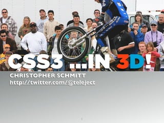
  • 1. CSS3 ...IN 3D!CHRISTOPHER SCHMITT http://twitter.com/@teleject 1
  • 2. SOMETIMES YOU GOTTA TAKE CSS FOR A RIDE TO SEE IF IT DOES SWEET JUMPS
  • 3.
  • 4.
  • 6.
  • 7. “TAKE CARE OFTHE LUXURIES AND THE NECESSITIES WILLTAKE CARE OFTHEMSELVES.” FRANK LLOYD WRIGHT 7
  • 10.
  • 11. > Warning (You are here.) > Color > Text > Borders > Effects > Transform ☞ AGENDAAGENDA ☞ (You are here.) Prizes! http:// interactwithwebstandards .com/
  • 15.
  • 16. #number4 { background-color: rgb(255, 255, 0); background-color: rgba(255, 255, 0,.4); } OPACITY background-color: rgba(255, 255, 0,.4); OPACITY
  • 17. • Firefox 3+, Opera 10+, and Safari support RGBA • Requires another background-color property for cross-browser support. • IE Support? OPACITYOPACITY
  • 18. OPACITY IN IE #number4 { background-color: transparent; filter:progid:DXImageTransform.Microsoft.gr adient( startColorstr=#66FFFF00, endColorstr=#66FFFF00 ); } background-color: transparent; filter:progid:DXImageTransform.Microsoft.gr adient( startColorstr=#66FFFF00, endColorstr=#66FFFF00 ); OPACITY IN IE
  • 19. • First step is to convert the RGB value of the color to hexadecimal. In this example, rgb(255,255,0) converts to #FFFF00. • Next, convert the alpha transparency value to hexadecimal string. In this example, the hexadecimal value is 66. • E.g., alpha value of .3 equals 4D in hexadecimal • Then assemble the hexadecimal value for transparency and the color together in one string, starting with the transparency: #66FFFF00. OPACITY IN IEOPACITY IN IE
  • 21.
  • 22. OPACITY ON ELEMENTS #number4 { /* .4 = 40% transparency */ opacity: .4; /* 40 = 40% transparency */ filter: alpha(opacity=40); } OPACITY ON ELEMENTS opacity: .4; filter: alpha(opacity=40);
  • 23. • Supported in Firefox 1.5+, Opera 9+, Safari 1.2+ and Chrome. • IE 5.5+ requires the use of its own alpha filter in order for the effect to be cross-browser. • A drawback to using the opacity filter is that the value is inherited: • If a parent element is set to be 10% transparent, the child elements’ transparency is also going to be 10%. • div.opacity * { opacity: 1; } • Watch out for legibility issues within the Web page. OPACITY ON ELEMENTSOPACITY ON ELEMENTS
  • 26. The longest word in the Oxford English dictionary is used to name a lung disease caused by the inhalation of very fine silica dust, causing inflammation in the lungs. PNEUMONOULTRAMICROSCOPICSILICOVOLCANOCONIOSISPNEUMONOULTRAMICROSCOPICSILICOVOLCANOCONIOSIS
  • 27.
  • 28. TEXT-OVERFLOW p { text-overflow: ellipsis; -o-text-overflow: ellipsis; } TEXT-OVERFLOW text-overflow: ellipsis; -o-text-overflow: ellipsis;
  • 31.
  • 32. ::selection { color: #90c; background: #cf0; } ::-moz-selection { color: #90c; background: #cf0; } TEXT-SELECTIONTEXT-SELECTION ::selection { color: #90c; background: #cf0; } ::-moz-selection { color: #90c; background: #cf0; }
  • 33. •Pseudo-element support: •Safari •Firefox •Nice subtle effect, esp. if you deal with a lot of text on your site. LESSONS LEARNEDLESSONS LEARNED
  • 35. FONT FILE SUPPORT .ttf .otf .eot Safari 3.1+ Opera 10+ Firefox 3.5+ IE4+ Y Y Y Y Y Y Y FONT FILE SUPPORT
  • 37.
  • 38. @FONT-FACE @font-face { font-family: 'Graublau Web'; src: url('GraublauWeb.eot'); src: local('☺'), url('GraublauWeb.woff') format('woff'), url ('GraublauWeb.ttf') format('truetype'); } h1 { font-family:“Graublau Web”,Verdana, sans-serif; } http://paulirish.com/2010/font-face-gotchas/#smiley @FONT-FACE @font-face { font-family: 'Graublau Web'; src: url('GraublauWeb.eot'); src: local('☺'), url('GraublauWeb.woff') format('woff'), url ('GraublauWeb.ttf') format('truetype'); }
  • 39. • Getting @font-face to work is a little tough. • Use http://fontsquirrel.com for pre-made kits, @font-face generator • Chrome now supports @font-face. • Don’t feel like bothering with all that hassle? • Use font services like typekit.com for 100s of licensed fonts. • Use commercially free fonts (see http://fontsquirrel.com) LESSONS LEARNEDLESSONS LEARNED
  • 40. • Font files are LARGE • gzip them, if you use them: http://articles.sitepoint.com/article/web-site-optimization-steps/2 • New font file format:WOFF: http://hacks.mozilla.org/2009/10/woff/ • Font files are already compressed and supports meta information telling where the font came from. (Vendors happy.) • It’s supported FF3.6 and coming to IE9, Chrome. LESSONS LEARNEDLESSONS LEARNED
  • 41.
  • 42. @FONT-FACE a.fn:before { font-weight: normal; font-style: normal; line-height: normal; font-family: 'SeeingStarsRegular', sans-serif; content: "W "; font-size: 2em; } @FONT-FACE a.fn:before content: "W ";
  • 43.
  • 44.
  • 45.
  • 47.
  • 48. h1 { font-size: 2.5em; font-family: Myriad, Helvetica,Arial, sans-serif; width: 66.6%; text-shadow: yellow .15em .15em .15em; margin: 0 0 0.1em 0; } TEXT-SHADOWTEXT-SHADOW text-shadow: yellow .15em .15em .15em;
  • 49.
  • 50. body { background-color: #999; } h1 { text-shadow: 0 1px 0 rgba(255,255,255,.6); } BEVEL TEXT-SHADOW text-shadow: 0 1px 0 rgba(255,255,255,.6); BEVEL TEXT-SHADOW
  • 51.
  • 52. body { background-color: #dcaa96; /* not white */ background-image: url(tile.jpg); } h1 { color: white; text-shadow: black 0px 0px 6px; } SOLAR TEXT-SHADOWSOLAR TEXT-SHADOW background-color: #dcaa96; /* not white */ color: white; text-shadow: black 0px 0px 6px;
  • 53.
  • 54. h1 { color: red; text-shadow: rgba(0, 0, 0, .9) 0px 0px 1px, rgba(255, 255, 51, .9) 0px −5px 5px, rgba(255, 204, 51, .7) 2px −10px 7px, rgba(255, 153, 0, .6) −2px −15px 10px; } TEXT-SHADOW FLAMETEXT-SHADOW FLAME rgba(0, 0, 0, .9) 0px 0px 1px, rgba(255, 255, 51, .9) 0px −5px 5px, rgba(255, 204, 51, .7) 2px −10px 7px, rgba(255, 153, 0, .6) −2px −15px 10px;
  • 57.
  • 58. #header { text-shadow: 0 −1px 0 rgba(0,0,0,.8); box-shadow: 3px 3px 19px rgba(0,0,0,.8); -webkit-box-shadow: 3px 3px 19px rgba(0,0,0,.8); -moz-box-shadow: 3px 3px 19px rgba(0,0,0,.8); } Works like text-shadow, but on boxes! BOX-SHADOWBOX-SHADOW box-shadow: 3px 3px 19px rgba(0,0,0,.8); -webkit-box-shadow: 3px 3px 19px rgba(0,0,0,.8); -moz-box-shadow: 3px 3px 19px rgba(0,0,0,.8);
  • 60.
  • 61. <div id="section"> <h2>Images on Borders</h2> <p>Epsum factorial non deposit quid pro quo hic escorol. Olypian quarrels et gorilla congolium sic ad nauseum. Souvlaki ignitus carborundum e pluribus unum..</p> </div><!-- /#section --> BORDER-IMAGEBORDER-IMAGE <div id="section"> </div><!-- /#section -->
  • 62. #section { border-style: solid; border-color: #930; border-width: 26px 39px 37px 43px; border-image: url(frame.png) 26 39 37 43 stretch stretch; -webkit-border-image: url(frame.png) 26 39 37 43 stretch stretch; -moz-border-image: url(frame.png) 26 39 37 43 stretch round; } BORDER-IMAGEBORDER-IMAGE border-image: url(frame.png) 26 39 37 43 stretch stretch; -webkit-border-image: url(frame.png) 26 39 37 43 stretch stretch; -moz-border-image: url(frame.png) 26 39 37 43 stretch round;
  • 63. • Works in FF 3.1+ and Safari 4+. • Image is scaled, if text is also scaled. LESSONS LEARNEDLESSONS LEARNED
  • 64.
  • 66. button { background: none; width: 250px; padding: 10px 0 10px 0; border-style: solid; border-color: #666; border-width: 0 17px 0 17px; } BORDER-IMAGEBORDER-IMAGE border-width: 0 17px 0 17px;
  • 67. button { background: none; width: 250px; padding: 10px 0 10px 0; border-style: solid; border-color: #666; border-width: 0 17px 0 17px; border-image: url(bkgd-button.png); } BORDER-IMAGEBORDER-IMAGE border-image: url(bkgd-button.png);
  • 68. button { background: none; width: 250px; padding: 10px 0 10px 0; border-style: solid; border-color: #666; border-width: 0 17px 0 17px; border-image: url(bkgd-button.png) 0 17 0 17 stretch stretch; } BORDER-IMAGEBORDER-IMAGE 0 17 0 17 stretch stretch
  • 69. button { background: none; width: 250px; padding: 10px 0 10px 0; border-style: solid; border-color: #666; border-width: 0 17px 0 17px; border-image: url(bkgd-button.png) 0 17 0 17 stretch stretch; -webkit-border-image: url(bkgd-button.png) 0 17 0 17 stretch stretch; -moz-border-image: url(bkgd-button.png) 0 17 0 15 stretch stretch; } BORDER-IMAGEBORDER-IMAGE -webkit-border-image: url(bkgd-button.png) 0 17 0 17 stretch stretch; -moz-border-image: url(bkgd-button.png) 0 17 0 15 stretch stretch;
  • 70. button { background: none; width: 250px; padding: 10px 0 10px 0; border-style: solid; border-color: #666; border-width: 0 17px 0 17px; border-image: url(bkgd-button.png) 0 17 0 17 stretch stretch; -webkit-border-image: url(bkgd-button.png) 0 17 0 17 stretch stretch; -moz-border-image: url(bkgd-button.png) 0 17 0 15 stretch stretch; color: white; font-family: "Gill Sans", Trebuchet, Calibri, sans-serif; font-weight: bold; text-transform: uppercase; text-shadow: 0px 0px 5px rgba(0,0,0,.8); } BORDER-IMAGEBORDER-IMAGE color: white; font-family: "Gill Sans", Trebuchet, Calibri, sans-serif; font-weight: bold; text-transform: uppercase; text-shadow: 0px 0px 5px rgba(0,0,0,.8);
  • 71. • Works in FF 3.1+ and Safari 4+. • Image is scaled, if text is also scaled. • Other values besides “stretch” are: • “repeat” (tiles the image); • “round”, which tiles and fills space with whole images; • and “space”, which is like “round” except it leaves empty space LESSONS LEARNEDLESSONS LEARNED
  • 73.
  • 74. div { background-image: url(beach.jpg); width: 375px; height: 500px; border: 8px solid #666; border-radius: 40px; -moz-border-radius: 40px; -webkit-border-radius: 40px; } BORDER-RADIUSBORDER-RADIUS border-radius: 40px; -moz-border-radius: 40px; -webkit-border-radius: 40px;
  • 75. CSS3 Firefox WebKit border-radius -moz-border-radius -webkit-border-radius border-top-left-radius -moz-border-radius- topleft -webkit-border-top-left- radius border-top-right-radius -moz-border-radius- topright -webkit-border-top- right-radius border-bottom- right-radius -moz-border-radius- bottomright -webkit-border-bottom- right-radius border-bottom-left- radius -moz-border-radius- bottomleft -webkit-border-bottom- left-radius BORDER-RADIUSBORDER-RADIUS
  • 76. • Radius is half the distance of the diameter. (Stay in school, kids!) • Radius border can be applied to one, two, three or all corners. • The higher the value for the radius, the more rounded the corner will be. • If borders on an inline image (IMG element) are rather large, borders are shown behind the image (see previous screenshot). • Workaround is to either keep border-radius value small or place image in background. LESSONS LEARNEDLESSONS LEARNED
  • 79.
  • 80.
  • 81. IMAGE MASKS img { display: block; float: left; margin-right:20px; border: 10px solid #ccc; padding: 2px; background-color: #666; -webkit-mask-box-image: url(mask.png); } IMAGE MASKS -webkit-mask-box-image: url(mask.png);
  • 82. • When creating a mask, every part of the image that is transparent becomes the mask or the part that hides a portion of the background image. • Approach is somewhat hard to understand, since typically, alpha transparency is, well, transparent. • The masks scale to the complete width of image, including borders. • The background shows through, including background images. • Might work best with areas of flat color behind the images LESSONS LEARNEDLESSONS LEARNED
  • 84.
  • 85. GRADIENTS div.building { border: 1px solid #666; float: left; width: 300px; height: 300px; margin: 20px; background-image: -webkit-gradient(radial,center center,900,center bottom,0,from(#0cf),to(white)); background-image: -moz-radial-gradient(center,900px,center bottom,0,from(#0cf),to(white)); background-repeat: no-repeat; } background-image: -webkit-gradient(radial,center center,900,center bottom,0,from(#0cf),to(white)); background-image: -moz-radial-gradient(center,900px,center bottom,0,from(#0cf),to(white)); background-repeat: no-repeat; GRADIENTS
  • 86. SAFARI GRADIENT background-image: -webkit-gradient(); Recommend using background-image over background shorthand. background-image: -webkit-gradient(); SAFARI GRADIENT
  • 87. background-image: -webkit-gradient(radial); Other value it accepts is “linear”. SAFARI GRADIENTSAFARI GRADIENT
  • 88. background-image: -webkit-gradient(radial,center center,900); Set the starting position of gradient. SAFARI GRADIENTSAFARI GRADIENT
  • 89. background-image: -webkit-gradient(radial,center center,900,center bottom,0); Set the end position of gradient. SAFARI GRADIENTSAFARI GRADIENT
  • 91. • Gradients in Safari can be applied to not just background images of block-level elements, but also: • list bullets, generated content, and border-images! • Unit values aren’t accepted (px, em, etc.) It’s assumed to be pixels. • Don’t use background-position shorthand values. • Use a background-image with a gradient for “older” browsers. LESSONS LEARNEDLESSONS LEARNED
  • 92. • Whereas Safari sets the type of gradient within its own proprietary property, Firefox has properties for both types of gradients: -moz-radial-gradient() and -moz-radiallinear(). • Unlike the Safari gradient, you can use background-position shorthand values and unit values when setting the starting and stopping points of gradients. • Firefox’s implementation of CSS gradients concerns transparency. FIREFOX GRADIENTSFIREFOX GRADIENTS
  • 93. background-image: -moz-linear-gradient(left top, left bottom, from(rgba(153,51,0,.3)), to(#6b3703), color-stop(0.5, #903000)); FIREFOX GRADIENTSFIREFOX GRADIENTS rgba(153,51,0,.3)
  • 95.
  • 96. img { display: block; float: left; margin-right:20px; border: 10px solid #ccc; padding: 2px; background-color: #666; -webkit-mask-box-image: -webkit-gradient(linear, left bottom, left top, from(rgba(0,0,0,1)), to(rgba(0,0,0,0))); } GRADIENT MASKS Only works in Safari. GRADIENT MASKS -webkit-mask-box-image: -webkit-gradient(linear, left bottom, left top, from(rgba(0,0,0,1)), to(rgba(0,0,0,0)));
  • 97. Example of transparent gradients, border image, PNG8, text-shadow, box-shadow
  • 100.
  • 101. img+img { transform: rotate(270deg); -webkit-transform: rotate(270deg); -moz-transform: rotate(270deg); filter: progid:DXImageTransform.Microsoft.BasicImage(rotation=3); } TRANSFORMTRANSFORM transform: rotate(270deg); -webkit-transform: rotate(270deg); -moz-transform: rotate(270deg);
  • 102. Degree Rotation BasicImage filter value 0 0 90 1 180 2 270 3 TRANSFORM IE CONVERSION TRANSFORM IE CONVERSION
  • 104.
  • 105. ANIMATING LINKS #navsite a { -webkit-transition-timing-function: linear; -webkit-transition-duration: .66s; -webkit-transition-property: background-color; } Note! Style rollover links normally. -webkit-transition-timing-function: linear; -webkit-transition-duration: .66s; -webkit-transition-property: background-color; ANIMATING LINKS
  • 106. • The transitioning-timing-function function states the type of animation the effect is going to take. • In this example, the value is set to linear, which means each frame of the animation length takes the same amount of time. • Other values for transitioning-timing-function include ease, ease-in, ease-out, and cubic-bezier(x1, y1, x2, y2). LESSONS LEARNEDLESSONS LEARNED
  • 108. • The first two values of cubic-bezier represent the transition on a curve, as shown in the figure. • Values for y1 and y2 represent the start and end of the transition and are always equal to the values of 0.0 and 1.0, respectively. • The speed with which the transition takes hold is represented by the values x1 and x2.The greater the value for x1 and x2, the slower the transition occurs. cubic-bezier(x1, y1, x2, y2) Cubic Bezier CurveCubic Bezier Curve
  • 109. • A value of ease-in starts the transition at a slow speed and then speeds up.This value is equivalent to cubic- bezier(0.42, 0, 1.0, 1). • The ease-out value starts the transition at a fast speed and then slows down.This value is equivalent to cubic- bezier(0.42, 0, 1.0, 1). • The ease value is equivalent to cubic-bezier(0.25, 0.1, 0.25, 1.0). Cubic Bezier Curve cubic-bezier(x1, y1, x2, y2) Cubic Bezier Curve
  • 110. • The transition-duration property’s default value is 0. • Any negative value is treated as though it’s zero. • Units the value may take include, but are not limited to, “s” for seconds and “ms” for milliseconds. • The transition-delay property sets the amount of time before a transition starts. DURATION & DELAYDURATION & DELAY
  • 111. • The transition-property property defines which CSS visual property the transition is applied to. • In the animated link example, the transition is applied to the background color. TRANSITION PROPERTYTRANSITION PROPERTY
  • 112. • You can write the properties of the transition effect in one value for the transition property: #navsite a { -webkit-transition: background-color .66s linear; } SHORTHAND PROPERTY -webkit-transition: background-color .66s linear; SHORTHAND PROPERTY
  • 113. TRANSFORM & ANIMATE: COMPLEX ANIMATING LINKSCOMPLEX ANIMATING LINKS
  • 115.
  • 116. • Web designer Faruk Ateş’s personal site (see http://farukat.es/) uses the transition property to change the color of the element. • As well as the color, width, box shadow, text shadow, and opacity. COMPLEX ANIMATED LINKSCOMPLEX ANIMATED LINKS
  • 117. #web20 li a { text-shadow: rgba(0,0,0, 0) 1px 1px 2px; -moz-box-shadow: rgba(0,0,0, 0) 2px 2px 2px; -webkit-box-shadow: rgba(0,0,0, 0) 2px 2px 2px; -moz-border-radius-topright: 31px; -moz-border-radius-bottomright: 31px; -webkit-border-top-right-radius: 31px; -webkit-border-bottom-right-radius: 31px; -webkit-transition: background-color .25s ease, color .5s ease, width .2s ease-out, -webkit-box-shadow .25s ease, text-shadow .2s ease, opacity .2s ease; } COMPLEX ANIMATED LINKSCOMPLEX ANIMATED LINKS -webkit-transition: background-color .25s ease, color .5s ease, width .2s ease-out, -webkit-box-shadow .25s ease, text-shadow .2s ease, opacity .2s ease;
  • 119.
  • 121. #clouds1 { width: 627px; height: 410px; position: absolute; right: −300px; top: 0; background-image: url(clouds.png); } ANIMATING ELEMENTSANIMATING ELEMENTS
  • 122. @-webkit-keyframes "clouds" { from { right: 0px; } to { right: 100px; } } ANIMATING ELEMENTSANIMATING ELEMENTS
  • 123. #clouds1 { width: 627px; height: 410px; position: absolute; right: −300px; top: 0; background-image: url(clouds.png); -webkit-transform: translate(300px, 0px); -webkit-animation-name: "clouds"; -webkit-animation-duration: 10s; -webkit-animation-iteration-count: 10; -webkit-animation-direction: alternate; } ANIMATING ELEMENTSANIMATING ELEMENTS -webkit-transform: translate(300px, 0px); -webkit-animation-name: "clouds"; -webkit-animation-duration: 10s; -webkit-animation-iteration-count: 10; -webkit-animation-direction: alternate;
  • 124. • Animations can take on more than one property (think offset properties and even opacity for some interesting effects). • The animation-transform property is used to associate which keyframe rule is used (“clouds). • The animation-duration is set for how long the effect should occur. (Negative values are treated as zero.) • The animation-iteration-count tells how many times it should happen. For constant looping, use value of “infinite”. • Use animation-direction property set to normal loops animation, while “alternate” creates a more seamless presentation (back and forth). ANIMATING ELEMENTSANIMATING ELEMENTS
  • 125.
  • 127. • Inserts HTML5 shim • Checks to see if browser supports CSS3 and HTML5 features • Allows us to deliver CSS rules for the browsers that do and the browsers that don’t have newest features. MODERNIZERMODERNIZER
  • 128. <html class= “js canvas canvastext geolocation rgba hsla no-multiplebgs borderimage borderradius boxshadow opacity no-cssanimations csscolumns no- cssgradients no-cssreflections csstransforms no-csstransforms3d no- csstransitions video audio localstorage sessionstorage webworkers applicationcache fontface”> DETECT HTML5 AND CSS3 .js canvas canvastext geolocation rgba hsla no-multiplebgs borderimage borderradius boxshadow opacity no-cssanimations csscolumns no- cssgradients no-cssreflections csstransforms no-csstransforms3d no- csstransitions video audio localstorage sessionstorage webworkers applicationcache fontface DETECT HTML5 AND CSS3
  • 129. #number4 { background-color: rgb(255, 255, 0); background-color: rgba(255, 255, 0, .4); } APPLY HTML5 AND CSS3APPLY HTML5 AND CSS3 background-color: rgb(255, 255, 0);
  • 130. .rgba #number4 { background-color: rgba(255, 255, 0, .4); } .no-rgba #number4 { background-color: rgb(255, 255, 0); } APPLY HTML5 AND CSS3APPLY HTML5 AND CSS3 .rgba .no-rgba
  • 131. • @font-face • Canvas • Canvas Text • HTML5 Audio • HTML5Video • rgba() • hsla() • border-image • border-radius • box-shadow • Multiple backgrounds • opacity: • CSS Animations • CSS Columns • CSS Gradients • CSS Reflections • CSS 2D Transforms • CSS 3D Transforms • CSS Transitions • Geolocation API • localStorage • sessionStorage • Web Workers • applicationCache • HTML5 Input Types • HTML5 Input Attributes • and more! WHAT IT CHECKS FORWHAT IT CHECKS FOR
  • 132. • 2-day, online jQuery Summit • http://jquerysummit.com/ Upcoming