Making the Transition from Print to Digital Design
•Descargar como KEY, PDF•
2 recomendaciones•1,396 vistas

This presentation explains different techniques and concepts relevant to transitioning best practices in print design to those of the web and other digital media. It covers universal principles that apply across-the-board as well as those unique to each discipline and offers specific insights on easing your transition from one to the next.

Recomendados
Recomendados
Más contenido relacionado
Similar a Making the Transition from Print to Digital Design
Similar a Making the Transition from Print to Digital Design (20)
Más de Tim Frick
Más de Tim Frick (13)
Último
Último (20)
Making the Transition from Print to Digital Design
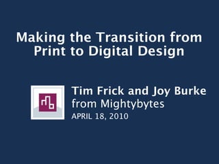
- 1. Making the Transition from Print to Digital Design Tim Frick and Joy Burke from Mightybytes APRIL 18, 2010
- 2. PART 1: Universal Design Principles
- 4. First read, second read, etc.
- 6. Reading Gravity (and how the Gutenberg Rule relates)
- 7. The Gutenberg Diagram PRIMARY STRONG OPTICAL AREA FALLOW AREA WEAK TERMINAL FALLOW AREA AREA
- 10. Terminal Area
- 12. Color Theory
- 13. Body Copy Generally dark body copy on light background creates better legibility
- 14. See? This is not very enjoyable reading. It This is way easier on the eyes, especially strains the eyes. It’s one thing if it’s a very for on-screen reading. Be nice to your short amount of text and enhances the users and make it easy for them to read design and user experience, but in what you are trying to tell them. general don’t set body copy like this, especially not on the web. Pellentesque nibh felis, eleifend id, commodo in, interdum vitae, leo. Praesent Pellentesque nibh felis, eleifend id, eu elit. Ut eu ligula. Class aptent taciti commodo in, interdum vitae, leo. Praesent sociosqu ad litora torquent per conubia eu elit. Ut eu ligula. Class aptent taciti nostra, per inceptos hymenaeos. sociosqu ad litora torquent per conubia nostra, per inceptos hymenaeos. Maecenas elementum augue nec nisl. Proin auctor lorem at nibh. Curabitur nulla Maecenas elementum augue nec nisl. purus, feugiat id, elementum in, lobortis Proin auctor lorem at nibh. Curabitur nulla quis, pede. Vivamus sodales adipiscing purus, feugiat id, elementum in, lobortis sapien. Vestibulum posuere nulla eget quis, pede. Vivamus sodales adipiscing wisi. sapien. Vestibulum posuere nulla eget wisi. Integer volutpat ligula eget enim. Suspendisse vitae arcu. Quisque Integer volutpat ligula eget enim. pellentesque. Nullam consequat, sem Suspendisse vitae arcu. Quisque vitae rhoncus tristique, mauris nulla pellentesque. Sed dapibus vehicula odio. fermentum est, bibendum ullamcorper Quisque pellentesque. sapien magna et quam. Sed dapibus vehicula odio. Proin bibendum gravida nisl. Fusce lorem. Phasellus sagittis, nulla in hendrerit Proin bibendum gravida nisl. Fusce lorem. laoreet, libero lacus feugiat urna, eget Phasellus sagittis, nulla in hendrerit hendrerit pede magna vitae lorem. laoreet, libero lacus feugiat urna, eget Praesent mauris. hendrerit pede magna vitae lorem. Praesent mauris.
- 15. Avoid Vibrating Colors Tsk, tsk. Nooooooooooooooo!
- 17. Balanced Color Palette kuler.adobe.co m
- 18. Moderation Use high contrast and high chroma in moderation
- 21. Saturation Find balance between low and high color saturation
- 22. Saturation Using high saturation for highlight areas can be an effective method for calls-to- action or emphasis
- 24. PART 2: Working for the Web
- 26. GOOD Magazine The user experience is optimized for the delivery platform.
- 29. Dynamic vs. Static Content
- 30. Static Content Doesn’t change from page to page • Logo • Main navigation • Social media links • Search bar
- 32. Dynamic Content Flexible content that changes • Headings • Body copy • Features • Testimonials
- 34. CMS 101
- 35. Content Management System Drupal Expression Engine WordPress
- 40. Designing on a Grid
- 41. Make Your Developers Happy • Backbone of the design • Easily plug in content on each new page • Creates consistency • Careful when breaking it on the web
- 42. 960 Grid • 960.gs • Downloadable .ai/.psd files • Uses CSS, with classes labeled “grid_xx” to determine widths • Grid Overlay Bookmark
- 48. From CMYK to RGB & HEX
- 49. CMYK Allows virtually any color to be produced in print
- 50. RGB Generally brighter, more vivid
- 51. RGB CMYK
- 52. RGB WYSIWYG (no need to print proofs)
- 53. HEX Values Hexidecimal numbering system using the RGB color model.
- 54. HEX Values Written as 3 sets of hex pairs: 1st two = Red 2nd two = Green 3rd two = Blue
- 55. HEX Values Red Green Blue #ff0000 #00ff00 #0000ff
- 57. Print vs. Screen Resolution
- 58. 300dpi vs 72dpi Standard screen resolution: 72dpi
- 59. Optimize Your Images! Determine goal dimensions of image at 100%, then make 72dpi
- 60. Saving Comps ‘Save for Web’ as .jpgs Keep original files
- 61. Print vs. Web Typography
- 62. Web Safe Fonts Andale Mono Times New Roman Arial Georgia Helvetica Courier New Verdana Geneva Trebuchet MS Lucida Grande
- 63. Font Embedding Systems • TypeKit • Fontdeck • Font-Face • Fonts Live • Fonts.com Web Fonts • Fontspring • Google Fonts
- 64. We <3 TypeKit • > 4,000 fonts • Super easy setup & integration • Reasonable rates • Host custom fonts • Flexibility in font usage
- 65. Legible Body Copy Studies show sans-serif fonts provide better legibility for body copy than most serif fonts.
- 66. Legible Body Copy Generally much bigger font size online than in print
- 67. Font Size Print: points (pt) Web: pixels (px)
- 77. PinP, Inc.
- 81. The Joffrey Ballet Chicago
Notas del editor
- \n
- Design principles that transition well across media formats.\n
- What is the take-away on this slide?\n
- Atlanta Magazine Article\n
- Fast Co Design\n
- Design pages (print, web, media, etc.) so that they take advantage of the natural way one&#x2019;s eyes travel across a page.\n
- - The Gutenberg Diagram\n- Same as books, users tend to read/experience a web page by starting at the top left and working their way down to the bottom right.\n
- Primary Optical Area:\n- top left\n- logo\n- 1st read\n
- Primary Optical Area:\n- top left\n- logo\n- 1st read\n
- Terminal Area:\n- bottom right\n- calls to action\n- buttons\n
- Mightybytes example\n
- - have to be more careful with colors vibrating on screen, even more than when on print\n- red on gray or green\n- orange directly on blue\n- need to talk about values/saturations and how they need to balance between colors to avoid bad vibrations (INSERT PIC OF BEACH BOYS? GOOD VIBRATIONS?!... &#x201C;the only kind of vibrations we want are...&#x201D; lol okay maybe not)\n- talk more later on RGB vs. CMYK later\n
- \n
- \n
- \n
- \n
- \n
- Chroma = purity of a color, so its lack in white, gray and black\n
- \n
- \n
- Eyes tend to be more sensitive to brighter colors on the web than in print.\n
- \n
- \n
- \n
- \n
- \n
- \n
- \n
- \n
- \n
- \n
- \n
- \n
- \n
- \n
- \n
- \n
- \n
- \n
- \n
- \n
- \n
- \n
- \n
- \n
- \n
- \n
- \n
- \n
- \n
- \n
- \n
- \n
- \n
- \n
- \n
- \n
- If you comp something up in 300dpi, you&#x2019;re packing more information into each pixel, \nwhich MAJORLY increases load time\n
- \n
- \n
- \n
- Others include: \n- Impact\n- Comic Sans\n- Arial Black\n
- Others include: \n- Impact\n- Comic Sans\n- Arial Black\n
- Cons:\n- No desktop version for comping up proofs\n\n
- \n
- Average body copy is set to 13 or 14px on web,\nwhereas 12 even seems big at times in print.\n
- \n
- \n
- \n
- \n
- \n
- \n
- \n
- \n
- \n
- \n
- \n
- \n
- \n
- \n
- \n
- \n
- \n
- \n