
Recomendados
Más contenido relacionado
La actualidad más candente
Similar a Music Magazine evaluation
Similar a Music Magazine evaluation (20)
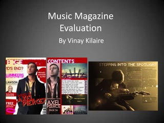
Music Magazine evaluation
- 1. Music Magazine Evaluation By Vinay Kilaire
- 2. In what ways does your media product use, develop or challenge the forms and conventions of real media products?
- 3. In what ways does your media product use, develop or challenge the forms and conventions of real media products? Masthead My media magazine is called ‘EDGE’. It is a mix of Pop and Rock genres so that it will have a wider range of a target audience. The magazine uses many codes and conventions that I have learned from studying related music magazines. First is the masthead. The masthead uses bright colours, such as white and bright pink. But the white can be changed or not even included depending on the background colour of the whole magazine front cover. These colours are very eye-catching and it is easy to read the name of the magazine. These colours are also contrasting against a dark red colour so that it stands out more. Because pink is a darker colour than white, it has been placed behind the white colours used in the masthead to act as some sort of shadow. This makes it easier to read the name of the magazine and makes it stand out more. I have also made the masthead look more graphic than mastheads of magazines that I have studied. I have added an underline that looks like the ‘edge’ of broken glass, hence the name of the magazine. It also has little pieces of coming from the glass to give it sort of a dynamic look to it. This also has a pink shadow, just like the name. On the contents page, I had modified the masthead so that it says ‘Contents’ instead of ‘EDGE’. I have also made it less graphic by removing the underline with the shattered pieces. This is done so that it won’t steal any attention from the original masthead.
- 4. In what ways does your media product use, develop or challenge the forms and conventions of real media products? Colour Scheme The main convention that I have used is the colour scheme. The colours that are a part of the colour scheme are the ones that I have used in the masthead. As I have said before, the masthead uses bright colours such as white and bright pink with a dark colour to contrast, which is a dark red. The white and pink, working together, look very eye-catching and graphic. Also, with the dark red being used to contrast against the bright colours, it makes them stand out more and make them more eye-catching. I have used this colour scheme all around the front cover and the contents page. On the front cover I have used it for the masthead, of course, and have tried to keep the use of the dark red and pink consistent in the cover lines and items around the cover. On the contents page I have used it for the title , page numbers , headlines and dividers for the different articles and sections on the page.
- 5. In what ways does your media product use, develop or challenge the forms and conventions of real media products? Cover Lines The cover lines around the front cover look very eye-catching due to the use of consistent colours, font and the font size. The colours I have used match the colour scheme I have used on the front cover and the contents page. When looking for what I would use, I tried to look for something that was similar to the one that I used for the masthead. I will talk about which fonts I actually used in a later slide. The size of the cover lines are the main ingredient to catching the audiences attention. The size depends on how well the audience can relate to it and if they have an interest in it. For this I chose topics that relate to artists that are very popular in today’s world. I have also tried to follow the style of the cover lines that the front cover of ‘Q’ magazine uses. I like this styles because it allows the front cover to hold a lot of information of things that will be featured inside the magazine. This styles consists of putting a lot of cover lines on the side of the cover with the font being bigger where it needs to highlight keywords that the audience will interested in the most.
- 6. In what ways does your media product use, develop or challenge the forms and conventions of real media products? Anchorage An anchorage headline is where there is a headline that gives more information to a picture. In my music magazine, I have used anchorage on my front cover and contents page. On the front cover I have written the anchorage headline in big letters so that people will see it first. I have also placed it with the picture, in a position it would be easy to tell that the headline, “Who is Axel Pierce?”, is connected to the central image. I have also added an anchorage headline to a smaller, less important story that is featured on the front cover. It reads “Brittany goes bald again!”, with an image of the pop star herself, Brittany Spears. On the contents page, I have used anchorage on different parts of the page. This is because there are different images around the page that need some anchorage to them.
- 7. In what ways does your media product use, develop or challenge the forms and conventions of real media products? Style of Photography The style of photography that I have used is similar to the photography on the front covers of music magazines that I have studied. I have used primary source photographs on my front cover, contents page and my double page spread. They are photographs of people who would portray famous artists in my music magazines. The photographs that I have used must look professional so that it will make as though the whole magazine was made professionally as well. On the front cover I have used a photo that was taken at a low angle, which is called a low-shot. This makes the person look as if he is above everybody else. I have then edited the colours to make it blend in with background. I have used the same image on the contents page so people can easily find where the story, which the artist is featured in, can be found. The colours of the photo on the contents page have been edited differently to the one on the front cover. On the double page spread, I have used a photograph that was taken landscape so that it would fit across two pages. These photographs have been edited using Adobe Photoshop to make them look professional.
- 8. In what ways does your media product use, develop or challenge the forms and conventions of real media products? Front Cover Photography For the central image on the front cover, I have taken inspiration from the magazine, ‘Q’. On Q’s issue from December 2012, it featured a photograph of the leader of the band, ‘The Killers’. I found the photography on the Q magazine to be good inspiration for the central image that I would like to use on my front cover of my music magazine. So I decided to use photography that was similar to this. As you can see the two images are very similar. The chin is held high in the light. On the ‘Q’ magazine, the artist on the front cover has his head sort-of facing away from the light, whereas on my magazine, my artist is facing towards the light. The light itself on the ‘Q’ magazine is a very hard light. You tell because of how sharp the shadows fade in in with the light. This must mean that the light must be close to the actual artist who is getting his picture taken. On my magazine, the artist is put in a softer light because the shadows are much smoother and lighter. This must mean that the light itself is further away from the artist when the picture was taken. Also the type of light is different. On the ‘Q’ magazine, the light is bright white, whereas on my magazine the light is darker and a yellow sun shade colour. This makes the light look warmer and ambient. Also, the hairstyle is similar. The hairstyle is a stylish comb-over which is a popular hairstyle in today’s world. I have also added a photo of famous artist Brittany Spears. I have used this image because there are smaller images of artists on the ‘Q’ magazine. This will attract the audiences attention because it has an anchorage headline underneath it.
- 9. In what ways does your media product use, develop or challenge the forms and conventions of real media products? Double Page Spread Photography On the double page spread, I have only used one image of the artist, who is also the subject of the article itself. This is a primary source image which was also edited in Adobe Photoshop. This is different from the rest of the primary source my photography but also similar in ways. It is different because the only colour that you can see the light yellow/beige of the light that I have simulated on my double page spread. This creates a classical feel to the artist and his music. It is also similar to the rest of the primary source photography. Just like the others it has a light source and the photograph tends to act upon it. It has also been edited to highlight the lighter areas from the photograph and darken the darker areas. The final image on the whole of the double page spread fits in well with the title of the article “Stepping into the Spotlight”. You can see this because of the colour, which is a warm light simulating a spotlight, asnd also the lens flare that I have added.
- 10. In what ways does your media product use, develop or challenge the forms and conventions of real media products? Mise en Scene The biggest play by the mise en scene is used on the double page spread. The double page spread shows two pages that have different kinds of conventions that all work together to form the mise en scene. First is the background and how most of the conventions interact with it. The first is the background. The background is a gradient that smoothly goes from black to a beige-y yellow. This is to simulate a warm light, a spotlight maybe, coming from above. This forms that basis of colour and how the rest of the conventions on the double page spread will follow it. The second is the photography of the artist featured in the article. When taking the original photograph, I made sure that the light source would be at a good angle to work with. Then, playing with the colour correction in Adobe Photoshop, I made it so that it would match the simulated light source that the background portrays. The next convention, that I have also made interactive with the simulated light source, is the font. The font has been darkened when near the dark area and it is a normal flat colour when closest to the light. This give the effect of a soft shadow on the text. The last thing is the smaller element used around the page. For example, the lens flare that can be seen coming from the light source. Also the particle elements all around the pages. All of these conventions and elements all work together to create the mise en scene. Mise en scene has also been used on the front cover, but hardly noticeable. From feedback, I was told that the front cover used too much white. So I took this as advice and added the same sort of gradient I used on the double page spread. But instead of black, I changed it to white. After doing this, I realised the central image lacked a bit of colour as well. So I changed the colour correction to match the background as well. This also gave it an effect that looked like a soft light source like the one created on the double page spread.
- 11. In what ways does your media product use, develop or challenge the forms and conventions of real media products? Skyline My Magazine On my music magazine, I have also used a Skyline. This is to be used as an extra piece of information that can be used to hook in the audiences attention. The way I did this was to put in a piece of information regarding a famous artist that people will probably like to see featured in this magazine. The font and the colour of the Kerrang Magazine writing also matches the colour scheme that I have used in the magazine. This is so that I can avoid clashing colours on the front cover. I knew that I had to use bold text for they skyline from studying music magazines of a similar genre.
- 12. In what ways does your media product use, develop or challenge the forms and conventions of real media products? CODE Bold and Light Font The font that I have used the most is called CODE Bold, the same one that I used on my magazine’s masthead. The reason I have used this font is because it is very thick which makes it stand out more and catch the attention of people. This font also a very modern font which you may see in modern-day adverts and brands. It is a very smooth and clean looking font to use in my magazine. Another font that I have used on the front cover of my magazine is called ‘Harabara’. This font is quite similar to LaoUI to CODE but slightly different around the edges. This gives a different feeling when reading headline that is Harabara written in this font. This is so the reader knows that they reading something on a different topic. For my double page spread, I used a font called REVOLUTION for the title of the page and for the article itself, I used a font called LaoUI. REVOLUTION is a another font that is very similar to CODE but it has that little bit of difference that would tell it apart from the rest of the magazine that has used the CODE font. LoaUI REVOLUTION is a simple font that is easy to read so the readers will have no problem. And to make it easier, I have made the questions in the interview bold, so that the reader can tell the difference between the questions and answers.
- 13. How does your media magazine represent particular social groups?
- 14. How does your media magazine represent particular social groups? My music magazine represent different social media groups in today’s community. The two main social media groups are 16 to 21-year-olds and Males and Females. How does my music magazine represent 16-21 year olds? In my magazine I have featured many artists who fall under the pop/rock music genres. Pop music itself is aimed at teenagers and young adults. But there are also artists who are teenagers and young adults becoming famous in today’s world. One example is One Direction. Are a popular appointment here are made up young adults. put in my magazine featured a negative story about them. In the headline reads “end of one direction?”. This represents teenagers and young adults as being stubborn and becoming upset with one another more often than mature adults. This is what may cause a boy band such as one direction to an end. So this headline could even be a possible headlining in real life because it is likely to happen.
- 15. How does your media magazine represent particular social groups? How does my music magazine represent males and females.? In my music magazine, I have featured both female and male artists. Within my magazine you can tell a lot about males and females in today’s society. For instance, you can guess how they dress. On the front cover of my magazine the central image is a male artist called Axel Pierce. As you can see he is dressed smartly with a blazer and casually with a hooded jacket and t-shirt. You can guess how women dressed in today’s society by looking at the photography I have used on my contents page. One of the stories on my contents page, with the headline “time for a change”, is a story about a female artist. As you can see females also like to dress up nicely. Also my contents page, if it is a headline that reads “Justin Bieber cheats Selena”. This represents males has been attracted to the opposite sex more than females. Situations like this cause male and female quarrels when they take the risk of being together. It is also things like this that journalists and people of the media live for. When things like this happen that would be a great opportunity for the media to publish a story about this that viewers would love to see.
- 16. What kind of media institution might distribute your media product and why?
- 17. What kind of media institution might distribute your media product and why? IPC is a digital publisher and consumer magazine publisher in the United Kingdom, founded in 1958. The company has distributed a range of magazines including popular magazine such as an NME and Nuts. There are categories and magazines that leadership you suggest fashion and beauty, home interest, lifestyle, sport and leisure, TV and entertainment and more. The company having such a large portfolio, the company sells of the danger 50 million magazine copies a year. Out of all the magazines that this company distributes, music magazines are its smallest market. With popular magazines are like an NME and Nuts, they don’t distribute a music magazine that relates to the Pop genre. Even though my magazine is a pop/rock genre it could possibly attract two new types of audiences; people who were into pure pop music and people and people who like pop music with a bit of rock music in there. This would be a good way for the company to go further into the music magazine market and would help them attract more audiences. I have also noticed that in the range of magazines that IUPC distribute, they have a type called ‘Teen’. This is a category for teenagers. My magazine would be another good way to attract teenagers as well, seeing as there is only one magazine in that category called ‘Teen Now’.
- 18. What kind of media institution might distribute your media product and why? Future PLC is in the amazing publisher in the UK, founded by Chris Anderson in 1985. Future PLC publishers over 150 magazines in five different categories; technology, entertainment, music, creative, and sports and auto. In 2006 it was the sixth largest media company in the UK. The company also owns the US company, future US. Looking at the categories that I am most interested in, the music category, the majority of magazines that the company distributes specialise in guitar-related music. This attracts audiences are into music genres such as rock, heavy metal and classic rock. The reason I am most interested in this media distribution company is because they don’t have any magazines that go into the pop genre. This is why it would be good for the company to distribute my magazine as mine is a pop/rock genre magazine. This means it will bring audiences who are interested in the pop music genre and people who are into pop/rock genres. My magazine would fit in well with this company as it will bring better and bigger musical audiences to it.
- 19. What kind of media institution might distribute your media product and why? Bauer Media Group is a multinational media company in Germany, founded in 1875. It was originally privately owned by the Bauer family. It publishes a range of different magazines in different categories such as football, lifestyle, motorcycling and many more. The music magazine category is what I am most interested in. The company’s most popular music magazines are Q and Kerrang. Q is a magazine which covers the music genres; indie, rock and alternative. Kerrang is a magazine that specialises in rock music my magazine specialises in the pop and rock genres. Indie an alternative are both music genres which relate to the music that would be featured in my magazine. But it still would attract the audiences of people who are into pop and pop-related music. So my magazine would be a good addition to the Bauer Media Group portfolio.
- 20. Who would be the audience for your media product?
- 21. Who would be the audience for your media product? When creating my music magazine I tried my best to aim for a demographic of people who are into pop/rock music and you are also 16 to 21 years old. That does not mean that these particular types of people would be the only audience for my music magazine. There could also be older people who are still into the young age music. That could also be people who are into new music that fall under the pop and rock genres. Genres themselves could be split into two separate audiences; people looked pop music and people who love rock music. People who are above 21 years old still should buy this magazine because even though they are older than the target audience age range they still should be able to be interested in this kind of magazine. People below 16 years old and may be interested in this magazine because the younger age people look for bright colours and flashy images which are featured in my music magazine. There may also people who are acting old age, say maybe 30 – 35 years old, who are still interested in the new music that falls under the pop and rock genres. There may also be people in this age range through our journalists and are looking for other magazines and media. The magazine is aimed at both male and female people. You can tell that it is aimed at both genders because of the colour scheme of the magazine. The colour scheme features the colours dark red and pink. Red is a dark colour and goes well with pink. Red can be used to attract both girls and boys. Bright pink is more attractive to girls than it is to boys.
- 22. How did you attract/address your audience?
- 23. How did you attract/ address your audience? To attract audiences to my magazine, the first thing that they will look at the front cover. On my front cover I have used bright colours as it draws the I have many audiences. These colours include pink, light yellow and white. I have also use darker colours contrast with the pipe colours, which makes them stand out more. For example, I have used pink on the dark red that is used in my colour scheme of the magazine. Another way that I have attracted audiences through my front cover is the use of headlines. The headlines that I have used on the front cover feature popular artists are already in today’s world. I thought to myself that if people saw these headlines that they would be attracted to them because they might want to find out why the artist is being featured in this magazine issue. Another way that people can be interested in my magazine, by looking at the front cover, is by looking at the central image used on there. The image looks professional and people may want to know who he is and why he is featured in the magazine.
- 24. What have you learned about the technology is from the process of constructing your product?
- 25. While creating my music magazine, technology with a huge part of it. To create my final product the devices that were used were a camera, a video camera, and a computer. I used the camera to take pictures of people who it would be featured in my magazine. There were things that I had to think about when to taking these pictures. I had to take into account the size of what the picture will be when featured in my magazine, the angle of a shot, whether it’s a low angle or higher angle shot etc., and where it will be in my magazine. The video camera was used only to record a video interview for my demographic research. I recorded the person being interviewed as I asked him questions from my survey. This was very helpful to my research because it shows how long it would take for one person to fill out my survey. Since it was a short amount of time, people viewing it wouldn’t have much of a problem filling it out.
- 26. Adobe Photoshop CS6 was the software used to actually produce my magazine. Since I had a lot of experience with it on my Graphics GCSE course, I had no trouble using it. The production of my whole magazine was done with this software, with help from Internet Explorer, to find any secondary source images that we needed in my magazine. Using the primary source pictures that I had taken with my camera, I used Adobe Photoshop to edit them and prepared them and prepare them for my magazine. The changes made the primary source pictures consist of removing the background, airbrushing and light source editing. Any changes made to secondary source pictures were also done in Photoshop. The changes made to the secondary source pictures consist of colour correction and light source editing as well. To make these changes, it was a simple use of the blending modes that can be used on top of other images. For example creating a new layer on top of an image, changing the blending mode to ‘Multiply’ and then using the papers to your desire, you can see that it gives it a nice effect. This is something useful and worth experimenting with in free time.
- 27. Adobe Premiere CS6 what are used to edit the speed art video of my music magazine. I have had much experience with video editing software as I have a passion for making films and short videos when possible. Adobe Premiere allows easy editing using a simple timeline view. This makes it easier to edit video clips and audio together very easily. All I needed to create this speed art video was a screen recording software called Screen Recorder Tool. This allows me to record what is going on-screen while producing my magazine front cover. That then gets exported as a video file and can be imported into a new Adobe Premiere project.
- 28. Overall, during this process of creating this music magazine a technology skills that I have used are mostly ones that I have already acquired from past experiences. Designing things in photo shop, and video editing short video and general use of a computer is nothing new to me. But that does not mean that there are some things that I haven’t learned along the way. The most useful thing I have learned is to use Blogger. Creating a blog is something that people can use if they are not willing to create a full-fledged website. With blogger is very easy to create blog posts that can have messages in them, videos, images and links to other websites. It is also very easy to use and then it is very good when you can customise different themes to change the look of your blog to the way you want it. It is a great way to show the process of creating my media product. Blogger has been a new experience to me as I have never used before. I never thought that I’d be using this sort of social media to show the process of this project. I think I’m using this from the start of the year, I have adapted to its user interface and the way it works as a social media website.
- 29. Looking back at your preliminary task, what do you feel you have learnt in the progression from it to the full product?
- 30. At the beginning of the year, I didn’t have much thought of what my end product would turn out like. I normally picture out the final product and use it as a guide. But when creating a magazine, something I had much experience with, really challenged me. In terms of design I had a few ideas just brainstorming around my head, but none of them seem to be good enough. The designs of magazine are different to what I’ve done in the past. But sometimes I like a good challenge when it comes to design. So I started to think about after the final project was done and how I would feel that I had now created this magazine and I know how to create a magazine if I need to. The main thing I was thinking about was the design because that is the thing that I am most interested in designing something. But now know that there is much just taking a design out of your head and bring it to life and creating a magazine. There are many things you have to think about, such as the chords and conventions that I have used in the magazine. To point out a few, the colour scheme, the masthead, the photography are the ones to stand out them last most. The headlines and pull quotes are very important as well for attracting audiences. I didn’t know that there was also much research done before actually producing a magazine and how this research is used to target specific audiences. Apart from all the thought that goes into the production of a magazine, I also didn’t think that I would be using a social media website, such as Blogger, to show the process of the magazine creation. Using blogger was a new experience to me, as you know, but it has been a good experience because now I know that there is something for people who are not willing to create a well website for whatever purpose. Blogger is a useful website for people to keep up to date wall with your blood as you post things to your viewers. Overall I have learnt a lot about the creation of the magazine and how much thought and time goes into creating one. Even though I have only created a front cover, the contents page and the double page spread, I can imagine how long could mistaken for companies to produce and is in replying number of pages and content to go into it.