Al punto advertising key note week 2
•Descargar como PPT, PDF•
1 recomendación•326 vistas


Recomendados
Más contenido relacionado
Similar a Al punto advertising key note week 2
Similar a Al punto advertising key note week 2 (20)
Al punto advertising key note week 2
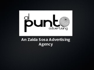
- 1. An Zaida Sosa Advertising Agency
- 2. Brand Name: Background The brand name is: Al Punto Advertising. We are a group of five former ex classmates. We started doing an ad campaign for the company Holsum of Puerto Rico Inc. and we won the account of this company competing with hundreds of students across the island, we started doing campaigns for nonprofit foundations and companies in which the target group was college students or (and) young professionals. Upon graduation, several of us moved to other countries but we are working virtually from multiple locations.
- 3. Brand Name: Strength The interesting thing about our brand (the name) is how fast the readers have an idea of what we do and what we do. Al Punto means in english: direct or to the point , and the idea of the name is to show future customers that our work goes directly to the target group that they wants and we warranty that.
- 4. Brand Name:USPTO Actually no agency related or otherwise has Al Punto Advertising registered. At the moment we are working on that,to have our agency registered as soon as possible.
- 5. Logo: The Law of Shape The logo our are company is very easy to read and understand and most important, easy to remember.
- 6. Logo: The Law of Shape The logo our are company is very easy to read and understand and most important, easy to remember.
- 7. Logo: The Law of Color The colors that we chose was Black & White.We decide to put this color in the logo because is a logo without a lot of graphics and don’t load of colors to be readable, even from far. Want a logo memorable to all.
- 8. Logo: The Law of Color The colors that we chose was Black & White.We decide to put this color in the logo because is a logo without a lot of graphics and don’t load of colors to be readable, even from far. Want a logo memorable to all.
- 9. Logo: Effectiveness The logo of our agency is very clear and define what were as company and what we do as advertising agency.
- 10. Logo: Competition De La Cruz Publicidad is and advertising agency too, as the same work that we do. As us, De La Cruz in the logo have the name of the company, the want too to be memorable. So they use the name trick in the logo.This is a very effective action.
- 11. Logo: Example The Walt Disney World logo is exactly what we say, is very easy to read and to understand. You can faster get the idea of what they are trying to sell.
- 12. Logo: Competition De La Cruz Publicidad is and advertising agency too, as the same work that we do. As us, De La Cruz in the logo have the name of the company, the want too to be memorable. So they use the name trick in the logo.This is a very effective action.
- 13. Logo: Al Punto Advertising Al Punto Advertising is a very simple logo to read and easy to understand. Its shows that for us as company (brand) is important that people remember our name.
- 14. Corporate Culture: Objectives We provide as agency: advertising campaigns services, we helps brands connect with they target group and meet the annual gross expectative s, and provide public relations services to our existing brands.
- 15. Mission Statements As a company we provide the latest and best team work of advertisers, marketers and public relations professionals for the best campaigns that clients ever had.
- 16. TAGLINE GOT AD?
- 17. Corporate Culture: Objectives We provide as agency: advertising campaigns services, we helps brands connect with they target group and meet the annual gross expectative s, and provide public relations services to our existing brands.