
Recomendados
Más contenido relacionado
La actualidad más candente
La actualidad más candente (20)
Más de 07bethsaun
Más de 07bethsaun (20)
Advert analysis
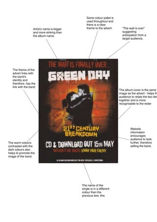
- 1. Artist’s name is bigger and more striking than the album name. Same colour pallet is used throughout and there is a clear theme to the advert. “The wait is over” suggesting anticipation from a target audience. The theme of the advert links with the band’s identity and therefore, has the link with the band The album cover is the same image as the advert - helps th audience to relate the two item together and is more recognisable to the wider Website information encourages audience to look further, therefore selling the band. The warm colours contrasted with the dark colours also helps to promote the image of the band. The name of the single is in a different colour than the previous text, this