SlideShare a Scribd company logo
1 of 49
 
When I started creating my Music Magazine, I started the format of my front cover. My friend model for my magazine so I wanted to use her on the front cover, contents and double page of my magazine. I took my main images in a studio and used a fan to make my model’s hair look wavy. After taking them I edited them to make sure they looked the best they could possibly look. When editing my image, I used the Magic Eraser Tool to get rid of my beige coloured background. The Magic Eraser Tool helped the background of my image look transparent. To my model’s hair look wavy and layered visually, I used the Eraser Tool to erase the beige background that was shown on the edges of my model’s hair. This made my image look better as it made my image look more original.
The Clone Stamp Tool, helped  clear the spots on my model’s face. Making sure her face looks radiant and clear. With her skin being clear, this helps focus your eyes even more on the bright pink dummy and the eye shadow above her eyelids and round her eyes.
To make my background for my music magazine, I had to make it in Photoshop first. By doing this I chose the colour of my background. I wanted the colour to be something different to white, so I decided to a pick a pale yellow beige colour, because I wanted the background to be different and original (compared to other music magazines). I then saved my design as PNG, so that I can use it as a background on the front cover of my music magazine in the software program of InDesign. The selling line  ' Music Magazine of the Century '  over exaggerates on how good the magazine is to the target audience/readers of the magazine . The masthead  ' Quality '  emphasises the quality of the magazine. The bold blueness of the masthead  goes with the theme of the model’s jumper. The main image of the artist is large, this is to represent that the main magazine issue is based on the model who is in the main image. The big bold texts, shows the main feature of the magazine issue, which is international superstar Lola Parmar ' .
When applying more text to my front cover, I changed the colour of my text because I wanted my magazine to have a colour theme to it. At the bottom of my front cover, I also have another feature in the colour of white. As you can see the ‘barcode’ matches the colour scheme of the feature at the bottom. On the left, you can see purple text with the words  ' Lola Parmar ' . I wanted to make my text more 3-D, so I experimented and right clicked into Effects and clicked Bevel and Emboss. This helped make my text look more 3-D.  Right-Click on Mouse I liked the effect of Bevel and Emboss so much, that I also used it for my masthead of my magazine  ' Quality ‘. The reason for this was that I wanted the masthead to look bold, big and 3-D. I also used Bevel and Emboss for the masthead of my double page spread article, so that it was clear to the readers who the main article was about.
When editing the images of my model, I made sure that every part of my model looked professional. One of the main things I edited on my image was the lips, teeth and skin. When doing this I used the Clone Stamp Tool. I found the Clone Stamp Tool easy to use since it got rid of spots and blemishes easily. It also helped produce straight teeth as you can see at the bottom of the bottom, my model didn’t have perfect teeth. So I used the Clone Stamp Tool, and as you can see, it worked perfectly on my model’s teeth. I also whitened my model’s teeth by highlighting it with  the Magnetic Lasso Tool. Then as you can see on the right  it shows how I whitened my model’s teeth. By going into Image, then Adjustments, then Variations.  When I arrived  in Variations, I clicked the  lightener in which they became whiter.
When editing my images, I always made sure that every part of the mage looked perfect, including the eyes of my model. Since my model hardly had any make up on, I used the Variations Tool on her and it made her eyes and used a lime/dark green/dark purple effect, so that it went with the theme in the double page spread article. As you can see on the left it shows the full image of what my model looks like with the edited work of the Variations Tool, in which my model looks like a true music artist
As you can see, it shows the development of my contents page and I how my contents page began and where it finished In the first image, it shows my model in a white background in which the image is on a pale yellow background, but I realised that it didn’t look right since the white and pale yellow were looking irregular, which leads in the second image.  I decided to take off the white background of my image, and leave the pale yellow background as it is. This too looked unusual, so I took off the pale yellow background so that my background was now white. With this, I thought it looked much better and more clear of what the audience was going to see in the contents page
On this slide, it shows the detailed lead up, to my double page spread article.  In the third and fourth image, it shows the development of the text and how the text was formed to have a glowing light shadow on it. In the first image, I had to go to Layout and Margins and Columns so that I could set the limit line, when setting up the background for my double page spread article, which links to the second image.
As I believed my music magazine wasn’t completely professional, I changed some parts of the front cover, contents page and double-page spread to make it look more professional and effective. In this case, I showed the construction of my new music magazine.
When changing my magazine ,I wanted to make sure that the ‘page numbers’ where in logical places in as they were extremely  important in a magazine (since they gave guidance to readers on where to find articles in a magazine). By making the page numbers the same, I changed the font to ‘Orator Std’ in which I also wanted the page numbers to be in the colour of turquoise, so that they didn’t differ what so ever. I have learnt a lot when doing this, as I have realised that music magazine constantly keep their ‘page number’ texts, continuous throughout their magazine issue.
When changing my magazine, I did change some parts of the front cover. The text you see above, had a slight change, as I changed the font to ‘Myriad Pro’. Although it may not seem like a big difference, I think ‘the smallest things can make the biggest difference”, in which I think the after image looks a lot better than the before image. As the ‘after’ image, looks a lot more realistic as part of the text for the front cover of my music magazine.
To make my magazine more appealing to the public and target audience. I wanted to give a short list of artists that are included in my Music Magazine. By doing this, the public and target audience are able to identify if they have any favouritism to the artists they see included in the magazine. Artists such as Cher Lloyd, One Direction, Katy Perry, Justin Bieber, Selena Gomez, The Wanted, Britney Spears and Olly Murs have all had a big impact to the music industry as they have either had Number 1 single in the UK, US or around the globe. As you can see, I kept with the palette theme on the front cover which is “Gold and Mid-Purple” so that it shows the continuous structure on the front cover of my magazine. I am pleased that I included this, on the front cover of my magazine.
When looking at the contents page of my magazine. I started to realise that my text was too big, in which I lowered down the detailed information for my contents page (the features) to a size 10pt and I also lowered the headings for my detailed information (headings for the featured information) to a size 18pt. This added a huge effect to my contents page, as I was able to include more featured information in my contents page, in addition to me being able to add another feature which was ‘Competitions & Extras’ which helped vary the opportunities for readers. Such as winning prizes, seeing all the teen celeb gossip and more.
As the previous slide showed me changing the size of the text in my contents page, I also changed the font of my text to ‘Calibri’ as it looked more effective and professional for my contents page. As seen above, it shows me highlighting the information of the ‘features’ and the ‘feature headlines’, as I changed both of these fonts.  I think changing the font of my text, has improved the look of my contents page at the moment and making the size smaller has made it more realistic and accessible for readers, to read it more clearer.
When I changed the size and the font of my text, I also changed the layout of it too. As you can see the ‘old version’ of the layout for my contents page (left), couldn’t been more detailed and it also couldn’t filled out the edges of the page. In this case, I re-organised the layout of my text so that it looked more appealing for readers, and also to make sure that I more proud of it. The ‘new version’ of the layout of my contents page (right) is much more definite than the ‘old version’ as it looks more presentable and its something you’d usually see in an everyday music magazine. Also when changing my layout, I took out the diamonds between the word ‘Features’ as I thought that it was quite over exaggerated as there didn’t need to be diamonds in between each letter of the word, so by making it more simple it added more of an effect. Differences NEW VERSION!
I used the ‘Line Tool’ to add a green out line to the word ‘www.guality-mag.co.uk, as I wanted it to look neat and not like it was there for a random reason I also thought that the diamonds between the words ‘Contents’ were also over exaggerated so I took out the diamonds in which I thought the word ‘Contents’ looked a lot better as it seemed more clear of it being the contents page and it didn’t look as random, as before. Also I added ‘www.quality-mag.co.uk’ in the left hand corner of my contents page. The reason I did this
I highlighted the word ‘Contents’ and added an effect to it In which I added an effect called ‘Bevel and Emboss’ which made my text look quite 3-D and effective. Even though this may have been a risk (as a lot of music magazines don’t make their text quite 3-D,) it was a risk I was willing to take   The ‘Bevel and Emboss’ effect is really good, as I used for my front cover when doing the text for ‘Quality’. I think by doing this instead of keeping the diamonds between the letters, it makes it look more eye-catching as you wouldn’t normally see the words ‘Contents’ in a 3-Dimensional effect
I changed the colour of the text ‘www.quality-mag.co.uk’ from green to red as I thought, since the magazine issue was the ‘Winter Issue’ red was more of a colour that was suitable for  Winter/Christmas time, than green. The format that helped me change the colour of my text
To more of an effect to my contents page I added the same effect to my ‘www.quality-mag.co.uk, except I added something extra  which was ‘Winter Issue 2010’ (as you can see below) I also did this text in red, in which I also did the sub-headings (titles of the featured articles) in red, as I wanted a new palette theme (colour theme) for my contents page
I changed the colour of each of the ‘www.quality-mag.co.uk’ text, as I wanted create a colour for them
I wanted to experiment with the changing of my music magazine, so I looked at using a transparent, coloured box, in which I though it looked quite nice.
I started to add more information to my contents page, in which I included a Competitions & Extras section. I gradually started to add information to the new section within the contents page
I started to do, more experimenting with the front cover of my music magazine, in which I liked it. I put a white background behind the strip of “Music Magazine of the Century” which I though looked quite effective I also  re-arranged some of the features on my front cover (by making them smaller and adding more information).
For the bottom strip of my music magazine, I changed the text as my original text had featured the words “Kanye West”. I started to realise that this didn’t ultimately make sense as Kanye West was a hip-hop artist. So I changed it to something more appealing and exciting. As you can see I included the new UK boy band “One Direction” who have attracted massive fanbase. So by including them in my magazine can gain attraction for the audience to look at my magazine.
To make sure that the colour palette on my front cover, were exactly the same. I made sure that the numbers were all correct in the “RGB Colour Space View)
The better version of my front cover. I must say that I’m very proud with the new version of my front cover as it looks a lot more attractive
When adding a new image to my contents page, I had to edit it first in ‘Adobe Photoshop CS3 Extended’ first. With the editing, I airbrushed my model’s face just to make sure that she looked fresh and flawless in the image.  This usage of airbrushing, is mainly used in a lot of professional magazines as magazine institutions make sure that their model has flawless skin, in which they are spotless.
To remove the background in the image, I used the ‘Background Eraser’ tool where it instantly removed the background. And I also used the ‘Eraser’ tool to make sure that the little bits that weren’t fully erased with the background were removed instantly. To make sure that my model’s skin did not have any spots.  I used the ‘Spot Healer’ tool in which it smoothed out my artists face.
As there was small shadow under my model’s armpit (not sweat), I used the ‘Variations...’ tool to cover this up, in which it worked quite well
When adding another a new image to my contents page, I also edited it first in ‘Adobe Photoshop CS3 Extended’ first. With the editing, I airbrushed my model’s face just to make sure that he looked fresh and flawless in the image. Although it didn’t take very long as my model had clear skin.
After editing my image, I wanted to change the colour of my model’s polo shirt, as it was black and it didn’t really fit with the content of pop. By making the shirt have a more ‘Pop’ effect to it, I used the ‘Variations...’ tool once again. I made the polo shirt look more colourful and ‘Pop’ as I changed the colour to a more turquoise colour. Although a colour for ‘Pop’ is a lot brighter, I did try to make the colour of the shirt a lot brighter, but it didn’t satisfy my liking as it didn’t look realistic to me.
To remove the background in the image, I used the ‘Background Eraser’ tool where it instantly removed the background. And I also used the ‘Eraser’ tool to make sure that the little bits that weren’t fully erased with the background were removed instantly. I didn’t previously with other images.
Here is an example of the erasing that I did with my image. As you can identify, I did this erasing near my model’s hair as there were a lot of sections that needed clearing-up as it didn’t look professional, in which I though it looked  a lot better afterwards.
Here is the official and second image for my contents page. Although I may realise that the shape of my model’s head may look a bit deformed, I am still really pleased with this image. It looks professional, in which my model looks professional (and looks like he’s doing a skincare advert).
After I finished editing my images and making them look professional, I put them on my contents page. I put my second finished image of my male model on my contents page. I did this by creating a new layer and going into ‘File’ then ‘Place’. My image then came up on my contents page, so I added a box around it, so that the image was boxed and look realistic for the reader.
When putting my other image on my contents page, I also had to go into ‘File’ and then into ‘Place’ for it come to up on my contents page. I also put a green box around this image, so that it could match the other image. I then added the page numbers in the boxed images so that the readers were able to indentify what the artist already look like (by seeing an image of them) and so that it would be a shortcut for them, to identify what page features that artist.
After putting the images and the numbers in the boxed images, I added some text at the bottom of the contents page which was “FIND OUT WHICH MUSIC STAR WILL BE ON THE COVER OF THE NEXT MAGAZINE ISSUE”. The reason why I did this, was to excite the readers about the next magazine issue and also to leave them guessing on “Who would be on the cover in the next magazine issue?”.
As the title of my double page article ‘Lola Parmar’ had quite a lot of space at the sides, I decided to fill it up with ‘kiss lips’. The reason why I decided to do ‘kiss lips’ was because I thought it would be appropriate as Lola is a girl in which she can be portrayal a feminine approach to the readers, reading the article.  When changing the colour of the ‘kiss lips’ I edited the lips in Adobe Photoshop CS5 Extended (as the software was updated) in which I used the ‘Variations...’ tool to make the lips bright pink colour. The reason why I chose bright pink, was because I wanted the lips to match the colour of Lola’s lips, in which they’re also bright pink.
After editing the ‘kiss lips’ I put them on my double-page article ‘title’. As you can see below I put the lips near the letter ‘L’ in which I put the size of  it quite big. I put another pair of ‘kiss lips’ on the other side of my double-page spread article, but I made the  size of the lips a lot smaller as there wasn’t  enough space to make them bigger. However, with the smaller lips I alternated them so that they  weren’t symmetrical to the other pair of lips.
Although I was pleased with my front cover and double-page spread article, I wasn’t completely convinced that my contents page looked professional. In this case, I changed my contents page again in which I felt evidently pleased with the results. The following slides, show the construction of the new version of my contents page.
When changing my contents page...again, I used a different image for my (female) model. The reason why I did this was because, I wanted to show more of what my artist look like, so I used a different image that I took of my model and edited that instead. When it came to editing, I decided not to erase the background, as from research I noticed some magazines kept in the backdrop they used to take images of their model/music artist. So in this case, I only airbrushed my model, but I only did a little bit of airbrushing, so that it wouldn’t make my model look plastic.  You may not be able to tell the differences between the two images above, as they look slightly similar.
Back on my contents page, I decided to put my article features, all to the right of the page in which I also decided to box them.  In this case, I decided to take out the green box in the image of my (male) model, in which I enlarged the image so that it filled up the left side of the page. I know this was a risk, as you don’t usually see this in a music magazine but I wanted to make my magazine look unique and different.
When changing the layout of my contents page, I changed the colour of the text in which I did a lot of detailed work on it (as you may see when looking at the finished product). As you can see above it shows the changing of the coloured text.
When changing my contents page, I also changed the title ‘Contents’ to ‘This Week...’. The reason why I did this was because, ‘This Week...’ seemed more logical of words, as it was a music magazine and not a lot of music magazines have the words “Contents”. They tend to have the words “In this issue”, “This Week” and many more. I changed the font of the text to ‘Baskerville Old Face’ in which I though it looked a lot better. Although its not seen, I changed the colour of the text to a goldish-yellow colour, as I wanted it to standout, compared to the rest of the other texts.
When placing the image of my (female) model on my contents page, I decided to put a border around it, as I wanted it to look different. When doing this, I also altered the image, so that it didn’t look dead or boring. I think by doing this it made my contents page look at a lot pleasing, in my opinion. After doing that, I added the page number to the image (so that it can demonstrate the idea of readers knowing which artist is on what page. I did the colour of the text in red, to match the border.
To add to the space of my contents page, I put the editors comments in the space, in which I thought it looked extremely professional. I put the colour to a pale red (except I made the word ‘Quality’ stand out in the colour of blue. I also changed the handwriting of the text to Arno Pro
As you can see, I did a lot more work to my contents page. I boxed my editors comments, boxed and colour the text “This Week...”, I also boxed and coloured the features on my left and I also boxed my image of my (male) model in which I also put the page number in the right hand corner. I can now say, that I’m extremely please with my contents page for my music magazine.
 

More Related Content

What's hot

DPS Links to Cover/Contents
DPS Links to Cover/ContentsDPS Links to Cover/Contents
DPS Links to Cover/Contentshibah24
 
Magazine Drafts
Magazine DraftsMagazine Drafts
Magazine Draftsliv1308
 
Text and features
Text and featuresText and features
Text and featureszoya167
 
Quetion 1 evaluation
Quetion 1 evaluationQuetion 1 evaluation
Quetion 1 evaluationKatierodway72
 
Choices Made When Creating my Music Magazine
Choices Made When Creating my Music MagazineChoices Made When Creating my Music Magazine
Choices Made When Creating my Music Magazinekhalfyard
 
Progress of my magazine product
Progress of my magazine productProgress of my magazine product
Progress of my magazine productbasicallytricia
 
Presentation 2
Presentation 2Presentation 2
Presentation 2ben_97
 
Creation of my Double Page Spread
Creation of my Double Page SpreadCreation of my Double Page Spread
Creation of my Double Page Spreadbluebirdsyd
 
Step by step of how i created my magazine
Step by step of how i created my magazineStep by step of how i created my magazine
Step by step of how i created my magazineasmediaf12
 
My evaluation question 1
My evaluation question 1 My evaluation question 1
My evaluation question 1 Emilia Angove
 
Magazine pre pro uploaded
Magazine pre pro uploadedMagazine pre pro uploaded
Magazine pre pro uploadedtaliasmith
 
UNIT 31/14 FINAL MAGAZINE ANALYSIS
UNIT 31/14 FINAL MAGAZINE ANALYSISUNIT 31/14 FINAL MAGAZINE ANALYSIS
UNIT 31/14 FINAL MAGAZINE ANALYSIScr4msey98
 
Cover layout and photoshop
Cover layout and photoshopCover layout and photoshop
Cover layout and photoshopzoya167
 
In what ways does your media product use
In what ways does your media product useIn what ways does your media product use
In what ways does your media product useellenronan
 
Q1. In what ways does your media product use, develop or challenge forms and ...
Q1. In what ways does your media product use, develop or challenge forms and ...Q1. In what ways does your media product use, develop or challenge forms and ...
Q1. In what ways does your media product use, develop or challenge forms and ...wallflowersssss
 
Q1 In what ways does your media product use, develop or challenge forms and c...
Q1 In what ways does your media product use, develop or challenge forms and c...Q1 In what ways does your media product use, develop or challenge forms and c...
Q1 In what ways does your media product use, develop or challenge forms and c...wallflowersssss
 

What's hot (19)

DPS Links to Cover/Contents
DPS Links to Cover/ContentsDPS Links to Cover/Contents
DPS Links to Cover/Contents
 
Magazine Drafts
Magazine DraftsMagazine Drafts
Magazine Drafts
 
Text and features
Text and featuresText and features
Text and features
 
Quetion 1 evaluation
Quetion 1 evaluationQuetion 1 evaluation
Quetion 1 evaluation
 
Choices Made When Creating my Music Magazine
Choices Made When Creating my Music MagazineChoices Made When Creating my Music Magazine
Choices Made When Creating my Music Magazine
 
Progress of my magazine product
Progress of my magazine productProgress of my magazine product
Progress of my magazine product
 
Presentation 2
Presentation 2Presentation 2
Presentation 2
 
Creation of my Double Page Spread
Creation of my Double Page SpreadCreation of my Double Page Spread
Creation of my Double Page Spread
 
Step by step of how i created my magazine
Step by step of how i created my magazineStep by step of how i created my magazine
Step by step of how i created my magazine
 
My evaluation question 1
My evaluation question 1 My evaluation question 1
My evaluation question 1
 
Magazine pre pro uploaded
Magazine pre pro uploadedMagazine pre pro uploaded
Magazine pre pro uploaded
 
UNIT 31/14 FINAL MAGAZINE ANALYSIS
UNIT 31/14 FINAL MAGAZINE ANALYSISUNIT 31/14 FINAL MAGAZINE ANALYSIS
UNIT 31/14 FINAL MAGAZINE ANALYSIS
 
Cover layout and photoshop
Cover layout and photoshopCover layout and photoshop
Cover layout and photoshop
 
In what ways does your media product use
In what ways does your media product useIn what ways does your media product use
In what ways does your media product use
 
Q1. In what ways does your media product use, develop or challenge forms and ...
Q1. In what ways does your media product use, develop or challenge forms and ...Q1. In what ways does your media product use, develop or challenge forms and ...
Q1. In what ways does your media product use, develop or challenge forms and ...
 
Q1 In what ways does your media product use, develop or challenge forms and c...
Q1 In what ways does your media product use, develop or challenge forms and c...Q1 In what ways does your media product use, develop or challenge forms and c...
Q1 In what ways does your media product use, develop or challenge forms and c...
 
Overall Evaluation
Overall EvaluationOverall Evaluation
Overall Evaluation
 
Construction
ConstructionConstruction
Construction
 
7
77
7
 

Viewers also liked

Bulimia Eve Y Lali
Bulimia Eve Y LaliBulimia Eve Y Lali
Bulimia Eve Y Lalievelau
 
Proyecto de Norma Foral de medidas fiscales contra el fraud fiscal 2013
Proyecto de Norma Foral de medidas fiscales contra el fraud fiscal  2013Proyecto de Norma Foral de medidas fiscales contra el fraud fiscal  2013
Proyecto de Norma Foral de medidas fiscales contra el fraud fiscal 2013CIALT
 
Que me debo de retirar antes de entrar a una cirugía
Que me debo de retirar antes de entrar a una cirugía Que me debo de retirar antes de entrar a una cirugía
Que me debo de retirar antes de entrar a una cirugía imssnotas1943
 
Visit mount songshan (嵩山攬勝)
Visit mount songshan (嵩山攬勝)Visit mount songshan (嵩山攬勝)
Visit mount songshan (嵩山攬勝)Chung Yen Chang
 
Educação Financeira1
Educação Financeira1Educação Financeira1
Educação Financeira1oleinik
 
fichas CONOCIMIENTO DE MI MISMO
 fichas CONOCIMIENTO DE MI MISMO fichas CONOCIMIENTO DE MI MISMO
fichas CONOCIMIENTO DE MI MISMOMarta Montoro
 
Provision of Online Education Programs
Provision of Online Education ProgramsProvision of Online Education Programs
Provision of Online Education ProgramsMorten Flate Paulsen
 
Técnicas e didática para a educação cidadã
Técnicas e didática para a educação cidadãTécnicas e didática para a educação cidadã
Técnicas e didática para a educação cidadãjovemsenador
 
Exercicios sobre Colisões e Sistema de Massa Variavel
Exercicios sobre Colisões e Sistema de Massa VariavelExercicios sobre Colisões e Sistema de Massa Variavel
Exercicios sobre Colisões e Sistema de Massa VariavelMaitsudá Matos
 
FEH Frente Ecologia e Humanismo Programa Eleitoral Eleição Deputados à ...
FEH   Frente Ecologia e Humanismo   Programa Eleitoral   Eleição Deputados à ...FEH   Frente Ecologia e Humanismo   Programa Eleitoral   Eleição Deputados à ...
FEH Frente Ecologia e Humanismo Programa Eleitoral Eleição Deputados à ...Partido da Terra - MPT
 
La importancia del ayuno antes de una cirugía o aplicación de anestesia.
La importancia del ayuno antes de una cirugía o aplicación de anestesia.La importancia del ayuno antes de una cirugía o aplicación de anestesia.
La importancia del ayuno antes de una cirugía o aplicación de anestesia.imssnotas1943
 

Viewers also liked (20)

Bulimia Eve Y Lali
Bulimia Eve Y LaliBulimia Eve Y Lali
Bulimia Eve Y Lali
 
Emerce eRetail 2012
Emerce eRetail 2012Emerce eRetail 2012
Emerce eRetail 2012
 
Diversificación y Unificación
Diversificación y UnificaciónDiversificación y Unificación
Diversificación y Unificación
 
aaaa
aaaaaaaa
aaaa
 
Proyecto de Norma Foral de medidas fiscales contra el fraud fiscal 2013
Proyecto de Norma Foral de medidas fiscales contra el fraud fiscal  2013Proyecto de Norma Foral de medidas fiscales contra el fraud fiscal  2013
Proyecto de Norma Foral de medidas fiscales contra el fraud fiscal 2013
 
Aircrak (Ubuntu)
Aircrak (Ubuntu)Aircrak (Ubuntu)
Aircrak (Ubuntu)
 
Que me debo de retirar antes de entrar a una cirugía
Que me debo de retirar antes de entrar a una cirugía Que me debo de retirar antes de entrar a una cirugía
Que me debo de retirar antes de entrar a una cirugía
 
Lista escolas que serão reformadas
Lista escolas que serão reformadasLista escolas que serão reformadas
Lista escolas que serão reformadas
 
Conceitos redes
Conceitos redesConceitos redes
Conceitos redes
 
Visit mount songshan (嵩山攬勝)
Visit mount songshan (嵩山攬勝)Visit mount songshan (嵩山攬勝)
Visit mount songshan (嵩山攬勝)
 
Educação Financeira1
Educação Financeira1Educação Financeira1
Educação Financeira1
 
fichas CONOCIMIENTO DE MI MISMO
 fichas CONOCIMIENTO DE MI MISMO fichas CONOCIMIENTO DE MI MISMO
fichas CONOCIMIENTO DE MI MISMO
 
Provision of Online Education Programs
Provision of Online Education ProgramsProvision of Online Education Programs
Provision of Online Education Programs
 
Radiacio nweb
Radiacio nwebRadiacio nweb
Radiacio nweb
 
Técnicas e didática para a educação cidadã
Técnicas e didática para a educação cidadãTécnicas e didática para a educação cidadã
Técnicas e didática para a educação cidadã
 
Exercicios sobre Colisões e Sistema de Massa Variavel
Exercicios sobre Colisões e Sistema de Massa VariavelExercicios sobre Colisões e Sistema de Massa Variavel
Exercicios sobre Colisões e Sistema de Massa Variavel
 
Tema 4 procesos
Tema 4 procesosTema 4 procesos
Tema 4 procesos
 
FEH Frente Ecologia e Humanismo Programa Eleitoral Eleição Deputados à ...
FEH   Frente Ecologia e Humanismo   Programa Eleitoral   Eleição Deputados à ...FEH   Frente Ecologia e Humanismo   Programa Eleitoral   Eleição Deputados à ...
FEH Frente Ecologia e Humanismo Programa Eleitoral Eleição Deputados à ...
 
Transformada de Derivadas
Transformada de DerivadasTransformada de Derivadas
Transformada de Derivadas
 
La importancia del ayuno antes de una cirugía o aplicación de anestesia.
La importancia del ayuno antes de una cirugía o aplicación de anestesia.La importancia del ayuno antes de una cirugía o aplicación de anestesia.
La importancia del ayuno antes de una cirugía o aplicación de anestesia.
 

Similar to Music Magazine Construction

Music Magazine Construction
Music Magazine ConstructionMusic Magazine Construction
Music Magazine ConstructionKhalid
 
Sophie Angus Unit 30 LO5
Sophie Angus Unit 30 LO5Sophie Angus Unit 30 LO5
Sophie Angus Unit 30 LO5sangus7
 
Construction of front cover magazine page
Construction of front cover magazine pageConstruction of front cover magazine page
Construction of front cover magazine pagechristine65
 
Prelim to Music Magazine
Prelim to Music MagazinePrelim to Music Magazine
Prelim to Music MagazineSuzyQuinn13
 
Construction of magazine
Construction of magazine Construction of magazine
Construction of magazine Lyndan Trenholm
 
Construction of magazine
Construction of magazine Construction of magazine
Construction of magazine Lyndan Trenholm
 
College magazine evaluation
College magazine evaluationCollege magazine evaluation
College magazine evaluationrebeccabailey1
 
Development page 1 draft one
Development page 1 draft oneDevelopment page 1 draft one
Development page 1 draft oneThomas Griffiths
 
Music Magazine evaluation
Music Magazine evaluationMusic Magazine evaluation
Music Magazine evaluationvinaykilaire652
 
Evaluation question 1
Evaluation question 1Evaluation question 1
Evaluation question 1shofialamin
 
Evaluation question 1
Evaluation question 1Evaluation question 1
Evaluation question 1shofialamin
 
Evaluation question 1
Evaluation question 1Evaluation question 1
Evaluation question 1shofialamin
 
Contents page
Contents pageContents page
Contents page07hhalim1
 
Magazine and Print Evaluation
Magazine and Print EvaluationMagazine and Print Evaluation
Magazine and Print EvaluationThomas Haase
 
AS Media Studies Foundation Portfolio
AS Media Studies Foundation PortfolioAS Media Studies Foundation Portfolio
AS Media Studies Foundation Portfolioimarieyer
 

Similar to Music Magazine Construction (20)

Music Magazine Construction
Music Magazine ConstructionMusic Magazine Construction
Music Magazine Construction
 
Sophie Angus Unit 30 LO5
Sophie Angus Unit 30 LO5Sophie Angus Unit 30 LO5
Sophie Angus Unit 30 LO5
 
Question 1
Question 1Question 1
Question 1
 
Construction of front cover magazine page
Construction of front cover magazine pageConstruction of front cover magazine page
Construction of front cover magazine page
 
Prelim to Music Magazine
Prelim to Music MagazinePrelim to Music Magazine
Prelim to Music Magazine
 
Construction of magazine
Construction of magazine Construction of magazine
Construction of magazine
 
Construction of magazine
Construction of magazine Construction of magazine
Construction of magazine
 
Preliminary task
Preliminary taskPreliminary task
Preliminary task
 
College magazine evaluation
College magazine evaluationCollege magazine evaluation
College magazine evaluation
 
Development page 1 draft one
Development page 1 draft oneDevelopment page 1 draft one
Development page 1 draft one
 
Question 7
Question 7Question 7
Question 7
 
Music Magazine evaluation
Music Magazine evaluationMusic Magazine evaluation
Music Magazine evaluation
 
Evaluation question 1
Evaluation question 1Evaluation question 1
Evaluation question 1
 
Evaluation question 1
Evaluation question 1Evaluation question 1
Evaluation question 1
 
Evaluation question 1
Evaluation question 1Evaluation question 1
Evaluation question 1
 
Contents page
Contents pageContents page
Contents page
 
Magazine and Print Evaluation
Magazine and Print EvaluationMagazine and Print Evaluation
Magazine and Print Evaluation
 
AS Media Studies Foundation Portfolio
AS Media Studies Foundation PortfolioAS Media Studies Foundation Portfolio
AS Media Studies Foundation Portfolio
 
Evaluation new
Evaluation newEvaluation new
Evaluation new
 
Evaluation (4)
Evaluation (4)Evaluation (4)
Evaluation (4)
 

More from Khalid

Camera Shots, Angles and Movement
Camera Shots, Angles and MovementCamera Shots, Angles and Movement
Camera Shots, Angles and MovementKhalid
 
A2 Media: The Evaluation
A2 Media: The EvaluationA2 Media: The Evaluation
A2 Media: The EvaluationKhalid
 
Album Cover Construction
Album Cover ConstructionAlbum Cover Construction
Album Cover ConstructionKhalid
 
Music Video Construction
Music Video ConstructionMusic Video Construction
Music Video ConstructionKhalid
 
Promotional Posters Analysis
Promotional Posters AnalysisPromotional Posters Analysis
Promotional Posters AnalysisKhalid
 
Album Cover Preview/Draft
Album Cover Preview/DraftAlbum Cover Preview/Draft
Album Cover Preview/DraftKhalid
 
Handwriting Trials
Handwriting Trials Handwriting Trials
Handwriting Trials Khalid
 
Influential Pop Artists
Influential Pop ArtistsInfluential Pop Artists
Influential Pop ArtistsKhalid
 
Album Cover Analysis
Album Cover AnalysisAlbum Cover Analysis
Album Cover AnalysisKhalid
 
Music Video Questionnaire Results
Music Video Questionnaire ResultsMusic Video Questionnaire Results
Music Video Questionnaire ResultsKhalid
 
Music Video Analysis
Music Video AnalysisMusic Video Analysis
Music Video AnalysisKhalid
 
Codes & Conventions For A Music Video
Codes & Conventions For A Music VideoCodes & Conventions For A Music Video
Codes & Conventions For A Music VideoKhalid
 
Equipment Used
Equipment UsedEquipment Used
Equipment UsedKhalid
 
Editing Techniques In A Music Video
Editing Techniques In A Music VideoEditing Techniques In A Music Video
Editing Techniques In A Music VideoKhalid
 
Music Magazine Evaluation
Music Magazine Evaluation Music Magazine Evaluation
Music Magazine Evaluation Khalid
 
Promotional Poster Construction
 Promotional Poster Construction Promotional Poster Construction
Promotional Poster ConstructionKhalid
 
Codes & Conventions For A Music Video
Codes & Conventions For A Music VideoCodes & Conventions For A Music Video
Codes & Conventions For A Music VideoKhalid
 
Music Video Institutions
Music Video InstitutionsMusic Video Institutions
Music Video InstitutionsKhalid
 
Images For School Magazine
Images For School MagazineImages For School Magazine
Images For School MagazineKhalid
 
Images for my School Magazine
Images for my School MagazineImages for my School Magazine
Images for my School MagazineKhalid
 

More from Khalid (20)

Camera Shots, Angles and Movement
Camera Shots, Angles and MovementCamera Shots, Angles and Movement
Camera Shots, Angles and Movement
 
A2 Media: The Evaluation
A2 Media: The EvaluationA2 Media: The Evaluation
A2 Media: The Evaluation
 
Album Cover Construction
Album Cover ConstructionAlbum Cover Construction
Album Cover Construction
 
Music Video Construction
Music Video ConstructionMusic Video Construction
Music Video Construction
 
Promotional Posters Analysis
Promotional Posters AnalysisPromotional Posters Analysis
Promotional Posters Analysis
 
Album Cover Preview/Draft
Album Cover Preview/DraftAlbum Cover Preview/Draft
Album Cover Preview/Draft
 
Handwriting Trials
Handwriting Trials Handwriting Trials
Handwriting Trials
 
Influential Pop Artists
Influential Pop ArtistsInfluential Pop Artists
Influential Pop Artists
 
Album Cover Analysis
Album Cover AnalysisAlbum Cover Analysis
Album Cover Analysis
 
Music Video Questionnaire Results
Music Video Questionnaire ResultsMusic Video Questionnaire Results
Music Video Questionnaire Results
 
Music Video Analysis
Music Video AnalysisMusic Video Analysis
Music Video Analysis
 
Codes & Conventions For A Music Video
Codes & Conventions For A Music VideoCodes & Conventions For A Music Video
Codes & Conventions For A Music Video
 
Equipment Used
Equipment UsedEquipment Used
Equipment Used
 
Editing Techniques In A Music Video
Editing Techniques In A Music VideoEditing Techniques In A Music Video
Editing Techniques In A Music Video
 
Music Magazine Evaluation
Music Magazine Evaluation Music Magazine Evaluation
Music Magazine Evaluation
 
Promotional Poster Construction
 Promotional Poster Construction Promotional Poster Construction
Promotional Poster Construction
 
Codes & Conventions For A Music Video
Codes & Conventions For A Music VideoCodes & Conventions For A Music Video
Codes & Conventions For A Music Video
 
Music Video Institutions
Music Video InstitutionsMusic Video Institutions
Music Video Institutions
 
Images For School Magazine
Images For School MagazineImages For School Magazine
Images For School Magazine
 
Images for my School Magazine
Images for my School MagazineImages for my School Magazine
Images for my School Magazine
 

Recently uploaded

Rohan Jaitley: Central Gov't Standing Counsel for Justice
Rohan Jaitley: Central Gov't Standing Counsel for JusticeRohan Jaitley: Central Gov't Standing Counsel for Justice
Rohan Jaitley: Central Gov't Standing Counsel for JusticeAbdulGhani778830
 
IndiaWest: Your Trusted Source for Today's Global News
IndiaWest: Your Trusted Source for Today's Global NewsIndiaWest: Your Trusted Source for Today's Global News
IndiaWest: Your Trusted Source for Today's Global NewsIndiaWest2
 
15042024_First India Newspaper Jaipur.pdf
15042024_First India Newspaper Jaipur.pdf15042024_First India Newspaper Jaipur.pdf
15042024_First India Newspaper Jaipur.pdfFIRST INDIA
 
Global Terrorism and its types and prevention ppt.
Global Terrorism and its types and prevention ppt.Global Terrorism and its types and prevention ppt.
Global Terrorism and its types and prevention ppt.NaveedKhaskheli1
 
57 Bidens Annihilation Nation Policy.pdf
57 Bidens Annihilation Nation Policy.pdf57 Bidens Annihilation Nation Policy.pdf
57 Bidens Annihilation Nation Policy.pdfGerald Furnkranz
 
Experience the Future of the Web3 Gaming Trend
Experience the Future of the Web3 Gaming TrendExperience the Future of the Web3 Gaming Trend
Experience the Future of the Web3 Gaming TrendFabwelt
 
16042024_First India Newspaper Jaipur.pdf
16042024_First India Newspaper Jaipur.pdf16042024_First India Newspaper Jaipur.pdf
16042024_First India Newspaper Jaipur.pdfFIRST INDIA
 
complaint-ECI-PM-media-1-Chandru.pdfra;;prfk
complaint-ECI-PM-media-1-Chandru.pdfra;;prfkcomplaint-ECI-PM-media-1-Chandru.pdfra;;prfk
complaint-ECI-PM-media-1-Chandru.pdfra;;prfkbhavenpr
 

Recently uploaded (8)

Rohan Jaitley: Central Gov't Standing Counsel for Justice
Rohan Jaitley: Central Gov't Standing Counsel for JusticeRohan Jaitley: Central Gov't Standing Counsel for Justice
Rohan Jaitley: Central Gov't Standing Counsel for Justice
 
IndiaWest: Your Trusted Source for Today's Global News
IndiaWest: Your Trusted Source for Today's Global NewsIndiaWest: Your Trusted Source for Today's Global News
IndiaWest: Your Trusted Source for Today's Global News
 
15042024_First India Newspaper Jaipur.pdf
15042024_First India Newspaper Jaipur.pdf15042024_First India Newspaper Jaipur.pdf
15042024_First India Newspaper Jaipur.pdf
 
Global Terrorism and its types and prevention ppt.
Global Terrorism and its types and prevention ppt.Global Terrorism and its types and prevention ppt.
Global Terrorism and its types and prevention ppt.
 
57 Bidens Annihilation Nation Policy.pdf
57 Bidens Annihilation Nation Policy.pdf57 Bidens Annihilation Nation Policy.pdf
57 Bidens Annihilation Nation Policy.pdf
 
Experience the Future of the Web3 Gaming Trend
Experience the Future of the Web3 Gaming TrendExperience the Future of the Web3 Gaming Trend
Experience the Future of the Web3 Gaming Trend
 
16042024_First India Newspaper Jaipur.pdf
16042024_First India Newspaper Jaipur.pdf16042024_First India Newspaper Jaipur.pdf
16042024_First India Newspaper Jaipur.pdf
 
complaint-ECI-PM-media-1-Chandru.pdfra;;prfk
complaint-ECI-PM-media-1-Chandru.pdfra;;prfkcomplaint-ECI-PM-media-1-Chandru.pdfra;;prfk
complaint-ECI-PM-media-1-Chandru.pdfra;;prfk
 

Music Magazine Construction

  • 1.  
  • 2. When I started creating my Music Magazine, I started the format of my front cover. My friend model for my magazine so I wanted to use her on the front cover, contents and double page of my magazine. I took my main images in a studio and used a fan to make my model’s hair look wavy. After taking them I edited them to make sure they looked the best they could possibly look. When editing my image, I used the Magic Eraser Tool to get rid of my beige coloured background. The Magic Eraser Tool helped the background of my image look transparent. To my model’s hair look wavy and layered visually, I used the Eraser Tool to erase the beige background that was shown on the edges of my model’s hair. This made my image look better as it made my image look more original.
  • 3. The Clone Stamp Tool, helped clear the spots on my model’s face. Making sure her face looks radiant and clear. With her skin being clear, this helps focus your eyes even more on the bright pink dummy and the eye shadow above her eyelids and round her eyes.
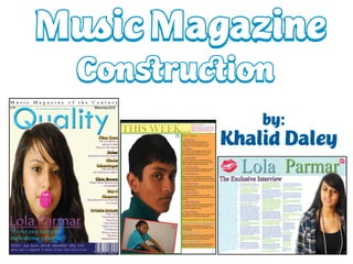
  • 4. To make my background for my music magazine, I had to make it in Photoshop first. By doing this I chose the colour of my background. I wanted the colour to be something different to white, so I decided to a pick a pale yellow beige colour, because I wanted the background to be different and original (compared to other music magazines). I then saved my design as PNG, so that I can use it as a background on the front cover of my music magazine in the software program of InDesign. The selling line ' Music Magazine of the Century ' over exaggerates on how good the magazine is to the target audience/readers of the magazine . The masthead ' Quality ' emphasises the quality of the magazine. The bold blueness of the masthead goes with the theme of the model’s jumper. The main image of the artist is large, this is to represent that the main magazine issue is based on the model who is in the main image. The big bold texts, shows the main feature of the magazine issue, which is international superstar Lola Parmar ' .
  • 5. When applying more text to my front cover, I changed the colour of my text because I wanted my magazine to have a colour theme to it. At the bottom of my front cover, I also have another feature in the colour of white. As you can see the ‘barcode’ matches the colour scheme of the feature at the bottom. On the left, you can see purple text with the words ' Lola Parmar ' . I wanted to make my text more 3-D, so I experimented and right clicked into Effects and clicked Bevel and Emboss. This helped make my text look more 3-D. Right-Click on Mouse I liked the effect of Bevel and Emboss so much, that I also used it for my masthead of my magazine ' Quality ‘. The reason for this was that I wanted the masthead to look bold, big and 3-D. I also used Bevel and Emboss for the masthead of my double page spread article, so that it was clear to the readers who the main article was about.
  • 6. When editing the images of my model, I made sure that every part of my model looked professional. One of the main things I edited on my image was the lips, teeth and skin. When doing this I used the Clone Stamp Tool. I found the Clone Stamp Tool easy to use since it got rid of spots and blemishes easily. It also helped produce straight teeth as you can see at the bottom of the bottom, my model didn’t have perfect teeth. So I used the Clone Stamp Tool, and as you can see, it worked perfectly on my model’s teeth. I also whitened my model’s teeth by highlighting it with the Magnetic Lasso Tool. Then as you can see on the right it shows how I whitened my model’s teeth. By going into Image, then Adjustments, then Variations. When I arrived in Variations, I clicked the lightener in which they became whiter.
  • 7. When editing my images, I always made sure that every part of the mage looked perfect, including the eyes of my model. Since my model hardly had any make up on, I used the Variations Tool on her and it made her eyes and used a lime/dark green/dark purple effect, so that it went with the theme in the double page spread article. As you can see on the left it shows the full image of what my model looks like with the edited work of the Variations Tool, in which my model looks like a true music artist
  • 8. As you can see, it shows the development of my contents page and I how my contents page began and where it finished In the first image, it shows my model in a white background in which the image is on a pale yellow background, but I realised that it didn’t look right since the white and pale yellow were looking irregular, which leads in the second image. I decided to take off the white background of my image, and leave the pale yellow background as it is. This too looked unusual, so I took off the pale yellow background so that my background was now white. With this, I thought it looked much better and more clear of what the audience was going to see in the contents page
  • 9. On this slide, it shows the detailed lead up, to my double page spread article. In the third and fourth image, it shows the development of the text and how the text was formed to have a glowing light shadow on it. In the first image, I had to go to Layout and Margins and Columns so that I could set the limit line, when setting up the background for my double page spread article, which links to the second image.
  • 10. As I believed my music magazine wasn’t completely professional, I changed some parts of the front cover, contents page and double-page spread to make it look more professional and effective. In this case, I showed the construction of my new music magazine.
  • 11. When changing my magazine ,I wanted to make sure that the ‘page numbers’ where in logical places in as they were extremely important in a magazine (since they gave guidance to readers on where to find articles in a magazine). By making the page numbers the same, I changed the font to ‘Orator Std’ in which I also wanted the page numbers to be in the colour of turquoise, so that they didn’t differ what so ever. I have learnt a lot when doing this, as I have realised that music magazine constantly keep their ‘page number’ texts, continuous throughout their magazine issue.
  • 12. When changing my magazine, I did change some parts of the front cover. The text you see above, had a slight change, as I changed the font to ‘Myriad Pro’. Although it may not seem like a big difference, I think ‘the smallest things can make the biggest difference”, in which I think the after image looks a lot better than the before image. As the ‘after’ image, looks a lot more realistic as part of the text for the front cover of my music magazine.
  • 13. To make my magazine more appealing to the public and target audience. I wanted to give a short list of artists that are included in my Music Magazine. By doing this, the public and target audience are able to identify if they have any favouritism to the artists they see included in the magazine. Artists such as Cher Lloyd, One Direction, Katy Perry, Justin Bieber, Selena Gomez, The Wanted, Britney Spears and Olly Murs have all had a big impact to the music industry as they have either had Number 1 single in the UK, US or around the globe. As you can see, I kept with the palette theme on the front cover which is “Gold and Mid-Purple” so that it shows the continuous structure on the front cover of my magazine. I am pleased that I included this, on the front cover of my magazine.
  • 14. When looking at the contents page of my magazine. I started to realise that my text was too big, in which I lowered down the detailed information for my contents page (the features) to a size 10pt and I also lowered the headings for my detailed information (headings for the featured information) to a size 18pt. This added a huge effect to my contents page, as I was able to include more featured information in my contents page, in addition to me being able to add another feature which was ‘Competitions & Extras’ which helped vary the opportunities for readers. Such as winning prizes, seeing all the teen celeb gossip and more.
  • 15. As the previous slide showed me changing the size of the text in my contents page, I also changed the font of my text to ‘Calibri’ as it looked more effective and professional for my contents page. As seen above, it shows me highlighting the information of the ‘features’ and the ‘feature headlines’, as I changed both of these fonts. I think changing the font of my text, has improved the look of my contents page at the moment and making the size smaller has made it more realistic and accessible for readers, to read it more clearer.
  • 16. When I changed the size and the font of my text, I also changed the layout of it too. As you can see the ‘old version’ of the layout for my contents page (left), couldn’t been more detailed and it also couldn’t filled out the edges of the page. In this case, I re-organised the layout of my text so that it looked more appealing for readers, and also to make sure that I more proud of it. The ‘new version’ of the layout of my contents page (right) is much more definite than the ‘old version’ as it looks more presentable and its something you’d usually see in an everyday music magazine. Also when changing my layout, I took out the diamonds between the word ‘Features’ as I thought that it was quite over exaggerated as there didn’t need to be diamonds in between each letter of the word, so by making it more simple it added more of an effect. Differences NEW VERSION!
  • 17. I used the ‘Line Tool’ to add a green out line to the word ‘www.guality-mag.co.uk, as I wanted it to look neat and not like it was there for a random reason I also thought that the diamonds between the words ‘Contents’ were also over exaggerated so I took out the diamonds in which I thought the word ‘Contents’ looked a lot better as it seemed more clear of it being the contents page and it didn’t look as random, as before. Also I added ‘www.quality-mag.co.uk’ in the left hand corner of my contents page. The reason I did this
  • 18. I highlighted the word ‘Contents’ and added an effect to it In which I added an effect called ‘Bevel and Emboss’ which made my text look quite 3-D and effective. Even though this may have been a risk (as a lot of music magazines don’t make their text quite 3-D,) it was a risk I was willing to take  The ‘Bevel and Emboss’ effect is really good, as I used for my front cover when doing the text for ‘Quality’. I think by doing this instead of keeping the diamonds between the letters, it makes it look more eye-catching as you wouldn’t normally see the words ‘Contents’ in a 3-Dimensional effect
  • 19. I changed the colour of the text ‘www.quality-mag.co.uk’ from green to red as I thought, since the magazine issue was the ‘Winter Issue’ red was more of a colour that was suitable for Winter/Christmas time, than green. The format that helped me change the colour of my text
  • 20. To more of an effect to my contents page I added the same effect to my ‘www.quality-mag.co.uk, except I added something extra which was ‘Winter Issue 2010’ (as you can see below) I also did this text in red, in which I also did the sub-headings (titles of the featured articles) in red, as I wanted a new palette theme (colour theme) for my contents page
  • 21. I changed the colour of each of the ‘www.quality-mag.co.uk’ text, as I wanted create a colour for them
  • 22. I wanted to experiment with the changing of my music magazine, so I looked at using a transparent, coloured box, in which I though it looked quite nice.
  • 23. I started to add more information to my contents page, in which I included a Competitions & Extras section. I gradually started to add information to the new section within the contents page
  • 24. I started to do, more experimenting with the front cover of my music magazine, in which I liked it. I put a white background behind the strip of “Music Magazine of the Century” which I though looked quite effective I also re-arranged some of the features on my front cover (by making them smaller and adding more information).
  • 25. For the bottom strip of my music magazine, I changed the text as my original text had featured the words “Kanye West”. I started to realise that this didn’t ultimately make sense as Kanye West was a hip-hop artist. So I changed it to something more appealing and exciting. As you can see I included the new UK boy band “One Direction” who have attracted massive fanbase. So by including them in my magazine can gain attraction for the audience to look at my magazine.
  • 26. To make sure that the colour palette on my front cover, were exactly the same. I made sure that the numbers were all correct in the “RGB Colour Space View)
  • 27. The better version of my front cover. I must say that I’m very proud with the new version of my front cover as it looks a lot more attractive
  • 28. When adding a new image to my contents page, I had to edit it first in ‘Adobe Photoshop CS3 Extended’ first. With the editing, I airbrushed my model’s face just to make sure that she looked fresh and flawless in the image. This usage of airbrushing, is mainly used in a lot of professional magazines as magazine institutions make sure that their model has flawless skin, in which they are spotless.
  • 29. To remove the background in the image, I used the ‘Background Eraser’ tool where it instantly removed the background. And I also used the ‘Eraser’ tool to make sure that the little bits that weren’t fully erased with the background were removed instantly. To make sure that my model’s skin did not have any spots. I used the ‘Spot Healer’ tool in which it smoothed out my artists face.
  • 30. As there was small shadow under my model’s armpit (not sweat), I used the ‘Variations...’ tool to cover this up, in which it worked quite well
  • 31. When adding another a new image to my contents page, I also edited it first in ‘Adobe Photoshop CS3 Extended’ first. With the editing, I airbrushed my model’s face just to make sure that he looked fresh and flawless in the image. Although it didn’t take very long as my model had clear skin.
  • 32. After editing my image, I wanted to change the colour of my model’s polo shirt, as it was black and it didn’t really fit with the content of pop. By making the shirt have a more ‘Pop’ effect to it, I used the ‘Variations...’ tool once again. I made the polo shirt look more colourful and ‘Pop’ as I changed the colour to a more turquoise colour. Although a colour for ‘Pop’ is a lot brighter, I did try to make the colour of the shirt a lot brighter, but it didn’t satisfy my liking as it didn’t look realistic to me.
  • 33. To remove the background in the image, I used the ‘Background Eraser’ tool where it instantly removed the background. And I also used the ‘Eraser’ tool to make sure that the little bits that weren’t fully erased with the background were removed instantly. I didn’t previously with other images.
  • 34. Here is an example of the erasing that I did with my image. As you can identify, I did this erasing near my model’s hair as there were a lot of sections that needed clearing-up as it didn’t look professional, in which I though it looked a lot better afterwards.
  • 35. Here is the official and second image for my contents page. Although I may realise that the shape of my model’s head may look a bit deformed, I am still really pleased with this image. It looks professional, in which my model looks professional (and looks like he’s doing a skincare advert).
  • 36. After I finished editing my images and making them look professional, I put them on my contents page. I put my second finished image of my male model on my contents page. I did this by creating a new layer and going into ‘File’ then ‘Place’. My image then came up on my contents page, so I added a box around it, so that the image was boxed and look realistic for the reader.
  • 37. When putting my other image on my contents page, I also had to go into ‘File’ and then into ‘Place’ for it come to up on my contents page. I also put a green box around this image, so that it could match the other image. I then added the page numbers in the boxed images so that the readers were able to indentify what the artist already look like (by seeing an image of them) and so that it would be a shortcut for them, to identify what page features that artist.
  • 38. After putting the images and the numbers in the boxed images, I added some text at the bottom of the contents page which was “FIND OUT WHICH MUSIC STAR WILL BE ON THE COVER OF THE NEXT MAGAZINE ISSUE”. The reason why I did this, was to excite the readers about the next magazine issue and also to leave them guessing on “Who would be on the cover in the next magazine issue?”.
  • 39. As the title of my double page article ‘Lola Parmar’ had quite a lot of space at the sides, I decided to fill it up with ‘kiss lips’. The reason why I decided to do ‘kiss lips’ was because I thought it would be appropriate as Lola is a girl in which she can be portrayal a feminine approach to the readers, reading the article. When changing the colour of the ‘kiss lips’ I edited the lips in Adobe Photoshop CS5 Extended (as the software was updated) in which I used the ‘Variations...’ tool to make the lips bright pink colour. The reason why I chose bright pink, was because I wanted the lips to match the colour of Lola’s lips, in which they’re also bright pink.
  • 40. After editing the ‘kiss lips’ I put them on my double-page article ‘title’. As you can see below I put the lips near the letter ‘L’ in which I put the size of it quite big. I put another pair of ‘kiss lips’ on the other side of my double-page spread article, but I made the size of the lips a lot smaller as there wasn’t enough space to make them bigger. However, with the smaller lips I alternated them so that they weren’t symmetrical to the other pair of lips.
  • 41. Although I was pleased with my front cover and double-page spread article, I wasn’t completely convinced that my contents page looked professional. In this case, I changed my contents page again in which I felt evidently pleased with the results. The following slides, show the construction of the new version of my contents page.
  • 42. When changing my contents page...again, I used a different image for my (female) model. The reason why I did this was because, I wanted to show more of what my artist look like, so I used a different image that I took of my model and edited that instead. When it came to editing, I decided not to erase the background, as from research I noticed some magazines kept in the backdrop they used to take images of their model/music artist. So in this case, I only airbrushed my model, but I only did a little bit of airbrushing, so that it wouldn’t make my model look plastic. You may not be able to tell the differences between the two images above, as they look slightly similar.
  • 43. Back on my contents page, I decided to put my article features, all to the right of the page in which I also decided to box them. In this case, I decided to take out the green box in the image of my (male) model, in which I enlarged the image so that it filled up the left side of the page. I know this was a risk, as you don’t usually see this in a music magazine but I wanted to make my magazine look unique and different.
  • 44. When changing the layout of my contents page, I changed the colour of the text in which I did a lot of detailed work on it (as you may see when looking at the finished product). As you can see above it shows the changing of the coloured text.
  • 45. When changing my contents page, I also changed the title ‘Contents’ to ‘This Week...’. The reason why I did this was because, ‘This Week...’ seemed more logical of words, as it was a music magazine and not a lot of music magazines have the words “Contents”. They tend to have the words “In this issue”, “This Week” and many more. I changed the font of the text to ‘Baskerville Old Face’ in which I though it looked a lot better. Although its not seen, I changed the colour of the text to a goldish-yellow colour, as I wanted it to standout, compared to the rest of the other texts.
  • 46. When placing the image of my (female) model on my contents page, I decided to put a border around it, as I wanted it to look different. When doing this, I also altered the image, so that it didn’t look dead or boring. I think by doing this it made my contents page look at a lot pleasing, in my opinion. After doing that, I added the page number to the image (so that it can demonstrate the idea of readers knowing which artist is on what page. I did the colour of the text in red, to match the border.
  • 47. To add to the space of my contents page, I put the editors comments in the space, in which I thought it looked extremely professional. I put the colour to a pale red (except I made the word ‘Quality’ stand out in the colour of blue. I also changed the handwriting of the text to Arno Pro
  • 48. As you can see, I did a lot more work to my contents page. I boxed my editors comments, boxed and colour the text “This Week...”, I also boxed and coloured the features on my left and I also boxed my image of my (male) model in which I also put the page number in the right hand corner. I can now say, that I’m extremely please with my contents page for my music magazine.
  • 49.