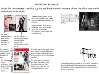
The document describes techniques used in a magazine cover that inspired the author's own work. These techniques include making eye contact between pages, emphasizing text with a large initial letter, underlining subheadings, using a white background to make the artist stand out, depicting a rock theme through clothing details, making cover stories larger to draw attention, and using sharp typography to continue the rock theme. The posture, props, facial expression and makeup of the magazine cover also inspired elements in the author's own work.
1. ADDITIONAL RESEARCH
I used this double page spread as a guide and inspiration for my own, I have therefore used similar
techniques for example:
The eye contact looking at the
other side brings the two pages
together, it also put emphasis on
the text.
The large ‘c’
standing for the
artist name
puts extra
emphasis on
the artist.
The content
and name of
magazine both
being at the
top.
The subheading
being
underlined then
what it includes
in this issue
below it.
The posture of this image
inspired me for my model to
do something similar I also
used similar props such as
the hat.
The background being white
allows the artist to stand out,
white also has positive
connotations in contrast to the
artist clothing.
The rock theme is
represented through
the clothing for
example the
leather, spikes, metal
and rips.
The main feature and artist in this
issue standing bold and being the
largest image makes it eye catchy
and persuading to go to that page
number.
The cover stories numbers
are larger than all the other
features, this shows that
they are the important and
new updates on the issue.
This typography encouraged my rock theme it triggered
some initial thought that I later used for example the
Sharpe edges being dragged down by scratches for the
theme to continue.
2. The hair being more lighten and shiny looking work
well in contrast to the dark heavy looking eyes, make
up and clothing. It reflects similar colours of the
background
The headmaster
typography represents
the theme of rock it
allows it to become
more realistic.
The facial expression looking still and strong and direct eye
contact
The white background allows the
text as well as artist to stand out.
The red darken lips contrasts with
the dark, heavy and messy looking
eye make-up. The rest of the face
being more lighter and ghost like
adds to the rock theme effects.