
Recomendados
Más contenido relacionado
Último
Último (20)
Destacado
Destacado (20)
Double page spread analysis
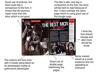
- 1. Good use of pictures, but there quite big in comparison to the font, it shows that the pictures mean more than the story which is not good The title is also very big in comparison to the font, the story will be hard to read because of this. It also overlaps the other page which is using good use of the double page The colours are very emo with it mostly being black so its stereotyped mostly at gothic/emo stereotypes Niche market, aimed at a small audience and not appealing to everyone Good use of double page, interlinking the pages I think the font should change and also more should be wrote
- 2. Caption, typed text under a photograph or diagram explaining the image Red writing shows that this piece of information is important Dull artic backgrounds, which could be interpreted as the ‘arctic monkeys’ Live picture of them as it says on the caption Boring font and colour not very eye catching Another live picture ‘The Review’ this could be saying about there live performances as there are two pictures of live performances on the double page spread The page is split down the middle doesn't look like a double page spread
- 3. Good use of using the double page spread, a picture has been used as the whole back ground which adds a great effect. Good clear picture so the viewers can recognise the band straight away A big font sized quote which instantly the readers attention is drawn to and wants to read what its about Good place to position the font as its not in the way of the picture and is readable The font is quite small and hard to read over the picture, a good amount has been wrote The red box catches a persons eye and instantly recognises the ‘linkin park’ and might want to read about their spread