2018 Blog Post + Landing Page Audit Excel Templates

http://bit.ly/landing-page-audit-video Over a year ago we did a live critique of Unfunnel Growth Labs member landing pages and blog posts on our weekly Office Hours webinar training. During that content auditing segment, I identified several blogging factors PLUS the four main landing page criteria that every landing page design must consider. Today I’m expanding that list with a 15-Point Landing Page Audit across those 4 categories that will tell you if your landing page offer, design and copy stacks up. The Landing Page Audit worksheet has five components (labeled above): 1. Grading Elements – Evaluating elements like the headline, offer, trust, visuals, etc.. 2.Grading Criteria – Grade these elements based on specific criteria. 3. Element Scores – Score each element separately on a scale from Exceptional to Unsatisfactory. 4. Final Score – Receive an overall score out of 100. 5. Action Items – Take action to improve the elements that don’t receive a perfect score. With all of the Landing Page editors or themes you can use out there, it is REALLY easy to create a kind of Frankenstein’s monster without even knowing it — this will give you the process you need to avoid doing that entirely. Download This Template at http://bit.ly/revenue-launchpad

Recommended
Recommended
More Related Content
Viewers also liked
Viewers also liked (9)
More from unfunnel
More from unfunnel (19)
Recently uploaded
Recently uploaded (20)
2018 Blog Post + Landing Page Audit Excel Templates
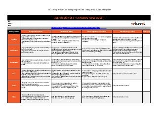
- 1. 2017 Blog Post + Landing Page Audit - Blog Post Audit Template 2017 BLOG POST + LANDING PAGE AUDIT URL: Writer: Date: Need instructions? Click here to access the 4-minute Blog Post Audit explainer video. Grading Element Exceptional (4 points) Competent (3 points) Needs Improvement (2 points) Unsatisfactory (1 point) Score (1-4) Headline • A clear, "tightly-written" promise is made using as many words as necessary. • The promise made in the headline is delivered upon in the body of the post. • Headline is compelling without being misleading or hypey. • Headline needs to be "tightened" or requires a bit more description to completely communicate the promise. • Headline isn't as compelling as it could be or is somewhat hypey or misleading. • Headline is "wordy" or far too short to completely communicate the promise. • Headline is not compelling or is hypey or misleading. • Elements of the promise made in the headline are not delivered upon in the body of the post. • Headline is weak or completely misleading and/or hypey. Introduction • Copy is extremely easy to consume and develops a rhythm for the post. • Copy draws the reader in and compels them to read the entire article. • Copy creates a "speed bump" for the reader through a wordy or unneccesary statement, complex words, or intimidating formatting. • The benefit of reading the entire article is not made completely clear early in the introduction. • Copy contains 2-3 "speed bumps" for the reader through wordy or unneccesary statements, complex words, or intimidating formatting. • Copy is extremely difficult to consume because of 4 or more wordy or unneccesary statements, complex words, or intimidating formatting. • The benefit of reading the entire article is not made clear at all in the introduction. Consumption • Copy is formatted in a way that makes the article easy to consume. • Transitions between ideas and subheadlines are smooth. • Copy contains one "speed bump" that could be removed by formatting with bullets, numbered lists, blockquotes, etc. • One transition between ideas and headlines creates a "speed bump" for the reader. • Copy contains 2-3 "speed bumps" that could be removed by formatting with bullets, numbered lists, blockquotes, etc. • 2-3 transitions between ideas and subheadlines create "speed bumps" for the reader. • Copy contains 4 or more "speed bumps" that could be removed by formatting with bullets, numbered lists, blockquotes, etc. • 4 or more transitions between ideas and headlines create "speed bumps" for the reader. Goal • A clear call to action is made that is relevant to the subject matter of the article. • Copy and/or design of the call to action compel the reader to take the desired action. • Call to action is located in one or more prominent positions within the post. • A more relevant call to action is available for this post. • Copy and/or design of the call to action could be more compelling to the reader. • Call to action could be located in a more prominent location in the post. • Call to action is completely irrelevant to the subject matter of the post. • Copy and/or design of the call to action is not compelling. • Call to action is difficult to find in the post. • The post does not contain a call to action. Media • All images, video, and audio are clean and clear and of high production quality. • All the posts' needs for images, video, and audio are met. • One instance of an image, video, or audio is unclear or of low production quality. • One section of the post requires the use of an image, video, or audio to complete the post. • There are 2-3 instances of images, video, and/or audio that are unclear or of low production quality. • To complete the post, 2-3 sections require the use of an image, video, or audio. • The post contains no media. Close • The close effectively concludes the post. • The close uses humor, wit, insight, or otherwise incites emotion that compels the reader to comment, share, or visit more pages on the blog. • The close effectively concludes the post. • The close uses dry or boring language. • The close does not effectively conclude the post. • The close uses dry or boring language. • The post contains no close.
- 2. 2017 Blog Post + Landing Page Audit - Blog Post Audit Template Search • All 5 on-page SEO elements (URL, body text, images, title tag, meta description) are optimized for a keyword unique to that page. • All opportunities to cross-link to other content are used. • One on-page SEO element is not keyword optimized. • One opportunity to cross-link is missed in this post. • 2 on-page SEO elements are not keyword optimized. • 2-3 opportunities to cross-link to other content are missed in this post. • The post is not keyword optimized or it "keyword cannibalizes" another post on the website. • The post misses 4 or more opportunities to cross- link to other content. Categorization • The post is in the appropriate category. • The post is appropriately tagged. NA NA • The post is not in the appropriate category. • The post is not appropriately tagged. Completeness • The post completely delivers on the promise made in the headline and introduction. • Every idea in the post is appropriately strengthened with media (images, video, etc), examples, data, and/or links to more information. • One idea in the post requries media (images, video, etc), examples, data, and/or links to more information to be complete. • 2-3 ideas in the post requrie media (images, video, etc), examples, data, and/or links to more information to be complete. • 4 or more ideas in the post require media (images, video, etc), examples, data, and/or links to more information to be complete. Consistency • The content of the post is consistent with the brand. • The content of the post is consistent with other information presented by the organization. NA NA • One or more elements of the post are inconsistent with the brand. • One or more elements of the post are inconsistent with other information presented by the organization. Final Score 0 Action Items *
- 3. 2017 Blog Post + Landing Page Audit - Landing Page Audit Sample LANDING PAGE AUDIT SAMPLE URL: Writer: Date: Grading Element Exceptional (4 points) Competent (3 points) Needs Improvement (2 points) Unsatisfactory (1 point) Score Offer Clarity • A clear, "tightly-written" headline, and subheadline that answers 'What is it?' and 'What does it do for me?' • The promise made in the headline is expanded upon in the subsequent content • Headline is compelling without being misleading or hypey. • Headline needs to be "tightened" or only answers one of the key questions. • Headline isn't as compelling as it could be or is somewhat hypey or misleading. • Headline is "wordy" or far too short to completely communicate the promise. • Headline is not compelling or is hypey or misleading. • Elements of the promise made in the headline are not delivered upon in the subsequent content • Headline is weak or completely misleading and/or hypey. 4 Scent • The copy and promises of the ad (or referring source) is articulated on the page. • The images from the ad (or referring) are shown on the landing page. • The design of the landing page is consistent with the ad (or referring source). • The copy and promises of the ad (or referring source) are somewhat articulated on the page. • The design of the landing page is somewhat consistent with the ad (or referring source). • The copy and promises of the ad (or referring source) are loosely articulated on the page. • The design of the landing page is loosely consistent with the ad (or referring source). • The copy and promises of the ad (or referring source) are not articulated on the page. • The images from the ad (or referring) not on the landing page. • The design of the landing page is not consistent with the ad (or referring source). 4 Relevance • The offer is something the target audience wants/needs. • The offerarticulartion is personalized for the specific target market. • The offer is something the target audience wants/needs. • The offer is articulated for an individual audience (many-to-one) • The offer is something the target audience might wants/needs. • The offer isn't articulated for the audience but is a feature list. • The offer isn't something the target market wants/needs. • The offer is poorly articulated to any audience. 4 Visualization • The product or service is depicted via authentic imagery or video. • The product’s or service’s features are depicted by authentic imagery or video. • The product or service is depicted via stock imagery or video. • The product’s or service’s features are depicted by bulleted lists. • The product or service is depicted via stock imagery or video. • The product’s or service’s features aren't depcited at all. • The product or service is not visually depcitec • The product’s or service’s features aren't visually depcited. 4 Form/CTA Visible Form • The form is immediately visible. N/A N/A • The form is not immediately visible. 4 Appropriate Number Of Fields • The number of form fields is appropriate for the offer, e.g., high commitment offers have longer forms & lower commitment offers have shorter form fields. • There are no ‘optional’ fields. N/A N/A • The number of form fields is disproportionate to the offer, e.g., high commitment offers have longer forms & lower commitment offers have shorter form fields. 4 Compelling Form Headline • A clear, "tightly-written" headline, and subheadline that answers 'What is it?' and 'What does it do for me?' • The promise made in the headline is expanded upon in the subsequent content • Headline is compelling without being misleading or hypey. • Headline needs to be "tightened" or only answers one of the key questions. • Headline isn't as compelling as it could be or is somewhat hypey or misleading. • Headline is "wordy" or far too short to completely communicate the promise. • Headline is not compelling or is hypey or misleading. • Elements of the promise made in the headline are not delivered upon in the subsequent content • Headline is weak or completely misleading and/or hypey. 4 Visible & Noticeable CTA • The CTA is visible. • The CTA stands out. • The CTA is reiterated throughout the page. • The CTA is descriptive, e.g., not ’Submit’ • Only 3 of the 4 CTA criteria are met. • Only 2 of the 4 CTA criteria are met. • 1 ≤ of the 4 CTA criteria are met. 4 Trust Professional Design • Layout is smooth and revolves around a single idea. • Fonts are consistent • Images are authentic • The page flow is intuitive to the user. • Layout is smooth and revolves around a single idea. • Too many font types, sizes, and colors. • Imagery is unprofessional or inauthentic. • The page flow is intuitive to the user. • Page layout is a mashup of multiple design inspirations. • Too many font types, sizes, and colors. • Imagery is unprofessional or inauthentic. • The page flow is intuitive to the user. • Page layout is a mashup of multiple design inspirations. • Too many font types, sizes, and colors. • Imagery is unprofessional or inauthentic. • The page flow is unintuitive to the user. 4
- 4. 2017 Blog Post + Landing Page Audit - Landing Page Audit Sample Relevant Trust Icons • Page uses trust icons. • Trust icons are appropriate for the page context. • There are no ‘old school’ hyperbolic trust claims, e. g. ‘Risk Free’ • The page uses trust icons. • Trust icons are not appropriate for the page context. • There are no ‘old school’ hyperbolic trust claims, e. g. ‘Risk Free’ • The page has trust icons. • Trust icons are not appropriate for the page context. • There are ‘old school’ hyperbolic trust claims, e.g. ‘Risk Free’ • There are no trust icons 4 Authentic Testimonials • Your page uses testimonials. • Your testimonials are not anonymous. • You testimonials include a name, photo, job title, and place of business. • Your page uses testimonials. • Your testimonials are not anonymous. • You testimonials don't include all of the following: name, photo, job title, and place of business. • Your page uses testimonials. • Your testimonials are anonymous. • You testimonials don't include any of the following: name, photo, job title, and place of business. • The page has no testimonials 4 Clear Privacy Policies • There is a visible privacy policy. • There is no ‘cute’ copy for your privacy policy information. • The privacy policy is in proximity to your CTA. • There is a visible privacy policy. • There is ‘cute’ copy for your privacy policy information. • The privacy policy is in proximity to your CTA. • There is a visible privacy policy. • There is ‘cute’ copy for your privacy policy information. • The privacy policy is not near your CTA. • The page has no privacy policy. 4 Visual Hierarchy Using Visual Queues To Highilight Key Areas • The page and design guide the eye to high priority sections. N/A N/A • The page and design conflict with your high priority page sections. 4 Page Design Fits A Singular Theme • The fonts, colors, imagery, and copy compliment each other. N/A N/A • The fonts, colors, imagery, and copy compete with one another as a ‘frankenpage’. 4 Supporting Imagery • The supporting imagery, e.g., features, product use, etc… does not compete with your CTA. • The supporting imagery, e.g., features, product use, etc… does not break the page theme. • The supporting imagery, e.g., features, product use, etc… does compete with your CTA. • The supporting imagery, e.g., features, product use, etc… does not break the page theme. • The supporting imagery, e.g., features, product use, etc…, competes with your CTA. • The supporting imagery, e.g., features, product use, etc…, does break the page theme. • The page doesn't use supporting imagery and relies on the hero shot. 4 Final Score 100 Action Items Write the action items down here!