
Recomendados
Más contenido relacionado
La actualidad más candente
La actualidad más candente (19)
Destacado
Más de Alfieweston
Más de Alfieweston (20)
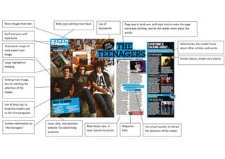
House Colors and Teenagers Featured in Striking Magazine Layout
- 1. House colours, shown very clearly.Advertorials, lets reader know about other articles and events.Issue, date, and sponsors website. For advertising purposes. Further information on “the teenagers”Use of drop cap, to draw the readers eye to the first paragraph. Striking main image, key for catching the attention of the reader.Use of pull quotes, to attract the attention of the reader. Page lead in bold sans serif style font to make the page more eye catching, and let the reader more about the article.Use of buzzwordsBold, eye-catching mast headMain body copy, in neat column structure. Large highlighted heading Magazine folioText box (in shape of note paper) over imageSerif and sans-serif style fontsMore images than text1476375933450<br />