
Recomendados
Más contenido relacionado
La actualidad más candente
La actualidad más candente (18)
Destacado
Similar a Magazine covers
Similar a Magazine covers (20)
Más de Charis Creber
Más de Charis Creber (20)
Magazine covers
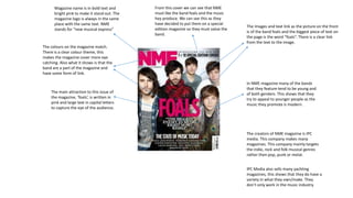
- 1. Magazine name is in bold text and bright pink to make it stand out. The magazine logo is always in the same place with the same text. NME stands for “new musical express” The colours on the magazine match. There is a clear colour theme, this makes the magazine cover more eye catching. Also what it shows is that the band are a part of the magazine and have some form of link. The main attraction to this issue of the magazine, ‘foals’, is written in pink and large text in capital letters to capture the eye of the audience. The images and text link as the picture on the front is of the band foals and the biggest piece of text on the page is the word “foals”. There is a clear link from the text to the image. In NME magazine many of the bands that they feature tend to be young and of both genders. This shows that they try to appeal to younger people as the music they promote is modern. The creators of NME magazine is IPC media. This company makes many magazines. This company mainly targets the indie, rock and folk musical genres rather then pop, punk or metal. IPC Media also sells many yachting magazines, this shows that they do have a variety in what they own/make. They don’t only work in the music industry. From this cover we can see that NME must like the band foals and the music hey produce. We can see this as they have decided to put them on a special edition magazine so they must value the band.
- 2. The title of the magazine ‘Kerrang’ is easily viewable and distinct to the viewer. It has a shattered theme in it that we can see is from a rock background as in rock was a bit about smashing things up which we can see is reflected in the title of the magazine. The main attraction of this issue is Black Sabbath and a world exclusive interview with them as they are coming up to a big event. We can see that the magazine is trying to attract customers to buy the magazine by giving away a free poster. They also feature other bands in the magazine which are shown in smaller images on the front cover to show the reader. The magazine also tries to gain the attention of more customers by adding in more posters of a different band, this will gain the more sales as they can vary the amount of fans they appeal to.
- 3. Slash fits in with the magazine theme as the magazine is the rolling stone which is a rock magazine. He fits in because he is a rock star, he has a cigarette in him mouth, he is wearing sun glasses and he has his electric guitar all of this fits in with Rock music. The layout of the cover is very basic, there are no other stories or giveaways listed on the front page. It is relatively simple. The large and clear picture on the cover brings attention because of the size people can clearly see the image. The magazine title ‘the rolling stone’ is half covered by the image. However though this doesn’t really matter as the brand is so strong, this is mainly because the magazine is named after one of the biggest rock n roil bands there has ever been. Again we see where the magazine is trying to draw peoples eyes by using capital letters for its headline. This draws in peoples eyes as it is easy to spot what the main story is. We can see that the magazine is trying to catch peoples eyes from the snippet of slashes exclusive interview. This teases the reader in and makes them want to read more of the interview.