
Recomendados
Más contenido relacionado
La actualidad más candente
La actualidad más candente (15)
Más de Charis Creber
Más de Charis Creber (20)
Poppy contents analysis 2
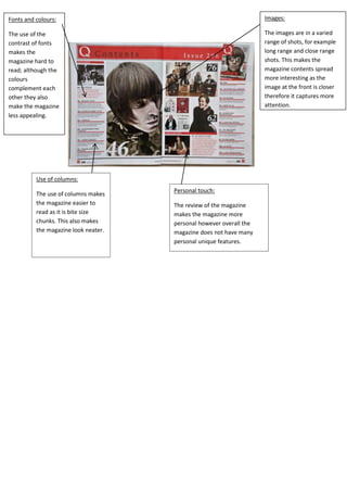
- 1. Fonts and colours: Images: The use of the contrast of fonts makes the magazine hard to read; although the colours complement each other they also make the magazine less appealing. The images are in a varied range of shots, for example long range and close range shots. This makes the magazine contents spread more interesting as the image at the front is closer therefore it captures more attention. Use of columns: The use of columns makes the magazine easier to read as it is bite size chunks. This also makes the magazine look neater. Personal touch: The review of the magazine makes the magazine more personal however overall the magazine does not have many personal unique features.