
Recomendados
Más contenido relacionado
La actualidad más candente
La actualidad más candente (20)
Similar a E:\media year 12\jhp eval2
Similar a E:\media year 12\jhp eval2 (20)
Más de CharlottNatalieJasmine
Último
Último (20)
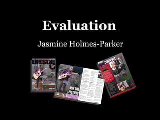
E:\media year 12\jhp eval2
- 2. Writing the copy When writing my interview I had to take into account the audiences personality to make it successful and appealing to them. My target audience are represented as youthful and having musical interest, they could also be seen as possible consumers as my magazine “Unison” is promoting bands, and artists. I also had to think about my institution “Unison” and what they will promote to the readers. I ensured the magazine constructed a positive representation of my main artist, as well as making sure the magazine was portrayed in a good way to ensure our readers would still have passion for the magazine each month.
- 5. Front cover analysis The different font shows that it’s the main cover story, and as the copy is purple it shows a link as it’s the same colour as the artist’s jacket This puff persuades readers to buy it, it’s big on the page and the red contrasts with the black making it stand out more. The artist is represented as relaxed and casual with her leg positioned on the wall, in a long shot, her eyes looking down instead of at the camera make her look more shy and vulnerable The cover lines in capital letters and left aligned make the magazine seem more realistic In this cover line I have put the band name in red as this is significant and underlined “exclusive” as this makes the magazine even more successful and this lets the target audience know that the magazine are still taking in their needs of excitement from a magazine (Richard Dyer) This is where I put necessary information such as the cover price and date, aswell as a website to offer our target audience addition platforms The masthead has an eroded look and is in sans serif capital letters, which is common in magazines, we chose Unison as our title as it means harmony also making it musical, it is also very edgy and unique This slogan is also good as it refers to musical language by using the word “tuned” making it clear to other viewers what genre of magazine this is Using a barcode, and issue number assures I am following the conventions of a magazine
- 7. Contents page analysis Page numbers by photos, I did this as it makes the magazine look more modern and up- to date which fits in with our target audience of 16-25 year olds I have included an editor’s column with a photo of the editor, which is very conventional as other magazines such as Kerrang include editors columns I used a simple sans serif font for the contents as it looks good and clear and doesn’t over crowd the main features of the page I used a 2 column layout for my contents page as it looks more professional and is common in most magazines For the editor’s column I put a handwritten font on for his signature this gave it a more friendly and personal mode of address to the readers For the contents page I adopted a look consisting of more photos than text, to show off the main features in the magazine Cover story image used on contents as it’s a main story This photo represents an indie band clearly due to their style as their facial expressions and body language shows them as moody and casual, it also has a depth of field Represents the magazine as fun I used a gradient tool for my background, which went from black to light grey as it contrasts with the white text and red dividers.
- 9. Double page analysis On my double page spread I put a main image across half of it as I felt the photo I took was strong and portrayed her as fun and loving through her facial expression and I wanted the target audience to see this I used a 3 column layout for my interview as there was a lot of copy to fit in, this also meant I was following the conventions of a magazine I put a brief description of the interview in a textbox to follow the conventions of magazines, it also helps to emphasise her success and career I included a pull quote to engage readers into the interview and to also follow the conventions On my page number I also included the website and month, I put it on the right hand bottom side of the page so it’s out of the way but is clear to see also as it’s not on the picture it doesn’t take the focus of it This picture in the corner shows the artists old career and shows her as vulnerable, which is the opposite to the main image, this shows the target audience how much she has grown and how happy and confident she is The title Is in white which contrasts with the natural background, the font is big and in capitals representing Prothero as the next thing thing/star I used the word “girl” as it represents the artist as being youthful which will make her young audience relate to her
- 11. From preliminary to Final Production
- 12. From preliminary to Final Production My photography skills have increased highly as I now look at the mise-en-scene much more, such as the background and jewellery and how it represented my artist. I also looked at different types 0f shots and camera angles and how they portrayed my artist e.g. High angle showing vulnerability and low angle showing power. I have improved my skills in constructing the preferred meaning within photographs. My skills have developed a lot since my newsletter, as I have used different programs (Adobe Photoshop instead of Microsoft word) and worked a lot harder on my final magazine and looked into detail at successful existing media magazines such as Kerrang, and NME. My journalism skills had to be good and practical for the magazine to be tremendous. In my interview I asked questions that you would find in a magazine, and I used detailed language to emphasise the passion my artist “Prothero” had for music. Overall I think my journalism skills have improved as I have learned to adapt certain tones to the different individuals in the interview, which makes it seem more realistic and creates a more appropriate mode of address.
- 14. My use of technology In Photoshop I learnt how to layer items “stack” so you could move individual items around alone. This made it easier for me to achieve a good magazine I cut my editor’s figure out from the background using the “Magnetic Lasso Tool”. This tool really helped me as the original image wasn’t very effective as the background looks messy on the edges, now it looks much more professional.
- 15. Photoshop toolbar I used the eye-dropper tool to make sure the purple colour scheme remained the same on my front cover. The “T” item allows you to write text on parts of your image, I used this regularly on all of my pages This is the gradient tool which I used on my contents page, when I put on my background it slightly lightens toward one end of the page This allowed me to change between two colours that I used regularly