1. Poster Evaluation
For this product I wanted to create something that would actively engage the target audience and other audiences alike and
make it so that it can be used effectively in cross platform marketing. The meaning behind the poster is an abstract approach to
a real issue for so many people this poster aims to shows the flowers and blue glow as a person's body as emotions with the
alcohol surrounding it as almost the societal expectation that to enjoy yourself you need to go out and drink especially a
problem for the target audience due to peer pressure and wanting to fit in it also shows that for a flower to grow it needs water
however it doesn’t need alcohol and if you water a flower constantly with alcohol it eventually dies almost representing what
can happen to the human body if you are a constant drinker or alcoholic.
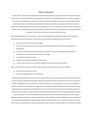
When collecting feedback on my final product, I used a survey collecting qualitive feedback to collect the best high-quality
responses and opinions of the product. For the most part I received positive feedback with comments such as:
very creative and I can understand the message,
I like how you have shown how someone can be like without drinking and I like how you used the flowers to
symbolise that,
I like how you have shown that before someone has started to drink, they can be happy and confident with
themselves but when they have had alcohol they can change,
that is absolutely wicked and funky,
it looks great, visually appealing with a strong message
smashin, I think it is great it is very detailed, professional and has had a lot of time put into it
which is what I wanted to come across from the poster however I also received some constructive feedback:
main title font is a little hard to read,
there is a lot happening and it is somewhat busy
I understand their feedback however the aim was to make the poster busy to show how alcohol can fully consume someone's
life and the writing is supposed to flow together like water linking the theme with all aspects of the poster and I will take this
element and feedback on when creating other products to make sure my message actively comes across to the audience.
Overall, I am pleased I was able to get my message across to the audience effectively without having to describe the meaning
behind the poster and pleased that people like what I have created. I think for my first product and collecting research I am
proud of my work and what I created being able to fit the brief and bring my initial idea to life through prepping and planning
whilst also staying true to the client and what they required from the client by extensively researching the client ,target
audience and existing campaigns in order to produce products that would please the client engage the audience and fit in with
the existing products of the Better Health campaign. Audience feedback helped me to create the final products as with each
draft I created, I received feedback to improve the product and cater it better to the target audience. This helped me as it gave
2. me an insight into industry as in industry you would liaise with the client getting their feedback on drafts and tweak/alter them
based on the feedback from the client in order to make the best product for the client.
The poster uses a diverse colour pallete reflecting the diversity of the effects alcohol can have on the body presenting
information in a diverse creative way to engage the audience whilst delivering valuable information to the consumer. The
poster for the majority consists of blues, blacks, and pinks. Blue usually connotes open spaces, freedom, intuition, imagination,
inspiration and sensitivity, all traits of a person signifying that these are what can be lost due to too much alcohol consumption.
Black connotes typically death, grief, mourning, darkness, depression, rebellion, and fear this represents the dark side of
alcohol and the affect it can have on not only you but the people around you. Pink represents healing innocence peace
sweetness tranquillity and warmth this represents a person before they start drinking and when they quit the contrast between
black and pink is not just evident I physical colour but the colours and what they connote showing the contrast of emotions and
conditions relaying the damage alcohol can do.
When taking the photography for this poster I made sure that I was organised and prepared with a charged camera battery
plenty of storage on the SD card and the correct conditions to take the photos in as it was not hot or cold which I had
researched beforehand as previously in the week it had been snowing meaning that the flowers I planned to take photos of had
snow on them and therefore I had to wait until the snow melted and the weather conditions were adequate before
photographing.
3. During this process as I had no experience with editing, I started to try and edit on publisher which became an issue as it was
hard to work with and consumed a lot of time and this is when I decided to learn Photoshop (industry standard editing
software). After a day of practicing with the software I was able to edit my poster creating drafts, receiving feedback, and
continuing to edit to be able to create my final product that I was happy with and fit the brief.
4. TV advertisement Evaluation
The product created didn’t meet my original plan for this advertisement for a number of reasons including:
Delayed schedule
Bad weather for filming
Cast and crew illness
Cast not showing up due to illness, bad weather and transport issues due to local and national
strikes
Due to the delay in filming, there would not have been adequate time to film all of the content
needed
Therefore, I adapted my original idea to not only better suit the audience and client but to make sure
there was adequate time to film and edit the content seen as I had never used premiere pro (industry
standard editing software) before.
When adapting the product created, I made sure to get feedback on my ideas not only to make sure that
it fit the brief and was what the client was looking for but still engaged my target audience and got
across the message that was intended.
As I had no experience with editing videos, I started to develop my knowledge of premiere pro (industry standard editing
software) by creating small videos with adobe stock footage practising with editing not only the visuals but the audio as well.
After a day of practicing with the software I was able to import my footage and start to edit together my advertisement finding
suitable audio tracks and sound effects in order to create an advertisement that would engage the target audience please the
client and fit the brief of what was required for the campaign.
When collecting feedback on the advertisement I again used a survey which was sent out electronically to a group who fit the
target audience collecting qualitive responses giving them the opportunity to voice their opinions on the product I had created
giving me feedback on how to improve until I produce my final product to the highest quality. This advertisements aim was to
effectively engage and therefore encourage people within the target audience to get active therefore when conducting
researching I asked questions targeted to finding the answers that would enable me to cater the advert to the intended viewers.
I am pleased with the product I have created and the feedback it received with comments such as:
spreads a great message and would motivate someone to go outside and get active,
I like the transitions,
I like the idea; I think it can be highly informative and has a positive message.
I like how informative it is,
I really like your video,
I like how the information is simple and straight to the point. Well done :),
5. It is well made and creative which reassures me that I have created a product positively influencing and engaging the
target audience.
The only criticism I received was:
film it with your phone landscape so that it fills the screen
I understand this criticism for a tv advertisement however after doing target audience research the target audience were more
likely to use social media and see it on a social media platform rather than on television and therefore target the intended
audience more effectively.
Within the advertisement both diegetic and non-diegetic sound is used merging the worlds of the character on screen and the
viewers as the diegetic sound is used at the beginning as the audience hear the alarm clock go off then fading out as the non-
diegetic soundtrack fades in. The soundtrack selected has an upbeat tempo and rhythm matching what the audience can see on
screen and relating to the fun colourful nature of the campaign whilst still being able to cater to a completely different
audience. When gathering the sound due to copyright I could not use just any soundtrack, so I used a website called
nocopyrightsounds that is specifically made for content creators who release copyright free music and audio clips for content
creators to use in their videos with the knowledge that their content will not get flagged for copyright infringement claims
which is reassuring for not only me but the client as copyright fees are very expensive.
In the advertisement apparent is the Blumler & Katz’s Uses and Gratifications Theory as this is a theory which suggests that
audiences use the media for varied reasons. This theory suggests that audiences are active and
that the media plays a “function” for audiences. They think the main functions of the media
are: Escape, Entertainment, Education & Information, Social Interaction, Identification. This
advertisement actively plays into this as it both is a form of information and education but also
entertainment as it informs its audience on the benefits of getting active but as I have done
extensive research it also aims to keep the audience engaged and entertained in order to retain
the information. The advertisement also contradicts two feminist male gaze theories. Laura
Mulvey created the male gaze theory where she claims that women are only included in media
to be objectified and something for men to look at this advertisement opposes this theory as in
no way is the woman in the advert objectified as the advertisement is more about
encouragement and empowerment than “looking good” or appealing to the male eye. An
expansion of this theory is Liesbet van Zoonens feminist theory which focuses on gender
inequality within media and focuses on the concept that gender is created by the media
therefore making regular people think they must reach the often-unachievable stereotypes
portrayed on screen to be accepted in society. However, in my advertisement this is evidently
not the case showing a real-life person doing real-life things.
6. Screenshots from the campaign emphasising the Blumler and Katz's Uses and Gratifications Theory and
contradicting the Laura Mulvey Male Gaze Theory and the Liesbet van Zoonen Feminist Theory.
Overall, I believe I have created effective products that not only meet the brief but meet the needs of both the client and the
audience achieved through extensive research planning and preparation as well as constant feedback from the target audience
throughout in order to make sure any decisions in changing the products still met the needs and engaged the target audience.