
Recomendados
Más contenido relacionado
La actualidad más candente
La actualidad más candente (20)
Destacado
Similar a Evaluation
Similar a Evaluation (20)
Evaluation
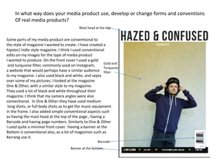
- 1. In what way does your media product use, develop or change forms and conventions Of real media products? Mast head at the top Some parts of my media product are conventional to the style of magazine I wanted to create. I have created a hipster/ indie style magazine. I think I used conventional edits on my images for the type of media product I wanted to produce. On the front cover I used a gold Gold and and turquoise filter, commonly used on Instagram, Turquoise a website that would perhaps have a similar audience filter. to my magazine. I also used black and white, and sepia over some of my pictures. I looked at the magazine One & Other, with a similar style to my magazine. They used a lot of black and white throughout their magazine. I think that my camera angles were also conventional. In One & Other they have used medium long shots, or full body shots as to get the music equipment in the frame. I also added simple conventional aspects such as having the mast head at the top of the page , having a Barcode and having page numbers. Similarly to One & Other I used quite a minimal front cover. Having a banner at the Bottom is conventional also, as a lot of magazines such as Kerrang use it. Barcode Banner at the bottom.
- 2. How does your media project represent particular social groups? My media product portrays people who make this sort of electronic/rap/alternative music to be quite working class, average people. There are no extravagant clothes or jewellery, just quite average casual clothing. Their clothes also show them wearing hoodies, which are often associated with lower class people, troublemakers or “hoodlems”. Their facial expressions in the images are quite intense stares, making them seem more aggressive. I think all of this reflects the stereotypes of youths as being rebellious. I think the people who would be reading the magazines would like the rebellious aspects of the magazine. Hipsters would perhaps feel as if they could relate to that sort of life style of smoking and drinking. My magazine also shows that Straight face, or they are into gadgets and technology. In the interview I used it aggressive facial discussed Sony Acid and Yamaha, and computer technology to expression. Hood up, portraying create music. I also included a competition to win a Mac “hoodlems” a computer. stereotype of youths. Quite basic clothing, not much accessorising e.g chains to make them seem wealthy.
- 3. What kind of media institution might distribute your media product and why? The magazine I have created seems to be more of an independent magazine. I have based a lot of it on the independent magazine One & Other. I think it is quite a niche and I feel it wouldn’t fit in with a lot of what publishers look to publish. The music featured is quite upcoming artists so would be less known so perhaps publishers would not have so much faith in the magazine. If I were to decide a specific publisher for Hazed & Confused my media product Development Hell. They already publish Mixmag. I don’t think my magazine is similar to Mixmag so perhaps they would like to have that variety but also they are an independent publishers.
- 4. Who would be the audience for your media product? My audience would be young males as the images I have used are all of males. These people could be seen as role models. I don’t think my audience would be any particular ethnicity as there is no major focus on anyone, the music could be associated with rap, which is marginally focused on black people. Despite this, the pictures in the magazine are all white people though, so a bit contrasting, which is why I think it could be a mixed group of ethnicities. As my magazine has some focus on upcoming artists, I think that the audience would wear clothes from small but upcoming brands, such as Hype, Dope Chef etc. Brands such as Hype would also be considered to be hipster, which I would also associate with Hype, quite a small brand my magazine . Also in the magazine, one of my commonly worn by the models wears a “Face Off” snapback by a brand Hipster type subculture. called Underground Kulture, which is quite a small not very recognisable brand. The face off snap back by Underground Kulture.
- 5. How did you attract and address your audience? My magazine is focused on young people. All of the artists are young, but also all the artists are male so I think my audience would be young men. I think the people reading the magazine would have a strong interest in the music industry, specifically alternative electronic type songs. They would probably be interested in technology as there are parts on the magazine on technology. They also include their facebook page so people who are into social networks, typically young people again. They may be interested in creating their own music. One reason I think that is because the magazine has some upcoming artists, promoting new artists so they may be looking into how to promote themselves, where’s good to play etc. Also, because of the competition to win a Mac, which has a lot of technology on them to make music so they may have got the magazine just for that. The magazine also features some cultural aspects on them, so the people who would buy the magazine would be interest in culture.
- 6. What have you learnt about technologies from the process of constructing this project ? In the process of making my magazine I have learned a lot about photoshop. I have learned about how to apply effects and filters to create the look I want. I have learned how to add my own fonts from the website dafont.com, although I had a lot of problems using this. I used a Canon 600 digital camera to take my pictures for the magazine, so I learned a lot about the different settings on that, and how to get the best quality pictures in different lightings. I have learnt about websites like Blogger and Slideshare which allow you to share your work online too.
- 7. Looking back at your preliminary task, what do you feel you have learnt in the progression from it to the full product? I have learned a lot about how to make a magazine look professional. What fonts best suit the style of my magazine, what layout is best suited for the front cover/contents page/double page spread. What colours set the tone of the magazine and what goes together. I have learnt about conventions, and how they are used in magazines, and how conventions will attract a certain type of audience. When I did my survey I learnt about who wants to consume what. I have leant that researching your audience is the most important thing about creating a magazine. You need to know about what people want and what people need. Also researching the market is important because you need to know about where there could be a gap in the market, and what type of publisher would publish your magazine.