Unraveling Multimodality with Large Language Models.pdf
Double page spread analysis
1. Double page spread analysis.
For this week’s homework, we have been asked to analyse three different double page
spread articles. These could be from any magazine that we wanted, despite the fact we are
making a music magazine for our coursework.
This task is for us to try and develop a better understanding of what double page spreads
mean to the audiences of magazines and the techniques used to make them interesting.
1)
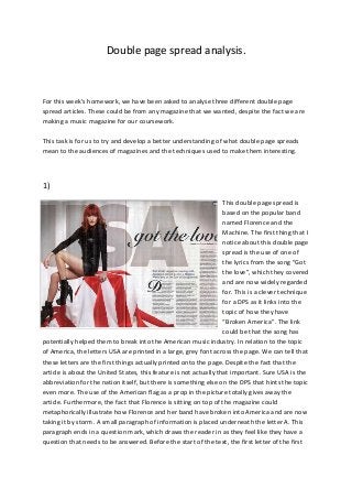
This double page spread is
based on the popular band
named Florence and the
Machine. The first thing that I
notice about this double page
spread is the use of one of
the lyrics from the song “Got
the love”, which they covered
and are now widely regarded
for. This is a clever technique
for a DPS as it links into the
topic of how they have
“Broken America”. The link
could be that the song has
potentially helped them to break into the American music industry. In relation to the topic
of America, the letters USA are printed in a large, grey font across the page. We can tell that
these letters are the first things actually printed onto the page. Despite the fact that the
article is about the United States, this feature is not actually that important. Sure USA is the
abbreviation for the nation itself, but there is something else on the DPS that hints the topic
even more. The use of the American flag as a prop in the picture totally gives away the
article. Furthermore, the fact that Florence is sitting on top of the magazine could
metaphorically illustrate how Florence and her band have broken into America and are now
taking it by storm. A small paragraph of information is placed underneath the letter A. This
paragraph ends in a question mark, which draws the reader in as they feel like they have a
question that needs to be answered. Before the start of the text, the first letter of the first
2. word is in a bigger and much different font. This highlights the importance of the article and
adds to the overall style of the magazine itself.
2)
This double page spread article is bursting with clever features and techniques. The first
feature that I notice when looking at this DPS is the unique and large font at the top of right
page. Three out of the 13 letters in the text are in a strange font, which could relate to the
nature of the band or a particular member of the band. The genre in which this band work
in may also be unique and alternative. The whole left hand side of the page is taken up by a
picture of the featured band. Their body language suggests that they don’t really have that
much care for the shoot at all, which could highlight how they are perhaps known for their
attitudes. In addition to this, their positions and body language could relate to the article
itself. For example, the article could be about a controversial issue that the band have
caused, so their poses may be reflective of that. Above the main article is a short,
descriptive sentence which will be used to pull the readers in. This is used to describe the
article and will usually highlight what the article is about.
In addition to all of the above, the letters A and D at the start of certain paragraphs are
bigger than the rest of the text. This makes the article look stylish and gives the magazine a
certain style and sense of diversity.
3. 3)
This is an article based on Lady Gaga.
The first feature of this article is the picture of Lady Gaga herself. Not only does it take up a
whole page which will most likely draw the audience in, but she is highly sexualised in the
picture. She is naked in the photo, apart from some strange, chain looking apparel. She is
covering up her modesty with her hands which will keeping her decent, may entice the
audience (of males) into reading the article. However, they may not really care too much
about what the article says. Instead, they will be drawn in by Lady Gaga and her looks.
Secondly, a large, red L is printed transparently across the article side of the page. This
makes the article look strange and unique, a lot like Lady Gaga. The fact that this is an L and
that it is large highlights the importance of Lady Gaga in the article.
The space of the text is used very well. The editors of the magazine want to take up as much
space as possible with information about Lady Gaga. There are hardly ant white spaces in-
between paragraphs, meaning that the readers are bound to get a lot of useful and
interesting information.
The layout of the DPS itself is affective as everything involved with it takes up adequate
space on the page.
There is a lack of colour on the page, apart from the large red L which spreads across the
article. This may be a feature of this magazine within the house style, but whether this is
4. correct or not, the layout gets the message across that this article is perhaps serious and
needs to be kept to the topic.