Storyboarding for content strategists jan 2015
•
11 likes•3,298 views

This expanded and updated version of my Sketching and Storyboarding for Content Strategy deck now includes new and additional examples of customer experience design storyboards/sketches at eBay and Citrix, additional simple sketching tutorials, and 6 tips for visual storytelling, plus 2 times when it's probably better to put down your pen. This presentation is especially geared for content strategists, but is may also be useful for viewers interested in general customer experience design (CX) and user experience design (UX).

Recommended
Recommended
More Related Content
Viewers also liked
Viewers also liked (15)
More from Deb Aoki
More from Deb Aoki (12)
Recently uploaded
Recently uploaded (20)
Storyboarding for content strategists jan 2015
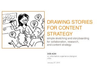
- 1. DEB AOKI sr. information experience designer citrix January 27, 2015 DRAWING STORIES FOR CONTENT STRATEGY simple sketching and storyboarding for collaboration, research, and content strategy
- 2. HELLO. UX Design + Content Strategy + Comics + Manga Nerd = Deb Aoki
- 3. I LOVE COMICS. I READ COMICS. I DRAW COMICS. • Bento Box in the Honolulu Star-Advertiser 3
- 4. 4 I WRITE ABOUT COMICS TOO.
- 5. 5 MEANWHILE, MOST OF MY JOBS WERE ABOUT WRITING FOR THE WEB
- 6. 6 THEN I GOT A CONTENT STRATEGY JOB AT…
- 7. And suddenly, my drawing skills came in handy again. 7
- 8. 8 NOW I’M AT… I still write, but now I mostly draw. …which is pretty awesome
- 9. PICTURES > WORDS WHY WRITE WHEN YOU CAN DRAW IT INSTEAD?
- 10. WHY DRAW PICTURES? 10 • Focuses on users’ needs and problems, rather than on design, business, or technology concerns or limitations • Pictures can communicate abstract ideas and user experiences quickly and powerfully. It’s a universal language • Helps you to communicate that your concerns are not about you (content writer), but about the customer • It’s very persuasive! Pictures can evoke emotions, empathy, and inspire action • Gets you in the room earlier in the product design process
- 11. WHY DRAW PICTURES? 11 • Provides an easy way to check the end-to-end experience to check for gaps, potential issues. If you can’t illustrate it, it may not make sense / may not matter to user • It’s fun! It encourages participation and informal discussions • Faster and cheaper than coding clickable prototypes or designing wireframes, or polished page mock-ups • Can provide a ‘big picture’ perspective of the entire user experience, goals & messaging • Helps get everyone on the team on the same page, clear up anything that’s unclear or unresolved
- 12. HOW CAN SKETCHING HELP WITH CONTENT STRATEGY? I’M GLAD YOU ASKED! HERE ARE A FEW EXAMPLES
- 13. BRAINSTORM IDEAS: shopping cart PICTURES > WORDS: STORYBOARDING AT EBAY 13
- 14. BRAINSTORM IDEAS: customer journey mapping PICTURES > WORDS: STORYBOARDING AT EBAY 14
- 15. PAINT A “BIG PICTURE”: shopping cart PICTURES > WORDS: STORYBOARDING AT EBAY 15
- 16. PAINT A “BIG PICTURE”: thanksgiving 2012 PICTURES > WORDS: STORYBOARDING AT EBAY 16
- 17. EXPLAIN HOW IT WORKS: green box user flows PICTURES > WORDS: STORYBOARDING AT EBAY 17
- 18. EXPLAIN HOW IT WORKS: Xenmobile storyboard PICTURES > WORDS: STORYBOARDING AT EBAY 18
- 19. UNDERSTAND CUSTOMERS: user/stakeholder personas 19 Mobile workers Managers/ employers Café owners Citrix / GoTo Meeting Designers/PMs/Devs
- 20. UNDERSTAND CUSTOMERS: GoTo Meeting personas 20 The Butler “You can count on me!” The Investigator “I need all the facts” The Facilitator “I’m here to help” The Networker “I connect people” The Sprinter “Let’s get this done quickly” The Preparer “I need time to plan carefully”
- 21. ILLUSTRATE PAIN POINTS: shopping cart PICTURES > WORDS: STORYBOARDING AT EBAY 21
- 22. ILLUSTRATE PAIN POINTS: too many buttons PICTURES > WORDS: STORYBOARDING AT EBAY 22
- 23. SELL AN IDEA: student accounts PICTURES > WORDS: STORYBOARDING AT EBAY 23
- 24. SELL AN IDEA: CubeFree app PICTURES > WORDS: STORYBOARDING AT EBAY 24
- 25. TEST A CONCEPT: group gifts PICTURES > WORDS: STORYBOARDING AT EBAY 25
- 26. TEST A CONCEPT: go together PICTURES > WORDS: STORYBOARDING AT EBAY 26
- 27. ‘BUT I CAN’T DRAW’ If you can draw dots, circles, squares and lines, you can draw. Yes, you can!
- 28. CIRCLE + SQUARE + DOTS + LINES = PEOPLE! PICTURES > WORDS: STORYBOARDING AT EBAY 28
- 29. ADD A FEW TWEAKS = DIFFERENT PEOPLE PICTURES > WORDS: STORYBOARDING AT EBAY 29
- 30. MORE WAYS TO DRAW PEOPLE PICTURES > WORDS: STORYBOARDING AT EBAY 30 DAVE GRAY Gamestorming BRANDY AGERBECK The Graphic Facilitator’s Guide
- 31. MORE WAYS TO DRAW PEOPLE PICTURES > WORDS: STORYBOARDING AT EBAY 31 DAVID SIBBETTS Visual Meetings DAN ROAM The Back of the Napkin
- 32. CIRCLE + DOTS + LINES = FACES AND EMOTIONS PICTURES > WORDS: STORYBOARDING AT EBAY 32
- 33. ADD FEATURES = DIFFERENT CHARACTERS PICTURES > WORDS: STORYBOARDING AT EBAY 33
- 34. BODY LANGUAGE CAN SAY ALOT PICTURES > WORDS: STORYBOARDING AT EBAY 34
- 35. WORD BALLOONS… WITHOUT WORDS PICTURES > WORDS: STORYBOARDING AT EBAY 35
- 36. CONNECT CONCEPTS WITH LINES PICTURES > WORDS: STORYBOARDING AT EBAY 36 Direct connection / action Tentative action Convoluted path Bouncing
- 37. DRAW COMMON CONCEPTS IN A FEW STROKES 37 idea lock / security time listen cloud laptop NO! money fast slowsmartphone email
- 38. DRAW COMMON PLACES IN A FEW STROKES
- 39. DIFFERENT PERSPECTIVES OF USER INTERACTION PICTURES > WORDS: STORYBOARDING AT EBAY 39 CLOSE-UP Emphasis on screen/finger interaction MID-TORSO Emphasis on screen SEMI-CLOSE Emphasis on device / human context/use FULL BODY Emphasis on ‘real world’ context/place of use
- 40. USE COLOR TO CONVEY DIFFERENT EMOTIONS / CONCEPTS / PERSONALITIES PICTURES > WORDS: STORYBOARDING AT EBAY 40
- 41. USE COLOR TO CONVEY DIFFERENT EMOTIONS / CONCEPTS / PERSONALITIES PICTURES > WORDS: STORYBOARDING AT EBAY 41 BLACK – Most important info / facts GREY – Secondary info / tentative RED – important / error / danger / stop GREEN – success / money / nature / go BLUE – calm / cool / water / sky / masculine ORANGE – cheerful / hot / caution PINK – fun / playful / youthful / feminine PURPLE – regal / sophisticated / serious BROWN – earthy / simple / dirty YELLOW – bright / accents / hard to read as text
- 42. COLORS can be an easy way to differentiate personas PRESENTATION TITLE GOES HERE 42 Female / Male Army / Navy Biz A / Biz B Differences within a group Japan / US / Germany Citrix / Apple / Google
- 43. COLORS can be an easy way to differentiate personas Colors can indicate different teams / stakeholders, make it easier to follow information flows
- 44. USE COLOR SELECTIVELY for emphasis, convey emotions PRESENTATION TITLE GOES HERE 44
- 45. DIFFERENT COLORS = DIFFERENT PERSPECTIVES PICTURES > WORDS: STORYBOARDING AT EBAY 45
- 46. AS YOU DRAW, ASK THESE QUESTIONS: PICTURES > WORDS: STORYBOARDING AT EBAY 46 Who is the user/customer? • What’s most important to them? • What are they trying to do / What do they want to do? • Does the user have any fears/obstacles? What’s the problem that we’re solving for the user? • What do they need to know before trying this? • What are their motivations and needs? What’s at stake? What’s in it for them? (benefits) • Why would they click the button/download / sign up? • How are we making their lives better/easier/simpler? • What happens if they don’t use this? • What would they do instead?
- 47. AS YOU DRAW, ASK THESE QUESTIONS: PICTURES > WORDS: STORYBOARDING AT EBAY 47 How is this different/better than similar services / experiences from other companies? (differentiators) • Why would they choose this? • Why would they opt to not try this? What if something goes wrong? • What can they do to fix things? • What will they see next? / What will happen? • Where can they get help? These questions can help you get the information you need to write content that is clear, concise, consistent, compelling, and helpful to customers
- 48. 6 VISUAL STORYTELLING TIPS PLUS: 2 SITUATIONS WHERE IT’S PROBABLY BETTER TO PUT DOWN YOUR PEN
- 49. KEEP YOUR STORY SHORT 49 Your story should be limited to 10-12 panels or less if possible. If it needs more panels, consider breaking story into segments.
- 50. SHOWING IT > SAYING IT 50 Let the pictures tell the story. If you removed the captions, would it still make sense?
- 51. KEEP CAPTIONS SHORT AND SIMPLE 51 Captions should be simple, easy to skim. Too much text = visual clutter
- 52. LIMIT YOUR COLOR PALETTE 52 Use color selectively to emphasize important things, communicate differences, or convey emotions. Too many colors can be distracting
- 53. LEFT TO RIGHT, TOP TO BOTTOM 53 Give the reader a predictable, intuitive path to read your story. Don’t leave them wondering what to look at next.
- 54. PICTURES, NOT PERFECTION 54 Speed, simplicity and clarity is more important than making “perfect” pictures. It doesn’t have to be beautiful/detailed to communicate ideas.
- 55. SKETCHING ISN’T ALWAYS THE ANSWER 55 It’s difficult to draw what you don’t understand / can’t visualize. Beware of situations where the speakers are using a lot of unfamiliar or complex/industry- specific terms/acronyms/concepts Know your audience. Sometimes a “cartoon”/“comic” isn’t appropriate when the topic is serious / politically sensitive. It can feel “cutesy,” disrespectful / un-businesslike in some situations
- 56. 5 STEPS FOR DRAWING STORYBOARDSBrainstorm > Script > Sketch > Finalize > Adapt
- 57. 57 STEP 1: BRAINSTORM IDEAS / SKETCH
- 58. 58 STEP 2: WRITE A SCRIPT
- 59. 59 STEP 3: DRAW ROUGH SKETCHES
- 60. 60 STEP 4: GET FEEDBACK / FINALIZE ART
- 61. 61 STEP 5: ADAPT VECTOR LINE ART OR VARIATIONS
- 62. QUESTIONS? THANK YOU! EMAIL: DEBORA.AOKI@CITRIX.COM TWITTER: @DEBAOKI ALSO AT: HTTP://WWW.MANGACOMICSMANGA.COM
Editor's Notes
- Hi, I'm Deb Aoki. By day, I'm a “senior information experience designer” at Citrix, which is a fancy way of saying that I’m basically a hybrid of a content strategist, a user experience designer, and a storyteller.
- But I also have another life: I draw comics. Throughout high school and college, I drew comics for my friends, then for my high school and college newspapers, then for various "alternative" newspapers, then eventually a "mainstream" newspaper, The Honolulu Advertiser, which is now the Honolulu Star-Advertiser. My comic strip Bento Box has been featured in The Advertiser since 1996.
- I'm also a semi-professional nerd. I write about manga (Japanese comics) for About.com.
- For many years, my day job has been mostly about writing – I've worked at Microsoft/MSN, Ogilvy and Mather, Kaiser Permanente, Disney Store, Citysearch and Art.com, mostly as a web / marketing writer. Drawing was just something fun I did on the side.
- Then in 2007, I started work at eBay. That's where I found out that my super-fun, kinda-nerdy hobby of drawing comics could be useful in my day-to-day work in the user experience design.
- To brainstorm ideas – or to refine concepts Believe it or not, eBay did not have a shopping cart on our site for many years. We have a lot of different sellers, that each accept different payment methods, offer different shipping options, and on and on. It was so complicated that several teams tried several times to do it, and gave up. So we had a bunch of brainstorming sessions to try to wrap our heads around the problem and possible solutions – and sketching was a big part of getting everyone on the same page.
- Then in 2007, I started work at eBay. That's where I found out that my super-fun, kinda-nerdy hobby of drawing comics could be useful in my day-to-day work in the user experience design.
- Here's why storyboarding can be more effective than just dry powerpoint decks with pie charts, bulletpoints and screenshots:
- It communicates ideas quickly and powerfully. Pictures can convey ideas more concisely than just text. Universally understandable - Pictures can make information easier to digest, especially when you're presenting to people for whom English is not their first language. Persuasive –Describing customer pain points is different than showing a customer looking lost, frustrated or angry. Pictures like this create empathy for the customer, inspires immediate action Focuses on our users' needs. It reminds us that what we do / what we make impacts PEOPLE (our users), vs. just focusing on nitpicking page design, or focusing too much on the what our technology can/can't deliver, or what makes $ for the business. It’s not about me, it’s about the customer – Too often, content strategists’ input can be too easily dismissed (“that’s just your opinion” / “you’re just the writer”). When you draw stories from the customer’s point of view, then it’s more clear that you’re advocating for the end user, not just for you/your ego/your department/your role in the project. Gets you in the room earlier – Too often, content strategists are called in last into a project – “just write the text here.” But by drawing, I was allowed into the planning process much earlier than I used to be, and was able to do a better job later in the process too, because I knew the key messages to convey, I really understood the hows and whys of the product and I really understood who the audience was.
- Provides ‘big picture’ perspective. Too often, stakeholders get focused on “their part” of the project/product. By pulling back, and looking at the whole end-to-end user experience, it can help everyone get on the same page about goals and key messages Check the end to end experience for gaps, potential issues – By following what the user sees / goes through from end to end, you can often identify gaps / things that would otherwise be missed when stakeholders/team members focus on looking at the project based on their scope of responsibility. If you can’t illustrate it, maybe it doesn’t make sense. A lot of times, tech / business team members fall back on terminology to explain things than really explaining what something is, how it works, how it impacts the user in specific ways. If I can’t visualize it, that means I don’t understand it and I can’t draw it. Asking questions so I can draw a picture of the situation can be a useful technique to provide a “gut-check”/”reality check for a project. Get the team on the same page - Pictures can help confirm a shared understanding, or point out areas/issues that need to be discussed and resolved. Faster and cheaper than coding - Drawing offers a quick way to hash out ideas and get rough concepts in front of users, rather than designing detailed page mockups/wireframes, or wrestling code to create clickable prototypes for testing. It encourages participation. Pictures can convey ideas more concisely than just text. Pictures also inspires people to chime in / participate because they’re playful / not “final” ideas
- There are a couple of different ways we use drawing/storyboarding at eBay:
- To brainstorm ideas – or to refine concepts Believe it or not, eBay did not have a shopping cart on our site for many years. We have a lot of different sellers, that each accept different payment methods, offer different shipping options, and on and on. It was so complicated that several teams tried several times to do it, and gave up. So we had a bunch of brainstorming sessions to try to wrap our heads around the problem and possible solutions – and sketching was a big part of getting everyone on the same page.
- Brainstorming: customer journey mapping – This is an example of a workshop where I met with various stakeholders from the business, design and technical development groups to map out what the various touch points / stages that a customer would go through as they become aware of Citrix Workspace Services through trying it, then buying it, then installing/troubleshooting it, and then on to being a loyal/happy user of the product (or not). I initially drew the steps on colored post it notes, then refined them onto more finished drawings on index cards, and taped them on a white board to show the steps on a timeline. We used colored dots to indicate happy/unhappy moments and crucial decision points. This allowed us to move steps around, add/remove/edit steps, and later present and discuss them.
- Paint a big picture – shopping cart This shows the buyers’ shopping ‘journey’ – as they go from ‘just browsing’ to ‘let me throw my money at you, eBay!” I wanted to show where the various pages were on the ‘intent to buy’ spectrum, and how things like merchandising and promotions can distract a user at that moment when they are ready to buy. Note the colors on the arrow – Blue indicating a “cool” mood, when the shopper is “just looking” to Green, when the shopper is ready to checkout and pay.
- Paint a big picture – Thanksgiving 2012 We did this about… 2 years ago. We had a lot of new projects / improvements on our product roadmap, but eBay being eBay, a lot of times, it’s hard to see the forest for the trees. That is, everyone focuses on their own project and doesn’t see how it impacts users as a whole. The story was about an eBay employee who goes home for Thanksgiving dinner, and gets bombarded with questions and complaints from his relatives about eBay. Then we pick up the story 2 years later, when he returns for Thanksgiving, and all his relatives tell him about their recent good experiences shopping on eBay. Everyone’s happy except the skeptical uncle… who comes around by the end of the story. The artwork was converted to vector format, so it could be blown up, and the monochrome characters were laid out over the color pages, so they’d pop. The entire story was presented as a skit at the company meeting, and distributed as a printed comic book.
- How it works: Green Box Green box is a program where eBay teams up with the USPS to offer sturdy, reusable boxes to sellers that are delivered to the seller, then later returned to the post office, or simply used again. This diagram uses the red boxes to show the seller’s part of the process, the blue boxes illustrate the buyer’s role, and the green arrows and box show the progress of the box. We used this diagram to show at a glance how the product would work at a new product idea fair. The idea won the top prize that year, and was eventually made into a real product at eBay.
- How it works: XenMobile storyboard For the Fall 2013 release of XenMobile, I worked with the product managers and marketing department to create this 2-page comic strip showing how a user could use the new features in XenMobile. This comic strip was featured on the Citrix Xenmobile website: http://www.citrix.com/products/xenmobile/overview.html
- UNDERSTAND CUSTOMERS: user personas - Another way I use sketching is to create quick user personas – to put a face on the different types of people who use a product/service. In this case, this was for CubeFree, an app designed to be used by mobile workers who work from cafes/shared workspaces. Needed to represent the workers, the workers’ managers/employers, the café owners, and the citrix product teams.
- Brainstorming: user personas – Here’s another example of user personas – this was for GoTo Meeting, to show the different personality types / needs of users I try to show the personality traits in their facial expressions, body language. I also try to vary the ages, ethnicities, etc. to show diversity whenever possible.
- Illustrate pain points: shopping cart One unique aspect of using a shopping cart on eBay is that many of the items on sale are one-of-a-kind, or available in very limited quantities. But we also couldn’t reserve items if someone put it in their cart – the items had to remain available to other buyers. So I used the metaphor of someone going tot the supermarket to buy cereal – he puts the cereal in his cart, then he remembers he needs milk. So while he’s looking at his milk, someone snatches his cereal away and buys it before he does. Illustrating the problem by using everyday, non-website situations really helped us to see how these situations would be really frustrating to users.
- Illustrate pain points: too many buttons One thing that happens in eBay is that we offer our users a lot of different ways to buy something or save it for later. So one of the by-products of that is a page with a lot of buttons! Quite often, we design based on what our one improvement/change would look like on the site – but often, we don’t take into account the cumulative effect of many changes made by many teams to the same page. This page was part of a story about a user who hears about a cool thermostat, then tries to go to eBay to buy it – and along the way, is confronted with a dizzying array of choices.
- Sell an idea – Student accounts This is a one-page summary of an idea presented at another new product fair. It’s kind of crowded, but it explains the how, why and how it works of this particular product in one page.
- Sell an idea – Cubefree This is a simple storyboard presentation for Cubefree, a Citrix Innovation project created by a small team of designers/devs. It’s a mobile app that helps mobile workers find cafes/shared workspaces nearby to work in, see ratings of a café’s wifi, noise level, crowds/seat availability, share a table with a friend, share ratings with other users, and be invited to try other Citrix mobile work apps like GoTo Meeting. This presentation helped the team get further funding to develop and market the app. It’s now available on the Apple App store. http://www.citrix.com/go/cubefree.html
- Test a concept – Group Gifts This was part of a series of four concepts for holiday promotions that we put in front of focus groups in the US and UK. Rather than have them look at page mocks, we drew stories that showed real life situations where people would use the product and why. To our surprise, this particular concept, group gifts ended up being the idea that resonated best with users. They could see themselves doing the things shown in the storyboard – that’s something that wouldn’t have been as immediately apparent or understandable to the users if we just showed them a series of page mock-ups.
- Test a concept – Go Together This was another early concept we put in front of users that helped determine the development of this product. In this case, Go Together was geared to make it easier for friends to buy tickets for a concert or sports event as a group, and get seats together, and get reimbursed easily. We couldn’t decide if it would make more sense to have the primary ticket buyer buy the tickets first, and then try to get reimbursed later, or to wait to get the monies first before buying the tickets. These quick illustrations of the pros and cons of each scenario were put in front of users who were asked which tradeoffs (pay first/worry about being reimbursed later vs. get reimbursed first, then buy tickets later) made the most sense to them.
- There are a couple of different ways we use drawing/storyboarding at eBay:
- Body language Sometimes you don’t even need a facial expression to show what’s happening, what the mood or action is
- The five rangers! The red one is always the leader, the blue one is the quiet but effective 2nd in command. Yellow ranger is the comic relief. Green ranger is the young, eager one, while pink ranger is always the chick. Shotaro Ishinomori tapped into the simple language of color to convey different personalities.
- Use color in your sketching to convey different concepts. For example, I use red for emphasis or error conditions, green = money, success / happy paths, etc.
- Colors to differentiate personas Gender – pinks/purples/red/orange can be used to indicate female, blues/greens can be used to indicate male Pastels can indicate babies / youth / cuteness Use colors associated with the group – for example, Green for army, blue for navy Simply use different colors to show different/rival groups of people. You can emphasize their differences by giving them different shaped heads Solids/Open – Need to show differentiation within a group? Try solids and open versions Nationality – make use of flag colors/designs to show people from different countries Use company colors and logos to indicate players from different companies. Here’s Citrix “C” / Apple / Google
- Colors to differentiate personas Used different colors to indicate different groups of stakeholders in Citrix content creation. Purple = product manager Dark Blue = Technical / Developers / Architects Red = Content Strategy / Technical Writers Green = Marketing / Sales Aqua = Worldwide Readiness / Technical/Customer Support / Education
- Color to convey emphasis, emotions Red is an eye-catching color that can draw attention to important things, show emotions like anger or love, or can show a “stop” or “no” sign to show that something is not allowed Blue is a peaceful color that can be used to show dreaminess, seriousness, water, depression, air, etc. Green is good for money / success / “go” Yellow can be happy, show illumination, or can show caution
- Different colors / different perspectives This is a storyboard illustrating Citrix Workspace Services, a cloud-based service that allows IT admins to create virtual desktops quickly from the cloud instead of installing it on onsite servers. The blue boxes indicate the point of view of the IT admin. The purple boxes indicate the point of view of the end user, a new manager who needs to have her desktop available quickly when she’s hired, and later, to get desktops created for contract employees quickly, then later removed when the contractors’ projects end.
- Who is the customer? Identify their needs, their limitations, their hopes/desires, their fears What is the problem we’re trying to solve? Ask why we’re creating the solution, and really ask if we’re solving an actual user need, vs. pushing something that is technically feasible or something that only has benefits for the business Understand the motivations for the user. Are we really making their lives easier/letting them do something faster, cheaper, etc? If they didn’t have this, would they be able to accomplish the same things faster/easier/cheaper?
- How is this different than our similar services? Your product/service doesn’t exist in a vacuum. Customers will be comparing it with other ways to solve the same problem. How does your product/service measure up? What makes your product/service more compelling/better than the competition? What if something goes wrong? Ask what the user should do if they have any problems or questions. Have we provided an intutive way for them to self-help/ solve their problems on their own? Where can they get help? Asking these questions early in the design process can help iron out potential issues up front, and provide clarity and focus later as you write content
- There are a couple of different ways we use drawing/storyboarding at eBay:
- Keep it short and simple if possible – remember that people’s attention spans are finite. Keep your story concise, and mercilessly edit out steps/panels if it isn’t essential to telling your story / conveying important info. Stick to one idea / action per panel if possible. This one is for “Snap Support” an app that lets users ask for tech help using their phone / camera to communicate with a support tech.
- Showing it is greater than saying it – Let the pictures tell the story whenever possible. If you removed the captions, would it still make sense?
- Short text – keep captions short and easy to skim. Giving the reader too much text to digest slows down the story, makes it harder to understand. It also creates visual clutter. Shorter text is more powerful, easier to digest, makes the content more memorable
- Limit your color palette – Resist the urge to use every color in your story. Selectively used color can draw the eye to important things. Too much color = the viewer doesn’t know where to look. Color can also be used as way to heighten emotion, convey information. Use it thoughtfully. I usually stick to one ‘emphasis’ color, a complementary/support color in a lighter tone, and the rest in blacks and greys. I tend to use minimal colors when I use screenshots in a story, so that the screenshots “pop” – have greater emphasis than the pictures.
- Left to right / top to bottom – in general, reading comics is like reading text. People are used to reading from left to right, from the top left corner to the bottom right corner. Don’t confuse readers by making a complex layout. Japanese comics are right to left, but since we’re mostly talking about western/English audiences, don’t worry about it.
- Speed and clarity is greater than perfection – Don’t get too caught up in drawing ‘perfect’ pictures!
- Sketching isn’t always the answer I’ve been put in situations where I’ve been asked to draw during meetings when I had no idea what the speakers were talking about. It’s really hard to interpret concepts into pictures when you don’t know what’s being said. I’ve also encountered situations where the people I’m working with are so used to talking in tech or business lingo that they simply can’t break things down into “human” terms / point of view unless I spend a lot of extra time trying to prod them to provide “real world” examples, or explain things in “plain english” in a way that I can grasp what they’re really saying well enough to interpret what they’re saying into drawings If it’s a more collaborative setting where I can stop the speaker and say “can you explain what you mean by that?” or “can you give me an example?” without holding up the flow of the meeting, then I can usually get by. You don’t want to be in a situation where you’re slowing things down unnecessarily. In those cases, it’s better to spend more time listening and asking questions later than interrupting the flow of the discussion. Know your audience: sometimes a sketch can feel too “cutesy” and “gimmicky” in certain situations. Comics are sometimes thought of as “kid stuff” and can feel inappropriate in certain situations. Remember, it’s not about you creating a “work of art” that only you can understand and appreciate. If it doesn’t help you communicate and collaborate with your team, then it’s probably a good idea to put down your pen and wait for another opportunity to use your drawing skills.
- Brainstorm / sketch Usually, the first thing I do when I get asked to do a visualization/storyboarding project is get the key people in the room, and start brainstorming and sketching. At this point, my sketches are often very rough because it’s more important that I do it quickly and capture the ideas.
- Write a script After narrowing down the scenarios that need to be illustrated, I work on a script. Sometimes I’ll use storyboard sheets with blocks / lines for written text to block out the scenes. It often helps for me to draw it out too, since there’s a limit to what you can cram into one panel – and that’s not always apparent when you write what you think will fit in a panel. I try to keep it to one idea per panel.
- Draw rough sketches Once I have a sense of the story, then I rough out what the panels will look like. The artwork is a little more finished than it was at the brainstorm stage, but not quite polished – this lets people know that they can still feel free to offer comments / suggestions for changes w/o feeling like they’re making me “go back to the drawing board.” If I’m working collaboratively, I can also do this on index cards or post it notes so I can move / add / adjust the placement of the panels
- Feedback / finalize I always allow for a lot of back and forth to make sure that the story reads smoothly and is as concise and clear as possible.
- Adapt to vector art or vertical/geographical variations Depending on how the illustrations/storyboards will be used, I’ll sometimes do variations. For example, if it’s going to be blown up into large-scale/poster-sized presentations, then I’ll adapt the illustrations into vector line art with Illustrator. Other types of variations can include adapting the story for different verticals (fashion, tech, motors) or different geographies (europe, asia, etc.)