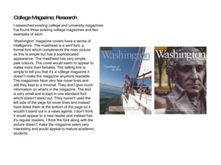
1. ‘ Washington' magazine covers have a sense of intelligence. The masthead is a serif font, a formal font which compliments the main picture as this is simple but has a sophisticated appearance. The masthead has very simple, pale colours. The cover would seem to appear to males more than females. The selling line is simply to tell you that it’s a college magazine it doesn’t make the magazine anymore readable. The magazines have very few cover lines and still they kept to a minimal. They don’t give much information on what's in the magazine. The text is very small and is kept in one standard font which doesn’t stand out. They haven't used the left side of the page for cover lines and instead have listed them at the bottom of the page so it wouldn’t stand out in a news agents. I don't think it would appear to a new reader and instead has it's regular readers. I think the font along with the picture doesn’t make the magazine seem very interesting and would appeal to mature academic students. College Magazine; Research I researched existing college and university magazines. I've found three existing college magazines and two examples of each.
2. The second magazine 'Beloit' is slightly more appealable than the first. The masthead font is sans serif. It makes the cover look more appealable to its age range because it looks informal. The selling line just informs that it is a college magazine so it isn't very encouraging to buy it. The images reflect the main cover lines. The main image is a student working or studying. The cover lines involves the students and cover a wide variety of the college. It would make it appeal to educated students studying varies subjects, male or female. The cover lines font is also sans serif and the font is different sizes which makes some text stand out more than others. The masthead, cover lines and selling lines are mostly white. The cover lines on left side are a different colour drawing more attention.
3. ‘ College’ magazine is a lifestyle and fashion magazine. It is mostly aimed at girls. The colour scheme is bright colours like red, yellow and blue. It has the same style as a popular fashion magazine such as Glamour or Elle. The masthead and text is san serif which makes it look informal. The main images are medium close-ups and they have a fashion feel to them. The left side of the page has been used for cover lines so it would stand out on a shelve in a shop. The cover lines are a mixture of bold and italic making some stand out more than others. They also are different size text. The cover lines are fashion and life related and have real life stories making them more interesting to teenage girls.