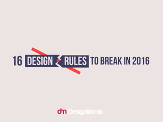
16 Design Rules To Break In 2016
•
202 recomendaciones•59,576 vistas

This document breaks 16 common design rules, encouraging designers to follow their instincts rather than strict rules. Some key points made include: forget who you are designing for and the design brief; go as fancy as you like rather than keeping designs simple; use colors freely rather than sticking to a theme; use multiple typefaces to convey different emotions rather than limiting to two; great designs are great regardless of being flat; and focus on standing out rather than being uniquely different. The document advocates breaking rules and conventions to create fresh, instinct-driven designs.

Recomendados
Recomendados
Más contenido relacionado
La actualidad más candente
La actualidad más candente (20)
Destacado
Destacado (18)
Similar a 16 Design Rules To Break In 2016
Similar a 16 Design Rules To Break In 2016 (20)
Más de DesignMantic
Más de DesignMantic (20)
Último
Último (20)
16 Design Rules To Break In 2016
- 1. 16 Design Rules To Break In 2016
- 2. Rule #1: Remember all the rules.
- 3. Nope. instead, ditch all the rules. Because great designs are designed outside of the box.
- 4. Rule #2: Design for the audience.
- 5. You are the designer. you know it, right? Seriously, forget who you are designing for. Just make sure you do justice with the business and make it apparent through design.
- 6. Rule #3: Follow the brief.
- 7. Follow your instinct (not brief). Brief is not bible. It is okay to read through th e brief but don't follow it religiously. Instead, do what your instinct tells you. Because, the d esigner in you knows the best.
- 8. Rule #4: Simple design rules.
- 9. Forget it. Go as FANCY as you like. Design is never simple. It is a myth that simple designs do better than realistic ones. If your design has to be fancy, b e it, make it fancy.
- 10. Rule #5: Keep it in grid.
- 11. Who cares if your design is well-balanced and looks good? Don't over complicate design through grids and layouts. If you are comfortable drawing without them, It' s okay.
- 12. Rule #6: Design with hierarchy.
- 13. In a flat world, where's the hierarchy? The last time we heard, the world was going flat. So, how does hierarchy fits into a flat, apparently void of details, world? Think about it.
- 14. Rule #7: Follow a color theme.
- 15. Whoever said that did not know Picasso. Because Picasso summed up this rule pretty right, "Why do two colors, put one next to the other, sing? Can one really explain this? No." So, don't bother. Use colors.
- 16. Rule #8: Stick to two or three typefaces.
- 17. Why there are so many fonts when two are enough, ever asked? If not, it is time you ask. Font is not just text written in fancy scripts. Fonts are emotions. Fonts are moods. For different emotions, using different fonts makes perfect sense.
- 19. Rule #9: Good designs are flat.
- 20. Good designs are good. not flat. No matter how much you have heard about flat-is-the-thing-and-everybody- loves-it, it is not entirely correct. Great designs are intrinsically great. You don't need to obsess over flat designs.
- 21. Rule #10: Whitespace is your friend.
- 22. Oh Yes. And It loves playing games. Do you know why whitespace is so cool and awesome? Because it tricks our mind to un-see things that are present. And slowly and gradually, it reveals what's in the design. But in this insanely busy world, who has got time for riddles?
- 23. Rule #11: Golden ratio.
- 24. ICYMI: golden ratio is reverse engineering. The fact that nobody tells you is that every good designs sets perfectly well into golden ratio (rectangle) by itself. No deliberate efforts needed.
- 25. Rule #12: Always think cross platform.
- 26. Yeah, and what about responsive? Responsive does not mean designing for various platforms or in different environments, it means designing a single solution that works equally well on all platforms and adapts according to the screen size.
- 28. Rule #13: Don't stretch that font.
- 29. Stretch it till you break it. The reason we are told so is because outstretching a font makes it look ugly and out of proportion. Apparently. But if you think you can pull it off right, it is fine to stretch, compress or even skew a font. And by the way, customized fonts are all in vogue these days.
- 30. Rule #14: Do paperwork.
- 31. Use whatever tools you are comfortable with. If paper is not your thing, it is okay to do preliminary work on your Tab, iPad or PC. Remember, it is important to be comfortable with the equipment you are using.
- 32. Rule #15: Be unique.
- 33. Uniqueness is contextual. What is unique today may not be unique tomorrow. And what is unique here may or may not be unique in other parts of the world. So instead of designing unique designs, design to standout.
- 34. Rule #16: Bring consistency into design.
- 35. Humdrum. who likes seeing the same thing over and over again? Imagine looking at things that are designed on a similar pattern, everyday. Sounds fun, no? Exactly, no. Be consistent in quality but don't try to oversell your once-so-popular-design.
- 36. Thank you!