
Recommended
More Related Content
Similar to Frequency distr-WPS Office.docx
Similar to Frequency distr-WPS Office.docx (20)
Recently uploaded
Recently uploaded (20)
Frequency distr-WPS Office.docx
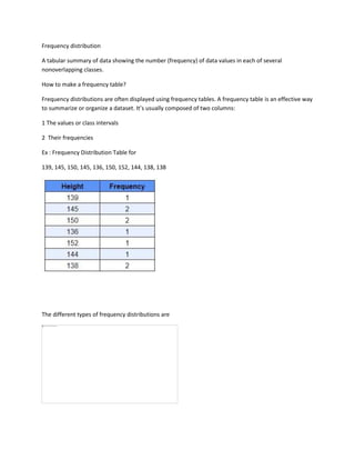
- 1. Frequency distribution A tabular summary of data showing the number (frequency) of data values in each of several nonoverlapping classes. How to make a frequency table? Frequency distributions are often displayed using frequency tables. A frequency table is an effective way to summarize or organize a dataset. It’s usually composed of two columns: 1 The values or class intervals 2 Their frequencies Ex : Frequency Distribution Table for 139, 145, 150, 145, 136, 150, 152, 144, 138, 138 The different types of frequency distributions are
- 2. 1 Ungrouped frequency distributions: Instead of sets of data values, it presents the frequency of an item in each particular data value. Example: Making an ungrouped frequency table A gardener set up a bird feeder in their backyard. To help them decide how much and what type of birdseed to buy, they decide to record the bird species that visit their feeder. Over the course of one morning, the following birds visit their feeder: 2 Grouped frequency distributions: The data is organised and grouped into groups called class intervals in this type. In a frequency distribution table, the frequency of data belonging to each class interval is represented. The grouped frequency table shows the frequency distribution in class intervals. Example: Grouped frequency distribution A sociologist conducted a survey of 20 adults. She wants to report the frequency distribution of the ages of the survey respondents. The respondents were the following ages in years: 52, 34, 32, 29, 63, 40, 46, 54, 36, 36, 24, 19, 45, 20, 28, 29, 38, 33, 49, 37
- 3. Round the class interval width to 10. The class intervals are 19 ≤ a < 29, 29 ≤ a < 39, 39 ≤ a < 49, 49 ≤ a < 59, and 59 ≤ a < 69. 3 Relative frequency distributions: It indicates what percentage of the total number of observations each category belongs to. Example: Relative frequency distribution From this table, the gardener can make observations, such as that 19% of the bird feeder visits were from chickadees and 25% were from finches. 4 Cumulative frequency distributions: A frequency distribution is the sum of the first frequency and all frequencies below it. We must add each value to the next, then add the sum to the next, and so on until the last value is reached. The whole sum of all frequencies will be the last cumulative frequency. Example: Cumulative frequency distribution
- 4. From this table, the sociologist can make observations such as 13 respondents (65%) were under 39 years old, and 16 respondents (80%) were under 49 years old. How to graph a frequency distribution? Pie charts, bar charts, and histograms are all ways of graphing frequency distributions. The best choice depends on the type of variable and what you’re trying to communicate. 1 Pie chart A pie chart is a graph that shows the relative frequency distribution of a nominal variable. A pie chart is a circle that’s divided into one slice for each value. The size of the slices shows their relative frequency. This type of graph can be a good choice when you want to emphasize that one variable is especially frequent or infrequent, or you want to present the overall composition of a variable. 2 Bar chart A bar chart is a graph that shows the frequency or relative frequency distribution of a categorical variable (nominal or ordinal). The y-axis of the bars shows the frequencies or relative frequencies, and the x-axis shows the values. Each value is represented by a bar, and the length or height of the bar shows the frequency of the value.
- 5. A bar chart is a good choice when you want to compare the frequencies of different values. It’s much easier to compare the heights of bars than the angles of pie chart slices. 3 Histogram A histogram is a graph that shows the frequency or relative frequency distribution of a quantitative variable. It looks similar to a bar chart.