Vendor Accuracy Study: 2010 Estimates vs. Census 2010
•
2 likes•440 views

Esri’s demographic data is ranked most accurate in a recent study. This white paper describes the Precision portion of a blind study conducted by four independent researchers who are authorities in small area forecasts and measures of forecast accuracy.

Recommended
Recommended
More Related Content
Similar to Vendor Accuracy Study: 2010 Estimates vs. Census 2010
Similar to Vendor Accuracy Study: 2010 Estimates vs. Census 2010 (20)
More from Esri
More from Esri (20)
Recently uploaded
Recently uploaded (20)
Vendor Accuracy Study: 2010 Estimates vs. Census 2010
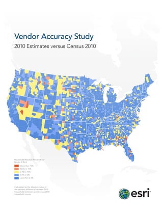
- 1. Vendor Accuracy Study 2010 Estimates versus Census 2010 Household Absolute Percent Error Vendor 2 (Esri) More than 15% 10.1% to 15% 5.1% to 10% 2.5% to 5% Less than 2.5% Calculated as the absolute value of the percent difference between 2010 household estimates and Census 2010 household counts
- 2. Table of Contents 3 Introduction 4 Results Methodology Reporting 8 Appendix A Tables 14 Appendix B Citations Study Conducted By Matthew Cropper, GISP, Cropper GIS Jerome N. McKibben, PhD, McKibben Demographic Research David A. Swanson, PhD, University of California, Riverside Jeff Tayman, PhD, University of California, San Diego Introduction By Lynn Wombold Chief Demographer, Esri Data producers work on a 10-year cycle. With every census, we get the opportunity to look back over the previous decade.
- 3. Introduction Vendor Accuracy Study 2010 Estimates versus Census 2010 Data producers work on a 10-year cycle. With every census, we get the opportunity to look back over the previous decade while resetting our annual demographic estimates to a new base. Census counts reveal how well we have anticipated and measured demographic change since the last census. The decade from 2000 to 2010 posed a real challenge. Since 2000, we have experienced both extremes in local change: rapid growth with the expansion of the housing market followed by the precipitous decline that heralded one of the worst recessions in US history. We know from experience just how difficult it is to capture rapid change accurately—growth or decline. We also understand the difficulty of measuring demographic change for the smallest areas: block groups. Block groups are the most frequently used areas because they represent accuracy, simply calculated as the percent difference the building blocks of user-defined polygons and ZIP between the estimate and the count. Summarizing the Codes. Unfortunately, after Census 2000, there was no results is not as simple. current data reported for block groups in the past decade. The average—the Mean Absolute Percent Error (MAPE)— To capture the change, we used data series that were represents a skewed distribution and clearly overstates symptomatic of population change, sources like address error for small areas. It is deemed suitable for counties or lists or delivery counts from the US Postal Service. We states, but it returns questionable results for census tracts revised our models to apply the available data sources to or block groups. A number of alternatives have been tried calculate change and investigated new sources of data to to retain the integrity of the results without overstating the measure changes in the distribution of the population. How error. Is one measure better than another? successful were we? With the release of the 2010 Census To obtain an unbiased answer to our questions, we turned counts, we addressed that question. to an independent team of investigators. We also added The answer can depend on the test that is used to compare one question, which came from data users: Is one data 2010 updates to 2010 Census counts. There is a test for bias, producer more accurate than another? There are certainly the Mean Algebraic Percent Error (MALPE), which indicates superficial differences among the vendors, but we use whether estimates tend to be too low or too high. However, similar data sources to derive our demographic updates. this test can overstate bias, since the lower limit is naturally Are there real differences in accuracy? The professionals capped at zero, while the upper limit is infinite. Another who undertook the study are well experienced in small-area test, the Index of Dissimilarity (ID), measures allocation forecasts and measures of forecast accuracy. We asked error, a more abstruse measure used by demographers to them to test two variables, total population and households, test the distribution of the population. For example, was from five major data vendors including Esri. The data was the US population distributed accurately among the states? provided without identifying the individual vendors—a The total may be off, but the allocation of the population blind study. The following is a summary of their findings. to subareas is tested independently of the total. However, data users prefer to know how much the estimated totals differ from the counts. The most common test is for 3
- 4. Results Methodology The data used in this project was the 2010 estimates of Briefly, if standard tests find that the distribution of total population and households produced by Esri and four Absolute Percent Errors (APEs) is right skewed (by extreme other major data vendors. The estimates data consisted of errors), then MAPE-R is used to change the shape of the the forecast results at four different levels of geography: distribution of APEs to one that is more symmetrical. If the state, county, census tract, and census block group. The tests show that it is not extremely right skewed, MAPE-R is vendors’ 2010 estimates, which were provided anonymously not needed, and MAPE is used. If MAPE-R is called for, the to the researchers by Esri, were then compared to the Box-Cox power transformation is used to change the shape results of the 2010 Census. Error measurements were then of the APE distribution efficiently and objectively (Box and calculated for each geographic area and summarized Cox 1964). The transformed APE distribution considers to show the total error for each level of geography. The all errors but assigns a proportionate amount of influence population and household error measurements were also to each case through normalization and not elimination, stratified and analyzed by base size in 2000 and 2000–2010 thereby reducing the otherwise disproportionate effect of growth rate quartiles. outliers on a summary measure of error. The mean of the transformed APE distribution is known as MAPE-T. The All the vendors, including Esri, had created their forecasts transformed APE distribution has a disadvantage, however: using 2000 Census geography. To analyze the accuracy the Box-Cox transformation moves the observations into a of the vendor forecasts without modifying their data or unit of measurement that is difficult to interpret (Emerson compromising the original results, the 2010 Census counts and Stoto 1983,124). Hence, MAPE-T is expressed back into were assigned to 2000 Census geography. This enabled the the original scale of the observations by taking its inverse study team to analyze the 2010 Census results versus the (Coleman and Swanson 2007). The reexpression of MAPE-T vendor forecasts without modifying any vendor datasets. is known as MAPE-R. The correspondence of the 2010 Census counts to 2000 geography entailed an extensive quality control and quality We strongly believe that the MAPE-R transformation assurance process to determine where census geography represents an optimal technique for dealing with outliers, had changed and to identify the population density of areas which are typically found in the error distributions of that were either divided or consolidated during 2000–2010. forecasts and estimates (Swanson, Tayman, and Barr 2000; Tayman, Swanson, and Barr 1999). There are other The full research project examined the three dimensions of techniques for dealing with outliers, including trimming forecast error: bias (MALPE), allocation (ID), and precision and winsorizing; as an alternative, one could turn to a (MAPE). Because precision is the dimension of error on robust measure such as the Median Absolute Percent Error which most data users focus, we follow suit in this paper. (MEDAPE) or the geometric Mean Absolute Percent Error In so doing, we use a refinement of MAPE that mitigates (GMAPE) (Barnett and Lewis 1994). Like Fox (1991), we are, the effects of extreme errors (outliers) in trying to assess however, reluctant to simply remove outlying observations average precision. This is important because extreme (trimming), and are equally averse to limiting them errors, while rare, cause average error to increase, thereby (winsorizing) and ignoring them (MEDAPE and GMAPE). overstating where the bulk of the errors are located Unlike these methods for dealing with outliers, MAPE-R not (Swanson, Tayman, and Barr 2000). The refinement we only mitigates the effect of outliers, it also retains virtually use is MAPE-R (Mean Absolute Percent Error—Rescaled), all of the information about each of the errors (Coleman which not only mitigates the effect of extreme errors but and Swanson 2007; Swanson, Tayman, and Barr 2000; also retains virtually all of the information about them, Tayman, Swanson, and Barr 1999). Hence, we use MAPE-R something MAPE and similar measurements don’t do as the preferred measure of forecast precision. (Coleman and Swanson 2007; Swanson, Tayman, and Barr 2000; Tayman, Swanson, and Barr 1999). 4 Vendor Accuracy Study
- 5. Reporting A scorecard was developed to present a summary of each vendor’s relative performance. A composite score is calculated within each geographic level, representing the sum of the error measures for population and households for each size and growth quartile (nine values each for population and households). The scores have a minimum value of zero and no upper bounds. These composite scores are then summed to determine which vendor had the lowest overall precision error. The population and households error totals were then added together to find a total overall score. These results showed that Esri had the lowest score in population, households, and overall error. The lowest scores indicate the highest accuracy. All Level Population & Household Results Criteria/Vendor Vendor 1 Vendor 2 (Esri) Vendor 3 Vendor 4 Vendor 5 Population 151.8 127.3 134.6 148.0 131.4 Households 164.1 120.4 142.1 147.7 173.3 Total Precision 315.9 247.7 276.7 295.7 304.7 (MAPE-R) Best Possible=0; Worst Possible=+∞ State Population & Household Results Criteria/Vendor Vendor 1 Vendor 2 (Esri) Vendor 3 Vendor 4 Vendor 5 Population 6.9 7.2 7.7 9.2 5.6 Households 14.5 5.4 10.2 10.1 24.1 Total State 21.4 12.6 17.9 19.3 29.7 Precision (MAPE-R) Best Possible=0; Worst Possible=+∞ As is the case in all comparative error procedures, there will be variations from overall results when examining the subcategories. The state level results were one such example (N=51). For total population, Vendor 5 had the lowest total error by 1.3 points; for households, Esri had the lowest total by 4.7 points. When the two scores were combined, Esri had the lowest overall score by 5.3 points. 5
- 6. County Level Population & Household Results Criteria/Vendor Vendor 1 Vendor 2 (Esri) Vendor 3 Vendor 4 Vendor 5 Population 20.2 19.1 21.0 20.9 21.6 Households 29.0 20.7 31.1 25.6 34.1 Total County 49.2 39.8 52.1 46.5 55.7 Precision (MAPE-R) Best Possible=0; Worst Possible=+∞ At the county level (N=3,141), Esri had the lowest population error score, by 1.1 points, and the lowest household error score, by 4.9 points. The results for the total county precision measure show that Esri had the lowest score by 6.7 points. Census Tract Level Population & Household Results Criteria/Vendor Vendor 1 Vendor 2 (Esri) Vendor 3 Vendor 4 Vendor 5 Population 55.3 47.1 48.1 54.9 47.7 Households 51.3 42.4 45.2 51.1 51.9 Total Census Tract 106.6 89.5 93.3 106 99.6 Precision (MAPE-R) Best Possible=0; Worst Possible=+∞ For census tracts (N=65,334), the results are similar. Esri had the lowest error sum for both population, by 0.6 points, and households, by 2.8 points. As a result, Esri achieved the lowest score for census tracts by 3.8 points. Block Group Level Population & Household Results Criteria/Vendor Vendor 1 Vendor 2 (Esri) Vendor 3 Vendor 4 Vendor 5 Population 69.4 53.9 57.8 63 56.5 Households 69.3 51.9 55.6 60.9 63.2 Total Block Group 138.7 105.8 113.4 123.9 119.7 Precision (MAPE-R) Best Possible=0; Worst Possible=+∞ Finally, at the block group level (N=208,687), Esri also had the lowest error sum for both population, by 2.6 points, and households, by 3.7 points. Esri had the lowest total error sum at the block group level by 7.6 points. 6 Vendor Accuracy Study
- 7. A review of the results finds several important trends. First, the error scores increase as the level of geography decreases in size and the number of cases significantly increases. Despite the larger number of observations for smaller geographies, the chances of extreme errors affecting the end results increases. The larger number of areas cannot mitigate the effects of extreme error on the overall average. There is also a noticeable difference in the size and distribution of the errors between population and households among the vendors. Esri tends to have the smallest total error in both population and households, but the difference between Esri and the other vendors is much greater in the households error. Part of this trend may be due to methodological differences. Since this was a blind study, the researchers had no idea which vendors were included, let alone what methodologies were used by the respective vendors. Therefore, one of the interests in performing the research was not to judge methodology but rather to test how well error measurements performed with a large number of cases like the total number of block groups. The availability of these datasets provided a unique opportunity to perform extensive error testing on extremely large numbers of estimates against census results. While the MAPE-R measurement performed well and did mitigate the influence of extreme errors, the sheer size of the largest errors still had an impact on the final results for all vendors. This situation was evident even when examining block group errors that had over 208,000 cases. Given that an analysis of estimate errors from multiple sources for all observations at the tract and block group levels has never before been undertaken, this procedure provides groundbreaking insight into small-area error analysis and the testing of error measurements. After reviewing the results for all quartiles at all levels of geography, it is concluded that Esri had the lowest precision error total for both population and households. The results also show that at smaller levels of geography, for which change is more difficult to forecast, Esri tended to perform even better, particularly for households. Esri tends to have the smallest total error in both population and households at smaller levels of geography, Esri tended to perform even better, particularly for households.
- 8. Appendix A Tables Results of the MAPE-R tests by vendor, variable, geographic level, and quartiles are included in these tables. Quartiles represent the size of the base population in 2000 and the rates of change from 2000 to 2010. The growth quartiles are defined as being roughly 25 percent of the observations of a geographic level that have the lowest 2000–2010 growth rate (quartile 1) through 25 percent of the observations of a geographic level that have the highest 2000–2010 growth rate (quartile 4). The size quartiles are defined as being roughly 25 percent of the observations of a geographic level that has the smallest 2010 size (quartile 1) through 25 percent of the observations of a geographic level that has the largest 2010 size (quartile 4). Quartile values vary by level of geography, as shown in the appendix tables. Table 1: Quartiles defined by variable and geography Block Group Households County Households Quartile Size Growth Rate Quartile Size Growth Rate 1 < 301 < -5.01% 1 < 3,500 < 0.00% 2 301 to 400 -5.01% to 0% 2 3,500 to 6,999 0% to 4.99% 3 401 to 500 0.01% to 4.99% 3 7,000 to 14,999 5.00% to 9.99% 4 501+ 5%+ 4 15,000+ 10.0%+ Block Group Population County Population Quartile Size Growth Rate Quartile Size Growth Rate 1 < 800 < -5.01% 1 < 9,999 < 0.00% 2 800 to 1,199 -5% to 0% 2 10,000 to 19,999 0.0% to 4.99% 3 1,200 to 1,599 0.01% to 4.99% 3 20,000 to 39,999 5.0% to 9.99% 4 1,600+ 5%+ 4 40,000+ 10.0%+ Census Tract Households State Householdss Quartile Size Growth Rate Quartile Size Growth Rate 1 < 999 < -5.01% 1 < 500,000 < 5.00% 2 1,000 to 1,499 -5% to 0% 2 500,000 to 1,499,999 5.00% to 9.99% 3 1,500 to 1,999 0.01% to 7.99% 3 1,500,000 to 2,999,999 10.0% to 14.99% 4 2,000+ 8%+ 4 3,000,000+ 15.0%+ Census Tract Populationtion State Population Quartile Size Growth Rate Quartile Size Growth Rate 1 < 2,999 < -5.01% 1 < 1,000,000 < 5.00% 2 2,999 to 3,999 -5% to 0% 2 1,000,000 to 2,999,999 5.00% to 9.99% 3 4,000 to 4,999 0.01% to 7.99% 3 3,000,000 to 7,999,999 10.0% to 14.99% 4 5,000+ 8%+ 4 8,000,000+ 15.0%+ 8 Vendor Accuracy Study
- 9. Table 2: Number of areas in each quartile Block Group Households County Households Quartile Size Growth Rate Quartile Size Growth Rate 1 45,266 45,561 1 622 782 2 47,283 55,088 2 636 760 3 38,664 35,881 3 769 646 4 77,474 72,157 4 1,114 953 Block Group Population County Population Quartile Size Growth Rate Quartile Size Growth Rate 1 47,311 62,469 1 695 1,101 2 66,866 41,191 2 652 742 3 42,289 33,529 3 681 492 4 52,221 71,498 4 1,113 806 Census Tract Households State Households Quartile Size Growth Rate Quartile Size Growth Rate 1 13,964 10,995 1 12 8 2 18,373 15,377 2 13 20 3 15,656 17,689 3 15 9 4 17,341 21,273 4 11 14 Census Tract Population State Population Quartile Size Growth Rate Quartile Size Growth Rate 1 18,491 15,345 1 8 16 2 13,925 13,524 2 14 16 3 12,078 17,021 3 18 9 4 20,840 19,444 4 11 10 9
- 10. State Population Results Best Performing Precision (MAPE-R) Vendor 1 Vendor 2 (Esri) Vendor 3 Vendor 4 Vendor 5 All States 0.7 0.8 0.8 1.0 0.6 Size Quartile 1 0.6 0.9 1.0 1.2 0.8 Quartile 2 0.8 0.8 0.8 1.0 0.7 Quartile 3 0.5 0.6 0.7 0.9 0.4 Quartile 4 0.9 0.9 0.8 0.9 0.5 Growth Rate Quartile 1 0.8 0.7 0.7 0.8 0.6 Quartile 2 0.4 0.5 0.6 0.8 0.5 Quartile 3 1.2 0.8 1.4 1.4 0.6 Quartile 4 1.0 1.2 0.9 1.2 0.9 SUM 6.9 7.2 7.7 9.2 5.6 State Household Results Best Performing Precision (MAPE-R) Vendor 1 Vendor 2 (Esri) Vendor 3 Vendor 4 Vendor 5 All States 1.2 0.6 1.1 1.1 2.7 Size Quartile 1 3.2 1.1 1.7 1.8 1.8 Quartile 2 1.8 0.5 0.8 1.1 2.4 Quartile 3 1.4 0.5 1.0 0.9 3.6 Quartile 4 1.0 0.4 0.8 0.8 2.8 Growth Rate Quartile 1 1.0 0.4 1.5 0.9 2.1 Quartile 2 1.6 0.5 0.8 1.0 2.6 Quartile 3 1.3 0.6 1.1 1.0 3.1 Quartile 4 2.0 0.8 1.4 1.5 3.0 SUM 14.5 5.4 10.2 10.1 24.1 10 Vendor Accuracy Study
- 11. County Population Results Best Performing Precision (MAPE-R) Vendor 1 Vendor 2 (Esri) Vendor 3 Vendor 4 Vendor 5 All Counties 2.1 2.0 2.2 2.2 2.2 Size Quartile 1 3.8 3.3 3.9 3.8 4.3 Quartile 2 2.6 2.3 2.5 2.5 2.6 Quartile 3 2.0 2.0 2.1 2.1 2.1 Quartile 4 1.4 1.5 1.6 1.6 1.5 Growth Rate Quartile 1 2.4 2.1 2.4 2.4 2.6 Quartile 2 1.8 1.7 1.9 1.9 2.0 Quartile 3 1.9 1.9 2.1 2.1 2.1 Quartile 4 2.2 2.3 2.3 2.3 2.2 SUM 20.2 19.1 21.0 20.9 21.6 County Household Results Best Performing Precision (MAPE-R) Vendor 1 Vendor 2 (Esri) Vendor 3 Vendor 4 Vendor 5 All Counties 3.0 2.2 3.2 2.6 3.7 Size Quartile 1 5.0 3.6 5.0 5.1 5.0 Quartile 2 3.6 2.4 4.0 3.1 3.1 Quartile 3 3.0 2.2 3.5 2.4 3.9 Quartile 4 2.3 1.6 2.0 1.8 3.5 Growth Rate Quartile 1 2.8 2.3 5.2 3.4 4.1 Quartile 2 2.9 1.9 2.0 2.3 3.3 Quartile 3 3.2 2.1 2.8 2.3 3.3 Quartile 4 3.2 2.4 2.8 2.6 4.2 SUM 29.0 20.7 31.1 25.6 34.1 11
- 12. Census Tract Population Results Best Performing Precision (MAPE-R) Vendor 1 Vendor 2 (Esri) Vendor 3 Vendor 4 Vendor 5 All Census Tracts 5.9 5.0 5.2 5.9 5.1 Size Quartile 1 7.8 6.6 6.7 7.5 6.7 Quartile 2 5.8 4.8 5.1 5.7 5.1 Quartile 3 5.4 4.5 4.8 5.5 4.8 Quartile 4 5.3 4.4 4.7 5.4 4.5 Growth Rate Quartile 1 8.8 8.8 7.7 8.2 7.3 Quartile 2 4.3 3.5 3.5 4.4 4.2 Quartile 3 4.2 3.3 3.9 4.6 4.2 Quartile 4 7.8 6.2 6.5 7.7 5.8 SUM 55.3 47.1 48.1 54.9 47.7 Census Tract Household Results Best Performing Precision (MAPE-R) Vendor 1 Vendor 2 (Esri) Vendor 3 Vendor 4 Vendor 5 All Census Tracts 5.4 4.2 4.7 5.3 5.4 Size Quartile 1 8.1 6.4 6.7 7.7 7.4 Quartile 2 5.3 4.2 4.6 5.3 5.5 Quartile 3 4.8 3.8 4.2 4.8 5.2 Quartile 4 4.7 3.8 4.3 4.8 4.9 Growth Rate Quartile 1 7.6 8.7 8.1 8.0 8.3 Quartile 2 3.9 2.8 3.0 4.0 5.4 Quartile 3 4.1 3.0 3.7 4.3 4.7 Quartile 4 7.4 5.5 5.9 6.9 5.1 SUM 51.3 42.4 45.2 51.1 51.9 12 Vendor Accuracy Study
- 13. Block Group Population Results Best Performing Precision (MAPE-R) Vendor 1 Vendor 2 (Esri) Vendor 3 Vendor 4 Vendor 5 All Block Groups 8.4 6.6 6.9 7.5 6.8 Size Quartile 1 10.3 8.3 8.5 9.0 8.5 Quartile 2 8.0 6.4 6.6 7.1 6.7 Quartile 3 7.7 6.1 6.5 6.8 6.2 Quartile 4 8.0 6.1 6.5 7.3 6.0 Growth Rate Quartile 1 5.7 4.6 5.5 5.5 4.9 Quartile 2 5.9 3.8 4.0 5.3 5.0 Quartile 3 5.4 4.0 4.7 5.4 4.9 Quartile 4 10.0 8.0 8.6 9.1 7.5 SUM 69.4 53.9 57.8 63.0 56.5 Block Group Household Results Best Performing Precision (MAPE-R) Vendor 1 Vendor 2 (Esri) Vendor 3 Vendor 4 Vendor 5 All Block Groups 7.5 5.5 6.0 6.6 6.8 Size Quartile 1 9.4 7.0 7.0 8.0 8.6 Quartile 2 7.2 5.3 5.8 6.3 7.0 Quartile 3 7.0 5.1 5.6 6.1 6.6 Quartile 4 7.2 5.1 5.8 6.4 6.0 Growth Rate Quartile 1 10.5 10.1 9.9 9.4 10.1 Quartile 2 5.5 3.1 3.4 4.7 6.3 Quartile 3 5.3 3.5 4.5 5.1 5.4 Quartile 4 9.7 7.2 7.6 8.3 6.4 SUM 69.3 51.9 55.6 60.9 63.2 13
- 14. Appendix B Citations Barnett, V., and T. Lewis, Outliers in Statistical Data, Third Edition (New York, NY: John Wiley & Sons, 1994). Box, G., and D. Cox, “An Analysis of Transformations,” Journal of the Royal Statistical Society, series B, no. 26 (1964): 211–252. Coleman, C., and D. A. Swanson, “On MAPE-R as a Measure of Cross- sectional Estimation and Forecast Accuracy,” Journal of Economic and Social Measurement, vol. 32, no. 4 (2007): 219–233. Emerson, J., and M. Stoto, “Transforming data,” in Understanding Robust and Exploratory Data Analysis, eds. D. Hoaglin, F. Mosteller, and J. Tukey (New York, NY: Wiley, 1983), 97–128. Fox, J., “Quantitative Applications in the Social Sciences,” Regression Diagnostics, no. 79 (1991), Newbury Park, CA: Sage Publications. Swanson, D. A.; J. Tayman; and C. F. Barr, “A Note on the Measurement of Accuracy for Subnational Demographic Forecasts,” Demography 37 (2000): 193–201. Tayman, J.; D. A. Swanson; and C. F. Barr, “In Search of the Ideal Measure of Accuracy for Subnational Demographic Forecasts,” Population Research and Policy Review 18 (1999): 387–409. Population and households error totals are then added together to find a total overall score. These results showed that Esri had the lowest score in population, households, and overall error. 14 Vendor Accuracy Study
- 15. Household Absolute Percent Error Household Absolute Percent Error Vendor 1 Vendor 3 Household Absolute Percent Error Household Absolute Percent Error Vendor 4 Vendor 5 More than 15% 10.1% to 15% 5.1% to 10% 2.5% to 5% Less than 2.5% Calculated as the absolute value of the percent difference between 2010 household estimates and Census 2010 household counts 15
- 16. Esri inspires and enables people to positively impact their future through a deeper, geographic understanding of the changing world around them. Governments, industry leaders, academics, and nongovernmental organizations trust us to connect them with the analytic knowledge they need to make the critical decisions that shape the planet. For more than 40 years, Esri has cultivated collaborative relationships with partners who share our commitment to solving earth’s most pressing challenges with geographic expertise and rational resolve. Today, we believe that geography is at the heart of a more resilient and sustainable future. Creating responsible products and solutions drives our passion for improving quality of life everywhere. Contact Esri 380 New York Street Redlands, California 92373-8100 usa 1 800 447 9778 t 909 793 2853 f 909 793 5953 info@esri.com esri.com Offices worldwide esri.com/locations Copyright © 2012 Esri. All rights reserved. Esri, the Esri globe logo, @esri.com, and esri.com are trademarks, service marks, or registered marks of Esri in the United States, the European Community, or certain other jurisdictions. Other companies and products or services mentioned herein may be trademarks, service marks, or registered marks of their respective mark owners. Printed in USA G53740 5/12rk