3. CONTINUED
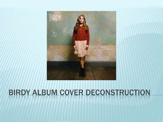
On the front of the album she seems to be
wearing an unconventional/ indie outfit.
Behind her is the look of a lightly coloured
vintage looking room.
She is in the centre drawing your eyes to her.
Insert cover image here.
4. CONTINUED
Throughout the booklet there are lots of
images of her in the limelight.
She is saying this is me so people can
recognise her for her image not just for her
voice.
Insert booklet images here.
5. CONTINUED
On the middle page of the booklet there is a
professional image of her looking away from
the camera.
Insert middle page of booklet here.
6. FONT
The same font is used throughout the
album.
It is a very young, new, fresh font
demonstrating that she is a new artist to the
music industry.
7. CONTINUED
It is a very thin font apart from her name
which is a little bit thicker.
It is also informal but soft.
8. COLOUR
Pale and pastel greeny/ blue throughout.
The colours are all natural.
Insert some examples.
9. POSITIONS
In every shot she is positioned in the middle.
Her name is on the right so you will see this
first then you will see the image of her.
Insert front cover image here.