
Recomendados
Más contenido relacionado
Más de EmmaJayneGraves
Último
Último (20)
Q magazine analysis
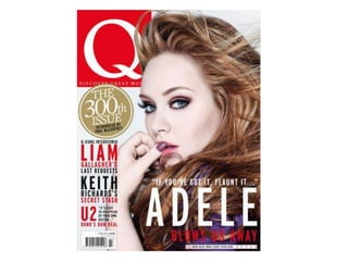
- 2. Colour Scheme –The colour scheme for the magazine is read white and black . This gives the magazine a serious look and suggests that it is appealing to the older audience. The red added to the black and white makes the colour scheme more advanced, it also stands out against the other colours making it more dramatic, drawing you into the magazine making you want to look and pick it up. Gold is only used once on the cover of the magazine, this suggest that it something special. Photography – The photo has been taken in a studio we can Writing style – There isn’t tell this because of the white much writing on the cover . background and the windswept Magazines don’t put a lot of hair. The image is also bright so writing on the cover as they it couldn’t of been taken are mainly headings to catch outside. The pose gives a sexy the readers attention and effect the way she is touching make them want to read the her lips., this isn’t a natural magazine. These headers are pose. The image reflects in in for most ages. The people in the headline. “if you’ve got it, them, the older generation will flaunt it...” This reflects the remember there music better sexiness of the image. “Blow but the younger generation us away” This reflects the has still heard of them. They windswept hair. A mid-close up manage to create a wide target shot has been used, this is so audience by doing this. It easy that we can’t see and on the to read so they can target their background and the main focus audience no matter what their is on her and we get to see her reading level is. beauty. The main focus is on her face and arm , the way her hair is positions and the colour of the cloths and colour scheme makes the stand out.
- 3. Overall look – The overall look to the magazine is serious. This appeals to the older target market . However there is an element of fun, filtration and gossip that maybe wouldn’t be seen in a different magazine. This is what appeals to the younger target market Text/picture ratio – Most Fonts – The font are clear, of the page is taken up by modern, and bold. This the picture. This is typical makes the front cover easy on a front cover as the to read, clear and modern. picture is the main They do this to catch attraction to the magazine. peoples attention and make Most of the text is to the them look at the magazine. left of the cover. This is to The font varies in size on take the focus from the text the front cover. The larger and put it on the image. text is what stands out and The writing on the image draws the reader into the relates to how is one the magazine, the smaller text cover. Only one image has tells the reader a bit more been used so it can appeal about the story inside and to the higher grade of make them interested. The social class and the older “Q” is in a different text this target audience. It usual for makes it stand out against a music magazine to have the other text and shows its only one image on the importance. The writing in cover as they tend to be the gold circle also uses this more serious. front which means it is important as its different to the rest of the cover.
- 5. Colour Scheme – The red, black and white colour scheme has continued on from the front cover, this creates a identity to the magazine which it has become recognized for. This appeals to the target audience and the genre of music. Photography – The black and white images suggest seriousness of the magazine, however the image looks fun, they have managed mix the two well. They have also used coloured images where the person looks serious which creates a balance again. There is a mixture of studio based images and live concert images. Concert images are expect in a magazine like this. Some images are been posed in and other are natural. With the mixture of images this shows all sides of the magazine on just one page. The larger images suggest Writing style – The writing is short and easy. They try to fit as much that they are the main information about the magazine on these two pages. They tell the important stories. reader what they want to know and where to find it. It is easy to read as it is only small bits of information and they want it to appeal to everyone.
- 6. Overall look – The contents page looks serious but fun at the same time. The black and white images, poses and the amount of writing is what gives the magazine a serious element. However the images look fun an interesting. Text/picture ratio – The page consists of more images than it does writing. This makes the reader interested in what is going on in the magazine. The images are the pages that the reader are more likely to turn to. They want the reader to do this as they the main stories in the magazine. The little amount of text is expected on a contents page as they are telling the reader what is inside the magazine and on which pages. Fonts - The types of fonts that they use look very formal and appeal to the older target audience. They make the magazine look smart and grown up but they also give the magazine a old look,
- 8. Colour scheme – They have carried on the colour scheme of black, white and red. They have carried on the colour scheme through all the magazine as it creates an identity, it also relates to the genre of magazine. Photography – Some of the poses that the band are doing are natural and some are not but these looks relaxed and fun. We get to see images of the them recording in a studio which is normal in this genre of music magazine. With the images been taken in the studio it makes us feel like we are part of them making the CD and have been given privet access to it that no one else can have. Other images have been used of different places which breaks the page up and Writing style – The article is about their life as a band and their new makes it a bit more album. They have used quotation marks when someone out of the band is interesting. talking. It seems a bit more privet and serious as we don’t know what they have asked the band we just get quotes.
- 9. Overall look – It looks fun but serious at the same time. It looks very natural which they want as they are in a recording studio. With the colours of the images and what they are wearing makes the red stand out on the page. Text/picture ratio – picture to text the ratio is probably about 60 – 40. The large images get the readers attention, so they are more likely to stop and read the page. As there is more images on the page it breaks the writing up so it makes the reader think that there isn’t as much text to read, therefore they are more likely to read the article. There doesn’t seem like a lot of text but it is informative and well written. Fonts – The fonts are the same as the one they have used on the contents page, this creates a magazine identity. They make the magazine look formal which fits in with the magazines overall look to make it appeal to their audience.