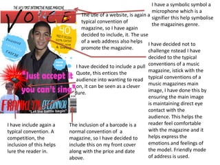
1. I have a symbolic symbol a
microphone which is a
The use of a website, is again a
signifier this help symbolise
typical convention of
the magazines genre.
magazine, so I have again
decided to include, it. The use
of a web address also helps
I have decided not to
promote the magazine.
challenge nstead I have
decided to the typical
I have decided to include a pull conventions of a music
Quote, this entices the magazine, istick with the
audience into wanting to read typical conventions of a
on, it can be seen as a clever music magazines main
lure. image, I have done this by
ensuring the main image
is maintaining direct eye
contact with the
audience. This helps the
I have include again a The inclusion of a barcode is a reader feel comfortable
typical convention. A normal convention of a with the magazine and it
competition, the magazine, so I have decided to helps express the
inclusion of this helps include this on my front cover emotions and feelings of
lure the reader in. along with the price and date the model. Friendly mode
above. of address is used.
2. The mastheads is
deliberately eye catching,
due to the bright colours
used.
The model is seen smiling,
which is seen to be
radiant to the audience
feelings, which would
attract them to the
magazine. The smile is
also a signifier of
happiness, it creates a
comforting and pleasant
atmosphere.
The model is dressed
smart and so wouldn’t
The round typography, again appears to be friendly, just appeal to the
the colours used are also seen to be signifiers , pink everyday audience.
and red suggest happiness and are also stereotypical
colours of the desired target audience which are
females.
3. The splats used again are used as a
symbol to help show the audience, from
this style it makes the reader aware the
age group this magazine us aimed
towards. Teenage like/Childlike style
This lure used helps entice
the audience and
encourages them to read
on.
I have used the same
technique as the “we love
pop” magazine, the word
“exclusive” again entices the
audience and lets the
audience know that this
interview can only be read in
this magazine nowhere else &
so again entices the reader.
The text above the masthead, helps separate
the difference between other music
magazines in the market. It helps plug a
whole in the music industry, it makes the
magazine unique.
4. This magazines has the
same sort of style as my
own. This magazine has
used stereotypical colours
to help relate and attract
their audience, where in
this case is females. The
same audience as my own
magazine.
The same colour pink is
used constantly
throughout the front
cover.
The masthead is bold to attract the
audiences attention, this technique
has been used on my own magazine
front cover. It also makes clear the
music genre this is based on (pop)
The magazine has used a symbolic signifier,
A smile is a signifier for happiness and so a heart, that symbolises love. This symbol in
gives the magazine a warm happy feeling. my opinion represents and suggests the
The fonts used are round, which have the particular market this magazine is aimed
connotations of happiness and friendliness. towards and the age range.
5. Lures the reader in, “exclusive” tells the reader they can’t
get the interview anywhere else. A barcode including the date
issue number and price is also a
typical convention of a magazine.
This magazine has not
challenged typical music
magazine conventions and has
instead stuck to the usual
conventions of a magazines
main image and this is done by,
direct eye contact being made
with the audience. This helps
the reader feel comfortable with
the magazine and help express
the models emotions and
feelings.
The model on the front is a well
known celebrity and so many of
it’s readers will aspire to be like
her. A so fulfils Maslow's theory.
6. The use of the personal
pronoun “us” makes the
audience and the magazine
feel as one, together as a
family.
This magazine has also used
a typical convention which
are pull quotes, these help
lure in the reader and grab
their attention. Entices
them, to read on.
The typography above the
masthead “GOSSIP,
FASHION, BOYS
Uncensored” are
stereotypical favourites are
it’s so clear target audience.
So again entices the
audience and gets them pick
up the magazine and to read
on.
7. Social Groups I am representing two different social groups of
society within my magazine. Both black and white.
The main image is clearly of a different race, the
main model is representation of his social group in
a positive way, the connotations of a shirt and a
waistcoats, is that it suggest elegance and
sophistication
I have chosen to move away from the negative
stereotypical images of particular social groups
within society, which can be seen to be offensive
and upsetting to the reader.
In the bottom, lower left of the magazine main
page Is that of a Caucasian male, who is seen,
facing the reader wearing sunglasses, this
presents him as being , cool, calm and collective.
I have decided to challenge stereotypes on my
front cover, the main image is representing
teenagers positively and invites a wider audience
as I have avoided sticking to the typical white
middle class icons on front covers of magazines.
Both images used challenges stereotypes as it
represents both social groups and ethnicities
positively. The main model is someone who
people can aspire to be and can feel proud of.
And fulfils Maslow's theory of the reader having a
sense of belonging.
8. Bauer Media
Bauer Media owns more than 80 influential media brands
spanning a wide range of interests, including heat, GRAZIA, Closer,
MCN, FHM, Parkers, MATCH, Magic 105.4, Kiss 100, Kerrang and Q.
It is seen to be one of the UK’s most leading companies
The company advertises its’ artists on television, radio and in magazines.
The following media institutions will help distribute my music, because
they have the same style of music and have a huge fan base and audience
Bauer Media
Website
MTV My artists songs will be played on shows such
as:
4 Music MTV,
4 music
Bliss
9.
10. Audience
The audience for my magazine, will be teenagers.
A mainstream audience as they are into that of pop music.
According to Psycho – Graphic research (Young and Rubican Advertising Agency, 1974) my
magazine will audience will appear to that of Aspirers, those who strive for a better life,
such as cars, gadgets etc. I think my magazines audience will also be to, that of
mainstreamers, those that prefer to be like other people, they will like to be like the
models in the magazine including the magazines main image.
My magazine will also appeal to the “E” category of
the “Socio-economic categorisation”. This category
appeals to that of students and avoids appealing to
those higher up in the categories. Such as Land
owners, the Royal Family, Doctors and Lawyers. As I
believe the magazine is for a much younger audience
and not targeted towards professionals. The
conventions on the magazine are designed to
specifically target a younger audience and not an adult
professional audience.
13. The magazine market is highly competitive market, as there are over
7000 magazines available on the market.
70% of those magazines are bought on impulse
The magazines front cover is one of the most important techniques
for promoting the magazine.
The cover must aim to hook the audience through the use of many
techniques, such as, free gifts, giveaways, exclusive content such as
interviews with famous celebrities, posters etc and bright vibrant
colours and interesting exciting cover lines.
These techniques and more have been applied to my magazine to
help the magazine achieve success.
I have chosen to address my audience in an informal manner, this
was done to make the reader feel at level with what they are reading
and want to read on. As more of a formal tone could make the
reader feel inferior and not appeal to them.
14. The use of the indexical sign, (smile) gives
the page a positive uplifting feel and
creates happiness for the reader.
I have both attracted and addressed my
audience by using many different techniques.
Throughout the magazine.
My magazine front covers main image is seen
to be attractive and so therefore encourages
the reader to pick up the magazine.
It also attracts aspires and people will aspire
to be like the what appears to be a cool,
model.
Lure used with the price, this is a brilliant
price compared to other music magazines
on the market, I'm offering the same if
better content
15. Exclusive interview, lets the reader know that this
interview can’t be viewed in any other magazine
and so again encourages the reader to pick up the
magazine . The use of the bright colour used helps
attract the readers attention. “exclusive” and
“inside” are in the same colour as these main
points need to be emphasised to the reader that
the interview is both exclusive and it can be found
inside the magazine.
16. The use of pull quotes, helps entice the
reader, and encourages them to
“needing” to read on. The colour used
also gives an uplifting and pleasant
feeling. The round font is round and
has a warm feeling to it and has the
connotations of friendliness.
I have also used bright, vibrant colours
throughout the magazine, the
connotations of this, is that it gives the
magazine a warm, inviting, pleasant
feeling and sets the mood from the
start.
Free gifts up for grabs, helps hook
the reader and again helps
encourage them to read on. Free
posters also helps hook the reader.
17. I have used a simple yet
effective name to help engage
the reader.
The use of the iconic signifier, tells the
reader the type of magazine this is.
Direct eye contact with the reader,
makes it appear that the model is
addressing the reader.
The use of direct address in the
typography, “you” makes the reader
feel part of the magazine and again
that they are addressing them directly.
18. The use of powerful lexis used on the contents page,
again lures the reader in to read on, and helps entice
them.
19. The contents page is,
colourful and eye
catching, due to both the
colours, attractive
models and the various
conventions and
techniques.
What the magazine has to offer to it’s
reader is in my opinion paramount.
The reader must be interested and
want to buy the magazine if the
things it’s offering are interesting.
Such as free gifts, exclusive content
such as posters, interviews with
famous celebrities etc.
The use of stereotypical
gender colour schemes
throughout makes it clear
the audience type and sex.
20.
21. To construct my music magazine I used
many different software's and
technologies. A high quality digital camera
was used to take good quality and
professional looking sharp images.
These were then upload onto my
computer, and them imported into Adobe
Photoshop, where I then edited and
enhanced the images and then began to
produce the front cover, contents and
double-page spread for the main image
and front cover and other pages to appear
more realistic and professional.
A blog was used to plan my work and keep
track of what has been done/needs to be
done. I think the use of technology has
played an important part for the
construction of my magazine.
Slide share was used to help show my
PowerPoint on my blog to make it appear
anaesthetically pleasing .
22.
23.
24. Looking back at my preliminary task, I personally feel that I have learnt a lot in the
progression from this to the full project. The main thing I learnt was conventional layout.
For my school magazine front cover,
I researched into existing magazines and found they all had similar if the same layout.
They all had a masthead that was positioned in the top left hand corner.
A barcode was a consistent convention on all the magazines I looked at.
A skyline was always included and so was , a 'lure‘.
Both a main story, and a main image was used to attract the audience and at times a few
smaller images were used related to the features listed down the sides and across the
bottom.
They also had particular colour schemes and a house style running throughout, which
would attract the type of audience they were trying to attract.
25. Elle magazine has a glamorous
reputation and has a huge female fan
base. The magazines main focus is
fashion and women's lifestyle. This can
be clearly seen through the front cover,
“beyonces” glamorous dress. The
conventions of the colours purple and
gold give the magazine an expensive
look. The image of the A-list celebrity on
the cover is not a grabbed shot, it is
posed, set in a studio and she is made to
look her best though she is not smiling.
The house style is quite minimal, with a
plain white background and a
sophisticated, feminine font style
especially featured in the masthead
which is large and takes up a quarter of
the page. The cover is not full of
information like a weekly gossip-style
magazine would be, which I think
increases the age range of the readers
and what they are looking for when
buying a magazine.
26. This is Heat magazine. Heat magazine is an
example of gossip weekly magazine. It uses
conventions like other gossip magazines such
as bold headings and lots of gossip stories
which are mainly based on that of celebrities.
The magazine doesn’t just always show “A” list
celebrities sometimes the magazine shows
both “B and C” list celebrities. All these
different techniques and conventions help
show the type of audience the magazine is
aimed towards; which are people who are
interested in reading about celebrities and
gossiping. It is aimed towards a young, teenage
adult audience. The colour scheme is not as
Elegant and sophisticated compared to that of
'Elle‘ magazine – the colours used are red,
white, pink and orange which are vibrant
colours but they do clash. The red stands out
against the white background.
27. 'Glamour magazine sells thousands of copies
each month, to mainly females.
The people who purchase Glamour magazines
are interested in both celebrities and women's
lifestyle. This magazine has a similar layout to
Elle magazine; this magazine has used a white
background, feminine like pink and an orange
colour scheme.
The cover is not full with information which
can be seen to put the reader of.
There is one main image on the cover of a
young female celebrity this helps attract a
young teenage audience.
She is seen holding kittens which portrays her
as being innocent and cute.
The audience warm to the main image as she
is smiling an indexical sign of happiness.