SlideShare a Scribd company logo
1 of 11
Analysis Of Three Music Magazine Contents Pages By Gregory McLaney
Analysis Of Magazine Contents Page – 1 NME Sept 2009
Contents Page NME (Sept 2009) Analysis Sub Heading The sub heading used ‘touring special’ is faded and has a photographic feel to it. It links with the image above it. Contents Listing The contents page listings such as ‘News’ and ‘Reviews’ show the reader what is inside the magazine and offers them all the contents of the page in one easy to read section. The numbers in red stand out and attract the audiences attention to a vital aspect of the contents. Content Mast Head/Banner The contents mast head ‘NME’ is the same as their front cover. However the ‘content’ text is plain white and in block capitals. This is to show the differentiation between the two making the ‘NME’ stand out more. Plus the banner with the date on shows the date the magazine was released and it links with the title and the contents The Main Image The main image is of a tour bus and a female. The image has connotations of stars and gigs which links with the target audience of the magazine which a large majority of the NME target audience enjoy music festivals and gigs. Bands Are Listed In Red With Page Number In Black The red shows the bands important and the editors choice to make them stand out and this creates a contrast with the black numbers. Readers will look at the red before they look for the page for the number so this creates the importance of the red text. The Main Image Style The image has been edited to look like a photograph this is significant in creating an artist look style which may link with the target audience. Also the use of the photograph style looks like a sketch book. Editors Introduction To Contents of Magazine Here is the editors introduction here it states what’s inside and what artists are inside. The audience read this to find their personal interest sections to read. Previous/Future Editors of NME Are Shown With Website and Phone Numbers (Subscription) The subscription zone in the right bottom corner of the magazine offers the reader a chance to purchase the magazine every week and it also offers a special price if they want  to do this.
Analysis Of Layout and Design Features The masthead used with the contents header. Both bold fonts.  Here is a list of the contents in the magazine these are only the main features in the magazine hence the white bold title with a black/grey background to them. There’s the titles: ‘NEWS’, ‘RADER’, ‘LIVE!’, ‘FEATURE’ and they all have the same background and bold white font. They also all have sub heading content listings below them. Editors introduction and highlighting information/insight to the magazine. Here is the section of the magazine Where the reader can have a choice to subscribe to the magazine and  receive weekly editions. Here is the band index, it shows the reader every single band in the magazine and what page they’re going to be on. The use of a subheading title is used it links with all the other colour schemes of the magazine to create a consistent style.
Analysis Of Magazine Contents Page – 2 Kerrang - Issue 1149 – 10/03/2007
Content masthead The contents masthead used here has a similar grungy effect that ‘Kerrang’ uses throughout their magazine. The attitude connoting effect links very well with the target audience and stands out well against the background. The Main Image The main Image used is of an artist that’s featured in the magazine. He’s in a medium close up shot. His facial expression conveys attitude and links with the genre of the magazine (rock). Contents Listing The contents here are listed with a title ‘THIS WEEK’ this links with the mast head of the magazine and the contents title it has the consistent ‘Kerrang’ grungy look to it. The contents listings have yellow bold subheadings with white listings these create a contrast with the background to stand out. Editors Introduction To Contents of Magazine This section of the magazine shows the editors introduction. This text includes a picture of the editor and an insight to the magazines content. Also, it includes the editors favourite aspects of the magazine and his signature. Subheading This small subheading links with the main image. It says ‘Cracking a smile pro’ this is connoting the main artist as a professional. Three content linked images Here are 3 images that are all linked with the magazine. They’re all different artist. The images all have a small subheading to attract the audience and a page number to lead them to the right direction. Subscription Section This common feature of music magazines is evident here. It offers the audience a chance to subscribe and get their favourite magazine for cheaper. Contents Page  Kerrang - Issue 1149 – 10/03/2007  Analysis
The mast head here is the same font that ‘Kerrang’ use throughout. It’s still block capitals and bold.  This is the listings of the magazine. All the listings are relevant to the magazines contents and they’re in the current colour scheme yellow and white. They’re also, both bold and capitalised to stand out. This is the subtitle on the main artist it offers a slight insight to the artist to attract the audience. Here is the editors introduction showing the audience highlights of the magazine. Here is the section of the magazine that allows the audience an option to subscribe to the magazine. Here is secondary images of the magazine that offer the audience an alternative band selection. Contents Page  Kerrang - Issue 1149 – 10/03/2007  Analysis
Analysis Of Magazine Contents Page – 3 Q Magazine – Issue 259 – Febuary 2008
Contents Mast Head Here is the mast head of the magazine. It has the consistent mast head ‘Q’ from the front of the magazine and the contents page header is simple, white, bold, and capitalized. The background is black which links with the whole colour scheme.  Main Image This is the main image of a well known artists. The image defiantly dominants the whole composition leading to the reader to knowing that artist is going to be a vital aspect inside the magazine. Magazine Contents Listings Here down the whole left third are the listings of bands and magazine attractions.  There are different sub headings and different colour backgrounds to show the more important options. Plus the all the colours link in with the colour scheme making the theme current throughout. Highlighted Band Section With Page Listings This section of the contents page is called ‘Review The world’s biggest and best music guide’ this title attracts the readers attention and offers them a list of bands in the magazine with page numbers it also links with the image to the left of it. This all attracts to the reader to further read on and it all links with the colour scheme. Date, Issue and Website The date is in bold at the top of the page with the issue number. Under that is the website where readers can find out more information, news and music gossip. Subheading This is the subheading of the main image it offers the page where the main artists information is. It also stands out due to the white background and the black text which creates the contrast. Contents Page  Q Magazine – Issue 259 – Febuary 2008  Analysis
This is the mast head of contents page. It has the consistent mast head from the front cover and it has a simple, white header (‘Contents’) Here is the listings of the magazines contents it’s split in to different sections to show different sources, bands and importance. This subtitle is linked with the main image and offers the reader the page where the information on the artists is. This is the section of the magazine that highlights the important main attractions. This is the main image of the contents page it links with the information of the subtitle. Contents Page  Kerrang - Issue 259 – Febuary 2008 Analysis  Analysis

More Related Content

More from Greg McLaney

Evaluation PowerPoint - Q6: What have you learnt about technologies from the ...
Evaluation PowerPoint - Q6: What have you learnt about technologies from the ...Evaluation PowerPoint - Q6: What have you learnt about technologies from the ...
Evaluation PowerPoint - Q6: What have you learnt about technologies from the ...Greg McLaney
 
Evaluation PowerPoint - Q3: What kind of media institution might distribute y...
Evaluation PowerPoint - Q3: What kind of media institution might distribute y...Evaluation PowerPoint - Q3: What kind of media institution might distribute y...
Evaluation PowerPoint - Q3: What kind of media institution might distribute y...Greg McLaney
 
Evaluation Powerpoint - Q7
Evaluation Powerpoint - Q7Evaluation Powerpoint - Q7
Evaluation Powerpoint - Q7Greg McLaney
 
Evaluation Powerpoint - Q3
Evaluation Powerpoint - Q3Evaluation Powerpoint - Q3
Evaluation Powerpoint - Q3Greg McLaney
 
Evaluation powerpoint - Q1
Evaluation powerpoint - Q1Evaluation powerpoint - Q1
Evaluation powerpoint - Q1Greg McLaney
 
Original Images - powerpoint
Original Images - powerpointOriginal Images - powerpoint
Original Images - powerpointGreg McLaney
 
Analysis of 3 Articles (Double Page Spreads)
Analysis of 3 Articles (Double Page Spreads)Analysis of 3 Articles (Double Page Spreads)
Analysis of 3 Articles (Double Page Spreads)Greg McLaney
 
Research task -(questions about front covers of music magazines)
Research task -(questions about front covers of music magazines)Research task -(questions about front covers of music magazines)
Research task -(questions about front covers of music magazines)Greg McLaney
 
Research task - (general questions about music magazines)
Research task - (general questions about music magazines)Research task - (general questions about music magazines)
Research task - (general questions about music magazines)Greg McLaney
 

More from Greg McLaney (9)

Evaluation PowerPoint - Q6: What have you learnt about technologies from the ...
Evaluation PowerPoint - Q6: What have you learnt about technologies from the ...Evaluation PowerPoint - Q6: What have you learnt about technologies from the ...
Evaluation PowerPoint - Q6: What have you learnt about technologies from the ...
 
Evaluation PowerPoint - Q3: What kind of media institution might distribute y...
Evaluation PowerPoint - Q3: What kind of media institution might distribute y...Evaluation PowerPoint - Q3: What kind of media institution might distribute y...
Evaluation PowerPoint - Q3: What kind of media institution might distribute y...
 
Evaluation Powerpoint - Q7
Evaluation Powerpoint - Q7Evaluation Powerpoint - Q7
Evaluation Powerpoint - Q7
 
Evaluation Powerpoint - Q3
Evaluation Powerpoint - Q3Evaluation Powerpoint - Q3
Evaluation Powerpoint - Q3
 
Evaluation powerpoint - Q1
Evaluation powerpoint - Q1Evaluation powerpoint - Q1
Evaluation powerpoint - Q1
 
Original Images - powerpoint
Original Images - powerpointOriginal Images - powerpoint
Original Images - powerpoint
 
Analysis of 3 Articles (Double Page Spreads)
Analysis of 3 Articles (Double Page Spreads)Analysis of 3 Articles (Double Page Spreads)
Analysis of 3 Articles (Double Page Spreads)
 
Research task -(questions about front covers of music magazines)
Research task -(questions about front covers of music magazines)Research task -(questions about front covers of music magazines)
Research task -(questions about front covers of music magazines)
 
Research task - (general questions about music magazines)
Research task - (general questions about music magazines)Research task - (general questions about music magazines)
Research task - (general questions about music magazines)
 

Recently uploaded

Activity 01 - Artificial Culture (1).pdf
Activity 01 - Artificial Culture (1).pdfActivity 01 - Artificial Culture (1).pdf
Activity 01 - Artificial Culture (1).pdfciinovamais
 
Presentation by Andreas Schleicher Tackling the School Absenteeism Crisis 30 ...
Presentation by Andreas Schleicher Tackling the School Absenteeism Crisis 30 ...Presentation by Andreas Schleicher Tackling the School Absenteeism Crisis 30 ...
Presentation by Andreas Schleicher Tackling the School Absenteeism Crisis 30 ...EduSkills OECD
 
Application orientated numerical on hev.ppt
Application orientated numerical on hev.pptApplication orientated numerical on hev.ppt
Application orientated numerical on hev.pptRamjanShidvankar
 
Gardella_Mateo_IntellectualProperty.pdf.
Gardella_Mateo_IntellectualProperty.pdf.Gardella_Mateo_IntellectualProperty.pdf.
Gardella_Mateo_IntellectualProperty.pdf.MateoGardella
 
1029-Danh muc Sach Giao Khoa khoi 6.pdf
1029-Danh muc Sach Giao Khoa khoi  6.pdf1029-Danh muc Sach Giao Khoa khoi  6.pdf
1029-Danh muc Sach Giao Khoa khoi 6.pdfQucHHunhnh
 
Advanced Views - Calendar View in Odoo 17
Advanced Views - Calendar View in Odoo 17Advanced Views - Calendar View in Odoo 17
Advanced Views - Calendar View in Odoo 17Celine George
 
Beyond the EU: DORA and NIS 2 Directive's Global Impact
Beyond the EU: DORA and NIS 2 Directive's Global ImpactBeyond the EU: DORA and NIS 2 Directive's Global Impact
Beyond the EU: DORA and NIS 2 Directive's Global ImpactPECB
 
microwave assisted reaction. General introduction
microwave assisted reaction. General introductionmicrowave assisted reaction. General introduction
microwave assisted reaction. General introductionMaksud Ahmed
 
Basic Civil Engineering first year Notes- Chapter 4 Building.pptx
Basic Civil Engineering first year Notes- Chapter 4 Building.pptxBasic Civil Engineering first year Notes- Chapter 4 Building.pptx
Basic Civil Engineering first year Notes- Chapter 4 Building.pptxDenish Jangid
 
Gardella_PRCampaignConclusion Pitch Letter
Gardella_PRCampaignConclusion Pitch LetterGardella_PRCampaignConclusion Pitch Letter
Gardella_PRCampaignConclusion Pitch LetterMateoGardella
 
Measures of Dispersion and Variability: Range, QD, AD and SD
Measures of Dispersion and Variability: Range, QD, AD and SDMeasures of Dispersion and Variability: Range, QD, AD and SD
Measures of Dispersion and Variability: Range, QD, AD and SDThiyagu K
 
Class 11th Physics NEET formula sheet pdf
Class 11th Physics NEET formula sheet pdfClass 11th Physics NEET formula sheet pdf
Class 11th Physics NEET formula sheet pdfAyushMahapatra5
 
1029 - Danh muc Sach Giao Khoa 10 . pdf
1029 -  Danh muc Sach Giao Khoa 10 . pdf1029 -  Danh muc Sach Giao Khoa 10 . pdf
1029 - Danh muc Sach Giao Khoa 10 . pdfQucHHunhnh
 
Ecological Succession. ( ECOSYSTEM, B. Pharmacy, 1st Year, Sem-II, Environmen...
Ecological Succession. ( ECOSYSTEM, B. Pharmacy, 1st Year, Sem-II, Environmen...Ecological Succession. ( ECOSYSTEM, B. Pharmacy, 1st Year, Sem-II, Environmen...
Ecological Succession. ( ECOSYSTEM, B. Pharmacy, 1st Year, Sem-II, Environmen...Shubhangi Sonawane
 
The basics of sentences session 2pptx copy.pptx
The basics of sentences session 2pptx copy.pptxThe basics of sentences session 2pptx copy.pptx
The basics of sentences session 2pptx copy.pptxheathfieldcps1
 
Explore beautiful and ugly buildings. Mathematics helps us create beautiful d...
Explore beautiful and ugly buildings. Mathematics helps us create beautiful d...Explore beautiful and ugly buildings. Mathematics helps us create beautiful d...
Explore beautiful and ugly buildings. Mathematics helps us create beautiful d...christianmathematics
 
Accessible design: Minimum effort, maximum impact
Accessible design: Minimum effort, maximum impactAccessible design: Minimum effort, maximum impact
Accessible design: Minimum effort, maximum impactdawncurless
 

Recently uploaded (20)

Activity 01 - Artificial Culture (1).pdf
Activity 01 - Artificial Culture (1).pdfActivity 01 - Artificial Culture (1).pdf
Activity 01 - Artificial Culture (1).pdf
 
Presentation by Andreas Schleicher Tackling the School Absenteeism Crisis 30 ...
Presentation by Andreas Schleicher Tackling the School Absenteeism Crisis 30 ...Presentation by Andreas Schleicher Tackling the School Absenteeism Crisis 30 ...
Presentation by Andreas Schleicher Tackling the School Absenteeism Crisis 30 ...
 
Application orientated numerical on hev.ppt
Application orientated numerical on hev.pptApplication orientated numerical on hev.ppt
Application orientated numerical on hev.ppt
 
Gardella_Mateo_IntellectualProperty.pdf.
Gardella_Mateo_IntellectualProperty.pdf.Gardella_Mateo_IntellectualProperty.pdf.
Gardella_Mateo_IntellectualProperty.pdf.
 
1029-Danh muc Sach Giao Khoa khoi 6.pdf
1029-Danh muc Sach Giao Khoa khoi  6.pdf1029-Danh muc Sach Giao Khoa khoi  6.pdf
1029-Danh muc Sach Giao Khoa khoi 6.pdf
 
Advanced Views - Calendar View in Odoo 17
Advanced Views - Calendar View in Odoo 17Advanced Views - Calendar View in Odoo 17
Advanced Views - Calendar View in Odoo 17
 
Beyond the EU: DORA and NIS 2 Directive's Global Impact
Beyond the EU: DORA and NIS 2 Directive's Global ImpactBeyond the EU: DORA and NIS 2 Directive's Global Impact
Beyond the EU: DORA and NIS 2 Directive's Global Impact
 
microwave assisted reaction. General introduction
microwave assisted reaction. General introductionmicrowave assisted reaction. General introduction
microwave assisted reaction. General introduction
 
Basic Civil Engineering first year Notes- Chapter 4 Building.pptx
Basic Civil Engineering first year Notes- Chapter 4 Building.pptxBasic Civil Engineering first year Notes- Chapter 4 Building.pptx
Basic Civil Engineering first year Notes- Chapter 4 Building.pptx
 
Gardella_PRCampaignConclusion Pitch Letter
Gardella_PRCampaignConclusion Pitch LetterGardella_PRCampaignConclusion Pitch Letter
Gardella_PRCampaignConclusion Pitch Letter
 
Measures of Dispersion and Variability: Range, QD, AD and SD
Measures of Dispersion and Variability: Range, QD, AD and SDMeasures of Dispersion and Variability: Range, QD, AD and SD
Measures of Dispersion and Variability: Range, QD, AD and SD
 
Class 11th Physics NEET formula sheet pdf
Class 11th Physics NEET formula sheet pdfClass 11th Physics NEET formula sheet pdf
Class 11th Physics NEET formula sheet pdf
 
1029 - Danh muc Sach Giao Khoa 10 . pdf
1029 -  Danh muc Sach Giao Khoa 10 . pdf1029 -  Danh muc Sach Giao Khoa 10 . pdf
1029 - Danh muc Sach Giao Khoa 10 . pdf
 
Ecological Succession. ( ECOSYSTEM, B. Pharmacy, 1st Year, Sem-II, Environmen...
Ecological Succession. ( ECOSYSTEM, B. Pharmacy, 1st Year, Sem-II, Environmen...Ecological Succession. ( ECOSYSTEM, B. Pharmacy, 1st Year, Sem-II, Environmen...
Ecological Succession. ( ECOSYSTEM, B. Pharmacy, 1st Year, Sem-II, Environmen...
 
The basics of sentences session 2pptx copy.pptx
The basics of sentences session 2pptx copy.pptxThe basics of sentences session 2pptx copy.pptx
The basics of sentences session 2pptx copy.pptx
 
Explore beautiful and ugly buildings. Mathematics helps us create beautiful d...
Explore beautiful and ugly buildings. Mathematics helps us create beautiful d...Explore beautiful and ugly buildings. Mathematics helps us create beautiful d...
Explore beautiful and ugly buildings. Mathematics helps us create beautiful d...
 
Mattingly "AI & Prompt Design: The Basics of Prompt Design"
Mattingly "AI & Prompt Design: The Basics of Prompt Design"Mattingly "AI & Prompt Design: The Basics of Prompt Design"
Mattingly "AI & Prompt Design: The Basics of Prompt Design"
 
Mehran University Newsletter Vol-X, Issue-I, 2024
Mehran University Newsletter Vol-X, Issue-I, 2024Mehran University Newsletter Vol-X, Issue-I, 2024
Mehran University Newsletter Vol-X, Issue-I, 2024
 
Accessible design: Minimum effort, maximum impact
Accessible design: Minimum effort, maximum impactAccessible design: Minimum effort, maximum impact
Accessible design: Minimum effort, maximum impact
 
INDIA QUIZ 2024 RLAC DELHI UNIVERSITY.pptx
INDIA QUIZ 2024 RLAC DELHI UNIVERSITY.pptxINDIA QUIZ 2024 RLAC DELHI UNIVERSITY.pptx
INDIA QUIZ 2024 RLAC DELHI UNIVERSITY.pptx
 

Analysis of 3 Contents Pages

  • 1. Analysis Of Three Music Magazine Contents Pages By Gregory McLaney
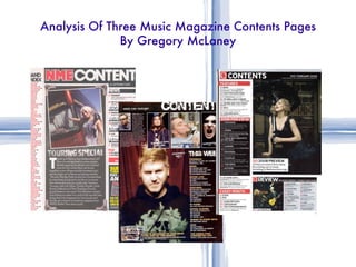
  • 2. Analysis Of Magazine Contents Page – 1 NME Sept 2009
  • 3. Contents Page NME (Sept 2009) Analysis Sub Heading The sub heading used ‘touring special’ is faded and has a photographic feel to it. It links with the image above it. Contents Listing The contents page listings such as ‘News’ and ‘Reviews’ show the reader what is inside the magazine and offers them all the contents of the page in one easy to read section. The numbers in red stand out and attract the audiences attention to a vital aspect of the contents. Content Mast Head/Banner The contents mast head ‘NME’ is the same as their front cover. However the ‘content’ text is plain white and in block capitals. This is to show the differentiation between the two making the ‘NME’ stand out more. Plus the banner with the date on shows the date the magazine was released and it links with the title and the contents The Main Image The main image is of a tour bus and a female. The image has connotations of stars and gigs which links with the target audience of the magazine which a large majority of the NME target audience enjoy music festivals and gigs. Bands Are Listed In Red With Page Number In Black The red shows the bands important and the editors choice to make them stand out and this creates a contrast with the black numbers. Readers will look at the red before they look for the page for the number so this creates the importance of the red text. The Main Image Style The image has been edited to look like a photograph this is significant in creating an artist look style which may link with the target audience. Also the use of the photograph style looks like a sketch book. Editors Introduction To Contents of Magazine Here is the editors introduction here it states what’s inside and what artists are inside. The audience read this to find their personal interest sections to read. Previous/Future Editors of NME Are Shown With Website and Phone Numbers (Subscription) The subscription zone in the right bottom corner of the magazine offers the reader a chance to purchase the magazine every week and it also offers a special price if they want to do this.
  • 4. Analysis Of Layout and Design Features The masthead used with the contents header. Both bold fonts. Here is a list of the contents in the magazine these are only the main features in the magazine hence the white bold title with a black/grey background to them. There’s the titles: ‘NEWS’, ‘RADER’, ‘LIVE!’, ‘FEATURE’ and they all have the same background and bold white font. They also all have sub heading content listings below them. Editors introduction and highlighting information/insight to the magazine. Here is the section of the magazine Where the reader can have a choice to subscribe to the magazine and receive weekly editions. Here is the band index, it shows the reader every single band in the magazine and what page they’re going to be on. The use of a subheading title is used it links with all the other colour schemes of the magazine to create a consistent style.
  • 5. Analysis Of Magazine Contents Page – 2 Kerrang - Issue 1149 – 10/03/2007
  • 6. Content masthead The contents masthead used here has a similar grungy effect that ‘Kerrang’ uses throughout their magazine. The attitude connoting effect links very well with the target audience and stands out well against the background. The Main Image The main Image used is of an artist that’s featured in the magazine. He’s in a medium close up shot. His facial expression conveys attitude and links with the genre of the magazine (rock). Contents Listing The contents here are listed with a title ‘THIS WEEK’ this links with the mast head of the magazine and the contents title it has the consistent ‘Kerrang’ grungy look to it. The contents listings have yellow bold subheadings with white listings these create a contrast with the background to stand out. Editors Introduction To Contents of Magazine This section of the magazine shows the editors introduction. This text includes a picture of the editor and an insight to the magazines content. Also, it includes the editors favourite aspects of the magazine and his signature. Subheading This small subheading links with the main image. It says ‘Cracking a smile pro’ this is connoting the main artist as a professional. Three content linked images Here are 3 images that are all linked with the magazine. They’re all different artist. The images all have a small subheading to attract the audience and a page number to lead them to the right direction. Subscription Section This common feature of music magazines is evident here. It offers the audience a chance to subscribe and get their favourite magazine for cheaper. Contents Page Kerrang - Issue 1149 – 10/03/2007 Analysis
  • 7. The mast head here is the same font that ‘Kerrang’ use throughout. It’s still block capitals and bold. This is the listings of the magazine. All the listings are relevant to the magazines contents and they’re in the current colour scheme yellow and white. They’re also, both bold and capitalised to stand out. This is the subtitle on the main artist it offers a slight insight to the artist to attract the audience. Here is the editors introduction showing the audience highlights of the magazine. Here is the section of the magazine that allows the audience an option to subscribe to the magazine. Here is secondary images of the magazine that offer the audience an alternative band selection. Contents Page Kerrang - Issue 1149 – 10/03/2007 Analysis
  • 8. Analysis Of Magazine Contents Page – 3 Q Magazine – Issue 259 – Febuary 2008
  • 9. Contents Mast Head Here is the mast head of the magazine. It has the consistent mast head ‘Q’ from the front of the magazine and the contents page header is simple, white, bold, and capitalized. The background is black which links with the whole colour scheme. Main Image This is the main image of a well known artists. The image defiantly dominants the whole composition leading to the reader to knowing that artist is going to be a vital aspect inside the magazine. Magazine Contents Listings Here down the whole left third are the listings of bands and magazine attractions. There are different sub headings and different colour backgrounds to show the more important options. Plus the all the colours link in with the colour scheme making the theme current throughout. Highlighted Band Section With Page Listings This section of the contents page is called ‘Review The world’s biggest and best music guide’ this title attracts the readers attention and offers them a list of bands in the magazine with page numbers it also links with the image to the left of it. This all attracts to the reader to further read on and it all links with the colour scheme. Date, Issue and Website The date is in bold at the top of the page with the issue number. Under that is the website where readers can find out more information, news and music gossip. Subheading This is the subheading of the main image it offers the page where the main artists information is. It also stands out due to the white background and the black text which creates the contrast. Contents Page Q Magazine – Issue 259 – Febuary 2008 Analysis
  • 10. Contents Mast Head Here is the mast head of the magazine. It has the consistent mast head ‘Q’ from the front of the magazine and the contents page header is simple, white, bold, and capitalized. The background is black which links with the whole colour scheme. Main Image This is the main image of a well known artists. The image defiantly dominants the whole composition leading to the reader to knowing that artist is going to be a vital aspect inside the magazine. Magazine Contents Listings Here down the whole left third are the listings of bands and magazine attractions. There are different sub headings and different colour backgrounds to show the more important options. Plus the all the colours link in with the colour scheme making the theme current throughout. Highlighted Band Section With Page Listings This section of the contents page is called ‘Review The world’s biggest and best music guide’ this title attracts the readers attention and offers them a list of bands in the magazine with page numbers it also links with the image to the left of it. This all attracts to the reader to further read on and it all links with the colour scheme. Date, Issue and Website The date is in bold at the top of the page with the issue number. Under that is the website where readers can find out more information, news and music gossip. Subheading This is the subheading of the main image it offers the page where the main artists information is. It also stands out due to the white background and the black text which creates the contrast. Contents Page Q Magazine – Issue 259 – Febuary 2008 Analysis
  • 11. This is the mast head of contents page. It has the consistent mast head from the front cover and it has a simple, white header (‘Contents’) Here is the listings of the magazines contents it’s split in to different sections to show different sources, bands and importance. This subtitle is linked with the main image and offers the reader the page where the information on the artists is. This is the section of the magazine that highlights the important main attractions. This is the main image of the contents page it links with the information of the subtitle. Contents Page Kerrang - Issue 259 – Febuary 2008 Analysis Analysis