SlideShare a Scribd company logo
1 of 178
Download to read offline
EXPLORING
COLORw o r k s h o p
with new exercises,
lessons and demonstrations
30th
A N N I V E R S A RY E D I T I O N
Nita Leland
EXPLORINGCOLORWORKSHOPLeland
newexercises,lessons
anddemonstrationsEEEEEEEEEEEEEEEEEEEEEEEEEEEEE
EAN
S7755
FnL104012401JUYrVyBQdWJsaWNhdGlvbnMsIEluYyAo02SW9sYSBkaXZpc2lvbikPR3JlZ29yeSBL03cnVlZ2VyAFcQuxUEMTAuNAI4MAExBkVB04Ti0xMw05NzgxNDQwMzQ1MTU5AA==
781440 3451599
52499
ISBN-10: 1-4403-4515-5
ISBN-13: 978-1-4403-4515-9
US $24.99
(CAN $30.99)
FnL104012001JUYrVyBQdWJsaWNhdGlvbnMsIEluYyAo02SW9sYSBkaXZpc2lvbikPR3JlZ29yeSBL03cnVlZ2VyAFcQwi4CMTMDMTAwATEFVVBD04LUEMMDM1MzEzNjY1NzM48A==
35313 665730 8
UPC
ART TECHNIQUES
FROM THE BEST-SELLING AUTHOR OF
THE NEW CREATIVE ARTIST AND CONFIDENT COLOR
UNLOCK THE SECRETS
to gorgeous, expressive,
unforgettable color!
Finding color combinations that not only work but excite the eye
is one of the greatest challenges artists face. This updated and
expanded 30th anniversary edition of the North Light classic
Exploring Color will show you, no matter what your skill level or
medium of choice, how to use and control color in your artwork.
Popular art instructor and best-selling author Nita Leland
will help you take any artwork you make to new heights.
Memorable paintings from 57 contributing artists will inspire
you, along with 75+ hands-on exercises, 8 step-by-step
demonstrations and countless nuggets of color knowledge—
all in your own private workshop!
Learn how to master color mixing, assemble the perfect
palette for your artistic goals, select just the right color scheme,
and communicate color in a way that elevates your designs
way beyond the ordinary. Start a handy journal to keep track
of your discoveries with customized mixtures, color wheels,
reference charts and other tools designed to uncover your color
personality and help you work with color more efficiently.
Nita knows the quest for perfect color can be fun, and it can
be yours. So stop guessing, and start exploring!
“Beautiful color is no happy
accident. Color can be learned.”
— Nita Leland
S7755_ExploringColor_CM.indd 1S7755_ExploringColor_CM.indd 1 5/10/16 10:18 AM5/10/16 10:18 AM
This book is dedicated with all my heart to my supportive
family, friends, teachers and students, and, as always, to R.G.L.
S7755_1-7_FrontMatt.indd 1S7755_1-7_FrontMatt.indd 1 5/10/16 10:19 AM5/10/16 10:19 AM
Cincinnati, Ohio
artistsnetwork.com
EXPLORING
COLORw o r k s h o p
with new exercises,
lessons and demonstrations
30th
A N N I V E R S A RY E D I T I O N
Nita Leland
2
S7755_1-7_FrontMatt.indd 2S7755_1-7_FrontMatt.indd 2 5/10/16 10:19 AM5/10/16 10:19 AM
AQUARIUM
Nita Leland
Mixed media acrylic collage
on illustration board
15" × 20" (38cm × 51cm)
Paint as you like and die happy. — Henry Miller
3
S7755_1-7_FrontMatt.indd 3S7755_1-7_FrontMatt.indd 3 5/10/16 10:19 AM5/10/16 10:19 AM
Contents
Color: A Journey and a Destination — 6
CHAPTER 1
Discovering the Joy of Color — 8
Start with a solid foundation of basic color theory.
CHAPTER 2
Learning the Language of Color — 16
Build your color vocabulary so you can identify color effects and
solve color problems without time-consuming trial and error.
Illustrated Glossary of Color Terms 18
CHAPTER 3
Exploring Color Characteristics — 32
Select your own basic palette with the help of handy reference
charts revealing the appearance and behavior of your paints.
CHAPTER 4
Controlling Color Mixtures — 54
Learn how to mix clean, vibrant colors every time using the
split-primary color mixing system.
Demonstration: Paint Using Split-Primary Color Mixing 60
CHAPTER 5
Working with Harmonious Colors — 68
Learn the distinctive harmonies, advantages, limitations and unique
expressive potentials of eight different primary color combinations.
Demonstration: Compare Harmonious Palettes 89
4
S7755_1-7_FrontMatt.indd 4S7755_1-7_FrontMatt.indd 4 5/10/16 10:19 AM5/10/16 10:19 AM
ASTM Color Index Guide — 168
Index of Color Exercises — 170
Index — 171
Contributing Artists — 172
About the Author — 175
CHAPTER 6
Expanding Your Palette with Color Schemes — 94
Add distinctive colors to your basic palette, control them with color
schemes and achieve exciting new dimensions in your art.
Demonstration: Find a Subject for a Color Scheme 108
Demonstration: Choose a Color Scheme for a Subject 110
CHAPTER 7
Using Color Contrast — 112
Find out how you can use different types of contrast to make
stronger art, generate excitement and show off your colors to their
best advantage.
Demonstration: Take Risks with Contrast 128
CHAPTER 8
Expressing the Harmony of Light and
Shadow with Color — 130
Bring harmony to your work using glazing, colorful shadows,
toned supports and consistent dominant light.
Demonstration: Start with Shadows for a Self-Portrait 140
CHAPTER 9
Unifying Color and Design — 148
Master the elements and principles of design so you can
express yourself freely in a well-planned composition.
Demonstration: Maintain Rhythm with Brushwork 160
Demonstration: Build and Enrich Color Layer by Layer 165
5
S7755_1-7_FrontMatt.indd 5S7755_1-7_FrontMatt.indd 5 5/11/16 10:18 AM5/11/16 10:18 AM
Color: A Journey and a Destination
If you’re an artist and don’t understand
color, you’re like a traveler who left your
luggage at home. Sooner or later you’ll
have to go back and get it if you want to
get very far.
Art without color? Inconceivable! But
why settle for ordinary color when you
can create radiant works of color?
Beautiful color is no happy accident.
You can have fantastic color, too. Color
can be learned. This book will help you:
• Build your color vocabulary.
• Explore your paints or medium of
choice.
• Master color mixing with a split-
primary palette.
• Use harmonious triads and color
schemes.
• Apply color contrast and design.
• Discover distinctive ways of using
color.
• Expand your appreciation of color
science, history and theory.
To explore color, you can use any
type of artists’ paint, pastel, oil pastel,
colored pencil, yarn, fabric or paper
collage—whatever medium you work
with. Make collages with colored papers
to plan your paintings; make watercolor
or acrylic sketches to design your oil
canvases. Color knows no boundaries in
art media.
Within these pages you’ll find
fabulous artwork by top artists to
inspire you in your color journey. The
illustrated glossary in chapter two (and
many more terms defined throughout
the book) will help you build your color
vocabulary. You’ll also have a brief
introduction to some newer paints and
media: interference and iridescent
colors in acrylics, PrimaTek mineral
pigments, and alcohol-based inks for
the adventuresome. Triads and color
schemes have been expanded with
modern pigments.
Play with color and have fun
while you learn. Easy, eye-opening
exercises placed throughout the book
are designed to help you expand your
color skills. Artists in many mediums
can do most of these exercises. Reserve
some time every day to do one. Collect
as many color samples or paints as you
can and use them for the exercises.
Share with your artist friends and make
exploring color a group project. As you
do the exercises, you’ll see that mastery
of color is an achievable goal. Exploring
color will make you aware of your color
preferences and strengthen your color
knowledge.
Once you learn how to mix and
arrange colors, exploring harmonious
color triads and expanded palettes along
the way, you’ll have the tools to build a
solid foundation for creative color. In no
time, you’ll start solving the mysteries
of color and be well on your way to
becoming a master colorist. That means
that, if you love color, you can unlock its
secrets—if you work at it.
So, begin your travels now in the
wonderful world of color, and have a
great trip.
—Nita Leland
6
S7755_1-7_FrontMatt.indd 6S7755_1-7_FrontMatt.indd 6 5/10/16 10:20 AM5/10/16 10:20 AM
AUTUMN COLORS
Georgia Mansur
Watercolor on watercolor ground
8" × 24" (20cm × 61cm)
Mansur’s spontaneous brushwork depicts an
appealing, vibrant landscape. Here’s an artist who
is not afraid of color.
Celebrating 30 years
of Exploring Color
When I became publisher of North Light
Books in 2007, not only did I inherit a
legacy of excellence in art instruction,
but I inherited a family of authors.
Many of those authors I would develop
personal relationships with via email
and phone conversations, although
90 percent of my authors I have never
met in person. Imagine my luck to
discover that Nita lives just fifty miles
north of our office! It’s been a pleasure
to be able to meet with her in the office
or over dinner where we have discussed
new book ideas as well as how
publishing has evolved to include
blogs, ebooks and videos.
Most art-instruction authors have
one book that they can envision, create
and share with the world; Nita Leland
is one of those rare authors whose
vision and passion went well beyond
a single book. She’s created a dozen
books and videos for North Light,
always investing her time, energy and
professional knowledge to make sure
that the products she creates will help
artists improve their knowledge of
painting. And, she’s able to produce so
many wonderful products because her
personal desire for knowledge about the
process of making art is never satisfied.
Her generosity, as well as her authority
on making art, has made her a gift to
the world of art instruction as well as a
popular artist and workshop instructor.
When Nita approached us about
revising Exploring Color, we gave the
idea a lot of thought. You don’t mess
with success. This book had been
revised once before, has sold more than
100,000 copies, and has been around for
three decades! That’s longer than North
Light Books has been a part of F+W
(North Light was acquired in 1983).
But in the end, we trusted that Nita
would deliver, and deliver she did.
She and I know that Exploring Color
Workshop will reach a new generation
of artists looking to expand their
understanding and use of color. And
for those of you already familiar with
Exploring Color, we hope you enjoy this
updated version and all the new art.
Books are only complete once they
are read; they need to be touched,
dog-eared and maybe even highlighted.
So, please explore the pages of this
book, savor the images, take in the text
and, most of all, apply what you learn to
your art. Take as much as you can from
these pages and become the artist you
desire to be.
—Jamie Markle
Publisher,
North Light Books
7
S7755_1-7_FrontMatt.indd 7S7755_1-7_FrontMatt.indd 7 5/10/16 10:20 AM5/10/16 10:20 AM
1
S7755_8-15_Chapter1_.indd 8S7755_8-15_Chapter1_.indd 8 5/10/16 10:21 AM5/10/16 10:21 AM
DISCOVERING THE
JOY OF COLOR
When we start out in art, our instructors usually emphasize values and shapes rather
than color. That’s good, because values are easy to understand. Shapes are, too,
since we identify objects by their shapes. But values and shapes make contact with
the intellect. Color touches the heart.
Color is important, whether you’re a fine artist, graphic designer, decorative
painter or fiber artist. After all, to paint is to color a surface; to weave is to mingle
colors. But do you really know what you’re doing with color? How much time do you
spend in trial and error, looking for suitable paint, the right color or the best mixture?
Suppose you want to mix a sky color, a skin color or a tree color. Or perhaps you
need to match a color for a specific application. Can you use a recipe? Formulas may
offer temporary solutions, but one-size-fits-all doesn’t work with color.
Develop your color sensitivity and color knowledge, so you can use color with
confidence, devising your own solutions to color problems with style and elegance.
MARKETPLACE
Paul St. Denis
Watercolor with collage
18" × 22" (46cm × 56cm)
AFTERNOON AT THE RAMOS CAFÉ
Angela Chang
Transparent watercolor on paper
28" × 18" (71cm × 46cm)
Art without color would lose much of its purpose. — Andrew Loomis
S7755_8-15_Chapter1_.indd 9S7755_8-15_Chapter1_.indd 9 5/10/16 10:21 AM5/10/16 10:21 AM
Color Theory Basics
In basic color theory, the primary colors cannot be created by mixing other colors, but they can
be used to create innumerable mixtures. The traditional primaries of artists’ pigments are red,
yellow and blue. Ground pigments, which contain impurities and lack spectral clarity, are more
opaque than dyes, therefore it is difficult to mix pure colors.
Ideally, red, yellow and blue pigments can be mixed in various combinations to produce
the secondary colors: red + blue = violet; red + yellow = orange; yellow + blue = green. Mix a
secondary with the primary on either side of it on the color wheel to get tertiary colors, which
take the names of both colors in the mixture. The mixtures are darker than the colors combined to
create them when using acrylics, gouache, oils, watercolors and other fine art media.
Modern developments in paint chemistry include many new pigments, such as a modern
primary triad of magenta, yellow and cyan. Magenta + cyan = violet; magenta + yellow = orange;
yellow + cyan = green. Practice making tertiary mixtures with the colors you have.
PRIMARIES SECONDARIES
PRIMARIES TERTIARIES
=
=
=
=
=
=
+
+
+
+
+
+
=
=
=
+
+
+
EXERCISE 1: MIX TO CREATE SECONDARY
AND TERTIARY COLORS
This exercise is the foundation of all
color mixing and the logical relationships
in color theory. Mix the primary colors
to make the secondary colors. Then,
mix each secondary with a primary to
create the tertiary colors. Take time to
play with whatever primary pigments you
have, making swatches of secondary and
tertiary mixtures in a color journal (see
Exercise 5). Label the colors you use,
so you can refer to them later. Jot down
notes on your reactions to new mixtures.
Keeping your swatches in rows or
columns will come in handy when you’re
trying to pick a palette for your artwork.
red
yellow
blue
red-orange
yellow-orange
blue-green
yellow-green
red-violet
blue-violet
red
yellow
blue
yellow
red
blue
orange
green
violet
yellow
blue
red
magenta
yellow
cyan
MODERN PRIMARIES
10
S7755_8-15_Chapter1_.indd 10S7755_8-15_Chapter1_.indd 10 5/10/16 10:22 AM5/10/16 10:22 AM
yellow
violet
red
green
blue
yellow-
green
blue-
green
blue-
violet
red-
violet
red-
orange
orange
yellow-
orange
KEY
Square = primary Circle = secondary Triangle = tertiary
EXERCISE 3: MAKE A TERTIARY TRIANGLE
Artists of the past often combined two secondary
mixtures to create what some called compound
colors, or muted mixtures. This old-style diagram
is based on Johann Wolfgang von Goethe’s color
triangle. Use primaries to mix secondaries, placing all
as shown. Mix two secondaries to create the tertiary
color between them.
Create several more triangles, switching out
the primaries. Your results will vary depending on
which pigments you mix. Some combinations result
in subtle chromatic neutrals; others look like mud.
Some you may find useful for painting shadows or
modifying glazes.
green + orange
(olive)
green + violet
(slate)
orange + violet
(russet)
EXERCISE 4: CREATE COLOR WHEELS
FROM BASIC TRIADS
See what mixtures you can make with all the primary
colors you have now. Using what you’ve learned about
mixing, create a twelve-color wheel on medium-weight
paper, canvas or illustration board. Sort your colors
into triads of red, yellow and blue, or magenta, yellow
and cyan. Put all other colors aside. Then, mix your
different reds and yellows (two colors per mixture) to
find the best orange mixture. Place this color on your
wheel and label it with the names of the colors in the
mixture. Repeat the exercise with every yellow and
blue or cyan (for green), then with every blue or cyan
and red or magenta (for violet). Study the mixtures
for a while. Don’t worry if some of your colors look
muddy. Color wheels made from triads of primary
colors you have help you organize your thinking about
color and expand your color choices.
EXERCISE 2: SEE COLOR CHANGE
RIGHT BEFORE YOUR EYES
To see how your eye is affected by strong color, stare
at the red X for ten to twenty seconds, then look
away at a white space. You’ll see the complement
(opposite) of red, which is green. Try it again, this
time looking at the yellow area. The complementary
green mixes with the color you’re looking at, turning
yellow into yellow-green. This phenomenon—called
successive or mixed contrast—affects the way you see
color as you work, so rest your eyes frequently when
working intensely with color.
11
S7755_8-15_Chapter1_.indd 11S7755_8-15_Chapter1_.indd 11 5/10/16 10:22 AM5/10/16 10:22 AM
EXERCISE 6: MAKE A COLOR WHEEL
IN YOUR FAVORITE MEDIUM
Create a color wheel using swatches of your favorite medium—
paint, pastel, colored pencil, fabrics, paper or yarn. Apply
colors to a wheel drawn on paper, canvas or illustration board,
or create mixtures that can be cut out and glued onto a
separate support with acrylic matte or soft gel medium.
Always put yellow at the top and move clockwise toward green
and blue.
Color wheel in acrylics
EXERCISE 5: START A COLOR JOURNAL
To find out what colors resonate with you, start a color
journal in a sketchbook. List artists whose work you like.
Figure out what you like most about them by studying
their work. Is it their brilliant use of color or strong
values? Do you like unusual color? Do you prefer subtlety
to boldness? Write down your reactions. Get a sense of
what attracts you—and what you don’t like—so you can
relate this information to what you learn as you explore
color. Play with swatches in your journal, arranging them
spontaneously or in columns on a grid. The important thing
is to get the information and the colors down while you’re
working with them and your reactions are fresh in your
mind. (Watercolor and ink journal pages by Patricia Kister)
Color wheel in oils
Color wheel in fibers (yarn)
Explore Color in Your Medium
Exploring color knows no boundaries in art media. Experience for yourself how color works
in your medium, because they all have idiosyncrasies. You may be a painter or calligrapher, a
colored pencil artist or pastelist; even collage and mixed media artists, weavers, knitters and
quilters benefit from exploring color. Make collages with Color-aid papers to design your color
schemes, or use watercolor or acrylic sketches to plan the color in your oil canvases. Then, trust
your intuition to lead you to unique color expression.
Make reference color wheels in every medium you work
with. Each experience reinforces your understanding of color
principles, regardless of how the colors are mixed and applied.
Collage artists adhere paper clippings with acrylic mediums;
quilters make cloth samplers. Oil and acrylic painters, as well
as pastelists and colored pencil artists, use gessoed paper
or canvas. Share materials and colors with artist friends to
increase your knowledge.
12
S7755_8-15_Chapter1_.indd 12S7755_8-15_Chapter1_.indd 12 5/10/16 10:22 AM5/10/16 10:22 AM
EXERCISE 7: COMBINE AND COMPARE ACRYLIC PRIMARIES
Which colors should you use for your primaries? Here’s where
color theory gets confusing. You can see how different these
acrylic mixtures are when I use different paint colors for my
primaries. For each sample, I applied a different primary to
each end of the strip and gradually mixed them across the
space, since acrylics don’t mingle like watercolors when you
use high-viscosity paints. The more you explore your paints,
the sooner you’ll be able to get the color mixture you want,
every time.
Pyrrole Red Light Cadmium Yellow
Medium
Quinacridone Red Lemon Yellow
Phthalo Blue
(Red Shade)
Cadmium Red
Medium
Phthalo Blue
(Green Shade)
Cadmium Yellow
Medium
Ultramarine Blue
Lemon Yellow
Cadmium Red
Medium
Hansa Yellow
Medium
Naphthol Red
Light
Hansa Yellow
Opaque
Cerulean Blue
Deep
Pyrrole Red LightCerulean Blue
Deep
Hansa Yellow
Medium
Phthalo Blue
(Red Shade)
Nickel Yellow Azo
SHAPE VS. COLOR
An object is identified by shape, no matter how bizarre its
color. Apparently, shape recognition is a function of the
intellect, while color awareness is intuitive. You have a great
deal of freedom in choosing colors when you’re working with
a recognizable shape. A blue pear? A purple cow? You can be
whimsical, dramatic, even absurd, if you like.
Ultramarine Blue Quinacridone Red
Phthalo Blue
(Red Shade)
Quinacridone Red
Learn to appreciate the unique beauty of different mixtures.
Record a swatch of each mixture in your color journal, along
with a note about the colors you used. These references will
come in handy when you’re painting. Maybe that dusky purple
will be just right for a blue grape, or the dull orange might
make a good shadow for a pumpkin.
13
S7755_8-15_Chapter1_.indd 13S7755_8-15_Chapter1_.indd 13 5/10/16 10:22 AM5/10/16 10:22 AM
EXERCISE 8: PAINT THE FOUR SEASONS
Divide a sheet of paper, illustration board or canvas into four
sections. Using the colors and the medium you’re most familiar
with, sketch the four seasons, or make abstract color sketches
of this subject in collage or fibers. If you prefer, you can make
a nonobjective design of geometric shapes. Be inventive with
the colors you have, but don’t experiment with new colors yet.
These sketches are a record of how you use color now; they’re
not meant to be finished work. Keep them for comparison with
later exercises.
Your first paintings of the four seasons should show the
range of color effects you can get with your present palette
before exploring color. Here I’ve used the three colors my
Permanent
Alizarin
Crimson
New
Gamboge
French
Ultramarine
TRADITIONAL PALETTE
How Do You Currently Use Color?
Most artists start out using their teacher’s colors or copying a palette from a book. Perhaps
you’ve been painting long enough to have developed a color style that clearly distinguishes your
work from others. But do your colors always say what you want them to say? Do you find you’re
repeating yourself with colors? Do you limit your subjects only to those suitable for certain colors?
Think for a moment about what you’re doing with color now.
teacher required when I first started painting. The little sketches
turned out all right, but some color mixtures aren’t exactly what
I wanted.
14
S7755_8-15_Chapter1_.indd 14S7755_8-15_Chapter1_.indd 14 5/10/16 10:22 AM5/10/16 10:22 AM
LOVE THAT TURQUOISE!
Judy Horne
Acrylic and collage on cold-press watercolor paper
21" × 21" (53cm × 53cm)
HOW BRAVE ARE YOU?
My heart almost stopped when I saw Horne’s colorful abstract.
I admire the courage of her stunning color and the energetic
rhythms of the whirling brushstrokes.
SKIPPER
Susan Webb Tregay
Acrylic on canvas
40" × 30" (102cm × 76cm)
ARE WE HAVING FUN YET?
Tregay embraces no-holds-barred color, using bright primaries
and adding pink for even more fun. Painting can be serious
business, but that doesn’t mean you can’t play while doing it.
What’s Your Color Personality?
If you’ve ever taken a color personality quiz online or asked a fashion consultant to match you to
your personal colors, you probably had mixed results. One system is based on your intuition and
the other on your physical appearance. When it comes to making art, you’ll get the best results by
combining your knowledge of color principles with your sense of which colors you prefer to look
at and to work with. The artists throughout this book have distinctive color personalities. Finding
ways to explore color will help you reveal yours.
15
S7755_8-15_Chapter1_.indd 15S7755_8-15_Chapter1_.indd 15 5/10/16 10:22 AM5/10/16 10:22 AM
2
S7755_16-31_Chapter2.indd 16S7755_16-31_Chapter2.indd 16 5/10/16 1:57 PM5/10/16 1:57 PM
LEARNING THE
LANGUAGE OF COLOR
In this chapter are three keys to help you unlock the mysteries of color. The first
is an illustrated glossary. Artists need words to communicate, but images help us
understand their meaning. I placed the glossary near the beginning of the book so
you can familiarize yourself with important color terms right away. The second key
shows how lighting affects color. No matter what you know about paint and color
mixing, the lighting you use to paint or display your work makes a huge difference
in how it appears to the viewer. The third key is a discussion of the all-important
properties of color: hue, value, intensity and temperature. And then, we’ll be ready
to talk about paint.
FREE SPIRIT
Denise Athanas
Acrylic on canvas
20" × 20" (51cm × 51cm)
Colors are forces, radiant energies that affect us positively or negatively,
whether we are aware of it or not. — Johannes Itten, The Art of Color
NIGHT IN THE CITY
Thomas W. Schaller
Watercolor on paper
30" × 22" (76cm × 56cm)
17
S7755_16-31_Chapter2.indd 17S7755_16-31_Chapter2.indd 17 5/10/16 1:57 PM5/10/16 1:57 PM
Illustrated Glossary of Color Terms
Like every specialized area in art, color has its own language. Following are definitions of some
of the color terms we will explore in greater depth throughout this book.
achromatic: lacking
color; black, gray or
white; neutral
color contrast: differences in hue,
value, intensity, temperature,
complements or quantity
color harmony: matching pigments for
similarities of intensity, transparency,
opacity and tinting strength
color wheel: a circular arrangement of
the colors of the spectrum
additive color: derived from light mixtures
color index name: color name and specific pigment identifier,
as in PR108 for Pigment Red, Cadmium Red; sometimes
called C.I. Name
EXERCISE 9: MAKE A GLOSSARY IN YOUR COLOR JOURNAL
Reserve the last twenty or so pages of your color journal
for a glossary. Anytime you come upon something in a
techniques book or hear a word that you don’t understand at
a workshop, add the term to your glossary with an image for
easy reference. Jot down definitions of unfamiliar words you
want to remember and use a glue stick or soft gel medium
to paste in small images that define the words. Another
option is starting a shoebox file just for your glossary.
color identity: an obvious color bias in
a mixture
analogous colors: colors next to each
other on the color wheel, such as
blue, blue-green and green
chromatic: having color, as opposed
to achromatic black, white and gray;
opposite of neutral
chromatic neutral: a neutral mixture
that hints at the pigment colors used
color scheme: orderly selection of
colors based on logical relationships
on the color wheel
18
S7755_16-31_Chapter2.indd 18S7755_16-31_Chapter2.indd 18 5/10/16 1:57 PM5/10/16 1:57 PM
complementary colors:
opposites on the color wheel;
enhance each other when
side by side; neutralize when
mixed
dominant light or color: the
predominant light in a composition
caused by changes in season,
weather, time of day or region
granulation: sedimentary effect in
washes; also, flocculation
hue: the spectral name of a color (red,
orange, yellow, green, blue or violet)
limited palette: selection of few
colors for an artwork
dye or ink: transparent coloring
matter dissolved in fluid; absorbed
by a surface
glaze: a transparent or translucent veil
of color modifying an underlying color
successive layers get
darker/neutralized
single layers modify color
without darkening
key: the dominant value relationships in a picture
intensity: the degree of purity or
brightness of a color; sometimes,
chroma or saturation
high
intensity
low
intensity
fugitive color or pigment: a
chemically unstable pigment that
fades or changes under normal
conditions of light or storage
gradation: gradual change;
provides transition and
movement in color design
high key: medium to light values
low key: medium to dark values
full contrast: light, medium and dark values
stable slight
change
fugitive
high key
low key
19
S7755_16-31_Chapter2.indd 19S7755_16-31_Chapter2.indd 19 5/17/16 10:44 AM5/17/16 10:44 AM
palette: the surface on which
colors are mixed; also, the
colors selected for use in an
artwork
primary color: a color that cannot be
mixed from other colors; yellow, blue,
red, magenta, cyan
secondary color: a color resulting from
the mixture of two primary colors;
orange, green or violet
shade: medium-to-dark value of
a color
optical mixture: occurs when small areas of color are juxtaposed
and perceived by the eye as a mixture; also, mixed contrast
pigment: powdered coloring matter used in the manufacture
of paint
reflected color or light: color or light on an object that is reflected
off of adjacent objects
semi-opaque: slightly or nearly opaque
semi-transparent: slightly or nearly transparent
simultaneous contrast: any one of several effects that colors
have on each other when juxtaposed and viewed together or
successively
local color: the natural or
painted color of an object
mixed contrast: the afterimage of a complementary color seen
after viewing a color; overlay of an afterimage on another color
properties of color: hue, value,
intensity, temperature
Hue:
green
Value:
dark/light
Intensity:
pure/gray
Temperature:
cool/warm
luminosity: radiance or glow in
an artwork
mingle: to blend paints without
excessive mixing, so colors retain
some of their identity
monochromatic: having a
single color
paint: pigment particles
suspended in a binder
opaque: having covering power;
not transparent
20
S7755_16-31_Chapter2.indd 20S7755_16-31_Chapter2.indd 20 5/10/16 1:58 PM5/10/16 1:58 PM
staining color: a color that
penetrates the surface; also,
dye
subtractive color: derived from paint mixtures that absorb all
colors except the local color of the object, which is reflected
successive contrast: the afterimage of a complementary color
seen after viewing a color
transparent: permits light
to penetrate and reflect off
the surface of a support
or allows another color to
show through
triad: a color scheme having three
colors with a logical relationship on
the color wheel
value: the degree of lightness or
darkness of a color
wet blending: applying several layers
of color without waiting for each layer
to dry
tetrad: a color scheme having four
colors with a logical relationship
on the color wheel
tint: a light value of a color
tone: a color modified by gray
or a complement
toned support or ground
paper or canvas having a
preliminary color wash or
undertone; underpainting
spectral color: the colors produced when white light passes
through a prism: red, orange, yellow, green, blue, violet
tinting strength: the power of a color to
influence mixtures
weak strong
split primaries: a warm
and a cool pigment for
each primary color (six
primaries), used in color
mixing
temperature: the relative
warmth or coolness of
colors
tertiary color: mixture of a primary
and its adjacent secondary: for
example, red-orange or blue-green
cool
hues
warm
hues
21
S7755_16-31_Chapter2.indd 21S7755_16-31_Chapter2.indd 21 5/10/16 1:58 PM5/10/16 1:58 PM
HOW LIGHTING CHANGES THE COLORS WE SEE
Use consistent lighting when you’re exploring color. The three settings I used for these
photos are full-spectrum fluorescent (left), daylight/sun (middle) and incandescent (right).
I prefer the full-spectrum fluorescent setting, because it doesn’t have a strong color bias.
EXERCISE 10: COMPARE LIGHTING
SITUATIONS WITH YOUR CAMERA
To see for yourself how lighting
changes your colors, set your digital
camera on manual and photograph a
piece of your art using the different
white-balance settings offered on
your camera. My camera has settings
for sunny, cloudy, non-spectral
fluorescent, full-spectrum fluorescent
and incandescent lighting. Don’t use
the auto setting, where the camera
chooses the lighting for you. For this
exercise, do not change the light
source or move your picture. Compare
the results.
The Language of Lighting
and How It Affects Color
Your brain controls what your eyes see. If you wear a red sweater, you will probably
see it as red no matter what color of light illuminates it. This phenomenon is called
color constancy. My students remark that their artwork looks different when they
take it home. They notice the change on the way to the car and in different rooms in
the house. This effect is directly related to the changing light that surrounds them.
Here are some strategies to help you increase your awareness of that elusive light
and control the light to achieve more consistent color in your artwork.
Normally, you can’t control the lighting that illuminates your painting on
someone else’s walls, but if you use color-correct lighting when you paint, your
work should be presentable in most situations. I use full-spectrum (sometimes called
daylight or natural) fluorescent lighting in my studio. The Vita-Lite and GE Sunshine
bulbs I’ve used have lasted 10–15 years and give great color rendition at 5000–
5500K. I buy them at lighting specialty and home improvement stores. If your space
is small, use desktop lamps or floor lamps with full-spectrum bulbs.
Whatever lighting you use while you paint, I suggest that you view your work
under different lighting conditions. I take a break while working on a painting
to check the colors under different lights in my home. I carry it to a window for
daylight, take it to the laundry room for non-spectral fluorescent, and to my living
room for incandescent lighting. Each gives me a different reading and I make a note
of my observation in my color journal.
22
S7755_16-31_Chapter2.indd 22S7755_16-31_Chapter2.indd 22 5/10/16 1:58 PM5/10/16 1:58 PM
HUE
Red
VALUE
Light
INTENSITY
Pure
TEMPERATURE
Warm
Cadmium Scarlet
Cadmium Red
Quinacridone
Red
Alizarin Crimson
CoolGrayDark
THE LANGUAGE OF COLOR
Every craft has its vocabulary. In color,
you may need to lower the intensity,
emphasize value contrast or adjust
temperature, so you should know exactly
what these terms mean. Make sure you
understand this language of color before
you go any further.
The Properties of Color
When you visit a foreign country, you’re more comfortable if you understand the language. The
same is true with color. Artists use commonly accepted terms to describe the properties of color.
Hue, value and intensity are the foundation words of color in every medium. Hue is the general
name of a color; value is its lightness or darkness; intensity is its purity or grayness. One more
property, temperature—the warmth or coolness of a color—critically affects color relationships.
23
S7755_16-31_Chapter2.indd 23S7755_16-31_Chapter2.indd 23 5/10/16 1:58 PM5/10/16 1:58 PM
Hue
Hue is the name or attribute of a color that permits it to be designated as red, orange, yellow, green, blue
or violet. As each color moves toward the next on the color wheel, it assumes the characteristics of its
neighbor. The general names of these in-between, tertiary colors are: red-orange, yellow-orange,
yellow-green, blue-green, blue-violet and red-violet. All of these colors comprise the twelve hues on the
color wheel shown on this page.
The color wheel establishes logical relationships useful in color mixing and design. You’ll frequently
use the wheel to organize and study these relationships, so get to know it well. Familiarize yourself with
the exact locations and names of hues around the circle. Always orient your color wheels like a map, with
yellow, the lightest hue, at the top and violet, the darkest, at the bottom. Place primary red to the lower left
on the wheel and blue to the lower right.
yellow
violet
red
green
blue
yellow-green
blue-green
blue-violetred-violet
red-orange
orange
yellow-orange
EXERCISE 11: PRACTICE PLACING COLORS
ON THE COLOR WHEEL
Select a tube each of twelve spectral colors you think will make
a bright color wheel. If you’re not a painter, make your wheel
with colored pencils, fibers, collage papers or whatever your
medium is. Don’t worry if you don’t have a full range of spectral
colors; you’ll learn to mix colors in chapter four. Now, lay out
a color wheel that resembles the face of a clock, beginning
with yellow at the top (twelve o’clock). Move clockwise toward
green in the following order: yellow, yellow-green, green, blue-
green, blue (four o’clock), blue-violet, violet, red-violet, red
(eight o’clock), red-orange, orange and yellow-orange. Label
your wheel with the names of the paint colors you used in each
mixture, as well as brand names, for future reference. (I didn’t
label mine here, because I want you to use your own selections
for this wheel.)
HUE VS. PAINT NAME
Hue and color are general terms. The hues in this small
sketch are red, yellow, green and blue. Pigment and paint
names, which we’ll examine in chapter three, are more
specific. Artists invariably ask what paint colors were used.
The paint names used here are Alizarin Crimson, Cadmium
Yellow Light, Permanent Green Pale and Ultramarine Blue.
Three of the paints are “single pigment” colors. Permanent
Green Pale is a mixture of two pigments.
24
S7755_16-31_Chapter2.indd 24S7755_16-31_Chapter2.indd 24 5/10/16 1:58 PM5/10/16 1:58 PM
PURE COLORS MAKE A BOLD STATEMENT
Baker’s playful watercolor shows an ordinary subject reflecting prismatic colors in
sunlight. What is the real subject of this painting? Of course, it’s color.
ALL IN A ROW
Linda Daly Baker
Transparent watercolor on
cold-press watercolor paper
22" × 30" (56cm × 76cm)
EXERCISE 12: SEARCH FOR A FULL RANGE OF HUES
Cut 2" (5cm) squares from fabric scraps or color clippings
from magazine pages to make a rainbow. This is more than a
fun exercise—it’s essential eye training to help you see the
differences in color relationships. Make one or more with plain
colors and others with dominant colors in prints and patterns.
Glue your patches to cardstock using fabric glue or acrylic soft
gel medium. Whether you use paint, paper or fibers, you can
find a full range of hues to make your rainbows, but you can
add more colors if you wish.
25
S7755_16-31_Chapter2.indd 25S7755_16-31_Chapter2.indd 25 5/10/16 1:59 PM5/10/16 1:59 PM
EXERCISE 13: COMPARE PURE COLORS TO GRAYSCALE VALUES
Make a value scale from light to dark, showing discernible
differences between value levels on the scale. If you paint,
add Payne’s Gray, Ivory Black, Neutral Tint or some other dark
neutral for dark values, and diluent or white for light values.
If you work in fibers, select different values of materials from
your scrap basket. You may also use colored pencils, or make
a collage chart of different values clipped from magazines and
pasted to paper or cardboard. Divide a 1" × 7" (2.5cm × 18cm)
vertical column into seven 1" (2.5cm) segments. Place black
at the bottom of the scale. Leave the top section white, and
below the white, place a light gray. Fill in the remaining spaces
with intermediate values, showing distinct, progressive steps
toward black.
Then, get a good sense of how values work in color by
making a scale that shows the approximate color values
corresponding to black, gray and white. No color is as bright as
white or as dark as black, but every color in its pure state has a
value that corresponds to a level on the black-and-white scale.
EXERCISE 14: WORK OUT VALUE SCALES FOR VARIOUS COLORS
Select six or more bright colors from your palette, including
the purest red, yellow and blue you have. Place each color on a
scale at its proper value level, using the black-and-white scale
for reference. Now make a value range for each color, mixing
with diluent (water or thinner) or white to create lights and
Neutral Tint or Payne’s Gray for darks. Place the light values
above and the darker ones below the pure hue, as shown. From
one value step to the next, show a discernible difference.
Some colors have a more extensive value range than others,
retaining their identity as they become darker. For example,
blue remains recognizable as blue, no matter how dark it
gets; but notice how quickly yellow and orange lose their color
identity as they get darker.
Value
Value is the degree of light or dark between the extremes of black and white. A tint moves
toward white; a shade moves toward black. Yellow is the lightest color, becoming white in just
a few value steps; violet is the darkest color, quickly descending to black. All other colors fall in
between. Red and green, which are similar in value, are situated near the middle of the value
scale. Distinguishing values is one of the most important skills in art. Use value to create contrasts
between colors, adding visual impact and drama.
26
S7755_16-31_Chapter2.indd 26S7755_16-31_Chapter2.indd 26 5/11/16 10:19 AM5/11/16 10:19 AM
JUST ORGANIC
Patricia Kister
Watercolor on cold-press watercolor paper
11" × 15" (28cm × 38cm)
RIDING THE RANGE
Emphasizing a full range of values from light to
dark, Kister makes a strong visual statement with
a simple subject. This is the foundation of good
painting.
LIKE MINDS
Mark E. Mehaffey
Watercolor on paper
35" × 35" (89cm × 89cm)
A CLEVER OBSERVATION
Mehaffey captured striking value patterns with a
limited palette of black and white enhanced by
skin tones. Casual observers might not notice the
interesting juxtaposition of art and fashion; this
artist has the skill and the wit to bring the story
to life.
27
S7755_16-31_Chapter2.indd 27S7755_16-31_Chapter2.indd 27 5/10/16 1:59 PM5/10/16 1:59 PM
Intensity
The intensity of a color, sometimes called chroma, is its
brightness (purity) or dullness. A pure, bright color is high
intensity; a grayed color is low intensity. The extreme of low
intensity is neutral gray. Pigment colors such as Permanent
Rose, Cadmium Yellow and Ultramarine Blue are high-
intensity colors, but no matter how bright they look, they
can’t match the brilliance of spectral colors and projected or
transmitted light.
It’s important to be able to see—and create—subtle
differences in intensity. Varying intensity gives you control
over compositional emphasis and creates a setting for
extraordinary color effects.
When you mix two neighboring high-intensity colors, the
mixture is slightly lower in intensity than either color by itself.
Intensity declines most in mixtures when the two parent colors
are far apart on the color wheel. Other ways to lower intensity
are to mix bright colors with gray, black or an earth color. But
remember, once you have lowered the intensity of a color, you
can’t turn it back into a pure hue, no matter how hard you try.
Once a mixture gets muddy, it never seems to improve.
THE ASPECTS OF A COLOR
When you mix a pure, high-intensity color with white,
you get a tint; with gray, a tone; with black, a shade.
Pure hue
Add white
Add gray
Add black
Tint
Tone
Shade
EXERCISE 15: CREATE SUBTLE DIFFERENCES IN INTENSITY
Starting with a pure, high-intensity color like Ultramarine Blue,
make a vertical value scale from light to dark on the left side
of your paper or canvas, using only water, thinner or white
to change the value. Then, using Neutral Tint or some other
neutral, mix a light gray. Add a small amount of this gray to
the tint on your palette, trying to match the value of the tint
at the top of your chart. Place a swatch of this slightly grayed
mixture to the right of the pale tint. Continue across the top
row, adding more gray and less color for each swatch as you go,
and always trying to match the value of the first tint. The last
swatch should be gray, with just a hint of the original color.
Move down to the next row and repeat the process.
Remember always to match the value of the first color in the
row, as you lower the intensity of that color. Then repeat this
exercise with another color. Notice how colors with a lighter
value, such as yellow, make appealing tints, but change
drastically as they darken. Colors of darker values, such as red
and violet, make rich tones and shades and still retain their
color identity throughout the change. Also, experiment using
earth colors to lower intensity. Make a chart like this one with
every color you use.
INTENSITY
VALUE
Pure Gray
DarkLight
28
S7755_16-31_Chapter2.indd 28S7755_16-31_Chapter2.indd 28 5/10/16 1:59 PM5/10/16 1:59 PM
EXERCISE 16: SORT YOUR STASH BY INTENSITY
Gather your tubes of paint, pastels, collage papers or whatever medium
you’re working with and sort them into two piles: high intensity and
low intensity. Divide a page of your color journal into two columns and
list the bright, high-intensity colors in the left column and the duller,
low-intensity ones in the right column. Place a small swatch beside the
name of each color. It takes a while to do this, but it’s a real time-saver
when you’re trying to find or match a color in your artwork.
Colors like Vermilion, Cadmium Yellow and Ultramarine Blue are high
intensity as they come from the tube. Others, like Brown Madder, Yellow
Ochre and Indigo, are low-intensity paint variations of red, yellow and
blue. In fibers, heather yarns and natural-dyed fabrics are low-intensity
materials. Learn to see the difference.
ZINNIA GLORY
Julie Ford Oliver
Oil on canvas
6" × 8" (15cm × 20cm)
ABANDONED
Julie Ford Oliver
Oil on canvas
8" × 6" (20cm × 15cm)
HIGH INTENSITY
LOW INTENSITY
Caput
Mortuum
Light Red
Oxide
Yellow
Ochre
Olive
Green
Green
Earth
Indigo
Permanent
Rose
French
Vermilion
Sennelier
Yellow
Permanent
Green Pale
Hooker’s
Green
Cobalt
Blue
INTENSITY ATTRACTS, WHETHER YOU
USE A LITTLE OR A LOT
At left, artist Julie Oliver reserves low-
intensity colors for her background and
tones down the foreground to emphasize
intense flower hues. Below, she
embellishes a lowly, unlikely subject—
a worn-out broom—with low-intensity
earth colors, adding a splash of red to
make the viewer smile.
29
S7755_16-31_Chapter2.indd 29S7755_16-31_Chapter2.indd 29 5/11/16 10:19 AM5/11/16 10:19 AM
THE GRAND FINALE
Karen Margulis
Pastel on sanded paper
9" × 12" (23cm × 31cm)
THE WARMTH OF BLUE
The bright yellow foliage of the aspen trees is
enhanced by the blue of the background. This blue
doesn’t convey cold mountain air; rather, it suggests
the warmth of autumn sunshine.
TEMPERATURE IS RELATIVE
Colors move from warmer to cooler in this collage study. The
top row starts with a cool red, but the temperature becomes
even cooler as it moves toward blue, stopping at blue-violet.
That same blue-violet begins the bottom row as the warmest
color, moving toward a cool blue-green. The temperature turns
slightly warmer as the last chip picks up some green on the
other side of the blue-green.
THE TEMPERATURE OF EARTH COLORS
As a group, earth colors are cooler than spectral colors,
because they are low-intensity, grayed versions of colors.
However, there are still noticeable differences in color
temperature from one earth color to another.
WARMERCOOLER
warmer cooler
Temperature
Color temperature helps you create depth, movement and mood. Warm
colors are aggressive and appear to advance; cool colors are passive
and seem to recede. The wrong temperature in one area may disturb
the balance in a piece, but correctly placed warm/cool contrast can add
the zing you need for your focal point.
The spectrum contains both warm and cool colors. Yellow, orange
and red are generally warm, and green, blue and violet are considered
cool. This is the most easily recognized distinction in color temperature.
However, color temperature is relative. A color that appears warm in
one place may look cool in another. Red-orange is the warmest color,
so as you move away from it in either direction on the color wheel, your
colors will all seem cooler, until they reach blue-green, which is the
coolest color. Then, as you return from blue-green to red-orange, your
colors appear warmer. Study this on your color wheel, so you can see
clearly how it works.
Try comparing different blue paints, fabrics or papers. Although
you know blue is a cool color on the spectrum, when you line up a
series of blues, you’ll see that some are warmer, leaning toward violet,
while others are cooler, with a bias toward green. Every hue has many
temperature variations in pigment. Practice will help you see the
differences.
Indian Red Light Red
Oxide
Raw Umber Burnt Sienna
Terre Verte Olive GreenIndigo Indanthrone
Blue
Neutral Tint Ivory BlackYellow Ochre Gold Ochre
30
S7755_16-31_Chapter2.indd 30S7755_16-31_Chapter2.indd 30 5/11/16 10:19 AM5/11/16 10:19 AM
EXERCISE 17: EXPAND A COLOR WHEEL
GUIDED BY TEMPERATURE
Sort your high-intensity colors into the twelve primary,
secondary and tertiary colors of the color wheel. Put away your
earth colors for the time being. On a firm support, such as
heavy paper or medium-weight illustration board, start with
a true yellow (not greenish or orangish) at the top, and make
swatches of colors moving clockwise on a color wheel, toward
green. Label the colors as you go along. Continue adding
swatches around the wheel, showing a gradual change in color
temperature leading from one color to the next and returning to
yellow. Every color on this wheel has a slightly warmer color on
one side of it and a slightly cooler one on the other, except
for red-orange and blue-green, which are the warmest and
coolest colors. When you move to the next color, the first
one becomes the warmer or cooler one, depending on which
direction you’re going.
Compare the colors before placing them on the wheel.
Rest your eyes occasionally, so you can see the colors more
accurately. When you feel confident that you recognize
temperature differences in pure colors, make a similar chart
using the earth colors.
PIGMENT
TEMPERATURE WHEEL
HansaYellow
HansaYellowLight
Permanent
GreenPale
H
ooker’s
Green
Phthalo Green
(Yellow
Shade)
Phthalo Green
(Blue Shade)
Phthalo Turquoise
Phthalo Blue(Green Shade)
Phthalo Blue
(Red Shade)
CobaltBlue
French
Ultramarine
Ultramarine
BlueViolet
Dioxazine
Violet
Ultramarine
Violet
Permanent
Magenta
Perm
anent
Alizarin
Crim
son
Pyrrole Red
Cadmium Red
Cadmium Scarlet
Perinone Orange
Cadmium
Orange
Perm
anent
Orange
IndianYellow
NewGamboge
HOT COLD
coolercooler
warm
erwarm
er
31
S7755_16-31_Chapter2.indd 31S7755_16-31_Chapter2.indd 31 5/10/16 2:00 PM5/10/16 2:00 PM
3
S7755_32-53_Chapter3.indd 32S7755_32-53_Chapter3.indd 32 5/10/16 2:01 PM5/10/16 2:01 PM
BIRCH LANDSCAPE
David R. Daniels
Watercolor on paper
43" × 63" (109cm × 160cm)
EXPLORING COLOR
CHARACTERISTICS
New colors and art media proliferate at the speed of light, it seems. While
it may appear to be “all about marketing,” in fact, paint chemistry has made
remarkable advances in the past fifty years, bringing us vibrant new colors,
unique mineral pigments, versatile acrylic paints and mediums, and
much more.
I’ll bet you would like to benefit from these developments. This chapter
helps you understand the characteristics of pigment and paint. Do the
exercises to familiarize yourself with every color on your palette and learn how
to test new colors before you add them to your palette.
PITCHER WITH PEACHES
AND CHERRIES
Chris Krupinksi
Transparent watercolor on
rough watercolor paper
30" × 22" (76cm × 56cm)
The use of expressive colors is felt to be one of the basic elements of the modern
mentality, an historical necessity, beyond choice. — Henri Matisse
33
S7755_32-53_Chapter3.indd 33S7755_32-53_Chapter3.indd 33 5/10/16 2:01 PM5/10/16 2:01 PM
Is It Pigment or Paint?
Ground, powdered pigments are the coloring substance
of most artists’ paints, which are made by combining the
pigments with a medium or vehicle that surrounds the pigment
particles and binds them to the support. The degree to which
color reflects from the paint molecules or passes through
transparent colors to reflect the support may be determined by
the grinding of the pigment particles, the inherent properties
of the pigment material and/or the nature of the support.
So, paint is pigment suspended in liquid, which forms a
layer on the painting surface. Dyes, which are substances
dissolved in liquid, are absorbed into the surface. Dyes are
more likely to fade than pigments.
There are only twelve hues on most color wheels, but there
are hundreds of pigment and paint variations of every hue.
For example, Cadmium Red and Permanent Alizarin Crimson
are both red pigments. However, not all paints with the same
names are made with the same pigments. To further confuse
matters, manufacturers continue to invent fanciful color
names, such as Saffron or Heliotrope, and it’s anybody’s guess
what those colors might be. The trend toward naming paint
colors for the pigment they’re made of is a good one. Although
the words are tricky, artists are becoming accustomed to using
abbreviated forms, such as “phthalo” for phthalocyanine and
“quin” for quinacridone. Referring to ASTM C.I. Names, such
as PB15:3 to identify Phthalocyanine Blue (Green Shade),
will help prevent duplicates in your paint box. Use the
ASTM chart in the Appendix to identify pigments before
buying your paints.
No doubt you’ve noticed that paints aren’t cheap.
Expect to pay more for top-quality paint. Traditional artists’
colors contain more colorants than student-grade, which
include fillers that dilute the pigment and produce a weak,
unsatisfactory paint at low cost to make them more affordable.
Buy the finest paint you can, because you’ll get better results
with concentrated pigments. If you must begin with student
paints, upgrade as soon as possible. Prices within an artists’
brand will vary according to the availability of colorants and
the cost of processing them. Manufacturers prepare some
colors from costly metallic pigments, like cadmium and cobalt,
and others from rare organic materials, such as genuine
rose madder. Daniel Smith uses gems and minerals such as
amethyst, azurite and lapis lazuli in their unique PrimaTek
series. Many well-known brands are reliable in most media.
You will probably prefer the working characteristics of some
brands over others. Artists’ quality pigments are usually
compatible between brands, except for some acrylics. Check
with the manufacturer to be sure. No “correct” brand of
paint exists.
Most paint manufacturers now prefer using a single
pigment in paint formulas, although some mixed colors such
as Hooker’s Green and Payne’s Gray are still available. These
pigment mixtures, sometimes called convenience colors,
tend to vary greatly between brands. Paints with the same
name may be manufactured using entirely different pigments.
Exploring color will train your eye to look for distinctions
between these colors.
COLOR CHEMISTRY
Chemists study the structures of dyes and pigments,
testing their characteristics and making paints from
colorants. Starting with William Henry Perkin’s discovery
in 1856 of aniline dyes made from coal tar, the quality
and performance of traditional artists’ pigments have
improved greatly in modern times. Many synthetic
pigments now available have great beauty, strength and
durability and are safer for artists to use. Fortunately,
reliable substitutes replace most fugitive colors (colors
that may fade or change color).
CODES FOR MANUFACTURERS
I use the following code letters with my swatches to
identify artists’ quality paint manufacturers who provide
rich, reliable color. This is a good time for you to start this
practice. Most colors are available in several brands, but
you’ll soon learn that they don’t all look the same. Add a
code for your favorite brand if it isn’t listed here.
DS Daniel Smith
GO Golden Artist Colors
HO Holbein
MB MaimeriBlu
MG M. Graham
OH Old Holland
RE Rembrandt
RO Daler-Rowney
SC Schmincke
SE Sennelier
WN Winsor & Newton
34
S7755_32-53_Chapter3.indd 34S7755_32-53_Chapter3.indd 34 5/10/16 2:01 PM5/10/16 2:01 PM
EXERCISE 18: COMPLETE A COLOR REFERENCE CHART
Using your medium of choice, make a reference chart of
all your colors. Divide a large circle into six sections. Place
swatches of fresh, high-intensity color to represent the
primaries and secondaries in the appropriate spots on the
perimeter of the wheel, as shown. Place the tertiaries at the
midpoint between primaries and secondaries—for example,
red-orange between red and orange. Find a place for all
your high-intensity colors near colors they relate to, moving
outside the circle, if necessary. If you have duplicate colors by
different manufacturers, place them near each other, so you
can compare them. Inside the circle, place low-intensity earth
colors related to the high-intensity colors on the perimeter:
Burnt Sienna near red or orange, and so on. Put the neutral
grays and blacks near the center. Label every color on your
reference chart with its name and a code for the manufacturer.
When you buy a new color, place it on your chart near similar
colors. Trade swatches with other artists and students, so
you can make useful comparisons between colors in many
different brands.
I updated this chart with modern pigment names and
removed discontinued colors, but some of these will change
over time. Not all manufacturers use the same names or make
the same colors, so labeling your swatches is important.
Quinacridone
Burnt Scarlet
Transparent Yellow
Cadmium Lemon
Aureolin
Hansa
Yellow Light
Permanent Green Pale
Permanent Sap Green
Hooker’s Green
Permanent Green Light
Phthalo Green
(Yellow Shade)
ViridianOlive
Green
Terre Verte
Phthalo
Blue Green
Phthalo
Turquoise Blue
Cobalt Teal
Manganese
Blue Hue
Antwerp
Blue
Cerulean Blue
Phthalo Blue (Red Shade)
Cobalt Blue
French Ultramarine
Ultramarine Blue Violet
Ultramarine Violet
Dioxazine
Violet
Cobalt Violet
Garnet Lake
Permanent Rose
Rose Madder Genuine
Quinacridone Magenta
Permanent Magenta
Permanent Alizarin Crimson
Indian Red
Brown Madder
Winsor Red
Payne’s Gray
Indigo
Mars Black
Burnt
Umber
Yellow
Ochre
Hansa Yellow
Indian Yellow
Azo Yellow
New Gamboge
Green Gold
Raw
Sienna
Naples
Yellow
Quinacridone Gold
Cadmium Yellow
Hansa Yellow Deep
Pyrrole Orange
Cadmium Orange
Cadmium Scarlet
Scarlet Lake
Cadmium Red
Light Red
Oxide
Burnt
Sienna
Pyrrole Red
Ivory
Black
Phthalo Green (Blue Shade)
Perylene
Maroon
Neutral
Tint
Caput
Mortuum
Ultramarine Violet (Reddish)
Indanthrone
Blue
Phthalo Blue (Green Shade)
35
S7755_32-53_Chapter3.indd 35S7755_32-53_Chapter3.indd 35 5/10/16 2:01 PM5/10/16 2:01 PM
IDENTIFYING COLORS
Colors can be described by their hue name, paint
name, pigment name or ASTM color index name,
which consists of a color code (PR = Pigment Red)
and a number for a specific pigment (PR108 =
Cadmium Red). For most artists, the paint name is
the most familiar, but many are now learning pigment
and Color Index Names (C.I. Names) to help them
understand their materials better.
HUE PAINT PIGMENT
COLOR INDEX
NAME
Classifying and Characterizing Pigments
Organic vs. inorganic
Pigments are classified as organic or inorganic, depending on
the source of the coloring matter. This is important only if you
prefer traditional colors with specific characteristics, such as
granulation. But it really doesn’t matter whether a color is a
natural material, a metal or a mineral, or a synthetic concocted
in a lab, as long as it’s the color you want.
Organic pigments come from compounds containing
carbon, often from living matter—plant or animal material.
For example, Rose Madder Genuine is made from plant
material; Sepia once came from the ink sacs of the cuttlefish;
Phthalocyanine Blue is a synthetic organic pigment made in a
laboratory.
Inorganic pigments come from earth materials (Raw
Sienna and Raw Umber), calcined earth materials (Burnt
Sienna and Burnt Umber) and minerals or metals (Cadmium
Red, Cobalt Blue, Manganese Blue). The minerals are often
brilliant and opaque; the earth colors are usually less intense.
Some materials are costly and difficult to obtain. Other
pigments contain unique properties that can’t be duplicated
in synthetic paints. For example, costly Cobalt Blue simply
can’t be matched in delicacy and beauty by substitutes
formulated using Phthalocyanine Blue or Ultramarine.
Substitutes should be labeled hue or tint to indicate they’re not
genuine pigments. Manufacturers have developed satisfactory
synthetic replacements for some colors, but only you can
decide if these substitutes are acceptable.
Lightfastness ratings
Some colors change quickly when exposed to light over a
period of time and others appear not to fade at all. In this
test, the colors that faded the most over a three-year period
showed a marked tendency to fade within the first two weeks
of exposure to direct sunlight. Others showed little fading or
color shift throughout the test. Check lightfastness ratings
and avoid using fugitive, fading colors. ASTM ratings of I and
II are reliable. Colors designated N/R haven’t been rated by
ASTM, but those produced by reliable manufacturers have
been tested to meet ASTM standards. Insist on colors that are
rated high in lightfastness. See Exercise 21 later in this chapter
for a way to run your own test.
Buyer beware
Artists of the past mixed their paints from scratch. Now you
buy them ready-made, but how do you know what you’re
getting? Don’t depend on printed color charts; seek charts
with painted chips whenever possible. The American Society
for Testing and Materials (ASTM) and the Art and Creative
Materials Institute (ACMI) set voluntary standards for
labeling, so you may find answers to your questions about
toxicity, lightfastness and composition of paint on the label
(you may need a magnifying glass to read it!). If the pigment
and binder have separated in a newly purchased tube of
paint or the paint is hard to squeeze out of the tube, return it
to the dealer or contact the manufacturer. Most have toll-free
numbers or technical and customer support on their websites.
red
Permanent Rose Quinacridone PV19
yellow
Indian Yellow Metal complex PY153
blue
Cerulean Blue
Oxides of
cobalt, tin
PB35
36
S7755_32-53_Chapter3.indd 36S7755_32-53_Chapter3.indd 36 5/10/16 2:02 PM5/10/16 2:02 PM
READING A PAINT TUBE LABEL
Manufacturers squeeze useful
information on their paint tubes.
M. Graham’s labels, shown here,
are surprisingly easy to read
considering all the information
they contain. There’s space
on this label to include health
warning icons for pigments that
require them.
Medium
Paint name
Manufacturer
Alternate
pigment names
Series
Stock number
Weight of contents
FRONT
Transparency/opacity
Lightfastness rating
Pigment common name
(Pigment Color Index
name/number)
Vehicle/binder
ASTM conformity
Manufacturer’s address
BACK
(Health warnings if
required)
MSDS safety and data
sheet reference link
EXERCISE 19: COMPARE MASS TONES AND UNDERTONES
What you see when you squeeze paint out of a tube isn’t always
what you get when you use it. There may be an actual change
in the color bias. For example, watercolor Aureolin looks like
honey mustard out of the tube, but when you thin it you get a
lovely transparent yellow. Check your paint colors, first diluting
each color to about half strength and then to a thin wash,
painting swatches of each variation next to a swatch of the
ACRYLICS (OUT OF JAR) OILS (OUT OF TUBE)
Naphthol Crimson Cadmium Red Deep Hue
Naphthol Red Light Ultramarine Blue
Cobalt Blue Hooker’s Green
Cerulean Blue Cadmium Yellow Light
PHTHALO BLUE AUREOLIN YELLOW
WATERCOLORS
mass tone
undertone
undertone
full-strength color. Some colors change significantly when
they’re reduced from their full-strength mass tone to a lighter,
diluted undertone.
Oils and acrylics also display the mass tone/undertone
effect. Colors here are applied directly from the tube or jar.
The acrylics in the left column have been drawn out to show
their undertone.
37
S7755_32-53_Chapter3.indd 37S7755_32-53_Chapter3.indd 37 5/10/16 2:02 PM5/10/16 2:02 PM
THISTLES
Karen Livingston
Watercolor on cold-press watercolor paper
15" × 8" (38cm × 20cm)
MIXING IT UP
Since most watercolor paints are compatible, Livingston
experiments with different brands in her paintings. Here, she
mingles several layers of paint, resulting in subtle textures. A
few sweeping brushstrokes suggest movement.
EXERCISE 20: MAKE YOUR OWN COLOR WORKBOOK
For a long time I let my swatches pile up without a system to
help me find my favorites. Making a workbook made it easier.
Buy a sketchbook with heavy paper or make your own. A D-ring
binder from the office supply store makes a sturdy workbook.
Cut sheets of 90–140 lb. (190–300gsm) watercolor paper or
canvas paper/pad to fit.
Mix and mingle colors in the workbook, testing their
characteristics and mixing qualities. Jot down brands and color
names. Make sample paintings and add (and label) swatches
of the colors you use. Record your reactions to the colors.
Sharpen your color awareness by comparing new colors in your
workbook with more traditional colors or those you tend to use
most. Use your workbook and your color journal as sounding
boards for your color experiments. Jot down the names of colors
you want to try. Note ideas for new color combinations. What
did you learn from doing each exercise? Every experience with
color teaches you something new to use in your artwork.
How Exploring Color Works
We’ll begin exploring color in this chapter by testing paints or dry media, to familiarize you with the
color characteristics of your chosen medium. Because I’m a watercolor painter, most of the exercises are
done in that medium, but you can use oils, acrylics, colored pencil, oil pastels and other media (see the
transparency chart later in the chapter) as well, to sharpen your eyes to see color and make comparisons.
This will help you when you work with color harmony, contrast and design later in the book.
You can adapt some of the exercises in this chapter to collage papers, fabrics, yarns or whatever
medium you prefer. For collage charts, collect and file colored paper or clippings in various hues, values,
intensities and temperatures. Fiber artists can use swatches of yarn or fabric samples to compare how
textures, patterns, the length and density of fibers, and the shine of metallic threads affect colors in
knitting, weaving and quilting. Be sure to include some transparent papers and fibers.
38
S7755_32-53_Chapter3.indd 38S7755_32-53_Chapter3.indd 38 5/10/16 2:02 PM5/10/16 2:02 PM
PAINT COMPOSITION
This chart is a handy reference to characteristics of the
most popular art mediums. For more information, browse
a manufacturer’s website and email or call their technical
support team.
acrylic paint
MEDIUM BINDER DILUENT/SOLVENT CHARACTERISTICS
acrylic polymer
dispersion
acrylic mediums, water/
denatured alcohol (limited use)
fast drying (dries darker);
opaque or transparent
OPEN Acrylic
paint (GO)
acrylic polymer
dispersion
OPEN acrylic mediums remains wet on palette for extended period
colored pencil wax, gum mineral spirits, colorless marker applied in layers; waxy; buff for shine
gouache paint natural gum water fast drying; opaque; matte
gouache (acrylic) paint acrylic dispersion water same as gouache; dries water resistant
ink (pigmented)
gum, shellac or
acrylic emulsion
water/denatured alcohol
fast drying; transparent, brilliant color;
use lightfast only
oil paint or oil sticks
natural oils (linseed,
poppy, safflower)
oil medium/ pure gum
turpentine, mineral spirits
slow drying; opaque
oil paint (water miscible) modified linseed oil
pure gum turpentine,
mineral spirits, water for cleanup
slow drying; loses water miscibility if
too much oil is used
pastel weak gum solution
only for water-soluble
soft pastel
brilliant pure color; opaque; soft or hard
pastel (oil) natural oils and wax
pure gum turpentine,
mineral spirits
opaque pastel effect with no dust
tempera paint egg yolk water fast drying; opaque; translucent layers
watercolor paint
natural or synthetic
gum (some with honey)
water fast drying (dries lighter); transparent; matte
watercolor paint (QoR) synthetic gum Arabic water fast drying; intense color
watercolor pencils
or sticks
water-soluble gum water mostly transparent; wettable for wash effects
alkyd paint oil modified alkyd resin
oil medium/pure gum
turpentine, mineral spirits
similar to oils, but fast drying;
compatible with oils; opaque
casein paint milk solids water fast drying; opaque; matte
DIFFERENCES IN BRANDS
Be careful about switching brands of a specific color while
working on a painting. Brands may vary to a surprising degree
in color bias, transparency and tinting strength. The same color
may also look quite different in oils, watercolors and acrylics.
Here’s Cobalt Blue in watercolor, showing a range of color bias
and strength across different brands.
COBALT BLUE
Winsor & Newton Grumbacher
Holbein Maimeri Holbein (hue)
EXERCISE 21: TEST THE LIGHTFASTNESS OF YOUR COLORS
Permanence from paint color to paint color varies. When
in doubt, test the colors yourself. Paint three or four
brushstrokes on a piece of paper, cut it in half and place one
half in a sunny window and the other in a dark place. Compare
the two halves once a month to see how long the color takes to
fade. See a sample color test in the glossary entry for fugitive
color in chapter two. Most colors are reliable under normal
conditions, but atmospheric pollution may be a problem
where you live. It’s probably fair to say that nothing can be
absolutely guaranteed.
39
S7755_32-53_Chapter3.indd 39S7755_32-53_Chapter3.indd 39 5/10/16 2:02 PM5/10/16 2:02 PM
Sorting your colors
Now’s your chance to find out what your colors can do. As best
you can, find colors in your chosen medium and match them to
the list of paint colors below. Add any others you’d like to try.
Remember that not all colors are available in every medium
or brand, nor do similar colors always have the same name.
Check the ASTM chart near the end of the book for the
C.I. Name of the colors below.
TAPING COLOR CHARTS FOR EASY LABELING
Mark grids on your paper or canvas, sized to the exercise you’re
planning to do, using low-tack, white artist’s tape that won’t
damage the surface when you remove it. As you work, write the
names of the paints you use on the tape. After your paints are
dry, transfer the names to the paper as you remove the tape.
Use a hair dryer on the low setting to warm the tape for easy
removal. The white strip between the colors makes it easier to
evaluate them.
HIGH-INTENSITY COLORS
MAGENTA, RED AND RED-ORANGE
Rose Madder Genuine (WN)
Permanent Rose
Quinacridone Magenta
Permanent Alizarin Crimson
Cadmium Red Medium
Winsor Red or Pyrrole Red
Cadmium Scarlet, French Vermilion
or Cadmium Red Light
Scarlet Lake
ORANGE AND YELLOW-ORANGE
Cadmium Orange or
Permanent Orange
New Gamboge, Indian Yellow or
Cadmium Yellow Deep
YELLOW AND YELLOW-GREEN
Cadmium Yellow Light,
Cadmium Yellow Medium or
Hansa Yellow Medium
Transparent Yellow or
Hansa Yellow Light
Aureolin
Cadmium Lemon
Permanent Green Pale, Permanent
Sap Green or Phthalo Green
(Yellow Shade)
GREEN AND BLUE-GREEN
Hooker’s Green
Phthalocyanine Green, Phthalo
Green or Winsor Green (Blue Shade)
Viridian
Phthalo Blue Green or Turquoise
BLUE AND BLUE-VIOLET
Cerulean Blue
Manganese Blue Hue
Phthalocyanine Blue, Phthalo Blue
or Winsor Blue (Red Shade) or
Winsor Blue (Green Shade)
Cobalt Blue
French Ultramarine or Ultramarine
Ultramarine Blue Violet
VIOLET AND RED-VIOLET
Dioxazine Violet
Permanent Magenta
Brown Madder
Burnt Sienna
Indian Red
Perylene Maroon
Quinacridone Gold
Raw Sienna
Yellow Ochre
Olive Green
Indigo
Indanthrene or Indanthrone Blue
LOW-INTENSITY COLORS
NEUTRALS
Neutral Tint
Ivory Black
Payne’s Gray
Flake White (oil, alkyd), Zinc White
(acrylic, gouache, watercolor) for
mixing
Titanium White for opacity
40
S7755_32-53_Chapter3.indd 40S7755_32-53_Chapter3.indd 40 5/10/16 2:02 PM5/10/16 2:02 PM
Cleaning and filling your palette
Don’t use your old palette until you’ve washed off all the
contaminated paint—you’ll be glad you did! If necessary,
soak it for a while and use the tip of a palette knife to scrape
out the old paint. I use a cleaning product for glass stovetops
to remove stains from my white palettes, rinse with soap and
water, and wipe with diluted vinegar. Test a small spot on your
palette before using this method.
Use fresh, clean color for the exercises that follow in the
book. Squeeze out a generous amount of paint if you’re using
watercolors. They can be remoistened instead of thrown away.
However, fresh paint releases more saturated color on your
paper, as shown in the image below. Acrylics must be sprayed
lightly and covered with plastic wrap overnight. OPEN
Acrylics and oil paints will dry less quickly, depending on the
humidity.
SETTING UP YOUR PALETTE
There’s more than one way to set up a palette. A beginner might include just the
basic primaries. One logical arrangement is to place the warm colors (red, orange,
yellow) on one side and the cool colors (green, blue, violet) on the other. Another way
is to place your colors in the order of the spectrum: red, orange, yellow, green, blue,
violet. Still another is to separate bright, high-intensity colors from lower-intensity
earth colors. One of the best setups for learning color mixing is the split-primary
palette (see chapter 4). Once you’ve decided on a general layout for your palette, use
it for exploring the colors in this chapter. Eventually you’ll arrange a painting palette
based on your favorite setup.
Warm
Cool
Spectral Split primaries
High intensity
Low intensity
USING FRESH PAINT
Make a point of using fresh paint for
exploring color and making art. Stiff
tubes or paint that has dried on the
palette may soften somewhat when
moistened, but won’t release as much
color as you would squeeze from the tube
just before use.
dried paint
fresh paint
Finding your own system
Arrange the colors on your palette according to a system
that makes sense to you and place your colors in that same
arrangement every time you use them. Be organized and
consistent. Mark the name of each color on a piece of masking
tape or a small sticker next to a color as soon as you put it on
your palette, so you don’t get your colors confused. You’ll find
your colors easily once you get used to your own setup.
DILUENTS AND MEDIUMS
Use the appropriate product for thinning your medium or
cleaning up after painting. Read the label or check the
manufacturer’s website.
• For watermedia: water
• For acrylics: water and acrylic medium (use no more than
50 percent water, then continue to thin with liquid
medium); alcohol for cleanup
• For oil and alkyd paints: pure gum turpentine or mineral
spirits, Liquin (by Winsor & Newton) to speed drying of oils
41
S7755_32-53_Chapter3.indd 41S7755_32-53_Chapter3.indd 41 5/10/16 2:03 PM5/10/16 2:03 PM
WHITE FLOWERS
Fabio Cembranelli
Watercolor on paper
56" × 38" (142cm × 97cm)
THE IMPORTANCE OF TRANSPARENCY
The delicate radiance of sunlit flowers calls for
transparency, so you can see the value of knowing
the difference between transparent and opaque
colors. Transparency allows your support, in this
case white watercolor paper, to emit luminosity
through several layers of color. Every brushstroke
on this watercolor is transparent, including the dark
accents behind the petals in the background.
EXERCISE 22: EVALUATE TRANSPARENCY AND OPACITY
Using an old ½" (12mm) brush, paint several strips of
undiluted India ink on watercolor paper (for water-soluble
or dry media) or on canvas (for oils, alkyds, oil pastels, oil
sticks). Let the ink dry thoroughly. With every color you have,
paint a band across the ink strip, adding enough thinner to
make the paint flow without losing its brilliance; arrange
the colors by families for easy comparison, leaving spaces
between color groups to add new colors. Notice how some
colors seem to disappear when they cross the ink strip; these
are transparent colors. Others cover the black entirely; these
are opaque. Semi-transparent or semi-opaque colors leave
a haze or translucent film. Record your observations in your
color journal.
Transparency and Opacity
A transparent layer of paint permits a previously applied
color, or the white reflective surface of the support, to shine
through it. Transparency, a natural characteristic of certain
pigments, is useful in glazing (see chapter eight). Most
watercolor paints are transparent to a degree; a few oils
and acrylics also have this trait, although they are more
commonly used in an opaque manner. Gouache, casein
and tempera are opaque watercolors containing substances
that induce opacity. Pastels and oil pastels vary in this
characteristic. A painting done in opaque colors looks very
different from one done with transparent paints.
42
S7755_32-53_Chapter3.indd 42S7755_32-53_Chapter3.indd 42 5/10/16 2:03 PM5/10/16 2:03 PM
TRANSPARENCY/OPACITY CHART
Transparency and opacity are obvious on this chart, which shows the characteristics of
different media. Notice the extremes of transparent ink and opaque casein. You don’t
need to test different media; just study your own medium thoroughly so you can easily
recognize which pigments are transparent and which are opaque.
Watercolor
MEDIUM
Ink
Casein
Gouache
Acrylic
gouache
Fluid acrylic
Tube acrylic
Oils
Oil sticks
Oil pastel
Pastel
Colored
pencil
Watercolor
sticks
43
S7755_32-53_Chapter3.indd 43S7755_32-53_Chapter3.indd 43 5/10/16 2:03 PM5/10/16 2:03 PM
Tinting Strength
In color mixing, tinting strength is the power of a color to influence a mixture; this is usually
determined by the pigment the paint is made of. Some pigments overpower nearly every color
you combine them with. Others are so delicate that, even in their most concentrated form, they
have little impact on stronger colors. Some artists like weaker paints because they’re easy to use
as glazes, but be aware that the power won’t be there if you need it.
Test tinting strength so your colors don’t surprise you by overpowering other colors or by
disappearing when you combine them with other colors. Be careful about combining colors that
vary too much in tinting strength. Mix delicate colors only with those they have some effect on
when mixed in normal proportions. For example, Rose Madder Genuine will have almost no
effect on Phthalo Green in a mixture, so this is a poor combination. Better choices would be Rose
Madder Genuine and Viridian (both delicate) or Permanent Alizarin Crimson and Phthalo Green
(both powerful).
Hooker’s Green
French Ultramarine
Burnt Umber
LOW MEDIUM HIGH
Permanent Rose
New Gamboge
Viridian
Cobalt Blue
Raw Umber
Rose Madder
Genuine
Aureolin
Phthalo Green
Phthalo Blue
Indian Red
Permanent
Alizarin Crimson
Transparent
Yellow
TINTING STRENGTHEXERCISE 23: COMPARE THE TINTING STRENGTH OF PAINTS
Sort your colors into groups according to hue (reds, yellows,
etc.) and paint a 1" (2.5cm) square chip of each color on
paper or canvas. As you work, observe which colors seem
more powerful and which appear weaker. Note this in your
color journal. When your sample chips are dry, cut them apart
and sort into delicate, intermediate and powerful colors (low,
medium and high tinting strength). Arrange them on a chart in
columns similar to the one shown here and adhere them with
paste or acrylic medium. Then see what happens when you mix
colors from different columns; observe how you have to adjust
for differences in tinting strength.
44
S7755_32-53_Chapter3.indd 44S7755_32-53_Chapter3.indd 44 5/10/16 2:03 PM5/10/16 2:03 PM
THE MORNING AFTER
Joan Rothel
Prismacolor pencil on Canson paper
20" × 26" (51cm × 66cm)
Collection of the artist
KNOW THE STRENGTH OF YOUR COLORS
Rothel creates a serene setting by using
delicate, unified colors with no powerful
colors to overwhelm them. Although
colored pencils aren’t mixed in the same
way as wet media are, it’s still important
to know the strength of your colors. Once
the colors are down, it may be hard to
remove them without altering the tooth
of the paper and muddying the colors.
TO MARKET
Jane Higgins
Watercolor on paper
22" × 30" (56cm × 76cm)
STRONG COLOR STATEMENT
Powerful colors were used to create this
painting, and delicate pigments wouldn’t
have contributed anything. Higgins knows
exactly which colors she needs to make a
direct color statement. The strong shapes
and bold colors are perfect partners here.
Also notice the granulating colors in the
shadows. (Look for more on granulation
later in this chapter.)
45
S7755_32-53_Chapter3.indd 45S7755_32-53_Chapter3.indd 45 5/10/16 2:03 PM5/10/16 2:03 PM
Staining Quality
Staining colors penetrate the fibers of a support and can’t
be removed without leaving a trace of color or damaging
the support. You can’t completely sponge or lift them out
to correct mistakes. They will stain clothing, fingers and
probably your palette. If you’re a beginner, you may want to
use nonstaining colors.
But don’t be too quick to banish staining colors, because
they can be some of the most beautiful available. If you paint
with little correction or scrubbing, you won’t have problems
with staining colors. Some artists even use transparent stains
in an interesting stain-and-glaze technique, sponging off the
surface after the paint stains the support, then glazing with
a transparent color. You can use staining colors for glazes,
but handle with care. Even a diluted wash may stain slightly,
or an underlying stain color may bleed through a glaze.
Surprisingly, some powerful colors don’t stain, while other
weaker colors do. But don’t guess. Test your colors to identify
their staining tendencies.
TESTING STAINING PROPERTIES
When testing the staining property of your paints, scrub
vigorously enough to loosen the surface color without damaging
the support. Some colors can be completely removed, but
others stain the support permanently. Note also that some
supports tend to stain more easily than others. For example,
highly sized papers are more resistant to staining; you can also
use Winsor & Newton Lifting Preparation on your surface to
make it a little less likely to stain.
MEMORIES OF MAUI #1—RED GINGER
Lynn Lawson-Pajunen
Watercolor on shuen rice paper
19" × 19" (48cm × 48cm)
USING STAINING AND OPAQUE COLORS
This artist layers intense staining colors
that penetrate the rice paper, then brings
out the image on top of the stains with
several layers of opaque paint. You can’t
scrub the paint off rice paper, but you can
add opaque paint to develop your image
after your paper has been stained. You can
do this on other surfaces, too, as long as
your paints stain the fibers of the support
and don’t lift easily when opaque layers
are applied.
46
S7755_32-53_Chapter3.indd 46S7755_32-53_Chapter3.indd 46 5/10/16 2:04 PM5/10/16 2:04 PM
EXERCISE 24: RECOGNIZE STAINING AND
LIFTING PROPERTIES
Paint a 2" (5cm) square of every color you have on a
sectioned sheet of paper or canvas sized to fit your workbook.
Let watercolors dry thoroughly, then cover one side of each
square with a scrap of mat board and scrub the visible half
with a sponge, picking up loosened pigment with a rag or
paper towel. For other media, scrub off the color with mineral
spirits (oils and alkyds) or alcohol (acrylics) after the paint
sets, but before it dries completely. When you add new colors
WATERCOLOR
Cobalt Blue
ACRYLIC
Phthalo Blue Cadmium Lemon Permanent
Alizarin Crimson
Rose Madder
Genuine
WATERCOLOR CRAYON
OIL
OIL STICK
Light Blue Cobalt Blue Yellow Bordeaux Scarlet
Ultramarine Phthalo Blue
(Green Shade)
Hansa Yellow Medium Quinacridone
Magenta
Pyrrole Red Light
Cerulean Blue Phthalo Blue
(Red Shade)
Cadmium Yellow Rose Madder
Quinacridone
Phthalo Green
Ultramarine Manganese Blue Cadmium Yellow Cadmium Red Chromium
Oxide Green
to your palette, test them for this property. Remember that
brands may vary. Label your chart and list the staining
colors in your color journal.
No amount of scrubbing will remove some of these
colors without making a hole in the paper. Test all your
colors so you don’t get a nasty shock when you’re painting.
Many substitutes for artists’ pigments are staining. (Note:
Some of the colors on this chart are not listed in the
comprehensive color chart in the back of the book.)
47
S7755_32-53_Chapter3.indd 47S7755_32-53_Chapter3.indd 47 5/10/16 2:04 PM5/10/16 2:04 PM
Granulating Colors
Some water-soluble pigments, when applied in a fluid manner,
will settle into the valleys of textured paper or canvas, making
interesting granular effects that suggest fog, the density of
a storm cloud or a sandy beach. Granulation is a natural
characteristic of these colors, not a defect. Flocculating colors
tend to clump in a watercolor wash. Some artists love this
textured effect; others prefer a transparent look.
Test your fluid colors, so you can recognize those that
create a mottled texture on a wet surface. These colors
deposit visible particles of pigment on almost any support.
Nongranulating colors make a smooth film.
Viridian Burnt
Umber
Burnt
Sienna
Cerulean
Blue
Cobalt Violet
Rose Madder
Genuine
Raw
Umber
Raw
Sienna
Manganese
Blue
French
Ultramarine
New Gamboge Venetian Red Perylene
Maroon
Winsor Blue Quinacridone
Magenta
EXERCISE 25: FIND GRANULATING COLORS
On a sectioned sheet of cold-press or rough watercolor paper,
dampen a square with water or diluent. Brush fluid paint over
the damp area, then pick up the sheet and rock it gently from
side to side. Don’t brush back over the wash or you may pick
WET-BLEND GRANULATING COLORS FOR RICH TEXTURE
Layer three or more successive washes with different
granulating pigments. Brush each layer lightly on the previous
wet layer with a flat brush. Rock the support slightly, then set
aside to dry. I used Cerulean Blue, Burnt Sienna, Raw Sienna
and Alizarin Crimson here.
up the granulating paint and ruin the effect. Let the paint
dry. Repeat with all your colors, and examine each sample for
pigments that settle into the valleys of the support. List the
names of the granulating colors in your color journal. Several
colors shown here in the top row are nongranulating.
48
S7755_32-53_Chapter3.indd 48S7755_32-53_Chapter3.indd 48 5/10/16 2:04 PM5/10/16 2:04 PM
Hematite GenuineSedona Genuine Amethyst Genuine
Rhodenite Genuine Mars Black
Piemontite Genuine
Jadeite Genuine Serpentine Genuine
Mayan Blue Genuine
EXERCISE 26: COMPARE THE GRANULATION OF MINERAL COLORS
Prehistoric painters applied natural minerals in their cave
paintings; some of these colors are still in use by today’s artists.
Manufacturers have revived authentic mineral paints, subtle
pigments that granulate beautifully. The pigments shown here are
PrimaTek watercolors. To make a swatch showing the granulation
ADD SPARKLE TO YOUR ARTWORK
Fiber and collage artists have glitter and shiny trims to
brighten their work. Painters can use touches of interference,
iridescent, pearlescent and metallic colors to achieve similar
results. These swatches show how the colors shine against dark
and light backgrounds.
of these paints, wet an area about 2" (5cm) in diameter,
then load your brush with fluid mineral paint and drop or
tap it into the wet surface. Rock the swatch as you did for
other granulation studies. These paints make great textures
in landscapes, still life and portraits.
The two rows on the left contain lustrous interference colors,
which change color according to the direction of light. The two
rows on the right contain a pearlescent color (first on the left),
which doesn’t change color, and metallic colors, which have
more covering power. Use these special-effect colors as subtle
enhancements; a little goes a long way.
49
S7755_32-53_Chapter3.indd 49S7755_32-53_Chapter3.indd 49 5/10/16 2:04 PM5/10/16 2:04 PM
Spreading Colors
While granulating colors stay where you put them, spreading colors burst into
bloom on a damp surface, creating exciting effects. Some artists call these colors
“shooters.” They may bleed through top layers of paint or gesso unless sealed with
acrylic medium.
Other interesting effects appear when you combine granulating and spreading
colors. The spreading color creates a halo around the settling paint, an effect with
interesting applications: highlights on edges of fuzzy objects, fur or sunlit clouds,
for example. Results vary according to how damp the surface is, how much you
load your brush, and how quickly the paint dries. You can use a hair dryer to speed
drying if you want to prevent a color from spreading too much.
BLUE ABSTRACT
Paul St. Denis
Fluid acrylic watermedia
on paper
22" × 36" (56cm × 91cm)
FEARLESS COLOR
St. Denis uses a quirky
system for pouring large
fluid acrylic watermedia
abstractions. He mixes
as many as twenty fluid
acrylic colors in quart
containers for pouring
multiple layers of color.
The poured colors blend
on the support, resulting
in spontaneous—and
sometimes unexpected—
effects. Says St. Denis,
“Not for the stingy or
faint of heart!”
POUR IT ON
Artist Paul St. Denis sets paintbrushes
aside and pours on layers of color
instead.
50
S7755_32-53_Chapter3.indd 50S7755_32-53_Chapter3.indd 50 5/10/16 2:05 PM5/10/16 2:05 PM
TWILIGHT RADIANCE
Lawrence C. Goldsmith
Watercolor on paper
18" × 24" (46cm × 61cm)
WET-IN-WET TECHNIQUE
Nothing quite compares with the flow of
watercolor on wet paper, but it’s always
more effective if the colors you use are
movers. The wetness of the paper also
determines how much the paint will
spread. Remember that colors are further
diluted when applied to a damp surface,
so use a little more paint than you would
on a dry surface.
Cerulean Blue +
Burnt Sienna
Manganese Blue +
Cadmium Scarlet
Cobalt Blue +
Cadmium Scarlet
EXERCISE 27: WATCH COLORS BLOSSOM
On a sectioned sheet of watercolor paper, dampen an area
with water or diluent. Load your brush with fluid color, and
touch the corner or point of the brush to the support. Let the
color move on its own over the damp surface. Repeat with your
other colors, and record the results. Do you like what happens
when the paint moves? Next, mix a granulating color, such as
Cerulean Blue, with a spreading color, like Permanent Alizarin
Crimson, on your palette, and touch the mixture to a dampened
square on the sectioned sheet. Watch how the colors separate.
Aureolin +
Phthalo Blue
Phthalo Green +
Permanent Alizarin Crimson
Cerulean Blue +
New Gamboge
Cerulean Blue +
Permanent Alizarin Crimson
Manganese Blue +
Cadmium Orange
French Ultramarine +
Burnt Sienna
Cadmium OrangeNew Gamboge
French Ultramarine
Manganese BlueCerulean Blue Winsor Red
Record your observations in your color journal, noting how you
might use this effect.
The watercolors shown here were applied to wet paper.
Cerulean Blue will stay just about anywhere you put it, because
it’s a settler. Spreading colors will continue to creep as long as
the surface is slightly damp. For example, I’m sure Cadmium
Orange would eat your studio if given a chance! When settling
and spreading colors are mixed, they tend to separate on a
damp surface, creating an intriguing halo effect.
51
S7755_32-53_Chapter3.indd 51S7755_32-53_Chapter3.indd 51 5/10/16 2:05 PM5/10/16 2:05 PM
FOCUS
Nita Leland
Watercolor on cold-press watercolor paper
18" × 24" (46cm × 61cm)
SPATTERING WATER
Although I love the amazing effects of salt in a watercolor
wash, I rarely use it. My preference is to lay a strong wash of
color, and after it has lost its shine, I spatter water droplets
from my fingertips. The texture is softer than salt and
doesn’t attract the viewers’ eyes away from the main subject.
Iodized table salt Salt crystals Coarse sea salt
COMPARING THE EFFECTS OF
DIFFERENT SALTS
Salt makes a clear pattern in a damp wash,
but it may be hazardous to the health of
your painting. Water makes a similar texture,
perhaps not quite as crystal-like, which is
sharper with some pigments than with others.
Tricks for Texture
Most art mediums have reactions with other materials that create interesting faux textures on a
support. Here are a few that I’ve tried in watercolor. Make sure that the material you’re using is
nontoxic and won’t damage or fade your paints or support before using them in your artwork.
One popular trick in watermedia is to sprinkle salt into a damp wash, creating a crystalline
texture. Allow the paint and salt to dry completely overnight; brush the dry salt off carefully. As
beautiful as the results may be, the permanence of this technique is questionable. Some experts
advise against this practice, citing possible effects of salt damage to paper or unknown reactions
to mineral pigments. If salt residue remains on your painting, condensation or humidity may
reactivate it. For a similar effect, spatter water by flicking it from a toothbrush, paintbrush, small
spray bottle or your fingertips into a pigmented wash that has just lost its shine, or use one of the
techniques shown on previous pages for texture.
Spattered alcohol creates a circular pattern rather than the crystalline texture made by salt
and is less likely to be damaging to your support over time. Hydrogen peroxide produces still
another fascinating texture in watercolor washes. Results depend not only on the material you
apply to the colored wash, but also on your method of application (spray, brush, fingers, etc.) and
the wetness of your support. I achieve better results when the surface is slightly damp rather than
sopping wet.
52
S7755_32-53_Chapter3.indd 52S7755_32-53_Chapter3.indd 52 5/10/16 2:05 PM5/10/16 2:05 PM
DREAMSCAPE #100
June Rollins
Alcohol inks on Yupo
5" × 7" (13cm × 18cm)
WORKING ON A SLICK SURFACE
Rollins allows alcohol inks to mingle and
flow on a slick surface such as Yupo or
smooth board. Then, she spatters with
alcohol or other ink colors to create a
sparkling texture. The inks are highly
transparent and brilliantly colored, as
you can see from the illustration.
Winsor Green
WATCH OUT FOR NONREACTIVE PIGMENTS
Some pigments (such as Winsor Green) don’t react to salt. Test
this technique on damp paint to find which pigments will give
the best crystalline effect and which don’t react at all. Test
your colors before using them in artwork to assure you’ll get
the results you’re hoping for.
EXERCISE 28: TRY MAKING TEXTURES IN ×
Here are some texture tricks to try with colored washes:
• Lay a piece of plastic wrap on a wet wash and
remove after the paint dries.
• Drizzle with hydrogen peroxide on a brush tip, or
apply with a dropper.
• Spritz with droplets of rubbing alcohol, or apply
with a dropper.
• Sprinkle salt from a shaker.
• Spritz or finger flick with plain water.
• Spritz rubbing alcohol with a toothbrush.
• Spatter a damp or dry wash with a different color
(not shown).
Salt
(shaker)
Rubbing alcohol
(toothbrush)
Plastic wrap print 30-percent
hydrogen peroxide
(dropper)
Water
(finger flicks)
Rubbing alcohol
(dropper)
53
S7755_32-53_Chapter3.indd 53S7755_32-53_Chapter3.indd 53 5/10/16 2:05 PM5/10/16 2:05 PM
OUT OF THE BLUE
Lisa Palombo
Acrylic on canvas
48" × 36" (122cm × 91cm)
4
S7755_54-67_Chapter4.indd 54S7755_54-67_Chapter4.indd 54 5/10/16 2:06 PM5/10/16 2:06 PM
CONTROLLING COLOR
MIXTURES
Successful color mixing depends on how you mix your colors and which ones
you mix. The “how” means avoid overmixing and practice color mingling.
“Which ones” has to do with using a limited palette of six colors—the
split-primary color mixing system—based on logical color theory. Build your
palette on this foundation and you’ll soon be a color master.
Not only will your color mixing improve with this knowledge, but you’ll also
discover that you save money on paint when you develop the skill of mixing the
colors you want instead of running to the art store to buy another tube of paint.
HANGIN’ AROUND
Linda Daly Baker
Transparent watercolor on
cold-press watercolor paper
22" × 30" (56cm × 76cm)
Color is a power which directly influences the soul. — Wassily Kandinsky
S7755_54-67_Chapter4.indd 55S7755_54-67_Chapter4.indd 55 5/10/16 2:06 PM5/10/16 2:06 PM
DON’T OVERMIX
Keep your colors clean and don’t mix too much. As you pick up
color and lay it on your support, you should still be able to see
clearly all the colors used in the mixture.
EXERCISE 29: PRACTICE COLOR-MIXING TECHNIQUES
Prepare a sectioned sheet with low-tack, white artist’s tape.
Mix any two or three colors, using the methods that follow,
to see the difference between overmixing and correct mixing
techniques.
• First, for comparison, mix the colors well into a solid color,
and place a swatch of this on your chart.
• Next, mix the colors lightly on a clean palette. Add a little
of each color to the edges of the mixture and sweep your
brush across the palette to pick up some of each color.
Place a swatch of this mixture next to the first one on your
chart. Apply the color directly to the dry surface without
repeated brushing.
• Then, try mixing your colors on the support instead of the
palette by applying them directly to the support and mixing
lightly, so you can still see the parent colors in the mixture.
It doesn’t really matter what method you use to create lively
mixtures, as long as you remember to mix lightly. For the top
row shown, I deliberately mixed flat, uninteresting color. In the
remaining samples, the color comes alive when I put it down
and leave it alone, without overmixing.
overmixing (acrylic)
light mixing on palette
light mixing on support
Color Mixing
The cardinal rule of color mixing in painting and drawing
media is, “Don’t mix too much.” Even if you’re using the right
colors, overmixing can dull a mixture. A good mixture shows
the original colors used and the mixture itself—for example,
yellow and blue, as well as green. This broken color gives
livelier color vibration. Also, you may be courting disaster if
you put too many colors into a mixture. For greater control
over mixtures, mix colors of the same approximate value and
tinting strength.
Fiber artists can make small woven, knitted or quilted
samples to mix their colors in warp and weft, and collage
artists can make mosaics of small paper clippings. In these
applications, colors are mixed by the eye instead of a brush.
overmixing (watercolor)
light mixing on palette
light mixing on
wet paper
56
S7755_54-67_Chapter4.indd 56S7755_54-67_Chapter4.indd 56 5/10/16 2:06 PM5/10/16 2:06 PM
Mingling Colors
Artists don’t always mix their colors on a palette and apply them with a brush. Sometimes they
drop fluid colors onto a wet surface and “go with the flow.” This is one of my favorite ways to
start—and sometimes finish a painting. It takes practice to figure out how wet to make the surface
and how much pigment to use, as well as how to help the colors move, but it’s great fun to dance
with your painting and see what the colors will do.
EXERCISE 30: LET COLORS MIX THEMSELVES
Mingling takes advantage of the spreading properties you
learned about in the last chapter. Begin by laying down a layer
of water or diluent on paper or canvas, then drip fluid paints
onto the wet surface and watch the colors mix themselves.
Help them a little by tilting or rocking the support. Spreading
colors will move quickly to create lovely blossoms and backruns
as long as the surface is damp. When your mingled colors begin
to dry, lay the support aside to dry thoroughly.
Use this as creative background or search the spontaneous
color flow for a design or subject for a painting.
Mingling on wet paper
Indanthrone
Blue
Quinacridone
Gold
Perylene
Maroon
COLOR BURST
Nita Leland
Watercolor on cold-press watercolor paper
14" × 10" (36cm × 25cm)
A MINGLED, SPONTANEOUS FINISH
The colors I selected for Color Burst—Perylene Maroon,
Quinacridone Gold and Indanthrone Blue—didn’t disappoint
me when I laid them into a wet wash of clear water on
watercolor paper. I used plenty of fresh pigment on my brush
so the colors wouldn’t fade back when they dried. These colors
almost moved themselves down the wet paper and delighted
me with a blossom at just the right spot.
57
S7755_54-67_Chapter4.indd 57S7755_54-67_Chapter4.indd 57 5/10/16 2:06 PM5/10/16 2:06 PM
Explorer colored pencil

More Related Content

Similar to Explorer colored pencil

Gcse Art and Design "Movement" Scheme of Work
Gcse Art and Design "Movement" Scheme of WorkGcse Art and Design "Movement" Scheme of Work
Gcse Art and Design "Movement" Scheme of WorkRWFortismere
 
Journey to the soul
Journey to the soulJourney to the soul
Journey to the soulBev Towns
 
Movement overview class tasks 2016
Movement overview class tasks 2016Movement overview class tasks 2016
Movement overview class tasks 2016Melanie Powell
 
BLCA Fall Newsletter 2013 _ 8.14.13
BLCA Fall Newsletter 2013 _ 8.14.13BLCA Fall Newsletter 2013 _ 8.14.13
BLCA Fall Newsletter 2013 _ 8.14.13Hannah Daly
 
Year 12 art week 1
Year 12 art week 1Year 12 art week 1
Year 12 art week 1missfcmay
 
Step by step beginners guide for pastel art printing
Step by step beginners guide for pastel art printingStep by step beginners guide for pastel art printing
Step by step beginners guide for pastel art printingPastel Art Prints
 
Loosen Up!
Loosen Up!Loosen Up!
Loosen Up!akullaf
 
Year 12 Art Week One.ppt
Year 12 Art Week One.pptYear 12 Art Week One.ppt
Year 12 Art Week One.pptmissfcmay
 
Desenho realista com lee hammond
Desenho realista com lee hammondDesenho realista com lee hammond
Desenho realista com lee hammondAna Santos
 
Year 12 Art Week One.ppt
Year 12 Art Week One.pptYear 12 Art Week One.ppt
Year 12 Art Week One.pptmissfcmay
 
CONTEMPORARY ARTS QUARTER 4 LESSON 1.pptx
CONTEMPORARY ARTS QUARTER 4 LESSON 1.pptxCONTEMPORARY ARTS QUARTER 4 LESSON 1.pptx
CONTEMPORARY ARTS QUARTER 4 LESSON 1.pptxDaisyCabuagPalaruan
 
Year 12 art first week
Year 12 art first weekYear 12 art first week
Year 12 art first weekmissfcmay
 
My Capstone Written Article
My Capstone Written ArticleMy Capstone Written Article
My Capstone Written ArticleZerish Watson
 
Summer assignment and self review final
Summer assignment and self review finalSummer assignment and self review final
Summer assignment and self review finaltaramaughan1998
 
Tips on how to instill creativity in your kids through art | Abrakadoodle
Tips on how to instill creativity in your kids through art | AbrakadoodleTips on how to instill creativity in your kids through art | Abrakadoodle
Tips on how to instill creativity in your kids through art | AbrakadoodleAngieG11
 

Similar to Explorer colored pencil (20)

Gcse Art and Design "Movement" Scheme of Work
Gcse Art and Design "Movement" Scheme of WorkGcse Art and Design "Movement" Scheme of Work
Gcse Art and Design "Movement" Scheme of Work
 
Journey to the soul
Journey to the soulJourney to the soul
Journey to the soul
 
Movement overview class tasks 2016
Movement overview class tasks 2016Movement overview class tasks 2016
Movement overview class tasks 2016
 
BLCA Fall Newsletter 2013 _ 8.14.13
BLCA Fall Newsletter 2013 _ 8.14.13BLCA Fall Newsletter 2013 _ 8.14.13
BLCA Fall Newsletter 2013 _ 8.14.13
 
Year 12 art week 1
Year 12 art week 1Year 12 art week 1
Year 12 art week 1
 
12 week one
12 week one12 week one
12 week one
 
Step by step beginners guide for pastel art printing
Step by step beginners guide for pastel art printingStep by step beginners guide for pastel art printing
Step by step beginners guide for pastel art printing
 
Loosen Up!
Loosen Up!Loosen Up!
Loosen Up!
 
Year 12 Art Week One.ppt
Year 12 Art Week One.pptYear 12 Art Week One.ppt
Year 12 Art Week One.ppt
 
Desenho realista com lee hammond
Desenho realista com lee hammondDesenho realista com lee hammond
Desenho realista com lee hammond
 
Year 12 Art Week One.ppt
Year 12 Art Week One.pptYear 12 Art Week One.ppt
Year 12 Art Week One.ppt
 
CONTEMPORARY ARTS QUARTER 4 LESSON 1.pptx
CONTEMPORARY ARTS QUARTER 4 LESSON 1.pptxCONTEMPORARY ARTS QUARTER 4 LESSON 1.pptx
CONTEMPORARY ARTS QUARTER 4 LESSON 1.pptx
 
The Color Wheel #1
The Color Wheel #1The Color Wheel #1
The Color Wheel #1
 
Year 12 abstraction 2
Year 12 abstraction 2Year 12 abstraction 2
Year 12 abstraction 2
 
Year 12 art first week
Year 12 art first weekYear 12 art first week
Year 12 art first week
 
BioPortfolio
BioPortfolioBioPortfolio
BioPortfolio
 
Yr12 guide
Yr12 guideYr12 guide
Yr12 guide
 
My Capstone Written Article
My Capstone Written ArticleMy Capstone Written Article
My Capstone Written Article
 
Summer assignment and self review final
Summer assignment and self review finalSummer assignment and self review final
Summer assignment and self review final
 
Tips on how to instill creativity in your kids through art | Abrakadoodle
Tips on how to instill creativity in your kids through art | AbrakadoodleTips on how to instill creativity in your kids through art | Abrakadoodle
Tips on how to instill creativity in your kids through art | Abrakadoodle
 

More from Heba Toukhi

42 windows-10-hotkeys
42 windows-10-hotkeys42 windows-10-hotkeys
42 windows-10-hotkeysHeba Toukhi
 
Curso completo de desenho volume 6
Curso completo de desenho   volume 6Curso completo de desenho   volume 6
Curso completo de desenho volume 6Heba Toukhi
 
Ernest w. watson the art of pencil drawing (1985, watson-guptill publicatio...
Ernest w. watson   the art of pencil drawing (1985, watson-guptill publicatio...Ernest w. watson   the art of pencil drawing (1985, watson-guptill publicatio...
Ernest w. watson the art of pencil drawing (1985, watson-guptill publicatio...Heba Toukhi
 
عرض دراسة جدوى
عرض دراسة جدوىعرض دراسة جدوى
عرض دراسة جدوىHeba Toukhi
 
ادارة الازمات والمشكلات
ادارة الازمات والمشكلاتادارة الازمات والمشكلات
ادارة الازمات والمشكلاتHeba Toukhi
 
انماط الشخصية
انماط الشخصيةانماط الشخصية
انماط الشخصيةHeba Toukhi
 

More from Heba Toukhi (6)

42 windows-10-hotkeys
42 windows-10-hotkeys42 windows-10-hotkeys
42 windows-10-hotkeys
 
Curso completo de desenho volume 6
Curso completo de desenho   volume 6Curso completo de desenho   volume 6
Curso completo de desenho volume 6
 
Ernest w. watson the art of pencil drawing (1985, watson-guptill publicatio...
Ernest w. watson   the art of pencil drawing (1985, watson-guptill publicatio...Ernest w. watson   the art of pencil drawing (1985, watson-guptill publicatio...
Ernest w. watson the art of pencil drawing (1985, watson-guptill publicatio...
 
عرض دراسة جدوى
عرض دراسة جدوىعرض دراسة جدوى
عرض دراسة جدوى
 
ادارة الازمات والمشكلات
ادارة الازمات والمشكلاتادارة الازمات والمشكلات
ادارة الازمات والمشكلات
 
انماط الشخصية
انماط الشخصيةانماط الشخصية
انماط الشخصية
 

Recently uploaded

Pari Chowk Call Girls ☎️ ((#9711106444)), 💘 Full enjoy Low rate girl💘 Genuine...
Pari Chowk Call Girls ☎️ ((#9711106444)), 💘 Full enjoy Low rate girl💘 Genuine...Pari Chowk Call Girls ☎️ ((#9711106444)), 💘 Full enjoy Low rate girl💘 Genuine...
Pari Chowk Call Girls ☎️ ((#9711106444)), 💘 Full enjoy Low rate girl💘 Genuine...delhimunirka15
 
Nehru Nagar, Call Girls ☎️ ((#9711106444)), 💘 Full enjoy Low rate girl💘 Genui...
Nehru Nagar, Call Girls ☎️ ((#9711106444)), 💘 Full enjoy Low rate girl💘 Genui...Nehru Nagar, Call Girls ☎️ ((#9711106444)), 💘 Full enjoy Low rate girl💘 Genui...
Nehru Nagar, Call Girls ☎️ ((#9711106444)), 💘 Full enjoy Low rate girl💘 Genui...delhimunirka15
 
Call Girls Varanasi Just Call 8617370543Top Class Call Girl Service Available
Call Girls Varanasi Just Call 8617370543Top Class Call Girl Service AvailableCall Girls Varanasi Just Call 8617370543Top Class Call Girl Service Available
Call Girls Varanasi Just Call 8617370543Top Class Call Girl Service AvailableNitya salvi
 
Russian Call Girls Pilibhit Just Call 👉👉 📞 8617370543 Top Class Call Girl Ser...
Russian Call Girls Pilibhit Just Call 👉👉 📞 8617370543 Top Class Call Girl Ser...Russian Call Girls Pilibhit Just Call 👉👉 📞 8617370543 Top Class Call Girl Ser...
Russian Call Girls Pilibhit Just Call 👉👉 📞 8617370543 Top Class Call Girl Ser...Nitya salvi
 
Azad Nagar Call Girls ,☎️ ((#9711106444)), 💘 Full enjoy Low rate girl💘 Genuin...
Azad Nagar Call Girls ,☎️ ((#9711106444)), 💘 Full enjoy Low rate girl💘 Genuin...Azad Nagar Call Girls ,☎️ ((#9711106444)), 💘 Full enjoy Low rate girl💘 Genuin...
Azad Nagar Call Girls ,☎️ ((#9711106444)), 💘 Full enjoy Low rate girl💘 Genuin...delhimunirka15
 
Sui Generis Magazine volume one Kristen Murillo.pdf
Sui Generis Magazine volume one Kristen Murillo.pdfSui Generis Magazine volume one Kristen Murillo.pdf
Sui Generis Magazine volume one Kristen Murillo.pdfkristenmurillo218
 
Call Girls Mehsana - 📞 8617370543 Our call girls are sure to provide you with...
Call Girls Mehsana - 📞 8617370543 Our call girls are sure to provide you with...Call Girls Mehsana - 📞 8617370543 Our call girls are sure to provide you with...
Call Girls Mehsana - 📞 8617370543 Our call girls are sure to provide you with...Nitya salvi
 
SB_ Pretzel and the puppies_ Rough_ RiverPhan (2024)
SB_ Pretzel and the puppies_ Rough_ RiverPhan (2024)SB_ Pretzel and the puppies_ Rough_ RiverPhan (2024)
SB_ Pretzel and the puppies_ Rough_ RiverPhan (2024)River / Thao Phan
 
Call Girls Bhavnagar - 📞 8617370543 Our call girls are sure to provide you wi...
Call Girls Bhavnagar - 📞 8617370543 Our call girls are sure to provide you wi...Call Girls Bhavnagar - 📞 8617370543 Our call girls are sure to provide you wi...
Call Girls Bhavnagar - 📞 8617370543 Our call girls are sure to provide you wi...Nitya salvi
 
Just Call Vip call girls Farrukhabad Escorts ☎️8617370543 Two shot with one g...
Just Call Vip call girls Farrukhabad Escorts ☎️8617370543 Two shot with one g...Just Call Vip call girls Farrukhabad Escorts ☎️8617370543 Two shot with one g...
Just Call Vip call girls Farrukhabad Escorts ☎️8617370543 Two shot with one g...Nitya salvi
 
Call Girls Veraval Just Call 8617370543Top Class Call Girl Service Available
Call Girls Veraval Just Call 8617370543Top Class Call Girl Service AvailableCall Girls Veraval Just Call 8617370543Top Class Call Girl Service Available
Call Girls Veraval Just Call 8617370543Top Class Call Girl Service AvailableNitya salvi
 
WhatsApp Chat: 📞 8617370543 Call Girls In Siddharth Nagar At Low Cost Cash Pa...
WhatsApp Chat: 📞 8617370543 Call Girls In Siddharth Nagar At Low Cost Cash Pa...WhatsApp Chat: 📞 8617370543 Call Girls In Siddharth Nagar At Low Cost Cash Pa...
WhatsApp Chat: 📞 8617370543 Call Girls In Siddharth Nagar At Low Cost Cash Pa...Nitya salvi
 
Jaunpur Escorts Service Girl ^ 9332606886, WhatsApp Anytime Jaunpur
Jaunpur Escorts Service Girl ^ 9332606886, WhatsApp Anytime JaunpurJaunpur Escorts Service Girl ^ 9332606886, WhatsApp Anytime Jaunpur
Jaunpur Escorts Service Girl ^ 9332606886, WhatsApp Anytime Jaunpurmeghakumariji156
 
WhatsApp-(# 9711106444 #)Call Girl in Noida Sector 80 Noida (Escorts) Delhi
WhatsApp-(# 9711106444 #)Call Girl in Noida Sector 80 Noida (Escorts) DelhiWhatsApp-(# 9711106444 #)Call Girl in Noida Sector 80 Noida (Escorts) Delhi
WhatsApp-(# 9711106444 #)Call Girl in Noida Sector 80 Noida (Escorts) Delhidelhimunirka15
 
Mussafah Call Girls +971525373611 Call Girls in Mussafah Abu Dhabi
Mussafah Call Girls +971525373611 Call Girls in Mussafah Abu DhabiMussafah Call Girls +971525373611 Call Girls in Mussafah Abu Dhabi
Mussafah Call Girls +971525373611 Call Girls in Mussafah Abu Dhabiromeke1848
 
Storyboard short: Ferrarius Tries to Sing
Storyboard short: Ferrarius Tries to SingStoryboard short: Ferrarius Tries to Sing
Storyboard short: Ferrarius Tries to SingLyneSun
 
9711106444 Ghaziabad, Call Girls @ ₹. 1500– Per Shot Per Night 7000 Delhi
9711106444 Ghaziabad, Call Girls @ ₹. 1500– Per Shot Per Night 7000 Delhi9711106444 Ghaziabad, Call Girls @ ₹. 1500– Per Shot Per Night 7000 Delhi
9711106444 Ghaziabad, Call Girls @ ₹. 1500– Per Shot Per Night 7000 Delhidelhimunirka15
 
Orai call girls 📞 8617370543At Low Cost Cash Payment Booking
Orai call girls 📞 8617370543At Low Cost Cash Payment BookingOrai call girls 📞 8617370543At Low Cost Cash Payment Booking
Orai call girls 📞 8617370543At Low Cost Cash Payment BookingNitya salvi
 
Navsari Call Girl 📞 8617370543 Low Price Genuine Service
Navsari Call Girl 📞 8617370543 Low Price Genuine ServiceNavsari Call Girl 📞 8617370543 Low Price Genuine Service
Navsari Call Girl 📞 8617370543 Low Price Genuine ServiceNitya salvi
 
Azamgarh Call Girls WhatsApp Chat: 📞 8617370543 (24x7 ) Service Available Nea...
Azamgarh Call Girls WhatsApp Chat: 📞 8617370543 (24x7 ) Service Available Nea...Azamgarh Call Girls WhatsApp Chat: 📞 8617370543 (24x7 ) Service Available Nea...
Azamgarh Call Girls WhatsApp Chat: 📞 8617370543 (24x7 ) Service Available Nea...Nitya salvi
 

Recently uploaded (20)

Pari Chowk Call Girls ☎️ ((#9711106444)), 💘 Full enjoy Low rate girl💘 Genuine...
Pari Chowk Call Girls ☎️ ((#9711106444)), 💘 Full enjoy Low rate girl💘 Genuine...Pari Chowk Call Girls ☎️ ((#9711106444)), 💘 Full enjoy Low rate girl💘 Genuine...
Pari Chowk Call Girls ☎️ ((#9711106444)), 💘 Full enjoy Low rate girl💘 Genuine...
 
Nehru Nagar, Call Girls ☎️ ((#9711106444)), 💘 Full enjoy Low rate girl💘 Genui...
Nehru Nagar, Call Girls ☎️ ((#9711106444)), 💘 Full enjoy Low rate girl💘 Genui...Nehru Nagar, Call Girls ☎️ ((#9711106444)), 💘 Full enjoy Low rate girl💘 Genui...
Nehru Nagar, Call Girls ☎️ ((#9711106444)), 💘 Full enjoy Low rate girl💘 Genui...
 
Call Girls Varanasi Just Call 8617370543Top Class Call Girl Service Available
Call Girls Varanasi Just Call 8617370543Top Class Call Girl Service AvailableCall Girls Varanasi Just Call 8617370543Top Class Call Girl Service Available
Call Girls Varanasi Just Call 8617370543Top Class Call Girl Service Available
 
Russian Call Girls Pilibhit Just Call 👉👉 📞 8617370543 Top Class Call Girl Ser...
Russian Call Girls Pilibhit Just Call 👉👉 📞 8617370543 Top Class Call Girl Ser...Russian Call Girls Pilibhit Just Call 👉👉 📞 8617370543 Top Class Call Girl Ser...
Russian Call Girls Pilibhit Just Call 👉👉 📞 8617370543 Top Class Call Girl Ser...
 
Azad Nagar Call Girls ,☎️ ((#9711106444)), 💘 Full enjoy Low rate girl💘 Genuin...
Azad Nagar Call Girls ,☎️ ((#9711106444)), 💘 Full enjoy Low rate girl💘 Genuin...Azad Nagar Call Girls ,☎️ ((#9711106444)), 💘 Full enjoy Low rate girl💘 Genuin...
Azad Nagar Call Girls ,☎️ ((#9711106444)), 💘 Full enjoy Low rate girl💘 Genuin...
 
Sui Generis Magazine volume one Kristen Murillo.pdf
Sui Generis Magazine volume one Kristen Murillo.pdfSui Generis Magazine volume one Kristen Murillo.pdf
Sui Generis Magazine volume one Kristen Murillo.pdf
 
Call Girls Mehsana - 📞 8617370543 Our call girls are sure to provide you with...
Call Girls Mehsana - 📞 8617370543 Our call girls are sure to provide you with...Call Girls Mehsana - 📞 8617370543 Our call girls are sure to provide you with...
Call Girls Mehsana - 📞 8617370543 Our call girls are sure to provide you with...
 
SB_ Pretzel and the puppies_ Rough_ RiverPhan (2024)
SB_ Pretzel and the puppies_ Rough_ RiverPhan (2024)SB_ Pretzel and the puppies_ Rough_ RiverPhan (2024)
SB_ Pretzel and the puppies_ Rough_ RiverPhan (2024)
 
Call Girls Bhavnagar - 📞 8617370543 Our call girls are sure to provide you wi...
Call Girls Bhavnagar - 📞 8617370543 Our call girls are sure to provide you wi...Call Girls Bhavnagar - 📞 8617370543 Our call girls are sure to provide you wi...
Call Girls Bhavnagar - 📞 8617370543 Our call girls are sure to provide you wi...
 
Just Call Vip call girls Farrukhabad Escorts ☎️8617370543 Two shot with one g...
Just Call Vip call girls Farrukhabad Escorts ☎️8617370543 Two shot with one g...Just Call Vip call girls Farrukhabad Escorts ☎️8617370543 Two shot with one g...
Just Call Vip call girls Farrukhabad Escorts ☎️8617370543 Two shot with one g...
 
Call Girls Veraval Just Call 8617370543Top Class Call Girl Service Available
Call Girls Veraval Just Call 8617370543Top Class Call Girl Service AvailableCall Girls Veraval Just Call 8617370543Top Class Call Girl Service Available
Call Girls Veraval Just Call 8617370543Top Class Call Girl Service Available
 
WhatsApp Chat: 📞 8617370543 Call Girls In Siddharth Nagar At Low Cost Cash Pa...
WhatsApp Chat: 📞 8617370543 Call Girls In Siddharth Nagar At Low Cost Cash Pa...WhatsApp Chat: 📞 8617370543 Call Girls In Siddharth Nagar At Low Cost Cash Pa...
WhatsApp Chat: 📞 8617370543 Call Girls In Siddharth Nagar At Low Cost Cash Pa...
 
Jaunpur Escorts Service Girl ^ 9332606886, WhatsApp Anytime Jaunpur
Jaunpur Escorts Service Girl ^ 9332606886, WhatsApp Anytime JaunpurJaunpur Escorts Service Girl ^ 9332606886, WhatsApp Anytime Jaunpur
Jaunpur Escorts Service Girl ^ 9332606886, WhatsApp Anytime Jaunpur
 
WhatsApp-(# 9711106444 #)Call Girl in Noida Sector 80 Noida (Escorts) Delhi
WhatsApp-(# 9711106444 #)Call Girl in Noida Sector 80 Noida (Escorts) DelhiWhatsApp-(# 9711106444 #)Call Girl in Noida Sector 80 Noida (Escorts) Delhi
WhatsApp-(# 9711106444 #)Call Girl in Noida Sector 80 Noida (Escorts) Delhi
 
Mussafah Call Girls +971525373611 Call Girls in Mussafah Abu Dhabi
Mussafah Call Girls +971525373611 Call Girls in Mussafah Abu DhabiMussafah Call Girls +971525373611 Call Girls in Mussafah Abu Dhabi
Mussafah Call Girls +971525373611 Call Girls in Mussafah Abu Dhabi
 
Storyboard short: Ferrarius Tries to Sing
Storyboard short: Ferrarius Tries to SingStoryboard short: Ferrarius Tries to Sing
Storyboard short: Ferrarius Tries to Sing
 
9711106444 Ghaziabad, Call Girls @ ₹. 1500– Per Shot Per Night 7000 Delhi
9711106444 Ghaziabad, Call Girls @ ₹. 1500– Per Shot Per Night 7000 Delhi9711106444 Ghaziabad, Call Girls @ ₹. 1500– Per Shot Per Night 7000 Delhi
9711106444 Ghaziabad, Call Girls @ ₹. 1500– Per Shot Per Night 7000 Delhi
 
Orai call girls 📞 8617370543At Low Cost Cash Payment Booking
Orai call girls 📞 8617370543At Low Cost Cash Payment BookingOrai call girls 📞 8617370543At Low Cost Cash Payment Booking
Orai call girls 📞 8617370543At Low Cost Cash Payment Booking
 
Navsari Call Girl 📞 8617370543 Low Price Genuine Service
Navsari Call Girl 📞 8617370543 Low Price Genuine ServiceNavsari Call Girl 📞 8617370543 Low Price Genuine Service
Navsari Call Girl 📞 8617370543 Low Price Genuine Service
 
Azamgarh Call Girls WhatsApp Chat: 📞 8617370543 (24x7 ) Service Available Nea...
Azamgarh Call Girls WhatsApp Chat: 📞 8617370543 (24x7 ) Service Available Nea...Azamgarh Call Girls WhatsApp Chat: 📞 8617370543 (24x7 ) Service Available Nea...
Azamgarh Call Girls WhatsApp Chat: 📞 8617370543 (24x7 ) Service Available Nea...
 

Explorer colored pencil

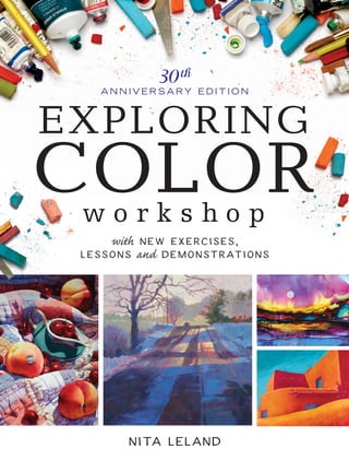
  • 1. EXPLORING COLORw o r k s h o p with new exercises, lessons and demonstrations 30th A N N I V E R S A RY E D I T I O N Nita Leland EXPLORINGCOLORWORKSHOPLeland newexercises,lessons anddemonstrationsEEEEEEEEEEEEEEEEEEEEEEEEEEEEE EAN S7755 FnL104012401JUYrVyBQdWJsaWNhdGlvbnMsIEluYyAo02SW9sYSBkaXZpc2lvbikPR3JlZ29yeSBL03cnVlZ2VyAFcQuxUEMTAuNAI4MAExBkVB04Ti0xMw05NzgxNDQwMzQ1MTU5AA== 781440 3451599 52499 ISBN-10: 1-4403-4515-5 ISBN-13: 978-1-4403-4515-9 US $24.99 (CAN $30.99) FnL104012001JUYrVyBQdWJsaWNhdGlvbnMsIEluYyAo02SW9sYSBkaXZpc2lvbikPR3JlZ29yeSBL03cnVlZ2VyAFcQwi4CMTMDMTAwATEFVVBD04LUEMMDM1MzEzNjY1NzM48A== 35313 665730 8 UPC ART TECHNIQUES FROM THE BEST-SELLING AUTHOR OF THE NEW CREATIVE ARTIST AND CONFIDENT COLOR UNLOCK THE SECRETS to gorgeous, expressive, unforgettable color! Finding color combinations that not only work but excite the eye is one of the greatest challenges artists face. This updated and expanded 30th anniversary edition of the North Light classic Exploring Color will show you, no matter what your skill level or medium of choice, how to use and control color in your artwork. Popular art instructor and best-selling author Nita Leland will help you take any artwork you make to new heights. Memorable paintings from 57 contributing artists will inspire you, along with 75+ hands-on exercises, 8 step-by-step demonstrations and countless nuggets of color knowledge— all in your own private workshop! Learn how to master color mixing, assemble the perfect palette for your artistic goals, select just the right color scheme, and communicate color in a way that elevates your designs way beyond the ordinary. Start a handy journal to keep track of your discoveries with customized mixtures, color wheels, reference charts and other tools designed to uncover your color personality and help you work with color more efficiently. Nita knows the quest for perfect color can be fun, and it can be yours. So stop guessing, and start exploring! “Beautiful color is no happy accident. Color can be learned.” — Nita Leland S7755_ExploringColor_CM.indd 1S7755_ExploringColor_CM.indd 1 5/10/16 10:18 AM5/10/16 10:18 AM
  • 2. This book is dedicated with all my heart to my supportive family, friends, teachers and students, and, as always, to R.G.L. S7755_1-7_FrontMatt.indd 1S7755_1-7_FrontMatt.indd 1 5/10/16 10:19 AM5/10/16 10:19 AM
  • 3. Cincinnati, Ohio artistsnetwork.com EXPLORING COLORw o r k s h o p with new exercises, lessons and demonstrations 30th A N N I V E R S A RY E D I T I O N Nita Leland 2 S7755_1-7_FrontMatt.indd 2S7755_1-7_FrontMatt.indd 2 5/10/16 10:19 AM5/10/16 10:19 AM
  • 4. AQUARIUM Nita Leland Mixed media acrylic collage on illustration board 15" × 20" (38cm × 51cm) Paint as you like and die happy. — Henry Miller 3 S7755_1-7_FrontMatt.indd 3S7755_1-7_FrontMatt.indd 3 5/10/16 10:19 AM5/10/16 10:19 AM
  • 5. Contents Color: A Journey and a Destination — 6 CHAPTER 1 Discovering the Joy of Color — 8 Start with a solid foundation of basic color theory. CHAPTER 2 Learning the Language of Color — 16 Build your color vocabulary so you can identify color effects and solve color problems without time-consuming trial and error. Illustrated Glossary of Color Terms 18 CHAPTER 3 Exploring Color Characteristics — 32 Select your own basic palette with the help of handy reference charts revealing the appearance and behavior of your paints. CHAPTER 4 Controlling Color Mixtures — 54 Learn how to mix clean, vibrant colors every time using the split-primary color mixing system. Demonstration: Paint Using Split-Primary Color Mixing 60 CHAPTER 5 Working with Harmonious Colors — 68 Learn the distinctive harmonies, advantages, limitations and unique expressive potentials of eight different primary color combinations. Demonstration: Compare Harmonious Palettes 89 4 S7755_1-7_FrontMatt.indd 4S7755_1-7_FrontMatt.indd 4 5/10/16 10:19 AM5/10/16 10:19 AM
  • 6. ASTM Color Index Guide — 168 Index of Color Exercises — 170 Index — 171 Contributing Artists — 172 About the Author — 175 CHAPTER 6 Expanding Your Palette with Color Schemes — 94 Add distinctive colors to your basic palette, control them with color schemes and achieve exciting new dimensions in your art. Demonstration: Find a Subject for a Color Scheme 108 Demonstration: Choose a Color Scheme for a Subject 110 CHAPTER 7 Using Color Contrast — 112 Find out how you can use different types of contrast to make stronger art, generate excitement and show off your colors to their best advantage. Demonstration: Take Risks with Contrast 128 CHAPTER 8 Expressing the Harmony of Light and Shadow with Color — 130 Bring harmony to your work using glazing, colorful shadows, toned supports and consistent dominant light. Demonstration: Start with Shadows for a Self-Portrait 140 CHAPTER 9 Unifying Color and Design — 148 Master the elements and principles of design so you can express yourself freely in a well-planned composition. Demonstration: Maintain Rhythm with Brushwork 160 Demonstration: Build and Enrich Color Layer by Layer 165 5 S7755_1-7_FrontMatt.indd 5S7755_1-7_FrontMatt.indd 5 5/11/16 10:18 AM5/11/16 10:18 AM
  • 7. Color: A Journey and a Destination If you’re an artist and don’t understand color, you’re like a traveler who left your luggage at home. Sooner or later you’ll have to go back and get it if you want to get very far. Art without color? Inconceivable! But why settle for ordinary color when you can create radiant works of color? Beautiful color is no happy accident. You can have fantastic color, too. Color can be learned. This book will help you: • Build your color vocabulary. • Explore your paints or medium of choice. • Master color mixing with a split- primary palette. • Use harmonious triads and color schemes. • Apply color contrast and design. • Discover distinctive ways of using color. • Expand your appreciation of color science, history and theory. To explore color, you can use any type of artists’ paint, pastel, oil pastel, colored pencil, yarn, fabric or paper collage—whatever medium you work with. Make collages with colored papers to plan your paintings; make watercolor or acrylic sketches to design your oil canvases. Color knows no boundaries in art media. Within these pages you’ll find fabulous artwork by top artists to inspire you in your color journey. The illustrated glossary in chapter two (and many more terms defined throughout the book) will help you build your color vocabulary. You’ll also have a brief introduction to some newer paints and media: interference and iridescent colors in acrylics, PrimaTek mineral pigments, and alcohol-based inks for the adventuresome. Triads and color schemes have been expanded with modern pigments. Play with color and have fun while you learn. Easy, eye-opening exercises placed throughout the book are designed to help you expand your color skills. Artists in many mediums can do most of these exercises. Reserve some time every day to do one. Collect as many color samples or paints as you can and use them for the exercises. Share with your artist friends and make exploring color a group project. As you do the exercises, you’ll see that mastery of color is an achievable goal. Exploring color will make you aware of your color preferences and strengthen your color knowledge. Once you learn how to mix and arrange colors, exploring harmonious color triads and expanded palettes along the way, you’ll have the tools to build a solid foundation for creative color. In no time, you’ll start solving the mysteries of color and be well on your way to becoming a master colorist. That means that, if you love color, you can unlock its secrets—if you work at it. So, begin your travels now in the wonderful world of color, and have a great trip. —Nita Leland 6 S7755_1-7_FrontMatt.indd 6S7755_1-7_FrontMatt.indd 6 5/10/16 10:20 AM5/10/16 10:20 AM
  • 8. AUTUMN COLORS Georgia Mansur Watercolor on watercolor ground 8" × 24" (20cm × 61cm) Mansur’s spontaneous brushwork depicts an appealing, vibrant landscape. Here’s an artist who is not afraid of color. Celebrating 30 years of Exploring Color When I became publisher of North Light Books in 2007, not only did I inherit a legacy of excellence in art instruction, but I inherited a family of authors. Many of those authors I would develop personal relationships with via email and phone conversations, although 90 percent of my authors I have never met in person. Imagine my luck to discover that Nita lives just fifty miles north of our office! It’s been a pleasure to be able to meet with her in the office or over dinner where we have discussed new book ideas as well as how publishing has evolved to include blogs, ebooks and videos. Most art-instruction authors have one book that they can envision, create and share with the world; Nita Leland is one of those rare authors whose vision and passion went well beyond a single book. She’s created a dozen books and videos for North Light, always investing her time, energy and professional knowledge to make sure that the products she creates will help artists improve their knowledge of painting. And, she’s able to produce so many wonderful products because her personal desire for knowledge about the process of making art is never satisfied. Her generosity, as well as her authority on making art, has made her a gift to the world of art instruction as well as a popular artist and workshop instructor. When Nita approached us about revising Exploring Color, we gave the idea a lot of thought. You don’t mess with success. This book had been revised once before, has sold more than 100,000 copies, and has been around for three decades! That’s longer than North Light Books has been a part of F+W (North Light was acquired in 1983). But in the end, we trusted that Nita would deliver, and deliver she did. She and I know that Exploring Color Workshop will reach a new generation of artists looking to expand their understanding and use of color. And for those of you already familiar with Exploring Color, we hope you enjoy this updated version and all the new art. Books are only complete once they are read; they need to be touched, dog-eared and maybe even highlighted. So, please explore the pages of this book, savor the images, take in the text and, most of all, apply what you learn to your art. Take as much as you can from these pages and become the artist you desire to be. —Jamie Markle Publisher, North Light Books 7 S7755_1-7_FrontMatt.indd 7S7755_1-7_FrontMatt.indd 7 5/10/16 10:20 AM5/10/16 10:20 AM
  • 10. DISCOVERING THE JOY OF COLOR When we start out in art, our instructors usually emphasize values and shapes rather than color. That’s good, because values are easy to understand. Shapes are, too, since we identify objects by their shapes. But values and shapes make contact with the intellect. Color touches the heart. Color is important, whether you’re a fine artist, graphic designer, decorative painter or fiber artist. After all, to paint is to color a surface; to weave is to mingle colors. But do you really know what you’re doing with color? How much time do you spend in trial and error, looking for suitable paint, the right color or the best mixture? Suppose you want to mix a sky color, a skin color or a tree color. Or perhaps you need to match a color for a specific application. Can you use a recipe? Formulas may offer temporary solutions, but one-size-fits-all doesn’t work with color. Develop your color sensitivity and color knowledge, so you can use color with confidence, devising your own solutions to color problems with style and elegance. MARKETPLACE Paul St. Denis Watercolor with collage 18" × 22" (46cm × 56cm) AFTERNOON AT THE RAMOS CAFÉ Angela Chang Transparent watercolor on paper 28" × 18" (71cm × 46cm) Art without color would lose much of its purpose. — Andrew Loomis S7755_8-15_Chapter1_.indd 9S7755_8-15_Chapter1_.indd 9 5/10/16 10:21 AM5/10/16 10:21 AM
  • 11. Color Theory Basics In basic color theory, the primary colors cannot be created by mixing other colors, but they can be used to create innumerable mixtures. The traditional primaries of artists’ pigments are red, yellow and blue. Ground pigments, which contain impurities and lack spectral clarity, are more opaque than dyes, therefore it is difficult to mix pure colors. Ideally, red, yellow and blue pigments can be mixed in various combinations to produce the secondary colors: red + blue = violet; red + yellow = orange; yellow + blue = green. Mix a secondary with the primary on either side of it on the color wheel to get tertiary colors, which take the names of both colors in the mixture. The mixtures are darker than the colors combined to create them when using acrylics, gouache, oils, watercolors and other fine art media. Modern developments in paint chemistry include many new pigments, such as a modern primary triad of magenta, yellow and cyan. Magenta + cyan = violet; magenta + yellow = orange; yellow + cyan = green. Practice making tertiary mixtures with the colors you have. PRIMARIES SECONDARIES PRIMARIES TERTIARIES = = = = = = + + + + + + = = = + + + EXERCISE 1: MIX TO CREATE SECONDARY AND TERTIARY COLORS This exercise is the foundation of all color mixing and the logical relationships in color theory. Mix the primary colors to make the secondary colors. Then, mix each secondary with a primary to create the tertiary colors. Take time to play with whatever primary pigments you have, making swatches of secondary and tertiary mixtures in a color journal (see Exercise 5). Label the colors you use, so you can refer to them later. Jot down notes on your reactions to new mixtures. Keeping your swatches in rows or columns will come in handy when you’re trying to pick a palette for your artwork. red yellow blue red-orange yellow-orange blue-green yellow-green red-violet blue-violet red yellow blue yellow red blue orange green violet yellow blue red magenta yellow cyan MODERN PRIMARIES 10 S7755_8-15_Chapter1_.indd 10S7755_8-15_Chapter1_.indd 10 5/10/16 10:22 AM5/10/16 10:22 AM
  • 12. yellow violet red green blue yellow- green blue- green blue- violet red- violet red- orange orange yellow- orange KEY Square = primary Circle = secondary Triangle = tertiary EXERCISE 3: MAKE A TERTIARY TRIANGLE Artists of the past often combined two secondary mixtures to create what some called compound colors, or muted mixtures. This old-style diagram is based on Johann Wolfgang von Goethe’s color triangle. Use primaries to mix secondaries, placing all as shown. Mix two secondaries to create the tertiary color between them. Create several more triangles, switching out the primaries. Your results will vary depending on which pigments you mix. Some combinations result in subtle chromatic neutrals; others look like mud. Some you may find useful for painting shadows or modifying glazes. green + orange (olive) green + violet (slate) orange + violet (russet) EXERCISE 4: CREATE COLOR WHEELS FROM BASIC TRIADS See what mixtures you can make with all the primary colors you have now. Using what you’ve learned about mixing, create a twelve-color wheel on medium-weight paper, canvas or illustration board. Sort your colors into triads of red, yellow and blue, or magenta, yellow and cyan. Put all other colors aside. Then, mix your different reds and yellows (two colors per mixture) to find the best orange mixture. Place this color on your wheel and label it with the names of the colors in the mixture. Repeat the exercise with every yellow and blue or cyan (for green), then with every blue or cyan and red or magenta (for violet). Study the mixtures for a while. Don’t worry if some of your colors look muddy. Color wheels made from triads of primary colors you have help you organize your thinking about color and expand your color choices. EXERCISE 2: SEE COLOR CHANGE RIGHT BEFORE YOUR EYES To see how your eye is affected by strong color, stare at the red X for ten to twenty seconds, then look away at a white space. You’ll see the complement (opposite) of red, which is green. Try it again, this time looking at the yellow area. The complementary green mixes with the color you’re looking at, turning yellow into yellow-green. This phenomenon—called successive or mixed contrast—affects the way you see color as you work, so rest your eyes frequently when working intensely with color. 11 S7755_8-15_Chapter1_.indd 11S7755_8-15_Chapter1_.indd 11 5/10/16 10:22 AM5/10/16 10:22 AM
  • 13. EXERCISE 6: MAKE A COLOR WHEEL IN YOUR FAVORITE MEDIUM Create a color wheel using swatches of your favorite medium— paint, pastel, colored pencil, fabrics, paper or yarn. Apply colors to a wheel drawn on paper, canvas or illustration board, or create mixtures that can be cut out and glued onto a separate support with acrylic matte or soft gel medium. Always put yellow at the top and move clockwise toward green and blue. Color wheel in acrylics EXERCISE 5: START A COLOR JOURNAL To find out what colors resonate with you, start a color journal in a sketchbook. List artists whose work you like. Figure out what you like most about them by studying their work. Is it their brilliant use of color or strong values? Do you like unusual color? Do you prefer subtlety to boldness? Write down your reactions. Get a sense of what attracts you—and what you don’t like—so you can relate this information to what you learn as you explore color. Play with swatches in your journal, arranging them spontaneously or in columns on a grid. The important thing is to get the information and the colors down while you’re working with them and your reactions are fresh in your mind. (Watercolor and ink journal pages by Patricia Kister) Color wheel in oils Color wheel in fibers (yarn) Explore Color in Your Medium Exploring color knows no boundaries in art media. Experience for yourself how color works in your medium, because they all have idiosyncrasies. You may be a painter or calligrapher, a colored pencil artist or pastelist; even collage and mixed media artists, weavers, knitters and quilters benefit from exploring color. Make collages with Color-aid papers to design your color schemes, or use watercolor or acrylic sketches to plan the color in your oil canvases. Then, trust your intuition to lead you to unique color expression. Make reference color wheels in every medium you work with. Each experience reinforces your understanding of color principles, regardless of how the colors are mixed and applied. Collage artists adhere paper clippings with acrylic mediums; quilters make cloth samplers. Oil and acrylic painters, as well as pastelists and colored pencil artists, use gessoed paper or canvas. Share materials and colors with artist friends to increase your knowledge. 12 S7755_8-15_Chapter1_.indd 12S7755_8-15_Chapter1_.indd 12 5/10/16 10:22 AM5/10/16 10:22 AM
  • 14. EXERCISE 7: COMBINE AND COMPARE ACRYLIC PRIMARIES Which colors should you use for your primaries? Here’s where color theory gets confusing. You can see how different these acrylic mixtures are when I use different paint colors for my primaries. For each sample, I applied a different primary to each end of the strip and gradually mixed them across the space, since acrylics don’t mingle like watercolors when you use high-viscosity paints. The more you explore your paints, the sooner you’ll be able to get the color mixture you want, every time. Pyrrole Red Light Cadmium Yellow Medium Quinacridone Red Lemon Yellow Phthalo Blue (Red Shade) Cadmium Red Medium Phthalo Blue (Green Shade) Cadmium Yellow Medium Ultramarine Blue Lemon Yellow Cadmium Red Medium Hansa Yellow Medium Naphthol Red Light Hansa Yellow Opaque Cerulean Blue Deep Pyrrole Red LightCerulean Blue Deep Hansa Yellow Medium Phthalo Blue (Red Shade) Nickel Yellow Azo SHAPE VS. COLOR An object is identified by shape, no matter how bizarre its color. Apparently, shape recognition is a function of the intellect, while color awareness is intuitive. You have a great deal of freedom in choosing colors when you’re working with a recognizable shape. A blue pear? A purple cow? You can be whimsical, dramatic, even absurd, if you like. Ultramarine Blue Quinacridone Red Phthalo Blue (Red Shade) Quinacridone Red Learn to appreciate the unique beauty of different mixtures. Record a swatch of each mixture in your color journal, along with a note about the colors you used. These references will come in handy when you’re painting. Maybe that dusky purple will be just right for a blue grape, or the dull orange might make a good shadow for a pumpkin. 13 S7755_8-15_Chapter1_.indd 13S7755_8-15_Chapter1_.indd 13 5/10/16 10:22 AM5/10/16 10:22 AM
  • 15. EXERCISE 8: PAINT THE FOUR SEASONS Divide a sheet of paper, illustration board or canvas into four sections. Using the colors and the medium you’re most familiar with, sketch the four seasons, or make abstract color sketches of this subject in collage or fibers. If you prefer, you can make a nonobjective design of geometric shapes. Be inventive with the colors you have, but don’t experiment with new colors yet. These sketches are a record of how you use color now; they’re not meant to be finished work. Keep them for comparison with later exercises. Your first paintings of the four seasons should show the range of color effects you can get with your present palette before exploring color. Here I’ve used the three colors my Permanent Alizarin Crimson New Gamboge French Ultramarine TRADITIONAL PALETTE How Do You Currently Use Color? Most artists start out using their teacher’s colors or copying a palette from a book. Perhaps you’ve been painting long enough to have developed a color style that clearly distinguishes your work from others. But do your colors always say what you want them to say? Do you find you’re repeating yourself with colors? Do you limit your subjects only to those suitable for certain colors? Think for a moment about what you’re doing with color now. teacher required when I first started painting. The little sketches turned out all right, but some color mixtures aren’t exactly what I wanted. 14 S7755_8-15_Chapter1_.indd 14S7755_8-15_Chapter1_.indd 14 5/10/16 10:22 AM5/10/16 10:22 AM
  • 16. LOVE THAT TURQUOISE! Judy Horne Acrylic and collage on cold-press watercolor paper 21" × 21" (53cm × 53cm) HOW BRAVE ARE YOU? My heart almost stopped when I saw Horne’s colorful abstract. I admire the courage of her stunning color and the energetic rhythms of the whirling brushstrokes. SKIPPER Susan Webb Tregay Acrylic on canvas 40" × 30" (102cm × 76cm) ARE WE HAVING FUN YET? Tregay embraces no-holds-barred color, using bright primaries and adding pink for even more fun. Painting can be serious business, but that doesn’t mean you can’t play while doing it. What’s Your Color Personality? If you’ve ever taken a color personality quiz online or asked a fashion consultant to match you to your personal colors, you probably had mixed results. One system is based on your intuition and the other on your physical appearance. When it comes to making art, you’ll get the best results by combining your knowledge of color principles with your sense of which colors you prefer to look at and to work with. The artists throughout this book have distinctive color personalities. Finding ways to explore color will help you reveal yours. 15 S7755_8-15_Chapter1_.indd 15S7755_8-15_Chapter1_.indd 15 5/10/16 10:22 AM5/10/16 10:22 AM
  • 18. LEARNING THE LANGUAGE OF COLOR In this chapter are three keys to help you unlock the mysteries of color. The first is an illustrated glossary. Artists need words to communicate, but images help us understand their meaning. I placed the glossary near the beginning of the book so you can familiarize yourself with important color terms right away. The second key shows how lighting affects color. No matter what you know about paint and color mixing, the lighting you use to paint or display your work makes a huge difference in how it appears to the viewer. The third key is a discussion of the all-important properties of color: hue, value, intensity and temperature. And then, we’ll be ready to talk about paint. FREE SPIRIT Denise Athanas Acrylic on canvas 20" × 20" (51cm × 51cm) Colors are forces, radiant energies that affect us positively or negatively, whether we are aware of it or not. — Johannes Itten, The Art of Color NIGHT IN THE CITY Thomas W. Schaller Watercolor on paper 30" × 22" (76cm × 56cm) 17 S7755_16-31_Chapter2.indd 17S7755_16-31_Chapter2.indd 17 5/10/16 1:57 PM5/10/16 1:57 PM
  • 19. Illustrated Glossary of Color Terms Like every specialized area in art, color has its own language. Following are definitions of some of the color terms we will explore in greater depth throughout this book. achromatic: lacking color; black, gray or white; neutral color contrast: differences in hue, value, intensity, temperature, complements or quantity color harmony: matching pigments for similarities of intensity, transparency, opacity and tinting strength color wheel: a circular arrangement of the colors of the spectrum additive color: derived from light mixtures color index name: color name and specific pigment identifier, as in PR108 for Pigment Red, Cadmium Red; sometimes called C.I. Name EXERCISE 9: MAKE A GLOSSARY IN YOUR COLOR JOURNAL Reserve the last twenty or so pages of your color journal for a glossary. Anytime you come upon something in a techniques book or hear a word that you don’t understand at a workshop, add the term to your glossary with an image for easy reference. Jot down definitions of unfamiliar words you want to remember and use a glue stick or soft gel medium to paste in small images that define the words. Another option is starting a shoebox file just for your glossary. color identity: an obvious color bias in a mixture analogous colors: colors next to each other on the color wheel, such as blue, blue-green and green chromatic: having color, as opposed to achromatic black, white and gray; opposite of neutral chromatic neutral: a neutral mixture that hints at the pigment colors used color scheme: orderly selection of colors based on logical relationships on the color wheel 18 S7755_16-31_Chapter2.indd 18S7755_16-31_Chapter2.indd 18 5/10/16 1:57 PM5/10/16 1:57 PM
  • 20. complementary colors: opposites on the color wheel; enhance each other when side by side; neutralize when mixed dominant light or color: the predominant light in a composition caused by changes in season, weather, time of day or region granulation: sedimentary effect in washes; also, flocculation hue: the spectral name of a color (red, orange, yellow, green, blue or violet) limited palette: selection of few colors for an artwork dye or ink: transparent coloring matter dissolved in fluid; absorbed by a surface glaze: a transparent or translucent veil of color modifying an underlying color successive layers get darker/neutralized single layers modify color without darkening key: the dominant value relationships in a picture intensity: the degree of purity or brightness of a color; sometimes, chroma or saturation high intensity low intensity fugitive color or pigment: a chemically unstable pigment that fades or changes under normal conditions of light or storage gradation: gradual change; provides transition and movement in color design high key: medium to light values low key: medium to dark values full contrast: light, medium and dark values stable slight change fugitive high key low key 19 S7755_16-31_Chapter2.indd 19S7755_16-31_Chapter2.indd 19 5/17/16 10:44 AM5/17/16 10:44 AM
  • 21. palette: the surface on which colors are mixed; also, the colors selected for use in an artwork primary color: a color that cannot be mixed from other colors; yellow, blue, red, magenta, cyan secondary color: a color resulting from the mixture of two primary colors; orange, green or violet shade: medium-to-dark value of a color optical mixture: occurs when small areas of color are juxtaposed and perceived by the eye as a mixture; also, mixed contrast pigment: powdered coloring matter used in the manufacture of paint reflected color or light: color or light on an object that is reflected off of adjacent objects semi-opaque: slightly or nearly opaque semi-transparent: slightly or nearly transparent simultaneous contrast: any one of several effects that colors have on each other when juxtaposed and viewed together or successively local color: the natural or painted color of an object mixed contrast: the afterimage of a complementary color seen after viewing a color; overlay of an afterimage on another color properties of color: hue, value, intensity, temperature Hue: green Value: dark/light Intensity: pure/gray Temperature: cool/warm luminosity: radiance or glow in an artwork mingle: to blend paints without excessive mixing, so colors retain some of their identity monochromatic: having a single color paint: pigment particles suspended in a binder opaque: having covering power; not transparent 20 S7755_16-31_Chapter2.indd 20S7755_16-31_Chapter2.indd 20 5/10/16 1:58 PM5/10/16 1:58 PM
  • 22. staining color: a color that penetrates the surface; also, dye subtractive color: derived from paint mixtures that absorb all colors except the local color of the object, which is reflected successive contrast: the afterimage of a complementary color seen after viewing a color transparent: permits light to penetrate and reflect off the surface of a support or allows another color to show through triad: a color scheme having three colors with a logical relationship on the color wheel value: the degree of lightness or darkness of a color wet blending: applying several layers of color without waiting for each layer to dry tetrad: a color scheme having four colors with a logical relationship on the color wheel tint: a light value of a color tone: a color modified by gray or a complement toned support or ground paper or canvas having a preliminary color wash or undertone; underpainting spectral color: the colors produced when white light passes through a prism: red, orange, yellow, green, blue, violet tinting strength: the power of a color to influence mixtures weak strong split primaries: a warm and a cool pigment for each primary color (six primaries), used in color mixing temperature: the relative warmth or coolness of colors tertiary color: mixture of a primary and its adjacent secondary: for example, red-orange or blue-green cool hues warm hues 21 S7755_16-31_Chapter2.indd 21S7755_16-31_Chapter2.indd 21 5/10/16 1:58 PM5/10/16 1:58 PM
  • 23. HOW LIGHTING CHANGES THE COLORS WE SEE Use consistent lighting when you’re exploring color. The three settings I used for these photos are full-spectrum fluorescent (left), daylight/sun (middle) and incandescent (right). I prefer the full-spectrum fluorescent setting, because it doesn’t have a strong color bias. EXERCISE 10: COMPARE LIGHTING SITUATIONS WITH YOUR CAMERA To see for yourself how lighting changes your colors, set your digital camera on manual and photograph a piece of your art using the different white-balance settings offered on your camera. My camera has settings for sunny, cloudy, non-spectral fluorescent, full-spectrum fluorescent and incandescent lighting. Don’t use the auto setting, where the camera chooses the lighting for you. For this exercise, do not change the light source or move your picture. Compare the results. The Language of Lighting and How It Affects Color Your brain controls what your eyes see. If you wear a red sweater, you will probably see it as red no matter what color of light illuminates it. This phenomenon is called color constancy. My students remark that their artwork looks different when they take it home. They notice the change on the way to the car and in different rooms in the house. This effect is directly related to the changing light that surrounds them. Here are some strategies to help you increase your awareness of that elusive light and control the light to achieve more consistent color in your artwork. Normally, you can’t control the lighting that illuminates your painting on someone else’s walls, but if you use color-correct lighting when you paint, your work should be presentable in most situations. I use full-spectrum (sometimes called daylight or natural) fluorescent lighting in my studio. The Vita-Lite and GE Sunshine bulbs I’ve used have lasted 10–15 years and give great color rendition at 5000– 5500K. I buy them at lighting specialty and home improvement stores. If your space is small, use desktop lamps or floor lamps with full-spectrum bulbs. Whatever lighting you use while you paint, I suggest that you view your work under different lighting conditions. I take a break while working on a painting to check the colors under different lights in my home. I carry it to a window for daylight, take it to the laundry room for non-spectral fluorescent, and to my living room for incandescent lighting. Each gives me a different reading and I make a note of my observation in my color journal. 22 S7755_16-31_Chapter2.indd 22S7755_16-31_Chapter2.indd 22 5/10/16 1:58 PM5/10/16 1:58 PM
  • 24. HUE Red VALUE Light INTENSITY Pure TEMPERATURE Warm Cadmium Scarlet Cadmium Red Quinacridone Red Alizarin Crimson CoolGrayDark THE LANGUAGE OF COLOR Every craft has its vocabulary. In color, you may need to lower the intensity, emphasize value contrast or adjust temperature, so you should know exactly what these terms mean. Make sure you understand this language of color before you go any further. The Properties of Color When you visit a foreign country, you’re more comfortable if you understand the language. The same is true with color. Artists use commonly accepted terms to describe the properties of color. Hue, value and intensity are the foundation words of color in every medium. Hue is the general name of a color; value is its lightness or darkness; intensity is its purity or grayness. One more property, temperature—the warmth or coolness of a color—critically affects color relationships. 23 S7755_16-31_Chapter2.indd 23S7755_16-31_Chapter2.indd 23 5/10/16 1:58 PM5/10/16 1:58 PM
  • 25. Hue Hue is the name or attribute of a color that permits it to be designated as red, orange, yellow, green, blue or violet. As each color moves toward the next on the color wheel, it assumes the characteristics of its neighbor. The general names of these in-between, tertiary colors are: red-orange, yellow-orange, yellow-green, blue-green, blue-violet and red-violet. All of these colors comprise the twelve hues on the color wheel shown on this page. The color wheel establishes logical relationships useful in color mixing and design. You’ll frequently use the wheel to organize and study these relationships, so get to know it well. Familiarize yourself with the exact locations and names of hues around the circle. Always orient your color wheels like a map, with yellow, the lightest hue, at the top and violet, the darkest, at the bottom. Place primary red to the lower left on the wheel and blue to the lower right. yellow violet red green blue yellow-green blue-green blue-violetred-violet red-orange orange yellow-orange EXERCISE 11: PRACTICE PLACING COLORS ON THE COLOR WHEEL Select a tube each of twelve spectral colors you think will make a bright color wheel. If you’re not a painter, make your wheel with colored pencils, fibers, collage papers or whatever your medium is. Don’t worry if you don’t have a full range of spectral colors; you’ll learn to mix colors in chapter four. Now, lay out a color wheel that resembles the face of a clock, beginning with yellow at the top (twelve o’clock). Move clockwise toward green in the following order: yellow, yellow-green, green, blue- green, blue (four o’clock), blue-violet, violet, red-violet, red (eight o’clock), red-orange, orange and yellow-orange. Label your wheel with the names of the paint colors you used in each mixture, as well as brand names, for future reference. (I didn’t label mine here, because I want you to use your own selections for this wheel.) HUE VS. PAINT NAME Hue and color are general terms. The hues in this small sketch are red, yellow, green and blue. Pigment and paint names, which we’ll examine in chapter three, are more specific. Artists invariably ask what paint colors were used. The paint names used here are Alizarin Crimson, Cadmium Yellow Light, Permanent Green Pale and Ultramarine Blue. Three of the paints are “single pigment” colors. Permanent Green Pale is a mixture of two pigments. 24 S7755_16-31_Chapter2.indd 24S7755_16-31_Chapter2.indd 24 5/10/16 1:58 PM5/10/16 1:58 PM
  • 26. PURE COLORS MAKE A BOLD STATEMENT Baker’s playful watercolor shows an ordinary subject reflecting prismatic colors in sunlight. What is the real subject of this painting? Of course, it’s color. ALL IN A ROW Linda Daly Baker Transparent watercolor on cold-press watercolor paper 22" × 30" (56cm × 76cm) EXERCISE 12: SEARCH FOR A FULL RANGE OF HUES Cut 2" (5cm) squares from fabric scraps or color clippings from magazine pages to make a rainbow. This is more than a fun exercise—it’s essential eye training to help you see the differences in color relationships. Make one or more with plain colors and others with dominant colors in prints and patterns. Glue your patches to cardstock using fabric glue or acrylic soft gel medium. Whether you use paint, paper or fibers, you can find a full range of hues to make your rainbows, but you can add more colors if you wish. 25 S7755_16-31_Chapter2.indd 25S7755_16-31_Chapter2.indd 25 5/10/16 1:59 PM5/10/16 1:59 PM
  • 27. EXERCISE 13: COMPARE PURE COLORS TO GRAYSCALE VALUES Make a value scale from light to dark, showing discernible differences between value levels on the scale. If you paint, add Payne’s Gray, Ivory Black, Neutral Tint or some other dark neutral for dark values, and diluent or white for light values. If you work in fibers, select different values of materials from your scrap basket. You may also use colored pencils, or make a collage chart of different values clipped from magazines and pasted to paper or cardboard. Divide a 1" × 7" (2.5cm × 18cm) vertical column into seven 1" (2.5cm) segments. Place black at the bottom of the scale. Leave the top section white, and below the white, place a light gray. Fill in the remaining spaces with intermediate values, showing distinct, progressive steps toward black. Then, get a good sense of how values work in color by making a scale that shows the approximate color values corresponding to black, gray and white. No color is as bright as white or as dark as black, but every color in its pure state has a value that corresponds to a level on the black-and-white scale. EXERCISE 14: WORK OUT VALUE SCALES FOR VARIOUS COLORS Select six or more bright colors from your palette, including the purest red, yellow and blue you have. Place each color on a scale at its proper value level, using the black-and-white scale for reference. Now make a value range for each color, mixing with diluent (water or thinner) or white to create lights and Neutral Tint or Payne’s Gray for darks. Place the light values above and the darker ones below the pure hue, as shown. From one value step to the next, show a discernible difference. Some colors have a more extensive value range than others, retaining their identity as they become darker. For example, blue remains recognizable as blue, no matter how dark it gets; but notice how quickly yellow and orange lose their color identity as they get darker. Value Value is the degree of light or dark between the extremes of black and white. A tint moves toward white; a shade moves toward black. Yellow is the lightest color, becoming white in just a few value steps; violet is the darkest color, quickly descending to black. All other colors fall in between. Red and green, which are similar in value, are situated near the middle of the value scale. Distinguishing values is one of the most important skills in art. Use value to create contrasts between colors, adding visual impact and drama. 26 S7755_16-31_Chapter2.indd 26S7755_16-31_Chapter2.indd 26 5/11/16 10:19 AM5/11/16 10:19 AM
  • 28. JUST ORGANIC Patricia Kister Watercolor on cold-press watercolor paper 11" × 15" (28cm × 38cm) RIDING THE RANGE Emphasizing a full range of values from light to dark, Kister makes a strong visual statement with a simple subject. This is the foundation of good painting. LIKE MINDS Mark E. Mehaffey Watercolor on paper 35" × 35" (89cm × 89cm) A CLEVER OBSERVATION Mehaffey captured striking value patterns with a limited palette of black and white enhanced by skin tones. Casual observers might not notice the interesting juxtaposition of art and fashion; this artist has the skill and the wit to bring the story to life. 27 S7755_16-31_Chapter2.indd 27S7755_16-31_Chapter2.indd 27 5/10/16 1:59 PM5/10/16 1:59 PM
  • 29. Intensity The intensity of a color, sometimes called chroma, is its brightness (purity) or dullness. A pure, bright color is high intensity; a grayed color is low intensity. The extreme of low intensity is neutral gray. Pigment colors such as Permanent Rose, Cadmium Yellow and Ultramarine Blue are high- intensity colors, but no matter how bright they look, they can’t match the brilliance of spectral colors and projected or transmitted light. It’s important to be able to see—and create—subtle differences in intensity. Varying intensity gives you control over compositional emphasis and creates a setting for extraordinary color effects. When you mix two neighboring high-intensity colors, the mixture is slightly lower in intensity than either color by itself. Intensity declines most in mixtures when the two parent colors are far apart on the color wheel. Other ways to lower intensity are to mix bright colors with gray, black or an earth color. But remember, once you have lowered the intensity of a color, you can’t turn it back into a pure hue, no matter how hard you try. Once a mixture gets muddy, it never seems to improve. THE ASPECTS OF A COLOR When you mix a pure, high-intensity color with white, you get a tint; with gray, a tone; with black, a shade. Pure hue Add white Add gray Add black Tint Tone Shade EXERCISE 15: CREATE SUBTLE DIFFERENCES IN INTENSITY Starting with a pure, high-intensity color like Ultramarine Blue, make a vertical value scale from light to dark on the left side of your paper or canvas, using only water, thinner or white to change the value. Then, using Neutral Tint or some other neutral, mix a light gray. Add a small amount of this gray to the tint on your palette, trying to match the value of the tint at the top of your chart. Place a swatch of this slightly grayed mixture to the right of the pale tint. Continue across the top row, adding more gray and less color for each swatch as you go, and always trying to match the value of the first tint. The last swatch should be gray, with just a hint of the original color. Move down to the next row and repeat the process. Remember always to match the value of the first color in the row, as you lower the intensity of that color. Then repeat this exercise with another color. Notice how colors with a lighter value, such as yellow, make appealing tints, but change drastically as they darken. Colors of darker values, such as red and violet, make rich tones and shades and still retain their color identity throughout the change. Also, experiment using earth colors to lower intensity. Make a chart like this one with every color you use. INTENSITY VALUE Pure Gray DarkLight 28 S7755_16-31_Chapter2.indd 28S7755_16-31_Chapter2.indd 28 5/10/16 1:59 PM5/10/16 1:59 PM
  • 30. EXERCISE 16: SORT YOUR STASH BY INTENSITY Gather your tubes of paint, pastels, collage papers or whatever medium you’re working with and sort them into two piles: high intensity and low intensity. Divide a page of your color journal into two columns and list the bright, high-intensity colors in the left column and the duller, low-intensity ones in the right column. Place a small swatch beside the name of each color. It takes a while to do this, but it’s a real time-saver when you’re trying to find or match a color in your artwork. Colors like Vermilion, Cadmium Yellow and Ultramarine Blue are high intensity as they come from the tube. Others, like Brown Madder, Yellow Ochre and Indigo, are low-intensity paint variations of red, yellow and blue. In fibers, heather yarns and natural-dyed fabrics are low-intensity materials. Learn to see the difference. ZINNIA GLORY Julie Ford Oliver Oil on canvas 6" × 8" (15cm × 20cm) ABANDONED Julie Ford Oliver Oil on canvas 8" × 6" (20cm × 15cm) HIGH INTENSITY LOW INTENSITY Caput Mortuum Light Red Oxide Yellow Ochre Olive Green Green Earth Indigo Permanent Rose French Vermilion Sennelier Yellow Permanent Green Pale Hooker’s Green Cobalt Blue INTENSITY ATTRACTS, WHETHER YOU USE A LITTLE OR A LOT At left, artist Julie Oliver reserves low- intensity colors for her background and tones down the foreground to emphasize intense flower hues. Below, she embellishes a lowly, unlikely subject— a worn-out broom—with low-intensity earth colors, adding a splash of red to make the viewer smile. 29 S7755_16-31_Chapter2.indd 29S7755_16-31_Chapter2.indd 29 5/11/16 10:19 AM5/11/16 10:19 AM
  • 31. THE GRAND FINALE Karen Margulis Pastel on sanded paper 9" × 12" (23cm × 31cm) THE WARMTH OF BLUE The bright yellow foliage of the aspen trees is enhanced by the blue of the background. This blue doesn’t convey cold mountain air; rather, it suggests the warmth of autumn sunshine. TEMPERATURE IS RELATIVE Colors move from warmer to cooler in this collage study. The top row starts with a cool red, but the temperature becomes even cooler as it moves toward blue, stopping at blue-violet. That same blue-violet begins the bottom row as the warmest color, moving toward a cool blue-green. The temperature turns slightly warmer as the last chip picks up some green on the other side of the blue-green. THE TEMPERATURE OF EARTH COLORS As a group, earth colors are cooler than spectral colors, because they are low-intensity, grayed versions of colors. However, there are still noticeable differences in color temperature from one earth color to another. WARMERCOOLER warmer cooler Temperature Color temperature helps you create depth, movement and mood. Warm colors are aggressive and appear to advance; cool colors are passive and seem to recede. The wrong temperature in one area may disturb the balance in a piece, but correctly placed warm/cool contrast can add the zing you need for your focal point. The spectrum contains both warm and cool colors. Yellow, orange and red are generally warm, and green, blue and violet are considered cool. This is the most easily recognized distinction in color temperature. However, color temperature is relative. A color that appears warm in one place may look cool in another. Red-orange is the warmest color, so as you move away from it in either direction on the color wheel, your colors will all seem cooler, until they reach blue-green, which is the coolest color. Then, as you return from blue-green to red-orange, your colors appear warmer. Study this on your color wheel, so you can see clearly how it works. Try comparing different blue paints, fabrics or papers. Although you know blue is a cool color on the spectrum, when you line up a series of blues, you’ll see that some are warmer, leaning toward violet, while others are cooler, with a bias toward green. Every hue has many temperature variations in pigment. Practice will help you see the differences. Indian Red Light Red Oxide Raw Umber Burnt Sienna Terre Verte Olive GreenIndigo Indanthrone Blue Neutral Tint Ivory BlackYellow Ochre Gold Ochre 30 S7755_16-31_Chapter2.indd 30S7755_16-31_Chapter2.indd 30 5/11/16 10:19 AM5/11/16 10:19 AM
  • 32. EXERCISE 17: EXPAND A COLOR WHEEL GUIDED BY TEMPERATURE Sort your high-intensity colors into the twelve primary, secondary and tertiary colors of the color wheel. Put away your earth colors for the time being. On a firm support, such as heavy paper or medium-weight illustration board, start with a true yellow (not greenish or orangish) at the top, and make swatches of colors moving clockwise on a color wheel, toward green. Label the colors as you go along. Continue adding swatches around the wheel, showing a gradual change in color temperature leading from one color to the next and returning to yellow. Every color on this wheel has a slightly warmer color on one side of it and a slightly cooler one on the other, except for red-orange and blue-green, which are the warmest and coolest colors. When you move to the next color, the first one becomes the warmer or cooler one, depending on which direction you’re going. Compare the colors before placing them on the wheel. Rest your eyes occasionally, so you can see the colors more accurately. When you feel confident that you recognize temperature differences in pure colors, make a similar chart using the earth colors. PIGMENT TEMPERATURE WHEEL HansaYellow HansaYellowLight Permanent GreenPale H ooker’s Green Phthalo Green (Yellow Shade) Phthalo Green (Blue Shade) Phthalo Turquoise Phthalo Blue(Green Shade) Phthalo Blue (Red Shade) CobaltBlue French Ultramarine Ultramarine BlueViolet Dioxazine Violet Ultramarine Violet Permanent Magenta Perm anent Alizarin Crim son Pyrrole Red Cadmium Red Cadmium Scarlet Perinone Orange Cadmium Orange Perm anent Orange IndianYellow NewGamboge HOT COLD coolercooler warm erwarm er 31 S7755_16-31_Chapter2.indd 31S7755_16-31_Chapter2.indd 31 5/10/16 2:00 PM5/10/16 2:00 PM
  • 34. BIRCH LANDSCAPE David R. Daniels Watercolor on paper 43" × 63" (109cm × 160cm) EXPLORING COLOR CHARACTERISTICS New colors and art media proliferate at the speed of light, it seems. While it may appear to be “all about marketing,” in fact, paint chemistry has made remarkable advances in the past fifty years, bringing us vibrant new colors, unique mineral pigments, versatile acrylic paints and mediums, and much more. I’ll bet you would like to benefit from these developments. This chapter helps you understand the characteristics of pigment and paint. Do the exercises to familiarize yourself with every color on your palette and learn how to test new colors before you add them to your palette. PITCHER WITH PEACHES AND CHERRIES Chris Krupinksi Transparent watercolor on rough watercolor paper 30" × 22" (76cm × 56cm) The use of expressive colors is felt to be one of the basic elements of the modern mentality, an historical necessity, beyond choice. — Henri Matisse 33 S7755_32-53_Chapter3.indd 33S7755_32-53_Chapter3.indd 33 5/10/16 2:01 PM5/10/16 2:01 PM
  • 35. Is It Pigment or Paint? Ground, powdered pigments are the coloring substance of most artists’ paints, which are made by combining the pigments with a medium or vehicle that surrounds the pigment particles and binds them to the support. The degree to which color reflects from the paint molecules or passes through transparent colors to reflect the support may be determined by the grinding of the pigment particles, the inherent properties of the pigment material and/or the nature of the support. So, paint is pigment suspended in liquid, which forms a layer on the painting surface. Dyes, which are substances dissolved in liquid, are absorbed into the surface. Dyes are more likely to fade than pigments. There are only twelve hues on most color wheels, but there are hundreds of pigment and paint variations of every hue. For example, Cadmium Red and Permanent Alizarin Crimson are both red pigments. However, not all paints with the same names are made with the same pigments. To further confuse matters, manufacturers continue to invent fanciful color names, such as Saffron or Heliotrope, and it’s anybody’s guess what those colors might be. The trend toward naming paint colors for the pigment they’re made of is a good one. Although the words are tricky, artists are becoming accustomed to using abbreviated forms, such as “phthalo” for phthalocyanine and “quin” for quinacridone. Referring to ASTM C.I. Names, such as PB15:3 to identify Phthalocyanine Blue (Green Shade), will help prevent duplicates in your paint box. Use the ASTM chart in the Appendix to identify pigments before buying your paints. No doubt you’ve noticed that paints aren’t cheap. Expect to pay more for top-quality paint. Traditional artists’ colors contain more colorants than student-grade, which include fillers that dilute the pigment and produce a weak, unsatisfactory paint at low cost to make them more affordable. Buy the finest paint you can, because you’ll get better results with concentrated pigments. If you must begin with student paints, upgrade as soon as possible. Prices within an artists’ brand will vary according to the availability of colorants and the cost of processing them. Manufacturers prepare some colors from costly metallic pigments, like cadmium and cobalt, and others from rare organic materials, such as genuine rose madder. Daniel Smith uses gems and minerals such as amethyst, azurite and lapis lazuli in their unique PrimaTek series. Many well-known brands are reliable in most media. You will probably prefer the working characteristics of some brands over others. Artists’ quality pigments are usually compatible between brands, except for some acrylics. Check with the manufacturer to be sure. No “correct” brand of paint exists. Most paint manufacturers now prefer using a single pigment in paint formulas, although some mixed colors such as Hooker’s Green and Payne’s Gray are still available. These pigment mixtures, sometimes called convenience colors, tend to vary greatly between brands. Paints with the same name may be manufactured using entirely different pigments. Exploring color will train your eye to look for distinctions between these colors. COLOR CHEMISTRY Chemists study the structures of dyes and pigments, testing their characteristics and making paints from colorants. Starting with William Henry Perkin’s discovery in 1856 of aniline dyes made from coal tar, the quality and performance of traditional artists’ pigments have improved greatly in modern times. Many synthetic pigments now available have great beauty, strength and durability and are safer for artists to use. Fortunately, reliable substitutes replace most fugitive colors (colors that may fade or change color). CODES FOR MANUFACTURERS I use the following code letters with my swatches to identify artists’ quality paint manufacturers who provide rich, reliable color. This is a good time for you to start this practice. Most colors are available in several brands, but you’ll soon learn that they don’t all look the same. Add a code for your favorite brand if it isn’t listed here. DS Daniel Smith GO Golden Artist Colors HO Holbein MB MaimeriBlu MG M. Graham OH Old Holland RE Rembrandt RO Daler-Rowney SC Schmincke SE Sennelier WN Winsor & Newton 34 S7755_32-53_Chapter3.indd 34S7755_32-53_Chapter3.indd 34 5/10/16 2:01 PM5/10/16 2:01 PM
  • 36. EXERCISE 18: COMPLETE A COLOR REFERENCE CHART Using your medium of choice, make a reference chart of all your colors. Divide a large circle into six sections. Place swatches of fresh, high-intensity color to represent the primaries and secondaries in the appropriate spots on the perimeter of the wheel, as shown. Place the tertiaries at the midpoint between primaries and secondaries—for example, red-orange between red and orange. Find a place for all your high-intensity colors near colors they relate to, moving outside the circle, if necessary. If you have duplicate colors by different manufacturers, place them near each other, so you can compare them. Inside the circle, place low-intensity earth colors related to the high-intensity colors on the perimeter: Burnt Sienna near red or orange, and so on. Put the neutral grays and blacks near the center. Label every color on your reference chart with its name and a code for the manufacturer. When you buy a new color, place it on your chart near similar colors. Trade swatches with other artists and students, so you can make useful comparisons between colors in many different brands. I updated this chart with modern pigment names and removed discontinued colors, but some of these will change over time. Not all manufacturers use the same names or make the same colors, so labeling your swatches is important. Quinacridone Burnt Scarlet Transparent Yellow Cadmium Lemon Aureolin Hansa Yellow Light Permanent Green Pale Permanent Sap Green Hooker’s Green Permanent Green Light Phthalo Green (Yellow Shade) ViridianOlive Green Terre Verte Phthalo Blue Green Phthalo Turquoise Blue Cobalt Teal Manganese Blue Hue Antwerp Blue Cerulean Blue Phthalo Blue (Red Shade) Cobalt Blue French Ultramarine Ultramarine Blue Violet Ultramarine Violet Dioxazine Violet Cobalt Violet Garnet Lake Permanent Rose Rose Madder Genuine Quinacridone Magenta Permanent Magenta Permanent Alizarin Crimson Indian Red Brown Madder Winsor Red Payne’s Gray Indigo Mars Black Burnt Umber Yellow Ochre Hansa Yellow Indian Yellow Azo Yellow New Gamboge Green Gold Raw Sienna Naples Yellow Quinacridone Gold Cadmium Yellow Hansa Yellow Deep Pyrrole Orange Cadmium Orange Cadmium Scarlet Scarlet Lake Cadmium Red Light Red Oxide Burnt Sienna Pyrrole Red Ivory Black Phthalo Green (Blue Shade) Perylene Maroon Neutral Tint Caput Mortuum Ultramarine Violet (Reddish) Indanthrone Blue Phthalo Blue (Green Shade) 35 S7755_32-53_Chapter3.indd 35S7755_32-53_Chapter3.indd 35 5/10/16 2:01 PM5/10/16 2:01 PM
  • 37. IDENTIFYING COLORS Colors can be described by their hue name, paint name, pigment name or ASTM color index name, which consists of a color code (PR = Pigment Red) and a number for a specific pigment (PR108 = Cadmium Red). For most artists, the paint name is the most familiar, but many are now learning pigment and Color Index Names (C.I. Names) to help them understand their materials better. HUE PAINT PIGMENT COLOR INDEX NAME Classifying and Characterizing Pigments Organic vs. inorganic Pigments are classified as organic or inorganic, depending on the source of the coloring matter. This is important only if you prefer traditional colors with specific characteristics, such as granulation. But it really doesn’t matter whether a color is a natural material, a metal or a mineral, or a synthetic concocted in a lab, as long as it’s the color you want. Organic pigments come from compounds containing carbon, often from living matter—plant or animal material. For example, Rose Madder Genuine is made from plant material; Sepia once came from the ink sacs of the cuttlefish; Phthalocyanine Blue is a synthetic organic pigment made in a laboratory. Inorganic pigments come from earth materials (Raw Sienna and Raw Umber), calcined earth materials (Burnt Sienna and Burnt Umber) and minerals or metals (Cadmium Red, Cobalt Blue, Manganese Blue). The minerals are often brilliant and opaque; the earth colors are usually less intense. Some materials are costly and difficult to obtain. Other pigments contain unique properties that can’t be duplicated in synthetic paints. For example, costly Cobalt Blue simply can’t be matched in delicacy and beauty by substitutes formulated using Phthalocyanine Blue or Ultramarine. Substitutes should be labeled hue or tint to indicate they’re not genuine pigments. Manufacturers have developed satisfactory synthetic replacements for some colors, but only you can decide if these substitutes are acceptable. Lightfastness ratings Some colors change quickly when exposed to light over a period of time and others appear not to fade at all. In this test, the colors that faded the most over a three-year period showed a marked tendency to fade within the first two weeks of exposure to direct sunlight. Others showed little fading or color shift throughout the test. Check lightfastness ratings and avoid using fugitive, fading colors. ASTM ratings of I and II are reliable. Colors designated N/R haven’t been rated by ASTM, but those produced by reliable manufacturers have been tested to meet ASTM standards. Insist on colors that are rated high in lightfastness. See Exercise 21 later in this chapter for a way to run your own test. Buyer beware Artists of the past mixed their paints from scratch. Now you buy them ready-made, but how do you know what you’re getting? Don’t depend on printed color charts; seek charts with painted chips whenever possible. The American Society for Testing and Materials (ASTM) and the Art and Creative Materials Institute (ACMI) set voluntary standards for labeling, so you may find answers to your questions about toxicity, lightfastness and composition of paint on the label (you may need a magnifying glass to read it!). If the pigment and binder have separated in a newly purchased tube of paint or the paint is hard to squeeze out of the tube, return it to the dealer or contact the manufacturer. Most have toll-free numbers or technical and customer support on their websites. red Permanent Rose Quinacridone PV19 yellow Indian Yellow Metal complex PY153 blue Cerulean Blue Oxides of cobalt, tin PB35 36 S7755_32-53_Chapter3.indd 36S7755_32-53_Chapter3.indd 36 5/10/16 2:02 PM5/10/16 2:02 PM
  • 38. READING A PAINT TUBE LABEL Manufacturers squeeze useful information on their paint tubes. M. Graham’s labels, shown here, are surprisingly easy to read considering all the information they contain. There’s space on this label to include health warning icons for pigments that require them. Medium Paint name Manufacturer Alternate pigment names Series Stock number Weight of contents FRONT Transparency/opacity Lightfastness rating Pigment common name (Pigment Color Index name/number) Vehicle/binder ASTM conformity Manufacturer’s address BACK (Health warnings if required) MSDS safety and data sheet reference link EXERCISE 19: COMPARE MASS TONES AND UNDERTONES What you see when you squeeze paint out of a tube isn’t always what you get when you use it. There may be an actual change in the color bias. For example, watercolor Aureolin looks like honey mustard out of the tube, but when you thin it you get a lovely transparent yellow. Check your paint colors, first diluting each color to about half strength and then to a thin wash, painting swatches of each variation next to a swatch of the ACRYLICS (OUT OF JAR) OILS (OUT OF TUBE) Naphthol Crimson Cadmium Red Deep Hue Naphthol Red Light Ultramarine Blue Cobalt Blue Hooker’s Green Cerulean Blue Cadmium Yellow Light PHTHALO BLUE AUREOLIN YELLOW WATERCOLORS mass tone undertone undertone full-strength color. Some colors change significantly when they’re reduced from their full-strength mass tone to a lighter, diluted undertone. Oils and acrylics also display the mass tone/undertone effect. Colors here are applied directly from the tube or jar. The acrylics in the left column have been drawn out to show their undertone. 37 S7755_32-53_Chapter3.indd 37S7755_32-53_Chapter3.indd 37 5/10/16 2:02 PM5/10/16 2:02 PM
  • 39. THISTLES Karen Livingston Watercolor on cold-press watercolor paper 15" × 8" (38cm × 20cm) MIXING IT UP Since most watercolor paints are compatible, Livingston experiments with different brands in her paintings. Here, she mingles several layers of paint, resulting in subtle textures. A few sweeping brushstrokes suggest movement. EXERCISE 20: MAKE YOUR OWN COLOR WORKBOOK For a long time I let my swatches pile up without a system to help me find my favorites. Making a workbook made it easier. Buy a sketchbook with heavy paper or make your own. A D-ring binder from the office supply store makes a sturdy workbook. Cut sheets of 90–140 lb. (190–300gsm) watercolor paper or canvas paper/pad to fit. Mix and mingle colors in the workbook, testing their characteristics and mixing qualities. Jot down brands and color names. Make sample paintings and add (and label) swatches of the colors you use. Record your reactions to the colors. Sharpen your color awareness by comparing new colors in your workbook with more traditional colors or those you tend to use most. Use your workbook and your color journal as sounding boards for your color experiments. Jot down the names of colors you want to try. Note ideas for new color combinations. What did you learn from doing each exercise? Every experience with color teaches you something new to use in your artwork. How Exploring Color Works We’ll begin exploring color in this chapter by testing paints or dry media, to familiarize you with the color characteristics of your chosen medium. Because I’m a watercolor painter, most of the exercises are done in that medium, but you can use oils, acrylics, colored pencil, oil pastels and other media (see the transparency chart later in the chapter) as well, to sharpen your eyes to see color and make comparisons. This will help you when you work with color harmony, contrast and design later in the book. You can adapt some of the exercises in this chapter to collage papers, fabrics, yarns or whatever medium you prefer. For collage charts, collect and file colored paper or clippings in various hues, values, intensities and temperatures. Fiber artists can use swatches of yarn or fabric samples to compare how textures, patterns, the length and density of fibers, and the shine of metallic threads affect colors in knitting, weaving and quilting. Be sure to include some transparent papers and fibers. 38 S7755_32-53_Chapter3.indd 38S7755_32-53_Chapter3.indd 38 5/10/16 2:02 PM5/10/16 2:02 PM
  • 40. PAINT COMPOSITION This chart is a handy reference to characteristics of the most popular art mediums. For more information, browse a manufacturer’s website and email or call their technical support team. acrylic paint MEDIUM BINDER DILUENT/SOLVENT CHARACTERISTICS acrylic polymer dispersion acrylic mediums, water/ denatured alcohol (limited use) fast drying (dries darker); opaque or transparent OPEN Acrylic paint (GO) acrylic polymer dispersion OPEN acrylic mediums remains wet on palette for extended period colored pencil wax, gum mineral spirits, colorless marker applied in layers; waxy; buff for shine gouache paint natural gum water fast drying; opaque; matte gouache (acrylic) paint acrylic dispersion water same as gouache; dries water resistant ink (pigmented) gum, shellac or acrylic emulsion water/denatured alcohol fast drying; transparent, brilliant color; use lightfast only oil paint or oil sticks natural oils (linseed, poppy, safflower) oil medium/ pure gum turpentine, mineral spirits slow drying; opaque oil paint (water miscible) modified linseed oil pure gum turpentine, mineral spirits, water for cleanup slow drying; loses water miscibility if too much oil is used pastel weak gum solution only for water-soluble soft pastel brilliant pure color; opaque; soft or hard pastel (oil) natural oils and wax pure gum turpentine, mineral spirits opaque pastel effect with no dust tempera paint egg yolk water fast drying; opaque; translucent layers watercolor paint natural or synthetic gum (some with honey) water fast drying (dries lighter); transparent; matte watercolor paint (QoR) synthetic gum Arabic water fast drying; intense color watercolor pencils or sticks water-soluble gum water mostly transparent; wettable for wash effects alkyd paint oil modified alkyd resin oil medium/pure gum turpentine, mineral spirits similar to oils, but fast drying; compatible with oils; opaque casein paint milk solids water fast drying; opaque; matte DIFFERENCES IN BRANDS Be careful about switching brands of a specific color while working on a painting. Brands may vary to a surprising degree in color bias, transparency and tinting strength. The same color may also look quite different in oils, watercolors and acrylics. Here’s Cobalt Blue in watercolor, showing a range of color bias and strength across different brands. COBALT BLUE Winsor & Newton Grumbacher Holbein Maimeri Holbein (hue) EXERCISE 21: TEST THE LIGHTFASTNESS OF YOUR COLORS Permanence from paint color to paint color varies. When in doubt, test the colors yourself. Paint three or four brushstrokes on a piece of paper, cut it in half and place one half in a sunny window and the other in a dark place. Compare the two halves once a month to see how long the color takes to fade. See a sample color test in the glossary entry for fugitive color in chapter two. Most colors are reliable under normal conditions, but atmospheric pollution may be a problem where you live. It’s probably fair to say that nothing can be absolutely guaranteed. 39 S7755_32-53_Chapter3.indd 39S7755_32-53_Chapter3.indd 39 5/10/16 2:02 PM5/10/16 2:02 PM
  • 41. Sorting your colors Now’s your chance to find out what your colors can do. As best you can, find colors in your chosen medium and match them to the list of paint colors below. Add any others you’d like to try. Remember that not all colors are available in every medium or brand, nor do similar colors always have the same name. Check the ASTM chart near the end of the book for the C.I. Name of the colors below. TAPING COLOR CHARTS FOR EASY LABELING Mark grids on your paper or canvas, sized to the exercise you’re planning to do, using low-tack, white artist’s tape that won’t damage the surface when you remove it. As you work, write the names of the paints you use on the tape. After your paints are dry, transfer the names to the paper as you remove the tape. Use a hair dryer on the low setting to warm the tape for easy removal. The white strip between the colors makes it easier to evaluate them. HIGH-INTENSITY COLORS MAGENTA, RED AND RED-ORANGE Rose Madder Genuine (WN) Permanent Rose Quinacridone Magenta Permanent Alizarin Crimson Cadmium Red Medium Winsor Red or Pyrrole Red Cadmium Scarlet, French Vermilion or Cadmium Red Light Scarlet Lake ORANGE AND YELLOW-ORANGE Cadmium Orange or Permanent Orange New Gamboge, Indian Yellow or Cadmium Yellow Deep YELLOW AND YELLOW-GREEN Cadmium Yellow Light, Cadmium Yellow Medium or Hansa Yellow Medium Transparent Yellow or Hansa Yellow Light Aureolin Cadmium Lemon Permanent Green Pale, Permanent Sap Green or Phthalo Green (Yellow Shade) GREEN AND BLUE-GREEN Hooker’s Green Phthalocyanine Green, Phthalo Green or Winsor Green (Blue Shade) Viridian Phthalo Blue Green or Turquoise BLUE AND BLUE-VIOLET Cerulean Blue Manganese Blue Hue Phthalocyanine Blue, Phthalo Blue or Winsor Blue (Red Shade) or Winsor Blue (Green Shade) Cobalt Blue French Ultramarine or Ultramarine Ultramarine Blue Violet VIOLET AND RED-VIOLET Dioxazine Violet Permanent Magenta Brown Madder Burnt Sienna Indian Red Perylene Maroon Quinacridone Gold Raw Sienna Yellow Ochre Olive Green Indigo Indanthrene or Indanthrone Blue LOW-INTENSITY COLORS NEUTRALS Neutral Tint Ivory Black Payne’s Gray Flake White (oil, alkyd), Zinc White (acrylic, gouache, watercolor) for mixing Titanium White for opacity 40 S7755_32-53_Chapter3.indd 40S7755_32-53_Chapter3.indd 40 5/10/16 2:02 PM5/10/16 2:02 PM
  • 42. Cleaning and filling your palette Don’t use your old palette until you’ve washed off all the contaminated paint—you’ll be glad you did! If necessary, soak it for a while and use the tip of a palette knife to scrape out the old paint. I use a cleaning product for glass stovetops to remove stains from my white palettes, rinse with soap and water, and wipe with diluted vinegar. Test a small spot on your palette before using this method. Use fresh, clean color for the exercises that follow in the book. Squeeze out a generous amount of paint if you’re using watercolors. They can be remoistened instead of thrown away. However, fresh paint releases more saturated color on your paper, as shown in the image below. Acrylics must be sprayed lightly and covered with plastic wrap overnight. OPEN Acrylics and oil paints will dry less quickly, depending on the humidity. SETTING UP YOUR PALETTE There’s more than one way to set up a palette. A beginner might include just the basic primaries. One logical arrangement is to place the warm colors (red, orange, yellow) on one side and the cool colors (green, blue, violet) on the other. Another way is to place your colors in the order of the spectrum: red, orange, yellow, green, blue, violet. Still another is to separate bright, high-intensity colors from lower-intensity earth colors. One of the best setups for learning color mixing is the split-primary palette (see chapter 4). Once you’ve decided on a general layout for your palette, use it for exploring the colors in this chapter. Eventually you’ll arrange a painting palette based on your favorite setup. Warm Cool Spectral Split primaries High intensity Low intensity USING FRESH PAINT Make a point of using fresh paint for exploring color and making art. Stiff tubes or paint that has dried on the palette may soften somewhat when moistened, but won’t release as much color as you would squeeze from the tube just before use. dried paint fresh paint Finding your own system Arrange the colors on your palette according to a system that makes sense to you and place your colors in that same arrangement every time you use them. Be organized and consistent. Mark the name of each color on a piece of masking tape or a small sticker next to a color as soon as you put it on your palette, so you don’t get your colors confused. You’ll find your colors easily once you get used to your own setup. DILUENTS AND MEDIUMS Use the appropriate product for thinning your medium or cleaning up after painting. Read the label or check the manufacturer’s website. • For watermedia: water • For acrylics: water and acrylic medium (use no more than 50 percent water, then continue to thin with liquid medium); alcohol for cleanup • For oil and alkyd paints: pure gum turpentine or mineral spirits, Liquin (by Winsor & Newton) to speed drying of oils 41 S7755_32-53_Chapter3.indd 41S7755_32-53_Chapter3.indd 41 5/10/16 2:03 PM5/10/16 2:03 PM
  • 43. WHITE FLOWERS Fabio Cembranelli Watercolor on paper 56" × 38" (142cm × 97cm) THE IMPORTANCE OF TRANSPARENCY The delicate radiance of sunlit flowers calls for transparency, so you can see the value of knowing the difference between transparent and opaque colors. Transparency allows your support, in this case white watercolor paper, to emit luminosity through several layers of color. Every brushstroke on this watercolor is transparent, including the dark accents behind the petals in the background. EXERCISE 22: EVALUATE TRANSPARENCY AND OPACITY Using an old ½" (12mm) brush, paint several strips of undiluted India ink on watercolor paper (for water-soluble or dry media) or on canvas (for oils, alkyds, oil pastels, oil sticks). Let the ink dry thoroughly. With every color you have, paint a band across the ink strip, adding enough thinner to make the paint flow without losing its brilliance; arrange the colors by families for easy comparison, leaving spaces between color groups to add new colors. Notice how some colors seem to disappear when they cross the ink strip; these are transparent colors. Others cover the black entirely; these are opaque. Semi-transparent or semi-opaque colors leave a haze or translucent film. Record your observations in your color journal. Transparency and Opacity A transparent layer of paint permits a previously applied color, or the white reflective surface of the support, to shine through it. Transparency, a natural characteristic of certain pigments, is useful in glazing (see chapter eight). Most watercolor paints are transparent to a degree; a few oils and acrylics also have this trait, although they are more commonly used in an opaque manner. Gouache, casein and tempera are opaque watercolors containing substances that induce opacity. Pastels and oil pastels vary in this characteristic. A painting done in opaque colors looks very different from one done with transparent paints. 42 S7755_32-53_Chapter3.indd 42S7755_32-53_Chapter3.indd 42 5/10/16 2:03 PM5/10/16 2:03 PM
  • 44. TRANSPARENCY/OPACITY CHART Transparency and opacity are obvious on this chart, which shows the characteristics of different media. Notice the extremes of transparent ink and opaque casein. You don’t need to test different media; just study your own medium thoroughly so you can easily recognize which pigments are transparent and which are opaque. Watercolor MEDIUM Ink Casein Gouache Acrylic gouache Fluid acrylic Tube acrylic Oils Oil sticks Oil pastel Pastel Colored pencil Watercolor sticks 43 S7755_32-53_Chapter3.indd 43S7755_32-53_Chapter3.indd 43 5/10/16 2:03 PM5/10/16 2:03 PM
  • 45. Tinting Strength In color mixing, tinting strength is the power of a color to influence a mixture; this is usually determined by the pigment the paint is made of. Some pigments overpower nearly every color you combine them with. Others are so delicate that, even in their most concentrated form, they have little impact on stronger colors. Some artists like weaker paints because they’re easy to use as glazes, but be aware that the power won’t be there if you need it. Test tinting strength so your colors don’t surprise you by overpowering other colors or by disappearing when you combine them with other colors. Be careful about combining colors that vary too much in tinting strength. Mix delicate colors only with those they have some effect on when mixed in normal proportions. For example, Rose Madder Genuine will have almost no effect on Phthalo Green in a mixture, so this is a poor combination. Better choices would be Rose Madder Genuine and Viridian (both delicate) or Permanent Alizarin Crimson and Phthalo Green (both powerful). Hooker’s Green French Ultramarine Burnt Umber LOW MEDIUM HIGH Permanent Rose New Gamboge Viridian Cobalt Blue Raw Umber Rose Madder Genuine Aureolin Phthalo Green Phthalo Blue Indian Red Permanent Alizarin Crimson Transparent Yellow TINTING STRENGTHEXERCISE 23: COMPARE THE TINTING STRENGTH OF PAINTS Sort your colors into groups according to hue (reds, yellows, etc.) and paint a 1" (2.5cm) square chip of each color on paper or canvas. As you work, observe which colors seem more powerful and which appear weaker. Note this in your color journal. When your sample chips are dry, cut them apart and sort into delicate, intermediate and powerful colors (low, medium and high tinting strength). Arrange them on a chart in columns similar to the one shown here and adhere them with paste or acrylic medium. Then see what happens when you mix colors from different columns; observe how you have to adjust for differences in tinting strength. 44 S7755_32-53_Chapter3.indd 44S7755_32-53_Chapter3.indd 44 5/10/16 2:03 PM5/10/16 2:03 PM
  • 46. THE MORNING AFTER Joan Rothel Prismacolor pencil on Canson paper 20" × 26" (51cm × 66cm) Collection of the artist KNOW THE STRENGTH OF YOUR COLORS Rothel creates a serene setting by using delicate, unified colors with no powerful colors to overwhelm them. Although colored pencils aren’t mixed in the same way as wet media are, it’s still important to know the strength of your colors. Once the colors are down, it may be hard to remove them without altering the tooth of the paper and muddying the colors. TO MARKET Jane Higgins Watercolor on paper 22" × 30" (56cm × 76cm) STRONG COLOR STATEMENT Powerful colors were used to create this painting, and delicate pigments wouldn’t have contributed anything. Higgins knows exactly which colors she needs to make a direct color statement. The strong shapes and bold colors are perfect partners here. Also notice the granulating colors in the shadows. (Look for more on granulation later in this chapter.) 45 S7755_32-53_Chapter3.indd 45S7755_32-53_Chapter3.indd 45 5/10/16 2:03 PM5/10/16 2:03 PM
  • 47. Staining Quality Staining colors penetrate the fibers of a support and can’t be removed without leaving a trace of color or damaging the support. You can’t completely sponge or lift them out to correct mistakes. They will stain clothing, fingers and probably your palette. If you’re a beginner, you may want to use nonstaining colors. But don’t be too quick to banish staining colors, because they can be some of the most beautiful available. If you paint with little correction or scrubbing, you won’t have problems with staining colors. Some artists even use transparent stains in an interesting stain-and-glaze technique, sponging off the surface after the paint stains the support, then glazing with a transparent color. You can use staining colors for glazes, but handle with care. Even a diluted wash may stain slightly, or an underlying stain color may bleed through a glaze. Surprisingly, some powerful colors don’t stain, while other weaker colors do. But don’t guess. Test your colors to identify their staining tendencies. TESTING STAINING PROPERTIES When testing the staining property of your paints, scrub vigorously enough to loosen the surface color without damaging the support. Some colors can be completely removed, but others stain the support permanently. Note also that some supports tend to stain more easily than others. For example, highly sized papers are more resistant to staining; you can also use Winsor & Newton Lifting Preparation on your surface to make it a little less likely to stain. MEMORIES OF MAUI #1—RED GINGER Lynn Lawson-Pajunen Watercolor on shuen rice paper 19" × 19" (48cm × 48cm) USING STAINING AND OPAQUE COLORS This artist layers intense staining colors that penetrate the rice paper, then brings out the image on top of the stains with several layers of opaque paint. You can’t scrub the paint off rice paper, but you can add opaque paint to develop your image after your paper has been stained. You can do this on other surfaces, too, as long as your paints stain the fibers of the support and don’t lift easily when opaque layers are applied. 46 S7755_32-53_Chapter3.indd 46S7755_32-53_Chapter3.indd 46 5/10/16 2:04 PM5/10/16 2:04 PM
  • 48. EXERCISE 24: RECOGNIZE STAINING AND LIFTING PROPERTIES Paint a 2" (5cm) square of every color you have on a sectioned sheet of paper or canvas sized to fit your workbook. Let watercolors dry thoroughly, then cover one side of each square with a scrap of mat board and scrub the visible half with a sponge, picking up loosened pigment with a rag or paper towel. For other media, scrub off the color with mineral spirits (oils and alkyds) or alcohol (acrylics) after the paint sets, but before it dries completely. When you add new colors WATERCOLOR Cobalt Blue ACRYLIC Phthalo Blue Cadmium Lemon Permanent Alizarin Crimson Rose Madder Genuine WATERCOLOR CRAYON OIL OIL STICK Light Blue Cobalt Blue Yellow Bordeaux Scarlet Ultramarine Phthalo Blue (Green Shade) Hansa Yellow Medium Quinacridone Magenta Pyrrole Red Light Cerulean Blue Phthalo Blue (Red Shade) Cadmium Yellow Rose Madder Quinacridone Phthalo Green Ultramarine Manganese Blue Cadmium Yellow Cadmium Red Chromium Oxide Green to your palette, test them for this property. Remember that brands may vary. Label your chart and list the staining colors in your color journal. No amount of scrubbing will remove some of these colors without making a hole in the paper. Test all your colors so you don’t get a nasty shock when you’re painting. Many substitutes for artists’ pigments are staining. (Note: Some of the colors on this chart are not listed in the comprehensive color chart in the back of the book.) 47 S7755_32-53_Chapter3.indd 47S7755_32-53_Chapter3.indd 47 5/10/16 2:04 PM5/10/16 2:04 PM
  • 49. Granulating Colors Some water-soluble pigments, when applied in a fluid manner, will settle into the valleys of textured paper or canvas, making interesting granular effects that suggest fog, the density of a storm cloud or a sandy beach. Granulation is a natural characteristic of these colors, not a defect. Flocculating colors tend to clump in a watercolor wash. Some artists love this textured effect; others prefer a transparent look. Test your fluid colors, so you can recognize those that create a mottled texture on a wet surface. These colors deposit visible particles of pigment on almost any support. Nongranulating colors make a smooth film. Viridian Burnt Umber Burnt Sienna Cerulean Blue Cobalt Violet Rose Madder Genuine Raw Umber Raw Sienna Manganese Blue French Ultramarine New Gamboge Venetian Red Perylene Maroon Winsor Blue Quinacridone Magenta EXERCISE 25: FIND GRANULATING COLORS On a sectioned sheet of cold-press or rough watercolor paper, dampen a square with water or diluent. Brush fluid paint over the damp area, then pick up the sheet and rock it gently from side to side. Don’t brush back over the wash or you may pick WET-BLEND GRANULATING COLORS FOR RICH TEXTURE Layer three or more successive washes with different granulating pigments. Brush each layer lightly on the previous wet layer with a flat brush. Rock the support slightly, then set aside to dry. I used Cerulean Blue, Burnt Sienna, Raw Sienna and Alizarin Crimson here. up the granulating paint and ruin the effect. Let the paint dry. Repeat with all your colors, and examine each sample for pigments that settle into the valleys of the support. List the names of the granulating colors in your color journal. Several colors shown here in the top row are nongranulating. 48 S7755_32-53_Chapter3.indd 48S7755_32-53_Chapter3.indd 48 5/10/16 2:04 PM5/10/16 2:04 PM
  • 50. Hematite GenuineSedona Genuine Amethyst Genuine Rhodenite Genuine Mars Black Piemontite Genuine Jadeite Genuine Serpentine Genuine Mayan Blue Genuine EXERCISE 26: COMPARE THE GRANULATION OF MINERAL COLORS Prehistoric painters applied natural minerals in their cave paintings; some of these colors are still in use by today’s artists. Manufacturers have revived authentic mineral paints, subtle pigments that granulate beautifully. The pigments shown here are PrimaTek watercolors. To make a swatch showing the granulation ADD SPARKLE TO YOUR ARTWORK Fiber and collage artists have glitter and shiny trims to brighten their work. Painters can use touches of interference, iridescent, pearlescent and metallic colors to achieve similar results. These swatches show how the colors shine against dark and light backgrounds. of these paints, wet an area about 2" (5cm) in diameter, then load your brush with fluid mineral paint and drop or tap it into the wet surface. Rock the swatch as you did for other granulation studies. These paints make great textures in landscapes, still life and portraits. The two rows on the left contain lustrous interference colors, which change color according to the direction of light. The two rows on the right contain a pearlescent color (first on the left), which doesn’t change color, and metallic colors, which have more covering power. Use these special-effect colors as subtle enhancements; a little goes a long way. 49 S7755_32-53_Chapter3.indd 49S7755_32-53_Chapter3.indd 49 5/10/16 2:04 PM5/10/16 2:04 PM
  • 51. Spreading Colors While granulating colors stay where you put them, spreading colors burst into bloom on a damp surface, creating exciting effects. Some artists call these colors “shooters.” They may bleed through top layers of paint or gesso unless sealed with acrylic medium. Other interesting effects appear when you combine granulating and spreading colors. The spreading color creates a halo around the settling paint, an effect with interesting applications: highlights on edges of fuzzy objects, fur or sunlit clouds, for example. Results vary according to how damp the surface is, how much you load your brush, and how quickly the paint dries. You can use a hair dryer to speed drying if you want to prevent a color from spreading too much. BLUE ABSTRACT Paul St. Denis Fluid acrylic watermedia on paper 22" × 36" (56cm × 91cm) FEARLESS COLOR St. Denis uses a quirky system for pouring large fluid acrylic watermedia abstractions. He mixes as many as twenty fluid acrylic colors in quart containers for pouring multiple layers of color. The poured colors blend on the support, resulting in spontaneous—and sometimes unexpected— effects. Says St. Denis, “Not for the stingy or faint of heart!” POUR IT ON Artist Paul St. Denis sets paintbrushes aside and pours on layers of color instead. 50 S7755_32-53_Chapter3.indd 50S7755_32-53_Chapter3.indd 50 5/10/16 2:05 PM5/10/16 2:05 PM
  • 52. TWILIGHT RADIANCE Lawrence C. Goldsmith Watercolor on paper 18" × 24" (46cm × 61cm) WET-IN-WET TECHNIQUE Nothing quite compares with the flow of watercolor on wet paper, but it’s always more effective if the colors you use are movers. The wetness of the paper also determines how much the paint will spread. Remember that colors are further diluted when applied to a damp surface, so use a little more paint than you would on a dry surface. Cerulean Blue + Burnt Sienna Manganese Blue + Cadmium Scarlet Cobalt Blue + Cadmium Scarlet EXERCISE 27: WATCH COLORS BLOSSOM On a sectioned sheet of watercolor paper, dampen an area with water or diluent. Load your brush with fluid color, and touch the corner or point of the brush to the support. Let the color move on its own over the damp surface. Repeat with your other colors, and record the results. Do you like what happens when the paint moves? Next, mix a granulating color, such as Cerulean Blue, with a spreading color, like Permanent Alizarin Crimson, on your palette, and touch the mixture to a dampened square on the sectioned sheet. Watch how the colors separate. Aureolin + Phthalo Blue Phthalo Green + Permanent Alizarin Crimson Cerulean Blue + New Gamboge Cerulean Blue + Permanent Alizarin Crimson Manganese Blue + Cadmium Orange French Ultramarine + Burnt Sienna Cadmium OrangeNew Gamboge French Ultramarine Manganese BlueCerulean Blue Winsor Red Record your observations in your color journal, noting how you might use this effect. The watercolors shown here were applied to wet paper. Cerulean Blue will stay just about anywhere you put it, because it’s a settler. Spreading colors will continue to creep as long as the surface is slightly damp. For example, I’m sure Cadmium Orange would eat your studio if given a chance! When settling and spreading colors are mixed, they tend to separate on a damp surface, creating an intriguing halo effect. 51 S7755_32-53_Chapter3.indd 51S7755_32-53_Chapter3.indd 51 5/10/16 2:05 PM5/10/16 2:05 PM
  • 53. FOCUS Nita Leland Watercolor on cold-press watercolor paper 18" × 24" (46cm × 61cm) SPATTERING WATER Although I love the amazing effects of salt in a watercolor wash, I rarely use it. My preference is to lay a strong wash of color, and after it has lost its shine, I spatter water droplets from my fingertips. The texture is softer than salt and doesn’t attract the viewers’ eyes away from the main subject. Iodized table salt Salt crystals Coarse sea salt COMPARING THE EFFECTS OF DIFFERENT SALTS Salt makes a clear pattern in a damp wash, but it may be hazardous to the health of your painting. Water makes a similar texture, perhaps not quite as crystal-like, which is sharper with some pigments than with others. Tricks for Texture Most art mediums have reactions with other materials that create interesting faux textures on a support. Here are a few that I’ve tried in watercolor. Make sure that the material you’re using is nontoxic and won’t damage or fade your paints or support before using them in your artwork. One popular trick in watermedia is to sprinkle salt into a damp wash, creating a crystalline texture. Allow the paint and salt to dry completely overnight; brush the dry salt off carefully. As beautiful as the results may be, the permanence of this technique is questionable. Some experts advise against this practice, citing possible effects of salt damage to paper or unknown reactions to mineral pigments. If salt residue remains on your painting, condensation or humidity may reactivate it. For a similar effect, spatter water by flicking it from a toothbrush, paintbrush, small spray bottle or your fingertips into a pigmented wash that has just lost its shine, or use one of the techniques shown on previous pages for texture. Spattered alcohol creates a circular pattern rather than the crystalline texture made by salt and is less likely to be damaging to your support over time. Hydrogen peroxide produces still another fascinating texture in watercolor washes. Results depend not only on the material you apply to the colored wash, but also on your method of application (spray, brush, fingers, etc.) and the wetness of your support. I achieve better results when the surface is slightly damp rather than sopping wet. 52 S7755_32-53_Chapter3.indd 52S7755_32-53_Chapter3.indd 52 5/10/16 2:05 PM5/10/16 2:05 PM
  • 54. DREAMSCAPE #100 June Rollins Alcohol inks on Yupo 5" × 7" (13cm × 18cm) WORKING ON A SLICK SURFACE Rollins allows alcohol inks to mingle and flow on a slick surface such as Yupo or smooth board. Then, she spatters with alcohol or other ink colors to create a sparkling texture. The inks are highly transparent and brilliantly colored, as you can see from the illustration. Winsor Green WATCH OUT FOR NONREACTIVE PIGMENTS Some pigments (such as Winsor Green) don’t react to salt. Test this technique on damp paint to find which pigments will give the best crystalline effect and which don’t react at all. Test your colors before using them in artwork to assure you’ll get the results you’re hoping for. EXERCISE 28: TRY MAKING TEXTURES IN × Here are some texture tricks to try with colored washes: • Lay a piece of plastic wrap on a wet wash and remove after the paint dries. • Drizzle with hydrogen peroxide on a brush tip, or apply with a dropper. • Spritz with droplets of rubbing alcohol, or apply with a dropper. • Sprinkle salt from a shaker. • Spritz or finger flick with plain water. • Spritz rubbing alcohol with a toothbrush. • Spatter a damp or dry wash with a different color (not shown). Salt (shaker) Rubbing alcohol (toothbrush) Plastic wrap print 30-percent hydrogen peroxide (dropper) Water (finger flicks) Rubbing alcohol (dropper) 53 S7755_32-53_Chapter3.indd 53S7755_32-53_Chapter3.indd 53 5/10/16 2:05 PM5/10/16 2:05 PM
  • 55. OUT OF THE BLUE Lisa Palombo Acrylic on canvas 48" × 36" (122cm × 91cm) 4 S7755_54-67_Chapter4.indd 54S7755_54-67_Chapter4.indd 54 5/10/16 2:06 PM5/10/16 2:06 PM
  • 56. CONTROLLING COLOR MIXTURES Successful color mixing depends on how you mix your colors and which ones you mix. The “how” means avoid overmixing and practice color mingling. “Which ones” has to do with using a limited palette of six colors—the split-primary color mixing system—based on logical color theory. Build your palette on this foundation and you’ll soon be a color master. Not only will your color mixing improve with this knowledge, but you’ll also discover that you save money on paint when you develop the skill of mixing the colors you want instead of running to the art store to buy another tube of paint. HANGIN’ AROUND Linda Daly Baker Transparent watercolor on cold-press watercolor paper 22" × 30" (56cm × 76cm) Color is a power which directly influences the soul. — Wassily Kandinsky S7755_54-67_Chapter4.indd 55S7755_54-67_Chapter4.indd 55 5/10/16 2:06 PM5/10/16 2:06 PM
  • 57. DON’T OVERMIX Keep your colors clean and don’t mix too much. As you pick up color and lay it on your support, you should still be able to see clearly all the colors used in the mixture. EXERCISE 29: PRACTICE COLOR-MIXING TECHNIQUES Prepare a sectioned sheet with low-tack, white artist’s tape. Mix any two or three colors, using the methods that follow, to see the difference between overmixing and correct mixing techniques. • First, for comparison, mix the colors well into a solid color, and place a swatch of this on your chart. • Next, mix the colors lightly on a clean palette. Add a little of each color to the edges of the mixture and sweep your brush across the palette to pick up some of each color. Place a swatch of this mixture next to the first one on your chart. Apply the color directly to the dry surface without repeated brushing. • Then, try mixing your colors on the support instead of the palette by applying them directly to the support and mixing lightly, so you can still see the parent colors in the mixture. It doesn’t really matter what method you use to create lively mixtures, as long as you remember to mix lightly. For the top row shown, I deliberately mixed flat, uninteresting color. In the remaining samples, the color comes alive when I put it down and leave it alone, without overmixing. overmixing (acrylic) light mixing on palette light mixing on support Color Mixing The cardinal rule of color mixing in painting and drawing media is, “Don’t mix too much.” Even if you’re using the right colors, overmixing can dull a mixture. A good mixture shows the original colors used and the mixture itself—for example, yellow and blue, as well as green. This broken color gives livelier color vibration. Also, you may be courting disaster if you put too many colors into a mixture. For greater control over mixtures, mix colors of the same approximate value and tinting strength. Fiber artists can make small woven, knitted or quilted samples to mix their colors in warp and weft, and collage artists can make mosaics of small paper clippings. In these applications, colors are mixed by the eye instead of a brush. overmixing (watercolor) light mixing on palette light mixing on wet paper 56 S7755_54-67_Chapter4.indd 56S7755_54-67_Chapter4.indd 56 5/10/16 2:06 PM5/10/16 2:06 PM
  • 58. Mingling Colors Artists don’t always mix their colors on a palette and apply them with a brush. Sometimes they drop fluid colors onto a wet surface and “go with the flow.” This is one of my favorite ways to start—and sometimes finish a painting. It takes practice to figure out how wet to make the surface and how much pigment to use, as well as how to help the colors move, but it’s great fun to dance with your painting and see what the colors will do. EXERCISE 30: LET COLORS MIX THEMSELVES Mingling takes advantage of the spreading properties you learned about in the last chapter. Begin by laying down a layer of water or diluent on paper or canvas, then drip fluid paints onto the wet surface and watch the colors mix themselves. Help them a little by tilting or rocking the support. Spreading colors will move quickly to create lovely blossoms and backruns as long as the surface is damp. When your mingled colors begin to dry, lay the support aside to dry thoroughly. Use this as creative background or search the spontaneous color flow for a design or subject for a painting. Mingling on wet paper Indanthrone Blue Quinacridone Gold Perylene Maroon COLOR BURST Nita Leland Watercolor on cold-press watercolor paper 14" × 10" (36cm × 25cm) A MINGLED, SPONTANEOUS FINISH The colors I selected for Color Burst—Perylene Maroon, Quinacridone Gold and Indanthrone Blue—didn’t disappoint me when I laid them into a wet wash of clear water on watercolor paper. I used plenty of fresh pigment on my brush so the colors wouldn’t fade back when they dried. These colors almost moved themselves down the wet paper and delighted me with a blossom at just the right spot. 57 S7755_54-67_Chapter4.indd 57S7755_54-67_Chapter4.indd 57 5/10/16 2:06 PM5/10/16 2:06 PM