SlideShare a Scribd company logo
1 of 42
© IELTSPodcast.com / B.W orthington, entire document, IELTS questions and IELTS essay.
IELTS Writing Task 1 Academic sample answers
Stock MarketQuarterly Watch2014
The graph above shows quarterly changes in the stock market from January 2014 through
September 2015.
The stock market was at just below 7500 in January 2014, and grew throughout the spring. A
decline of approximately 1000 points occurred from April through July 2014. The market then
recovered until April 2015, after which it saw a modest decline through September. With the
exception of the sharp dip in mid-2014, the stock market was not exceptionally volatile over this 21
month period. The longest stretch of uninterrupted positive growth was from July 2014 to April
2014.
The lowest point experienced during the period shown here was in July 2014, when the stock
market reached a trough of roughly 7200. The stock market achieved its peak for this time period in
April 2015, when it reached 8000. The final level of the stock market shown here was more than
500 points higher than its initial level.
(154 words)
© IELTSPodcast.com / B.W orthington, entire document, IELTS questions and IELTS essay.
2014 World FoodConsumption
This pie chart shows the shares of total world food consumption held by each of seven different
food types in 2014.
Meat is consumed the most, at 31.4 percent. Fish has the second highest consumption levels, at 27.9
percent. Cereals consumption represents 11.7 percent of the total. Fruits’ share of consumption is
10.6 percent, followed closely by vegetables at 10.5 percent, and then bread at 5.5 percent. The
smallest food group in terms of world consumption is rice, at 2.4 percent.
The graphs shows that overall global consumption is widely dispersed among food types; no one
type has a majority share. Animal-based foods (meat and fish) do make up the majority of
consumption when added together. It is important to note, however, that based on the information in
this pie chart no conclusions can be drawn about the dietary diversity of an individual person.
(150 words)
© IELTSPodcast.com / B.W orthington, entire document, IELTS questions and IELTS essay.
2014 Age Distribution in Asia
The pie chart above shows the age distribution of the population in Asian countries for 2014.
The population is divided into five age groups: 0 to 14 years, 15 to 24 years, 25 to 54 years, 55 to
64 years, and 65 years and above. People in the 25 to 54 age group make up the largest group, at
35.3 percent of the total population. The 15 to 24 group and 55 to 64 group make follow, with 19.5
percent and 18.4 percent of the population, respectively. 0 to 14 year olds make up 15.6 percent of
the population. Those aged 65 years and above hold the smallest share of the population, at 11.2
percent.
In summary, the pie chart shows that working-age adults (including teens 15 and older) made up the
vast majority of the Asian population in 2014. Young children and seniors combined add up to just
over a quarter of the total population.
(156 words)
© IELTSPodcast.com / B.W orthington, entire document, IELTS questions and IELTS essay.
Book Sales by Genre across Time
The bar graph above shows the total number of book sales for five genres of books for three years,
from 2013 through 2015.
Across the three years, total sales of romance novels ranked highest, with more than 1500 copies
sold. Second highest were books in the fantasy genre at approximately 1400 sold, followed closely
by science fiction and then thrillers. Mystery books had the lowest sales numbers, at roughly 1000
across the three years. Only about two-thirds as many books were sold in the mystery genre as in
romance.
Broken down by year, the graph indicates that 2014 was the slowest year for sales of romance and
fantasy books. Romance was the most-sold genre in both 2013 and 2015. Sales of books in the
mystery, thriller, and science fiction genres were slowest in 2015. Overall, combined book sales in
all genres were highest in 2013, possibly indicating a decline in fiction reading during the three
years shown.
(157 words)
© IELTSPodcast.com / B.W orthington, entire document, IELTS questions and IELTS essay.
Common Budget Items Chart
The graph above records common household budget items in eight categories, tracking the items
both by percentage distribution and number of respondents.
Food was the most common budget item, as indicated by nearly 4500 respondents, or over 30
percent. Second most common was the house, at nearly 3500 respondents, or roughly 30 percent.
Third highest was children’s education, which slightly more than 2000 respondents, more than 10
percent, indicated. Family’s was selected by around 10 percent of respondents, or less than 2000
people. The other four categories all received less than 10 percent selection rates by respondents. In
order from greatest to least these were: communication, clothes, transportation and savings. Less
than 500 respondents indicated savings as a budget item, or less than 5 percent.
In summary, food and housing ranked substantially farther ahead of all other categories. In the case
of food, roughly twice as many respondents indicated this as opposed to third-ranked children’s
education.
(156 words)
© IELTSPodcast.com / B.W orthington, entire document, IELTS questions and IELTS essay.
People’s Optimism Five (5) Years Ago Vs. Today
The bar graph above compares people’s levels of optimism today versus five years ago, in 2010.
The graph indicates the number of respondents who fell into each of five categories ranging from
“Not Positive at All” to “Very Positive.” Over three hundred respondents indicated that they felt
“Not Positive at All” in 2010. This was the highest number of respondents in a single category for
either year. In 2015, the most people—just under 300—indicated that they felt “Very Positive.” The
second highest category in both 2010 and 2015 was “Average.” This category received over 200
responses in 2010, and increased somewhat in 2015. Both “Not Very Positive” and “Quite Positive”
received just over 100 responses in both years, and saw relatively little change between 2010 and
2015.
Based on the change shown in the two most extreme categories, one can conclude that people are
generally more positive now than they were five years ago.
(156 words)
© IELTSPodcast.com / B.W orthington, entire document, IELTS questions and IELTS essay.
January 2015 Temperature Variation in the Philippines
The preceding line graph tracks daily temperature fluctuations in the Philippines throughout the
month of January 2015.
Temperatures at 12:00 PM are unsurprisingly the highest by far. Temperatures for this time of day
varied between roughly 28 degrees and more than 32 degrees. The high temperature for the month
was measured at noon on both January 21 and 29. Temperatures for the three other times shown
(6:00 AM, 6:00 PM, and 12:00 AM) follow a similar trend to each other, fluctuating around 20
degrees. The coldest temperature for the month occurred on January 1, when a low of 15 degrees
was recorded.
From January 1 to January 31 relatively little warming was seen overall, as illustrated by the trend
line in the bottom section of the graph. A slight exception to this may be observed in the early
morning temperature readings, as evidence by the peak 6:00 AM temperature on January 31.
(152 words)
© IELTSPodcast.com / B.W orthington, entire document, IELTS questions and IELTS essay.
Temperature Calibration Data
The line graph above depicts the results of 30 temperature calibration tests. The readings are
measured to one-tenth of a degree, against a standard of 25 degrees.
The closest test result to the standard is the third result, which is less than one-tenth of a degree
below the standard. The furthest reading from the standard came in Test No. 21, when the device
registered just over 24.30 degrees. Out of 30 readings, 20 read temperatures below the standard.
Only 10 tests registered readings above 25 degrees.
Across the tests, a spread of a full degree was seen between the highest and lowest results.
Substantial fluctuations were seen between almost every consecutive test, with a few exceptions.
None of the readings were completely accurately with respect to the standard, and then device
exhibited a tendency to register lower-than-standard temperatures, rather than higher. In fact, the
most accuracy and least fluctuation occurred in the early tests.
(154 words)
© IELTSPodcast.com / B.W orthington, entire document, IELTS questions and IELTS essay.
Toyota CarSales – Quarterly Monitoring
The bar graph above tracks quarterly Toyota car sales from January 2015 through October 2015.
In January 2014 over 1.5 million Toyota cars were sold—the lowest in the graph. The figure
climbed to roughly 1.9 million in the quarter beginning in April 2014, then declined to just over 1.6
million cars in the third quarter (July through September). By the end of 2014 sales had again risen
to over 1.9 million cars. Through the quarter beginning in July 2015 sales numbers fluctuated only
slightly.
The fourth quarter of 2015 has seen less than one million Toyota cars sold. With November and
December 2015 still remaining, however, if fourth quarter sales maintain their October pace this
will likely be the quarter with the highest sales in 2014 and 2015. The final quarter of 2014 was the
second highest-selling past quarter, with negligibly fewer sales than in April through June 2015.
Overall, sales have been higher in 2015 than in 2014.
(160 words)
© IELTSPodcast.com / B.W orthington, entire document, IELTS questions and IELTS essay.
World PopulationGrowth (1970-2010)
This graph tracks world population growth on each of the six inhabited continents by decade, from
1970 through 2010.
Asia’s population is the highest, starting at over 500 million in the 1970s, and growing to well over
600 million by 2010. Asia is followed by Africa, moving from under 200 million people to nearly
300 million. Neither Europe, America, and nor Oceania reach populations of 200 million in any
decade, although all experience the same upward trend as Asia and Africa from 1970 to 2010.
Oceania’s population is by far the smallest.
With respect to the rates at which these populations are growing, Europe appears to be increasing
fastest, having nearly doubled from just over 100 million in 1970 to nearly 200 million. A slight
divergence between Europe and America is observable, indicating that U.S. population growth rates
are lower than European growth rates. The gap between Asia and Africa is also increasing.
(153 words)
© IELTSPodcast.com / B.W orthington, entire document, IELTS questions and IELTS essay.
2014 Deaths Due to NeurologicalCondition
The pie chart above shows the share of deaths due to a neurological condition accounted for by each
of five diseases in 2014.
Alzheimer’s disease is the most prevalent of these five neurological conditions, and was responsible
for 30.9 percent of the deaths indicated here. Next most common was Multiple sclerosis, which
accounted for 24.6 percent of deaths from a neurological condition in 2014. Parkinson’s disease
claimed 21.3 percent of lives lost to neurological conditions. Noticeably less common were
Epilepsy and Migraine, which accounted for 14.6 percent of the deaths and 8.5 percent of the deaths
respectively.
The only condition that held a share greater than 25 percent of the total deaths was Alzheimer’s
disease, although it was responsible for far less than a majority of the deaths tracked here. Multiple
sclerosis was just under one quarter. Epilepsy and Migraine combined accounted for less deaths
than either Alzheimer’s or Multiple sclerosis.
(151 words)
© IELTSPodcast.com / B.W orthington, entire document, IELTS questions and IELTS essay.
5-Year Carbon Dioxide Emission in Japan
The bar graph above shows total annual carbon dioxide emission levels in Japan for the five year
period from 2008 through 2012. Emission levels are measured in kilograms per kilowatt hour.
Emissions were highest in the 2008, the first year shown, at 750 kg/kWh. Emissions in 2009
dropped a small amount, to roughly 700 kg/kWh. The following year, 2010, total carbon dioxide
emission was at approximately the same level. In 2011, the emission level dropped to its lowest
point on the graph, dipping to around 600 kg/kWh. The level of emissions rose very slightly in
2012, the final year.
Overall, annual carbon dioxide emissions in Japan decreased after 2008, although the downward
trend did not continue through the final year, 2012. From the first year shown to the last, the annual
level of carbon dioxide emission decreased approximately 150 kg/kWh, or roughly twenty percent
from the 2008. Most of this decrease occurred between 2010 and 2011.
(156 words)
© IELTSPodcast.com / B.W orthington, entire document, IELTS questions and IELTS essay.
Active Military Manpowerper Country
This graph compares the active military manpower of five geopolitically important countries:
China, the United States, India, Russia, and North Korea.
The graph is organized so that it shows the military manpower of each country from left to right,
greatest to least. China has the most active military members, at nearly 2.4 million. Next comes the
US, with an active military of over 1.3 million people—far fewer than China. India has the third
largest active military, slightly smaller than the US. Russia’s active military is the fourth largest, at
around 700,000, or roughly half the size of the US active military. Fifth and smallest is North
Korea, with an active military slightly smaller than Russia’s.
The disparity between the largest active military shown above (China’s) and the smallest (North
Korea’s) is immense. The Chinese active military is nearly four times larger than North Korea’s,
and nearly double the second largest active military—that of the US.
(157 words)
© IELTSPodcast.com / B.W orthington, entire document, IELTS questions and IELTS essay.
Approval Ratings of US PresidentChurchill (10 yearterm)
This line graph tracks the approval ratings for a president’s 10 year term from 1985 to 1995.
The graph shows that in 1985, at the beginning of this president’s term, the percentage approval
rating was below 30 percent. Approval moved above 30 percent in 1986 and increased very slightly
in 1987. By 1988 approval of the president was at roughly 35 percent. In 1989 President Churchill’s
approval rating continue to improve, exceeding 39 percent. The level of approval held steady in
1990. From 1990 to 1992 approval again increased, reaching approximately 44 percent. This
percentage remained level in 1993 and grew slightly in 1994. Approval peaked in the final year,
1994, at more than 45 percent.
In summary, President Churchill’s approval ratings grew throughout the 10 year term, increasing
more than 15 percentage points. The lowest approval rating was in the first year, and the highest
rating in the last year. At no point did the percentage approval decline.
(159 words)
© IELTSPodcast.com / B.W orthington, entire document, IELTS questions and IELTS essay.
Average Life Expectancyper Country
In the graph above, average life expectancy (in years) is compared for six countries: Monaco, the
United States, the Philippines, Laos, Rwanda, and South Africa.
The graph organizes the country from longest life expectancy to shortest, left to right. Individuals in
Monaco have the longest life expectancy, well over 84 years. Next highest is the United States, with
a life expectancy around 75 years. The Philippines is third highest, Laos is fourth, and Rwanda
second to last. All of these have a life expectancy of more than 52 years. Of the six countries
surveyed here, only South Africa has a life expectancy lower than this.
In summary, life expectancies from this survey of six countries vary widely. That of Monaco (with
the highest life expectancy) approaches twice that of South Africa (with the lowest life expectancy).
In this graph, Europe and the US have the longest life expectancies, Asia is in the middle, and the
African countries have the shortest life expectancies.
(162 words)
© IELTSPodcast.com / B.W orthington, entire document, IELTS questions and IELTS essay.
Billing Distribution for the Month of August 2015
The pie chart above depicts the distribution of total billing between five buildings for the month of
August 2015.
Building A accounted for the greatest share of the billing, at 24.3 percent. Next was Building C,
with exactly 22 percent of the total. Third, Building E’s share amounted to 20.1 percent. Building B
took up 17.2 percent of the billing. The smallest share was that of Building D, at 16.4 percent.
Based on this pie chart, one can see that the billing was distributed relatively evenly between the
five buildings. The percentage figures that accompany this visual representation all one to calculate
more precisely the difference between the largest and smallest shares of the billing. Building A,
with the greatest share, accounted for 8.9 percentage points more than the building with the smallest
share, Building D. The three other buildings’ billing share was clustered in the gap between 24.3
and 16.4 percent.
(152 words)
© IELTSPodcast.com / B.W orthington, entire document, IELTS questions and IELTS essay.
Coastline Coverageby Country
The bar graph above shows the coastline, in kilometers, held by each of five countries: Canada,
Indonesia, Russia, the Philippines, and Japan.
Graphically, one can observe that the countries on the left possess more coastline than those on the
right. Canada has the most coastline, with over 1 million kilometers. With over 700,000 kilometers
of coastline, Indonesia’s coverage is second highest. Next is Russia, which contains just less than
600,000 kilometers of coastline. There are just over 300,000 kilometers of coastline in the
Philippines. Japan has the fewest kilometers of coastline: around 250,000.
Based on the countries in this graph, one can surmise that the overall size of the country is a rough
indicator of how much coastline it has. Canada, a large country, has the most coastline. On the other
hand, Japan—which is much smaller than Canada overall—has the least amount of coastline,
despite being an island.
(150 words)
© IELTSPodcast.com / B.W orthington, entire document, IELTS questions and IELTS essay.
Daily Activity Distribution per Day
This pie chart shows the share of time in a day that is generally occupied by each of five activities
(these five activities add up to 100 percent). These common activities are sleeping, working, eating,
travelling, and relaxing.
By far the greatest portion of the day is consumed by work, at nearly 42 percent. Sleeping occupies
the second highest portion of time: exactly one quarter of the day. Travelling accounts for nearly 17
percent of the day’s activity. Eating and relaxing each account for exactly 8.3 percent of daily
activity.
In short, work makes up a very large share—although not a majority—of daily activity. At 41.7
percent it takes up more time than the other three waking activities combined, as eating, travelling,
and relaxing total only 33.3 percent of daily activity. Added all together, waking activities account
for three-fourths of all activity, and sleep accounts for only one-fourth.
(150 words)
© IELTSPodcast.com / B.W orthington, entire document, IELTS questions and IELTS essay.
Daily Stock MarketFluctuationIndex
The line graph above plots the daily fluctuation of the stock market index for the 19 days from
March 1 to March 19.
On March 1, the stock market index sat at approximately 1.05. From there it climbed to roughly
1.25 on March 4, plunged for a day, and then by March 7 nearly regained its previous peak. The
index then declined for two days. It rebounded slightly to above 1.1 on March 10, but declined
again the following day. From March 12 to 14 the index increased again, reaching just above 1.2
before it plunged drastically on March 15. March 16 saw the greatest single-day increase in the
stock index, up to 1.3. The final three days first saw a plunge in the index, then a slight continued
decline back to the same level as the first day.
Although the stock market index peaked on March 16, from start to finish for this period there was
no increase in the index.
(162 words)
© IELTSPodcast.com / B.W orthington, entire document, IELTS questions and IELTS essay.
GensetDieselMonitoring
The graph above charts both fuel consumption (the left vertical axis and blue bars) and operation
hours (the right vertical axis and red line) for five fuel burning generators.
Generator B consumed the most fuel, around 215 units. Generator C consumed 200 units, the
second most. Generator D was third in fuel consumption, around 165 units. Both Generator E and A
consumed far less: just over 125 units and just under 125, respectively. In terms of operation hours,
Generator E was highest, at around 95. Next came Generator A, at approximately 85 hours.
Generator C saw the third highest operation hours, followed by Generator B. Generator D had the
fewest operation hours: less than 68.
Looking at Generators A and E—those with the lowest fuel consumption and highest operation
hours—it appears that fuel consumption and operation hours are inversely related. This does not
hold true for the other three generators, however.
(153 words)
© IELTSPodcast.com / B.W orthington, entire document, IELTS questions and IELTS essay.
Hazardous Waste Inventory 2014
This bar graph depicts an inventory, measured in kilograms, of hazardous materials. The five
materials included are: medical waste, expired medicine, wet batteries, busted fluorescent lamps,
and used diesel fuel.
The graph lists the materials from least to most, left to right. There is roughly 800 kg of medical
waste, which is the least of all the hazardous materials. Expired medicine accounts for just slightly
inventory. Wet batteries, although it accounts for far more than medical-related materials, is third
least. Busted fluorescent lamps comprise more than 3000 kg of the inventory. Used diesel fuel is by
far the most prevalent type of hazardous material. More than 4500 kg of it are present in the
inventory.
The graph shows that energy-related waste makes up the vast majority of hazardous materials in
this inventory. Wet batteries, the smallest of the three “energy” materials, accounts for more
kilograms of inventory than both medical waste and expired medicine combined.
(155 words)
© IELTSPodcast.com / B.W orthington, entire document, IELTS questions and IELTS essay.
Income Tax Comparisonper Civil Status
This graph compares income tax across six countries, based on civil status (married or single). The
six countries shown are Belgium, Canada, the Czech Republic, Denmark, Finland, and France.
Income tax, for both civil statuses, is lowest in the Czech Republic. The lowest tax rate shown on
the graph is married status tax of only about 5 percent in the Czech Republic. Married and single
income tax rates are only slightly higher in France. Third lowest are tax rates in Canada. In
Belgium, taxes for married status are lower than in Finland. Belgium’s single status income tax is
higher than Finland’s, however. Income tax rates for both civil statuses are highest in Denmark,
where the single income tax rate reaches 30 percent.
Finland is the only country where the two tax rates are the same. In none of the six countries is
married income tax higher than single income tax. The largest gap between the two rates occurs in
Belgium.
(160 words)
© IELTSPodcast.com / B.W orthington, entire document, IELTS questions and IELTS essay.
PassengerServedPerAirport Terminal
The bar graph above tracks the total number of passengers served in 2014 at each of seven major
airport terminals: Atlanta, Beijing, Dubai, Chicago, London, Los Angeles, and Hong Kong.
The graph shows the airports with the most passenger traffic on the left, and those with less on the
right. Atlanta was the busiest of these six airports in 2014, serving around 8 million passengers.
Beijing came second, having served 7.5 million passengers. The other five airport terminals all
served around 6 million passengers. In order from most to least passengers, these six were: Dubai,
Chicago, London, Los Angeles, and lastly Hong Kong.
Combined, these seven large airports served more than 56 million passengers in 2014. The
difference between the airport with the highest volume of passengers (Atlanta) and the lowest
volume (Hong Kong) in this graph was approximately 2 million passengers. All seven of these
airports are located in very large cities.
(153 words)
© IELTSPodcast.com / B.W orthington, entire document, IELTS questions and IELTS essay.
PowerConsumption (Per Location)for July 2015
This graph tracks power consumption, measured in kilowatt hours, for six locations during the
month of July 2015. The locations for which consumption is measured are Power Center 1,
Passenger Terminal Center, Admin Building, Triangle, IPB, and Hiring Hall.
Hiring Hall consumed the most power in July 2015, using nearly 100,000 KWH. Power Center 1
used the next highest amount of power, consuming more than 90,000 KWH. Admin Building’s
consumption was third highest, at around 82,000 KWH. IPB, Passenger Terminal Center, and
Triangle consumed much less—around 77,000 KWH, 65,000 KWH, and 61,000 KWH respectively.
Indeed, power Hiring Hall and Power Center 1 appear to have consumed more power each than the
lowest three (IPB, Passenger Terminal Center, and Triangle) combined. Hiring Hall, which
consumed the highest number of KWH, consumed roughly 35,000 more KWH than Triangle, which
had the lowest power consumption. Thus, the difference was more than 50 percent of Triangle’s
total consumption.
(155 words)
Production Output for 3rd
Quarter of 2015
© IELTSPodcast.com / B.W orthington, entire document, IELTS questions and IELTS essay.
This graph tracks production output by container, breakbulk, bulk, and passenger for July, August,
and September 2015.
The lowest amount of production noted was of bulk output in July. Bulk production in this month
amounted to a little more than 60,000 MT. The highest amount of production recorded was of
breakbulk output in September, when production reached more than 400,000 MT.
For all categories, July had the lowest production, August somewhat higher, and September had the
highest production levels. For all three months, breakbulk production was highest, followed by
container, then passenger. Bulk production was the lowest for all months shown here. In July, the
difference between container, bulk, and breakbulk production appears to be slightly less pronounced
than in August or September. The difference between production levels in these three categories
was greatest in September. Passenger output grew by roughly the same amount each month,
peaking at less than 250,000 pax in September 2015.
(155 words)
Thermal Conductivity of Materialat 25C
© IELTSPodcast.com / B.W orthington, entire document, IELTS questions and IELTS essay.
The line graph above compares the thermal conductivity of acetals, acetone, acetylene gas, acrylic,
and atmospheric air at 25 degrees Celsius.
Acetone has the highest thermal conductivity of all the substances, at 1600 W/(m-K). Acetylene gas
has the second highest conductivity, measuring nearly 1550 W/(m-K). Slightly below 1500 W/(m-
K) are acetals, with the third highest conductivity. Next is air, which has a thermal conductivity of
roughly 1425 W/(m-K). The least conductive material included in this graph is acrylic. The thermal
conductivity of acrylic is just over 1350 W/(m-K).
Overall, the thermal conductivity of these six substances appears to vary quite widely, given the
graphical representation. Only acetals and acetylene gas appear to be closer than 50 W/(m-K) apart
in their level of conductivity. The difference between the most conductive material, acetone, and the
least conductive material, acrylic, is nearly 250 W/(m-K). Further information, for instance a
sampling of more materials, would be necessary to know how substantial this difference is.
(160 words)
Unemployment Rate in Asia
© IELTSPodcast.com / B.W orthington, entire document, IELTS questions and IELTS essay.
The graph above compares unemployment rates for three years—2012, 2013, and 2014—in six
countries in Asia. The countries compared are the Philippines, China, Japan, Singapore, India, and
Thailand.
In all three years, unemployment was highest in the Philippines. The unemployment rate in the
Philippines peaked at nearly 6 percent in 2014. Unemployment was second highest in India for all
three years. Third came unemployment in China. Unemployment in Japan was fourth highest, and
very close to China’s rate of unemployment in 2014—around 4.25 percent. Singapore had the
second to lowest unemployment rates for all three years. Data was not available for Thailand in
2012, but in 2013 and 2014 it had the lowest unemployment rates of all six countries.
Unemployment was at its lowest in 2014 in Thailand, when it was below 1.25 percent.
For Thailand, India, and Singapore, unemployment was lowest in 2014. For the Philippines, China,
and Japan, unemployment was highest in that same year.
(160 words)
Waste Hauling Truck Trips
© IELTSPodcast.com / B.W orthington, entire document, IELTS questions and IELTS essay.
This bar graph compares the number of waste hauling truck trips taken by two haulers during the
months of July, August, and September 2014.
In July 2014, Hauler A made 100 trips and Hauler B took less than 90, In August, increasing their
trips substantially, Hauler A took a few less than 120 trips, whereas Hauler B took nearly 150. In
September, the volume of trips decreased for both haulers. Hauler A took only about 80 trips, and
Hauler B took 100. Although the decrease in trips was greater for Hauler B, it still retained a higher
volume of trips than Hauler A in the final month.
The volume of waste hauling trips taken was highest for both haulers in August 2014. It was lowest
for Hauler A in September, and for Hauler B in July. Cumulatively, Hauler B made more trips
during these three months than Hauler A did, largely due to its higher volume of trips in August.
(160 words)
WaterService Reading
© IELTSPodcast.com / B.W orthington, entire document, IELTS questions and IELTS essay.
The graph above compares water service meter readings from May 24 and June 24. Seven buildings
are included in the reading, and water service is measured in cubic feet.
Building A used the least amount of water as indicated by both the May 24 and June 24 readings.
Building D had the second lowest readings, in both May and June. Building F used somewhat more
water in both months, the third lowest reading. With increasing usage readings, next came Building
E, then Building G, then Building B. Building C logged the highest water service readings on both
May 24 and June 24.
Readings from all seven buildings indicated lower water usage in May than in June. The lowest
usage recorded, from Building A on May 24, was around 25000 cubic meters. The highest usage
recorded was in Building C on June 24. This reading registered water usage of around 75000 cubic
meters.
(152 words)
World’s MostExpensive Cities 2014
© IELTSPodcast.com / B.W orthington, entire document, IELTS questions and IELTS essay.
This graph shows average daily expenses, in US dollars, in five of the world’s most expensive cities
in 2014. The cities are: New York, New York; Moscow, Russia; Tokyo, Japan; Paris, France; and
Singapore, Singapore.
Cost of living was the highest in New York—nearly $2400 per day—by a noticeable margin.
Expenses in the other cities were closer together in price. Second highest was Moscow, at around
$1600 per day. Next was Tokyo, around $1500 per day, followed closely by Paris at approximately
$1300. Singapore was the most affordable of these expensive cities, with average daily expenses of
still more than $900 per day.
Based on this chart alone, there is no geographic correlation to higher prices, or any other
information to explain why, for instance, Moscow is more expensive than Tokyo. The difference in
price between the most expensive city (New York) and least expensive (Singapore) is substantial,
however: New York is more than twice as costly.
(159 words)
Calorie Source for UK males at different life periods.
© IELTSPodcast.com / B.W orthington, entire document, IELTS questions and IELTS essay.
Percentage of total intake.
The bar chart shows the different calorific sources of UK males of varying age
groups, 0-24, 25-49 and 50+. The sources are dairy, meat, pulses and vegetables.
Between being born and reaching 24 the main source of calories was dairy products,
with over 40% coming from dairy products, and the other sources equal at around
20%, except pulses which represent around 18%. For the 25-49 age group by far the
largest source was meat at exactly 50% of total calorie intake, followed by dairy at
25%, vegetables at 15% and pulses representing just 10%. Regarding the over 50
group the largest contributor were pulses at well over 60%, followed by meat, dairy
and vegetables in that order.
Overall it is clear each group leans towards one predominant caloric source over the
rest. Pulses were the least favoured choice for the younger groups, with vegetables
also making up a minority contribution amongst every age group.
156
Expected City Visits by Country of Origin for 2018 (Thousands/year)
© IELTSPodcast.com / B.W orthington, entire document, IELTS questions and IELTS essay.
The bar chart shows the forecasted visits to four European cities, London, Paris,
Madrid and Istanbul, from three countries the United States, Canada and Mexico.
The US represents the highest number of expected travellers by a large margin,
followed by Canada then Mexico. In 2018 the most popular destination overall is
Paris and the least popular is Istanbul.
For Americans, in the future their most popular destination will be Paris, at 100
thousand visits, the least Istanbul at 60 000, Madrid's expected travellers reach 70
000 and London's 80 000. In 2018 Istanbul is the most popular for Canadians at 70
000 followed by London and Paris at 50 000 and 45 000, and the least desirable is
Madrid at just 30 000 expected visits. Madrid will be by far the most popular
destination, just over 60 000, the other cities only reach between 20 000 and
25 000.
To summarise the graph shows that each country has widely varying preferences, the
most marked being Mexico's preference for Madrid, America's favourite would be
Paris and Canada's Istanbul.
177
© IELTSPodcast.com / B.W orthington, entire document, IELTS questions and IELTS essay.
Council Expenditure by Three Regions in the UK, 2014
The three pie charts show the distribution of spending between three counties in
northern England in 2014.
Of the 3 regions Yorkshire spent the most on education, followed by Lancashire, and
finally Derbyshire. Derbyshire spent the most on leisure, representing about 35%,
Yorkshire spent 25% and Lancashire slightly more at 30%. Derbyshire also spent the
most on community care, reaching 20%, while the other two spent less, Yorkshire at
18% while Lancashire at 12%.
All 3 counties spent a similar proportion on the environment between 5 -10%,
Derbyshire having the highest amount. Social services expenditure was at 15% for
Yorkshire, 10% for Lancashire and just 3% for Derbyshire representing the lowest of
the three. Regarding the category of other, the amounts were broadly similar,
representing between 7% and 10% for each of the three.
Overall amongst the three regions education and leisure make up the largest
expenses, followed by the environment and social services representing the lowest.
© IELTSPodcast.com / B.W orthington, entire document, IELTS questions and IELTS essay.
Foreign Direct Investment in Australia over 3 years
The bar chart shows the foreign investment of countries in Australia over 3 years,
2011-2014.
In 2011 Malaysia invests the highest however, all countries invested between 80 and
100, except Somalia which invested around 20 USD million. In 2012, all countries
increased the amount invested while Germany almost doubled its investment and
reached 180m USD, the other countries also increased but only by around 15%.
Somalia more than doubled the amount invested and reached 50mUSD.
By 2013 New Zealand had overtaken Germany and had invested 200m USD while
the latter was at 190m USD, both Mexico and Malaysia had increased and reached
140m USD and 130 USD respectively. Somalia almost doubled the amount sent again
to reach 90m USD, to bring it on a par with Thailand. In 2014 investment grew from
each country except Mexico, which remained steady, while Somalia dropped to its
2011 level of around 20m USD.Overall every country increased their investment in
Australia for each consecutive year bar Somalia which reduced it in the final period.
171
© IELTSPodcast.com / B.W orthington, entire document, IELTS questions and IELTS essay.
NB. An official IELTS paper would use information much less political, this chart was
used entirely for convenience.
The bar chart shows the amount of weekly attacks on targets ranging from Coalition
forces, Iraqi citizens and Iraqi Security forces, in given political periods over a period
of 3 years.
Attacks on coalition forces remain at around 400 per week then reach 600 per week
once the government is established, the frequency of attacks remain at roughly this
level thereafter. Assaults on Iraqi Security forces are greater each period for 7 out of
the 9 periods, thereby reaching an almost 20 fold increase by the end of the time-
scale. Unfortunately attacks on Iraqi civilians also see an increase for every period
reported except in the pre-constitution stage where the fall by more than 50%, only to
rise repeatedly afterwards.
Overall it is clear the amount of attacks have increased, although the largest
proportion is represented by attacks on coalition forces, the group seeing the largest
increase in attacks in percentage terms are the Iraqi security forces.
156
© IELTSPodcast.com / B.W orthington, entire document, IELTS questions and IELTS essay.
The bar chart shows the changes in public funding for transit expenses over an eight
year period, 2000-2008. There is also a key showing the percentage annual growth
rate of each fund, Local, State and Federal.
Local funds consistently represent the largest contribution throughout the said period,
followed by Federal funds, then State funds. State funds have the highest annual
percentage growth rate of 9.3%, followed closely by Local funds at 9.2%, whereas
Federal funding is only growing at 5.3% annually.
Despite dipping in 2004 and 2005, the general trend is that expenditure is increasing
year on year with total expenditure starting at 9.1 billion USD, and finishing at 16.1.
the State is the smallest contributor overall, however the amount given doubles from
1 billion to 2 billion over the said period. Federal funds increased by around 50%
from 4.3 billion to 6.4 billion.
To summarise, funding for transit capital expenditure is increasing, the largest source
is Local funding, then State. Federal funding contributes the least and is also growing.
© IELTSPodcast.com / B.W orthington, entire document, IELTS questions and IELTS essay.
NB. An official IELTS paper would use information much less political, this chart was
used entirely for convenience.
The bar chart shows the percentage of people registered as eligible voters from state
to state, by race and year, 1965 and 2004.
In 1965 there are clearly more white eligible registered voters than black, the largest
gap between these groups is in Mississippi where blacks reached just 7%, and whites
were at almost 80%. The highest percentage of white registered voters was in
Louisiana, followed by South Carolina. The highest percentage of black registered
voters was in Virginia at just over 40% closely followed by South Carolina.
Regarding 2004 the trend of more white than black registered voters continues in
every state except Mississippi. Furthermore, the percentage of white voters falls in
almost every state. The lowest percentage of black voters is now Virginia at slightly
under 60% whereas the highest reaches 75%, Mississippi.
Overall white voters are still in the majority in almost all cases, however, over the
forty year period the trend points to a harmonising of voter numbers in each state.
169
© IELTSPodcast.com / B.W orthington, entire document, IELTS questions and IELTS essay.
The bar chart shows the life expectancy of males and females at birth, and at 65, the
data is from four countries, England, Scotland, Wales and Northern Ireland.
Females from England have the highest life expectancy at 81.5 years, beating women
from Northern Ireland by 6 months. Females from Scotland have the lowest life
expectancy of 79.6 years, meaning a gap of around 13 months between the highest
and lowest. English female life expectancy at 65 is also the highest, and the Scottish
is also the lowest.
Regarding male life expectancy the highest is from England and reaches 77.2, almost
an extra 2 years over the lowest, Scotland, at 74.6. Wales is the second lowest at 76.6
years, followed by N. Ireland at 76.1. At 65 the order is the same with England first,
Wales and N. Ireland broadly similar and Scotland at the lowest with 15.8 years of
life expected after 65.
In all countries observed, and at all age points, women outlive men, and regarding
countries, Scotland has the lowest life expectancy while England has the highest.
180
© IELTSPodcast.com / B.W orthington, entire document, IELTS questions and IELTS essay.
The bar chart shows the increase in consumption for four countries, Germany, Japan,
the US and China, over a three year period 2011-2013, in billions, in USD.
The US and China both experienced growth in consumption every year, although the
increase was less following each subsequent year. Japan and Germany followed
similar patterns except for in 2012 Germany experienced a negative increase as did
Japan in 2013.
China attained the largest consumption increase in 2011, reaching over 700 (USD
billions), Japan was responsible for the largest fall in consumption, experiencing a
fall of almost 800 (USD billions). Throughout the entire period China consistently
grew its consumption the highest, while Germany was repeatedly the country with
lowest growth except in 2013 when it was Japan. Overall the majority of the countries
experienced positive increase in consumption
except individual countries during 2012 and 2013.142
© IELTSPodcast.com / B.W orthington, entire document, IELTS questions and IELTS essay.
The bar chart shows the average monthly revenue from retail telecommunication
subscribers from eight countries in North America, Europe, Asia and Oceania. Each
country is represented by three bars, green for mobile, brown for data, and blue for
services.
In practically all cases services represents the highest revenue source per client,
followed by data and internet and lastly mobile. Australia has the highest revenue per
customer for services at $109, however overall Japan has the highest revenue per
customer because data and mobile revenues are considerably higher than the other
countries.
Italy has the lowest revenue figures overall, with mobile revenue at $16, data at $44,
and services at $51. The North American figures are broadly similar, both countries
reach around $90 for services, $65 for data and between $53-$44 for mobile. The
UK, Germany and France have similar figures except France has the highest data
revenue for the European countries.
The lowest revenue figures are found in Europe, the highest are in Asia, namely
Japan, while North American revenue numbers in the middle.
174
© IELTSPodcast.com / B.W orthington, entire document, IELTS questions and IELTS essay.
International Student Enrolment in British Universities 2009-2014
The bar chart shows the percentage of international student enrolled in British
universities in two years, 1990 and 2014.
For the majority of the universities managed to increase the percentage of
international students preset at their institutions. The universities that experienced
the
largest gain were the Scottish ones, Glasgow jumped from 4% to 6%, while
Edinburgh's percentage doubled from 3% to 6%. In England, Huddersfield also grew
its percentage of foreign students considerably. The university with the largest
percentage in both 1990 and 2014 was Brighton, 12% and 13% respectively.
The only university to loose international students in percentage terms was Cardiff,
falling from 2% to 1%. All universities underwent some change except Liverpool
whose proportion of international students remained stable at 8%. Manchester,
Bristol
and Leeds each experienced an increase albeit of a smaller proportion, in the range of
1-2 percentage points growth.
Over the twenty four year period changes in the percentage of students enrolled has
fluctuated but generally towards an upward trend. The decrease was in Cardiff and
falls short of the leader Brighton, by 12 points.
© IELTSPodcast.com / B.W orthington, entire document, IELTS questions and IELTS essay.
IELTS Writing Task 1 sample answers
http://www.ieltspodcast.com/general-task-1-sample-essays/
IELTS Writing Task 2 sample answers
http://www.ieltspodcast.com/band-9-sample-essays/
IELTS Writing Task 1 Academic bar graphs sample questions
http://www.ieltspodcast.com/ielts-academic-task-1-sample-question-bar-graphs/
IELTS Writing Task 1 Academic pie charts sample questions
http://www.ieltspodcast.com/ielts-academic-task-1-sample-question-pie-charts/
IELTS Writing Task 1 Academic line graphs sample questions
http://www.ieltspodcast.com/29-sample-ielts-academic-task-1-line-graphs/
IELTS Writing Task 1 Academic sample answers
http://www.ieltspodcast.com/academic-task-1-sample-essays/

More Related Content

What's hot

IELTS Writing Task 01.pptx
IELTS Writing Task 01.pptxIELTS Writing Task 01.pptx
IELTS Writing Task 01.pptxraihan shakil
 
IELTS ACADEMIC TASK 1: How to describe a pie chart
IELTS ACADEMIC TASK 1: How to describe a pie chartIELTS ACADEMIC TASK 1: How to describe a pie chart
IELTS ACADEMIC TASK 1: How to describe a pie chartBen Worthington
 
Ielts writing task 1 chart
Ielts writing task 1 chartIelts writing task 1 chart
Ielts writing task 1 chartAshak Hossan
 
Ielts writing task 1 - graph sample 20
Ielts writing task 1 - graph sample 20Ielts writing task 1 - graph sample 20
Ielts writing task 1 - graph sample 20ieltsboxcom
 
IELTS Writing task-1& 2
IELTS Writing task-1& 2IELTS Writing task-1& 2
IELTS Writing task-1& 2Accent BLC
 
Ielts writing task 1 - chart sample 25
Ielts writing task 1 - chart sample 25Ielts writing task 1 - chart sample 25
Ielts writing task 1 - chart sample 25ieltsboxcom
 
IELTS Writing Task 1 - Describing Numbers in Task 1
IELTS Writing Task 1 - Describing Numbers in Task 1IELTS Writing Task 1 - Describing Numbers in Task 1
IELTS Writing Task 1 - Describing Numbers in Task 1IELTSBackup
 
IELTS Writing Task 1 - Prepositions for IELTS Writing Task 1 Graphs
IELTS Writing Task 1 - Prepositions for IELTS Writing Task 1 GraphsIELTS Writing Task 1 - Prepositions for IELTS Writing Task 1 Graphs
IELTS Writing Task 1 - Prepositions for IELTS Writing Task 1 GraphsIELTSBackup
 
Writing task 1
Writing task 1Writing task 1
Writing task 1Thanh Thuy
 
IELTS Speaking - Part 1 - Explanation - Useful Tips
IELTS Speaking - Part 1 - Explanation - Useful TipsIELTS Speaking - Part 1 - Explanation - Useful Tips
IELTS Speaking - Part 1 - Explanation - Useful TipsIELTSBackup
 
IELTS Writing Task 1 General Sample Answers
IELTS Writing Task 1 General Sample AnswersIELTS Writing Task 1 General Sample Answers
IELTS Writing Task 1 General Sample AnswersBen Worthington
 
Ielts writing task 1 academic
Ielts writing task 1 academicIelts writing task 1 academic
Ielts writing task 1 academicmike wattie
 
How to Start IELTS Writing Task 2. 5 minute tutorial.
How to Start IELTS Writing Task 2. 5 minute tutorial.How to Start IELTS Writing Task 2. 5 minute tutorial.
How to Start IELTS Writing Task 2. 5 minute tutorial.Ben Worthington
 
IELTS Writing Task 1 Academic line graphs sample questions
IELTS Writing Task 1 Academic line graphs sample questionsIELTS Writing Task 1 Academic line graphs sample questions
IELTS Writing Task 1 Academic line graphs sample questionsBen Worthington
 
Writing task 2 band 8 9
Writing task 2 band 8   9Writing task 2 band 8   9
Writing task 2 band 8 9Linh Pham
 
Ielts writing task 2 Overview
Ielts writing task 2 OverviewIelts writing task 2 Overview
Ielts writing task 2 OverviewBreeze Brinks
 
Ielts writing task 1 - chart sample 27
Ielts writing task 1 - chart sample 27Ielts writing task 1 - chart sample 27
Ielts writing task 1 - chart sample 27ieltsboxcom
 
Ielts task 1 general
Ielts task 1 generalIelts task 1 general
Ielts task 1 generalmike wattie
 
Ielts writing task 1 - chart sample 23
Ielts writing task 1 - chart  sample 23Ielts writing task 1 - chart  sample 23
Ielts writing task 1 - chart sample 23IELTSbox.com
 

What's hot (20)

IELTS Writing Task 01.pptx
IELTS Writing Task 01.pptxIELTS Writing Task 01.pptx
IELTS Writing Task 01.pptx
 
IELTS ACADEMIC TASK 1: How to describe a pie chart
IELTS ACADEMIC TASK 1: How to describe a pie chartIELTS ACADEMIC TASK 1: How to describe a pie chart
IELTS ACADEMIC TASK 1: How to describe a pie chart
 
Ielts writing task1 samples hocielts
Ielts writing task1 samples hocieltsIelts writing task1 samples hocielts
Ielts writing task1 samples hocielts
 
Ielts writing task 1 chart
Ielts writing task 1 chartIelts writing task 1 chart
Ielts writing task 1 chart
 
Ielts writing task 1 - graph sample 20
Ielts writing task 1 - graph sample 20Ielts writing task 1 - graph sample 20
Ielts writing task 1 - graph sample 20
 
IELTS Writing task-1& 2
IELTS Writing task-1& 2IELTS Writing task-1& 2
IELTS Writing task-1& 2
 
Ielts writing task 1 - chart sample 25
Ielts writing task 1 - chart sample 25Ielts writing task 1 - chart sample 25
Ielts writing task 1 - chart sample 25
 
IELTS Writing Task 1 - Describing Numbers in Task 1
IELTS Writing Task 1 - Describing Numbers in Task 1IELTS Writing Task 1 - Describing Numbers in Task 1
IELTS Writing Task 1 - Describing Numbers in Task 1
 
IELTS Writing Task 1 - Prepositions for IELTS Writing Task 1 Graphs
IELTS Writing Task 1 - Prepositions for IELTS Writing Task 1 GraphsIELTS Writing Task 1 - Prepositions for IELTS Writing Task 1 Graphs
IELTS Writing Task 1 - Prepositions for IELTS Writing Task 1 Graphs
 
Writing task 1
Writing task 1Writing task 1
Writing task 1
 
IELTS Speaking - Part 1 - Explanation - Useful Tips
IELTS Speaking - Part 1 - Explanation - Useful TipsIELTS Speaking - Part 1 - Explanation - Useful Tips
IELTS Speaking - Part 1 - Explanation - Useful Tips
 
IELTS Writing Task 1 General Sample Answers
IELTS Writing Task 1 General Sample AnswersIELTS Writing Task 1 General Sample Answers
IELTS Writing Task 1 General Sample Answers
 
Ielts writing task 1 academic
Ielts writing task 1 academicIelts writing task 1 academic
Ielts writing task 1 academic
 
How to Start IELTS Writing Task 2. 5 minute tutorial.
How to Start IELTS Writing Task 2. 5 minute tutorial.How to Start IELTS Writing Task 2. 5 minute tutorial.
How to Start IELTS Writing Task 2. 5 minute tutorial.
 
IELTS Writing Task 1 Academic line graphs sample questions
IELTS Writing Task 1 Academic line graphs sample questionsIELTS Writing Task 1 Academic line graphs sample questions
IELTS Writing Task 1 Academic line graphs sample questions
 
Writing task 2 band 8 9
Writing task 2 band 8   9Writing task 2 band 8   9
Writing task 2 band 8 9
 
Ielts writing task 2 Overview
Ielts writing task 2 OverviewIelts writing task 2 Overview
Ielts writing task 2 Overview
 
Ielts writing task 1 - chart sample 27
Ielts writing task 1 - chart sample 27Ielts writing task 1 - chart sample 27
Ielts writing task 1 - chart sample 27
 
Ielts task 1 general
Ielts task 1 generalIelts task 1 general
Ielts task 1 general
 
Ielts writing task 1 - chart sample 23
Ielts writing task 1 - chart  sample 23Ielts writing task 1 - chart  sample 23
Ielts writing task 1 - chart sample 23
 

Similar to IELTS Writing Task 1 Academic sample answers

Bar Chart Samples.pdf
Bar Chart Samples.pdfBar Chart Samples.pdf
Bar Chart Samples.pdfZoay7I6
 
Analytical Paragraph Writing
Analytical Paragraph Writing Analytical Paragraph Writing
Analytical Paragraph Writing Noopur Sharma
 
SCAR Mood Monitor December 2015
SCAR Mood Monitor December 2015SCAR Mood Monitor December 2015
SCAR Mood Monitor December 2015SCAResearchDept
 
Sex ratio and mortality rate -4
Sex ratio and mortality rate -4Sex ratio and mortality rate -4
Sex ratio and mortality rate -4marvin choudhary
 
Sex ratio and mortality rate3
Sex ratio and mortality rate3Sex ratio and mortality rate3
Sex ratio and mortality rate3Nurulain siddiqui
 
Sex ratio and mortality rate3
Sex ratio and mortality rate3Sex ratio and mortality rate3
Sex ratio and mortality rate3dpsaligarh
 
Amárach Economic Recovery Index October 2013
Amárach Economic Recovery Index October 2013Amárach Economic Recovery Index October 2013
Amárach Economic Recovery Index October 2013Amarach Research
 
HAPPY BEE 20.08.2023.pptx
HAPPY BEE 20.08.2023.pptxHAPPY BEE 20.08.2023.pptx
HAPPY BEE 20.08.2023.pptxFransErasmus4
 
9 band score IELTS essays Task1.pdf
9 band score IELTS essays  Task1.pdf9 band score IELTS essays  Task1.pdf
9 band score IELTS essays Task1.pdfssusercf024c
 
Analytical paragraph Writing
Analytical paragraph Writing Analytical paragraph Writing
Analytical paragraph Writing varsha sinha
 
Public Services and Austerity
Public Services and AusterityPublic Services and Austerity
Public Services and AusterityIpsos UK
 
IELTS Writing Task 1Line graph samples
IELTS Writing Task 1Line graph samplesIELTS Writing Task 1Line graph samples
IELTS Writing Task 1Line graph samplesLord Robin
 
Line graph samples
Line graph samplesLine graph samples
Line graph samplesLord Robin
 
Exploratory data analysis
Exploratory data analysisExploratory data analysis
Exploratory data analysisGramener
 
Humanizing Data Storytelling for Greater Business Impact
Humanizing Data Storytelling for Greater Business ImpactHumanizing Data Storytelling for Greater Business Impact
Humanizing Data Storytelling for Greater Business ImpactGramener
 
Population growth, demographic transition model and overpopulated places
Population growth, demographic transition model and overpopulated placesPopulation growth, demographic transition model and overpopulated places
Population growth, demographic transition model and overpopulated placesdavidgeo3eso
 

Similar to IELTS Writing Task 1 Academic sample answers (20)

Bar Chart Samples.pdf
Bar Chart Samples.pdfBar Chart Samples.pdf
Bar Chart Samples.pdf
 
Class5 statisticsi
Class5 statisticsiClass5 statisticsi
Class5 statisticsi
 
Analytical Paragraph Writing
Analytical Paragraph Writing Analytical Paragraph Writing
Analytical Paragraph Writing
 
SCAR Mood Monitor December 2015
SCAR Mood Monitor December 2015SCAR Mood Monitor December 2015
SCAR Mood Monitor December 2015
 
Bci foi sept 2014
Bci foi sept 2014Bci foi sept 2014
Bci foi sept 2014
 
Sex ratio and mortality rate -4
Sex ratio and mortality rate -4Sex ratio and mortality rate -4
Sex ratio and mortality rate -4
 
Sex ratio and mortality rate3
Sex ratio and mortality rate3Sex ratio and mortality rate3
Sex ratio and mortality rate3
 
Sex ratio and mortality rate3
Sex ratio and mortality rate3Sex ratio and mortality rate3
Sex ratio and mortality rate3
 
Amárach Economic Recovery Index October 2013
Amárach Economic Recovery Index October 2013Amárach Economic Recovery Index October 2013
Amárach Economic Recovery Index October 2013
 
HAPPY BEE 20.08.2023.pptx
HAPPY BEE 20.08.2023.pptxHAPPY BEE 20.08.2023.pptx
HAPPY BEE 20.08.2023.pptx
 
9 band score IELTS essays Task1.pdf
9 band score IELTS essays  Task1.pdf9 band score IELTS essays  Task1.pdf
9 band score IELTS essays Task1.pdf
 
Analytical paragraph Writing
Analytical paragraph Writing Analytical paragraph Writing
Analytical paragraph Writing
 
Public Services and Austerity
Public Services and AusterityPublic Services and Austerity
Public Services and Austerity
 
IELTS Writing Task 1Line graph samples
IELTS Writing Task 1Line graph samplesIELTS Writing Task 1Line graph samples
IELTS Writing Task 1Line graph samples
 
Line graph samples
Line graph samplesLine graph samples
Line graph samples
 
Statistical reports
Statistical reportsStatistical reports
Statistical reports
 
Bci foi july 2014
Bci foi july 2014Bci foi july 2014
Bci foi july 2014
 
Exploratory data analysis
Exploratory data analysisExploratory data analysis
Exploratory data analysis
 
Humanizing Data Storytelling for Greater Business Impact
Humanizing Data Storytelling for Greater Business ImpactHumanizing Data Storytelling for Greater Business Impact
Humanizing Data Storytelling for Greater Business Impact
 
Population growth, demographic transition model and overpopulated places
Population growth, demographic transition model and overpopulated placesPopulation growth, demographic transition model and overpopulated places
Population growth, demographic transition model and overpopulated places
 

More from Ben Worthington

Tips for IELTS Academic Task 1 (sentences for change and contrast).
Tips for IELTS Academic Task 1 (sentences for change and contrast). Tips for IELTS Academic Task 1 (sentences for change and contrast).
Tips for IELTS Academic Task 1 (sentences for change and contrast). Ben Worthington
 
IELTS ACADEMIC TASK 1: How to describe a line graph
IELTS ACADEMIC TASK 1: How to describe a line graphIELTS ACADEMIC TASK 1: How to describe a line graph
IELTS ACADEMIC TASK 1: How to describe a line graphBen Worthington
 
Make Your IELTS Essay Sound More Academic with HEDGING
Make Your IELTS Essay Sound More Academic with HEDGINGMake Your IELTS Essay Sound More Academic with HEDGING
Make Your IELTS Essay Sound More Academic with HEDGINGBen Worthington
 
IELTS Essay Topics with Answers (writing task 2)
IELTS Essay Topics with Answers (writing task 2)IELTS Essay Topics with Answers (writing task 2)
IELTS Essay Topics with Answers (writing task 2)Ben Worthington
 
How to learn IELTS Vocabulary (Collocations and Topic Specific Vocabulary)
How to learn IELTS Vocabulary (Collocations and Topic Specific Vocabulary)How to learn IELTS Vocabulary (Collocations and Topic Specific Vocabulary)
How to learn IELTS Vocabulary (Collocations and Topic Specific Vocabulary)Ben Worthington
 
24 Tips you can use RIGHT NOW to improve your IELTS Writing Score
24 Tips you can use RIGHT NOW to improve your IELTS Writing Score24 Tips you can use RIGHT NOW to improve your IELTS Writing Score
24 Tips you can use RIGHT NOW to improve your IELTS Writing ScoreBen Worthington
 
Giving examples in IELTS Writing Task 2
Giving examples in IELTS Writing Task 2 Giving examples in IELTS Writing Task 2
Giving examples in IELTS Writing Task 2 Ben Worthington
 

More from Ben Worthington (7)

Tips for IELTS Academic Task 1 (sentences for change and contrast).
Tips for IELTS Academic Task 1 (sentences for change and contrast). Tips for IELTS Academic Task 1 (sentences for change and contrast).
Tips for IELTS Academic Task 1 (sentences for change and contrast).
 
IELTS ACADEMIC TASK 1: How to describe a line graph
IELTS ACADEMIC TASK 1: How to describe a line graphIELTS ACADEMIC TASK 1: How to describe a line graph
IELTS ACADEMIC TASK 1: How to describe a line graph
 
Make Your IELTS Essay Sound More Academic with HEDGING
Make Your IELTS Essay Sound More Academic with HEDGINGMake Your IELTS Essay Sound More Academic with HEDGING
Make Your IELTS Essay Sound More Academic with HEDGING
 
IELTS Essay Topics with Answers (writing task 2)
IELTS Essay Topics with Answers (writing task 2)IELTS Essay Topics with Answers (writing task 2)
IELTS Essay Topics with Answers (writing task 2)
 
How to learn IELTS Vocabulary (Collocations and Topic Specific Vocabulary)
How to learn IELTS Vocabulary (Collocations and Topic Specific Vocabulary)How to learn IELTS Vocabulary (Collocations and Topic Specific Vocabulary)
How to learn IELTS Vocabulary (Collocations and Topic Specific Vocabulary)
 
24 Tips you can use RIGHT NOW to improve your IELTS Writing Score
24 Tips you can use RIGHT NOW to improve your IELTS Writing Score24 Tips you can use RIGHT NOW to improve your IELTS Writing Score
24 Tips you can use RIGHT NOW to improve your IELTS Writing Score
 
Giving examples in IELTS Writing Task 2
Giving examples in IELTS Writing Task 2 Giving examples in IELTS Writing Task 2
Giving examples in IELTS Writing Task 2
 

Recently uploaded

Tree View Decoration Attribute in the Odoo 17
Tree View Decoration Attribute in the Odoo 17Tree View Decoration Attribute in the Odoo 17
Tree View Decoration Attribute in the Odoo 17Celine George
 
4.16.24 21st Century Movements for Black Lives.pptx
4.16.24 21st Century Movements for Black Lives.pptx4.16.24 21st Century Movements for Black Lives.pptx
4.16.24 21st Century Movements for Black Lives.pptxmary850239
 
4.11.24 Mass Incarceration and the New Jim Crow.pptx
4.11.24 Mass Incarceration and the New Jim Crow.pptx4.11.24 Mass Incarceration and the New Jim Crow.pptx
4.11.24 Mass Incarceration and the New Jim Crow.pptxmary850239
 
Blowin' in the Wind of Caste_ Bob Dylan's Song as a Catalyst for Social Justi...
Blowin' in the Wind of Caste_ Bob Dylan's Song as a Catalyst for Social Justi...Blowin' in the Wind of Caste_ Bob Dylan's Song as a Catalyst for Social Justi...
Blowin' in the Wind of Caste_ Bob Dylan's Song as a Catalyst for Social Justi...DhatriParmar
 
4.11.24 Poverty and Inequality in America.pptx
4.11.24 Poverty and Inequality in America.pptx4.11.24 Poverty and Inequality in America.pptx
4.11.24 Poverty and Inequality in America.pptxmary850239
 
ClimART Action | eTwinning Project
ClimART Action    |    eTwinning ProjectClimART Action    |    eTwinning Project
ClimART Action | eTwinning Projectjordimapav
 
Grade 9 Quarter 4 Dll Grade 9 Quarter 4 DLL.pdf
Grade 9 Quarter 4 Dll Grade 9 Quarter 4 DLL.pdfGrade 9 Quarter 4 Dll Grade 9 Quarter 4 DLL.pdf
Grade 9 Quarter 4 Dll Grade 9 Quarter 4 DLL.pdfJemuel Francisco
 
CLASSIFICATION OF ANTI - CANCER DRUGS.pptx
CLASSIFICATION OF ANTI - CANCER DRUGS.pptxCLASSIFICATION OF ANTI - CANCER DRUGS.pptx
CLASSIFICATION OF ANTI - CANCER DRUGS.pptxAnupam32727
 
Team Lead Succeed – Helping you and your team achieve high-performance teamwo...
Team Lead Succeed – Helping you and your team achieve high-performance teamwo...Team Lead Succeed – Helping you and your team achieve high-performance teamwo...
Team Lead Succeed – Helping you and your team achieve high-performance teamwo...Association for Project Management
 
ICS2208 Lecture6 Notes for SL spaces.pdf
ICS2208 Lecture6 Notes for SL spaces.pdfICS2208 Lecture6 Notes for SL spaces.pdf
ICS2208 Lecture6 Notes for SL spaces.pdfVanessa Camilleri
 
How to Manage Buy 3 Get 1 Free in Odoo 17
How to Manage Buy 3 Get 1 Free in Odoo 17How to Manage Buy 3 Get 1 Free in Odoo 17
How to Manage Buy 3 Get 1 Free in Odoo 17Celine George
 
How to Fix XML SyntaxError in Odoo the 17
How to Fix XML SyntaxError in Odoo the 17How to Fix XML SyntaxError in Odoo the 17
How to Fix XML SyntaxError in Odoo the 17Celine George
 
Scientific Writing :Research Discourse
Scientific  Writing :Research  DiscourseScientific  Writing :Research  Discourse
Scientific Writing :Research DiscourseAnita GoswamiGiri
 
Q4-PPT-Music9_Lesson-1-Romantic-Opera.pptx
Q4-PPT-Music9_Lesson-1-Romantic-Opera.pptxQ4-PPT-Music9_Lesson-1-Romantic-Opera.pptx
Q4-PPT-Music9_Lesson-1-Romantic-Opera.pptxlancelewisportillo
 
Indexing Structures in Database Management system.pdf
Indexing Structures in Database Management system.pdfIndexing Structures in Database Management system.pdf
Indexing Structures in Database Management system.pdfChristalin Nelson
 
Sulphonamides, mechanisms and their uses
Sulphonamides, mechanisms and their usesSulphonamides, mechanisms and their uses
Sulphonamides, mechanisms and their usesVijayaLaxmi84
 
ESP 4-EDITED.pdfmmcncncncmcmmnmnmncnmncmnnjvnnv
ESP 4-EDITED.pdfmmcncncncmcmmnmnmncnmncmnnjvnnvESP 4-EDITED.pdfmmcncncncmcmmnmnmncnmncmnnjvnnv
ESP 4-EDITED.pdfmmcncncncmcmmnmnmncnmncmnnjvnnvRicaMaeCastro1
 
Textual Evidence in Reading and Writing of SHS
Textual Evidence in Reading and Writing of SHSTextual Evidence in Reading and Writing of SHS
Textual Evidence in Reading and Writing of SHSMae Pangan
 

Recently uploaded (20)

Tree View Decoration Attribute in the Odoo 17
Tree View Decoration Attribute in the Odoo 17Tree View Decoration Attribute in the Odoo 17
Tree View Decoration Attribute in the Odoo 17
 
4.16.24 21st Century Movements for Black Lives.pptx
4.16.24 21st Century Movements for Black Lives.pptx4.16.24 21st Century Movements for Black Lives.pptx
4.16.24 21st Century Movements for Black Lives.pptx
 
4.11.24 Mass Incarceration and the New Jim Crow.pptx
4.11.24 Mass Incarceration and the New Jim Crow.pptx4.11.24 Mass Incarceration and the New Jim Crow.pptx
4.11.24 Mass Incarceration and the New Jim Crow.pptx
 
Blowin' in the Wind of Caste_ Bob Dylan's Song as a Catalyst for Social Justi...
Blowin' in the Wind of Caste_ Bob Dylan's Song as a Catalyst for Social Justi...Blowin' in the Wind of Caste_ Bob Dylan's Song as a Catalyst for Social Justi...
Blowin' in the Wind of Caste_ Bob Dylan's Song as a Catalyst for Social Justi...
 
4.11.24 Poverty and Inequality in America.pptx
4.11.24 Poverty and Inequality in America.pptx4.11.24 Poverty and Inequality in America.pptx
4.11.24 Poverty and Inequality in America.pptx
 
ClimART Action | eTwinning Project
ClimART Action    |    eTwinning ProjectClimART Action    |    eTwinning Project
ClimART Action | eTwinning Project
 
Grade 9 Quarter 4 Dll Grade 9 Quarter 4 DLL.pdf
Grade 9 Quarter 4 Dll Grade 9 Quarter 4 DLL.pdfGrade 9 Quarter 4 Dll Grade 9 Quarter 4 DLL.pdf
Grade 9 Quarter 4 Dll Grade 9 Quarter 4 DLL.pdf
 
INCLUSIVE EDUCATION PRACTICES FOR TEACHERS AND TRAINERS.pptx
INCLUSIVE EDUCATION PRACTICES FOR TEACHERS AND TRAINERS.pptxINCLUSIVE EDUCATION PRACTICES FOR TEACHERS AND TRAINERS.pptx
INCLUSIVE EDUCATION PRACTICES FOR TEACHERS AND TRAINERS.pptx
 
CLASSIFICATION OF ANTI - CANCER DRUGS.pptx
CLASSIFICATION OF ANTI - CANCER DRUGS.pptxCLASSIFICATION OF ANTI - CANCER DRUGS.pptx
CLASSIFICATION OF ANTI - CANCER DRUGS.pptx
 
Team Lead Succeed – Helping you and your team achieve high-performance teamwo...
Team Lead Succeed – Helping you and your team achieve high-performance teamwo...Team Lead Succeed – Helping you and your team achieve high-performance teamwo...
Team Lead Succeed – Helping you and your team achieve high-performance teamwo...
 
ICS2208 Lecture6 Notes for SL spaces.pdf
ICS2208 Lecture6 Notes for SL spaces.pdfICS2208 Lecture6 Notes for SL spaces.pdf
ICS2208 Lecture6 Notes for SL spaces.pdf
 
How to Manage Buy 3 Get 1 Free in Odoo 17
How to Manage Buy 3 Get 1 Free in Odoo 17How to Manage Buy 3 Get 1 Free in Odoo 17
How to Manage Buy 3 Get 1 Free in Odoo 17
 
How to Fix XML SyntaxError in Odoo the 17
How to Fix XML SyntaxError in Odoo the 17How to Fix XML SyntaxError in Odoo the 17
How to Fix XML SyntaxError in Odoo the 17
 
Scientific Writing :Research Discourse
Scientific  Writing :Research  DiscourseScientific  Writing :Research  Discourse
Scientific Writing :Research Discourse
 
Q4-PPT-Music9_Lesson-1-Romantic-Opera.pptx
Q4-PPT-Music9_Lesson-1-Romantic-Opera.pptxQ4-PPT-Music9_Lesson-1-Romantic-Opera.pptx
Q4-PPT-Music9_Lesson-1-Romantic-Opera.pptx
 
Indexing Structures in Database Management system.pdf
Indexing Structures in Database Management system.pdfIndexing Structures in Database Management system.pdf
Indexing Structures in Database Management system.pdf
 
Sulphonamides, mechanisms and their uses
Sulphonamides, mechanisms and their usesSulphonamides, mechanisms and their uses
Sulphonamides, mechanisms and their uses
 
Faculty Profile prashantha K EEE dept Sri Sairam college of Engineering
Faculty Profile prashantha K EEE dept Sri Sairam college of EngineeringFaculty Profile prashantha K EEE dept Sri Sairam college of Engineering
Faculty Profile prashantha K EEE dept Sri Sairam college of Engineering
 
ESP 4-EDITED.pdfmmcncncncmcmmnmnmncnmncmnnjvnnv
ESP 4-EDITED.pdfmmcncncncmcmmnmnmncnmncmnnjvnnvESP 4-EDITED.pdfmmcncncncmcmmnmnmncnmncmnnjvnnv
ESP 4-EDITED.pdfmmcncncncmcmmnmnmncnmncmnnjvnnv
 
Textual Evidence in Reading and Writing of SHS
Textual Evidence in Reading and Writing of SHSTextual Evidence in Reading and Writing of SHS
Textual Evidence in Reading and Writing of SHS
 

IELTS Writing Task 1 Academic sample answers

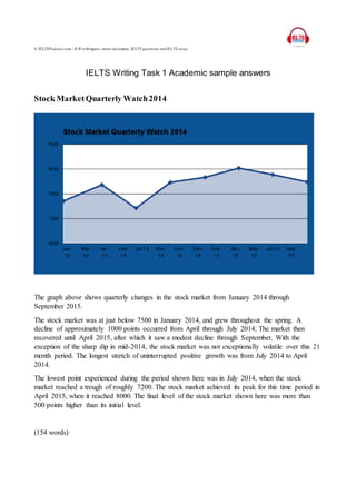
  • 1. © IELTSPodcast.com / B.W orthington, entire document, IELTS questions and IELTS essay. IELTS Writing Task 1 Academic sample answers Stock MarketQuarterly Watch2014 The graph above shows quarterly changes in the stock market from January 2014 through September 2015. The stock market was at just below 7500 in January 2014, and grew throughout the spring. A decline of approximately 1000 points occurred from April through July 2014. The market then recovered until April 2015, after which it saw a modest decline through September. With the exception of the sharp dip in mid-2014, the stock market was not exceptionally volatile over this 21 month period. The longest stretch of uninterrupted positive growth was from July 2014 to April 2014. The lowest point experienced during the period shown here was in July 2014, when the stock market reached a trough of roughly 7200. The stock market achieved its peak for this time period in April 2015, when it reached 8000. The final level of the stock market shown here was more than 500 points higher than its initial level. (154 words)
  • 2. © IELTSPodcast.com / B.W orthington, entire document, IELTS questions and IELTS essay. 2014 World FoodConsumption This pie chart shows the shares of total world food consumption held by each of seven different food types in 2014. Meat is consumed the most, at 31.4 percent. Fish has the second highest consumption levels, at 27.9 percent. Cereals consumption represents 11.7 percent of the total. Fruits’ share of consumption is 10.6 percent, followed closely by vegetables at 10.5 percent, and then bread at 5.5 percent. The smallest food group in terms of world consumption is rice, at 2.4 percent. The graphs shows that overall global consumption is widely dispersed among food types; no one type has a majority share. Animal-based foods (meat and fish) do make up the majority of consumption when added together. It is important to note, however, that based on the information in this pie chart no conclusions can be drawn about the dietary diversity of an individual person. (150 words)
  • 3. © IELTSPodcast.com / B.W orthington, entire document, IELTS questions and IELTS essay. 2014 Age Distribution in Asia The pie chart above shows the age distribution of the population in Asian countries for 2014. The population is divided into five age groups: 0 to 14 years, 15 to 24 years, 25 to 54 years, 55 to 64 years, and 65 years and above. People in the 25 to 54 age group make up the largest group, at 35.3 percent of the total population. The 15 to 24 group and 55 to 64 group make follow, with 19.5 percent and 18.4 percent of the population, respectively. 0 to 14 year olds make up 15.6 percent of the population. Those aged 65 years and above hold the smallest share of the population, at 11.2 percent. In summary, the pie chart shows that working-age adults (including teens 15 and older) made up the vast majority of the Asian population in 2014. Young children and seniors combined add up to just over a quarter of the total population. (156 words)
  • 4. © IELTSPodcast.com / B.W orthington, entire document, IELTS questions and IELTS essay. Book Sales by Genre across Time The bar graph above shows the total number of book sales for five genres of books for three years, from 2013 through 2015. Across the three years, total sales of romance novels ranked highest, with more than 1500 copies sold. Second highest were books in the fantasy genre at approximately 1400 sold, followed closely by science fiction and then thrillers. Mystery books had the lowest sales numbers, at roughly 1000 across the three years. Only about two-thirds as many books were sold in the mystery genre as in romance. Broken down by year, the graph indicates that 2014 was the slowest year for sales of romance and fantasy books. Romance was the most-sold genre in both 2013 and 2015. Sales of books in the mystery, thriller, and science fiction genres were slowest in 2015. Overall, combined book sales in all genres were highest in 2013, possibly indicating a decline in fiction reading during the three years shown. (157 words)
  • 5. © IELTSPodcast.com / B.W orthington, entire document, IELTS questions and IELTS essay. Common Budget Items Chart The graph above records common household budget items in eight categories, tracking the items both by percentage distribution and number of respondents. Food was the most common budget item, as indicated by nearly 4500 respondents, or over 30 percent. Second most common was the house, at nearly 3500 respondents, or roughly 30 percent. Third highest was children’s education, which slightly more than 2000 respondents, more than 10 percent, indicated. Family’s was selected by around 10 percent of respondents, or less than 2000 people. The other four categories all received less than 10 percent selection rates by respondents. In order from greatest to least these were: communication, clothes, transportation and savings. Less than 500 respondents indicated savings as a budget item, or less than 5 percent. In summary, food and housing ranked substantially farther ahead of all other categories. In the case of food, roughly twice as many respondents indicated this as opposed to third-ranked children’s education. (156 words)
  • 6. © IELTSPodcast.com / B.W orthington, entire document, IELTS questions and IELTS essay. People’s Optimism Five (5) Years Ago Vs. Today The bar graph above compares people’s levels of optimism today versus five years ago, in 2010. The graph indicates the number of respondents who fell into each of five categories ranging from “Not Positive at All” to “Very Positive.” Over three hundred respondents indicated that they felt “Not Positive at All” in 2010. This was the highest number of respondents in a single category for either year. In 2015, the most people—just under 300—indicated that they felt “Very Positive.” The second highest category in both 2010 and 2015 was “Average.” This category received over 200 responses in 2010, and increased somewhat in 2015. Both “Not Very Positive” and “Quite Positive” received just over 100 responses in both years, and saw relatively little change between 2010 and 2015. Based on the change shown in the two most extreme categories, one can conclude that people are generally more positive now than they were five years ago. (156 words)
  • 7. © IELTSPodcast.com / B.W orthington, entire document, IELTS questions and IELTS essay. January 2015 Temperature Variation in the Philippines The preceding line graph tracks daily temperature fluctuations in the Philippines throughout the month of January 2015. Temperatures at 12:00 PM are unsurprisingly the highest by far. Temperatures for this time of day varied between roughly 28 degrees and more than 32 degrees. The high temperature for the month was measured at noon on both January 21 and 29. Temperatures for the three other times shown (6:00 AM, 6:00 PM, and 12:00 AM) follow a similar trend to each other, fluctuating around 20 degrees. The coldest temperature for the month occurred on January 1, when a low of 15 degrees was recorded. From January 1 to January 31 relatively little warming was seen overall, as illustrated by the trend line in the bottom section of the graph. A slight exception to this may be observed in the early morning temperature readings, as evidence by the peak 6:00 AM temperature on January 31. (152 words)
  • 8. © IELTSPodcast.com / B.W orthington, entire document, IELTS questions and IELTS essay. Temperature Calibration Data The line graph above depicts the results of 30 temperature calibration tests. The readings are measured to one-tenth of a degree, against a standard of 25 degrees. The closest test result to the standard is the third result, which is less than one-tenth of a degree below the standard. The furthest reading from the standard came in Test No. 21, when the device registered just over 24.30 degrees. Out of 30 readings, 20 read temperatures below the standard. Only 10 tests registered readings above 25 degrees. Across the tests, a spread of a full degree was seen between the highest and lowest results. Substantial fluctuations were seen between almost every consecutive test, with a few exceptions. None of the readings were completely accurately with respect to the standard, and then device exhibited a tendency to register lower-than-standard temperatures, rather than higher. In fact, the most accuracy and least fluctuation occurred in the early tests. (154 words)
  • 9. © IELTSPodcast.com / B.W orthington, entire document, IELTS questions and IELTS essay. Toyota CarSales – Quarterly Monitoring The bar graph above tracks quarterly Toyota car sales from January 2015 through October 2015. In January 2014 over 1.5 million Toyota cars were sold—the lowest in the graph. The figure climbed to roughly 1.9 million in the quarter beginning in April 2014, then declined to just over 1.6 million cars in the third quarter (July through September). By the end of 2014 sales had again risen to over 1.9 million cars. Through the quarter beginning in July 2015 sales numbers fluctuated only slightly. The fourth quarter of 2015 has seen less than one million Toyota cars sold. With November and December 2015 still remaining, however, if fourth quarter sales maintain their October pace this will likely be the quarter with the highest sales in 2014 and 2015. The final quarter of 2014 was the second highest-selling past quarter, with negligibly fewer sales than in April through June 2015. Overall, sales have been higher in 2015 than in 2014. (160 words)
  • 10. © IELTSPodcast.com / B.W orthington, entire document, IELTS questions and IELTS essay. World PopulationGrowth (1970-2010) This graph tracks world population growth on each of the six inhabited continents by decade, from 1970 through 2010. Asia’s population is the highest, starting at over 500 million in the 1970s, and growing to well over 600 million by 2010. Asia is followed by Africa, moving from under 200 million people to nearly 300 million. Neither Europe, America, and nor Oceania reach populations of 200 million in any decade, although all experience the same upward trend as Asia and Africa from 1970 to 2010. Oceania’s population is by far the smallest. With respect to the rates at which these populations are growing, Europe appears to be increasing fastest, having nearly doubled from just over 100 million in 1970 to nearly 200 million. A slight divergence between Europe and America is observable, indicating that U.S. population growth rates are lower than European growth rates. The gap between Asia and Africa is also increasing. (153 words)
  • 11. © IELTSPodcast.com / B.W orthington, entire document, IELTS questions and IELTS essay. 2014 Deaths Due to NeurologicalCondition The pie chart above shows the share of deaths due to a neurological condition accounted for by each of five diseases in 2014. Alzheimer’s disease is the most prevalent of these five neurological conditions, and was responsible for 30.9 percent of the deaths indicated here. Next most common was Multiple sclerosis, which accounted for 24.6 percent of deaths from a neurological condition in 2014. Parkinson’s disease claimed 21.3 percent of lives lost to neurological conditions. Noticeably less common were Epilepsy and Migraine, which accounted for 14.6 percent of the deaths and 8.5 percent of the deaths respectively. The only condition that held a share greater than 25 percent of the total deaths was Alzheimer’s disease, although it was responsible for far less than a majority of the deaths tracked here. Multiple sclerosis was just under one quarter. Epilepsy and Migraine combined accounted for less deaths than either Alzheimer’s or Multiple sclerosis. (151 words)
  • 12. © IELTSPodcast.com / B.W orthington, entire document, IELTS questions and IELTS essay. 5-Year Carbon Dioxide Emission in Japan The bar graph above shows total annual carbon dioxide emission levels in Japan for the five year period from 2008 through 2012. Emission levels are measured in kilograms per kilowatt hour. Emissions were highest in the 2008, the first year shown, at 750 kg/kWh. Emissions in 2009 dropped a small amount, to roughly 700 kg/kWh. The following year, 2010, total carbon dioxide emission was at approximately the same level. In 2011, the emission level dropped to its lowest point on the graph, dipping to around 600 kg/kWh. The level of emissions rose very slightly in 2012, the final year. Overall, annual carbon dioxide emissions in Japan decreased after 2008, although the downward trend did not continue through the final year, 2012. From the first year shown to the last, the annual level of carbon dioxide emission decreased approximately 150 kg/kWh, or roughly twenty percent from the 2008. Most of this decrease occurred between 2010 and 2011. (156 words)
  • 13. © IELTSPodcast.com / B.W orthington, entire document, IELTS questions and IELTS essay. Active Military Manpowerper Country This graph compares the active military manpower of five geopolitically important countries: China, the United States, India, Russia, and North Korea. The graph is organized so that it shows the military manpower of each country from left to right, greatest to least. China has the most active military members, at nearly 2.4 million. Next comes the US, with an active military of over 1.3 million people—far fewer than China. India has the third largest active military, slightly smaller than the US. Russia’s active military is the fourth largest, at around 700,000, or roughly half the size of the US active military. Fifth and smallest is North Korea, with an active military slightly smaller than Russia’s. The disparity between the largest active military shown above (China’s) and the smallest (North Korea’s) is immense. The Chinese active military is nearly four times larger than North Korea’s, and nearly double the second largest active military—that of the US. (157 words)
  • 14. © IELTSPodcast.com / B.W orthington, entire document, IELTS questions and IELTS essay. Approval Ratings of US PresidentChurchill (10 yearterm) This line graph tracks the approval ratings for a president’s 10 year term from 1985 to 1995. The graph shows that in 1985, at the beginning of this president’s term, the percentage approval rating was below 30 percent. Approval moved above 30 percent in 1986 and increased very slightly in 1987. By 1988 approval of the president was at roughly 35 percent. In 1989 President Churchill’s approval rating continue to improve, exceeding 39 percent. The level of approval held steady in 1990. From 1990 to 1992 approval again increased, reaching approximately 44 percent. This percentage remained level in 1993 and grew slightly in 1994. Approval peaked in the final year, 1994, at more than 45 percent. In summary, President Churchill’s approval ratings grew throughout the 10 year term, increasing more than 15 percentage points. The lowest approval rating was in the first year, and the highest rating in the last year. At no point did the percentage approval decline. (159 words)
  • 15. © IELTSPodcast.com / B.W orthington, entire document, IELTS questions and IELTS essay. Average Life Expectancyper Country In the graph above, average life expectancy (in years) is compared for six countries: Monaco, the United States, the Philippines, Laos, Rwanda, and South Africa. The graph organizes the country from longest life expectancy to shortest, left to right. Individuals in Monaco have the longest life expectancy, well over 84 years. Next highest is the United States, with a life expectancy around 75 years. The Philippines is third highest, Laos is fourth, and Rwanda second to last. All of these have a life expectancy of more than 52 years. Of the six countries surveyed here, only South Africa has a life expectancy lower than this. In summary, life expectancies from this survey of six countries vary widely. That of Monaco (with the highest life expectancy) approaches twice that of South Africa (with the lowest life expectancy). In this graph, Europe and the US have the longest life expectancies, Asia is in the middle, and the African countries have the shortest life expectancies. (162 words)
  • 16. © IELTSPodcast.com / B.W orthington, entire document, IELTS questions and IELTS essay. Billing Distribution for the Month of August 2015 The pie chart above depicts the distribution of total billing between five buildings for the month of August 2015. Building A accounted for the greatest share of the billing, at 24.3 percent. Next was Building C, with exactly 22 percent of the total. Third, Building E’s share amounted to 20.1 percent. Building B took up 17.2 percent of the billing. The smallest share was that of Building D, at 16.4 percent. Based on this pie chart, one can see that the billing was distributed relatively evenly between the five buildings. The percentage figures that accompany this visual representation all one to calculate more precisely the difference between the largest and smallest shares of the billing. Building A, with the greatest share, accounted for 8.9 percentage points more than the building with the smallest share, Building D. The three other buildings’ billing share was clustered in the gap between 24.3 and 16.4 percent. (152 words)
  • 17. © IELTSPodcast.com / B.W orthington, entire document, IELTS questions and IELTS essay. Coastline Coverageby Country The bar graph above shows the coastline, in kilometers, held by each of five countries: Canada, Indonesia, Russia, the Philippines, and Japan. Graphically, one can observe that the countries on the left possess more coastline than those on the right. Canada has the most coastline, with over 1 million kilometers. With over 700,000 kilometers of coastline, Indonesia’s coverage is second highest. Next is Russia, which contains just less than 600,000 kilometers of coastline. There are just over 300,000 kilometers of coastline in the Philippines. Japan has the fewest kilometers of coastline: around 250,000. Based on the countries in this graph, one can surmise that the overall size of the country is a rough indicator of how much coastline it has. Canada, a large country, has the most coastline. On the other hand, Japan—which is much smaller than Canada overall—has the least amount of coastline, despite being an island. (150 words)
  • 18. © IELTSPodcast.com / B.W orthington, entire document, IELTS questions and IELTS essay. Daily Activity Distribution per Day This pie chart shows the share of time in a day that is generally occupied by each of five activities (these five activities add up to 100 percent). These common activities are sleeping, working, eating, travelling, and relaxing. By far the greatest portion of the day is consumed by work, at nearly 42 percent. Sleeping occupies the second highest portion of time: exactly one quarter of the day. Travelling accounts for nearly 17 percent of the day’s activity. Eating and relaxing each account for exactly 8.3 percent of daily activity. In short, work makes up a very large share—although not a majority—of daily activity. At 41.7 percent it takes up more time than the other three waking activities combined, as eating, travelling, and relaxing total only 33.3 percent of daily activity. Added all together, waking activities account for three-fourths of all activity, and sleep accounts for only one-fourth. (150 words)
  • 19. © IELTSPodcast.com / B.W orthington, entire document, IELTS questions and IELTS essay. Daily Stock MarketFluctuationIndex The line graph above plots the daily fluctuation of the stock market index for the 19 days from March 1 to March 19. On March 1, the stock market index sat at approximately 1.05. From there it climbed to roughly 1.25 on March 4, plunged for a day, and then by March 7 nearly regained its previous peak. The index then declined for two days. It rebounded slightly to above 1.1 on March 10, but declined again the following day. From March 12 to 14 the index increased again, reaching just above 1.2 before it plunged drastically on March 15. March 16 saw the greatest single-day increase in the stock index, up to 1.3. The final three days first saw a plunge in the index, then a slight continued decline back to the same level as the first day. Although the stock market index peaked on March 16, from start to finish for this period there was no increase in the index. (162 words)
  • 20. © IELTSPodcast.com / B.W orthington, entire document, IELTS questions and IELTS essay. GensetDieselMonitoring The graph above charts both fuel consumption (the left vertical axis and blue bars) and operation hours (the right vertical axis and red line) for five fuel burning generators. Generator B consumed the most fuel, around 215 units. Generator C consumed 200 units, the second most. Generator D was third in fuel consumption, around 165 units. Both Generator E and A consumed far less: just over 125 units and just under 125, respectively. In terms of operation hours, Generator E was highest, at around 95. Next came Generator A, at approximately 85 hours. Generator C saw the third highest operation hours, followed by Generator B. Generator D had the fewest operation hours: less than 68. Looking at Generators A and E—those with the lowest fuel consumption and highest operation hours—it appears that fuel consumption and operation hours are inversely related. This does not hold true for the other three generators, however. (153 words)
  • 21. © IELTSPodcast.com / B.W orthington, entire document, IELTS questions and IELTS essay. Hazardous Waste Inventory 2014 This bar graph depicts an inventory, measured in kilograms, of hazardous materials. The five materials included are: medical waste, expired medicine, wet batteries, busted fluorescent lamps, and used diesel fuel. The graph lists the materials from least to most, left to right. There is roughly 800 kg of medical waste, which is the least of all the hazardous materials. Expired medicine accounts for just slightly inventory. Wet batteries, although it accounts for far more than medical-related materials, is third least. Busted fluorescent lamps comprise more than 3000 kg of the inventory. Used diesel fuel is by far the most prevalent type of hazardous material. More than 4500 kg of it are present in the inventory. The graph shows that energy-related waste makes up the vast majority of hazardous materials in this inventory. Wet batteries, the smallest of the three “energy” materials, accounts for more kilograms of inventory than both medical waste and expired medicine combined. (155 words)
  • 22. © IELTSPodcast.com / B.W orthington, entire document, IELTS questions and IELTS essay. Income Tax Comparisonper Civil Status This graph compares income tax across six countries, based on civil status (married or single). The six countries shown are Belgium, Canada, the Czech Republic, Denmark, Finland, and France. Income tax, for both civil statuses, is lowest in the Czech Republic. The lowest tax rate shown on the graph is married status tax of only about 5 percent in the Czech Republic. Married and single income tax rates are only slightly higher in France. Third lowest are tax rates in Canada. In Belgium, taxes for married status are lower than in Finland. Belgium’s single status income tax is higher than Finland’s, however. Income tax rates for both civil statuses are highest in Denmark, where the single income tax rate reaches 30 percent. Finland is the only country where the two tax rates are the same. In none of the six countries is married income tax higher than single income tax. The largest gap between the two rates occurs in Belgium. (160 words)
  • 23. © IELTSPodcast.com / B.W orthington, entire document, IELTS questions and IELTS essay. PassengerServedPerAirport Terminal The bar graph above tracks the total number of passengers served in 2014 at each of seven major airport terminals: Atlanta, Beijing, Dubai, Chicago, London, Los Angeles, and Hong Kong. The graph shows the airports with the most passenger traffic on the left, and those with less on the right. Atlanta was the busiest of these six airports in 2014, serving around 8 million passengers. Beijing came second, having served 7.5 million passengers. The other five airport terminals all served around 6 million passengers. In order from most to least passengers, these six were: Dubai, Chicago, London, Los Angeles, and lastly Hong Kong. Combined, these seven large airports served more than 56 million passengers in 2014. The difference between the airport with the highest volume of passengers (Atlanta) and the lowest volume (Hong Kong) in this graph was approximately 2 million passengers. All seven of these airports are located in very large cities. (153 words)
  • 24. © IELTSPodcast.com / B.W orthington, entire document, IELTS questions and IELTS essay. PowerConsumption (Per Location)for July 2015 This graph tracks power consumption, measured in kilowatt hours, for six locations during the month of July 2015. The locations for which consumption is measured are Power Center 1, Passenger Terminal Center, Admin Building, Triangle, IPB, and Hiring Hall. Hiring Hall consumed the most power in July 2015, using nearly 100,000 KWH. Power Center 1 used the next highest amount of power, consuming more than 90,000 KWH. Admin Building’s consumption was third highest, at around 82,000 KWH. IPB, Passenger Terminal Center, and Triangle consumed much less—around 77,000 KWH, 65,000 KWH, and 61,000 KWH respectively. Indeed, power Hiring Hall and Power Center 1 appear to have consumed more power each than the lowest three (IPB, Passenger Terminal Center, and Triangle) combined. Hiring Hall, which consumed the highest number of KWH, consumed roughly 35,000 more KWH than Triangle, which had the lowest power consumption. Thus, the difference was more than 50 percent of Triangle’s total consumption. (155 words) Production Output for 3rd Quarter of 2015
  • 25. © IELTSPodcast.com / B.W orthington, entire document, IELTS questions and IELTS essay. This graph tracks production output by container, breakbulk, bulk, and passenger for July, August, and September 2015. The lowest amount of production noted was of bulk output in July. Bulk production in this month amounted to a little more than 60,000 MT. The highest amount of production recorded was of breakbulk output in September, when production reached more than 400,000 MT. For all categories, July had the lowest production, August somewhat higher, and September had the highest production levels. For all three months, breakbulk production was highest, followed by container, then passenger. Bulk production was the lowest for all months shown here. In July, the difference between container, bulk, and breakbulk production appears to be slightly less pronounced than in August or September. The difference between production levels in these three categories was greatest in September. Passenger output grew by roughly the same amount each month, peaking at less than 250,000 pax in September 2015. (155 words) Thermal Conductivity of Materialat 25C
  • 26. © IELTSPodcast.com / B.W orthington, entire document, IELTS questions and IELTS essay. The line graph above compares the thermal conductivity of acetals, acetone, acetylene gas, acrylic, and atmospheric air at 25 degrees Celsius. Acetone has the highest thermal conductivity of all the substances, at 1600 W/(m-K). Acetylene gas has the second highest conductivity, measuring nearly 1550 W/(m-K). Slightly below 1500 W/(m- K) are acetals, with the third highest conductivity. Next is air, which has a thermal conductivity of roughly 1425 W/(m-K). The least conductive material included in this graph is acrylic. The thermal conductivity of acrylic is just over 1350 W/(m-K). Overall, the thermal conductivity of these six substances appears to vary quite widely, given the graphical representation. Only acetals and acetylene gas appear to be closer than 50 W/(m-K) apart in their level of conductivity. The difference between the most conductive material, acetone, and the least conductive material, acrylic, is nearly 250 W/(m-K). Further information, for instance a sampling of more materials, would be necessary to know how substantial this difference is. (160 words) Unemployment Rate in Asia
  • 27. © IELTSPodcast.com / B.W orthington, entire document, IELTS questions and IELTS essay. The graph above compares unemployment rates for three years—2012, 2013, and 2014—in six countries in Asia. The countries compared are the Philippines, China, Japan, Singapore, India, and Thailand. In all three years, unemployment was highest in the Philippines. The unemployment rate in the Philippines peaked at nearly 6 percent in 2014. Unemployment was second highest in India for all three years. Third came unemployment in China. Unemployment in Japan was fourth highest, and very close to China’s rate of unemployment in 2014—around 4.25 percent. Singapore had the second to lowest unemployment rates for all three years. Data was not available for Thailand in 2012, but in 2013 and 2014 it had the lowest unemployment rates of all six countries. Unemployment was at its lowest in 2014 in Thailand, when it was below 1.25 percent. For Thailand, India, and Singapore, unemployment was lowest in 2014. For the Philippines, China, and Japan, unemployment was highest in that same year. (160 words) Waste Hauling Truck Trips
  • 28. © IELTSPodcast.com / B.W orthington, entire document, IELTS questions and IELTS essay. This bar graph compares the number of waste hauling truck trips taken by two haulers during the months of July, August, and September 2014. In July 2014, Hauler A made 100 trips and Hauler B took less than 90, In August, increasing their trips substantially, Hauler A took a few less than 120 trips, whereas Hauler B took nearly 150. In September, the volume of trips decreased for both haulers. Hauler A took only about 80 trips, and Hauler B took 100. Although the decrease in trips was greater for Hauler B, it still retained a higher volume of trips than Hauler A in the final month. The volume of waste hauling trips taken was highest for both haulers in August 2014. It was lowest for Hauler A in September, and for Hauler B in July. Cumulatively, Hauler B made more trips during these three months than Hauler A did, largely due to its higher volume of trips in August. (160 words) WaterService Reading
  • 29. © IELTSPodcast.com / B.W orthington, entire document, IELTS questions and IELTS essay. The graph above compares water service meter readings from May 24 and June 24. Seven buildings are included in the reading, and water service is measured in cubic feet. Building A used the least amount of water as indicated by both the May 24 and June 24 readings. Building D had the second lowest readings, in both May and June. Building F used somewhat more water in both months, the third lowest reading. With increasing usage readings, next came Building E, then Building G, then Building B. Building C logged the highest water service readings on both May 24 and June 24. Readings from all seven buildings indicated lower water usage in May than in June. The lowest usage recorded, from Building A on May 24, was around 25000 cubic meters. The highest usage recorded was in Building C on June 24. This reading registered water usage of around 75000 cubic meters. (152 words) World’s MostExpensive Cities 2014
  • 30. © IELTSPodcast.com / B.W orthington, entire document, IELTS questions and IELTS essay. This graph shows average daily expenses, in US dollars, in five of the world’s most expensive cities in 2014. The cities are: New York, New York; Moscow, Russia; Tokyo, Japan; Paris, France; and Singapore, Singapore. Cost of living was the highest in New York—nearly $2400 per day—by a noticeable margin. Expenses in the other cities were closer together in price. Second highest was Moscow, at around $1600 per day. Next was Tokyo, around $1500 per day, followed closely by Paris at approximately $1300. Singapore was the most affordable of these expensive cities, with average daily expenses of still more than $900 per day. Based on this chart alone, there is no geographic correlation to higher prices, or any other information to explain why, for instance, Moscow is more expensive than Tokyo. The difference in price between the most expensive city (New York) and least expensive (Singapore) is substantial, however: New York is more than twice as costly. (159 words) Calorie Source for UK males at different life periods.
  • 31. © IELTSPodcast.com / B.W orthington, entire document, IELTS questions and IELTS essay. Percentage of total intake. The bar chart shows the different calorific sources of UK males of varying age groups, 0-24, 25-49 and 50+. The sources are dairy, meat, pulses and vegetables. Between being born and reaching 24 the main source of calories was dairy products, with over 40% coming from dairy products, and the other sources equal at around 20%, except pulses which represent around 18%. For the 25-49 age group by far the largest source was meat at exactly 50% of total calorie intake, followed by dairy at 25%, vegetables at 15% and pulses representing just 10%. Regarding the over 50 group the largest contributor were pulses at well over 60%, followed by meat, dairy and vegetables in that order. Overall it is clear each group leans towards one predominant caloric source over the rest. Pulses were the least favoured choice for the younger groups, with vegetables also making up a minority contribution amongst every age group. 156 Expected City Visits by Country of Origin for 2018 (Thousands/year)
  • 32. © IELTSPodcast.com / B.W orthington, entire document, IELTS questions and IELTS essay. The bar chart shows the forecasted visits to four European cities, London, Paris, Madrid and Istanbul, from three countries the United States, Canada and Mexico. The US represents the highest number of expected travellers by a large margin, followed by Canada then Mexico. In 2018 the most popular destination overall is Paris and the least popular is Istanbul. For Americans, in the future their most popular destination will be Paris, at 100 thousand visits, the least Istanbul at 60 000, Madrid's expected travellers reach 70 000 and London's 80 000. In 2018 Istanbul is the most popular for Canadians at 70 000 followed by London and Paris at 50 000 and 45 000, and the least desirable is Madrid at just 30 000 expected visits. Madrid will be by far the most popular destination, just over 60 000, the other cities only reach between 20 000 and 25 000. To summarise the graph shows that each country has widely varying preferences, the most marked being Mexico's preference for Madrid, America's favourite would be Paris and Canada's Istanbul. 177
  • 33. © IELTSPodcast.com / B.W orthington, entire document, IELTS questions and IELTS essay. Council Expenditure by Three Regions in the UK, 2014 The three pie charts show the distribution of spending between three counties in northern England in 2014. Of the 3 regions Yorkshire spent the most on education, followed by Lancashire, and finally Derbyshire. Derbyshire spent the most on leisure, representing about 35%, Yorkshire spent 25% and Lancashire slightly more at 30%. Derbyshire also spent the most on community care, reaching 20%, while the other two spent less, Yorkshire at 18% while Lancashire at 12%. All 3 counties spent a similar proportion on the environment between 5 -10%, Derbyshire having the highest amount. Social services expenditure was at 15% for Yorkshire, 10% for Lancashire and just 3% for Derbyshire representing the lowest of the three. Regarding the category of other, the amounts were broadly similar, representing between 7% and 10% for each of the three. Overall amongst the three regions education and leisure make up the largest expenses, followed by the environment and social services representing the lowest.
  • 34. © IELTSPodcast.com / B.W orthington, entire document, IELTS questions and IELTS essay. Foreign Direct Investment in Australia over 3 years The bar chart shows the foreign investment of countries in Australia over 3 years, 2011-2014. In 2011 Malaysia invests the highest however, all countries invested between 80 and 100, except Somalia which invested around 20 USD million. In 2012, all countries increased the amount invested while Germany almost doubled its investment and reached 180m USD, the other countries also increased but only by around 15%. Somalia more than doubled the amount invested and reached 50mUSD. By 2013 New Zealand had overtaken Germany and had invested 200m USD while the latter was at 190m USD, both Mexico and Malaysia had increased and reached 140m USD and 130 USD respectively. Somalia almost doubled the amount sent again to reach 90m USD, to bring it on a par with Thailand. In 2014 investment grew from each country except Mexico, which remained steady, while Somalia dropped to its 2011 level of around 20m USD.Overall every country increased their investment in Australia for each consecutive year bar Somalia which reduced it in the final period. 171
  • 35. © IELTSPodcast.com / B.W orthington, entire document, IELTS questions and IELTS essay. NB. An official IELTS paper would use information much less political, this chart was used entirely for convenience. The bar chart shows the amount of weekly attacks on targets ranging from Coalition forces, Iraqi citizens and Iraqi Security forces, in given political periods over a period of 3 years. Attacks on coalition forces remain at around 400 per week then reach 600 per week once the government is established, the frequency of attacks remain at roughly this level thereafter. Assaults on Iraqi Security forces are greater each period for 7 out of the 9 periods, thereby reaching an almost 20 fold increase by the end of the time- scale. Unfortunately attacks on Iraqi civilians also see an increase for every period reported except in the pre-constitution stage where the fall by more than 50%, only to rise repeatedly afterwards. Overall it is clear the amount of attacks have increased, although the largest proportion is represented by attacks on coalition forces, the group seeing the largest increase in attacks in percentage terms are the Iraqi security forces. 156
  • 36. © IELTSPodcast.com / B.W orthington, entire document, IELTS questions and IELTS essay. The bar chart shows the changes in public funding for transit expenses over an eight year period, 2000-2008. There is also a key showing the percentage annual growth rate of each fund, Local, State and Federal. Local funds consistently represent the largest contribution throughout the said period, followed by Federal funds, then State funds. State funds have the highest annual percentage growth rate of 9.3%, followed closely by Local funds at 9.2%, whereas Federal funding is only growing at 5.3% annually. Despite dipping in 2004 and 2005, the general trend is that expenditure is increasing year on year with total expenditure starting at 9.1 billion USD, and finishing at 16.1. the State is the smallest contributor overall, however the amount given doubles from 1 billion to 2 billion over the said period. Federal funds increased by around 50% from 4.3 billion to 6.4 billion. To summarise, funding for transit capital expenditure is increasing, the largest source is Local funding, then State. Federal funding contributes the least and is also growing.
  • 37. © IELTSPodcast.com / B.W orthington, entire document, IELTS questions and IELTS essay. NB. An official IELTS paper would use information much less political, this chart was used entirely for convenience. The bar chart shows the percentage of people registered as eligible voters from state to state, by race and year, 1965 and 2004. In 1965 there are clearly more white eligible registered voters than black, the largest gap between these groups is in Mississippi where blacks reached just 7%, and whites were at almost 80%. The highest percentage of white registered voters was in Louisiana, followed by South Carolina. The highest percentage of black registered voters was in Virginia at just over 40% closely followed by South Carolina. Regarding 2004 the trend of more white than black registered voters continues in every state except Mississippi. Furthermore, the percentage of white voters falls in almost every state. The lowest percentage of black voters is now Virginia at slightly under 60% whereas the highest reaches 75%, Mississippi. Overall white voters are still in the majority in almost all cases, however, over the forty year period the trend points to a harmonising of voter numbers in each state. 169
  • 38. © IELTSPodcast.com / B.W orthington, entire document, IELTS questions and IELTS essay. The bar chart shows the life expectancy of males and females at birth, and at 65, the data is from four countries, England, Scotland, Wales and Northern Ireland. Females from England have the highest life expectancy at 81.5 years, beating women from Northern Ireland by 6 months. Females from Scotland have the lowest life expectancy of 79.6 years, meaning a gap of around 13 months between the highest and lowest. English female life expectancy at 65 is also the highest, and the Scottish is also the lowest. Regarding male life expectancy the highest is from England and reaches 77.2, almost an extra 2 years over the lowest, Scotland, at 74.6. Wales is the second lowest at 76.6 years, followed by N. Ireland at 76.1. At 65 the order is the same with England first, Wales and N. Ireland broadly similar and Scotland at the lowest with 15.8 years of life expected after 65. In all countries observed, and at all age points, women outlive men, and regarding countries, Scotland has the lowest life expectancy while England has the highest. 180
  • 39. © IELTSPodcast.com / B.W orthington, entire document, IELTS questions and IELTS essay. The bar chart shows the increase in consumption for four countries, Germany, Japan, the US and China, over a three year period 2011-2013, in billions, in USD. The US and China both experienced growth in consumption every year, although the increase was less following each subsequent year. Japan and Germany followed similar patterns except for in 2012 Germany experienced a negative increase as did Japan in 2013. China attained the largest consumption increase in 2011, reaching over 700 (USD billions), Japan was responsible for the largest fall in consumption, experiencing a fall of almost 800 (USD billions). Throughout the entire period China consistently grew its consumption the highest, while Germany was repeatedly the country with lowest growth except in 2013 when it was Japan. Overall the majority of the countries experienced positive increase in consumption except individual countries during 2012 and 2013.142
  • 40. © IELTSPodcast.com / B.W orthington, entire document, IELTS questions and IELTS essay. The bar chart shows the average monthly revenue from retail telecommunication subscribers from eight countries in North America, Europe, Asia and Oceania. Each country is represented by three bars, green for mobile, brown for data, and blue for services. In practically all cases services represents the highest revenue source per client, followed by data and internet and lastly mobile. Australia has the highest revenue per customer for services at $109, however overall Japan has the highest revenue per customer because data and mobile revenues are considerably higher than the other countries. Italy has the lowest revenue figures overall, with mobile revenue at $16, data at $44, and services at $51. The North American figures are broadly similar, both countries reach around $90 for services, $65 for data and between $53-$44 for mobile. The UK, Germany and France have similar figures except France has the highest data revenue for the European countries. The lowest revenue figures are found in Europe, the highest are in Asia, namely Japan, while North American revenue numbers in the middle. 174
  • 41. © IELTSPodcast.com / B.W orthington, entire document, IELTS questions and IELTS essay. International Student Enrolment in British Universities 2009-2014 The bar chart shows the percentage of international student enrolled in British universities in two years, 1990 and 2014. For the majority of the universities managed to increase the percentage of international students preset at their institutions. The universities that experienced the largest gain were the Scottish ones, Glasgow jumped from 4% to 6%, while Edinburgh's percentage doubled from 3% to 6%. In England, Huddersfield also grew its percentage of foreign students considerably. The university with the largest percentage in both 1990 and 2014 was Brighton, 12% and 13% respectively. The only university to loose international students in percentage terms was Cardiff, falling from 2% to 1%. All universities underwent some change except Liverpool whose proportion of international students remained stable at 8%. Manchester, Bristol and Leeds each experienced an increase albeit of a smaller proportion, in the range of 1-2 percentage points growth. Over the twenty four year period changes in the percentage of students enrolled has fluctuated but generally towards an upward trend. The decrease was in Cardiff and falls short of the leader Brighton, by 12 points.
  • 42. © IELTSPodcast.com / B.W orthington, entire document, IELTS questions and IELTS essay. IELTS Writing Task 1 sample answers http://www.ieltspodcast.com/general-task-1-sample-essays/ IELTS Writing Task 2 sample answers http://www.ieltspodcast.com/band-9-sample-essays/ IELTS Writing Task 1 Academic bar graphs sample questions http://www.ieltspodcast.com/ielts-academic-task-1-sample-question-bar-graphs/ IELTS Writing Task 1 Academic pie charts sample questions http://www.ieltspodcast.com/ielts-academic-task-1-sample-question-pie-charts/ IELTS Writing Task 1 Academic line graphs sample questions http://www.ieltspodcast.com/29-sample-ielts-academic-task-1-line-graphs/ IELTS Writing Task 1 Academic sample answers http://www.ieltspodcast.com/academic-task-1-sample-essays/