On National Teacher Day, meet the 2024-25 Kenan Fellows
Magazine inspirations
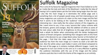
1. Suffolk Magazine
This is one of my favourite regional magazines that I have looked at so far
as I really like the look and style of the Masthead. I really like the idea of
having it all in capital letters yet the first letter being larger than the rest.
I also like the main image as it dominates the whole page and is
something that a lot of people would enjoy and find interesting as not
many magazines use a picture of a deer as the main image and the fact
that it seems to be looking at the ‘audience’ makes it that bit more
interesting too. I also really like the colour scheme of this magazine, as
like I want mine to use, it has a very ‘autumn-like’ colour scheme with
the browns, greens and oranges. Also the addition of white as some of
the text colour adds that bit of brightness to the page which makes it
look a whole lot better when contrasting with the darker background
colours of brown and green. Something that I disagree with on this front
cover is the decision to use a large block-colour banner at the bottom of
the page. I find that this takes away from the experience that the
audience has from the main image as it seems to clash a lot with the
rest. Also the white colour used makes it seem a bit bland compared to
the rest of the page as it contains multiple different images. I want my
magazine to turn out similar to this one as it is very effective in getting
the audience interested, with the use of the image and the colour
scheme used also ties in with the theme of the magazine as an entirety.
2. Northern Life MagazineI have also been inspired by this magazine too as I think the way the
image has been taken is a very good idea, with it been taken from the
opposite side of a lake. I also like the image because of the main focus
point of it is a very small portion, and the rest of it is surrounded by
other scenery such as the sky and trees. I think this is a very good idea
as it provides a lot of space for other things to go such as bits of text like
the sub-headers and other images. This also makes sure none of the
text is overlapping the main part of the image and doesn’t take
attention away from it. I also like the smaller images as they are just
placed on top which saves space as they don’t need a reserved part of
the page for them. I think this is a good idea as it helps with consistency
too as all of the images work well together because they all are in
circles that are the same size as apposed to having different sized
images placed throughout the page. I also like the colour scheme of this
magazine as it also uses the ‘natural’ colour scheme with the light
greens and blues, however this one is more like summer with the
yellows and brighter variations of the colours. I have taken inspiration
from this magazine too as I really like the look of the image used and
think I will do something similar to having the main focal point of the
image smaller with a larger border around it to fit in texts and other
common conventions used on regional magazine front covers.