

Recomendados
Más contenido relacionado
La actualidad más candente
La actualidad más candente (16)
Destacado
Destacado (16)
Similar a Media case study
Similar a Media case study (20)
Media case study
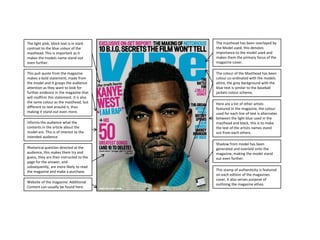
- 1. The light pink, block text is in stark The masthead has been overlayed by contrast to the blue colour of the the Model used, this denotes masthead. This is important as it importance to the model used and makes the models name stand out makes them the primary focus of the even further. magazine cover. This pull quote from the magazine The colour of the Masthead has been makes a bold statement; made from colour co-ordinated with the models the model and it grasps the audience attire, the grey background with the attention as they want to look for blue text is similar to the baseball further evidence in the magazine that jackets colour scheme. will reaffirm this statement. It is also the same colour as the masthead, but Here are a list of other artists different to text around it, thus featured in the magazine, the colour making it stand out even more. used for each line of text is alternates between the light blue used in the Informs the audience what the masthead and black, this is to make contents in the article about the the text of the artists names stand model are. This is of interest to the out from each others. intended audience. Shadow from model has been Rhetorical question directed at the generated and overlaid onto the audience, this makes them try and magazine, making the model stand guess, they are then instructed to the out even further. page for the answer, and subsequently, are more likely to read the magazine and make a purchase. This stamp of authenticity is featured on each edition of the magazines cover, it also serves purpose of Website of the magazine. Additional outlining the magazine ethos. Content can usually be found here.
- 2. The giant V behind the model is the first character from the magazine title, it is easily identifiable to readers of the magazine. The masthead has been formatted in a way that looks it has made room to fit more of the model in the scene, this places importance upon the model. Here are featured contents of the magazine, the headline of the article is listed in capitals to grasp attention. The black and white colour scheme used gives a vintage impression and aligns with the clothing worn by the model. The red heart is the only coloured object on the whole page, the fact a women is trying to grab onto it asserts that the model is These are the details of the photographers. Below are details of where the photos were taken, both the front cover and contents page.
- 3. Extremely big, capitalised USA that The font used here is designed to The drop capital letter used is the The name of the conveys how big the country is, and give a classy, minimalist look, against same font as the subheading. This is woman featured in that the population loves the subject her dress and the white background. to convey importance to the the article is blue in of the article. Contrasts with the ‘USA’. paragraph and catch attention. colour so it stands out The red in her hair and These are the the ribbons are colour author/photographers co-ordinated to stand names. out more against the white background.
- 4. The purple, block text is the same The masthead has been overlaid by colour as the. This is important as it the Model used, this denotes makes the models name stand out importance to the model used and even further, and indicates that makes them the primary focus of the ‘Drake’ is the star of the magazine. It magazine cover. us also underlined, thus making it stand out even more. The colour of the Masthead has been made to co-ordinate with the Informs the audience what the jewellery worn by the model as contents in the article about the purple/gold/black go well with the model are. This is of interest to the white/grey gradient background. intended audience. Here are a list of other artists This seal of approval shows that the featured in the magazine, the colour top 30 songs are listed in the used for the star separating their magazine, including an all new names is the same as the number one. masthead, but different to the font text, as to make it stand out. This displays the title of another article that the reader may be The URL’s of the social networking interested in. accounts of the magazine are placed here. Usually additional content Informs shop staff of when the linking back to the website is posted magazine issue would be outdated and streamed to the users social networking account. Barcode & Price on left hand side, easily visible on the magazine This QR Code can be scanned from a stand. mobile device, then a webpage will Website of the magazine. Additional be opened showing additional Content can usually be found here. content for the magazine.
- 5. The stony grey background colour The contents page is addressed as the used enhances the other colours and ‘Master Plan’. This conveys that it makes them stand out, without encompasses everything that is contrasting too much. covered in the magazine. This is the Magazine Edition. The The masthead has rounded, yet bold month is shown as a new issue is font that has a gradient colour released every month. scheme. This makes it aesthetically pleasing, and makes it stand out from ‘The Source’ Logo. Here are featured contents of the magazine, the headline of the article is listed in capitals to grasp attention. The section titles are done in the same font type and colour scheme to the masthead, although they are smaller, indicating less importance. It appears as if the models skin has been manipulated to add a reddish hue to it. This allows it to match the font colour for each articles title. This statement is designed to capture the audiences attention by making it appear as if ‘weezy’ is partaking in controversial activity. The articles page number is highlighted in red encouraging the user to read the article.
- 6. The black background used The font used here is designed to The model is standing in a pose that exemplifies the statement of his give a bold statement out. Although does not look happy, giving evidence suggesting not to become a hip hop it looks aesthetically appealing due to to back up his statement. His tattoo’s artist as it implies he has been left in the contrast between the black showing may give a tough look and the darkness background. suggest this is what his life is like. The second sentence has a different font colour to make it stand out, and give importance to that final statement.