
Recomendados
Más contenido relacionado
Más de LewisTowse7
Más de LewisTowse7 (20)
Último
Último (20)
Paramore digipak analysis
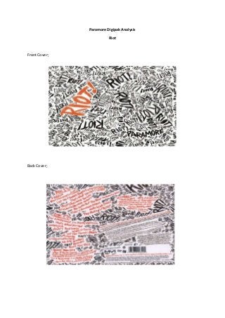
- 1. Paramore Digipak Analysis Riot Front Cover; Back Cover;
- 2. Disk; Paramore’ssecondstudioalbum,‘Riot!’wasreleasedbackin2007. The digipakhasa designthatis seenasbeenconsistentthroughoutthe full thingasseeninthe above images.The designof the frontcover beingthe same asthe back as well asthe disk hasa basicfeel toitas the fonton the coversand diskisthe same throughoutand appearsto have a scribble like looktoitgivingitafeel of chaos whichtherefore reflectsthe title of the album.The albumalsorepresentsconventionsof rock due to the usedcolourscheme;black,white andorange.These coloursare frequentlyseeninrock basedmediatextssuchas rock magazines,musicchannels(Kerrang!etc).The albumcoverhas variousdifferentfontsizes,apartfromthe orange colouredword‘Riot!’whichiscompletely differentfromthe backgrounddesignwhichthereforegrabsthe viewers’attentiontothe difference intexts.The same designisthe same for the rear of the digipak;the backgroundhasthe same contentas the frontwiththe word riotbeingprintednumeroustimesapartfromthe majorityof the texton the rear side isactuallywritteninorange font. The fonthighlightsthe ideaof ariot as itlooks as thoughit ishand writteninagraffiti styledfontgivingitafeel of violence anddisturbance which adds tothe ideaof chaos. There are websitesthatfeature onthe backcoverof the digipak; paramore.net,fueledbyramen.com andmyspace.com/paramore.These are all inorange fontmaking themstandout significantlysothat the audience will spotthisandview thesewebsites.