
Recomendados
Más contenido relacionado
La actualidad más candente
La actualidad más candente (19)
Similar a Cunning Plan - The Power of Typography
Similar a Cunning Plan - The Power of Typography (20)
Último
Último (20)
Cunning Plan - The Power of Typography
- 2. A brief introduction to the origins and history of typography. It’s application and it’s importance in society. Also examples of what makes good type as opposed to bad type. Introduction
- 3. Presentation Breakdown 1 A brief history of type 2 It’s the space between the notes that makes the music! 3 Importance to society 4 The 5 main categories of type Serif Type Sans Serif Type Script (handwritten fonts) Display Speciality Fonts Picture Fonts 5 Questions
- 4. Origins 1445 Johannes Gutenberg invents movable type within the printing press. First Gutenberg bibles were sold cheaply due to the effectiveness of the movable wooden type. By the end of the 15th century printing had become a European wide practise.
- 5. 1822 1919 1990 1886 1950 Didot -1811 Bodoni - 1813Ottmar Mergenthaler invented the Linotype machine, the first device that could easily and quickly set complete lines of type for use in printing presses Bauhaus was one of the first European schools to teach Art+Design as a collective and to seek new ways to improve the world through creativity. Type played an incredibly important role in this expression.
- 7. It’s the space between the notes that makes the music! Advertising created a need for new typefaces. Letters were made taller and wider. Mainly used as headers on posters billboards. N E W N E W N E W
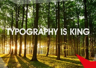
- 9. What is typography? Typography is Power Typography is the power to communicate words and ideas visually.
- 10. What is a typographer? A typographer is someone who is sensitive to the different forms of type. Sensitive to how type conveys a message, interacts with its environment but also its effect on the reader.
- 11. Typography is a hidden tool of manipulation within society Neville Brody
- 12. Is anyone out there? Can anybody identify this font?
- 13. Good job!
- 14. Roald Dahl
- 16. SerifSerif type has ‘little feet’. These feet come from the flicks made by calligraphers when drawing letters. Serif type is believed to be the most readable type for continuous text. That’s why you often see serif type for large format text e.g. books, magazines and newspapers • Traditional • Elegant • Legible • Timeless
- 17. Garamond Bembo Can anybody identify this font?
- 18. Giambattista Bodoni’s typeface represented a huge expression leap forward in typography! Designed for the Napoleonic revolution and change. Bodoni became a staple in typographic design centuries later in the roaring 30’s. The height of the Art Deco design and fashion.
- 19. Sans SerifSans serif is considered to be the pure form of letters. When we learn the alphabet we are often taught the sans serif version. • Informal • Friendly • Modern
- 20. Futura Futura Medium Akzidenz Grotesk A sans serif typeface walks into the street and is hit by a modernist truck. The carnage is Grotesk...Akzidenz happen. ITC Avant Guard the quick red jumps over the lazy
- 22. Jenna Sue
- 24. Script fonts are very similar to the original black letter fonts that Gutenberg created in that they mimic handwriting and calligraphic styles. The freedom to add swirls and fancy elements to letters is what appeals to typographers and designers. Often linked characters. Joined ascenders descenders RARELY IN ALL CAPS Script
- 27. c d s j V B E W y u v b e w y v b e w i v b e w i v V Y C 61 8 7 y r 349 v b a u Symbol Picture Fonts Often referred to as ding-bats or PI Fonts. Designed for ornamental purposes, frames and mathematical equations ....sadly it has evolved into something much more scarier.
- 29. Thank you for listening! Any Questions?