Evolution of Email Design – Lyris
•
0 likes•172 views

Andrew King from Lyris talks about the evolution of email design along with the latest and greatest in email design that boosts email marketing engagement. Visit http://blog.lyris.com/ to accelerate your email marketing.

Recommended
More Related Content
Viewers also liked
Viewers also liked (10)
Recently uploaded
Recently uploaded (20)
Evolution of Email Design – Lyris
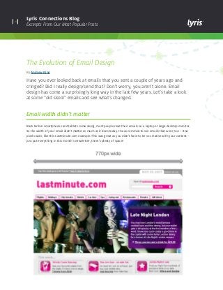
- 1. 1 Lyris Connections Blog Excerpts From Our Most Popular Posts The Evolution of Email Design By Andrew King Have you ever looked back at emails that you sent a couple of years ago and cringed? Did I really design/send that? Don’t worry, you aren’t alone. Email design has come a surprisingly long way in the last few years. Let’s take a look at some “old skool” emails and see what’s changed. Email width didn’t matter Back before smartphones and tablets came along, most people read their emails on a laptop or large desktop monitor. So the width of your email didn’t matter as much as it does today. It was common to see emails that were 700 – 800 pixels wide, like this Lastminute.com example. This was great as you didn’t have to be so creative with your content – just put everything in this month’s newsletter, there’s plenty of space!
- 2. 2 Lyris Connections Blog Excerpts From Our Most Popular Posts Today most emails are 600 pixels wide or less. Many companies have also opted for scalable and responsive designs which can adapt to mobile environments. These emails obviously have a lot less room for content but they look great on mobile devices, which is really important with so many people using smartphones to read their emails. Lastminute. com’s newsletter today is 600 pixels wide and uses a responsive design which reduces its width to 320 pixels when viewed on a smartphone.
- 3. 3 Lyris Connections Blog Excerpts From Our Most Popular Posts What’s a pre-header? It’s only in the last few years that pre-header text has been optimized to include clever marketing messages which can help increase your open and click-through rates. Most pre-headers back in the day said something along the lines of, “Can’t read this message? Click here to view it online.” While this is useful and not something I think you should remove, there are smarter ways to format your pre-header. Best practice these days is to insert the marketing message on the left-hand side of the pre-header and the “view online” link on the right. This text acts as a preview on the email’s content in many email clients like Outlook, Gmail, and iPhones.
- 4. 4 Lyris Connections Blog Excerpts From Our Most Popular Posts Copy crazy! Another trend we’ve seen is that the amount of copy used within emails has dramatically decreased. This could be due to the fact that marketers have realized that their email subscribers are more and more time-poor and aren’t going to spend 10 minutes reading every piece of content within their email. In fact, I can tell you from the stats I’ve seen that a large chunk of your subscribers will spend under 10 seconds reading your emails. The Apple emails below are good examples of how email design has evolved to deal with this issue. Generally a good rule of thumb is to stick to one paragraph of copy, one image, and a strong call-to-action per product/story within your email. The aim should be to drive the subscriber to your website and not make them spend as long as possible on your email.
- 5. Copyright © 2014 Lyris, Inc. All rights reserved. lyris.com About Lyris Inc: Lyris (@Lyris ) is a leading global provider of digital marketing solutions that help companies engage with customers in more meaningful ways. Lyris products and services empower marketers to design, automate, and optimize data-driven interactive marketing campaigns that facilitate superior engagement, increase conversions, and deliver measurable business value. Lyris’ high-performance, secure, and flexible digital marketing platforms improve marketing efficiency by providing automated digital message delivery, robust segmentation, and real-time digital channel analytics. The Lyris solutions portfolio is comprised of both in-the-cloud and on-premises offerings – Lyris HQ and Lyris LM – combined with customer-focused services and support. More than 5,000 companies worldwide partner with Lyris to manage and execute sophisticated digital marketing campaigns across email, social, Web, and mobile channels. Learn more at www.lyris.com. Keep up with the latest industry trends, developments and best practices for continuously optimizing your digital marketing campaigns. Visit Lyris Connections Blog Three key tips for improving your email design: 1. Keep the width below 600 pixels so that your email renders well across all environments. 2. Include a marketing message in the top left corner of your email. This text will act as a preview to the content of your email and will get clicked on. 3. Keep your copy short. People don’t have 10 minutes to read your email, so get your message across quickly and drive your subscribers to your website. If you need help with your email design please feel free to contact the Lyris Professional Services team.