Why Teams call analytics are critical to your entire business
Graphic Materials
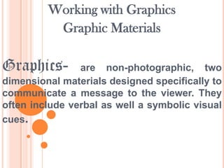
1. Working with Graphics
Graphic Materials
Graphics-
are non-photographic, two
dimensional materials designed specifically to
communicate a message to the viewer. They
often include verbal as well a symbolic visual
cues.
3. Drawing
Objects-
Include
AutoShape, WordArt and Lines. Buttons to
create new objects are in the drawing mode
panel, and users can create new objects using
operations on the canvas after selecting a
drawing mode.
5. AutoShapes -is a tool to help you draw
objects on your document. You can choose to
have an AutoShapes toolbar or use the
AutoShapes menu on the Draw toolbar. Once
you insert an AutoShape, you can also put a
Text Box inside it, or other shapes. You can
move or resize them as you wish.
12. To Insert an AutoShape
1. Click on the Insert Menu – Picture – AutoShape
2. Select the AutoShape category you want.
3. Click the AutoShape you want to add.
4. The mouse pointer changes to a crosshair (+)
5. To insert a shape with a predefined (default) size, simply
click on the document. To insert a different size, drag
crosshair (diagonally) until the AutoShape is the size and
shape you want. Observe that the drawing object is
selected, as indicated by the eight sizing handles around
it. (At this point, the drawing object can be moved by
dragging, rotated, resized or deleted.)
6. To deselect the AutoShape, click outside it.
13. WordArt- is text with special effects. You
can create shadowed, skewed, rotated, and
stretched text, as well as text with particular
shapes. The special text effect created with
WordArt is a Drawing object, so you can also
use buttons on the Drawing toolbar to change
the effect, such as filling the text effect with a
picture.
15. To Insert a WordArt
1. Position the insertion point where you will insert the WordArt.
2. Click on the Insert menu – Picture WordArt; or simply click on the Insert WordArt button on the
Drawing toolbar. The WordArt Gallery dialog box opens.
3. Select the style you like and click on OK. The Edit WordArt
Text dialog box opens.
4. Choose the font style, font size, and font attribute you want.
5. Type your text in the space provided.
6. Edit your work when necessary
7. When done, click on OK
8. To edit your finished WordArt dialog box, then use the button
you need for editing.
16. Line-
is a one-dimensional element
measured only in length. It is an abstract
concept that is more perceived than actually
viewed. Very few lines appear in nature, yet
we see the edges of things around us, helping
us to differentiate a shape or form from its
surroundings.
18. To Add a Line, Arrow, Double-arrow
1. On the Drawing toolbar, click on the button–lines.
2. Click on the Line, Arrow or Double-arrow button.
3. Position the mouse where you want to insert the drawing object.
4. Drag the mouse until the drawing object is the size and shape you want.
To Add a Curve, Freeform or Scribble
1. On the Drawing toolbar, click on the AutoShapes button – Lines
2. If the Curve button is picked: Click where you want the shape to start. Continue
moving the mouse, clicking wherever you want to add a point to the curve.
3. If the Freeform button is picked: Drag to draw freehand shapes; click and move
the mouse to draw straight lines.
4. If the Scribble button is picked: Drag the mouse pointer and draw like you
would with a pen.
5. To end a shape and leave it open, double-click it at any point.
6. To close a shape, click near its starting point.
19. Pictures
1. ClipArt- in the graphic arts, refers to pre-made
images used to illustrate any medium. Today, clip art is used
extensively in both personal and commercial projects,
ranging from home-printed greeting cards to commercial
candles. Clip art comes in many forms, both electronic and
printed. However, most clip art today is created, distributed,
and used in an electronic form. Since its inception, clip art
has evolved to include a wide variety of content, file formats,
illustration styles, and licensing restrictions. Clip art is
generally composed exclusively of illustrations (created by
hand or by computer software), and does not include stock
photography.
21. To Insert a Clip Art from the Clip Gallery
1. Place the insertion point where you want to insert a Clip
Art.
2. Click on the Insert menu – Picture – Clip Art. The Clip Art
Gallery opens.
3. Click on a given category.
4. Click on the desired picture, and then click on Insert Clip
on the pop-up menu.
22. 2. Bitmaps images-
are exactly what
their name says they are: a collection of bits
that form an image. The image consists of a
matrix of individual dots (or pixels) that all
have their own colour (described using bits,
the smallest possible units of information for
a computer).
24. To Insert a Bitmap Image
1. Click where you want to insert the picture.
2. Click on the Insert menu – Picture – From File. The
insert dialog box opens.
3. Locate the picture you want to insert.
4. Click on the Insert button located at the bottom of
the dialog box.
25. 3. A photograph or photo-
is an
image created by light falling on a lightsensitive surface, usually photographic film
or an electronic image such as a CCD or a
CMOS chip. Most photographs are created
using a camera, which uses a lens to focus
the scene's visible wavelengths of light into a
reproduction of what the human eye would
see.
27. To Insert a Picture from a Scanner or Digital
Camera
1. Set up the picture in the device.
2. Click where you want to insert the picture.
3. Click on the Insert menu – Picture – From Scanner or Camera.
Note: This feature must be installed before you can use it.
4. Select the device you are using under Device.
5. Select either Web Quality (for onscreen viewing) or Print Quality
(if printing).
6. Click either Insert (if you want to use the predefined settings) or
Custom Insert (if you want to change image settings).
7. When the image appears in the document, make any changes
you want.
28. Diagram- is a two-dimensional geometric
symbolic representation of information
according to some visualization technique.
Sometimes, the technique uses a threedimensional visualization which is then
projected onto the two-dimensional surface.
The word graph is sometimes used as a
synonym for diagram.
29. Types of Diagram
1. Graphs-
are pictures that help us
understand amounts. These amounts are called
data. There are many kinds of graphs, each
having special parts.
30. Types of Graphs
1. Circle Graph-
is shaped like a circle.
It is divided into fractions that look like
pieces of pie, so sometimes a circle graph
is called a pie graph.
34. 3. Picture Graph-
uses pictures or
symbols to show data. One picture often
stands for more than one vote so a key is
necessary to understand the symbols.
42. 2. Network diagram may refer to:
*Computer network diagram, a depiction of nodes and
connections in a computer or telecommunications
network
*Graph drawing, methods for visualizing graphs and
networks regardless of their application
*Project network, a flow chart showing the sequence of a
project's tasks and their dependencies
*Social network, a social structure of individuals or
organizations.
44. 3.
Flowchart-
is a type of diagram that
represents an algorithm or process,
showing the steps as boxes of various
kinds, and their order by connecting these
with arrows.
46. 4. Venn diagram-
or set diagram is a
diagram that shows all possible logical
relations between a finite collection of sets
(aggregation of things).
48. 5. Existential graph-
is a type of
diagrammatic or visual notation for logical
expressions, proposed by Charles Sanders
Peirce, who wrote on graphical logic as
early as 1882 and continued to develop the
method until his death in 1914.
50. How to Create a Graph using a Spreadsheet
1. Enter your data into the spreadsheet in a table format.
2. Select the cells that contain the information that you want to appear in
the graph. If you want the column labels and the row labels to show up in
the graph, ensure that those are selected also.
3. Press the F11 button on your keyboard. This will create your graph on a
"chart sheet." A chart sheet is basically a spreadsheet page within a
workbook that is totally dedicated to displaying your graph.
4. Use the Chart wizard Click insert then chart, if F11 doesn't work. In
Gnumeric it won't work. Choose Chart Type.
5. On the Chart toolbar, which appears after your chart is created, click on
the arrow next to the Chart Type button and click on the type of chart you
want.
51. 2. Chart-
is a graphical representation of
columns and rows of numbers. Charts can make
data interesting, attractive and easy to read and
evaluate. You can interpret information easily,
analyse and compare data clearly. Charts can
make some dull numbers in your presentation
interesting and attractive. They also help you
make your audience understand what you are
talking about.
52. Types of Charts
1. Column Chart-
shows data changes
over a period of time or illustrates
comparisons among items. Categories are
organized horizontally, values vertically, to
emphasize variation over time.
53. Example of Column Chart
6
5
4
Series 1
Series 2
Series 3
3
2
1
0
Category 1Category 2Category 3Category 4
54. 2. Bar Chart-
illustrates comparisons
among individual items. Categories are
organized vertically, values horizontally, to
focus on comparing values and to place
less emphasis on time.
55. Example of Bar Chart
Category 4
Category 3
Series 3
Series 2
Series 1
Category 2
Category 1
0
2
4
6
56. 3. Line Chart-
is a type of chart which
displays information as a series of data points
connected by straight line segments. It is a basic
type of chart common in many fields. It is an
extension of a scatter graph, and is created by
connecting a series of points that represent
individual measurements with line segments. A
line chart is often used to visualize a trend in data
over intervals of time – a time series – thus the
line is often drawn chronologically.
57. Example of Line Chart
6
5
4
3
Series 1
Series 2
Series 3
2
1
0
Category Category Category Category
1
2
3
4
58. 4. Pie Chart-
is a circular chart divided
into sectors, illustrating proportion. In a pie
chart, the arc length of each sector (and
consequently its central angle and area), is
proportional to the quantity it represents.
59. Example of Pie Chart
Sales
1st Qtr
2nd Qtr
3rd Qtr
4th Qtr
60. 5. XY or Scatter Chart-
displays
series as a set of points. Values are
represented by the position of the point in
the chart space. Categories are represented
by different points in the chart.
61. Example of XY or Scatter Chart
Y-Values
3.5
3
2.5
2
1.5
Y-Values
1
0.5
0
0
1
2
3
62. 6. Area Chart-
displays graphically
quantitate data. It is based on the line chart.
The area between axis and line are
commonly emphasized with colors, textures
and hatchings. Commonly one compares
with an area chart two or more quantities
63. Example of Area Chart
50
45
40
35
30
25
20
15
10
5
0
Series 2
Series 1
64. 7. Doughnut Chart- displays value data
as percentages of the whole. Categories
are represented by individual slices.
Doughnut charts are functionally identical to
pie charts.
66. 8. Radar Chart-
is a graphical method
of displaying multivariate data in the form of
a two-dimensional chart of three or more
quantitative variables represented on axes
starting from the same point. The relative
position and angle of the axes is typically
uninformative.
67. Example of Radar Chart
1/9/2002
1/8/2002
1/5/2002
40
30
20
10
0
1/6/2002
Series 1
Series 2
1/7/2002
68. 9. Surface Chart-
shows a threedimensional surface that connects a set of
data points. A surface chart is useful when
you want to find optimum combinations
between two sets of data.
69. Example of Surface Chart
5
4
3
2
1
0
Series 3
Series 2
Series 1
4-5
3-4
2-3
1-2
0-1
70. 10. Bubble Chart -is a type of chart that
displays three dimensions of data. Each
entity with its triplet (v1, v2, v3) of
associated data is plotted as a disk that
expresses two of the vi values through the
disk's xy location and the third through its
size.
72. 11. Stock Chart-
is often used for
scientific data, for example, to indicate
temperature changes. You may organize
your data in the correct order to create this
and other stock details.
73. Example of Stock Chart
160
140
120
100
80
60
40
20
0
70
60
50
40
30
20
10
0
Volume
High
Low
Close
74. To Add a Chart
1. From the New Presentation box, select the presentation that you want
except for the AutoContent Wizard and then click on the OK button.
2. From the New Slide dialog box, select the AutoLayout with a
placeholder for a chart and then click on the OK button.
3. The slide appears on your screen. Depending on the layout that you
choose, your screen may look different.
4. Add the title and main text as needed.
5. Double-click on the object with a chart. The datasheet appears.
Note: If the datasheet does not appear, click on the View Datasheet
button to display the datasheet.
6. Type the actual data in the cell of the datasheet. As you type the
actual data, your data replaces the old data.
7. When you have finished typing all the data, click anywhere outside
the datasheet. A new chart is displayed on your screen.
Editor's Notes
Line Chart• Pie Chart• XY (Scatter) Chart• Area Chart• Doughnut Chart• Radar Chart• Surface Chart• Bubble Chart• Stock Chart• Cone, Cylinder, PyramidTypes o Graphs• Bar• Pictorial• Circle• Line