Bleubird visual branding
•
0 likes•73 views

A comprehensive explanation of our visual execution for Bleubird Clothing store
![[VISUAL EXECUTION] January 6, 2014
Blue Bird project | 1
EXECUTIVE SUMMARY
This report presented the visual branding project for Bleubird products. The project was conducted
by Blue team, including Nguyen Phuc Tuan Anh, Tran Tuong Linh and Pham Tra My. After
developing ideas together, each member was specialized in one task to bring about optimum results.
Tuan Anh was the photographer/designer of the creative team who produced initials photos and
original promotional materials. Tuong Linh was the market researcher who studied target market and
helped us convey the messages accordingly. Tra My was the image analyst who studied concepts,
symbolism and visual elements that were incorporated in our images.
Firstly, our client – Bleubird shop – was founded in Hanoi, June 2013. Its product line is designed
women clothing in vintage style with the price ranges from 300,000 VND to 500,000 VND. After
carrying out market research, the team believed that Bleubird’s target market should be females,
about the age of 18 – 24, with middle high income. They would be thinkers (practical, independent),
experiencers (impulsive, self-expressive and care about appearances) or believers (loyal customers).
Also, since the brand is still comparatively new in the market, target customers should at first be
limited to Hanoi area.
Secondly, our project was inspired by the following proposition: “Modern vintage designed
clothing”. Initially, the team produced five images under the form of a fashion sketchbook, with
sketches and Bleubird’s logo on the left and the picture of a model wearing final products on the
right. The sketches emphasized the “designed” characteristic of these clothing. Besides, in all of our
photos, the symbol blue bird was incorporated as the connection between the drafted ideas (2D) and
reality (3D). It brought the brand spirit into the products: happiness and contentment as well as
represented the designer’s delight when her ideas came true.
Thirdly, the team proposed that these promotional materials should be displayed on the shop’s
website, Facebook page and other online media channels for the youth, in printed advertising such as
women fashion magazines, lookbooks and posters to place at partners’ stores. Consequently, in the
execution of final products, Blue team developed the sketch book ideas further, including webpages
advertising and posters.
The team sincerely thank Bleubird’s owner/designer – Bui Dieu Linh, for lending us original
products for our photo shoots as well as time and support during the execution of this project.](data:image/gif;base64,R0lGODlhAQABAIAAAAAAAP///yH5BAEAAAAALAAAAAABAAEAAAIBRAA7)
Recommended
More Related Content
Similar to Bleubird visual branding
Similar to Bleubird visual branding (20)
Recently uploaded
Recently uploaded (20)
Bleubird visual branding
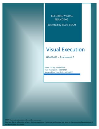
- 1. Visual Execution GRAP2411 – Assessment 3 Pham Tra My – s3357655 Tran Tuong Linh – s3372717 Nguyen Phuc Tuan Anh – s3259027 BLEUBIRD VISUAL BRANDING Presented by BLUE TEAM RMIT electronic submission of work for assessment I declare that in submitting all work for this assessment I have read, understood and agree to the content and expectations of the Assessment declaration.
- 2. [VISUAL EXECUTION] January 6, 2014 Blue Bird project | 1 EXECUTIVE SUMMARY This report presented the visual branding project for Bleubird products. The project was conducted by Blue team, including Nguyen Phuc Tuan Anh, Tran Tuong Linh and Pham Tra My. After developing ideas together, each member was specialized in one task to bring about optimum results. Tuan Anh was the photographer/designer of the creative team who produced initials photos and original promotional materials. Tuong Linh was the market researcher who studied target market and helped us convey the messages accordingly. Tra My was the image analyst who studied concepts, symbolism and visual elements that were incorporated in our images. Firstly, our client – Bleubird shop – was founded in Hanoi, June 2013. Its product line is designed women clothing in vintage style with the price ranges from 300,000 VND to 500,000 VND. After carrying out market research, the team believed that Bleubird’s target market should be females, about the age of 18 – 24, with middle high income. They would be thinkers (practical, independent), experiencers (impulsive, self-expressive and care about appearances) or believers (loyal customers). Also, since the brand is still comparatively new in the market, target customers should at first be limited to Hanoi area. Secondly, our project was inspired by the following proposition: “Modern vintage designed clothing”. Initially, the team produced five images under the form of a fashion sketchbook, with sketches and Bleubird’s logo on the left and the picture of a model wearing final products on the right. The sketches emphasized the “designed” characteristic of these clothing. Besides, in all of our photos, the symbol blue bird was incorporated as the connection between the drafted ideas (2D) and reality (3D). It brought the brand spirit into the products: happiness and contentment as well as represented the designer’s delight when her ideas came true. Thirdly, the team proposed that these promotional materials should be displayed on the shop’s website, Facebook page and other online media channels for the youth, in printed advertising such as women fashion magazines, lookbooks and posters to place at partners’ stores. Consequently, in the execution of final products, Blue team developed the sketch book ideas further, including webpages advertising and posters. The team sincerely thank Bleubird’s owner/designer – Bui Dieu Linh, for lending us original products for our photo shoots as well as time and support during the execution of this project.
- 3. [VISUAL EXECUTION] January 6, 2014 Blue Bird project | 2 IMAGE EXECUTION AND RATIONALE Figure 1. Bleubird’s homepage design (photo by Tuan Anh, appropriated by Tuong Linh) When our idea of the sketchbook was developed further into webpage advertising, commercialism in the photo was emphasized by focusing on the product and the shop’s offers, less background space of the photo and more space for connecting with the shop. The “Modern vintage designed clothing” proposition is still reflected in the photo of model wearing Bleubird products (modern vintage) and the sketches images of product categories (designed clothing). Half of the outfit represents drafted idea and the other half is real, showing the comparison between imagination and reality while blue bird symbol shows the brand’s signature.
- 4. [VISUAL EXECUTION] January 6, 2014 Blue Bird project | 3 When customers click on a specific product category, the respective index item will stand out as we feature the new arrival look: Figure 2. Bleubird’s website – Feature product page (photo by Tuan Anh, appropriated by Tuong Linh)
- 5. [VISUAL EXECUTION] January 6, 2014 Blue Bird project | 4 Figure 3. Bleubird poster design (by Tuan Anh ) The above picture still uses our main elements which are animated blue birds and animated line to convey our message to customers but in much simpler way. The use of minimalist helps to enhance the elegant and sophisticated design of the products. In this image, the spirit of being young, free and pure are enhanced without creating visual noise and still highlight the special of clothes which are in modern vintage style.
- 6. [VISUAL EXECUTION] January 6, 2014 Blue Bird project | 5 Figure 4. Bleubird’s magazine advertising (by Tuan Anh) In this picture, the model was placed along the central vertical line of skeleton structure, creating the balance for the photo. Focal point is her arms slightly crossing, leaving the tender look of vintage style. Moreover, the contrast between light and dark value of the top and bottom brings out the delicate details in Bluebird’s design. For example: it emphasizes the curvy hem of the top which makes it different from others. Besides, this background bears some similarities to the floral patterns, showing a connection between the model and the environment around, reflecting the contentment element of our brand spirit. The team wanted each promotional photo to have a unique background and specifically for this one, it took more time for our photographer to find.
- 7. [VISUAL EXECUTION] January 6, 2014 Blue Bird project | 6 Figure 5. Bleubird’s magazine advertising (by Tuan Anh) Both floral and dotted patterns are vintage style’s signature. By switching the value of the top and bottom from previous image to this image we were able to create a different impression of the outfit – a sharper look with more contrast from dotted patterns. After all, differentiating the products is really about making the details stand out.
- 8. [VISUAL EXECUTION] January 6, 2014 Blue Bird project | 7 Figure 6. Bleubird’s magazine advertising (by Tuan Anh) The model in this picture is placed following the rule of third which creating a negative space for the entire image. The existence of negative space helps generate a calm and relaxing atmosphere.. The girl stands right in the middle of the photo creating an image of an independent and strong girl in the modern world. The power pole placed behind the model somehow reminds viewer of life in urban area which, from our point of view, also create the point of interest for the image.