
Recomendados
Más contenido relacionado
La actualidad más candente
La actualidad más candente (20)
Destacado
Similar a NME magazine analysis
Similar a NME magazine analysis (20)
Más de PaigeWard961
Más de PaigeWard961 (20)
Último
Último (20)
NME magazine analysis
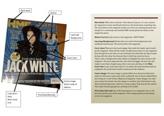
- 1. Mast head Button Layering/ Background Mast Head: NME which stands for ‘New Musical Express’, it’s very common for magazines to have mastheads which are shortened down something else. The mast head on this magazine stands out and is eye catching because even though it’s a commonly used method NME sounds good and relates to the magazines genre. Button:Highlights key stories in the magazines. ‘MUST READ.’ Layering/Background:Similar fonts are used in the background, text, masthead and barcode. This works well on the magazine. Cover Lines Centre ImageDirect mode of address. Look who’s backMain Cover Line Price/Date/Barcode Cover Lines:These are short and snappy, they make the reader want to pick up the magazine. These tell the reader straight away what is in the magazine. Even though the cover lines are eye catching with what they say they’re quite boring with the colour but because they’re bold they stand out more. There is also a background colour (blue) to highlight the main stories in the magazine. The more important the cover lines the bigger the text is for the reader to see them straight away, this is more eye catching. In the Main Cover Line it says ‘Look who’s back’ it’s in italics this may have been done to emphasize the words and to make it stand out to the audience. Centre Image: The main image is of Jack White he is dressed in black and white, his skin tone is quite pale with a ‘yellowish’ tint, his back combed black hair brings in a ‘rock’ theme. Majority of magazine ‘centre images’ are closeups to show the emotion but this image is a medium shot which doesn’t only show his facial expression, which is a ‘serious angry’ look, but also his clothes. This makes the photograph eye catching to the reader. Price/Date/Barcode:One of the main features on a magazine cover is the barcode and the price of the magazine. This is always found on the bottom corner of a magazine.