
Recomendados
Más contenido relacionado
La actualidad más candente
La actualidad más candente (20)
Similar a Screenshots 2
Similar a Screenshots 2 (20)
Más de Phoebe_Rowlands
Más de Phoebe_Rowlands (20)
Último
Último (11)
Screenshots 2
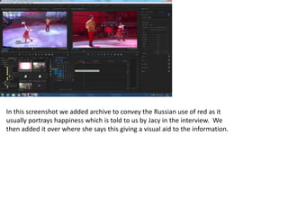
- 1. In this screenshot we added archive to convey the Russian use of red as it usually portrays happiness which is told to us by Jacy in the interview. We then added it over where she says this giving a visual aid to the information.
- 2. In this screenshot we are adding the graphics to the interview which is a code and convention of interviews. This tells the audience who the interviewee is and what they do. Before the interview we decided to use this clip of zooming into a camera to introduce the photographer with a voiceover over the top as this is relevant to what she will be talking about which is red in photography.
- 3. We then added our third interview which would also be edited so that the questions would be edited out which follows the codes and conventions of interviews.
- 4. We added our first cutaway for the photographer as she talks about red standing out in a lipstick and so we decided to film a panning shot of the different shades of red lipstick. For this screenshot we cut the answers separately so that we could gatekeep the information, creating the narrative we wanted to convey.
- 5. We added further cutaways to the photographer giving evidence of what she was talking about giving the audience visual aids and they will be able to understand further of what she is talking about. This makes the documentary easy to understand and the audience will be able to remain active.
- 6. This is a cutaway that we added to the Artist’s interview that conveys the bodily and fleshy connotations of red that he talks about. This talks about the gruesome connotations of red which differs from other information given about the positive and bold connotations of red.
- 7. In these screenshots we have edited and re-filmed some of the footage for the title sequence this is to focus on the colour red, for example, the top screenshot shows that we are resizing the frame to ensure that the background is edited out and the only focus is red. As well as the traffic light, only zooming in on the red light.
- 8. We added further cutaways to the Artist’s interview as we found this to be the most informed part of the documentary and it seemed to take a larger portion than the other interviews and so we had to go out and film a lot of cutaways to relate to what he was saying as well as entertaining the audience so that they do not channel surf.
- 9. In this screenshot we decided that to introduce the artist we wanted to show us walking through the gallery and this included the clip of the word ‘Gallery’. This lets the audience know what the next interview/topic will entail for the documentary.
- 10. For this screenshot we added an exponential fade to the music as this will allow the vox pops to take over and will not interfere with the sound as well as not being cut abruptly. Talking about art in war, red was used to show an internal suffering as well as blood and gore. This artwork from World War 2 fit perfectly for this information anchoring the interview.
- 11. In this screenshot we have edited both of the photography and costume designer interviews and are now adding them together to link, cutaways and further editing will be used so that they flow smoothly together.
- 12. This is the fourth interview that would be in our documentary and it was with a young, self employed Make-up Artist. She talks about the connotations of red in makeup as well as in film. We made sure that the mise-en-scene was appropriate for this interview as well as following the rule of thirds like the others. We edited out the questions and cut the answers to gatekeep the information.
- 13. Cutaways of makeup and red makeup were added as evidence and visual aids as well as keeping the audience interested. Also, the cutaways were useful when there were jump cuts in the interviews as they were played over them making the conversation flow smootly.
- 14. After playing the title sequence each time we watched the documentary, we found that the music didn’t feel right and fit correctly and so we found ‘Red Right Hand’ by the Arctic Monkeys which was fast paced and gave entertainment and fun to the documentary. We used this cutaway when the photographer says that lipstick would stand out a person, this gives the evidence to that claim and depicts to the audience the boldness of red whether they thought about it or not originally – it could perhaps have added a new representation of red for the audience.
- 15. We then added some archive from the film ‘Inglorious Bastards’ which depicts the provocative nature of red lipstick on women, the anchors the interview with the make-up artist when she says that red makeup in film can be shown as provocative. Adding cutaways of where the interview was filmed keeps the audience interested as they are not just staring at the interviewee, this prevents channel surfing. Such as this make-up panning shot in the left hand box.
- 16. We used this external shot of The Tate Gallery at the start of the interview for the artist to display where the interview was as well as bringing the audience with us making them feel as though they were there as well.
- 17. We added the voiceover that was recorded in our school studio to tie the start of the documentary together making the documentary understandable, giving the audience an idea of what the documentary entails. This cutaway shows Andy Warhol as the artist in the interview talks about his artwork and so we thought it appropriate for them to see who he was.
- 18. This was the last clip we added to the title sequence as the voiceover talks about red in fireworks, giving a dramatic effect and so the video of red fireworks would show this.
- 19. Shown in this screenshot is the new title sequence, we had shortened the title sequence as it seemed to long and may bore the audience, we also changed the title of our documentary as we found that this is a more interesting title and encapulates the audience.