
Recomendados
Más contenido relacionado
La actualidad más candente
La actualidad más candente (20)
Similar a Evaluation Questions
Similar a Evaluation Questions (20)
Último
Último (9)
Evaluation Questions
- 1. In what ways does your media product use, develop or challenge forms and conventions of real media products?
- 4. Here I have used a sense of direction, showing when she laughs. This is a technique used in other magazines so I thought I would do the same.
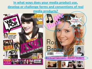
- 5. I have used iconic codes and conventions to add to the realism of my magazine. Earlier, I circled a few codes and conventions that have been used in a real magazine and that I have used in my magazine too. A few features I have used on my front cover are a main image, magazine title (in the corner), a quotation with oversized speech marks, a sub title, strap line, bar code, issue number and price and a “Free Poster” sign.
- 6. On my contents page, I have used the logo of my magazine title, column layout, more photo’s, features that will appear in the magazine and page numbers.
- 7. On my double page spread, I have included a main title “Cover Story”, another sight of the magazine title, more photo’s, an introduction, column layout, quick fire questions, album promotion and a tweet to interact with the social media i.e. twitter. Overall, all of these codes and conventions I have used contribute to the realism of my magazine.
- 8. How does your media product represent particular social groups? My music magazine represents particular social groups through the genre of “pop”. Such artists in the genre include Nicole Scherzinger, Pixie Lott, The Saturdays, Olly Murs, Michael Buble, Britney Spears etc. I saw that the “pop” genre in magazines has a very large target audience as it has been going for a very long time. I researched “pop” magazine and I realised that there are many “pop” magazines out there in the market so I’m confident that mine will sell.
- 9. The models I used in my magazine are dressed appropriately for the photographs so they would represent the social groups that I have aimed my magazine to. I also did this so the audience can relate to them, feel inspired and it will represent them as they may be their idols. The females are dressed in dresses so it has a feminine touch to it and the males are dressed in suits and look smart. Therefore creating a “classy” and sophisticated look which will represent the audience and that social group. Whereas, if the models were dressed in black and were related to “Goths”, then it would be very inappropriate to the audience and social group that I'm aiming at. Males Females
- 10. This is the image I tried to replicate. For my front cover. It’s simple with a classy look and the social groups and audience would be able to relate to this look that I have used.
- 11. Holly Willoughby is who I would use to describe my magazine. She is feminine, sophisticated and has a “clean” edge to her. She resembles purity which I’d like to think is what my magazine represents. Also, she is featured in my magazine on the contents page, some of my audience would see her as a role model and if she appears in my magazine then it would appeal to my audience. Holly would also belong to the social group and audience that my magazine is aimed towards – a sophisticated young woman.
- 12. What kind of media institution might distribute your media product? I think bauer media group will be the best media institution to distribute my media product. They have more than eighty influential media brands spanning a wide range of interests, including Heat, Grazia, Closer, FHM, Magic 105.4, Kiss, Kerrang and 4Music. I know they are a successful company as all of these magazines I have mentioned are successful. It’s an advantage how “Grazia” is there as that is a magazine who’s audience I would include for my magazine. As well as this, it sells lots of music magazines which is ideal as mine is a music magazine so I think Bauer Media would be the ideal institution for me to distribute my magazine.
- 13. Who would be the audience for your media product? I researched different types of music magazines and found that “pop” magazines were one of the highest selling types. I thought I would challenge myself, as this is a tough and highly competitive category. However, I have slightly changed my audience from the typical “pop” music audience, for example, I have a slightly higher age group of 16-30 years and is aimed at females. This is slightly different to other pop music magazines so it may stand out. It’s not childish and aimed at young teenagers, it is a sophisticated magazine aimed at young women.
- 14. My audience would be interested in pop music. Examples include Michael Bublé and Pixie Lott. These are the kind of artist who I would include and associate within my magazine.
- 15. I would NOT include bands such as ACDC and The Rolling Stones within my magazine as these bands appeal to completely different audience to what I am aiming at. The average 16 – 30 year old female would much rather prefer Pixie Lott and Michael Bublé than these two bands.
- 16. I’d like to think my magazine is a more sophisticated version of this “We Love Pop” magazine. It's because it's not just about music. They have a fashion section and celebrity gossip. Mine will be a more sophisticated version as it's less "in- your-face" and more gentle and spaced out.
- 17. Also, I have used this magazine to resemble the type of audience. The audience I want to read my magazine will consist of a similar range of people who read this “Grazia”.
- 18. I’d like to think that my magazine has a similar audience of both of these magazine when they are pout together. The “We Love Pop” would have the music side and the “Grazia” would have the sophisticated side to the audience
- 19. How did you attract/address your audience? I addressed my audience on many different ways. For example, they can relate to the artists and celebrities in the magazine. Also, I used a sophisticated female colour scheme using tones of light pinks, greys and whites. All of this is shown on my front cover page as this is the first page my audience will see.
- 20. The front cover has a mention of the Brit Awards, which people will want to know about. As well as having an advertisement to get tickets to a singer, “Harry Baldwin”. They would be attracted to these items so they would want to buy my magazine.
- 21. Also, on the front cover page, I have included a “Free Posters” sign so my audience will know that there are going to be free posters and this will engage them to my magazine as they may want the posters.
- 22. The contents page includes the name of artists and celebrities who are included in the magazine, these people are going to attract the audience as the audience will admire and be fans of these people so would want to read about them. It also shows little insiders of the topics and stories but not giving away too much information on the articles included, so if/when they want to read about it, they will have to read the magazine.
- 23. On the double page spread, I have included many techniques to attract the audience, such as photo’s, quick fire questions. I used a “latest tweet” so my magazine seems to have tied into the social media network which the audience know a lot about, after all it’s growing in the world and I thought I could relate to it. As well as these, I have included an album advertisement for Rosie’s CD as well as stating when her next performance is (on Dancing on Ice) this will attract my audience as the fans would want to know more about her.
- 24. What have you learnt about technologies from the process of constructing this product? Looking back at your preliminary task, what do you feel you have learnt in the progression from it to the full product?
- 25. School Magazine Vs Music Magazine A B
- 26. The first thing that comes to mind when I look at both of my magazines is how, in A, I never used more photo’s compared to B: As you can tell, here I have taken on board that other magazines use more than one image. This grabs the audiences attention. So on my music magazine I have used five images.
- 27. In my school magazine, I have noticed how I blurred the edges of the main image which has left spaces around the edges of the magazine (the blue background). Conversely, on my music magazine, I have used my main image to fill the page. This is done on most magazines I looked at, as long as you can overlap it with other images, writing, a strap line etc but you can still see the main image clearly. I have successfully done this in my music magazine.
- 28. Here I have also improved on using codes and conventions, i.e. barcode, issue number, date and price. I never did this before which makes it lack realism. Now I have seen other magazines include these, I will.
- 29. I have also included, on my music magazine, a strap line: This shows what is included in my magazine. Hopefully it will draw in my audience as it is a high profile topic, “Brit Awards” so people will want to get the latest gossip on it and gossip from their favourite artist who have been at the Brit Awards.
- 30. I have kept some things the same as I found out that they worked from my feedback. An example of this is the oversized speech marks with the quotations that overlap them. This worked well and looks professional so I kept it in my magazine.
- 32. Front Cover One big difference that I have improved on the contents page is the layout. For example, it’s in columns. The school Contents magazine is as though its split, Page horizontally, in two. Whereas, my music magazine is divided vertically in a rough outline of three columns. I have also Double included the magazine logo Page which, as you can tell, I have Spread carried on all the way through my magazine where as before I never carried this through.
- 33. I have used more page numbers. Before I only used a very little amount whereas now, I have used a lot more. After my school magazine I focused on researching other magazine in the music industry, and I noticed that they have a lot more page numbers etc than I did in my school magazine. So that’s when I realised I had to put more page numbers in my contents page. I have circled the page numbers that I have used and you can tell the difference.
- 34. I have also improved on the technology of editing my photo’s. As you can tell, in my school A B magazine, I just put the photo on the magazine whereas in my music magazine I have learnt to edit them, put boarders around them and other B techniques. A A B
- 35. Another technique I have learnt to do is to “finish off” where I have written text. As you can see in my school magazine, I just wrote the text and left it at that, whereas, in my music magazine I have neatened the text by having it in a pink box. I also think it adds to the sophistication and overall makes it look a lot better and more neat and professional.