1. 3 products similar to Ancillary 2
The King of Limbs - Radiohead
The Poster has 'Radiohead' written at the centre of
the poster, positioned backwards, in a large white
font, with the whole background being black, this
poster doesn’t include the album name, this could
have been done for one of two reasons the first is
because it is a way that Radiohead are getting the
point across that they sell an album on the status of
their name, rather than the quality of their album.
Secondly it could be because the album name is
longer than the band name, therefore to make the
presentation look the better; they’ve not included
the album name.
Following the written language, we see the image that has created for, and associated with The King
Of Limbs album, in some ways it could described as a filler to take up some of the space of the
poster, but you would guess it's their due to the relevance of the album artwork, in which it is
included on the album.
Finally, next to this is the XL Recordings logo, they will want people to know Radiohead are on their
label; therefore will want to be included on the poster. Altogether this looks quite basic, but it
doesn't look bad, tacky or rushed in any case. This gives me confidence that I could create something
simplistic that would still work well.
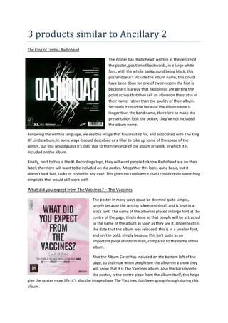
What did you expect from The Vaccines? – The Vaccines
The poster in many ways could be deemed quite simple,
largely because the writing is keep minimal, and is kept in a
black font. The name of the album is placed in large font at the
centre of the page, this is done so that people will be attracted
to the name of the album as soon as they see it. Underneath is
the date that the album was released, this is in a smaller font,
and isn’t in bold, simply because this isn't quite as an
important piece of information, compared to the name of the
album.
Also the Album Cover has included on the bottom left of the
page, so that now when people see the album in a show they
will know that it is The Vaccines album. Also the backdrop to
the poster, is the centre piece from the album itself, this helps
give the poster more life, it's also the image phase The Vaccines that been going through during this
album.
2. Overall, I believe this is the quite a simple in its own respect, they are helping to their album into
people’s minds, by having catch the readers eye, as it is based in the centre of the page. The
affective simplicity is something I believe I could recreate on my poster.
Viva La Vida – Coldplay
The final poster I’ve chosen to analyse is Coldplay’s
Viva La Vida album poster. The context of the poster consists
mainly of the band, the colour black (a running theme) and the
bold font. The main attention on this poster is the band that is
placed right in the middle of the poster. I feel that this image
and the way that it’s positionedare really effective as there’s a
sense of everything else on the poster being centred on them.
As they are a band it’s important that the posterreflects each of
them individually and as a band as well toreflect the chemistry.
Again this works well witheach of the individual’s poses
and stance and as aband, how they’ve been grouped together
and thecorresponding outfits reflects how close they are.
Withthe main singer at the front again portrays that bandimage
and informs the audience how the band workstogether and
who takes the dominant role etc.
The font used is one that’s been continuously usedthrough
their development giving a sense of recognition and build of
band image. The layout of the writing on the page again works
well with the overall layout. The initial attention is on the image which engages the reader; then
they instantly read a page from the top to the bottom, therefore the focus will be on the lines at the
topwhich on this poster is the essential information. The layout of the writing gives a sense of
coming in to the band, as the writing ispositioned as though it’s a ‘V’ shape giving the effect of
coming in which again reflects the central focus of the band. Then at the bottom of the page the
writing goes from in to out. I feel on my final poster I should consider this particular layout as I find
it really effective; however I must consider my image to ensure it works well as an overall effect.