SlideShare una empresa de Scribd logo
1 de 22
Descargar para leer sin conexión
Data Visualization
K.THIYAGU, Assistant Professor, Department of Education, Central University of Kerala, Kasaragod
1
Data visualization is the
process of creating graphical
representations of information.
This process helps the presenter
communicate data in a way that’s
easy for the viewer to interpret
and draw conclusions.
2
Data Visualization Techniques
• Pie Chart
• Bar Chart
• Histogram
• Gantt Chart
• Heat Map
• Box and Whisker Plot
• Waterfall Chart
• Area Chart
• Pictogram Chart
• Timeline
• Highlight Table
• Bullet Graph
• Choropleth Map
• Word Cloud
• Network Diagram
• Correlation Matrices
3
Pie Chart
Pie charts are ideal for
illustrating proportions, or part-
to-whole comparisons.
4
Bar Chart / Bar Graph
In this type of visualization, one axis of the
chart shows the categories being compared,
and the other, a measured value.
The length of the bar indicates how each
group measures according to the value.
5
Histogram
Histograms illustrate the distribution of data over a continuous
interval or defined period.
These visualizations are helpful in identifying where values are
concentrated, as well as where there are gaps or unusual values.
Histograms are especially useful for showing the frequency of a
particular occurrence.
6
Gantt Chart
Gantt charts are particularly common in project
management, as they’re useful in illustrating a project
timeline or progression of tasks.
In this type of chart, tasks to be performed are listed
on the vertical axis and time intervals on the horizontal
axis. Horizontal bars in the body of the chart represent
the duration of each activity.
7
Heat Map
A heat map is a type of visualization used to show
differences in data through variations in color.
These charts use color to communicate values in a way that
makes it easy for the viewer to quickly identify trends. Having
a clear legend is necessary in order for a user to successfully
read and interpret a heatmap.
8
A Box and Whisker Plot
A box and whisker plot, or box plot, provides a visual
summary of data through its quartiles.
First, a box is drawn from the first quartile to the
third of the data set. A line within the box represents
the median. “Whiskers,” or lines, are then drawn
extending from the box to the minimum (lower extreme)
and maximum (upper extreme). Outliers are represented
by individual points that are in-line with the whiskers.
This type of chart is helpful in quickly identifying
whether or not the data is symmetrical or skewed.
9
Waterfall Chart
Waterfall chart is a visual representation that
illustrates how a value changes as it’s influenced by
different factors, such as time.
The main goal of this chart is to show the viewer how
a value has grown or declined over a defined period.
For example, waterfall charts are popular for showing
spending or earnings over time.
10
Area Chart
An area chart, or area graph, is a variation on a
basic line graph in which the area underneath the
line is shaded to represent the total value of each
data point.
When several data series must be compared on
the same graph, stacked area charts are used.
11
Scatter Plot
A scatter plot displays data for two variables as
represented by points plotted against the horizontal and
vertical axis.
This type of data visualization is useful in illustrating
the relationships that exist between variables and can be
used to identify trends or correlations in data.
12
Pictogram Chart
Pictogram charts, or pictograph charts, are
particularly useful for presenting simple data in a
more visual and engaging way.
These charts use icons to visualize data, with
each icon representing a different value or category.
13
Timeline
Timelines are the most effective way to visualize a
sequence of events in chronological order.
Timelines are used to communicate time-related
information and display historical data.
14
Highlight Table
By highlighting cells in the table with color, you can make it
easier for viewers to quickly spot trends and patterns in the
data.
These visualizations are useful for comparing categorical data.
15
Bullet Graph
A bullet graph is a variation of a bar graph that can act as
an alternative to dashboard gauges to represent performance
data.
In a bullet graph, the darker horizontal bar in the middle of
the chart represents the actual value, while the vertical line
represents a comparative value, or target.
If the horizontal bar
passes the vertical line, the
target for that metric has
been surpassed.
Additionally, the
segmented colored sections
behind the horizontal bar
represent range scores, such
as “poor,” “fair,” or “good.”
16
Choropleth Maps
A choropleth map uses color, shading, and other patterns to
visualize numerical values across geographic regions. These
visualizations use a progression of color (or shading) on a
spectrum to distinguish high values from low.
Choropleth maps allow
viewers to see how a variable
changes from one region to the
next.
17
Word Cloud
A word cloud, or tag cloud, is a visual
representation of text data in which the size of the
word is proportional to its frequency.
The more often a specific word appears in a dataset,
the larger it appears in the visualization. In addition
to size, words often appear bolder or follow a specific
color scheme depending on their frequency.
18
Network Diagram
Network diagrams are a type of data visualization that
represent relationships between qualitative data points.
These visualizations are composed of nodes and links,
also called edges. Nodes are singular data points that are
connected to other nodes through edges, which show the
relationship between multiple nodes.
19
Correlation Matrix
A correlation matrix is a table that shows correlation
coefficients between variables.
Each cell represents the relationship between two variables,
and a color scale is used to communicate whether the
variables are correlated and to what extent.
20
Other Data Visualisation
• Bubble clouds
• Cartograms
• Circle views
• Dendrograms
• Dot distribution maps
• Open-high-low-close
charts
• Polar areas
https://online.hbs.edu/blog/post/data-visualization-techniques
• Radial trees
• Ring Charts
• Sankey diagram
• Span charts
• Streamgraphs
• Treemaps
• Wedge stack graphs
• Violin plots
21
Thank You
K.THIYAGU, Assistant Professor, Department of Education, Central University of Kerala, Kasaragod
22

Más contenido relacionado

La actualidad más candente

La actualidad más candente (20)

Introduction to Data Visualization
Introduction to Data VisualizationIntroduction to Data Visualization
Introduction to Data Visualization
 
Data visualization
Data visualizationData visualization
Data visualization
 
Data Visualization
Data VisualizationData Visualization
Data Visualization
 
Data preprocessing in Data Mining
Data preprocessing in Data MiningData preprocessing in Data Mining
Data preprocessing in Data Mining
 
Data visualization introduction
Data visualization introductionData visualization introduction
Data visualization introduction
 
Data visualization
Data visualizationData visualization
Data visualization
 
Data Visualization.pptx
Data Visualization.pptxData Visualization.pptx
Data Visualization.pptx
 
Big data visualization
Big data visualizationBig data visualization
Big data visualization
 
Brief introduction to data visualization
Brief introduction to data visualizationBrief introduction to data visualization
Brief introduction to data visualization
 
Data Visualization - What can you see? #baai17
Data Visualization - What can you see? #baai17Data Visualization - What can you see? #baai17
Data Visualization - What can you see? #baai17
 
Exploratory data analysis data visualization
Exploratory data analysis data visualizationExploratory data analysis data visualization
Exploratory data analysis data visualization
 
Data Visualization in Data Science
Data Visualization in Data ScienceData Visualization in Data Science
Data Visualization in Data Science
 
Data Preprocessing
Data PreprocessingData Preprocessing
Data Preprocessing
 
Data Visualization
Data VisualizationData Visualization
Data Visualization
 
Exploratory data analysis
Exploratory data analysis Exploratory data analysis
Exploratory data analysis
 
Exploratory Data Analysis
Exploratory Data AnalysisExploratory Data Analysis
Exploratory Data Analysis
 
Data visualization
Data visualizationData visualization
Data visualization
 
Data visualization-tools
Data visualization-toolsData visualization-tools
Data visualization-tools
 
Data Reduction
Data ReductionData Reduction
Data Reduction
 
Data Mining: Data Preprocessing
Data Mining: Data PreprocessingData Mining: Data Preprocessing
Data Mining: Data Preprocessing
 

Similar a Data Visualisation.pdf

Different Types of Data Visualization.pptx
Different Types of Data Visualization.pptxDifferent Types of Data Visualization.pptx
Different Types of Data Visualization.pptxTejaswiniNareshIT
 
Different Types of Data Visualization in Data Science - NareshIT
Different Types of Data Visualization in Data Science - NareshITDifferent Types of Data Visualization in Data Science - NareshIT
Different Types of Data Visualization in Data Science - NareshITTejaswiniNareshIT
 
Graphicalrepresntationofdatausingstatisticaltools2019_210902_105156.pdf
Graphicalrepresntationofdatausingstatisticaltools2019_210902_105156.pdfGraphicalrepresntationofdatausingstatisticaltools2019_210902_105156.pdf
Graphicalrepresntationofdatausingstatisticaltools2019_210902_105156.pdfHimakshi7
 
Basics of Educational Statistics (Graphs & its Types)
Basics of Educational Statistics (Graphs & its Types)Basics of Educational Statistics (Graphs & its Types)
Basics of Educational Statistics (Graphs & its Types)HennaAnsari
 
Data analysis & presentation
Data analysis & presentationData analysis & presentation
Data analysis & presentationIram Aziz
 
Displaying data using charts and graphs
Displaying data using charts and graphsDisplaying data using charts and graphs
Displaying data using charts and graphsCharles Flynt
 
Top 8 Different Types Of Charts In Statistics And Their Uses
Top 8 Different Types Of Charts In Statistics And Their UsesTop 8 Different Types Of Charts In Statistics And Their Uses
Top 8 Different Types Of Charts In Statistics And Their UsesStat Analytica
 
Graphs and visual aids 11
Graphs and visual aids 11Graphs and visual aids 11
Graphs and visual aids 11Sowie Althea
 
Exploi Exploratory Data Analysis.pdf
Exploi Exploratory Data Analysis.pdfExploi Exploratory Data Analysis.pdf
Exploi Exploratory Data Analysis.pdf21CS031MouneshT
 
GIS Ostrava 2018 – Insights for ArGIS
GIS Ostrava 2018 – Insights for ArGISGIS Ostrava 2018 – Insights for ArGIS
GIS Ostrava 2018 – Insights for ArGISJan Novotný
 
The use of data visualization to tell effective
The use of data visualization to tell effectiveThe use of data visualization to tell effective
The use of data visualization to tell effectivegentlemoro
 
Statistical Graphics / Exploratory Data Analysis - DAY 2 - 8614 - B.Ed - AIOU
Statistical Graphics / Exploratory Data Analysis - DAY 2 - 8614 - B.Ed - AIOUStatistical Graphics / Exploratory Data Analysis - DAY 2 - 8614 - B.Ed - AIOU
Statistical Graphics / Exploratory Data Analysis - DAY 2 - 8614 - B.Ed - AIOUEqraBaig
 
Visualization Idioms with D3.js
Visualization Idioms with D3.jsVisualization Idioms with D3.js
Visualization Idioms with D3.jsPriyanshiVerma62
 
Graphs and chars
Graphs and charsGraphs and chars
Graphs and charssalemhusin
 
Presentation de la DATA visualisation.pptx
Presentation de la DATA visualisation.pptxPresentation de la DATA visualisation.pptx
Presentation de la DATA visualisation.pptxsalmakoummich
 

Similar a Data Visualisation.pdf (20)

Different Types of Data Visualization.pptx
Different Types of Data Visualization.pptxDifferent Types of Data Visualization.pptx
Different Types of Data Visualization.pptx
 
Graphs in Biostatistics
Graphs in Biostatistics Graphs in Biostatistics
Graphs in Biostatistics
 
Different Types of Data Visualization in Data Science - NareshIT
Different Types of Data Visualization in Data Science - NareshITDifferent Types of Data Visualization in Data Science - NareshIT
Different Types of Data Visualization in Data Science - NareshIT
 
Graphicalrepresntationofdatausingstatisticaltools2019_210902_105156.pdf
Graphicalrepresntationofdatausingstatisticaltools2019_210902_105156.pdfGraphicalrepresntationofdatausingstatisticaltools2019_210902_105156.pdf
Graphicalrepresntationofdatausingstatisticaltools2019_210902_105156.pdf
 
Bigdata
BigdataBigdata
Bigdata
 
Basics of Educational Statistics (Graphs & its Types)
Basics of Educational Statistics (Graphs & its Types)Basics of Educational Statistics (Graphs & its Types)
Basics of Educational Statistics (Graphs & its Types)
 
Data analysis & presentation
Data analysis & presentationData analysis & presentation
Data analysis & presentation
 
Types of Chart
Types of ChartTypes of Chart
Types of Chart
 
Displaying data using charts and graphs
Displaying data using charts and graphsDisplaying data using charts and graphs
Displaying data using charts and graphs
 
Data Visualization
Data VisualizationData Visualization
Data Visualization
 
Top 8 Different Types Of Charts In Statistics And Their Uses
Top 8 Different Types Of Charts In Statistics And Their UsesTop 8 Different Types Of Charts In Statistics And Their Uses
Top 8 Different Types Of Charts In Statistics And Their Uses
 
Graphs and visual aids 11
Graphs and visual aids 11Graphs and visual aids 11
Graphs and visual aids 11
 
Exploi Exploratory Data Analysis.pdf
Exploi Exploratory Data Analysis.pdfExploi Exploratory Data Analysis.pdf
Exploi Exploratory Data Analysis.pdf
 
GIS Ostrava 2018 – Insights for ArGIS
GIS Ostrava 2018 – Insights for ArGISGIS Ostrava 2018 – Insights for ArGIS
GIS Ostrava 2018 – Insights for ArGIS
 
Ways of presenting information
Ways of presenting informationWays of presenting information
Ways of presenting information
 
The use of data visualization to tell effective
The use of data visualization to tell effectiveThe use of data visualization to tell effective
The use of data visualization to tell effective
 
Statistical Graphics / Exploratory Data Analysis - DAY 2 - 8614 - B.Ed - AIOU
Statistical Graphics / Exploratory Data Analysis - DAY 2 - 8614 - B.Ed - AIOUStatistical Graphics / Exploratory Data Analysis - DAY 2 - 8614 - B.Ed - AIOU
Statistical Graphics / Exploratory Data Analysis - DAY 2 - 8614 - B.Ed - AIOU
 
Visualization Idioms with D3.js
Visualization Idioms with D3.jsVisualization Idioms with D3.js
Visualization Idioms with D3.js
 
Graphs and chars
Graphs and charsGraphs and chars
Graphs and chars
 
Presentation de la DATA visualisation.pptx
Presentation de la DATA visualisation.pptxPresentation de la DATA visualisation.pptx
Presentation de la DATA visualisation.pptx
 

Más de Thiyagu K

Blooms Digital Taxonomy.pdf
Blooms Digital Taxonomy.pdfBlooms Digital Taxonomy.pdf
Blooms Digital Taxonomy.pdfThiyagu K
 
Artificial Intelligence (AI) in Education.pdf
Artificial Intelligence (AI) in Education.pdfArtificial Intelligence (AI) in Education.pdf
Artificial Intelligence (AI) in Education.pdfThiyagu K
 
Classroom of the Future: 7 Most Powerful Shifts .pdf
Classroom of the Future: 7 Most Powerful Shifts .pdfClassroom of the Future: 7 Most Powerful Shifts .pdf
Classroom of the Future: 7 Most Powerful Shifts .pdfThiyagu K
 
PowerPoint Presentation Tips.pdf
PowerPoint Presentation Tips.pdfPowerPoint Presentation Tips.pdf
PowerPoint Presentation Tips.pdfThiyagu K
 
Chat GPT - A Game Changer in Education
Chat GPT - A Game Changer in EducationChat GPT - A Game Changer in Education
Chat GPT - A Game Changer in EducationThiyagu K
 
Chat GPT Intoduction.pdf
Chat GPT Intoduction.pdfChat GPT Intoduction.pdf
Chat GPT Intoduction.pdfThiyagu K
 
Unit 8 - ICT NET Materials (UGC NET Paper I).pdf
Unit 8 - ICT NET Materials (UGC NET Paper I).pdfUnit 8 - ICT NET Materials (UGC NET Paper I).pdf
Unit 8 - ICT NET Materials (UGC NET Paper I).pdfThiyagu K
 
Unit 10 - Higher Education System (UGC NET Paper I).pdf
Unit 10 - Higher Education System (UGC NET Paper I).pdfUnit 10 - Higher Education System (UGC NET Paper I).pdf
Unit 10 - Higher Education System (UGC NET Paper I).pdfThiyagu K
 
Unit 10 - Higher Education System UGC NET Paper I.pdf
Unit 10 - Higher Education System UGC NET Paper I.pdfUnit 10 - Higher Education System UGC NET Paper I.pdf
Unit 10 - Higher Education System UGC NET Paper I.pdfThiyagu K
 
Mobile Photography.pdf
Mobile Photography.pdfMobile Photography.pdf
Mobile Photography.pdfThiyagu K
 
Teaching Aptitude.pdf
Teaching Aptitude.pdfTeaching Aptitude.pdf
Teaching Aptitude.pdfThiyagu K
 
Education Department Activities and Infrastructure
Education Department Activities and InfrastructureEducation Department Activities and Infrastructure
Education Department Activities and InfrastructureThiyagu K
 
NAAC Presentation - Education Department 21.09.2022.pdf
NAAC Presentation - Education Department 21.09.2022.pdfNAAC Presentation - Education Department 21.09.2022.pdf
NAAC Presentation - Education Department 21.09.2022.pdfThiyagu K
 
Unit 2- Research Aptitude (UGC NET Paper I)
Unit 2- Research Aptitude (UGC NET Paper I)Unit 2- Research Aptitude (UGC NET Paper I)
Unit 2- Research Aptitude (UGC NET Paper I)Thiyagu K
 
Grant Agencies.pdf
Grant Agencies.pdfGrant Agencies.pdf
Grant Agencies.pdfThiyagu K
 
EdTech Trends 2022.pdf
EdTech Trends 2022.pdfEdTech Trends 2022.pdf
EdTech Trends 2022.pdfThiyagu K
 
Jisha Phd Presentation.pdf
Jisha Phd Presentation.pdfJisha Phd Presentation.pdf
Jisha Phd Presentation.pdfThiyagu K
 
Balance Technology With Mindfulness.pdf
Balance Technology With Mindfulness.pdfBalance Technology With Mindfulness.pdf
Balance Technology With Mindfulness.pdfThiyagu K
 
Infographics: Concept Map / Mind Map
Infographics: Concept Map / Mind MapInfographics: Concept Map / Mind Map
Infographics: Concept Map / Mind MapThiyagu K
 
Digital Author Identifier (DAI) / Author Identifier System (AIS)
Digital Author Identifier (DAI) / Author Identifier System (AIS)Digital Author Identifier (DAI) / Author Identifier System (AIS)
Digital Author Identifier (DAI) / Author Identifier System (AIS)Thiyagu K
 

Más de Thiyagu K (20)

Blooms Digital Taxonomy.pdf
Blooms Digital Taxonomy.pdfBlooms Digital Taxonomy.pdf
Blooms Digital Taxonomy.pdf
 
Artificial Intelligence (AI) in Education.pdf
Artificial Intelligence (AI) in Education.pdfArtificial Intelligence (AI) in Education.pdf
Artificial Intelligence (AI) in Education.pdf
 
Classroom of the Future: 7 Most Powerful Shifts .pdf
Classroom of the Future: 7 Most Powerful Shifts .pdfClassroom of the Future: 7 Most Powerful Shifts .pdf
Classroom of the Future: 7 Most Powerful Shifts .pdf
 
PowerPoint Presentation Tips.pdf
PowerPoint Presentation Tips.pdfPowerPoint Presentation Tips.pdf
PowerPoint Presentation Tips.pdf
 
Chat GPT - A Game Changer in Education
Chat GPT - A Game Changer in EducationChat GPT - A Game Changer in Education
Chat GPT - A Game Changer in Education
 
Chat GPT Intoduction.pdf
Chat GPT Intoduction.pdfChat GPT Intoduction.pdf
Chat GPT Intoduction.pdf
 
Unit 8 - ICT NET Materials (UGC NET Paper I).pdf
Unit 8 - ICT NET Materials (UGC NET Paper I).pdfUnit 8 - ICT NET Materials (UGC NET Paper I).pdf
Unit 8 - ICT NET Materials (UGC NET Paper I).pdf
 
Unit 10 - Higher Education System (UGC NET Paper I).pdf
Unit 10 - Higher Education System (UGC NET Paper I).pdfUnit 10 - Higher Education System (UGC NET Paper I).pdf
Unit 10 - Higher Education System (UGC NET Paper I).pdf
 
Unit 10 - Higher Education System UGC NET Paper I.pdf
Unit 10 - Higher Education System UGC NET Paper I.pdfUnit 10 - Higher Education System UGC NET Paper I.pdf
Unit 10 - Higher Education System UGC NET Paper I.pdf
 
Mobile Photography.pdf
Mobile Photography.pdfMobile Photography.pdf
Mobile Photography.pdf
 
Teaching Aptitude.pdf
Teaching Aptitude.pdfTeaching Aptitude.pdf
Teaching Aptitude.pdf
 
Education Department Activities and Infrastructure
Education Department Activities and InfrastructureEducation Department Activities and Infrastructure
Education Department Activities and Infrastructure
 
NAAC Presentation - Education Department 21.09.2022.pdf
NAAC Presentation - Education Department 21.09.2022.pdfNAAC Presentation - Education Department 21.09.2022.pdf
NAAC Presentation - Education Department 21.09.2022.pdf
 
Unit 2- Research Aptitude (UGC NET Paper I)
Unit 2- Research Aptitude (UGC NET Paper I)Unit 2- Research Aptitude (UGC NET Paper I)
Unit 2- Research Aptitude (UGC NET Paper I)
 
Grant Agencies.pdf
Grant Agencies.pdfGrant Agencies.pdf
Grant Agencies.pdf
 
EdTech Trends 2022.pdf
EdTech Trends 2022.pdfEdTech Trends 2022.pdf
EdTech Trends 2022.pdf
 
Jisha Phd Presentation.pdf
Jisha Phd Presentation.pdfJisha Phd Presentation.pdf
Jisha Phd Presentation.pdf
 
Balance Technology With Mindfulness.pdf
Balance Technology With Mindfulness.pdfBalance Technology With Mindfulness.pdf
Balance Technology With Mindfulness.pdf
 
Infographics: Concept Map / Mind Map
Infographics: Concept Map / Mind MapInfographics: Concept Map / Mind Map
Infographics: Concept Map / Mind Map
 
Digital Author Identifier (DAI) / Author Identifier System (AIS)
Digital Author Identifier (DAI) / Author Identifier System (AIS)Digital Author Identifier (DAI) / Author Identifier System (AIS)
Digital Author Identifier (DAI) / Author Identifier System (AIS)
 

Último

ANG SEKTOR NG agrikultura.pptx QUARTER 4
ANG SEKTOR NG agrikultura.pptx QUARTER 4ANG SEKTOR NG agrikultura.pptx QUARTER 4
ANG SEKTOR NG agrikultura.pptx QUARTER 4MiaBumagat1
 
Concurrency Control in Database Management system
Concurrency Control in Database Management systemConcurrency Control in Database Management system
Concurrency Control in Database Management systemChristalin Nelson
 
Transaction Management in Database Management System
Transaction Management in Database Management SystemTransaction Management in Database Management System
Transaction Management in Database Management SystemChristalin Nelson
 
How to do quick user assign in kanban in Odoo 17 ERP
How to do quick user assign in kanban in Odoo 17 ERPHow to do quick user assign in kanban in Odoo 17 ERP
How to do quick user assign in kanban in Odoo 17 ERPCeline George
 
Student Profile Sample - We help schools to connect the data they have, with ...
Student Profile Sample - We help schools to connect the data they have, with ...Student Profile Sample - We help schools to connect the data they have, with ...
Student Profile Sample - We help schools to connect the data they have, with ...Seán Kennedy
 
THEORIES OF ORGANIZATION-PUBLIC ADMINISTRATION
THEORIES OF ORGANIZATION-PUBLIC ADMINISTRATIONTHEORIES OF ORGANIZATION-PUBLIC ADMINISTRATION
THEORIES OF ORGANIZATION-PUBLIC ADMINISTRATIONHumphrey A Beña
 
USPS® Forced Meter Migration - How to Know if Your Postage Meter Will Soon be...
USPS® Forced Meter Migration - How to Know if Your Postage Meter Will Soon be...USPS® Forced Meter Migration - How to Know if Your Postage Meter Will Soon be...
USPS® Forced Meter Migration - How to Know if Your Postage Meter Will Soon be...Postal Advocate Inc.
 
ROLES IN A STAGE PRODUCTION in arts.pptx
ROLES IN A STAGE PRODUCTION in arts.pptxROLES IN A STAGE PRODUCTION in arts.pptx
ROLES IN A STAGE PRODUCTION in arts.pptxVanesaIglesias10
 
Keynote by Prof. Wurzer at Nordex about IP-design
Keynote by Prof. Wurzer at Nordex about IP-designKeynote by Prof. Wurzer at Nordex about IP-design
Keynote by Prof. Wurzer at Nordex about IP-designMIPLM
 
Active Learning Strategies (in short ALS).pdf
Active Learning Strategies (in short ALS).pdfActive Learning Strategies (in short ALS).pdf
Active Learning Strategies (in short ALS).pdfPatidar M
 
Measures of Position DECILES for ungrouped data
Measures of Position DECILES for ungrouped dataMeasures of Position DECILES for ungrouped data
Measures of Position DECILES for ungrouped dataBabyAnnMotar
 
Daily Lesson Plan in Mathematics Quarter 4
Daily Lesson Plan in Mathematics Quarter 4Daily Lesson Plan in Mathematics Quarter 4
Daily Lesson Plan in Mathematics Quarter 4JOYLYNSAMANIEGO
 
Grade 9 Quarter 4 Dll Grade 9 Quarter 4 DLL.pdf
Grade 9 Quarter 4 Dll Grade 9 Quarter 4 DLL.pdfGrade 9 Quarter 4 Dll Grade 9 Quarter 4 DLL.pdf
Grade 9 Quarter 4 Dll Grade 9 Quarter 4 DLL.pdfJemuel Francisco
 
The Contemporary World: The Globalization of World Politics
The Contemporary World: The Globalization of World PoliticsThe Contemporary World: The Globalization of World Politics
The Contemporary World: The Globalization of World PoliticsRommel Regala
 
ClimART Action | eTwinning Project
ClimART Action    |    eTwinning ProjectClimART Action    |    eTwinning Project
ClimART Action | eTwinning Projectjordimapav
 
Textual Evidence in Reading and Writing of SHS
Textual Evidence in Reading and Writing of SHSTextual Evidence in Reading and Writing of SHS
Textual Evidence in Reading and Writing of SHSMae Pangan
 
HỌC TỐT TIẾNG ANH 11 THEO CHƯƠNG TRÌNH GLOBAL SUCCESS ĐÁP ÁN CHI TIẾT - CẢ NĂ...
HỌC TỐT TIẾNG ANH 11 THEO CHƯƠNG TRÌNH GLOBAL SUCCESS ĐÁP ÁN CHI TIẾT - CẢ NĂ...HỌC TỐT TIẾNG ANH 11 THEO CHƯƠNG TRÌNH GLOBAL SUCCESS ĐÁP ÁN CHI TIẾT - CẢ NĂ...
HỌC TỐT TIẾNG ANH 11 THEO CHƯƠNG TRÌNH GLOBAL SUCCESS ĐÁP ÁN CHI TIẾT - CẢ NĂ...Nguyen Thanh Tu Collection
 

Último (20)

ANG SEKTOR NG agrikultura.pptx QUARTER 4
ANG SEKTOR NG agrikultura.pptx QUARTER 4ANG SEKTOR NG agrikultura.pptx QUARTER 4
ANG SEKTOR NG agrikultura.pptx QUARTER 4
 
Concurrency Control in Database Management system
Concurrency Control in Database Management systemConcurrency Control in Database Management system
Concurrency Control in Database Management system
 
Transaction Management in Database Management System
Transaction Management in Database Management SystemTransaction Management in Database Management System
Transaction Management in Database Management System
 
How to do quick user assign in kanban in Odoo 17 ERP
How to do quick user assign in kanban in Odoo 17 ERPHow to do quick user assign in kanban in Odoo 17 ERP
How to do quick user assign in kanban in Odoo 17 ERP
 
Student Profile Sample - We help schools to connect the data they have, with ...
Student Profile Sample - We help schools to connect the data they have, with ...Student Profile Sample - We help schools to connect the data they have, with ...
Student Profile Sample - We help schools to connect the data they have, with ...
 
THEORIES OF ORGANIZATION-PUBLIC ADMINISTRATION
THEORIES OF ORGANIZATION-PUBLIC ADMINISTRATIONTHEORIES OF ORGANIZATION-PUBLIC ADMINISTRATION
THEORIES OF ORGANIZATION-PUBLIC ADMINISTRATION
 
USPS® Forced Meter Migration - How to Know if Your Postage Meter Will Soon be...
USPS® Forced Meter Migration - How to Know if Your Postage Meter Will Soon be...USPS® Forced Meter Migration - How to Know if Your Postage Meter Will Soon be...
USPS® Forced Meter Migration - How to Know if Your Postage Meter Will Soon be...
 
ROLES IN A STAGE PRODUCTION in arts.pptx
ROLES IN A STAGE PRODUCTION in arts.pptxROLES IN A STAGE PRODUCTION in arts.pptx
ROLES IN A STAGE PRODUCTION in arts.pptx
 
Keynote by Prof. Wurzer at Nordex about IP-design
Keynote by Prof. Wurzer at Nordex about IP-designKeynote by Prof. Wurzer at Nordex about IP-design
Keynote by Prof. Wurzer at Nordex about IP-design
 
Active Learning Strategies (in short ALS).pdf
Active Learning Strategies (in short ALS).pdfActive Learning Strategies (in short ALS).pdf
Active Learning Strategies (in short ALS).pdf
 
Measures of Position DECILES for ungrouped data
Measures of Position DECILES for ungrouped dataMeasures of Position DECILES for ungrouped data
Measures of Position DECILES for ungrouped data
 
Daily Lesson Plan in Mathematics Quarter 4
Daily Lesson Plan in Mathematics Quarter 4Daily Lesson Plan in Mathematics Quarter 4
Daily Lesson Plan in Mathematics Quarter 4
 
Grade 9 Quarter 4 Dll Grade 9 Quarter 4 DLL.pdf
Grade 9 Quarter 4 Dll Grade 9 Quarter 4 DLL.pdfGrade 9 Quarter 4 Dll Grade 9 Quarter 4 DLL.pdf
Grade 9 Quarter 4 Dll Grade 9 Quarter 4 DLL.pdf
 
LEFT_ON_C'N_ PRELIMS_EL_DORADO_2024.pptx
LEFT_ON_C'N_ PRELIMS_EL_DORADO_2024.pptxLEFT_ON_C'N_ PRELIMS_EL_DORADO_2024.pptx
LEFT_ON_C'N_ PRELIMS_EL_DORADO_2024.pptx
 
The Contemporary World: The Globalization of World Politics
The Contemporary World: The Globalization of World PoliticsThe Contemporary World: The Globalization of World Politics
The Contemporary World: The Globalization of World Politics
 
YOUVE GOT EMAIL_FINALS_EL_DORADO_2024.pptx
YOUVE GOT EMAIL_FINALS_EL_DORADO_2024.pptxYOUVE GOT EMAIL_FINALS_EL_DORADO_2024.pptx
YOUVE GOT EMAIL_FINALS_EL_DORADO_2024.pptx
 
INCLUSIVE EDUCATION PRACTICES FOR TEACHERS AND TRAINERS.pptx
INCLUSIVE EDUCATION PRACTICES FOR TEACHERS AND TRAINERS.pptxINCLUSIVE EDUCATION PRACTICES FOR TEACHERS AND TRAINERS.pptx
INCLUSIVE EDUCATION PRACTICES FOR TEACHERS AND TRAINERS.pptx
 
ClimART Action | eTwinning Project
ClimART Action    |    eTwinning ProjectClimART Action    |    eTwinning Project
ClimART Action | eTwinning Project
 
Textual Evidence in Reading and Writing of SHS
Textual Evidence in Reading and Writing of SHSTextual Evidence in Reading and Writing of SHS
Textual Evidence in Reading and Writing of SHS
 
HỌC TỐT TIẾNG ANH 11 THEO CHƯƠNG TRÌNH GLOBAL SUCCESS ĐÁP ÁN CHI TIẾT - CẢ NĂ...
HỌC TỐT TIẾNG ANH 11 THEO CHƯƠNG TRÌNH GLOBAL SUCCESS ĐÁP ÁN CHI TIẾT - CẢ NĂ...HỌC TỐT TIẾNG ANH 11 THEO CHƯƠNG TRÌNH GLOBAL SUCCESS ĐÁP ÁN CHI TIẾT - CẢ NĂ...
HỌC TỐT TIẾNG ANH 11 THEO CHƯƠNG TRÌNH GLOBAL SUCCESS ĐÁP ÁN CHI TIẾT - CẢ NĂ...
 

Data Visualisation.pdf

  • 1. Data Visualization K.THIYAGU, Assistant Professor, Department of Education, Central University of Kerala, Kasaragod 1
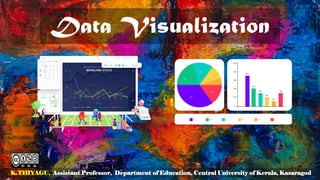
  • 2. Data visualization is the process of creating graphical representations of information. This process helps the presenter communicate data in a way that’s easy for the viewer to interpret and draw conclusions. 2
  • 3. Data Visualization Techniques • Pie Chart • Bar Chart • Histogram • Gantt Chart • Heat Map • Box and Whisker Plot • Waterfall Chart • Area Chart • Pictogram Chart • Timeline • Highlight Table • Bullet Graph • Choropleth Map • Word Cloud • Network Diagram • Correlation Matrices 3
  • 4. Pie Chart Pie charts are ideal for illustrating proportions, or part- to-whole comparisons. 4
  • 5. Bar Chart / Bar Graph In this type of visualization, one axis of the chart shows the categories being compared, and the other, a measured value. The length of the bar indicates how each group measures according to the value. 5
  • 6. Histogram Histograms illustrate the distribution of data over a continuous interval or defined period. These visualizations are helpful in identifying where values are concentrated, as well as where there are gaps or unusual values. Histograms are especially useful for showing the frequency of a particular occurrence. 6
  • 7. Gantt Chart Gantt charts are particularly common in project management, as they’re useful in illustrating a project timeline or progression of tasks. In this type of chart, tasks to be performed are listed on the vertical axis and time intervals on the horizontal axis. Horizontal bars in the body of the chart represent the duration of each activity. 7
  • 8. Heat Map A heat map is a type of visualization used to show differences in data through variations in color. These charts use color to communicate values in a way that makes it easy for the viewer to quickly identify trends. Having a clear legend is necessary in order for a user to successfully read and interpret a heatmap. 8
  • 9. A Box and Whisker Plot A box and whisker plot, or box plot, provides a visual summary of data through its quartiles. First, a box is drawn from the first quartile to the third of the data set. A line within the box represents the median. “Whiskers,” or lines, are then drawn extending from the box to the minimum (lower extreme) and maximum (upper extreme). Outliers are represented by individual points that are in-line with the whiskers. This type of chart is helpful in quickly identifying whether or not the data is symmetrical or skewed. 9
  • 10. Waterfall Chart Waterfall chart is a visual representation that illustrates how a value changes as it’s influenced by different factors, such as time. The main goal of this chart is to show the viewer how a value has grown or declined over a defined period. For example, waterfall charts are popular for showing spending or earnings over time. 10
  • 11. Area Chart An area chart, or area graph, is a variation on a basic line graph in which the area underneath the line is shaded to represent the total value of each data point. When several data series must be compared on the same graph, stacked area charts are used. 11
  • 12. Scatter Plot A scatter plot displays data for two variables as represented by points plotted against the horizontal and vertical axis. This type of data visualization is useful in illustrating the relationships that exist between variables and can be used to identify trends or correlations in data. 12
  • 13. Pictogram Chart Pictogram charts, or pictograph charts, are particularly useful for presenting simple data in a more visual and engaging way. These charts use icons to visualize data, with each icon representing a different value or category. 13
  • 14. Timeline Timelines are the most effective way to visualize a sequence of events in chronological order. Timelines are used to communicate time-related information and display historical data. 14
  • 15. Highlight Table By highlighting cells in the table with color, you can make it easier for viewers to quickly spot trends and patterns in the data. These visualizations are useful for comparing categorical data. 15
  • 16. Bullet Graph A bullet graph is a variation of a bar graph that can act as an alternative to dashboard gauges to represent performance data. In a bullet graph, the darker horizontal bar in the middle of the chart represents the actual value, while the vertical line represents a comparative value, or target. If the horizontal bar passes the vertical line, the target for that metric has been surpassed. Additionally, the segmented colored sections behind the horizontal bar represent range scores, such as “poor,” “fair,” or “good.” 16
  • 17. Choropleth Maps A choropleth map uses color, shading, and other patterns to visualize numerical values across geographic regions. These visualizations use a progression of color (or shading) on a spectrum to distinguish high values from low. Choropleth maps allow viewers to see how a variable changes from one region to the next. 17
  • 18. Word Cloud A word cloud, or tag cloud, is a visual representation of text data in which the size of the word is proportional to its frequency. The more often a specific word appears in a dataset, the larger it appears in the visualization. In addition to size, words often appear bolder or follow a specific color scheme depending on their frequency. 18
  • 19. Network Diagram Network diagrams are a type of data visualization that represent relationships between qualitative data points. These visualizations are composed of nodes and links, also called edges. Nodes are singular data points that are connected to other nodes through edges, which show the relationship between multiple nodes. 19
  • 20. Correlation Matrix A correlation matrix is a table that shows correlation coefficients between variables. Each cell represents the relationship between two variables, and a color scale is used to communicate whether the variables are correlated and to what extent. 20
  • 21. Other Data Visualisation • Bubble clouds • Cartograms • Circle views • Dendrograms • Dot distribution maps • Open-high-low-close charts • Polar areas https://online.hbs.edu/blog/post/data-visualization-techniques • Radial trees • Ring Charts • Sankey diagram • Span charts • Streamgraphs • Treemaps • Wedge stack graphs • Violin plots 21
  • 22. Thank You K.THIYAGU, Assistant Professor, Department of Education, Central University of Kerala, Kasaragod 22