SlideShare a Scribd company logo
1 of 47
Download to read offline
Client:
University College of Northern Denmark
Technology and Business - Web Development Top-up Programme
Class: pwei2014
Supervisor: Nadeem Iftikhar
Bianca Amza
Submission Date: 18th
of June 2015
BACHELOR THESIS
Project participants:
Toni Peychev
Danske Slotshoteller
Mobile Website for Danske Slotshoteller
TABLE OF CONTENTS TABLE OF CONTENTS 3Page
INTRODUCTION5
Overview of the company ����������������������5
Problem delimitation ��������������������������������5
Problem Formulation ��������������������������������6
Project Objectives��������������������������������6
Purpose of the project������������������������������6
METHODOLOGY���������������������������������������������7
Introduction to methodology������������������7
Five planes of UX����������������������������������������7
Iterative Waterfall model��������������������������8
STAKEHOLDER ANALYSIS�����������������������������13
Planning����������������������������������������������������13
1. Identify the project stakeholders��13
2. Prioritize the stakeholders ��������������14
3. Organize the stakeholders ������������15
TARGET GROUP ANALYSIS���������������������������17
PERSONA PROFILE NO.1�������������������������������20
PERSONA PROFILE NO.2�������������������������������22
USER JOURNEY NO. 1 (bad) �����������������������24
USER JOURNEY NO. 2 (bad) �����������������������26
USER NEEDS  SITE OBJECTIVES�������������������28
User Needs������������������������������������������������28
Site Objectives ����������������������������������������29
1. Content Requirements��������������������29
2. Features��������������������������������������������29
SWOT Analysis���������������������������������������������30
COMPETITOR ANALYSIS�������������������������������31
1st
COMPETITOR: SØRUP SLOT������������31
2nd
COMPETITOR: HAVREHOLM SLOT 32
3rd
COMPETITOR: HINDSGAVL SLOT����34
4th
COMPETITOR: DRONNINGLUND SLOT
��������������������������������������������������������������36
COMPARISON������������������������������������������38
CONCLUSION ������������������������������������������42
SWOT Analysis���������������������������������������������44
THE STRUCTURE PLANE���������������������������������45
	 USER JOURNEY NO. 3 (good)�����������46
	 USER JOURNEY NO. 4 (good)�����������48
Planning����������������������������������������������������50
1.0 Defining the structure������������������������51
1.1 Interaction Design ������������������������51
1.2 Information Architecture��������������52
Content Structure: Categories����������52
1. General information about the ho-
tels ��������������������������������������������������������52
2. Specific information about each one
of the hotels ����������������������������������������53
2.0 Mapping the content. Sitemap ������54
2.1 The “Closed Card Sorting” Method
��������������������������������������������������������������54
2.2 Choosing the right structure��������55
Sitemap������������������������������������������������56
THE SKELETON PLANE�����������������������������������57
Interface Design��������������������������������������57
Planning����������������������������������������������������57
Navigation Design ����������������������������������58
Global Navigation������������������������������59
Local Navigation ��������������������������������60
Contextual Navigation ����������������������60
Information Design����������������������������������61
Sketches  Wireframes ����������������������62
THE SURFACE PLANE�������������������������������������64
Visual Design��������������������������������������������64
Contrast������������������������������������������������64
Functional Regions������������������������������65
Consistency������������������������������������������66
Considerations for mobile content����66
The Chrome����������������������������������������������67
Progressive Disclosure ������������������������67
Colours Theory������������������������������������������68
Functional Colors��������������������������������69
Typography  Legibility�����������������������������71
GESTALT PRINCIPLES�������������������������������������72
Parallelism��������������������������������������������72
Enclosure����������������������������������������������72
Proximity ����������������������������������������������72
Similarity������������������������������������������������73
Common Fate��������������������������������������73
IMPLEMENTATION�����������������������������������������74
Introduction����������������������������������������������74
Technologies used����������������������������������74
Setting up the environment��������������������77
Sub-domain vs. Sub-directory������������77
Creating http://m.slotshotel.dk����������77
Redirecting  Mobile detection in
Joomla ������������������������������������������������78
FUTURE CONSIDERATIONS���������������������������80
Features����������������������������������������������������80
CONCLUSION�����������������������������������������������81
LITERATURE  REFERENCES���������������������������82
APPENDIX�����������������������������������������������������84
4 UCN Web Development Bachelor Thesis INTRODUCTION
Danske Slotshoteller is a chain of six classical
castles and manors which have been re-
stored with respect for their age and history.
The hotels are located in different parts of
the country and each one of them is deco-
rated in its own style, with its own restaurant
and nearby attractions.
However, for all these six hotels, there is only
one website, www.slotshotel.dk consisting
of all the information related to them and
their business. The website is functional and
offering a variety of features, from gener-
al details about the services offered to the
clients, to information about each one of
the hotels, online booking system and gift
voucher promotions. Obviously, further im-
provements can be made, but creating a
hierarchy with the priorities is necessary in
order to keep a clear evidence over the
whole process.
The main and the most important aspects
is represented by the accessibility and the
client receiving the message the business is
sending. Either we are talking about a holi-
day special offer or a promotion for the lat-
est phone released, it is crucial for the user
to be able to reach this piece of informa-
tion. In our case, we are talking about news-
letters, schedules, different discounts and
offers for stays at the hotels and a lot others.
The first question that has to be answered
is: “How?” How can a client reach this infor-
mation? As previously mentioned, the main
information and all the details regarding the
hotels and their services are stored in one
place: www.slotshotel.dk. So, of course, the
question becomes: “How can a user access
the website and implicitly the information that
he/she is looking for?”
Depending on the device used, there are
several possible answers to this question.
Originally, the website was designed main-
ly for desktop computers and laptops, but
as the number of people who browse the
internet by using their mobile phones has
dramatically increased, a mobile version
of the website seems to be more and more
necessary.
According to www.dst.dk (Denmark in Fig-
ures 2013):
“The Internet has become widely popular in the
everyday life of the Danes – and the mobile
phone is increasingly used for this purpose. More
than half of all mobile phone owners use their
mobile phone when they browse the Internet,
and a third send and receive emails via their
mobile phone. Today, 92 per cent of all Danes
have access to the Internet from their home.
E-mail is the most common purpose of using the
Internet, followed by search for information on
goods and internet banking.”
The client’s request was to develop and
create a new way the information is being
presented to the user on smaller devices
than a normal sized notebook, as he clearly
specified that there is a lot of extra informa-
tion on the original webpage that it is use-
less to have and read on a smart phone.
(E.g.: history of the hotels - it is less likely that
a user would prefer reading a long piece of
text about the hotels a hundred years ago,
instead of watching a video or browse on
Facebook).
Overview of the company
Problem delimitation
6 UCN Web Development Bachelor Thesis METHODOLOGY
In addition, the current design of the site has
been designed specifically for desktop com-
puters, laptops, and bigger devices than a
mobile phone, so despite the efforts of mak-
ing it responsive and more user-friendly, a
mobile version is still highly recommended.
One of the reasons for this is given by the
chaotic structure of the website (due to the
smaller screen size) and therefore by the dif-
ficulty the user is facing when trying to nav-
igate and find the info he is looking for. The
extra information makes the process slower
and can be irritating, especially when more
and more clients checking the hotels and
their offers are doing it from their mobile
phones.
What the client is aiming for is a clear, friendly
way of presenting the most important infor-
mation (prices, schedule, locations, book-
ing) no matter the device used for it as he is
unsatisfied with the fact that a lot of clients
are lost due to these issues.
How to develop an effective mobile version
of the current website which will enhance
the services Danske Slotshoteller offers and
improve the user experience so both the
company and the client will benefit from it?
The purpose of this project is to create a
new way of presenting the information re-
lated to the hotels on smaller devices such
as smartphones or tablets. The current web-
site (www.slotshotel.dk) includes all the nec-
essary details about the six hotels, but the
way it is structured does not reflect the user’s
needs when using an iPhone for example.
There is a lot extra-information that needs to
be removed, so “cut the fluff” will be one of
the main objectives along with properly re-
organizing the rest of the content to fit small-
er devices.
By creating a mobile version of this website,
the client aims to make the information eas-
ier to reach and access and therefore more
attractive for new and regular customers
due to the simplicity and the logic way of
structuring the most essential pieces of data.
Problem Formulation
Purpose of the project
1.	 Project management
2.	 Collect data by personally interview-
ing the people
3.	 Develop a new concept for the mo-
bile website
4.	 Create UX - The user experience de-
velopment process means first of all mak-
ing sure that every aspect of the UX has
been taken into consideration and un-
der control. In other words, creating UX
is more or less anticipating every action
the user is likely to take and understand-
ing its expectations at any step through-
out the whole process.
5.	 Create a new environment for the
mobile website
6.	 Implement the concept by using an
appropriate CMS platform
Project Objectives
This chapter will introduce and describe the
collection of our chosen methods, process-
es and considerations which have defined
and shaped the project. Adevelopment
methodology is the framework used tostruc-
ture, plan, and control the overall process of
developing during a project.
Over the years a large variety of differ-
ent methodologies have emerged and
evolved, each offering a specific set of ad-
vantages and disadvantages.This is the rea-
son no methodology is uniform and as pro-
jects vary in their level of complexity, scope,
team size, duration and numerous other
variables, so can different methodologies fit
better or worse for a specific project’s work-
flow.
Choosing the best suited methodology is
crucial for a project’s success and it is one
of the first things that should be decided af-
ter careful and extensive consideration. The
base three options we had in the beginning
were either to adopt an existing method-
ology, create our own, or take the middle
route and use one that exists, but change
and adapt it to suit our needs better. Given
the limited amount of time we had, we de-
cided it is too risky to choose the second op-
tion and instead opted to turn to the more
traditional and well known approaches that
we were already familiar with.
Furthermore, since one of the major aspects
of our problem definition was to empha-
size the importance of user experience (UX)
and produce a user-centered product, a
supplementing UX design process had to
be introduced as well in order to achieve a
consistent outcome in the end product and
delivera positive experience to users.
Introduction to methodology
Five planes of UX
There are multiple processes used by UX designers, and no single process fits everyone. All
of them however have a somewhat similar set of principles, and can be applied to comple-
ment many existing methodologies and frameworks such as Agile and waterfall.Different
processes and people might give different labels to these concepts, but ultimately they
can represent any major UX process, such as the Double Diamond1
(Design Council, UK,
2005) and the Five planes of UX2
(Jesse James Garett, CA, USA, 2000):
1. http://www.designcouncil.org.uk/news-opinion/design-process-what-double-diamond
2. http://www.jjg.net/elements/pdf/elements_ch02.pdf
Strategy → Research → Analysis → Design → Production
TABLE OF CONTENTS 98 UCN Web Development Bachelor Thesis Iterative Waterfall model
Since we have been using the Five planes of UX in the past and we are familiar with its
linear, yet incremental nature, we decided it is in our interest to follow it as a conceptual
framework. It consists of the following phases (or “planes”):
Strategy → Scope → Structure → Skeleton → Surface
In his essential UX book The Elements of User Experience1
, Garrett explains the framework as
“On the lowest plane, we are not concerned with the final shape of the site, product, or service at
all — we only care about how the site will fit into our strategy (while meeting the needs of our users).
On the highest plane, we are only concerned with the most concrete details of the appearance
of the product.” (pg 21). This model seeks to define the key considerations that go into the
development of user experience on the Web and is does not describea development pro-
cess, but is supplementary to it.
1. http://www.jjg.net/elements/pdf/elements_ch02.pdf
Iterative Waterfall model
When choosing the most appropriate method, we had to take into considerations the fol-
lowing factors: the size of our team (2); the duration of the project (2 months); level of expe-
rience with project management, design, and implementation (low to medium) etc. and
compare with the characteristics of the Waterfall and Agile groups of methodologies.
The Waterfall approach is linear in nature,
which means it is divided into sequential
phases and each phase must be finalized
before the next one is initiated, with no turn-
ing back at later stages allowed, since it
disrupts the strictness of the milestones and
deadlines.
It focuses on following time schedules,
meeting target dates and building an entire
system at once after extensive analysis and
written documentation.
Compared to the agile framework, which
emphasizes quick, periodic deliverables
(usually called sprints) of client-prioritized
features, it requires thoroughly research-
ing and understanding requirements in ad-
vance and is a lot more limiting in flexibility
and handling of changes.
a.	 The team and the client agree on what will be delivered early in the development life-
cycle. This makes designing and implementation a lot more straightforward, since a lot of
effort is put in figuring out the scope of the work beforehand;
b.	 Providing some degree of safety for inexperienced teams, since its orderly sequence
of development steps and tight predefined scheduling results in the delivery of a product
which is based upon a more complete understanding of all deliverables;
c.	 Except for arranged meetings, the clients involvement is not needed after the require-
ments phase;
d.	 Provides a clearer sense of progress due to its step-by-step nature;
e.	 Last, but not least, we believed that the required careful documentation of all phases
was not only perfectly compatible with the steps in UX processes, but could also give us
enough relevant material to analyze defend in our report;
However, pure Waterfall development has
a number of drawbacks that could disrupt
the workflow and cause a snowball-effect,
such as the inability to backtrack in order to
add or modify requirements, unpredictabil-
ity towards change and possible reduced
manageability due to lack of iterations. This
got us thinking – was there a way to intro-
duce iterations in a Waterfall approach and
what might the repercussions be.
Further researching the idea produced sur-
prising results. In his 1970 paper “Managing
the Development of Large Software Sys-
tems”2
, Winston Royce - the inventor of the
Waterfall approach himself, states that the
method is flawed, calling it “risky and invit-
ing failure”. Not only this, but he continues
to declare that an Iterative Waterfall ap-
proach is superior and is the next (and prac-
tically not the last) natural step in eliminat-
ing development risks.
Although still quite complex to use with large
projects, adapting this philosophy to our
needs in a smaller, more narrowed down
scale for the creation of a mobile website
seemed like the perfect solution for us.
The first step in order to adapt the Iterative
Waterfall model to our project was to use
only the necessary steps we need and omit
the rest, reducing the complexity level and
allowing further breaking down in incre-
ments. Three iterative development cycles
were established, each requiring the pre-
vious to be completed, but also providing
the possibility to backtrack and make cor-
rections if needed. Simultaneously, the Five
planes of UX are also introduced gradually,
corresponding to the cycle at hand.
While it is usually used in large-scale, long and complex projects, some of its advantages for
our project seemed very fitting:
1.
2. http://leadinganswers.typepad.com/leading_answers/files/original_waterfall_paper_winston_royce.pdf
TABLE OF CONTENTS 11Page10 UCN Web Development Bachelor Thesis
The first cycle consists of the REQUIREMENTS
 ANALYSIS phases and with them begins
the process of understanding the abstract
state of the situation by researching, de-
ducing and documenting the findings. The
first cycle is iterated three times, once for
each consecutive plane. For the STRATEGY
plane, we focus on product objectives and
user needs; the SCOPE plane sets in place
the content and functionality specifications
by defining and prioritizing them; and the
STRUCTURE plane iteration sees ideas mov-
ing away from their abstract origins and
taking shape by focusing on a more precise
interaction design and information archi-
tecture.
The second cycle marks the beginning of
the DESIGN  DEVELOPMENT phases, which
are iterated twice. First, during the SKELETON
plane we design the interface  naviga-
tional design, so that the elements are both
easily accessible and clearly understood by
the users; and lastly, the SURFACE plane iter-
ation is used to finalize all visual details and
establish a concrete presence. The project
should be in a deployable state after the
last iteration (deadline).
The third cycle is special and a little bit dif-
ferent than the first two, as it has no overlap-
ping planes and iterations there don’t have
a minimum or maximum count. It involves
DEPLOYMENT, TESTING  MAINTENANCE for
an already developed mobile website and
they will start taking place after the client
receives the product. They are a continu-
ous, looping future phase in the project and
the frequency of the iterations depends on
how the client feels about the product and
how he plans to develop it in the long term.
12 UCN Web Development Bachelor Thesis STAKEHOLDER ANALYSIS
Rather than randomly writing them down on
a paper, a brainstorm to generate a com-
prehensive list of stakeholders, consisting of
a set of questions will be conducted. The
questions that needed to be answered in
order to get a quick overview of the stake-
holders are displayed below:
Questions:
a.	 Who initiated the project?
b.	 Who will benefit after the project com-
pletion? Who is the client?
c.	 Who will be responsible for the mainte-
nance after the implementation?
d.	 Who is directly involved in the project?
e.	 Who is financing and supplying the re-
sources for the project?
f.	 Who will be influenced by the results of
the project?
g.	 Who has external influence in the pro-
ject?
h.	 Who will manage the project after com-
pletion?
“Stakeholder management is critical to the success of every project in every organization I have
ever worked with. By engaging the right people in the right way in your project, you can make a big
difference to its success... and to your career.” – Rachel Thompson, Mind Tools
A stakeholder analysis was necessary in order to identify the people be involved in the pro-
ject, how and to what extent a person or a group of people influences the development
process. Besides this, it is essential to know how people with different roles are influenced
by the project after implementation in order to uncover their expectations and ensure they
are met or revised for further changes.
The analysis is structured into few different steps that allow the correct identification of all
the stakeholders and their roles in the development process of the project.
Planning
1.	 Identify the project stakeholders
2.	 Prioritize the stakeholders: IMPORTANCE and INFLUENCE over the project
3.	 Organize the stakeholders: POWER and INTEREST in the project
The analysis outcome should provide the team with a clear idea over the people in-
volved in the project, their expectations, the relationships they have and the roles each
one of them is playing in the project life cycle.
1. Identify the project stakeholders
RESEARCH PHASE
TABLE OF CONTENTS 15Page14 UCN Web Development Bachelor Thesis
Answers:
a.	 Danske Slotshoteller, web developing
team (students)
b.	 Danske Slotshoteller and their clients
c.	 Danske Slotshoteller and their technical
support team (employee)
d.	 Danske Slotshoteller owner, developing
team (students), project supervisor (UCN
teacher)
e.	 Danske Slotshoteller
f.	 Danske Slotshoteller and their clients,
competitors
g.	 Competitors
h.	 Danske Slotshoteller, Danske Slotshotell-
er technical support (employees)
After summarizing the answers, a first list of the stakeholders involved in the project has been
made and can be seen below:
»» Danske Slotshoteller (project manager, technical support, employees)
»» Danske Slotshoteller clients (people visiting the hotels and other potential clients)
»» Competitors (other hotels in Denmark, especially in the nearby areas of the hotels)
»» Project supervisor (UCN teacher)
»» Web Developing team (students)
2. Prioritize the stakeholders: IMPORTANCE  INFLUENCE
After identifying the stakeholders, the next step of the process is to organize the list created
in the first phase according to the importance and influence that each stakeholder has in
the project.
Danske Slotshoteller CEO (owner) has a
great influence throughout the whole de-
velopment process as he assists the team
with regular feedback at each step. Using
an agile method for the project life requires
first of all great client insight, constant con-
tact with him and this is nevertheless making
the whole process more dynamic due to
the unpredictable flow of events.
The hotels technical support and the pro-
ject supervisor are also stakeholders since
they are collaborating with the project
team and have valuable knowledge and
the necessary skills in different matters (e.g.
provides with helpful info about the server
configuration and the environment of the
future mobile website, gives advice about
design). They do not have any decisional
power though and therefore no influence in
the process.
The developers (students) are the active
participants stakeholders in the project
since they have the relevant skills to imple-
ment the solution; no doubt they are one of
the most influential factors when a decision
is being taken as the course of the project
depends mostly on them.
Aside from the people directly involved in
the project, there are also stakeholders who
will be influenced by the project after its im-
plementation and are not necessary in its or-
ganization. They do not have any influence
over the actual developing process, but
they make the difference between a poor
and a successful product. The outside pro-
ject stakeholders in this case are the users
(clients of the hotels) and the competitors.
3. Organize the stakeholders: POWER  INTEREST
The purpose of this analysis is to understand who the stakeholders are, their expectations
and the way they react to the project. It is important to know how to engage them and the
most effective way of communication.
Organizing them by the power they have in the project and the interest they have in the
whole working process helps at finding out who are the stakeholders that need to be in-
formed about the development, how often, and the stakeholders that should be fully satis-
fied by the outcome of the project and managed closely.
High Power, interested people
The stakeholders who are affected by the
project during its life-cycle are Danske Slot-
shoteller CEO, the UCN supervisor and, of
course, the developing team (students).
The CEO is obviously interested in the project
since he is the one who helped at shaping
the initial requirements and started the pro-
ject and if he is not pleased with the direc-
tion the project is moving to (either design
or functional aspects), than further changes
should be taken into consideration immedi-
ately.
16 UCN Web Development Bachelor Thesis TARGET GROUP ANALYSIS
Therefore, it is safe to assume that the CEO is
the stakeholder with the highest importance
and should be kept satisfied and up-to-date
at all times.
In close relation to the CEO is the develop-
ing team who is responsible for building the
product while fulfilling the client’s require-
ments . The developing team is also very in-
terested in successfully completing the pro-
ject and create a satisfactory product and
is the stakeholder who connects all the oth-
ers and ensures a smooth process.
Low Power, Interested people
The supervisor is a stakeholder who does
not have any decisional power over the
project, but his role is essential because he
is providing the team with helpful feedback
and further guidance. He should be though
kept informed about the developing pro-
cess so he can give advice. His interest in
the project is to help the developing team
(students) to complete it.
The technical support as a stakeholder is
involved in the project due to their knowl-
edge about the company, its servers and
their configuration. This stakeholder’s role is
to help the developing team with informa-
tion about the system, setting up a proper
environment for the product (mobile web-
site) and the best methods to work with it.
His interest in the project is to make sure that
the system is handled properly and the pro-
cess is running in a safe secure background
that will not create any problems.
The stakeholders who are most likely to be
influenced by the project after its comple-
tion are Danske Slotshoteller, clients of Dan-
ske Slotshoteller (people who are visiting or
are planning to book a stay at one of the
hotels) and competitors of Danske Slotsho-
teller. The last two of them hardly influence
the developing process of the project, but a
detailed analysis will be conducted for both
from different reasons.
Low Power, Less interested people
First of all, it is important to know who are the
people using the hotels services and how to
properly reach other potential customers,
but it is even more important to know how
to keep them satisfied and build a product
up to their expectations.
On the other hand, a competitor analysis is
also necessary in order to find out the weak-
ness and the strengths of the competition
and take advantage of them. However, this
stakeholder has no power over the project
and it will be influenced by the its outcome.
An analysis of the market is critical to the success of any product and our mobile website
is no different. Understanding the target audience and knowing how to effectively reach
them is vital and can often mean the difference between a good and a greater success
rate.
The reason this is important is because it helps to shape the product to best meet the needs
of the market as well as determining the most effective way to reach target audience.
Before beginning an audience analysis it is advisable to come up with a list of guideline
questions that will be answered by completing the research and give an overview of the
target market.
These questions can be grouped into four parts: who, why, where and how. The following
analysis is also based on the interview with the client and partially supplemented by the
public research documents “Denmark in figures” (2013), “Mobile phones in Denmark” (2013), as
well as basic marketing theory (http://www.about.com/money).
WHO?
The first question that must be answered in
the beginning of an audience analysis is
“Who are the targets?”
It includes demographic analysis and ad-
dresses age, gender, marital status, income,
span, etc. Since the services offered at
Danske Slotshoteller are varied and aimed
at specific occasions, it also reflects on the
above variables. The main purposes for a
visit at one of the hotels are the following:
marriages, business meetings, confirmation,
birthdays  general parties, as well as fami-
ly holidays. This automatically broadens the
characteristics of the target group.
Marriages are organized mostly by couples
of ages 30+; business meetings are booked
by corporate request and include a pre-
dominant male percentage and similar age
group of 30+; confirmation is a coming-of-
age Christian ritual usually performed with
male or female young adolescents of age
group 13-23; birthdays  parties for different
TABLE OF CONTENTS 19Page18 UCN Web Development Bachelor Thesis
occasions can include virtually any gender
 age, and the same goes for family visits.
By summing up these delimitations, it turns
out the total age limit goes all the way from
teenagers to elderly people. However, ac-
tual bookings are made by users of legal
age, who have a sufficient  constant cur-
rent income rate, which narrows down the
group to 30-60 years of age working profes-
sionals.
WHY?
The next set of questions that must be asked
is “Why does the market need this product?”
Understanding why the market would be in-
terested in the product can assist in custom-
izing the item to best meet the desires of the
target audience. Since the purpose of the
project is to introduce the greatest ease of
access to information  booking on a mo-
bile phone, it is noteworthy to realize wheth-
er the above established demographic will
find it useful.
A statistical overview of smartphone
sales and use of mobile internet offers a
deeper understanding of the issue. With
2012 marking an all-time high of smart-
phone sales, an even higher peak pro-
jected for 2016, and given the fact that,
as of 2012, 97% of Danish families have at
least one mobile phone with more than
50% of individual users accessing the
internet on their phones, the numbers
strongly suggest that more than half of
the target audience might stumble on
the mobile website for one reason or an-
other (NB! Research excludes tablet use 
market share).
Given these numbers, it is imperative that
we make sure that once they do, their ex-
perience is 100% hassle-free, information is
presented in a ”rush-friendly” manner and
contact and booking functions are a few
clicks away.
WHERE?
Once who the target audience is and why
they need the new product is ascertained,
the next question is “Where are they?”
This information is important because it
helps to determine how to reach the au-
dience and get the message out in the
marketplace. According to the information
gathered by interviewing the client, approx-
imately 50% of all guests are regulars and
50% are newcomers.
This ratio actually presents a great strategic
opportunity for launching a new and im-
proved mobile website, because virtually
half the clients are yetto be introduced to
Danske Slotshoteller, and first impressions of
usability and presentation can be crucial to
converting prospects to regulars.
As far as the regulars are concerned, there
is always the opportunity for those familiar
with the current mobile website to dislike the
new version, but the ones who use it for the
first time should exceed and replace lost cli-
ents, if any.
Furthermore, roughly 75% of all guests are
Danish, 15% are Norwegian and 10% are
American. In this case, however, their virtual
presence is far more important than their ge-
ographic location – the majority of foreign
visitors come mostly for family holidays and
to a lesser degree for business meetings.
This has to make us think: how do you plan
such a trip abroad and it is safe to assume
that the answer is “online”. Therefore, a bet-
ter established digital presence can not
only facilitate existing foreign clients, but
even increase their number should they are
pleased enough on first impression.
Same logic can be applied for some of the
Danish clients, who have also proved to pre-
fer online booking through “Expedia.com” 
“Booking.com”, compared to by phone or
by client’s own booking system.
HOW?
After achieving a greater insight of where
the customers might be located, who they
are, and why they need the product, we
can finallywonder about:
“How can we spread the word to the target au-
dience?”
Physically reaching the existing audience is
only one aspect of this, however.The mes-
sage must be crafted in such a way thatit
gets the target to notice and realize the im-
portance, value and benefits of using the
new product.In order to succeed at doing
this, a simple, but subtle marketing cam-
paign can be introduced.
Locally, a non-intrusive distribution ofspecif-
ically designed flyers and/or business cards
at hotels’ reception desks or directly mailing
thecurrent newsletter subscribers can prove
to be effective.
Digitally, inexpensive advertisement options
can be utilized, such as promoting in social
media and partnering websites;integra-
tion in desktop version of website via a QR
code; as well as establishing a strategically
active presence on selected web commu-
nities, such as wedding forums (http://www.
bryllupsklar.dk), Christianity-related portals
(http://www.konfirmationsportalen.dk/),
etc.
In the long term, more solid investments
might be made, like advertising on more
popular expensive holiday platforms or
even improving own booking system, if fi-
nancially feasible at the time.
TABLE OF CONTENTS 21PagePERSONA PROFILE NO.1
Amanda Smith
DEMOGRAPHIC
DATA
Amanda has expressed her interest in
photography from a very early age and she has
never doubted what her dream job is. She is
working as a freelance photographer, has flexible
working hours and more than sufficient income.
Due to her career choice, she is more or less
familiar with modern technologies and is an
above-average user. She has been happily
married for almost 5 years and has no children.
Age: 32
Gender: Female
Location: Bakersfield, CA, USA
Occupation: Self-employed
Position: Photographer
Income: 21.000 kr/month
BACKGROUND
DATA
GOALS 
CONSIDERATIONS
Primary: Amanda and her husband are going to
have their 5 years anniversary as a married
couple in a few months and she is determined
to go on a romantic one week holiday to
celebrate the occasion. She loves travelling and
wants to experience the summer in Europe. She
is focused on finding a luxurious big hotel in a
quiet out-of-town area with beautiful nature
and preferably a restaurant with a wide
selection of good wines.
Secondary: Since photography is her second
love, she would also enjoy being able to visit a
picturesque place and take photos of the
moments she shares together with her
husband. That is why it is important for her to
get a good view of the vicinity of the hotel and
see what attractions lie in close proximity.
Devices used:
• Smartphone (Samsung Galaxy S6 Edge);
• Laptop (Asus Zenbook)
Emotions  traits:
• Joyful, positive, open-
minded, artistic
personality;
• Active, decisive, confident
in what she wants;
• Appreciates good ideas,
creative thinking and
visuals that tell a story.
• More of a cat person.
Pain points  frustrations:
• Unintuitive services;
• Improperly communicated ideas;
• Technical mishandling of features;
TABLE OF CONTENTS 23PagePERSONA PROFILE NO.2
Christian Holm Andersen
DEMOGRAPHIC
DATA
After finishing his BsC in Business administration
and MsC in Human Resources Development,
Christian has increasingly been promoted over the
years and has had quite a successful career. He is
currently working for a Marketing  finance
company in a high-ranking responsible position. He
is not an IT expert, but due to extensive use of his
company-provided Apple products, he has his way
around modern devices. Christian has been married
for 24 years and has two daughters, ages 23  21.
Age: 52
Gender: Male
Location: Aalborg, Denmark
Occupation: Marketing  Finance
Position: HR manager
Income: 35.000 kr/month
BACKGROUND
DATA
GOALS 
CONSIDERATIONS
Primary: The company is expanding and a new
branch has been opened recently. The CEO has
asked Christian to organize and lead a seminar
and a week of team building activities in the end
of July for the new employees in order to help
them to get to know and trust each other more,
thus becoming a better and more efficient
team. He has to research the available options
and send a list of his best recommendations to
the CEO.
Secondary: Christian is experienced with
organizing team building activities and knows
that people get to know each other much more
quickly if some sort of team sport or game is
involved. He also wants to take full advantage of
the nice weather and find a hotel which is out in
the nature, has a fully equipped business hall
and can organize a party for the last day of stay
Devices used:
 Smartphone (Apple iPhone 6);
 Tablet (Apple iPad Air 2)
 Laptop (Apple Macbook Air)
Emotions  traits:
 Calm, calculating, patient
personality;
 Professional, analytical,
systematic in his tasks;
 Appreciates proper
researching before making
decisions; simple solutions
to complex problems;
straight-to-the point
communication;
 Vegetarian, but loves fish;
Pain points  frustrations:
 Chaotic and confusing visuals;
 Unclear developers’ intent on features;
 Unnecessary  unrelated information;
TABLE OF CONTENTS 25Page
USER JOURNEY NO. 1 (bad)
A user journey is a series of steps which represent a scenario in which theuser might interact with the product in order to complete his goal. User journeys can help usunderstand how users are going to interact with our website and what are
their expectations from it. Two user journeys are going to be presented for each persona involved –showcasing both the current situation with its weaknesses and the new and improved concept which is supposed to improve their experience.
Amanda stumbles upon www.slotshotel.dk – a website representing a chain of six
hotels of her chosen type. That is the first step in her user journey and the first thing
she sees is a homepage in gold, vintage-looking cozy color, displaying a map of
Denmark with 6 marked locations, one for every hotel.Instinctively, she tries clicking
on one of the locations, given their strong resemblance to links, but nothing hap-
pens. She zooms in and tries clicking on all of them. But soon she realizes nothing will
come of it, so she starts scrolling (minor pain point).
After scrolling down the homepage and reading some introducto-
ry information, she feels encouraged because it sounds exactly like
the place she is looking for. At the bottom of the page, right after
the text finishes, she sees two buttons – for bookings and restaurant.
Influenced by the things she is particularly interested in, she makes a
decision:
Amanda is sitting at a café after meeting a potential client for her services as a
photographer and is planning her dream summer holiday in Europe on her Sam-
sung Galaxy phone. Based on her requirements, she has figured out she is looking
for an old, fancy, secluded hotel, out in the nature, which means renovated cas-
tles should be exactly what she needs. After checking a number of castles in dif-
ferent countries, she finds a portal, displaying a list of renovated castles  manors
in Denmark and she is intrigued.
Curious if a selection of wines is available in their menu, she clicks on
Restaurants and hopes to find a list of drinks. She is redirected to a
hub page with some text and 6 containers with telephone number
and menu link for each restaurant. Unfortunately for her, all of the
menus contain only food items and no other links are visible to indi-
cate drinks menus. (pain point)
Determined to keep looking, she scrolls back up and checks the
global navigation drop-down menu for clues on where to find a wine
catalogue. Upon clicking on it, she sees a “Wine tasting” tab and
clicks on it. Alongside some confusing information about wine prices,
she sees a number of “Read more” links. She tries the first one, but the
loaded pdf document is more of an overview of wines rather than
a catalogue. She tries the second one and finally sees a complete
list of all the wines. Amanda is feeling a bit frustrated and thinks the
information architecture is not very clever, but is at least reassured
that a wide selection of wines are available (minor pain point).
Amanda has decided the last thing she wants to check is a gallery of the hotels and
their surroundings. She goes back to the home page in order to see the locations
on the map from north to south, and then from the drop down menu selects Hved-
holmSlotshotel – the southernmost hotel in the chain. Although she doesn’t know
Denmark, she seems initially impressed by the short description and is eager to see
the photo gallery. Much to her dismay however, clicking on the according button
yields no results whatsoever. Multiple tapping produces no result and Amanda tries
a different hotel, but to no avail. Disappointed with all the flaws that resulted in a
rather bad user experience for her, she does not even consider trying the booking
function. She puts her phone down and continues her lunch. That marks the end of
the user and she is no longer a prospective customer for DanskeSlotshoteller. (pain
point)
TABLE OF CONTENTS 27PageUSER JOURNEY NO. 2 (bad)
Christian has just got on the plane from Aalborg to Copenhagen,
for a business trip, and takes out his IPad with the intention of finding
the perfect spot for the team building trip he was asked to organize.
Since he is looking to get the team out of the noise of the crowded
city, he uses Google to find out suitable options out in the nature.
Christian’s user journey begins as he stumbles upon www.slotshotel.
dk and the first thing he sees is a map of Denmark with 6 locations
of castles  manors and he immediately notices 3 of them are not
that far away from Aalborg, where the new branch is located – Vraa,
KokkedalStore Restrup. He is intrigued and decides to check if con-
ference options are available.
Without scrolling, Christian immediately accesses the drop down
mega menu and quickly locates “Møderogkonferencer”. He is shortly
redirected to a hub page with introductory information on confer-
ence facilities and three expandable containers with further informa-
tion. Although he finds the text helpful, he cannot help but notice
prices are listed rather chaotically and are hard to figure out andthere
are no instructions on who to call or write to in order to ask about it
(minor pain point).
Using the drop down menu again, he notices the tab “Golfferie”
and he thinks that golf might be the perfect game activity that peo-
ple can enjoy together. All it takes is a single look for him to see that
Store Restrup and Kokkedalhotels offer plenty of golf course options
nearby and that also helps him narrow his choice down. However,
he is again perplexed by the way prices are displayed (per 3 nights
per person) and cannot see who  how to ask for help if he needs to
sign up for more or less than that period (minor pain point).
Feeling a little bit discouraged by the lack of a visible quick contact option, Christian
tries to see if he could check for availability and possibly see how prices are calculated
at check out. He goes back to the home page and scrolls down until he locates the
booking button. After tapping it, he is redirected to the booking screen and is asked to
fill in some details, such as hotel and guest count. He chooses Store Restrup, but surpris-
ingly finds out that the number of guests is limited to 1 or 2. Realizing that around half
a dozen reservation need to be made for the entire team, Christian decides it is not
worth the hassle to use DanskeSlotshoteller’s services and starts searching for a different
establishment (pain point).
TABLE OF CONTENTS 29PageUSER NEEDS  SITE OBJECTIVES
1.	 To be able to reach the necessary information as fast as possible:
Although browsing the web via a mobile device has become extremely common (ref. DK in
figures), single sessions are short because users are usually on the go and they do not dedi-
cate all of their attention to the device. “Instant gratification and quick fixes” are expected
by today’s generation of internet consumers (The Guardian, 2014). This means users should
be able to find answers to all of their questions with minimum effort and zero frustration.
2.	 To be able to reach or contact the hotels at all times in order to receive immedi-
ate assistance in case of confusion and/or inquiries:
A short and easy user journey could prove successful if at any point the user decides to
contact the hotel. This is why it is imperative that an always visible “click-to-call” button can
be accessed at all times and spare the users the need to navigate to a Contact section,
remember a phone number and dial it manually.
3.	 To properly see photos of the hotels exteriors and interiors:
“A picture is worth more than a thousand words” and that stays true in web design as well.
Studies have shown that our brains not only process visuals faster, but they also retain and
transmit much more information when it’s delivered visually.That is why it is crucial to be able
to show visitors images of each hotel quickly and painlessly, in a mobile friendly way – it also
builds trust and users are more likely to make a decision based on impeccable visuals.
4.	 To easily access other people’s reviews on the hotels services and restaurants:
According to different surveys, between 70-90% of users are influenced in their decision by
some type of recommendation (Forbes, 2014). User-submitted content in particular such as
Yelp, Amazon, TripAdvisor, etc. has seen a massive increase of influence over buying deci-
sions and that is why users are more likely to trust us if we provide them with quick and easy
access to TripAdvisor reviews and social medias in order to see previous customers’ experi-
ences;
5.	 To get a simple booking experience:
Even if a client has made his mind and is determined to use our services, a bad booking
experience can mean all the effort we have put is in vain. Furthermore, a section of users
would not even consider calling the hotel in order to complain. That is why a smooth book-
ing experience needs to be used, which facilitates users as much as possible.
User Needs Site Objectives
What Danske Slotshotellert is trying to ac-
complish with the development of a dedi-
cated mobile website is basically to adapt
to the ever growing segment of mobile us-
ers in the market.
While the company does have a currently
functional responsive template which is us-
able on mobile devices, the journey of the
users is far from positive (as showcased later
in User Journeys).
The website has numerous design, informa-
tional, functional and technical problems
which are very hard to fix due to the respon-
sive nature of their main website. That is why
the decision was made to stop trying to fix
everything for all platforms, but invest in a
partial rebranding by introducing an entire-
ly new mobile website.
The new website will retain the mission, vi-
sion and values of the current business mod-
el, but it will include only the most important
piece of information and features, specif-
ically designed to be accessed, displayed
and used on a handheld device.
The long term goal of this is to increase the
flow of new customers and increase the
number of regulars as well by providing a
fulfilling, yet simple user experience. Sec-
ondary objective is to make use of a system
which is easier to maintain and update.
»» The menu icon alongside with the logo is present on all pages of the website
»» Link to the main website visible
»» Link to the web-shop of the hotels
»» Link to the restaurant control reports
»» online booking option
»» representative photos from the hotels
2. Features
1.	 Click-to-call
2.	 Go to main website
3.	 Get directions/Find your way (via
Google Maps)
4.	 Contact information for each one of
the hotels
5.	 Access the hotels on different social
networks (Facebook)
6.	 Travel Guide: Nearby Attractions 
Shopping Centres
7.	 Book via Booking.com
8.	 Reviews from other people who visit-
ed the hotels (via TripAdvisor )
9.	 Restaurant info: schedules, prices,
menus
10.	Photo galleries of the hotels (exterior,
interior, restaurant, wine cellar)
11.	Slideshow with the six hotels on the
front page
12.	Visit the hotels web-shop (for dis-
counts, offers and gift vouchers)
1. Content Requirements
COMPETITOR ANALYSIS
A detailed analysis of all the researched known competitors will be provided below, stressing both
advantages and disadvantages. Based on the analysis, a list of common strengths and weaknesses
will be assessed, which will serve as a basis of the conclusion and will provide important insight into
the functional specifications of the project.
1st
COMPETITOR: SØRUP HERREGAARD
The first competitor on the list is Sorup and
the immediate impression upon loading
their website on mobile is that of a propor-
tionate, segmented and easily perceivable
product, with instantly recognizable and
obvious purpose. Users are introduced to a
simple layout of a logo, menu icon, a transi-
tioning set of images and a welcoming mes-
sage, all scaled to good size.
While overly simplistic, the design is stylish,
consistent and creates the proper perspec-
tive for the specific type of establishment it
represents.
This is further complimented by the excel-
lent addition of Google Business view mod-
ule on the front page, allowing users to take
a virtual tour of the hotel and optimized per-
fectly on mobile. However, upon further in-
spection, a number of flaws appear which
definitely impact negatively the experience
of browsing on a mobile device. Some of
them are caused by the responsive nature
of the website, while others are present in
the desktop version as well.
Probably the biggest problem encountered
is the absence of the Booking function – it
took extensive browsing and scrolling back
and forth in order to locate a small “BOOK”
button, located at the bot-
tom of a sub-menu article
about room prices.
Upon clicking it, a redirection
takes the user to a third-par-
ty, non-responsive, although
usable, booking platform. It
is also worth noting that the
drop-down menu contains a
full site map - links and sub-
links to every section of the
website.
On the plus side, the design
of the menu itself is relevant
and pleasant, much better
than a genericlist of options,
but on the downside, it con-
tains just too many links, feels
Website: www.sorup.dk
Status: Responsive
SWOT Analysis
»» No competitor has a dedicated
mobile website as of yet;
»» Not having to spend time in opti-
mizing all components of a respon-
sive desktop website separately in
order to keep it usable on mobile;
»» Reducing data traffic and load-
ing speed for mobile users;
»» Using a third-party booking system
from Booking.com due to the client
not having a reliable own system;
»» No previous practical experience
in developing a mobile website
withJoomla;
»» Unlike the competition, as much
as 6 hotels need to be properly in-
cluded  presented in 1 website;
»» Learn from competitors’ mistakes
and avoid them;
»» Achieve a new level of accessi-
bility and a uniform ease of use, no
matter the device;
»» Attract new customers by making
a good impression with a superior
website on mobile devices;
»» Using Booking.com for handling
booking operations can actual-
ly turn out to be an advantage –
Booking.com is perfectly optimized
for mobile and is one of the most
popular platforms on the web, so
user might feel more secure  famil-
iar with it;
»» Clients rejecting the complete
redesign of the website - as part of
a brand, a fraction of users can of-
ten react negatively to the change
and switch to using a competitors’
services;
»» Possible difficulty in implementing
some of the more advanced fea-
tures (i.e. GPS control);
»» Website turning out to be more
complex and visuallyconfusing than
expected;
Strengths Weaknesses
Opportunities Threats
TABLE OF CONTENTS 33Page32 UCN Web Development Bachelor Thesis
overcrowded and con-
fusing. Furthermore, a lot
of the sub-menu items are
featured in more than one
menu items, which creates
a lot of redundancy and du-
plicated information.
The information itself is help-
ful, but the presentation
could use some improve-
ments – although the font is
large enough and the text
is easy to read, inconsistent
line lengths, unsuitable align-
ment (centered) and gen-
eral uneven distribution of
images vs. text make it look
less professional than some
of the other competitors.
Another quite serious issue is
that some information is ful-
ly inaccessible while holding
the device in vertical posi-
tion. Sorup is also one of the
two analyzed websites to
feature a search-function,
but unfortunately it falls short
of being able to assist users
in finding specific content
– the list of results is non-de-
scriptive, full of irrelevant 
duplicated results and gen-
erally unhelpful.
While Sorup has some re-
deemable features, such
as the Google Business
View, and is generally usa-
ble on a mobile device, it’s
chaotically spread-out in-
formation and hard to find
booking-function severely
decrease its efficiency.
2nd
COMPETITOR: HAVREHOLM SLOT
Initial reactions to Havre-
holm’s website were mixed
– it is noticeable from first
glance that the logo has
not been done in a vector
graphics program and looks
blurred and unprofessional.
Not only that, but coupled
with the global navigation
bar just beneath it, it takes
half the visible screen (and
the entire visible screen in
horizontal position!) and
filling it mostly with white
space. The transitioning im-
ages are, on the other hand,
only visible while in horizontal
position – in vertical position
they have been stretched
thin and on smaller screens
the users would have a real
problem figuring them out.
The lower part of the screen,
Website: www.havreholm.dk
Status: Responsive
however, contrasts with a
much higher quality. While
a little bit too informative, it
strikes a good balance be-
tween images  text in or-
der to introduce users to the
services they might expect
to find, provides instant and
clear means of booking via
a global “RESERVATION”
button, and definitely cre-
ates a cozy ambiance due
to the visual elements and
neutral color scheme.
However, the negatives
seem to greatly outweigh
the positives as numerous
problems arose after more
extensive use. The drop-
down menu is one of the first
elements to be criticized – it
is generic android/iOS drop-
down list with no alterations,
looking not only bland and
uninviting, but also lacks
form and structure. Further-
more, after any page loads,
it reverts to a default “Go
To” value, which makes it
easy for the user to get lost in
navigation. The other pair of
globally-present items – the
“RESERVATION”  “NYHEDS-
BREV” also fails to live up to
the expectations. While one
would question the logic or
necessity to put a newsletter
function centrally as a glob-
al element, making it look as
important as the booking,
it is an even more puzzling
why it also has links for the
booking itself, given the fact
both are quite visible. When
we also take into account
that most pages contain the
same booking links before
the footer, it really seems
like an overkill to duplicate
the same link so many times,
especially when there is a
global signifier visible from
the start.
However, the single most
crucial problem the webite
faces is the almost complete
impossibility to actually use
the booking function. In or-
der to do so, one is required
to use Booking.com, but not
in a separate window, but
embedded inside a small
section of the page. The re-
sult on a mobile device is dis-
astrous – an extremely small
fraction of the Booking.com
page is visible and inhuman
patience and zealous devo-
tion are required to success-
fully make a booking, which
would take seconds on the
desktop version. The web-
site’s Gallery section is also
poorly optimized for mo-
bile, displaying glitches and
technical problems.
On the bright side, the in-
formation is presented in a
very good manner, font siz-
es are large and readable,
line lengths are suitable and
even though the alignment
of text can be a bit incon-
sistent, the general legibility
is high and the information is
easy to perceive.
TABLE OF CONTENTS 35Page34 UCN Web Development Bachelor Thesis
Website: www.hindsgavl.dk
Status: Responsive
Hindgavl’s website definitely takes a step
up in terms of professionalism and efficien-
cy. Some of the few downsides spotted
are in the home page, which provides no
context on mobile. The layout  design are
less personal, more generic, there is almost
no text to give a clue what the website is
about and the displayed headlines create
the impression of some sort of events por-
tal instead of a hotel. However, the Booking
function is visible right after the page loads,
and there is always a booking button on the
always-present header bar, which makes
room reservation quick and easy at all times,
even when scrolling. While using the book-
ing function users are asked to tilt their de-
vice to horizontal position, and while tablet
users will find it way easier due to the bigger
screen size, booking is also quite easy on a
smartphone as well.
The global drop-down menu is customized,
it is neither overcrowded nor empty, it has
a strong character and users cannot get
lost at all times. As navigation is concerned,
the global menu bar contains links and sub-
links to all sections, and although some local
navigation is also present, it feels largely un-
necessary. Another advantage of Hindsgavl
is the useful search function, which provides
relevant results and good enough context
to show users what they need. Another opti-
mized section is the Gallery, which, although
not perfect, works far better than any of the
3rd
COMPETITOR: HINDSGAVL SLOT competitors’.
As with the other responsive websites, font
size is good and text readable, although
unaligned. There are some inconsistencies
in font type and size on most pages how-
ever, and it feels like too much information
is presented at times, especially given the
high accessibility and easy navigation to all
the important information. This is further so-
lidified by some sections which are not at all
appropriate for a mobile device – namely
the “Press Kit” section, containing down-
loads; the extensive Contacts info, letting
users to contact all employees personally;
and a “Job hos os” section for people look-
ing for a job. While all of the above features
are undisputedly relevant and useful for
their appropriate target group (journalists,
job seekers, ect…) on a desktop, it is doubt-
ful whether they are best suited for a mobile
device.
While not perfect, Hindsgavl’s website has
clearly been designed with mobile access
in mind and that is one of its biggest sell-
ing points – its features are noticeably opti-
mized for smartphones and tablets, it is very
modern and up to date from a design point
of view, even if it is more or less generic, and
it simply feels superior to the other competi-
tors’ websites.
TABLE OF CONTENTS 37Page36 UCN Web Development Bachelor Thesis
4th
COMPETITOR: DRONNINGLUND SLOT
Website: www.dronninglund-slot.dk
Status: Not responsive
Due to its not-responsive nature, Dronnin-
glund slot’s website feels expectedly un-
pleasant to deal with on a mobile device.
It is very hard to point any specific features
that make a good impression. Although the
home splash-page provides clear context
about the nature of the establishment, the
positives unfortunately end here.
As opposed to all previous websites, Dron-
ninglund slot is using some sort of segre-
gated information architecture in order to
separate information into three sub-sites,
dealing with different, but sometimes over-
lapping information. All three of them have
separate global navigation bars, which are
not drop-down, and in order to switch be-
tween them, users are required to first go
back to the front page. All three sub-sites
are full of inconsistencies as well – informa-
tion is very unevenly distributed with some
sections containing as few as a couple of
lines of text; images used vary greatly in
quality – some are visibly more professional
than others, some are used multiple times
and some are very generic.
Visibility is a huge concern, as font size is too
small to be read normally in a hand-held
device, requiring a lot of zooming in. The in-
formation is itself is relevant, but too spread
out and difficult to obtain – and without a
proper search function it can be a rather
chaotic experience. Even when found, it re-
quires a lot of effort to be perceived.
Furthermore, a lot of technical problems 
limitations arise – during browsing a lot of
plugins were marked as “unable to load”
or “disabled” – without a doubt due to the
differences between desktop  mobile de-
vices architecture. Touch areas are also
very hard to guess at times. Gallery section
is prone to lag. Fortunately, booking is possi-
ble due to a redirection to a third party ser-
vice, which is also not optimized for mobile.
It is however hard to believe that some us-
ers will make use of this feature on anything
other than a desktop computer.
It is quite noticeable that Dronninglund Slot’s
website has been designed with absolutely
no consideration for mobile access. It feels
outdated, uninspired and is completely out
of line with modern standards. Even fea-
tures that look like they are working can be
deceiving at best – like using a static image
of a map instead of an interactive modern
solution, or providing links to German and
English version of the website, which turn out
to lead only to a single page in the respec-
tive languages. All of this, supplemented by
the manner in which information is present-
ed creates not only a palpable and una-
voidable gap between user expectations
and reality, but also puts severe technical
bounds on its user base, which unfortunately
results in a more than dreadful experience.
TABLE OF CONTENTS 39Page38 Competitor Analysis - Comparison (part 1)
Competitors Home Page Navigation  Organization
Sørup Herregaard
»» www.sorup.dk
»» responsive
»» Contextually relevant;
»» Visually unbalanced
(images dominate text);
»» Not very informative
(duplicated information in
text  titles);
»» Google Business view in-
tegrated in home page –
big plus;
»» Global navigation (drop-down
megamenu) too overcrowded 
confusing;
»» Custom-made megamenu con-
tains all local navigation as sub-
menu items, acting as sort of a
sitemap;
»» Local navigation contains a lot of
duplicated links;
»» Booking function very hard to find;
Havreholm Slot
»» www.havreholm.dk
»» responsive
»» Logo taking too much
space  looking bad on
mobile (not vector graph-
ics);
»» Central image scaled
thin, overshadowed by
logo megamenu;
»» Good balance be-
tween text  images;
»» Too informative;
»» Elegant  relevant de-
sign, but little rough on
mobile;
»» Global navigation – drop-down
megamenu taking almost the entire
screen together with logo;
»» 2 global links outside of megamenu
contain links to each other – redun-
dancy;
»» Megamenu is generic and uninvit-
ing;
»» Inconsistent local navigation – most
local sections contain booking links in
the end, duplicating the global nav
links;
»» Can require too much scrolling due
to duplicated info  links;
COMPETITOR ANALYSIS - COMPARISON
Readability Performance Content
»» Font is large and easy to
read (sans-serif);
»» Text is not aligned;
»» Line length is inconsistent;
»» Content is structured in
blocks;
»» A lot of important informa-
tion is not visible in vertical
(and sometimes even in hori-
zontal) position;
»» Easy to scan;
»» Image transition can be
smoother;
»» Short loading time;
»» Google Business view
working great on mobile;
»» Occasionally bumping
into remnants of old web-
site (bad links);
»» Search function not very
useful;
»» Relevant information,
but too spread out and
hard to find;
»» Inconsistent text vs. im-
age balance;
»» Made in a way to re-
quire less maintaining;
»» Some blocks of info re-
semble ads;
»» Font is good size  easy
to read (sans-serif for global
nav text; serif for local nav
links);
»» Inconsistent text align-
ment – different sections for-
matted differently;
»» Adequate  consistent
line length;
»» Good balance between
text  images;
»» Megamenu reverting to
default “Go to” value after
page load, making it easier
to lose yourself in the web-
site;
»» Booking function for
rooms totally unusable on
mobile;
»» Gallery section not opti-
mized for mobile access;
»» Short loading times;
»» Relevant information,
but can be hard to find
due to bad mapping;
»» Visual representation is
aesthetic  mostly nicely
segmented for easy view-
ing;
»» Booking from mobile
devices downright impos-
sible;
(part 1)
TABLE OF CONTENTS 41Page40 Competitor Analysis - Comparison (part 2)
Competitors Home Page Navigation  Organization
Hindsgavl Slot
»» www.hindsgavl.dk
»» responsive
»» Provides no context for
visitors;
»» Non-informative at all
on mobile (almost no text);
»» Generic, non-specific
design;
»» Contact info displayed
twice – redundancy;
»» Looks like some sort of
events portal, based on
displayed headlines;
»» The only visible element
to signify the nature of the
website is “Booking”;
»» Global navigation bar remains
present when scrolling, giving quick
 easy access to the drop-down
megamenu at all times;
»» Megamenu is simple, easy to use
 elegant;
»» No strictly local navigation –
megamenu contains links to every
section  sub-section;
»» Useful search function – provides
detailed  understandable results;
»» Slight inconsistency – duplicated
link (restaurant);
Dronninglund Slot
»» w w w . d r o n n i n -
glund-slot.dk
»» not responsive
»» More splash page than
home page;
»» Provides clear context;
»» Not informative;
»» Misleading “English”
 “German” buttons on
home page do not trans-
late website;
»» Navigation is divided by the home
page in three entry points, acting
like separate websites – switching
between them requires going back
through the home page;
»» No global navigation – menu bars
are different for all three parts of the
website;
»» Requires backtracking to find infor-
mation;
»» Even more chaotic without a
search function;
Readability Performance Content
»» Font is easy to read
(sans-serif);
»» Inconsistent use of font
type and font size on the
same page;
»» Good balance between
text  images;
»» Text can be too much in
some sections;
»» Text is not aligned;
»» Booking relatively hard on
a small screen;
»» Booking function is op-
timized for mobile access
(horizontal positioning is re-
quired on screen);
»» Gallery section is opti-
mized for mobile access,
but can require a bit more
precision;
»» Touch areas sometimes
unintuitive;
»» Good loading times;
»» Information is relevant
and easy to find;
»» Some unnecessary sec-
tions for a mobile device
(press kit, job hos os);
»» Visual representation is
modern, if a bit generic;
»» Designed with mobile in
mind;
»» Font is good size  easy
to read (sans-serif for global
nav text; serif for local nav
links);
»» Inconsistent text align-
ment – different sections for-
matted differently;
»» Adequate  consistent
line length;
»» Good balance between
text  images;
»» Not optimized for mo-
bile – a lot of plugins do not
load at all;
»» Uses static image of a
map instead of a more
modern solution;
»» Booking is easy to do
through a third party web-
site;
»» Information is relevant,
but too spread out, une-
venly distributed  hard
to find;
»» Designed with no con-
siderations for mobile ac-
cess in mind;
»» Visual presentation
looks dated  uninspired;
TABLE OF CONTENTS 4342 UCN Web Development Bachelor Thesis
Analyzing all four of the competitors’ mobile websites has revealed a number of patterns,
similarities and weaknesses, which prevent any of the websites to achieve a perfect status.
Working with this data could be of great use for the project and could help weed out all
imperfections and combine the gathered knowledge with the client’s discussed needs in
order to create a website, close to perfection. Here is a list of features, traits and notes of
interest which help us achieve a greater understanding of the underlying problems at hand
and go in the right direction:
CONCLUSION
1.	 Booking function
»» Out of the 4 analyzed websites, only
two (HavreholmHindsgavl) have a
Booking function which is easy to find,
and only one (Hindsgavl) has made it
easy to use as well. The other websites
have their Booking functions placed out
of sight, making it very hard for users to
find it. Given it is one of the most crucial
and essential features a hotel website
has to offer and it is directly related to
converting prospects to clients, it is of the
utmost importance that we pick a stra-
tegic location for our Booking function,
making sure it is easy to spot, feels natu-
rally placed and, of course, is in working
condition, regardless if it is a proprietary
system or uses a third-party platform.
2.	 Drop-Down menu
»» Out of the reviewed mobile websites,
three feature a drop-down megamenu
which contains most of the global nav-
igation. Out of those three, one is ex-
tremely overcrowded and complicated
to get by, one is completely generic and
non-descriptive, and one (Hindsgavl) is
exemplary – properly stylized, providing
a perfect number of links which makes it
neither too simple nor too crowded and
very user-friendly.
»» Since global navigation is a well-es-
tablished concept and users expect to
find it, it is only logical that we take notice
of Hindgavl’s obviously superior solution
and try to achieve a similar balance of
perceivable elegance combined with a
much welcome simplicity.
»» This is a high-priority feature, since it
contains all important “pathways” to
main information hubs and it needs to
be as usable as possible.
3.	 Consistent use of text, images 
information in general
»» Due to their responsive (and non-re-
sponsive) nature, all of the reviewed
websites had a problem in common –
the inconsistent use of text and images,
including the overly excessive amount
of the (sometimes unnecessary) infor-
mation  the spread out nature of that
Competitor Analysis - Conclusion
information.
»» This means that users of mobile devic-
es will have to go through a lot of scroll-
ing, clicking  going back to reach the
information that has any real practical
use.
»» Coupled with the above-mentioned
problems of difficult navigation and
hard-to-use features, this severely de-
creases the chances of converting a
prospect to a client by introducing the
huge risk of losing the user’s attention.
Solving this problem would mean includ-
ing just the correct amount of informa-
tion and deploying it in such a way that
minimum effort is required to find, per-
ceive and use it.
»» By offering the answers to a users
question quickly and efficiently through
a mobile site, it is way more likely for them
towant either more information and/or
proceed with a booking.
4.	 Search function
»» Out of the 4 analyzed websites, 2
have implemented search functional-
ity, with one of them (Hindsgavl) doing
it better than the other (Sorup). The in-
clusion of a search bar was the topic of
a heated discussion, since while not ob-
ligatory to include, it has certain advan-
tages which cannot be denied.
»» On one hand, the aim of the project
is to introduce a clean, tidy and light-
weight navigation system which is very
easy to use and follow, and one could
argue if a search function is needed for
a website which is so specific and not
content-rich.
»» Ultimately, a search function’s pur-
pose is to get users closer to a sale and as
such, it might probably not be the most
useful element on the website. In the
tested examples, the searches returned
a lot of irrelevant and unhelpful results,
further questioning the need for it.
»» However, according to a number
of studies, such as (http://www.usabil-
ity.gov/sites/default/files/documents/
guidelines_book.pdf) a search function
is a vital part of user’s psychology and
expectations, and a palpable percent-
age of users are likely to neglect naviga-
tion completely in ftavour of the search
bar, despite how good and easy to use
said navigation is.
»» Furthermore, from a data mining per-
spective, every time someone types a
single thing into that search box, they
are giving us insight into how they see
and what they think about the website,
which might help pinpoint important
content problems and insight into users’
expectations in the long term.
»» In light of these studies, we have de-
cided that even if a search function is
not implemented when at launch, it is
very likely a feature to be added some-
time in future development.
SWOT Analysis
»» No competitor has a dedicated
mobile website as of yet;
»» Not having to spend time in opti-
mizing all components of a respon-
sive desktop website separately in
order to keep it usable on mobile;
»» Reducing data traffic and load-
ing speed for mobile users;
»» Using a third-party booking system
from Booking.com due to the client
not having a reliable own system;
»» No previous practical experience
in developing a mobile website
withJoomla;
»» Unlike the competition, as much
as 6 hotels need to be properly in-
cluded  presented in 1 website;
»» Learn from competitors’ mistakes
and avoid them;
»» Achieve a new level of accessi-
bility and a uniform ease of use, no
matter the device;
»» Attract new customers by making
a good impression with a superior
website on mobile devices;
»» Using Booking.com for handling
booking operations can actual-
ly turn out to be an advantage –
Booking.com is perfectly optimized
for mobile and is one of the most
popular platforms on the web, so
user might feel more secure  famil-
iar with it;
»» Clients rejecting the complete
redesign of the website - as part of
a brand, a fraction of users can of-
ten react negatively to the change
and switch to using a competitors’
services;
»» Possible difficulty in implementing
some of the more advanced fea-
tures (i.e. GPS control);
»» Website turning out to be more
complex and visuallyconfusing than
expected;
Strengths Weaknesses
Opportunities Threats
THE STRUCTURE PLANE
“Users spend most of their time on websites other than yours. Thus a big part of customers’ mental
models of your site will be influenced by information gleaned from other sites. People expect web-
sites to act alike.” - Jakob’s Law of the Internet User Experience
After clarifying the requirements and the functional specifications from the Scope and
Strategy planes, all the necessary pieces of data have been collected. It is time now to
move forward onto the next phase (the Structure Plane) and to organize the information
according to different criteria.
Next, an improved version of the user journeys will be show-cased in order to illustrate how
the data gathered so far can improve the user’s experience.
TABLE OF CONTENTS 47PageUSER JOURNEY NO. 3 (good)
Amanda is sitting at a café after meeting a potential client for her services as a photographer and is planning her dream summer holiday in Europe on her Samsung Galaxy phone. Based on her require-
ments, she has figured out she is looking for an old, fancy, secluded hotel, out in the nature, which means renovated castles should be exactly what she needs. After checking a number of castles in
different countries, she finds a portal, displaying a list of renovated castles  manors in Denmark and she is intrigued.
1. Amanda stumbles upon www.
slotshotel.dk – a website represent-
ing a chain of six hotels of her cho-
sen type. That is the first step in her
user journey and the first thing she
sees is a homepage in a simple, but
very appealing three colour pal-
ette, a large welcoming sign and a
fun-looking carousel at the centre
of the screen. At the bottom of the
page she sees a big, round Click-to-
call and Info buttons. After tapping
the Info button and reading some
introductory information, she feels
encouraged because it sounds ex-
actly like the place she is looking for
(minor pain point eliminated).
2. Curious if a selection of wines is available
in their menu, she clicks on the Menu icon
standing always in the top right corner and
immediately notices the “Restaurants” tab.
After clicking on it she is redirected to a com-
pact hub page with some text and 6 buttons
– one for each restaurant. Randomly choos-
ing Vraa Restaurant, she is redirected to the
restaurants page. She notices again the
round click-to-call button, as well as the cen-
trally placed buttons “Food Menu”  “Wine
Menu”. After tapping the wine menu, she
sees a complete list of all the wines in a .pdf
document and is more than satisfied with
their wide selection (pain point eliminated).
3. The next thing Amanda wants to check is
pictures of the hotels and their surroundings.
Without even going to the previous page,
she clicks the Menu button again and since
she doesn’t know Denmark, she selects the
same hotel – Vraaslotshotel. The images she
is looking for are instantly displayed as the
page is loaded. She clicks and scrolls around
them, seeminglyimpressed. The two sets of
buttons surrounding the gallery also make
it easy for her to check the hotel’s Face-
book page and TripAdvisor reviews. She is
extremely pleased with her experience with
the website and has all but decided she has
found the perfect place for a special holiday
(minor pain point eliminated).
4. Excited by the good news, Aman-
da cannot wait to tell her husband
and decide together which of the
six hotels to choose. Delighted, she
goes out of the café and calls him
straight away. This marks the end
of her user journey and she is nowa
newly recruited customer of Dansk-
eSlotshoteller (pain point eliminat-
ed)
TABLE OF CONTENTS 49PageUSER JOURNEY NO. 4 (good)
Christian has just got on the plane from Aalborg to Copenhagen, for a business trip, and takes out his iPad with the intention of finding the perfect spot for the team building trip he was asked to organize.
Since he is looking to get the team out of the noise of the crowded city, he uses Google to find out suitable options out in the nature.
1. Christian’s user journey begins as
he stumbles upon www.slotshotel.
dk and the first thing he sees is a
simple interface with a welcoming
message and a centered carou-
sel. After swiping through them, he
notices three are located nearby
Aalborg – Vraa, Kokkedal  Store
Restrup. He is intrigued and decides
to check if conference options are
available.
2. Christian immediately accesses
the drop down mega menu and
quickly locates “Meetings  con-
ferences”. He is shortly redirected
to a hub page withfour expanda-
ble containers with information. He
finds the text very helpful and is glad
to see Click-to-call buttonis always
available if he needs to ask some-
thing (minor pain point eliminated).
3. Using the drop down menu again,
he notices the tab “Golf holiday” list-
ed under Servicesand he thinks that
golf might be the perfect game ac-
tivity that people can enjoy togeth-
er. All it takes is a single look for him
to see that allhotels offer golf course
options with the exception of Vraa,
which also helps him eliminate and
focus on the other two hotels near
Aalborg. The hub page does not pro-
vide all the details, but it is enough
for him to know that the option exists
and he can easily arrange it by call-
ing. He follows the same one-click
procedure to see that parties can
also be organizedt
4. Feeling positive that he has found a
very suitable place to host the team
building seminar, Christian decides to
see if there is availability for the dates
chosen. He accesses the Menu and
goes to Store Restrup’s page. The
booking button is instantly visible, but
he doesn’t tap it until after he’s seen
some pictures of the area. He is redi-
rected to Booking.com – a platform
he has used numerous times. A quick
search shows that there are enough
available rooms to accommodate
the entire team. Relieved that he
found everything he needs in such a
short amount of time puts a smile on his face. Christian navigates back tothe website
and uses the Click-to-call button in order to discuss booking plus all the necessary extras.
His user journey finishes in a more than positive way and he is feeling confident he will
recommend DanskeSlotshoteller to his employer (pain point eliminated).
TABLE OF CONTENTS 51Page50 UCN Web Development Bachelor Thesis
1.1 Interaction Design
»» defining how the user will be interacting with the web-site’s functionality and
features
»» incorporating external resources in the project
1.2. Information Architecture 	
»» structural design of the information space to facilitate intuitive access to con-
tent
»» introducing pre-established content categories
2.0 Mapping the content: Sitemap
2.1 “Closed Card Sorting“ method
»» involving the users in the process
2.2 Choosing the right structure
»» presenting the new sitemap
Planning
1.0 Defining the structure
As a mobile website, the only way the users
can interact with it is by tapping on different
areas of the device screen. It is therefore im-
portant for the user to correctly anticipate
what each one of the buttons/zones/pages
is designed for.
The easiest way to achieve this is to adapt
the website to widely recognized standards
and principles in order to create a similar ex-
perience to the websites most used by the
targeted audience. For instance, everybody
knows that the navigation bar of a website is
usually located in the top of the page and it
feels only natural for the user to find the main
navigation or a menu button in this specific
area. Another good example is given by the
world wide usage of icons as anyone can
recognize a “Home” icon or a “Call” button
and immediately understand their purposes;
the logo is a link to the home page of the
website - also a good example regarding
this matter.
Besides accessing the menu and navigat-
ing throughout the content, the users can
directly call the hotels for further assistance,
get directions by using Google Maps (use
GPS or type in address), swipe left or right to
view the photos in the hotels galleries and
send a message by using the provided con-
tact forms.
While visiting the website, the user can also
get redirected to external websites and ser-
vices for different purposes.
As previously mentioned since the hotels
do not have a proper booking system of
their own, Booking.com will be used on the
mobile website as a temporary solution, in
agreement with the client. Therefore, when
using the booking option, all the mobile us-
ers will be redirected to the simple, widely
used interface of Booking.com.
TripAdvisor is another external resource the
project is taking advantage of because its
extensive (again, widely used) list of reviews
from other people.
Additionally, besides an external link to the
main website and also another one point-
ing to the hotels web-shop (used to offer
the customers the possibility of purchasing
online different products and services: gift
vouchers, holiday discounts on hotels stays),
the website will make use of Google Maps
for the “Get directions” feature - one of the
most trusted and used service for such pur-
poses.
Social Networks integration is an important
aspect that should not be forgotten and
for this purpose, Facebook buttons/links will
send to the Facebook pages of each hotel.
1.0 Defining the structure
1.1 Interaction Design
TABLE OF CONTENTS 53Page52 UCN Web Development Bachelor Thesis
1.2 Information Architecture
A website with a clear structure would never
lead the users into a dead-point, question-
ing themselves why exactly they are there.
It should be easy and straightforward for the
user to find information across the website,
so the content should be organized in a
logic manner. The way the content is cat-
egorized should reflect the site objectives,
meet the user needs and have different
roles: either to educate, to inform or to per-
suade. For this project, besides “educating”
the user by giving him a general idea upon
the most important features and data in the
website, the way the information is present-
ed should motivate the user into finding out
more and ultimately wishing to visit these
places. However, the limited screen space
does not allow doing this by overcrowding
the pages with text and forcing the user into
reading endless paragraphs on a small de-
vice is certainly not the best approach.
Therefore most information on the website
is collected in small reference articles from
the main website and the persuading part
will be left for attractive photo galleries em-
phasized by a simple, yet effective design
with a clean template.
Content Structure: Categories
All the information from the website can be divided into two different main categories:
1.	 General information about all the six hotels
2.	 Specific information about each one of the hotels
1. General information about the hotels
In this category is included all the pieces
of information which are related to all the
hotels at the same time. For instance, the
details regarding the meetings and confer-
ences that can be arranged by the hotels
are the same, but the capacity differs from
one hotel to another. The same principle
can be applied for the information about
the restaurants, parties and services offered
by Danske Slotshoteller.
a.	 General information about the business
As it suggests, this sub-category includes
general information about the business
such as a short introductory description for
the hotels, main office’s contact details
(address, phone, e-mail address) and direct
access to the main Facebook page.
b.	 Information about restaurants
This section includes general information
about the restaurants and the most impor-
tant info someone might look for. In addition
to an attractive small introduction to the
food served at Danske Slotshoteller restau-
rants, this category includes useful details
such as starting prices, number of dishes
served, opening hours and technical speci-
fications about booking tables and reserva-
tions. Moreover, this category includes also
info about each one of the six restaurants,
like menus and location.
However it is difficult to delimitate this cat-
egory because part of the information can
be placed in a different section as well, and
data regarding locations and/or phone
numbers would be duplicated. This also
means that some information might need to
be accessed from different places around
the website, depending on the user’s
needs. For instance, a user might want to
only check a restaurant without booking a
stay, while another one wants to also spend
a few nights and visit the surroundings be-
sides eating at one of the places.
c.	 Information about different meetings
and events that can be organized at the
hotels
One of the reasons people come to these six
is places is given by the fact that they can
organize and receive help (advice) with dif-
ferent types of arrangements such as par-
ties, meetings and conferences. From wed-
dings, confirmations, receptions to courses
and business conferences, the hotels are
prepared for all kind of events offering all
the necessary facilities besides food and
accommodation.
To make it easier for the users to find exact-
ly the type of event they are looking for,
this category can be further divided into 2
smaller subcategories depending on the
purpose of the arrangement: Parties (wed-
dings mainly, confirmations, evening par-
ties, annual events) and Business Meetings
(conferences, tam building, courses).
d.	 Information about the services offered
by Danske Slotshoteller
Besides different types of arrangements that
can be organized in these places, the hotels
offer also different types of services to their
clients that include: wine tasting, gastrono-
my courses organized by the restaurants of
the hotels and golf sessions in collaboration
with nearby clubs.
What makes the wine tasting so special and
worth of its own sub-category (page) is the
fact that wine lovers find out more about the
wine making process while trying it, making
it an unique experience since the hotels im-
port wine from different countries around
the world: New Zealand, Chile, Romania,
France Italy.
2. Specific information about each one
of the hotels
Each one of the hotels will be treated in this
part of the project as a different, stand-on-
its-own category mostly due to their geo-lo-
cations, different contact details and styles.
It is one of the team’s goals to emphasize
the fact that that even though they belong
to Danske Sotshoteller, they are unique from
one to another and there is always a new
place to be visited.
This categories include contact details such
as address, phone numbers, e-mail address-
es as well as booking and reviews, photo
galleries, nearby attractions and shopping
centres, Facebook links.
Bachelor thesis
Bachelor thesis
Bachelor thesis
Bachelor thesis
Bachelor thesis
Bachelor thesis
Bachelor thesis
Bachelor thesis
Bachelor thesis
Bachelor thesis
Bachelor thesis
Bachelor thesis
Bachelor thesis
Bachelor thesis
Bachelor thesis
Bachelor thesis
Bachelor thesis
Bachelor thesis
Bachelor thesis
Bachelor thesis

More Related Content

Viewers also liked

Suma resta division
Suma resta divisionSuma resta division
Suma resta divisionIvan Ramirez
 
Prevención Heridas y lesiones.
Prevención Heridas y lesiones.Prevención Heridas y lesiones.
Prevención Heridas y lesiones.carlos uzola
 
Operaciones aritmeticas con spinner
Operaciones aritmeticas con spinnerOperaciones aritmeticas con spinner
Operaciones aritmeticas con spinnerIvan Ramirez
 
Kurtz Marketing Code LLC Brand Optimization PowerPoint
Kurtz Marketing Code LLC Brand Optimization PowerPointKurtz Marketing Code LLC Brand Optimization PowerPoint
Kurtz Marketing Code LLC Brand Optimization PowerPointKurtz Marketing Code LLC
 
Designing Healthy Communities Dr. Richard Jackson
Designing Healthy Communities Dr. Richard JacksonDesigning Healthy Communities Dr. Richard Jackson
Designing Healthy Communities Dr. Richard JacksonMandolyn McConaha
 
Как не утопить сайт на этапе разработки?
Как не утопить сайт на этапе разработки?Как не утопить сайт на этапе разработки?
Как не утопить сайт на этапе разработки?Gedocorp | Гедокорп
 
Маркетинговые возможности участника строительной выставки Обнинск Строй Экспо...
Маркетинговые возможности участника строительной выставки Обнинск Строй Экспо...Маркетинговые возможности участника строительной выставки Обнинск Строй Экспо...
Маркетинговые возможности участника строительной выставки Обнинск Строй Экспо..."ПИАР ГРУП" ООО
 
Resume 2 02 2065
Resume 2 02 2065Resume 2 02 2065
Resume 2 02 2065Karl Newman
 
NERI Presentation QEO Spring 2016
NERI Presentation QEO Spring 2016NERI Presentation QEO Spring 2016
NERI Presentation QEO Spring 2016NevinInstitute
 

Viewers also liked (16)

Suma resta division
Suma resta divisionSuma resta division
Suma resta division
 
Prevención Heridas y lesiones.
Prevención Heridas y lesiones.Prevención Heridas y lesiones.
Prevención Heridas y lesiones.
 
Net framework
Net frameworkNet framework
Net framework
 
Operaciones aritmeticas con spinner
Operaciones aritmeticas con spinnerOperaciones aritmeticas con spinner
Operaciones aritmeticas con spinner
 
Kurtz Marketing Code LLC Brand Optimization PowerPoint
Kurtz Marketing Code LLC Brand Optimization PowerPointKurtz Marketing Code LLC Brand Optimization PowerPoint
Kurtz Marketing Code LLC Brand Optimization PowerPoint
 
Designing Healthy Communities Dr. Richard Jackson
Designing Healthy Communities Dr. Richard JacksonDesigning Healthy Communities Dr. Richard Jackson
Designing Healthy Communities Dr. Richard Jackson
 
Hang fire
Hang fireHang fire
Hang fire
 
Как не утопить сайт на этапе разработки?
Как не утопить сайт на этапе разработки?Как не утопить сайт на этапе разработки?
Как не утопить сайт на этапе разработки?
 
Bombonati
BombonatiBombonati
Bombonati
 
Presentacion ritmica
Presentacion ritmicaPresentacion ritmica
Presentacion ritmica
 
FOFT-Test
FOFT-TestFOFT-Test
FOFT-Test
 
Маркетинговые возможности участника строительной выставки Обнинск Строй Экспо...
Маркетинговые возможности участника строительной выставки Обнинск Строй Экспо...Маркетинговые возможности участника строительной выставки Обнинск Строй Экспо...
Маркетинговые возможности участника строительной выставки Обнинск Строй Экспо...
 
Resume 2 02 2065
Resume 2 02 2065Resume 2 02 2065
Resume 2 02 2065
 
NERI Presentation QEO Spring 2016
NERI Presentation QEO Spring 2016NERI Presentation QEO Spring 2016
NERI Presentation QEO Spring 2016
 
PayJunction
PayJunctionPayJunction
PayJunction
 
F iesta maria
F iesta mariaF iesta maria
F iesta maria
 

Similar to Bachelor thesis

Mapa research crosschannelexperiencesreport-brochure-mar14
Mapa research crosschannelexperiencesreport-brochure-mar14Mapa research crosschannelexperiencesreport-brochure-mar14
Mapa research crosschannelexperiencesreport-brochure-mar14Mapa International Limited
 
La Banca Móvil - SAP Forum
La Banca Móvil - SAP ForumLa Banca Móvil - SAP Forum
La Banca Móvil - SAP ForumJoe Torres
 
the-generator group - report
the-generator group - reportthe-generator group - report
the-generator group - reportJoe McCluskey
 
Олена Петращук "Як підписати контракт одразу після IT конференцій в США та Єв...
Олена Петращук "Як підписати контракт одразу після IT конференцій в США та Єв...Олена Петращук "Як підписати контракт одразу після IT конференцій в США та Єв...
Олена Петращук "Як підписати контракт одразу після IT конференцій в США та Єв...Lviv Startup Club
 
Tablet Banking Series: A deep dive into five standout initiatives
Tablet Banking Series: A deep dive into five standout initiativesTablet Banking Series: A deep dive into five standout initiatives
Tablet Banking Series: A deep dive into five standout initiativesMapa International Limited
 
Cloud Banking by Evgeniy Sen - ENG
Cloud Banking by Evgeniy Sen - ENGCloud Banking by Evgeniy Sen - ENG
Cloud Banking by Evgeniy Sen - ENGEvgeniy Sen
 
Final group trend paper
Final group trend paperFinal group trend paper
Final group trend paperkawerner
 
Writing for the Web from Web Copywriting to SEO Copywriting and Content Marke...
Writing for the Web from Web Copywriting to SEO Copywriting and Content Marke...Writing for the Web from Web Copywriting to SEO Copywriting and Content Marke...
Writing for the Web from Web Copywriting to SEO Copywriting and Content Marke...Valentina Iannaco
 
Internet of Things Part 1 - Monetizing
Internet of Things Part 1 - MonetizingInternet of Things Part 1 - Monetizing
Internet of Things Part 1 - MonetizingScott Morrison
 
Customers & Hotels
Customers & HotelsCustomers & Hotels
Customers & Hotelsruf16811
 
The Ideal Destination - Digital Marketing Insights for the Hotels and Leisure...
The Ideal Destination - Digital Marketing Insights for the Hotels and Leisure...The Ideal Destination - Digital Marketing Insights for the Hotels and Leisure...
The Ideal Destination - Digital Marketing Insights for the Hotels and Leisure...Chris Walton
 
NCI-Project-Showcase-Sample-Projects
NCI-Project-Showcase-Sample-ProjectsNCI-Project-Showcase-Sample-Projects
NCI-Project-Showcase-Sample-ProjectsKeith Ferguson APA
 
Example of business plan
Example of business planExample of business plan
Example of business planEdebex.com
 

Similar to Bachelor thesis (20)

Mapa research crosschannelexperiencesreport-brochure-mar14
Mapa research crosschannelexperiencesreport-brochure-mar14Mapa research crosschannelexperiencesreport-brochure-mar14
Mapa research crosschannelexperiencesreport-brochure-mar14
 
La Banca Móvil - SAP Forum
La Banca Móvil - SAP ForumLa Banca Móvil - SAP Forum
La Banca Móvil - SAP Forum
 
the-generator group - report
the-generator group - reportthe-generator group - report
the-generator group - report
 
OpenWays Trend Assignment
OpenWays Trend AssignmentOpenWays Trend Assignment
OpenWays Trend Assignment
 
Олена Петращук "Як підписати контракт одразу після IT конференцій в США та Єв...
Олена Петращук "Як підписати контракт одразу після IT конференцій в США та Єв...Олена Петращук "Як підписати контракт одразу після IT конференцій в США та Єв...
Олена Петращук "Як підписати контракт одразу після IT конференцій в США та Єв...
 
IQNOMY converting big data into highter occupancy rates
IQNOMY converting big data into highter occupancy ratesIQNOMY converting big data into highter occupancy rates
IQNOMY converting big data into highter occupancy rates
 
Tablet Banking Series: A deep dive into five standout initiatives
Tablet Banking Series: A deep dive into five standout initiativesTablet Banking Series: A deep dive into five standout initiatives
Tablet Banking Series: A deep dive into five standout initiatives
 
Cloud Banking by Evgeniy Sen - ENG
Cloud Banking by Evgeniy Sen - ENGCloud Banking by Evgeniy Sen - ENG
Cloud Banking by Evgeniy Sen - ENG
 
Final group trend paper
Final group trend paperFinal group trend paper
Final group trend paper
 
Industry Trend Paper (Group)
Industry Trend Paper (Group)Industry Trend Paper (Group)
Industry Trend Paper (Group)
 
Writing for the Web from Web Copywriting to SEO Copywriting and Content Marke...
Writing for the Web from Web Copywriting to SEO Copywriting and Content Marke...Writing for the Web from Web Copywriting to SEO Copywriting and Content Marke...
Writing for the Web from Web Copywriting to SEO Copywriting and Content Marke...
 
Internet of Things Part 1 - Monetizing
Internet of Things Part 1 - MonetizingInternet of Things Part 1 - Monetizing
Internet of Things Part 1 - Monetizing
 
Customers & Hotels
Customers & HotelsCustomers & Hotels
Customers & Hotels
 
The Ideal Destination - Digital Marketing Insights for the Hotels and Leisure...
The Ideal Destination - Digital Marketing Insights for the Hotels and Leisure...The Ideal Destination - Digital Marketing Insights for the Hotels and Leisure...
The Ideal Destination - Digital Marketing Insights for the Hotels and Leisure...
 
arla-wsa
arla-wsaarla-wsa
arla-wsa
 
NCI-Project-Showcase-Sample-Projects
NCI-Project-Showcase-Sample-ProjectsNCI-Project-Showcase-Sample-Projects
NCI-Project-Showcase-Sample-Projects
 
KB.TProject copy
KB.TProject copyKB.TProject copy
KB.TProject copy
 
SLCP
SLCPSLCP
SLCP
 
Electronic Commerce
Electronic CommerceElectronic Commerce
Electronic Commerce
 
Example of business plan
Example of business planExample of business plan
Example of business plan
 

Bachelor thesis

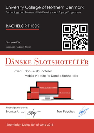
  • 1. Client: University College of Northern Denmark Technology and Business - Web Development Top-up Programme Class: pwei2014 Supervisor: Nadeem Iftikhar Bianca Amza Submission Date: 18th of June 2015 BACHELOR THESIS Project participants: Toni Peychev Danske Slotshoteller Mobile Website for Danske Slotshoteller
  • 2. TABLE OF CONTENTS TABLE OF CONTENTS 3Page INTRODUCTION5 Overview of the company ����������������������5 Problem delimitation ��������������������������������5 Problem Formulation ��������������������������������6 Project Objectives��������������������������������6 Purpose of the project������������������������������6 METHODOLOGY���������������������������������������������7 Introduction to methodology������������������7 Five planes of UX����������������������������������������7 Iterative Waterfall model��������������������������8 STAKEHOLDER ANALYSIS�����������������������������13 Planning����������������������������������������������������13 1. Identify the project stakeholders��13 2. Prioritize the stakeholders ��������������14 3. Organize the stakeholders ������������15 TARGET GROUP ANALYSIS���������������������������17 PERSONA PROFILE NO.1�������������������������������20 PERSONA PROFILE NO.2�������������������������������22 USER JOURNEY NO. 1 (bad) �����������������������24 USER JOURNEY NO. 2 (bad) �����������������������26 USER NEEDS SITE OBJECTIVES�������������������28 User Needs������������������������������������������������28 Site Objectives ����������������������������������������29 1. Content Requirements��������������������29 2. Features��������������������������������������������29 SWOT Analysis���������������������������������������������30 COMPETITOR ANALYSIS�������������������������������31 1st COMPETITOR: SØRUP SLOT������������31 2nd COMPETITOR: HAVREHOLM SLOT 32 3rd COMPETITOR: HINDSGAVL SLOT����34 4th COMPETITOR: DRONNINGLUND SLOT ��������������������������������������������������������������36 COMPARISON������������������������������������������38 CONCLUSION ������������������������������������������42 SWOT Analysis���������������������������������������������44 THE STRUCTURE PLANE���������������������������������45 USER JOURNEY NO. 3 (good)�����������46 USER JOURNEY NO. 4 (good)�����������48 Planning����������������������������������������������������50 1.0 Defining the structure������������������������51 1.1 Interaction Design ������������������������51 1.2 Information Architecture��������������52 Content Structure: Categories����������52 1. General information about the ho- tels ��������������������������������������������������������52 2. Specific information about each one of the hotels ����������������������������������������53 2.0 Mapping the content. Sitemap ������54 2.1 The “Closed Card Sorting” Method ��������������������������������������������������������������54 2.2 Choosing the right structure��������55 Sitemap������������������������������������������������56 THE SKELETON PLANE�����������������������������������57 Interface Design��������������������������������������57 Planning����������������������������������������������������57 Navigation Design ����������������������������������58 Global Navigation������������������������������59 Local Navigation ��������������������������������60 Contextual Navigation ����������������������60 Information Design����������������������������������61 Sketches Wireframes ����������������������62 THE SURFACE PLANE�������������������������������������64 Visual Design��������������������������������������������64 Contrast������������������������������������������������64 Functional Regions������������������������������65 Consistency������������������������������������������66 Considerations for mobile content����66 The Chrome����������������������������������������������67 Progressive Disclosure ������������������������67 Colours Theory������������������������������������������68 Functional Colors��������������������������������69 Typography Legibility�����������������������������71 GESTALT PRINCIPLES�������������������������������������72 Parallelism��������������������������������������������72 Enclosure����������������������������������������������72 Proximity ����������������������������������������������72 Similarity������������������������������������������������73 Common Fate��������������������������������������73 IMPLEMENTATION�����������������������������������������74 Introduction����������������������������������������������74 Technologies used����������������������������������74 Setting up the environment��������������������77 Sub-domain vs. Sub-directory������������77 Creating http://m.slotshotel.dk����������77 Redirecting Mobile detection in Joomla ������������������������������������������������78 FUTURE CONSIDERATIONS���������������������������80 Features����������������������������������������������������80 CONCLUSION�����������������������������������������������81 LITERATURE REFERENCES���������������������������82 APPENDIX�����������������������������������������������������84
  • 3. 4 UCN Web Development Bachelor Thesis INTRODUCTION Danske Slotshoteller is a chain of six classical castles and manors which have been re- stored with respect for their age and history. The hotels are located in different parts of the country and each one of them is deco- rated in its own style, with its own restaurant and nearby attractions. However, for all these six hotels, there is only one website, www.slotshotel.dk consisting of all the information related to them and their business. The website is functional and offering a variety of features, from gener- al details about the services offered to the clients, to information about each one of the hotels, online booking system and gift voucher promotions. Obviously, further im- provements can be made, but creating a hierarchy with the priorities is necessary in order to keep a clear evidence over the whole process. The main and the most important aspects is represented by the accessibility and the client receiving the message the business is sending. Either we are talking about a holi- day special offer or a promotion for the lat- est phone released, it is crucial for the user to be able to reach this piece of informa- tion. In our case, we are talking about news- letters, schedules, different discounts and offers for stays at the hotels and a lot others. The first question that has to be answered is: “How?” How can a client reach this infor- mation? As previously mentioned, the main information and all the details regarding the hotels and their services are stored in one place: www.slotshotel.dk. So, of course, the question becomes: “How can a user access the website and implicitly the information that he/she is looking for?” Depending on the device used, there are several possible answers to this question. Originally, the website was designed main- ly for desktop computers and laptops, but as the number of people who browse the internet by using their mobile phones has dramatically increased, a mobile version of the website seems to be more and more necessary. According to www.dst.dk (Denmark in Fig- ures 2013): “The Internet has become widely popular in the everyday life of the Danes – and the mobile phone is increasingly used for this purpose. More than half of all mobile phone owners use their mobile phone when they browse the Internet, and a third send and receive emails via their mobile phone. Today, 92 per cent of all Danes have access to the Internet from their home. E-mail is the most common purpose of using the Internet, followed by search for information on goods and internet banking.” The client’s request was to develop and create a new way the information is being presented to the user on smaller devices than a normal sized notebook, as he clearly specified that there is a lot of extra informa- tion on the original webpage that it is use- less to have and read on a smart phone. (E.g.: history of the hotels - it is less likely that a user would prefer reading a long piece of text about the hotels a hundred years ago, instead of watching a video or browse on Facebook). Overview of the company Problem delimitation
  • 4. 6 UCN Web Development Bachelor Thesis METHODOLOGY In addition, the current design of the site has been designed specifically for desktop com- puters, laptops, and bigger devices than a mobile phone, so despite the efforts of mak- ing it responsive and more user-friendly, a mobile version is still highly recommended. One of the reasons for this is given by the chaotic structure of the website (due to the smaller screen size) and therefore by the dif- ficulty the user is facing when trying to nav- igate and find the info he is looking for. The extra information makes the process slower and can be irritating, especially when more and more clients checking the hotels and their offers are doing it from their mobile phones. What the client is aiming for is a clear, friendly way of presenting the most important infor- mation (prices, schedule, locations, book- ing) no matter the device used for it as he is unsatisfied with the fact that a lot of clients are lost due to these issues. How to develop an effective mobile version of the current website which will enhance the services Danske Slotshoteller offers and improve the user experience so both the company and the client will benefit from it? The purpose of this project is to create a new way of presenting the information re- lated to the hotels on smaller devices such as smartphones or tablets. The current web- site (www.slotshotel.dk) includes all the nec- essary details about the six hotels, but the way it is structured does not reflect the user’s needs when using an iPhone for example. There is a lot extra-information that needs to be removed, so “cut the fluff” will be one of the main objectives along with properly re- organizing the rest of the content to fit small- er devices. By creating a mobile version of this website, the client aims to make the information eas- ier to reach and access and therefore more attractive for new and regular customers due to the simplicity and the logic way of structuring the most essential pieces of data. Problem Formulation Purpose of the project 1. Project management 2. Collect data by personally interview- ing the people 3. Develop a new concept for the mo- bile website 4. Create UX - The user experience de- velopment process means first of all mak- ing sure that every aspect of the UX has been taken into consideration and un- der control. In other words, creating UX is more or less anticipating every action the user is likely to take and understand- ing its expectations at any step through- out the whole process. 5. Create a new environment for the mobile website 6. Implement the concept by using an appropriate CMS platform Project Objectives This chapter will introduce and describe the collection of our chosen methods, process- es and considerations which have defined and shaped the project. Adevelopment methodology is the framework used tostruc- ture, plan, and control the overall process of developing during a project. Over the years a large variety of differ- ent methodologies have emerged and evolved, each offering a specific set of ad- vantages and disadvantages.This is the rea- son no methodology is uniform and as pro- jects vary in their level of complexity, scope, team size, duration and numerous other variables, so can different methodologies fit better or worse for a specific project’s work- flow. Choosing the best suited methodology is crucial for a project’s success and it is one of the first things that should be decided af- ter careful and extensive consideration. The base three options we had in the beginning were either to adopt an existing method- ology, create our own, or take the middle route and use one that exists, but change and adapt it to suit our needs better. Given the limited amount of time we had, we de- cided it is too risky to choose the second op- tion and instead opted to turn to the more traditional and well known approaches that we were already familiar with. Furthermore, since one of the major aspects of our problem definition was to empha- size the importance of user experience (UX) and produce a user-centered product, a supplementing UX design process had to be introduced as well in order to achieve a consistent outcome in the end product and delivera positive experience to users. Introduction to methodology Five planes of UX There are multiple processes used by UX designers, and no single process fits everyone. All of them however have a somewhat similar set of principles, and can be applied to comple- ment many existing methodologies and frameworks such as Agile and waterfall.Different processes and people might give different labels to these concepts, but ultimately they can represent any major UX process, such as the Double Diamond1 (Design Council, UK, 2005) and the Five planes of UX2 (Jesse James Garett, CA, USA, 2000): 1. http://www.designcouncil.org.uk/news-opinion/design-process-what-double-diamond 2. http://www.jjg.net/elements/pdf/elements_ch02.pdf Strategy → Research → Analysis → Design → Production
  • 5. TABLE OF CONTENTS 98 UCN Web Development Bachelor Thesis Iterative Waterfall model Since we have been using the Five planes of UX in the past and we are familiar with its linear, yet incremental nature, we decided it is in our interest to follow it as a conceptual framework. It consists of the following phases (or “planes”): Strategy → Scope → Structure → Skeleton → Surface In his essential UX book The Elements of User Experience1 , Garrett explains the framework as “On the lowest plane, we are not concerned with the final shape of the site, product, or service at all — we only care about how the site will fit into our strategy (while meeting the needs of our users). On the highest plane, we are only concerned with the most concrete details of the appearance of the product.” (pg 21). This model seeks to define the key considerations that go into the development of user experience on the Web and is does not describea development pro- cess, but is supplementary to it. 1. http://www.jjg.net/elements/pdf/elements_ch02.pdf Iterative Waterfall model When choosing the most appropriate method, we had to take into considerations the fol- lowing factors: the size of our team (2); the duration of the project (2 months); level of expe- rience with project management, design, and implementation (low to medium) etc. and compare with the characteristics of the Waterfall and Agile groups of methodologies. The Waterfall approach is linear in nature, which means it is divided into sequential phases and each phase must be finalized before the next one is initiated, with no turn- ing back at later stages allowed, since it disrupts the strictness of the milestones and deadlines. It focuses on following time schedules, meeting target dates and building an entire system at once after extensive analysis and written documentation. Compared to the agile framework, which emphasizes quick, periodic deliverables (usually called sprints) of client-prioritized features, it requires thoroughly research- ing and understanding requirements in ad- vance and is a lot more limiting in flexibility and handling of changes. a. The team and the client agree on what will be delivered early in the development life- cycle. This makes designing and implementation a lot more straightforward, since a lot of effort is put in figuring out the scope of the work beforehand; b. Providing some degree of safety for inexperienced teams, since its orderly sequence of development steps and tight predefined scheduling results in the delivery of a product which is based upon a more complete understanding of all deliverables; c. Except for arranged meetings, the clients involvement is not needed after the require- ments phase; d. Provides a clearer sense of progress due to its step-by-step nature; e. Last, but not least, we believed that the required careful documentation of all phases was not only perfectly compatible with the steps in UX processes, but could also give us enough relevant material to analyze defend in our report; However, pure Waterfall development has a number of drawbacks that could disrupt the workflow and cause a snowball-effect, such as the inability to backtrack in order to add or modify requirements, unpredictabil- ity towards change and possible reduced manageability due to lack of iterations. This got us thinking – was there a way to intro- duce iterations in a Waterfall approach and what might the repercussions be. Further researching the idea produced sur- prising results. In his 1970 paper “Managing the Development of Large Software Sys- tems”2 , Winston Royce - the inventor of the Waterfall approach himself, states that the method is flawed, calling it “risky and invit- ing failure”. Not only this, but he continues to declare that an Iterative Waterfall ap- proach is superior and is the next (and prac- tically not the last) natural step in eliminat- ing development risks. Although still quite complex to use with large projects, adapting this philosophy to our needs in a smaller, more narrowed down scale for the creation of a mobile website seemed like the perfect solution for us. The first step in order to adapt the Iterative Waterfall model to our project was to use only the necessary steps we need and omit the rest, reducing the complexity level and allowing further breaking down in incre- ments. Three iterative development cycles were established, each requiring the pre- vious to be completed, but also providing the possibility to backtrack and make cor- rections if needed. Simultaneously, the Five planes of UX are also introduced gradually, corresponding to the cycle at hand. While it is usually used in large-scale, long and complex projects, some of its advantages for our project seemed very fitting: 1. 2. http://leadinganswers.typepad.com/leading_answers/files/original_waterfall_paper_winston_royce.pdf
  • 6. TABLE OF CONTENTS 11Page10 UCN Web Development Bachelor Thesis The first cycle consists of the REQUIREMENTS ANALYSIS phases and with them begins the process of understanding the abstract state of the situation by researching, de- ducing and documenting the findings. The first cycle is iterated three times, once for each consecutive plane. For the STRATEGY plane, we focus on product objectives and user needs; the SCOPE plane sets in place the content and functionality specifications by defining and prioritizing them; and the STRUCTURE plane iteration sees ideas mov- ing away from their abstract origins and taking shape by focusing on a more precise interaction design and information archi- tecture. The second cycle marks the beginning of the DESIGN DEVELOPMENT phases, which are iterated twice. First, during the SKELETON plane we design the interface naviga- tional design, so that the elements are both easily accessible and clearly understood by the users; and lastly, the SURFACE plane iter- ation is used to finalize all visual details and establish a concrete presence. The project should be in a deployable state after the last iteration (deadline). The third cycle is special and a little bit dif- ferent than the first two, as it has no overlap- ping planes and iterations there don’t have a minimum or maximum count. It involves DEPLOYMENT, TESTING MAINTENANCE for an already developed mobile website and they will start taking place after the client receives the product. They are a continu- ous, looping future phase in the project and the frequency of the iterations depends on how the client feels about the product and how he plans to develop it in the long term.
  • 7. 12 UCN Web Development Bachelor Thesis STAKEHOLDER ANALYSIS Rather than randomly writing them down on a paper, a brainstorm to generate a com- prehensive list of stakeholders, consisting of a set of questions will be conducted. The questions that needed to be answered in order to get a quick overview of the stake- holders are displayed below: Questions: a. Who initiated the project? b. Who will benefit after the project com- pletion? Who is the client? c. Who will be responsible for the mainte- nance after the implementation? d. Who is directly involved in the project? e. Who is financing and supplying the re- sources for the project? f. Who will be influenced by the results of the project? g. Who has external influence in the pro- ject? h. Who will manage the project after com- pletion? “Stakeholder management is critical to the success of every project in every organization I have ever worked with. By engaging the right people in the right way in your project, you can make a big difference to its success... and to your career.” – Rachel Thompson, Mind Tools A stakeholder analysis was necessary in order to identify the people be involved in the pro- ject, how and to what extent a person or a group of people influences the development process. Besides this, it is essential to know how people with different roles are influenced by the project after implementation in order to uncover their expectations and ensure they are met or revised for further changes. The analysis is structured into few different steps that allow the correct identification of all the stakeholders and their roles in the development process of the project. Planning 1. Identify the project stakeholders 2. Prioritize the stakeholders: IMPORTANCE and INFLUENCE over the project 3. Organize the stakeholders: POWER and INTEREST in the project The analysis outcome should provide the team with a clear idea over the people in- volved in the project, their expectations, the relationships they have and the roles each one of them is playing in the project life cycle. 1. Identify the project stakeholders RESEARCH PHASE
  • 8. TABLE OF CONTENTS 15Page14 UCN Web Development Bachelor Thesis Answers: a. Danske Slotshoteller, web developing team (students) b. Danske Slotshoteller and their clients c. Danske Slotshoteller and their technical support team (employee) d. Danske Slotshoteller owner, developing team (students), project supervisor (UCN teacher) e. Danske Slotshoteller f. Danske Slotshoteller and their clients, competitors g. Competitors h. Danske Slotshoteller, Danske Slotshotell- er technical support (employees) After summarizing the answers, a first list of the stakeholders involved in the project has been made and can be seen below: »» Danske Slotshoteller (project manager, technical support, employees) »» Danske Slotshoteller clients (people visiting the hotels and other potential clients) »» Competitors (other hotels in Denmark, especially in the nearby areas of the hotels) »» Project supervisor (UCN teacher) »» Web Developing team (students) 2. Prioritize the stakeholders: IMPORTANCE INFLUENCE After identifying the stakeholders, the next step of the process is to organize the list created in the first phase according to the importance and influence that each stakeholder has in the project. Danske Slotshoteller CEO (owner) has a great influence throughout the whole de- velopment process as he assists the team with regular feedback at each step. Using an agile method for the project life requires first of all great client insight, constant con- tact with him and this is nevertheless making the whole process more dynamic due to the unpredictable flow of events. The hotels technical support and the pro- ject supervisor are also stakeholders since they are collaborating with the project team and have valuable knowledge and the necessary skills in different matters (e.g. provides with helpful info about the server configuration and the environment of the future mobile website, gives advice about design). They do not have any decisional power though and therefore no influence in the process. The developers (students) are the active participants stakeholders in the project since they have the relevant skills to imple- ment the solution; no doubt they are one of the most influential factors when a decision is being taken as the course of the project depends mostly on them. Aside from the people directly involved in the project, there are also stakeholders who will be influenced by the project after its im- plementation and are not necessary in its or- ganization. They do not have any influence over the actual developing process, but they make the difference between a poor and a successful product. The outside pro- ject stakeholders in this case are the users (clients of the hotels) and the competitors. 3. Organize the stakeholders: POWER INTEREST The purpose of this analysis is to understand who the stakeholders are, their expectations and the way they react to the project. It is important to know how to engage them and the most effective way of communication. Organizing them by the power they have in the project and the interest they have in the whole working process helps at finding out who are the stakeholders that need to be in- formed about the development, how often, and the stakeholders that should be fully satis- fied by the outcome of the project and managed closely. High Power, interested people The stakeholders who are affected by the project during its life-cycle are Danske Slot- shoteller CEO, the UCN supervisor and, of course, the developing team (students). The CEO is obviously interested in the project since he is the one who helped at shaping the initial requirements and started the pro- ject and if he is not pleased with the direc- tion the project is moving to (either design or functional aspects), than further changes should be taken into consideration immedi- ately.
  • 9. 16 UCN Web Development Bachelor Thesis TARGET GROUP ANALYSIS Therefore, it is safe to assume that the CEO is the stakeholder with the highest importance and should be kept satisfied and up-to-date at all times. In close relation to the CEO is the develop- ing team who is responsible for building the product while fulfilling the client’s require- ments . The developing team is also very in- terested in successfully completing the pro- ject and create a satisfactory product and is the stakeholder who connects all the oth- ers and ensures a smooth process. Low Power, Interested people The supervisor is a stakeholder who does not have any decisional power over the project, but his role is essential because he is providing the team with helpful feedback and further guidance. He should be though kept informed about the developing pro- cess so he can give advice. His interest in the project is to help the developing team (students) to complete it. The technical support as a stakeholder is involved in the project due to their knowl- edge about the company, its servers and their configuration. This stakeholder’s role is to help the developing team with informa- tion about the system, setting up a proper environment for the product (mobile web- site) and the best methods to work with it. His interest in the project is to make sure that the system is handled properly and the pro- cess is running in a safe secure background that will not create any problems. The stakeholders who are most likely to be influenced by the project after its comple- tion are Danske Slotshoteller, clients of Dan- ske Slotshoteller (people who are visiting or are planning to book a stay at one of the hotels) and competitors of Danske Slotsho- teller. The last two of them hardly influence the developing process of the project, but a detailed analysis will be conducted for both from different reasons. Low Power, Less interested people First of all, it is important to know who are the people using the hotels services and how to properly reach other potential customers, but it is even more important to know how to keep them satisfied and build a product up to their expectations. On the other hand, a competitor analysis is also necessary in order to find out the weak- ness and the strengths of the competition and take advantage of them. However, this stakeholder has no power over the project and it will be influenced by the its outcome. An analysis of the market is critical to the success of any product and our mobile website is no different. Understanding the target audience and knowing how to effectively reach them is vital and can often mean the difference between a good and a greater success rate. The reason this is important is because it helps to shape the product to best meet the needs of the market as well as determining the most effective way to reach target audience. Before beginning an audience analysis it is advisable to come up with a list of guideline questions that will be answered by completing the research and give an overview of the target market. These questions can be grouped into four parts: who, why, where and how. The following analysis is also based on the interview with the client and partially supplemented by the public research documents “Denmark in figures” (2013), “Mobile phones in Denmark” (2013), as well as basic marketing theory (http://www.about.com/money). WHO? The first question that must be answered in the beginning of an audience analysis is “Who are the targets?” It includes demographic analysis and ad- dresses age, gender, marital status, income, span, etc. Since the services offered at Danske Slotshoteller are varied and aimed at specific occasions, it also reflects on the above variables. The main purposes for a visit at one of the hotels are the following: marriages, business meetings, confirmation, birthdays general parties, as well as fami- ly holidays. This automatically broadens the characteristics of the target group. Marriages are organized mostly by couples of ages 30+; business meetings are booked by corporate request and include a pre- dominant male percentage and similar age group of 30+; confirmation is a coming-of- age Christian ritual usually performed with male or female young adolescents of age group 13-23; birthdays parties for different
  • 10. TABLE OF CONTENTS 19Page18 UCN Web Development Bachelor Thesis occasions can include virtually any gender age, and the same goes for family visits. By summing up these delimitations, it turns out the total age limit goes all the way from teenagers to elderly people. However, ac- tual bookings are made by users of legal age, who have a sufficient constant cur- rent income rate, which narrows down the group to 30-60 years of age working profes- sionals. WHY? The next set of questions that must be asked is “Why does the market need this product?” Understanding why the market would be in- terested in the product can assist in custom- izing the item to best meet the desires of the target audience. Since the purpose of the project is to introduce the greatest ease of access to information booking on a mo- bile phone, it is noteworthy to realize wheth- er the above established demographic will find it useful. A statistical overview of smartphone sales and use of mobile internet offers a deeper understanding of the issue. With 2012 marking an all-time high of smart- phone sales, an even higher peak pro- jected for 2016, and given the fact that, as of 2012, 97% of Danish families have at least one mobile phone with more than 50% of individual users accessing the internet on their phones, the numbers strongly suggest that more than half of the target audience might stumble on the mobile website for one reason or an- other (NB! Research excludes tablet use market share). Given these numbers, it is imperative that we make sure that once they do, their ex- perience is 100% hassle-free, information is presented in a ”rush-friendly” manner and contact and booking functions are a few clicks away. WHERE? Once who the target audience is and why they need the new product is ascertained, the next question is “Where are they?” This information is important because it helps to determine how to reach the au- dience and get the message out in the marketplace. According to the information gathered by interviewing the client, approx- imately 50% of all guests are regulars and 50% are newcomers. This ratio actually presents a great strategic opportunity for launching a new and im- proved mobile website, because virtually half the clients are yetto be introduced to Danske Slotshoteller, and first impressions of usability and presentation can be crucial to converting prospects to regulars. As far as the regulars are concerned, there is always the opportunity for those familiar with the current mobile website to dislike the new version, but the ones who use it for the first time should exceed and replace lost cli- ents, if any. Furthermore, roughly 75% of all guests are Danish, 15% are Norwegian and 10% are American. In this case, however, their virtual presence is far more important than their ge- ographic location – the majority of foreign visitors come mostly for family holidays and to a lesser degree for business meetings. This has to make us think: how do you plan such a trip abroad and it is safe to assume that the answer is “online”. Therefore, a bet- ter established digital presence can not only facilitate existing foreign clients, but even increase their number should they are pleased enough on first impression. Same logic can be applied for some of the Danish clients, who have also proved to pre- fer online booking through “Expedia.com” “Booking.com”, compared to by phone or by client’s own booking system. HOW? After achieving a greater insight of where the customers might be located, who they are, and why they need the product, we can finallywonder about: “How can we spread the word to the target au- dience?” Physically reaching the existing audience is only one aspect of this, however.The mes- sage must be crafted in such a way thatit gets the target to notice and realize the im- portance, value and benefits of using the new product.In order to succeed at doing this, a simple, but subtle marketing cam- paign can be introduced. Locally, a non-intrusive distribution ofspecif- ically designed flyers and/or business cards at hotels’ reception desks or directly mailing thecurrent newsletter subscribers can prove to be effective. Digitally, inexpensive advertisement options can be utilized, such as promoting in social media and partnering websites;integra- tion in desktop version of website via a QR code; as well as establishing a strategically active presence on selected web commu- nities, such as wedding forums (http://www. bryllupsklar.dk), Christianity-related portals (http://www.konfirmationsportalen.dk/), etc. In the long term, more solid investments might be made, like advertising on more popular expensive holiday platforms or even improving own booking system, if fi- nancially feasible at the time.
  • 11. TABLE OF CONTENTS 21PagePERSONA PROFILE NO.1 Amanda Smith DEMOGRAPHIC DATA Amanda has expressed her interest in photography from a very early age and she has never doubted what her dream job is. She is working as a freelance photographer, has flexible working hours and more than sufficient income. Due to her career choice, she is more or less familiar with modern technologies and is an above-average user. She has been happily married for almost 5 years and has no children. Age: 32 Gender: Female Location: Bakersfield, CA, USA Occupation: Self-employed Position: Photographer Income: 21.000 kr/month BACKGROUND DATA GOALS CONSIDERATIONS Primary: Amanda and her husband are going to have their 5 years anniversary as a married couple in a few months and she is determined to go on a romantic one week holiday to celebrate the occasion. She loves travelling and wants to experience the summer in Europe. She is focused on finding a luxurious big hotel in a quiet out-of-town area with beautiful nature and preferably a restaurant with a wide selection of good wines. Secondary: Since photography is her second love, she would also enjoy being able to visit a picturesque place and take photos of the moments she shares together with her husband. That is why it is important for her to get a good view of the vicinity of the hotel and see what attractions lie in close proximity. Devices used: • Smartphone (Samsung Galaxy S6 Edge); • Laptop (Asus Zenbook) Emotions traits: • Joyful, positive, open- minded, artistic personality; • Active, decisive, confident in what she wants; • Appreciates good ideas, creative thinking and visuals that tell a story. • More of a cat person. Pain points frustrations: • Unintuitive services; • Improperly communicated ideas; • Technical mishandling of features;
  • 12. TABLE OF CONTENTS 23PagePERSONA PROFILE NO.2 Christian Holm Andersen DEMOGRAPHIC DATA After finishing his BsC in Business administration and MsC in Human Resources Development, Christian has increasingly been promoted over the years and has had quite a successful career. He is currently working for a Marketing finance company in a high-ranking responsible position. He is not an IT expert, but due to extensive use of his company-provided Apple products, he has his way around modern devices. Christian has been married for 24 years and has two daughters, ages 23 21. Age: 52 Gender: Male Location: Aalborg, Denmark Occupation: Marketing Finance Position: HR manager Income: 35.000 kr/month BACKGROUND DATA GOALS CONSIDERATIONS Primary: The company is expanding and a new branch has been opened recently. The CEO has asked Christian to organize and lead a seminar and a week of team building activities in the end of July for the new employees in order to help them to get to know and trust each other more, thus becoming a better and more efficient team. He has to research the available options and send a list of his best recommendations to the CEO. Secondary: Christian is experienced with organizing team building activities and knows that people get to know each other much more quickly if some sort of team sport or game is involved. He also wants to take full advantage of the nice weather and find a hotel which is out in the nature, has a fully equipped business hall and can organize a party for the last day of stay Devices used:  Smartphone (Apple iPhone 6);  Tablet (Apple iPad Air 2)  Laptop (Apple Macbook Air) Emotions traits:  Calm, calculating, patient personality;  Professional, analytical, systematic in his tasks;  Appreciates proper researching before making decisions; simple solutions to complex problems; straight-to-the point communication;  Vegetarian, but loves fish; Pain points frustrations:  Chaotic and confusing visuals;  Unclear developers’ intent on features;  Unnecessary unrelated information;
  • 13. TABLE OF CONTENTS 25Page USER JOURNEY NO. 1 (bad) A user journey is a series of steps which represent a scenario in which theuser might interact with the product in order to complete his goal. User journeys can help usunderstand how users are going to interact with our website and what are their expectations from it. Two user journeys are going to be presented for each persona involved –showcasing both the current situation with its weaknesses and the new and improved concept which is supposed to improve their experience. Amanda stumbles upon www.slotshotel.dk – a website representing a chain of six hotels of her chosen type. That is the first step in her user journey and the first thing she sees is a homepage in gold, vintage-looking cozy color, displaying a map of Denmark with 6 marked locations, one for every hotel.Instinctively, she tries clicking on one of the locations, given their strong resemblance to links, but nothing hap- pens. She zooms in and tries clicking on all of them. But soon she realizes nothing will come of it, so she starts scrolling (minor pain point). After scrolling down the homepage and reading some introducto- ry information, she feels encouraged because it sounds exactly like the place she is looking for. At the bottom of the page, right after the text finishes, she sees two buttons – for bookings and restaurant. Influenced by the things she is particularly interested in, she makes a decision: Amanda is sitting at a café after meeting a potential client for her services as a photographer and is planning her dream summer holiday in Europe on her Sam- sung Galaxy phone. Based on her requirements, she has figured out she is looking for an old, fancy, secluded hotel, out in the nature, which means renovated cas- tles should be exactly what she needs. After checking a number of castles in dif- ferent countries, she finds a portal, displaying a list of renovated castles manors in Denmark and she is intrigued. Curious if a selection of wines is available in their menu, she clicks on Restaurants and hopes to find a list of drinks. She is redirected to a hub page with some text and 6 containers with telephone number and menu link for each restaurant. Unfortunately for her, all of the menus contain only food items and no other links are visible to indi- cate drinks menus. (pain point) Determined to keep looking, she scrolls back up and checks the global navigation drop-down menu for clues on where to find a wine catalogue. Upon clicking on it, she sees a “Wine tasting” tab and clicks on it. Alongside some confusing information about wine prices, she sees a number of “Read more” links. She tries the first one, but the loaded pdf document is more of an overview of wines rather than a catalogue. She tries the second one and finally sees a complete list of all the wines. Amanda is feeling a bit frustrated and thinks the information architecture is not very clever, but is at least reassured that a wide selection of wines are available (minor pain point). Amanda has decided the last thing she wants to check is a gallery of the hotels and their surroundings. She goes back to the home page in order to see the locations on the map from north to south, and then from the drop down menu selects Hved- holmSlotshotel – the southernmost hotel in the chain. Although she doesn’t know Denmark, she seems initially impressed by the short description and is eager to see the photo gallery. Much to her dismay however, clicking on the according button yields no results whatsoever. Multiple tapping produces no result and Amanda tries a different hotel, but to no avail. Disappointed with all the flaws that resulted in a rather bad user experience for her, she does not even consider trying the booking function. She puts her phone down and continues her lunch. That marks the end of the user and she is no longer a prospective customer for DanskeSlotshoteller. (pain point)
  • 14. TABLE OF CONTENTS 27PageUSER JOURNEY NO. 2 (bad) Christian has just got on the plane from Aalborg to Copenhagen, for a business trip, and takes out his IPad with the intention of finding the perfect spot for the team building trip he was asked to organize. Since he is looking to get the team out of the noise of the crowded city, he uses Google to find out suitable options out in the nature. Christian’s user journey begins as he stumbles upon www.slotshotel. dk and the first thing he sees is a map of Denmark with 6 locations of castles manors and he immediately notices 3 of them are not that far away from Aalborg, where the new branch is located – Vraa, KokkedalStore Restrup. He is intrigued and decides to check if con- ference options are available. Without scrolling, Christian immediately accesses the drop down mega menu and quickly locates “Møderogkonferencer”. He is shortly redirected to a hub page with introductory information on confer- ence facilities and three expandable containers with further informa- tion. Although he finds the text helpful, he cannot help but notice prices are listed rather chaotically and are hard to figure out andthere are no instructions on who to call or write to in order to ask about it (minor pain point). Using the drop down menu again, he notices the tab “Golfferie” and he thinks that golf might be the perfect game activity that peo- ple can enjoy together. All it takes is a single look for him to see that Store Restrup and Kokkedalhotels offer plenty of golf course options nearby and that also helps him narrow his choice down. However, he is again perplexed by the way prices are displayed (per 3 nights per person) and cannot see who how to ask for help if he needs to sign up for more or less than that period (minor pain point). Feeling a little bit discouraged by the lack of a visible quick contact option, Christian tries to see if he could check for availability and possibly see how prices are calculated at check out. He goes back to the home page and scrolls down until he locates the booking button. After tapping it, he is redirected to the booking screen and is asked to fill in some details, such as hotel and guest count. He chooses Store Restrup, but surpris- ingly finds out that the number of guests is limited to 1 or 2. Realizing that around half a dozen reservation need to be made for the entire team, Christian decides it is not worth the hassle to use DanskeSlotshoteller’s services and starts searching for a different establishment (pain point).
  • 15. TABLE OF CONTENTS 29PageUSER NEEDS SITE OBJECTIVES 1. To be able to reach the necessary information as fast as possible: Although browsing the web via a mobile device has become extremely common (ref. DK in figures), single sessions are short because users are usually on the go and they do not dedi- cate all of their attention to the device. “Instant gratification and quick fixes” are expected by today’s generation of internet consumers (The Guardian, 2014). This means users should be able to find answers to all of their questions with minimum effort and zero frustration. 2. To be able to reach or contact the hotels at all times in order to receive immedi- ate assistance in case of confusion and/or inquiries: A short and easy user journey could prove successful if at any point the user decides to contact the hotel. This is why it is imperative that an always visible “click-to-call” button can be accessed at all times and spare the users the need to navigate to a Contact section, remember a phone number and dial it manually. 3. To properly see photos of the hotels exteriors and interiors: “A picture is worth more than a thousand words” and that stays true in web design as well. Studies have shown that our brains not only process visuals faster, but they also retain and transmit much more information when it’s delivered visually.That is why it is crucial to be able to show visitors images of each hotel quickly and painlessly, in a mobile friendly way – it also builds trust and users are more likely to make a decision based on impeccable visuals. 4. To easily access other people’s reviews on the hotels services and restaurants: According to different surveys, between 70-90% of users are influenced in their decision by some type of recommendation (Forbes, 2014). User-submitted content in particular such as Yelp, Amazon, TripAdvisor, etc. has seen a massive increase of influence over buying deci- sions and that is why users are more likely to trust us if we provide them with quick and easy access to TripAdvisor reviews and social medias in order to see previous customers’ experi- ences; 5. To get a simple booking experience: Even if a client has made his mind and is determined to use our services, a bad booking experience can mean all the effort we have put is in vain. Furthermore, a section of users would not even consider calling the hotel in order to complain. That is why a smooth book- ing experience needs to be used, which facilitates users as much as possible. User Needs Site Objectives What Danske Slotshotellert is trying to ac- complish with the development of a dedi- cated mobile website is basically to adapt to the ever growing segment of mobile us- ers in the market. While the company does have a currently functional responsive template which is us- able on mobile devices, the journey of the users is far from positive (as showcased later in User Journeys). The website has numerous design, informa- tional, functional and technical problems which are very hard to fix due to the respon- sive nature of their main website. That is why the decision was made to stop trying to fix everything for all platforms, but invest in a partial rebranding by introducing an entire- ly new mobile website. The new website will retain the mission, vi- sion and values of the current business mod- el, but it will include only the most important piece of information and features, specif- ically designed to be accessed, displayed and used on a handheld device. The long term goal of this is to increase the flow of new customers and increase the number of regulars as well by providing a fulfilling, yet simple user experience. Sec- ondary objective is to make use of a system which is easier to maintain and update. »» The menu icon alongside with the logo is present on all pages of the website »» Link to the main website visible »» Link to the web-shop of the hotels »» Link to the restaurant control reports »» online booking option »» representative photos from the hotels 2. Features 1. Click-to-call 2. Go to main website 3. Get directions/Find your way (via Google Maps) 4. Contact information for each one of the hotels 5. Access the hotels on different social networks (Facebook) 6. Travel Guide: Nearby Attractions Shopping Centres 7. Book via Booking.com 8. Reviews from other people who visit- ed the hotels (via TripAdvisor ) 9. Restaurant info: schedules, prices, menus 10. Photo galleries of the hotels (exterior, interior, restaurant, wine cellar) 11. Slideshow with the six hotels on the front page 12. Visit the hotels web-shop (for dis- counts, offers and gift vouchers) 1. Content Requirements
  • 16. COMPETITOR ANALYSIS A detailed analysis of all the researched known competitors will be provided below, stressing both advantages and disadvantages. Based on the analysis, a list of common strengths and weaknesses will be assessed, which will serve as a basis of the conclusion and will provide important insight into the functional specifications of the project. 1st COMPETITOR: SØRUP HERREGAARD The first competitor on the list is Sorup and the immediate impression upon loading their website on mobile is that of a propor- tionate, segmented and easily perceivable product, with instantly recognizable and obvious purpose. Users are introduced to a simple layout of a logo, menu icon, a transi- tioning set of images and a welcoming mes- sage, all scaled to good size. While overly simplistic, the design is stylish, consistent and creates the proper perspec- tive for the specific type of establishment it represents. This is further complimented by the excel- lent addition of Google Business view mod- ule on the front page, allowing users to take a virtual tour of the hotel and optimized per- fectly on mobile. However, upon further in- spection, a number of flaws appear which definitely impact negatively the experience of browsing on a mobile device. Some of them are caused by the responsive nature of the website, while others are present in the desktop version as well. Probably the biggest problem encountered is the absence of the Booking function – it took extensive browsing and scrolling back and forth in order to locate a small “BOOK” button, located at the bot- tom of a sub-menu article about room prices. Upon clicking it, a redirection takes the user to a third-par- ty, non-responsive, although usable, booking platform. It is also worth noting that the drop-down menu contains a full site map - links and sub- links to every section of the website. On the plus side, the design of the menu itself is relevant and pleasant, much better than a genericlist of options, but on the downside, it con- tains just too many links, feels Website: www.sorup.dk Status: Responsive SWOT Analysis »» No competitor has a dedicated mobile website as of yet; »» Not having to spend time in opti- mizing all components of a respon- sive desktop website separately in order to keep it usable on mobile; »» Reducing data traffic and load- ing speed for mobile users; »» Using a third-party booking system from Booking.com due to the client not having a reliable own system; »» No previous practical experience in developing a mobile website withJoomla; »» Unlike the competition, as much as 6 hotels need to be properly in- cluded presented in 1 website; »» Learn from competitors’ mistakes and avoid them; »» Achieve a new level of accessi- bility and a uniform ease of use, no matter the device; »» Attract new customers by making a good impression with a superior website on mobile devices; »» Using Booking.com for handling booking operations can actual- ly turn out to be an advantage – Booking.com is perfectly optimized for mobile and is one of the most popular platforms on the web, so user might feel more secure famil- iar with it; »» Clients rejecting the complete redesign of the website - as part of a brand, a fraction of users can of- ten react negatively to the change and switch to using a competitors’ services; »» Possible difficulty in implementing some of the more advanced fea- tures (i.e. GPS control); »» Website turning out to be more complex and visuallyconfusing than expected; Strengths Weaknesses Opportunities Threats
  • 17. TABLE OF CONTENTS 33Page32 UCN Web Development Bachelor Thesis overcrowded and con- fusing. Furthermore, a lot of the sub-menu items are featured in more than one menu items, which creates a lot of redundancy and du- plicated information. The information itself is help- ful, but the presentation could use some improve- ments – although the font is large enough and the text is easy to read, inconsistent line lengths, unsuitable align- ment (centered) and gen- eral uneven distribution of images vs. text make it look less professional than some of the other competitors. Another quite serious issue is that some information is ful- ly inaccessible while holding the device in vertical posi- tion. Sorup is also one of the two analyzed websites to feature a search-function, but unfortunately it falls short of being able to assist users in finding specific content – the list of results is non-de- scriptive, full of irrelevant duplicated results and gen- erally unhelpful. While Sorup has some re- deemable features, such as the Google Business View, and is generally usa- ble on a mobile device, it’s chaotically spread-out in- formation and hard to find booking-function severely decrease its efficiency. 2nd COMPETITOR: HAVREHOLM SLOT Initial reactions to Havre- holm’s website were mixed – it is noticeable from first glance that the logo has not been done in a vector graphics program and looks blurred and unprofessional. Not only that, but coupled with the global navigation bar just beneath it, it takes half the visible screen (and the entire visible screen in horizontal position!) and filling it mostly with white space. The transitioning im- ages are, on the other hand, only visible while in horizontal position – in vertical position they have been stretched thin and on smaller screens the users would have a real problem figuring them out. The lower part of the screen, Website: www.havreholm.dk Status: Responsive however, contrasts with a much higher quality. While a little bit too informative, it strikes a good balance be- tween images text in or- der to introduce users to the services they might expect to find, provides instant and clear means of booking via a global “RESERVATION” button, and definitely cre- ates a cozy ambiance due to the visual elements and neutral color scheme. However, the negatives seem to greatly outweigh the positives as numerous problems arose after more extensive use. The drop- down menu is one of the first elements to be criticized – it is generic android/iOS drop- down list with no alterations, looking not only bland and uninviting, but also lacks form and structure. Further- more, after any page loads, it reverts to a default “Go To” value, which makes it easy for the user to get lost in navigation. The other pair of globally-present items – the “RESERVATION” “NYHEDS- BREV” also fails to live up to the expectations. While one would question the logic or necessity to put a newsletter function centrally as a glob- al element, making it look as important as the booking, it is an even more puzzling why it also has links for the booking itself, given the fact both are quite visible. When we also take into account that most pages contain the same booking links before the footer, it really seems like an overkill to duplicate the same link so many times, especially when there is a global signifier visible from the start. However, the single most crucial problem the webite faces is the almost complete impossibility to actually use the booking function. In or- der to do so, one is required to use Booking.com, but not in a separate window, but embedded inside a small section of the page. The re- sult on a mobile device is dis- astrous – an extremely small fraction of the Booking.com page is visible and inhuman patience and zealous devo- tion are required to success- fully make a booking, which would take seconds on the desktop version. The web- site’s Gallery section is also poorly optimized for mo- bile, displaying glitches and technical problems. On the bright side, the in- formation is presented in a very good manner, font siz- es are large and readable, line lengths are suitable and even though the alignment of text can be a bit incon- sistent, the general legibility is high and the information is easy to perceive.
  • 18. TABLE OF CONTENTS 35Page34 UCN Web Development Bachelor Thesis Website: www.hindsgavl.dk Status: Responsive Hindgavl’s website definitely takes a step up in terms of professionalism and efficien- cy. Some of the few downsides spotted are in the home page, which provides no context on mobile. The layout design are less personal, more generic, there is almost no text to give a clue what the website is about and the displayed headlines create the impression of some sort of events por- tal instead of a hotel. However, the Booking function is visible right after the page loads, and there is always a booking button on the always-present header bar, which makes room reservation quick and easy at all times, even when scrolling. While using the book- ing function users are asked to tilt their de- vice to horizontal position, and while tablet users will find it way easier due to the bigger screen size, booking is also quite easy on a smartphone as well. The global drop-down menu is customized, it is neither overcrowded nor empty, it has a strong character and users cannot get lost at all times. As navigation is concerned, the global menu bar contains links and sub- links to all sections, and although some local navigation is also present, it feels largely un- necessary. Another advantage of Hindsgavl is the useful search function, which provides relevant results and good enough context to show users what they need. Another opti- mized section is the Gallery, which, although not perfect, works far better than any of the 3rd COMPETITOR: HINDSGAVL SLOT competitors’. As with the other responsive websites, font size is good and text readable, although unaligned. There are some inconsistencies in font type and size on most pages how- ever, and it feels like too much information is presented at times, especially given the high accessibility and easy navigation to all the important information. This is further so- lidified by some sections which are not at all appropriate for a mobile device – namely the “Press Kit” section, containing down- loads; the extensive Contacts info, letting users to contact all employees personally; and a “Job hos os” section for people look- ing for a job. While all of the above features are undisputedly relevant and useful for their appropriate target group (journalists, job seekers, ect…) on a desktop, it is doubt- ful whether they are best suited for a mobile device. While not perfect, Hindsgavl’s website has clearly been designed with mobile access in mind and that is one of its biggest sell- ing points – its features are noticeably opti- mized for smartphones and tablets, it is very modern and up to date from a design point of view, even if it is more or less generic, and it simply feels superior to the other competi- tors’ websites.
  • 19. TABLE OF CONTENTS 37Page36 UCN Web Development Bachelor Thesis 4th COMPETITOR: DRONNINGLUND SLOT Website: www.dronninglund-slot.dk Status: Not responsive Due to its not-responsive nature, Dronnin- glund slot’s website feels expectedly un- pleasant to deal with on a mobile device. It is very hard to point any specific features that make a good impression. Although the home splash-page provides clear context about the nature of the establishment, the positives unfortunately end here. As opposed to all previous websites, Dron- ninglund slot is using some sort of segre- gated information architecture in order to separate information into three sub-sites, dealing with different, but sometimes over- lapping information. All three of them have separate global navigation bars, which are not drop-down, and in order to switch be- tween them, users are required to first go back to the front page. All three sub-sites are full of inconsistencies as well – informa- tion is very unevenly distributed with some sections containing as few as a couple of lines of text; images used vary greatly in quality – some are visibly more professional than others, some are used multiple times and some are very generic. Visibility is a huge concern, as font size is too small to be read normally in a hand-held device, requiring a lot of zooming in. The in- formation is itself is relevant, but too spread out and difficult to obtain – and without a proper search function it can be a rather chaotic experience. Even when found, it re- quires a lot of effort to be perceived. Furthermore, a lot of technical problems limitations arise – during browsing a lot of plugins were marked as “unable to load” or “disabled” – without a doubt due to the differences between desktop mobile de- vices architecture. Touch areas are also very hard to guess at times. Gallery section is prone to lag. Fortunately, booking is possi- ble due to a redirection to a third party ser- vice, which is also not optimized for mobile. It is however hard to believe that some us- ers will make use of this feature on anything other than a desktop computer. It is quite noticeable that Dronninglund Slot’s website has been designed with absolutely no consideration for mobile access. It feels outdated, uninspired and is completely out of line with modern standards. Even fea- tures that look like they are working can be deceiving at best – like using a static image of a map instead of an interactive modern solution, or providing links to German and English version of the website, which turn out to lead only to a single page in the respec- tive languages. All of this, supplemented by the manner in which information is present- ed creates not only a palpable and una- voidable gap between user expectations and reality, but also puts severe technical bounds on its user base, which unfortunately results in a more than dreadful experience.
  • 20. TABLE OF CONTENTS 39Page38 Competitor Analysis - Comparison (part 1) Competitors Home Page Navigation Organization Sørup Herregaard »» www.sorup.dk »» responsive »» Contextually relevant; »» Visually unbalanced (images dominate text); »» Not very informative (duplicated information in text titles); »» Google Business view in- tegrated in home page – big plus; »» Global navigation (drop-down megamenu) too overcrowded confusing; »» Custom-made megamenu con- tains all local navigation as sub- menu items, acting as sort of a sitemap; »» Local navigation contains a lot of duplicated links; »» Booking function very hard to find; Havreholm Slot »» www.havreholm.dk »» responsive »» Logo taking too much space looking bad on mobile (not vector graph- ics); »» Central image scaled thin, overshadowed by logo megamenu; »» Good balance be- tween text images; »» Too informative; »» Elegant relevant de- sign, but little rough on mobile; »» Global navigation – drop-down megamenu taking almost the entire screen together with logo; »» 2 global links outside of megamenu contain links to each other – redun- dancy; »» Megamenu is generic and uninvit- ing; »» Inconsistent local navigation – most local sections contain booking links in the end, duplicating the global nav links; »» Can require too much scrolling due to duplicated info links; COMPETITOR ANALYSIS - COMPARISON Readability Performance Content »» Font is large and easy to read (sans-serif); »» Text is not aligned; »» Line length is inconsistent; »» Content is structured in blocks; »» A lot of important informa- tion is not visible in vertical (and sometimes even in hori- zontal) position; »» Easy to scan; »» Image transition can be smoother; »» Short loading time; »» Google Business view working great on mobile; »» Occasionally bumping into remnants of old web- site (bad links); »» Search function not very useful; »» Relevant information, but too spread out and hard to find; »» Inconsistent text vs. im- age balance; »» Made in a way to re- quire less maintaining; »» Some blocks of info re- semble ads; »» Font is good size easy to read (sans-serif for global nav text; serif for local nav links); »» Inconsistent text align- ment – different sections for- matted differently; »» Adequate consistent line length; »» Good balance between text images; »» Megamenu reverting to default “Go to” value after page load, making it easier to lose yourself in the web- site; »» Booking function for rooms totally unusable on mobile; »» Gallery section not opti- mized for mobile access; »» Short loading times; »» Relevant information, but can be hard to find due to bad mapping; »» Visual representation is aesthetic mostly nicely segmented for easy view- ing; »» Booking from mobile devices downright impos- sible; (part 1)
  • 21. TABLE OF CONTENTS 41Page40 Competitor Analysis - Comparison (part 2) Competitors Home Page Navigation Organization Hindsgavl Slot »» www.hindsgavl.dk »» responsive »» Provides no context for visitors; »» Non-informative at all on mobile (almost no text); »» Generic, non-specific design; »» Contact info displayed twice – redundancy; »» Looks like some sort of events portal, based on displayed headlines; »» The only visible element to signify the nature of the website is “Booking”; »» Global navigation bar remains present when scrolling, giving quick easy access to the drop-down megamenu at all times; »» Megamenu is simple, easy to use elegant; »» No strictly local navigation – megamenu contains links to every section sub-section; »» Useful search function – provides detailed understandable results; »» Slight inconsistency – duplicated link (restaurant); Dronninglund Slot »» w w w . d r o n n i n - glund-slot.dk »» not responsive »» More splash page than home page; »» Provides clear context; »» Not informative; »» Misleading “English” “German” buttons on home page do not trans- late website; »» Navigation is divided by the home page in three entry points, acting like separate websites – switching between them requires going back through the home page; »» No global navigation – menu bars are different for all three parts of the website; »» Requires backtracking to find infor- mation; »» Even more chaotic without a search function; Readability Performance Content »» Font is easy to read (sans-serif); »» Inconsistent use of font type and font size on the same page; »» Good balance between text images; »» Text can be too much in some sections; »» Text is not aligned; »» Booking relatively hard on a small screen; »» Booking function is op- timized for mobile access (horizontal positioning is re- quired on screen); »» Gallery section is opti- mized for mobile access, but can require a bit more precision; »» Touch areas sometimes unintuitive; »» Good loading times; »» Information is relevant and easy to find; »» Some unnecessary sec- tions for a mobile device (press kit, job hos os); »» Visual representation is modern, if a bit generic; »» Designed with mobile in mind; »» Font is good size easy to read (sans-serif for global nav text; serif for local nav links); »» Inconsistent text align- ment – different sections for- matted differently; »» Adequate consistent line length; »» Good balance between text images; »» Not optimized for mo- bile – a lot of plugins do not load at all; »» Uses static image of a map instead of a more modern solution; »» Booking is easy to do through a third party web- site; »» Information is relevant, but too spread out, une- venly distributed hard to find; »» Designed with no con- siderations for mobile ac- cess in mind; »» Visual presentation looks dated uninspired;
  • 22. TABLE OF CONTENTS 4342 UCN Web Development Bachelor Thesis Analyzing all four of the competitors’ mobile websites has revealed a number of patterns, similarities and weaknesses, which prevent any of the websites to achieve a perfect status. Working with this data could be of great use for the project and could help weed out all imperfections and combine the gathered knowledge with the client’s discussed needs in order to create a website, close to perfection. Here is a list of features, traits and notes of interest which help us achieve a greater understanding of the underlying problems at hand and go in the right direction: CONCLUSION 1. Booking function »» Out of the 4 analyzed websites, only two (HavreholmHindsgavl) have a Booking function which is easy to find, and only one (Hindsgavl) has made it easy to use as well. The other websites have their Booking functions placed out of sight, making it very hard for users to find it. Given it is one of the most crucial and essential features a hotel website has to offer and it is directly related to converting prospects to clients, it is of the utmost importance that we pick a stra- tegic location for our Booking function, making sure it is easy to spot, feels natu- rally placed and, of course, is in working condition, regardless if it is a proprietary system or uses a third-party platform. 2. Drop-Down menu »» Out of the reviewed mobile websites, three feature a drop-down megamenu which contains most of the global nav- igation. Out of those three, one is ex- tremely overcrowded and complicated to get by, one is completely generic and non-descriptive, and one (Hindsgavl) is exemplary – properly stylized, providing a perfect number of links which makes it neither too simple nor too crowded and very user-friendly. »» Since global navigation is a well-es- tablished concept and users expect to find it, it is only logical that we take notice of Hindgavl’s obviously superior solution and try to achieve a similar balance of perceivable elegance combined with a much welcome simplicity. »» This is a high-priority feature, since it contains all important “pathways” to main information hubs and it needs to be as usable as possible. 3. Consistent use of text, images information in general »» Due to their responsive (and non-re- sponsive) nature, all of the reviewed websites had a problem in common – the inconsistent use of text and images, including the overly excessive amount of the (sometimes unnecessary) infor- mation the spread out nature of that Competitor Analysis - Conclusion information. »» This means that users of mobile devic- es will have to go through a lot of scroll- ing, clicking going back to reach the information that has any real practical use. »» Coupled with the above-mentioned problems of difficult navigation and hard-to-use features, this severely de- creases the chances of converting a prospect to a client by introducing the huge risk of losing the user’s attention. Solving this problem would mean includ- ing just the correct amount of informa- tion and deploying it in such a way that minimum effort is required to find, per- ceive and use it. »» By offering the answers to a users question quickly and efficiently through a mobile site, it is way more likely for them towant either more information and/or proceed with a booking. 4. Search function »» Out of the 4 analyzed websites, 2 have implemented search functional- ity, with one of them (Hindsgavl) doing it better than the other (Sorup). The in- clusion of a search bar was the topic of a heated discussion, since while not ob- ligatory to include, it has certain advan- tages which cannot be denied. »» On one hand, the aim of the project is to introduce a clean, tidy and light- weight navigation system which is very easy to use and follow, and one could argue if a search function is needed for a website which is so specific and not content-rich. »» Ultimately, a search function’s pur- pose is to get users closer to a sale and as such, it might probably not be the most useful element on the website. In the tested examples, the searches returned a lot of irrelevant and unhelpful results, further questioning the need for it. »» However, according to a number of studies, such as (http://www.usabil- ity.gov/sites/default/files/documents/ guidelines_book.pdf) a search function is a vital part of user’s psychology and expectations, and a palpable percent- age of users are likely to neglect naviga- tion completely in ftavour of the search bar, despite how good and easy to use said navigation is. »» Furthermore, from a data mining per- spective, every time someone types a single thing into that search box, they are giving us insight into how they see and what they think about the website, which might help pinpoint important content problems and insight into users’ expectations in the long term. »» In light of these studies, we have de- cided that even if a search function is not implemented when at launch, it is very likely a feature to be added some- time in future development.
  • 23. SWOT Analysis »» No competitor has a dedicated mobile website as of yet; »» Not having to spend time in opti- mizing all components of a respon- sive desktop website separately in order to keep it usable on mobile; »» Reducing data traffic and load- ing speed for mobile users; »» Using a third-party booking system from Booking.com due to the client not having a reliable own system; »» No previous practical experience in developing a mobile website withJoomla; »» Unlike the competition, as much as 6 hotels need to be properly in- cluded presented in 1 website; »» Learn from competitors’ mistakes and avoid them; »» Achieve a new level of accessi- bility and a uniform ease of use, no matter the device; »» Attract new customers by making a good impression with a superior website on mobile devices; »» Using Booking.com for handling booking operations can actual- ly turn out to be an advantage – Booking.com is perfectly optimized for mobile and is one of the most popular platforms on the web, so user might feel more secure famil- iar with it; »» Clients rejecting the complete redesign of the website - as part of a brand, a fraction of users can of- ten react negatively to the change and switch to using a competitors’ services; »» Possible difficulty in implementing some of the more advanced fea- tures (i.e. GPS control); »» Website turning out to be more complex and visuallyconfusing than expected; Strengths Weaknesses Opportunities Threats THE STRUCTURE PLANE “Users spend most of their time on websites other than yours. Thus a big part of customers’ mental models of your site will be influenced by information gleaned from other sites. People expect web- sites to act alike.” - Jakob’s Law of the Internet User Experience After clarifying the requirements and the functional specifications from the Scope and Strategy planes, all the necessary pieces of data have been collected. It is time now to move forward onto the next phase (the Structure Plane) and to organize the information according to different criteria. Next, an improved version of the user journeys will be show-cased in order to illustrate how the data gathered so far can improve the user’s experience.
  • 24. TABLE OF CONTENTS 47PageUSER JOURNEY NO. 3 (good) Amanda is sitting at a café after meeting a potential client for her services as a photographer and is planning her dream summer holiday in Europe on her Samsung Galaxy phone. Based on her require- ments, she has figured out she is looking for an old, fancy, secluded hotel, out in the nature, which means renovated castles should be exactly what she needs. After checking a number of castles in different countries, she finds a portal, displaying a list of renovated castles manors in Denmark and she is intrigued. 1. Amanda stumbles upon www. slotshotel.dk – a website represent- ing a chain of six hotels of her cho- sen type. That is the first step in her user journey and the first thing she sees is a homepage in a simple, but very appealing three colour pal- ette, a large welcoming sign and a fun-looking carousel at the centre of the screen. At the bottom of the page she sees a big, round Click-to- call and Info buttons. After tapping the Info button and reading some introductory information, she feels encouraged because it sounds ex- actly like the place she is looking for (minor pain point eliminated). 2. Curious if a selection of wines is available in their menu, she clicks on the Menu icon standing always in the top right corner and immediately notices the “Restaurants” tab. After clicking on it she is redirected to a com- pact hub page with some text and 6 buttons – one for each restaurant. Randomly choos- ing Vraa Restaurant, she is redirected to the restaurants page. She notices again the round click-to-call button, as well as the cen- trally placed buttons “Food Menu” “Wine Menu”. After tapping the wine menu, she sees a complete list of all the wines in a .pdf document and is more than satisfied with their wide selection (pain point eliminated). 3. The next thing Amanda wants to check is pictures of the hotels and their surroundings. Without even going to the previous page, she clicks the Menu button again and since she doesn’t know Denmark, she selects the same hotel – Vraaslotshotel. The images she is looking for are instantly displayed as the page is loaded. She clicks and scrolls around them, seeminglyimpressed. The two sets of buttons surrounding the gallery also make it easy for her to check the hotel’s Face- book page and TripAdvisor reviews. She is extremely pleased with her experience with the website and has all but decided she has found the perfect place for a special holiday (minor pain point eliminated). 4. Excited by the good news, Aman- da cannot wait to tell her husband and decide together which of the six hotels to choose. Delighted, she goes out of the café and calls him straight away. This marks the end of her user journey and she is nowa newly recruited customer of Dansk- eSlotshoteller (pain point eliminat- ed)
  • 25. TABLE OF CONTENTS 49PageUSER JOURNEY NO. 4 (good) Christian has just got on the plane from Aalborg to Copenhagen, for a business trip, and takes out his iPad with the intention of finding the perfect spot for the team building trip he was asked to organize. Since he is looking to get the team out of the noise of the crowded city, he uses Google to find out suitable options out in the nature. 1. Christian’s user journey begins as he stumbles upon www.slotshotel. dk and the first thing he sees is a simple interface with a welcoming message and a centered carou- sel. After swiping through them, he notices three are located nearby Aalborg – Vraa, Kokkedal Store Restrup. He is intrigued and decides to check if conference options are available. 2. Christian immediately accesses the drop down mega menu and quickly locates “Meetings con- ferences”. He is shortly redirected to a hub page withfour expanda- ble containers with information. He finds the text very helpful and is glad to see Click-to-call buttonis always available if he needs to ask some- thing (minor pain point eliminated). 3. Using the drop down menu again, he notices the tab “Golf holiday” list- ed under Servicesand he thinks that golf might be the perfect game ac- tivity that people can enjoy togeth- er. All it takes is a single look for him to see that allhotels offer golf course options with the exception of Vraa, which also helps him eliminate and focus on the other two hotels near Aalborg. The hub page does not pro- vide all the details, but it is enough for him to know that the option exists and he can easily arrange it by call- ing. He follows the same one-click procedure to see that parties can also be organizedt 4. Feeling positive that he has found a very suitable place to host the team building seminar, Christian decides to see if there is availability for the dates chosen. He accesses the Menu and goes to Store Restrup’s page. The booking button is instantly visible, but he doesn’t tap it until after he’s seen some pictures of the area. He is redi- rected to Booking.com – a platform he has used numerous times. A quick search shows that there are enough available rooms to accommodate the entire team. Relieved that he found everything he needs in such a short amount of time puts a smile on his face. Christian navigates back tothe website and uses the Click-to-call button in order to discuss booking plus all the necessary extras. His user journey finishes in a more than positive way and he is feeling confident he will recommend DanskeSlotshoteller to his employer (pain point eliminated).
  • 26. TABLE OF CONTENTS 51Page50 UCN Web Development Bachelor Thesis 1.1 Interaction Design »» defining how the user will be interacting with the web-site’s functionality and features »» incorporating external resources in the project 1.2. Information Architecture »» structural design of the information space to facilitate intuitive access to con- tent »» introducing pre-established content categories 2.0 Mapping the content: Sitemap 2.1 “Closed Card Sorting“ method »» involving the users in the process 2.2 Choosing the right structure »» presenting the new sitemap Planning 1.0 Defining the structure As a mobile website, the only way the users can interact with it is by tapping on different areas of the device screen. It is therefore im- portant for the user to correctly anticipate what each one of the buttons/zones/pages is designed for. The easiest way to achieve this is to adapt the website to widely recognized standards and principles in order to create a similar ex- perience to the websites most used by the targeted audience. For instance, everybody knows that the navigation bar of a website is usually located in the top of the page and it feels only natural for the user to find the main navigation or a menu button in this specific area. Another good example is given by the world wide usage of icons as anyone can recognize a “Home” icon or a “Call” button and immediately understand their purposes; the logo is a link to the home page of the website - also a good example regarding this matter. Besides accessing the menu and navigat- ing throughout the content, the users can directly call the hotels for further assistance, get directions by using Google Maps (use GPS or type in address), swipe left or right to view the photos in the hotels galleries and send a message by using the provided con- tact forms. While visiting the website, the user can also get redirected to external websites and ser- vices for different purposes. As previously mentioned since the hotels do not have a proper booking system of their own, Booking.com will be used on the mobile website as a temporary solution, in agreement with the client. Therefore, when using the booking option, all the mobile us- ers will be redirected to the simple, widely used interface of Booking.com. TripAdvisor is another external resource the project is taking advantage of because its extensive (again, widely used) list of reviews from other people. Additionally, besides an external link to the main website and also another one point- ing to the hotels web-shop (used to offer the customers the possibility of purchasing online different products and services: gift vouchers, holiday discounts on hotels stays), the website will make use of Google Maps for the “Get directions” feature - one of the most trusted and used service for such pur- poses. Social Networks integration is an important aspect that should not be forgotten and for this purpose, Facebook buttons/links will send to the Facebook pages of each hotel. 1.0 Defining the structure 1.1 Interaction Design
  • 27. TABLE OF CONTENTS 53Page52 UCN Web Development Bachelor Thesis 1.2 Information Architecture A website with a clear structure would never lead the users into a dead-point, question- ing themselves why exactly they are there. It should be easy and straightforward for the user to find information across the website, so the content should be organized in a logic manner. The way the content is cat- egorized should reflect the site objectives, meet the user needs and have different roles: either to educate, to inform or to per- suade. For this project, besides “educating” the user by giving him a general idea upon the most important features and data in the website, the way the information is present- ed should motivate the user into finding out more and ultimately wishing to visit these places. However, the limited screen space does not allow doing this by overcrowding the pages with text and forcing the user into reading endless paragraphs on a small de- vice is certainly not the best approach. Therefore most information on the website is collected in small reference articles from the main website and the persuading part will be left for attractive photo galleries em- phasized by a simple, yet effective design with a clean template. Content Structure: Categories All the information from the website can be divided into two different main categories: 1. General information about all the six hotels 2. Specific information about each one of the hotels 1. General information about the hotels In this category is included all the pieces of information which are related to all the hotels at the same time. For instance, the details regarding the meetings and confer- ences that can be arranged by the hotels are the same, but the capacity differs from one hotel to another. The same principle can be applied for the information about the restaurants, parties and services offered by Danske Slotshoteller. a. General information about the business As it suggests, this sub-category includes general information about the business such as a short introductory description for the hotels, main office’s contact details (address, phone, e-mail address) and direct access to the main Facebook page. b. Information about restaurants This section includes general information about the restaurants and the most impor- tant info someone might look for. In addition to an attractive small introduction to the food served at Danske Slotshoteller restau- rants, this category includes useful details such as starting prices, number of dishes served, opening hours and technical speci- fications about booking tables and reserva- tions. Moreover, this category includes also info about each one of the six restaurants, like menus and location. However it is difficult to delimitate this cat- egory because part of the information can be placed in a different section as well, and data regarding locations and/or phone numbers would be duplicated. This also means that some information might need to be accessed from different places around the website, depending on the user’s needs. For instance, a user might want to only check a restaurant without booking a stay, while another one wants to also spend a few nights and visit the surroundings be- sides eating at one of the places. c. Information about different meetings and events that can be organized at the hotels One of the reasons people come to these six is places is given by the fact that they can organize and receive help (advice) with dif- ferent types of arrangements such as par- ties, meetings and conferences. From wed- dings, confirmations, receptions to courses and business conferences, the hotels are prepared for all kind of events offering all the necessary facilities besides food and accommodation. To make it easier for the users to find exact- ly the type of event they are looking for, this category can be further divided into 2 smaller subcategories depending on the purpose of the arrangement: Parties (wed- dings mainly, confirmations, evening par- ties, annual events) and Business Meetings (conferences, tam building, courses). d. Information about the services offered by Danske Slotshoteller Besides different types of arrangements that can be organized in these places, the hotels offer also different types of services to their clients that include: wine tasting, gastrono- my courses organized by the restaurants of the hotels and golf sessions in collaboration with nearby clubs. What makes the wine tasting so special and worth of its own sub-category (page) is the fact that wine lovers find out more about the wine making process while trying it, making it an unique experience since the hotels im- port wine from different countries around the world: New Zealand, Chile, Romania, France Italy. 2. Specific information about each one of the hotels Each one of the hotels will be treated in this part of the project as a different, stand-on- its-own category mostly due to their geo-lo- cations, different contact details and styles. It is one of the team’s goals to emphasize the fact that that even though they belong to Danske Sotshoteller, they are unique from one to another and there is always a new place to be visited. This categories include contact details such as address, phone numbers, e-mail address- es as well as booking and reviews, photo galleries, nearby attractions and shopping centres, Facebook links.